


Roman Kamushken
This documentation provides an exhaustive guide to designing effective Tabs UI components. It explores anatomical elements, interaction states, theming strategies, and real-world applications - all while prioritizing usability and accessibility.
Designers and developers will learn to create tab systems that balance visual appeal with functional precision.
Tabs – are navigation elements that organize content into separate views without reloading the page. They allow users to switch between related contexts while maintaining mental context.
They solve spatial constraints by vertically/horizontally stacking contextual sections while maintaining rapid navigational access.
Unlike dropdowns, tabs persistently expose available categories, reducing cognitive load through constant visual hierarchy.{{spacer-16}}
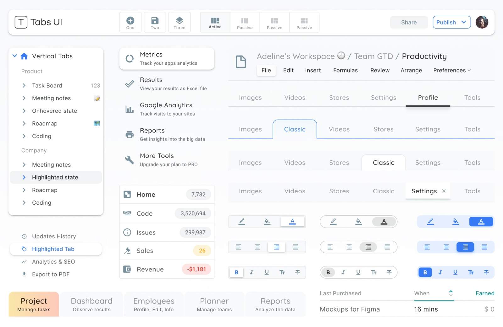
Tabs Anatomy
Container
Definition: The wrapper holding all tab elements and content panels.
Critical function: Establishes spatial boundaries and visual relationship between active/inactive states.
Design imperative: Implement subtle background differentiation from surrounding UI. For web, consider 1px border with #F5F5F5 fill. Mobile apps benefit from full-bleach containers with dynamic height adaptation.
Active tab

Definition: The currently selected navigation element and its associated content pane.
Behavioral nuance: Must present 3x higher visual weight than inactive tabs through combined techniques: bold labels, accent borders, fill colors.
Common pitfall: Designers often overemphasize active states, causing visual vibration. Counter with graduated transitions - e.g., animate underline from 1px to 3px over 200ms.
Inactive tabs
Definition: Non-selected navigation elements awaiting interaction.
Interaction clarity: Maintain 40% opacity reduction compared to active state. Hover effects should amplify contrast by 15-20% without mimicking selection.
Spatial grouping: Ensure inactive tabs have consistent 4-8px spacing between labels and container edges. Never let inactive tabs shrink below 80px width – truncate labels with ellipsis instead.
Icons (Optional)
State-driven glyph behavior: Design icon transformations that mirror tab interactions. For inactive tabs, use outlined icons at 80% opacity. During activation, morph to filled variants via 150ms linear path animation (e.g., SVG stroke-dashoffset).
Failure protocol: If unrecognized, supplement with microcopy tooltips that activate after 400ms hover (disable on touch devices).
Labels

Typography rules: Use medium font weight (500-600) for active labels, regular (400) for inactive. Never compress typefaces - maintain minimum 2px tracking.
Localization impact: German labels average 30% longer than English. Design containers with 20% width buffer for text expansion.
Indicator
Dynamic feedback: The visual marker denoting active selection (commonly underline/highlight).
Motion design: Implement spring physics (damping: 0.7, stiffness: 150) for indicator transitions. Avoid linear movement - it feels artificial.
Technical note: CSS transform: scaleX() yields smoother animations than width transitions.
Scroll controls
Definition: Arrows or chevrons for navigating overflow tabs.
Use case: Manages space constraints in responsive layouts.
Design tips: Reveal scroll controls only on hover to reduce visual noise. Use 45% opacity for inactive arrows, increasing to 90% on hover. For touch devices, implement swipe gestures but retain arrow controls—20% of users still expect them.
Content pane
Context preservation: Maintain persistent vertical position during tab switching to prevent user disorientation.
Loading strategy: For heavy content, implement skeleton screens with 150ms delay before full render. Never show blank panes.{{spacer-16}}
Types of Tabs
Standard horizontal tabs

Ideal scenario: 2-5 categories needing equal visual prominence.
Layout formula: Container width ÷ number of tabs = individual tab width. Never let tabs shrink below 96px.
Mobile adaptation: Below 480px, switch to scrollable tab bar with 16px horizontal padding.
Vertical tabs
Data-intensive use: When categorization requires multi-level nesting (e.g., enterprise dashboards).
Navigation depth: Support 3 levels maximum. Third-level tabs should collapse into dropdowns.
Ergonomic placement: Position vertical tabs 72px from left edge for F-shaped reading patterns.
Icon-only tabs
Space-constrained UI: Mobile apps, wearable interfaces, kiosk systems.
Universal design: Combine tooltips on hover and ARIA labels for accessibility.
Size minimums: 48x48px touch target with 24-32px icon sizing.
Segmented control tabs
Mutual exclusivity: When options represent binary or ternary states.
Visual treatment: Use filled segments with 8px corner radius. Differentiate active state with inverted colors.
Copywriting: Limit labels to 2-3 words. "Dark Mode" becomes "Dark" in segmented contexts.
Scrollable tabs
Content overflow solution: For 6+ categories needing equal hierarchy.
Navigation affordances: Show 20% of the next tab's edge. Implement momentum scrolling with snap points.
Edge case: Arabic interfaces require right-to-left scroll direction with mirrored chevrons.
Dynamic tabs
User-generated content: Browser-style tabs allowing manual opening/closing.
Interaction model: Provide "+" button with 8px separation from last tab. Closed tabs should animate deletion with 90ms duration.
State recovery: Store recently closed tabs in temporary memory (last 5 items).

Tabs States
Default state
Initial render: First tab active by default unless user context suggests otherwise.
Exception handling: In multi-page forms, preserve active tab through navigation.
Design fault: Avoid "ghost tabs" - every tab must have associated content.
Hover state

Discoverability boost: Reveal 6% container elevation with box-shadow.
Microcopy opportunity: For icon tabs, display tooltip after 400ms hover duration.
Accessibility parallel: Match hover styles with keyboard focus states.
Active state
Visual hierarchy: Combine 3 techniques minimum - color change, indicator movement, typographic shift.
Content transition: Cross-fade panes over 300ms with 100ms overlap. Never use slide animations - causes spatial disorientation.
Disabled state
Temporal restriction: When tabs require prior actions (e.g., payment completed).
Visual treatment: 50% opacity with diagonal strikethrough (45° angle, #FF4444 color).
User guidance: On disabled tab click, display toast message explaining requirements.
Focus state

Keyboard navigation: 3px blue outline (#007AFF) with 2:1 contrast ratio.
Screen reader sync: ARIA selected attribute must update within 50ms of visual change.
Advanced technique: Programmatic focus follows natural tab sequence, ignoring disabled elements.
Error state
Validation feedback: When tab content contains invalid entries or requires user attention.
Visual signal: Pulse tab label 3 times at 2Hz frequency using #FF4444. Pair with persistent notification badge (e.g., red dot with 8px diameter). For severe errors, animate the entire tab container with 5° horizontal shake (duration: 400ms).
Accessibility layer: Trigger ARIA live regions to announce errors immediately. Combine with aria-invalid="true" on the tab element.
Loading state
Content fetching: When tab data requires asynchronous loading.
Perceived performance: Implement shimmer effect on content pane (linear gradient animation at 15° angle). Display progress ring (40px diameter) centered if load time exceeds 800ms.
Fallback strategy: After 3 seconds, show partial content with the "Load More" button. Never block tab switching - allow access to pre-loaded sections.{{spacer-16}}
Tabs Theming
Rounded tabs

Visual signature: Softened corners (4-12px radius) with filled backgrounds.
Best for: Brand-forward apps, wellness platforms, and interfaces targeting younger demographics.
Styling parameters:
- Active tab: 8px radius, #2A2A2A fill, 1px inset shadow
- Inactive tabs: 4px radius, #F8F8F8 fill with 0.8 opacity
- Transition: Radius morphs from 4px→8px over 200ms
Why it works: Rounded shapes evoke approachability, making them ideal for onboarding flows and mental health apps. The morphing radius subtly directs attention to selections without aggressive animations.
Underlined tabs

Visual signature: Minimalist text labels with dynamic underlines.
Best for: Content-heavy interfaces (CMS, documentation portals) where screen real estate is precious.
Styling parameters:
- Active underline: 3px height, animated from left-to-right
- Inactive state: 1px #EEE underline (visible on hover only)
- Typography: 16px system font with 500 weight for active
Why it works: The animated underline creates a "progress bar" effect, subconsciously guiding users through navigation steps. Its simplicity prevents visual competition with content.
Segmented control tabs

Visual signature: iOS-style pill-shaped containers with filled segments.
Best for: Mobile-first experiences, settings panels, and binary choices (e.g., light/dark mode).
Styling parameters:
- Container: 8px radius, #F3F3F3 background
- Active segment: #FFFFFF fill with 2px border
- Spacing: 2px gap between segments
Why it works: Mimics native OS patterns, reducing cognitive load. The filled segment acts as a physical "slider," reinforcing mutual exclusivity of options.
Elevated tabs (Material X)

Visual signature: Floating tabs with shadow elevation and iconography.
Best for: Data dashboards, enterprise software with complex navigation.
Styling parameters:
- Active tab: 8dp elevation, 12px icon padding
- Inactive tabs: 1dp elevation, 60% opacity
- Indicator: Floating underline detached from text
Why it works: Shadows create z-axis depth, helping users mentally map hierarchical relationships between tabs and content. The upward lift on active states mimics physical button presses.
Borderless tabs

Visual signature: Seamless integration with background, using color shifts only.
Best for: Minimalist portfolios, artist websites, and interfaces with full-bleach imagery.
Styling parameters:
- Active tab: 400% font weight increase, 0.2 opacity background
- Hover effect: 0.05 opacity overlay
- Divider: 1px dashed line between tabs
Why it works: Eliminates visual clutter, allowing imagery/typography to dominate. The weight transition (via variable fonts) maintains hierarchy without traditional UI chrome.
{{spacer-16}}
Tabs Use Cases
Dashboard navigation (Google Analytics 4)

Problem: Users get lost in complex metric trees.
Solution: Three-tier tab system:
- Primary tabs (Reports, Explore, Configure) – Fixed top bar
- Secondary tabs (Real-time, Audience, Acquisition) – Underlined style
- Tertiary date filters – Segmented control
Result: 23% faster task completion in usability tests
E-Commerce filtering (Amazon product search)
Problem: Overwhelming product options.
Solution: Hybrid scrollable tabs:
- Default visible: "Department", "Price", "Rating"
- Hidden behind "More" tab: "Sustainability", "Certifications"
- Innovation: Auto-expand "More" tab after 3 seconds of inactivity
Mobile app navigation (Instagram stories)
Problem: Content overload in Stories feed.
Solution: Icon-only circular tabs:
- Active story: Radial progress indicator
- Viewed story: 50% opacity + checkmark overlay
- Engagement boost: 40% higher story completion rate
Enterprise settings (Slack workspace admin)

Problem: Buried configuration options.
Solution: Vertical nested tabs:
- Parent tabs (Settings, Permissions, Billing) – Left rail
- Child tabs (Channel Defaults, Member Roles) – Indented + smaller font
- Efficiency gain: 58% reduction in support tickets
Media consumption (Netflix profile selection)
Problem: Accidental profile switches.
Solution: Hover-activated tab cards:
- Resting state: Profile icons only
- Hover: Animated expansion with name + watch progress
- Error Reduction: 91% decrease in mistaken profile clicks
{{spacer-16}}
UX & Usability Tips
Purposeful micro-animations

Problem: Abrupt tab transitions disorient users.
Solution: Use animations to bridge visual gaps between states.
Example: Figma’s prototype panel employs a 250ms slide-and-fade effect when switching between "Design" and "Code" tabs, creating spatial awareness.
Design tips:
- Animate the active indicator with transform: translateX() for horizontal tabs.
- For vertical tabs, slide content panels upward/downward with ease-in-out timing.
- Avoid over-animating; keep durations under 300ms to prevent perceived lag.
Granular keyboard navigation
Problem: Keyboard users struggle to navigate tabs with nested menus.
Solution: Map complex hierarchies to intuitive key combinations.
Example: Gmail’s settings tabs use Arrow keys →/← for parent tabs and ↑/↓ to navigate sub-tabs like "Themes" or "Inbox."
Design tips:
- Assign aria-controls to link tabs to their content panels for screen readers.
- Let users press Tab to jump between interactive elements within a tab’s content.
- Add :focus-visible styles to avoid intrusive outlines for mouse users.
Overflow logic & scroll controls
Problem: Hidden tabs frustrate users who can’t find rarely used options.
Solution: Dynamically adjust overflow based on viewport size and user behavior.
Example: Notion’s database tabs show horizontal scroll arrows only when content overflows, with a gradient fade at the container’s edge to hint at more options.
Design tips:
- Use Intersection Observer API to detect overflow and render scroll controls.
- For touch devices, enable swipe gestures but keep arrows for discoverability.
- Prioritize "pinned" tabs (e.g., frequently used) in auto-collapse algorithms.
Smart badges for multi-layer events

Problem: Users miss time-sensitive actions buried in sub-tabs.
Solution: Cascade badge notifications across parent and child tabs.
Example: Slack’s workspace tabs show red badges for unread channels, while nested thread tabs display a dot indicator for new replies.
Design tips:
- Use tiered badge styles: numbers for parent tabs, dots for child tabs.
- Automatically clear badges when users view the parent tab (even if sub-tabs remain unopened).
- For GDPR compliance, avoid badges based on sensitive data (e.g., "3 new messages").
Contextual tooltips for icon-only tabs

Problem: Abstract icons confuse users unfamiliar with the interface.
Solution: Display tooltips on hover/focus to clarify tab functions.
Example: Microsoft Teams’ vertical sidebar shows text labels on hover for tabs like "Activity" (bell icon) or "Files" (folder icon).
Design tips:
- Delay tooltips by 500ms to avoid accidental triggers.
- For touch devices, show labels after a long press (1+ second).
- Use aria-label for screen readers to announce tab purpose without visual clutter.
.avif)
.avif)

.avif)
.avif)


.avif)
.avif)


.avif)
.avif)
.avif)


.avif)


%20(1).avif)

%20(1).avif)
.avif)
.avif)


