My Biggest UX Career Mistakes and Lessons Learned

While sitting and reflecting on my path as a UX designer, in my head emerged the lessons I had received along the way.

My Biggest UX Career Mistakes and Lessons Learned
Career

Published on

August 15, 2024

|

3 min read

Blog

My Biggest UX Career Mistakes and Lessons Learned

Navigation

Subscribe to new posts

Thank you! Your submission has been received!
Oops! Something went wrong while submitting the form.

By subscribing you agree to with our Privacy Policy.

Share this post

Roman Kamushken

There's a question that continues to disturb me: what's the "greatest" career mistake I made, and how hard did it affect my growth as a designer?

This question made me review my past experience, searching for tips that would help to avoid those mistakes in the future. Fortunately, I'm not the only one. The majority of UX designers shared their own experiences, uncovering the same pitfalls that all of us met.

So, what are they? What are these major career mistakes that UX designers can make?

Let’s take a closer look on them 👇

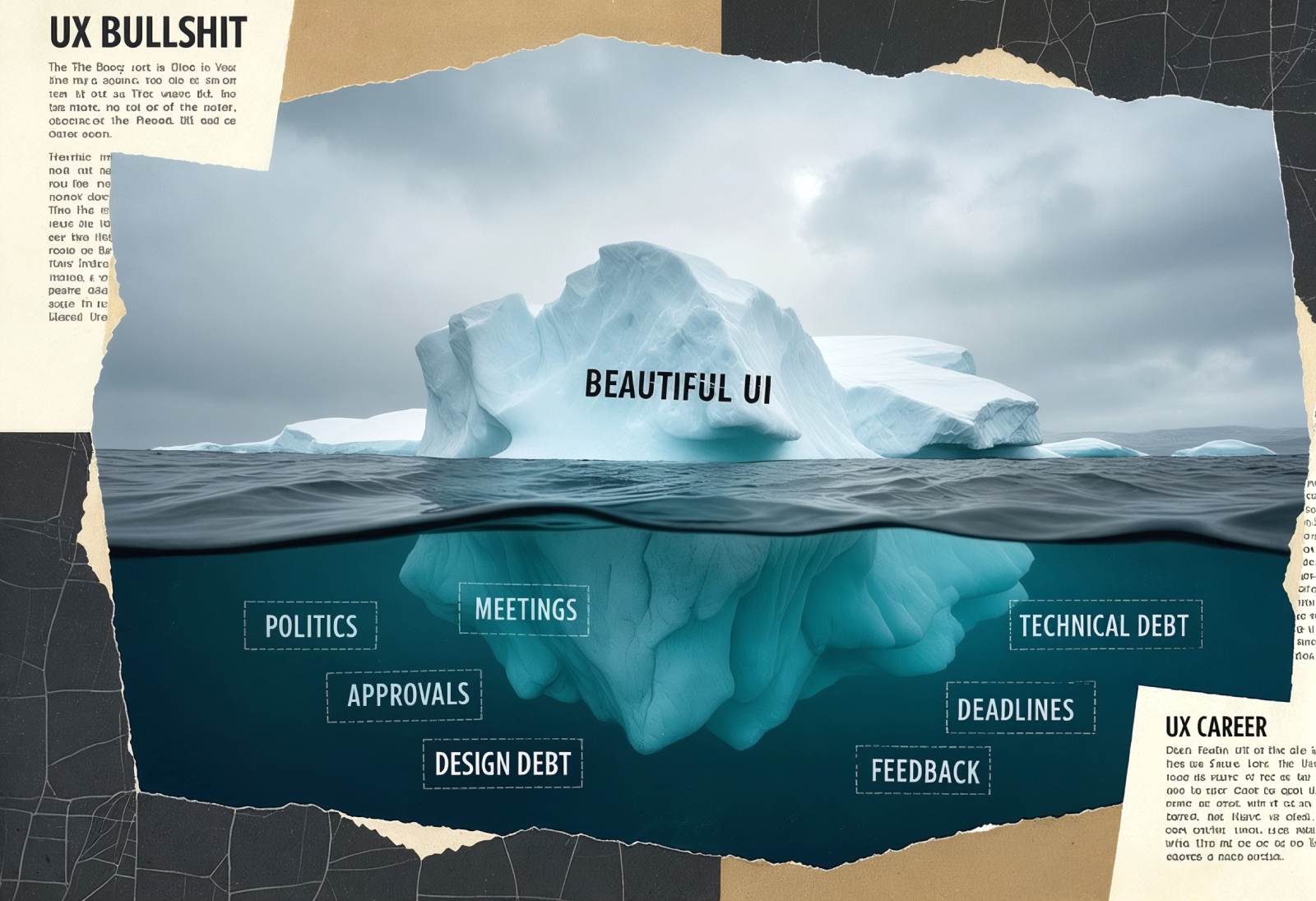
Mistake 1: Neglecting Users’ Feedback

At the beginning of my career, I put aesthetics above usability.

I thought that good design would automatically lead to successful user experience.
It wasn’t true.

One of the projects that comes to my mind - a redesign of a mobile app for an important client. I took into account the stakeholder’s requirements and skipped usability testing to meet the tight deadlines.

And as a result - the app was visually attractive but user-confusing.

How to Avoid This Mistake:

  • Always protect the interests of users.
  • Prioritize users’ needs.
  • Conduct usability testing at an early stage of your work.
  • Don't be afraid to dispute stakeholders' opinions if they conflict with users’ needs.

Mistake 2: Not Documenting Your Work

In the past, I didn’t document my working process as a UX designer.
I mistakenly guessed my work was the company's property.

But when I started looking for a new job, I understood that I had nothing to show. I tried my best to create case studies and had to rely on my memory to recall my works.

Mistake 2: Not Documenting Your Work

How to Avoid This Mistake:

  • Document your case studies from the beginning of a project.
  • Collect every evidence of your work (documents, sketches, mockups).
  • Use apps like Notion to document your process and improve it as you go along.

Mistake 3: Caring Too Much

I used to care about a company's success more than the executives who hired me.

In total, I spent almost six months explaining one design process to them, but they didn't pay any attention. They just wanted to look smart in front of each other and debate over something  unnecessary.

Realized that I cared too much in order to explain to people that didn't even listen to me.

How to Avoid This Mistake:

  • Prioritize your own needs and well-being.
  • Say no to requests that conflict with your values or goals.
  • Set clear boundaries and pay attention to mental health.

Mistake 4: “The Startup Trap”

I once worked for a startup that promised me “the world”.

They assured me that I would be the part of a "rocket ship" that would take off and make me wealthy. But everything resulted in too many tasks out of the scope of my role.

Mistake 4: “The Startup Trap”

I was just free fuel for burning.

By the way, the company didn't even look nice on my CV.

How to Avoid This Mistake:

  • Being realistic about any startup's risks.
  • Choose the companies that prioritize UX design and provide necessary support for UX designers.
  • Be sure you're getting paid as required and not just relying on fairness.

Mistake 5: Solutioning Without Research

UX designers are problem-solvers.

Sometimes we can get too caught up in solving a problem without pre-figuring out the context. This may lead to solutions that don't meet the user's needs or are not practicable at all.

How to Avoid This Mistake:

  • Always perform research before starting a new project.
  • Don't be afraid to question and challenge assumptions.
  • Prioritize the researching part of your work-process.

Mistake 6: Not Changing When Possible

Staying at the same job for too long can be a mistake.

You may find out that the market pay is way more than what you're being paid, or that you're no longer improving your skills.

For the previous company I had been working for seven years, and the last three years were just coasting and maintaining the status quo.

How to Avoid This Mistake:

  • Regularly value your job and career goals.
  • Don’t be afraid to move on in your career.
  • Don't stay in a job that's not suitable for you.

Mistake 7: Neglecting Networking

And the last one - I neglected networking.

I was so focused on my work that I ignored the importance of building and maintaining relationships with colleagues and peers.

Mistake 7: Neglecting Networking

Thankfully, I learned that networking is essential to my career as a UX designer. It may provide a significant support system and lead to new opportunities.

How to Avoid This Mistake:

  • Make time and effort for networking.
  • Try to attend work events and conferences.
  • Use social media to connect with other design fellas, developers and founders.

Conclusion and Final Advices

Growth and learning are lifelong processes and making mistakes is a part of them.

Mistakes are opportunities for growth as a professional.
Don’t be afraid to make them.
Be afraid not to draw conclusions after. 

Final advices:

  • Always prioritize the user and advocate for their needs and expectations.
  • Continuously learn and grow, and seek out new challenges and opportunities.
  • Build relationships with colleagues, peers, and mentors, and don't be afraid to ask for help or advice.
  • Stay adaptable and open-minded, and be willing to pivot when necessary.
  • Keep in mind your own well-being and goals, and don't be afraid to walk away from a situation that's not serving you.

Share this post

Subscribe to Setproduct

Once per week we send a newsletter with new releases, freebies and blog publications
Oops! Something went wrong while submitting the form.

By clicking Sign Up you're confirming that you agree with our Terms and Conditions.

Congratulations!

You're in! Expect awesome updates in your inbox

FAQs

Lorem ipsum dolor sit amet, consectetur adipiscing elit. Suspendisse varius enim in eros elementum tristique.
No items found.

Our Dashboard Templates Will Make It A Treat To View Data

Experience the magic of data visualization with our user-friendly dashboard templates. Try out our dashboards now and enjoy efficient reporting processes, greater transparency in, among others monitoring and making educated decisions easily.

Material X for Figma

Figma library with 1100+ components & 40 app templates beyond Material Design. Powered by top-notch shapes and Manrope font. Customizable & Adjustable UI kit now available for Angular & Figma

Material You UI kit

Figma & React library with 2600+ variants of 32 components compatible with Material Design 3. Plus 220+ dashboard templates for all the viewports. Now available for NextJS & TailwindCSS.

Figma React UI kit

Designed and well-organized in Figma React-based UI toolkit for the web. Optimized for building complex data-dense interfaces for desktop and mobile applications.

Panda Design System

Figma library with dashboard, calendar, kanban, profile, table, ecommerce and 80+ templates in total. Components with variants, dark theme included.

Eclipse UI kit

Figma library with 1100+ components & 74 templates for data-driven web applications. Powered by auto-layout. Supercharged by Figma's variants.

Rome UI kit for Figma

Customizable and well-organized team library. Contains 250+ components & 30 web app templates powered by stylish and trendy guidelines.

Material Design System

Figma library is based on 100% guidelines compliance with Material.io. Contains ready‑to-use templates to accelerate app UI design.

Neolex Dashboard UI kit

Customizable & adjustable dashboard design system with 50+ ready-to-use app layouts, 1900+ variants for 30 components with auto-layout.

Material Desktop Dashboard UI kit

Figma library with 48+ dashboard templates based on reusable desktop app patterns carefully handpicked from the most popular web apps.

Xela UI kit for Figma

Figma library with 1900+ variants of 30 components categories to craft perfectly shaped desktop & mobile apps. Customizable & Adjustable dashboard design system with 50+ web app templates.

Figma S8 Design System

Figma design library for mobile and desktop apps made of high quality styled components. Full version includes 67 dashboard templates.

OE Figma Design System

Customizable and well-organized Figma library. This design system aimed to build highly loaded interfaces, boost the speed and save more costs.

Related posts

Lorem ipsum dolor sit amet, consectetur adipiscing elit.

Career

4 mins read

Navigating the job market storm: A webdev professional's tale

Discover how a developer's layoff led to a successful transition into UX/UI design. Learn about their journey and insights into the job market.

Figma Templates & UI kits

Save time and human resources by reusing hundreds of pre-made templates crafted by us. Based on top notch UX taken from the World's best apps.

Material X for Figma

Figma library with 1100+ components & 40 app templates beyond Material Design. Powered by top-notch shapes and Manrope font. Customizable & Adjustable UI kit now available for Angular & Figma

Material You UI kit

Figma & React library with 2600+ variants of 32 components compatible with Material Design 3. Plus 220+ dashboard templates for all the viewports. Now available for NextJS & TailwindCSS.

Figma React UI kit

Designed and well-organized in Figma React-based UI toolkit for the web. Optimized for building complex data-dense interfaces for desktop and mobile applications.

Panda Design System

Figma library with dashboard, calendar, kanban, profile, table, ecommerce and 80+ templates in total. Components with variants, dark theme included.

Eclipse UI kit

Figma library with 1100+ components & 74 templates for data-driven web applications. Powered by auto-layout. Supercharged by Figma's variants.

Rome UI kit for Figma

Customizable and well-organized team library. Contains 250+ components & 30 web app templates powered by stylish and trendy guidelines.

Material Design System

Figma library is based on 100% guidelines compliance with Material.io. Contains ready‑to-use templates to accelerate app UI design.

Neolex Dashboard UI kit

Customizable & adjustable dashboard design system with 50+ ready-to-use app layouts, 1900+ variants for 30 components with auto-layout.

Material Desktop Dashboard UI kit

Figma library with 48+ dashboard templates based on reusable desktop app patterns carefully handpicked from the most popular web apps.

Xela UI kit for Figma

Figma library with 1900+ variants of 30 components categories to craft perfectly shaped desktop & mobile apps. Customizable & Adjustable dashboard design system with 50+ web app templates.

Figma S8 Design System

Figma design library for mobile and desktop apps made of high quality styled components. Full version includes 67 dashboard templates.

OE Figma Design System

Customizable and well-organized Figma library. This design system aimed to build highly loaded interfaces, boost the speed and save more costs.

Figma iOS kit

Figma library of iOS patterns served as ready-made templates. This UI kit inspired by World's best apps. Based on Human Interface guidelines.

Figma S8 Design System

Figma design library for mobile and desktop apps made of high quality styled components. Full version includes 67 dashboard templates.

Most iOS UI kit for Figma

iOS native components and app templates organized into a «Most Design System» fully compatible with Apple's Human Interface guidelines.

Rome UI kit for Figma

Customizable and well-organized team library. Contains 250+ components & 30 web app templates powered by stylish and trendy guidelines.

Material Design System

Figma library is based on 100% guidelines compliance with Material.io. Contains ready‑to-use templates to accelerate app UI design.

Nucleus UI

Nucleus UI contains 1000 components and variants with 500+ mobile screens designed for Figma (including 9 themes from Event, E-commerce, Finance, NFT, etc.).

Figma Android UI kit

Components-driven Android mobile UI library for Figma. Consists of 140 high quality application templates made of total 250+ UI components.

Mobile X UI kit

Customizable & adjustable iOS / Android design system loaded with ready-made 157 app templates based on 860+ variants for 20 components.

Appka iOS UI kit

Customizable & adjustable iOS design system with 4100+ variants for 28 components and 280+ ready-to-use app layouts crafted for Figma.

Full iOS UI kit

Customizable iOS design system with 320 ready-to-use app layouts. You can modify them or use as it is to save time and never design from scratch again.

Xela for Flutter

XelaUI for Flutter is a simple, modular and accessible component library that gives you the building Flutter apps for mobile and desktop.

Xela for Android

Ready-made collection of fully customizable widgets, UI screens and reusable components for Android coded with Jetpack Compose.

Xela for Swift

Designed for iOS Developers. We provide fully coded customizable components, widgets and well-organized iOS screens for Figma & SwiftUI.

Material You UI kit

Figma & React library with 2600+ variants of 32 components compatible with Material Design 3. Plus 220+ dashboard templates for all the viewports. Now available for NextJS & TailwindCSS.

Figma Charts UI kit

Components-driven graphs design kit for dashboards, presentations, infographics & data visualisation. Includes 25+ charts types for all the viewports.

Hyper Charts

Create impressive visuals with Figma's graphs templates – dozens of scalable and customizable data visualization blocks for dark and light modes.

Orion UI kit

Figma library with 40+ full-width charts templates served in light & dark themes. Contains 200+ of dataviz widgets that look perfect on desktop & mobile screens.

Xela for React

React based components library for beautiful user interface in React apps. Lightweight library for your projects. Contains pre-made web app templates.

Figma React UI kit

Designed and well-organized in Figma React-based UI toolkit for the web. Optimized for building complex data-dense interfaces for desktop and mobile applications.

Material X for Figma

Figma library with 1100+ components & 40 app templates beyond Material Design. Powered by top-notch shapes and Manrope font. Customizable & Adjustable UI kit now available for Angular & Figma

Xela for Flutter

XelaUI for Flutter is a simple, modular and accessible component library that gives you the building Flutter apps for mobile and desktop.

Xela for Android

Ready-made collection of fully customizable widgets, UI screens and reusable components for Android coded with Jetpack Compose.

Xela for Swift

Designed for iOS Developers. We provide fully coded customizable components, widgets and well-organized iOS screens for Figma & SwiftUI.

Material You UI kit

Figma & React library with 2600+ variants of 32 components compatible with Material Design 3. Plus 220+ dashboard templates for all the viewports. Now available for NextJS & TailwindCSS.

Xela for React

React based components library for beautiful user interface in React apps. Lightweight library for your projects. Contains pre-made web app templates.

Levitate 3D kit for Figma

Components-driven 3D kit to design eye-catching Figma presentations. Helps to enhance your landing page, product or app, brand ident, etc.

Website templates UI kit

Landing pages reusable templates kit based on most effective web design patterns. 140+ dark & light constrained design blocks.

Figma Landing Pages UI kit

Landing pages templates library based on constrained & organized components aimed to speed-up the production of effective websites.

Zeus UI kit

Create hassle-free landing pages in Figma. This kit is based on 10 landing page templates, powered by 1600+ variants for 630+ web blocks.

This is some text inside of a div block.