


William James
A landing page has one job: turn a click into a decision. Most landing pages fail at this because the page makes the decision harder than the alternative of closing the tab. The traffic is usually fine. The page is the bottleneck.
Optimization is a small set of rules applied consistently: one promise per page, one action per screen, proof above the fold, no second-guessing for the visitor. Below are 8 rules that move conversion in days, rather than quarters.
TL;DR. A landing page converts when the first screen answers three questions in under five seconds: what is this, why should I care, what do I do next. Everything else (length, sections, visuals) is in service of those three answers.The 8 rules:
- One page, one promise. No multi-product hero. No mixed audiences.
- Hero answers "what" in 5 seconds. Plain language, no slogans.
- Social proof above the fold. Logos, ratings, or one strong quote.
- One CTA, repeated. Same wording every time. Not five different buttons.
- Forms ask for the minimum. Email is often enough at the top of funnel.
- Mobile is the version. Design mobile first, scale up to desktop.
- Under 2 seconds. Speed is part of conversion, even with perfect copy.
- Test one variable at a time. Anything else is guessing dressed up as data.
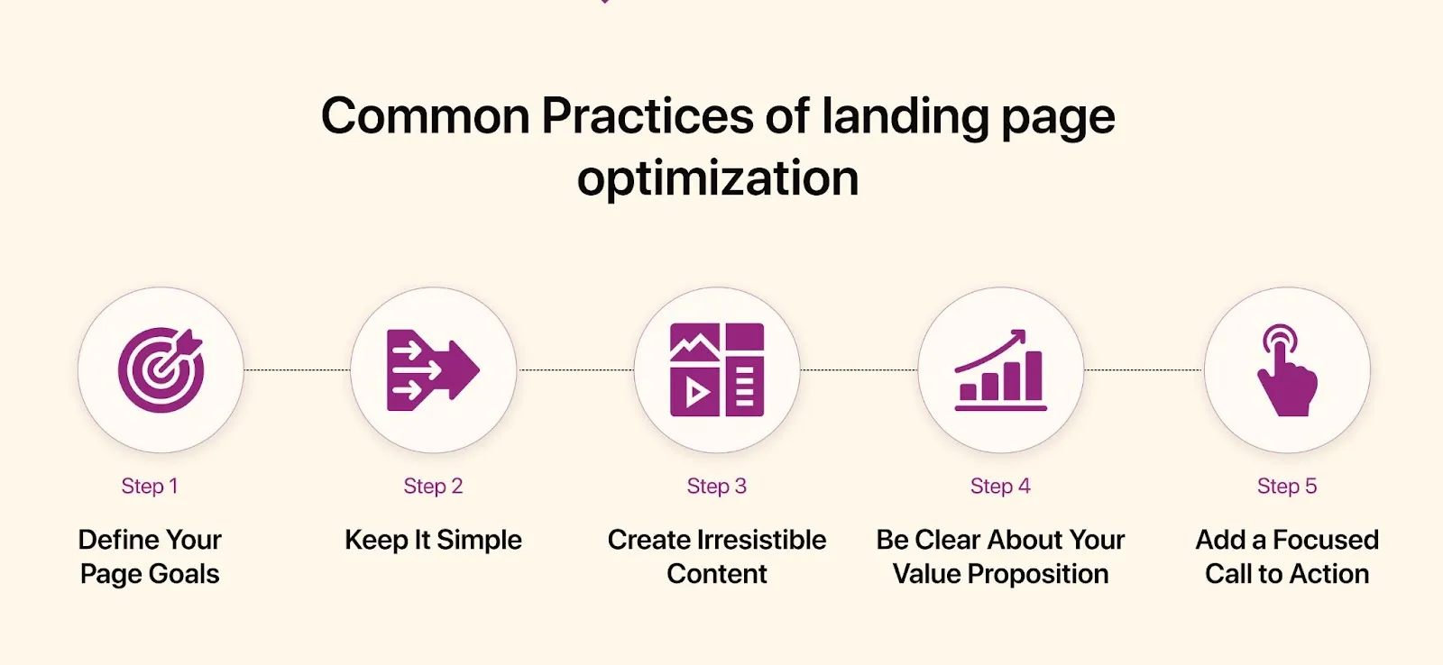
The 8 rules
1. One page, one promise
A landing page is not your homepage. The homepage describes the company; a landing page sells one outcome to one audience arriving from one source. The moment a page tries to cover two products, two pricing tiers, or two job-to-be-done, conversion drops because the visitor has to do the segmentation work that the page should have done for them.
Build separate pages per campaign, per persona, per offer. Yes, this means 4–10 landing pages instead of one. The maintenance cost is real, but the conversion uplift from message-match (paid ad copy = landing page headline) usually pays for it within the first ad cycle. Pages that share the same promise can share the same layout component; only the hero copy and proof block need to change.
2. The hero answers "what" in 5 seconds
The hero block (top viewport, before the first scroll) is the only part of the page guaranteed to be seen. Treat it as the entire page in miniature. It needs four elements: a headline that names the outcome in plain words, a subhead that adds one clarifying sentence, a CTA that promises the next step, and one piece of visual proof (product screenshot, demo loop, or hero image of the result).
Headline patterns that work: [Outcome] for [audience] ("Invoice automation for indie consultants"), [Verb] [object] in [time] ("Ship a landing page in an afternoon"), Stop [pain] ("Stop chasing late invoices"). Patterns that fail: aspirational poetry ("Where ideas take flight"), jargon stacks ("AI-powered omnichannel orchestration"), self-praise ("The world's best CRM").
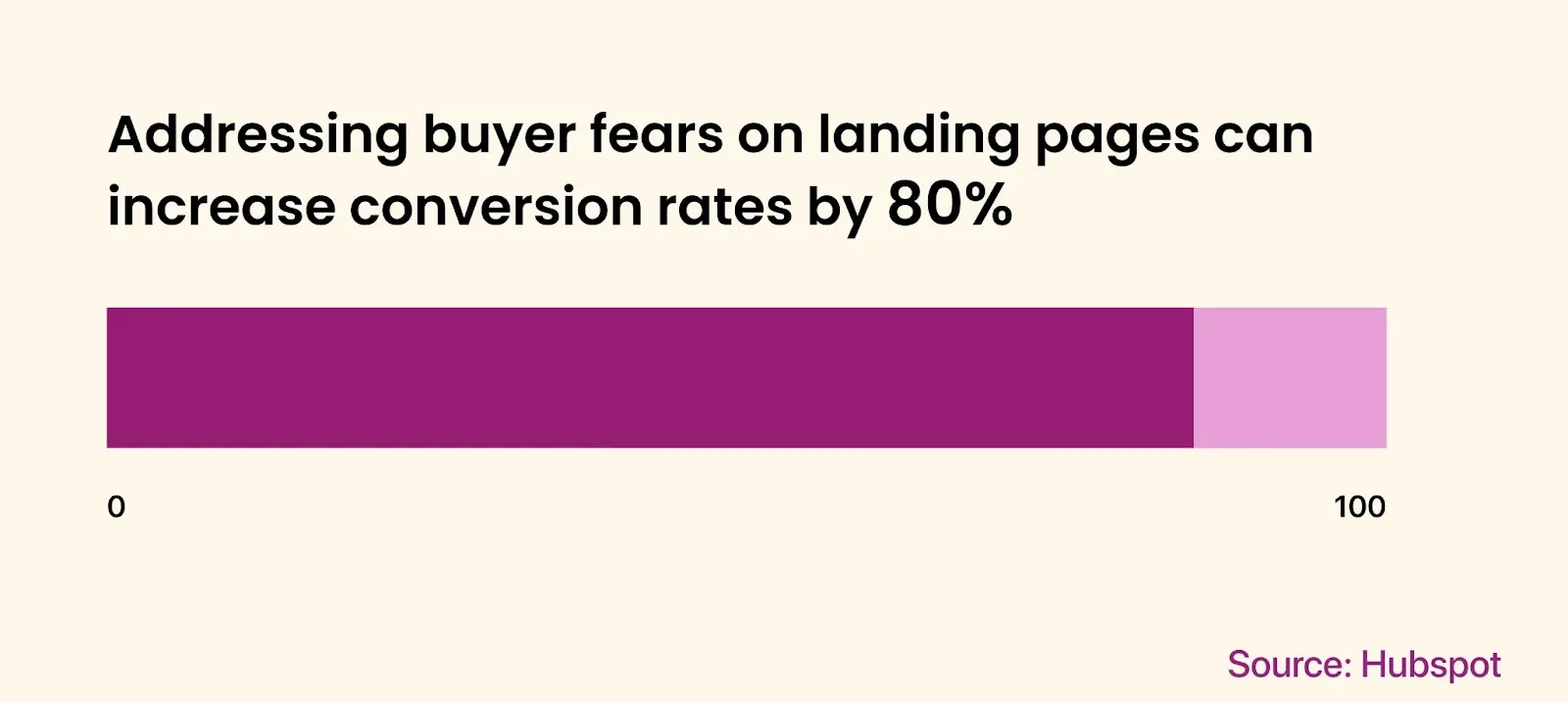
3. Social proof goes above the fold, not below
Visitors decide whether to trust you before they decide whether to read you. If proof lives at the bottom of the page (a common "testimonials section" pattern), 70% of bounced visitors never see it. Move at least one trust signal into the hero or the block immediately after it.
What counts as proof, ranked by impact: named customer logos (best if recognizable), a quantified result ("3,000 designers ship faster with this kit"), a rating with volume ("4.8 from 1,200 reviews"), one quote with a real photo and full name. Generic "trusted by industry leaders" without specifics is worse than no proof at all: it signals that the real names are not strong enough to print.
4. One CTA, repeated. Not multiplied
A page with three different CTAs (Buy, Book a demo, Read whitepaper) converts worse than a page with one CTA repeated three times. Choice paralysis is a real conversion killer; even sophisticated buyers freeze when forced to pick between micro-commitments. Decide upfront what the single action is, and make every CTA on the page point to it with identical wording and color.
A repeated CTA after every major section gives slow scrollers a way to convert without scrolling back up. The wording should describe the action itself ("Start free trial") rather than the eventual outcome ("Grow your business"). Secondary links (pricing, docs, support) belong in the footer or a small text link below the CTA, never as a competing button.
5. Forms ask for the minimum that lets you follow up
Every additional form field reduces submissions by roughly 5–10%. A four-field form (name, email, company, role) loses 25–40% of the leads that a one-field form (email) would have captured. The question is not "what do I want to know about this person", but rather "what is the minimum that lets me follow up".
At the top of the funnel, email alone is often enough. Defer name, company size, and role to the second touch (post-signup welcome, sales call, or progressive profiling on next visit). For B2B with sales-led motions, three fields are the upper limit: work email, company name, and one qualifying question (team size or use case). If your form has more than five fields, the page is asking the visitor to do the qualification work that your CRM should do instead.
6. Mobile is the version, not "a version"
More than half of paid traffic is mobile. For B2C and most SMB-targeted B2B, that share is 65–80%. A landing page that looks great on desktop and "still works" on mobile is a page that fails for the majority of its audience. Design mobile first, then scale up to desktop, instead of the reverse.
Practical implications: hero copy fits in one mobile viewport without scrolling. CTA button is thumb-reachable (bottom 60% of the screen). Form fields use the correct mobile keyboard (type="email", type="tel"). No hover states as primary interactions. Sticky CTA bar at the bottom of the viewport on long pages. Test on a real device rather than the responsive preview in DevTools: the gap between simulator behavior and actual touch behavior is wider than designers usually expect.
7. Under 2 seconds, or the funnel leaks before it starts
Every 100ms of additional load time costs roughly 1% of conversions. A page that takes 4 seconds to render loses about 20% of its potential leads before the visitor even sees the headline. Speed is not a polish task for engineering; it is the first conversion lever.
The biggest wins, ranked by ROI: compress hero images to WebP or AVIF (often 60–80% smaller than PNG/JPG), defer all third-party scripts (analytics, chat widgets, A/B testing tools) until after first paint, ship a single CSS file scoped to the page (no global stylesheet from the marketing site), preload only the hero font weight. A landing page should be one HTML file, one CSS file, one critical image, and nothing else above the fold. Anything more is a leak.
8. Test one variable at a time
Most "A/B test" failures come from testing two variants that differ in headline, image, and CTA simultaneously. The result is unreadable: you cannot tell which change moved the metric. Test one variable per experiment, run it long enough to reach significance (typically 1,000–2,000 conversions per variant), then ship the winner and move to the next variable.
Variable order that usually pays best: headline first (highest leverage, fastest to change), CTA wording second, hero image third, form length fourth, social proof placement fifth. Avoid testing the price, the audience, or the offer through A/B: those are strategic decisions; they need qualitative research instead of split tests on a sample of bounced traffic.
Anti-patterns to avoid
- Multi-product hero. "We do X, Y, and Z" forces the visitor to pick. Pick for them.
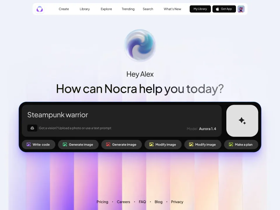
- Stock photos of people on laptops. Indistinguishable from every other landing page. Use product screenshots or remove the image.
- Navigation links across the top. Every nav link is an exit. Strip the nav, keep only the logo.
- Vague testimonials. "Great product, highly recommend!" without name, photo, or company is worse than no testimonial.
- Popups in the first 5 seconds. Visitors who have not read the headline cannot be persuaded by a discount popup. Trigger popups on exit intent or scroll depth, never on a timer.
- CTAs that hide the action. "Learn more" is a non-commitment. Use the verb of the action: "Start free trial", "Book a 15-min call", "Download the kit".
Pre-launch checklist
Run this list before any landing page goes live or before any paid campaign points to one:
- Headline matches the ad copy (or organic query intent) word-for-word
- Hero answers "what is this" in 5 seconds without scrolling
- At least one piece of social proof is visible above the fold
- Page has exactly one CTA, repeated 2–4 times with identical wording
- Form has ≤3 fields (≤1 at top of funnel)
- Mobile viewport shows hero + CTA without scrolling
- Largest Contentful Paint under 2 seconds on a 4G mobile connection
- No nav links across the top (logo only)
- Trust signals (privacy, terms, contact) live in the footer
- Tracking installed for: page view, CTA click, form submit, scroll depth
- At least one variable identified for the first A/B test post-launch
FAQ
How long does landing page optimization take to show results?
Conversion changes show up within 1–2 ad cycles (typically 7–14 days for paid traffic with reasonable volume). The first 2–3 rules (one promise, hero clarity, social proof placement) usually deliver the largest lift; later rules compound on top. Without paid traffic, plan for 4–6 weeks of organic data before you can compare meaningfully.
What is a good landing page conversion rate?
Median across industries is 2.35%. Top quartile is 5–11% depending on offer (free trial vs. demo request vs. purchase). For high-intent traffic (branded search, retargeting), 10%+ is achievable. Use your own historical baseline as the benchmark; industry averages are too noisy to set targets from.
Do I need separate landing pages for each ad campaign?
If campaigns target different audiences, offers, or pain points: yes, separate pages. The conversion lift from message-match almost always covers the maintenance cost. If campaigns differ only in creative but target the same offer and audience, one page is fine.
Should I use a popup or an inline form?
Inline form first, popup as a fallback for exit intent. Popups triggered on a timer or scroll depth (without exit intent) annoy visitors who were going to convert anyway and rarely rescue the ones who would not. Inline forms placed in the hero and repeated after each section convert better than any popup pattern.
Closing
Landing page optimization is not a redesign project. It is a habit: ship the page, measure, identify the single weakest variable, change it, measure again. The 8 rules above are the prior on where to look first. The data tells you which one to fix this week.
.webp&w=1920&q=75)
.webp&w=1920&q=75)
.webp&w=1920&q=75)
.webp&w=1920&q=75)
.webp&w=1920&q=75)
.webp&w=1920&q=75)