How to create responsive mobile tab bar in Figma

Create convenient and flexible design components right in Figma

Tutorials

Published on

December 16, 2018

|

4 mins read

Blog

How to create responsive mobile components in Figma

Navigation

Subscribe to newsletter

Thank you! Your submission has been received!
Oops! Something went wrong while submitting the form.

By subscribing you agree to with our Privacy Policy.

Share this post

Roman Kamushken

<span class="blog_big-paragraph">When creating the next design product based on iOS design templates, I decided to experiment with the Tab Bar component. I'd like to remind you that it is the bottom navigation in the iOS guidelines. I wanted its contents to have a logical and optimal behaviour at resizing. I wanted to make it as adaptive as possible for all mobile iOS devices, as far as Figma and constraints allow to make it.</span>

{{spacer-64}}

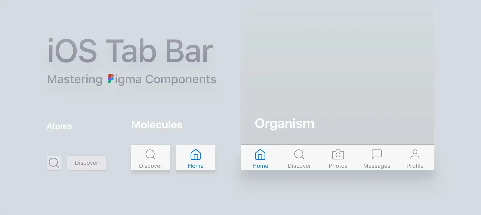
What does Tab Bar consist of?

A tab bar appears at the bottom of an app screen and provides the ability to quickly switch between different sections of an app.

{{spacer-64}}

Could we have it responsive?

No tool for interface design allows the full adaptivity so far. Figma is no exception, it uses the classic Constraints approach, but even with it you can do a lot. For example, you can see the perfect and actually adaptive behaviour of the Tab Bar on all devices in the animation below:

The elements move proportionally to the indents between them.
Below I will tell you how to achieve this behavior in a simple way.

{{spacer-64}}

The problem is the icons

A good design system in Figma necessarily contains an icons library. At least the main system ones. This eliminates the need to import them manually from SVG files every time. Constraints in the Scale mode should be for each icon component, from which you will make a convenient library over time. Then you will get a flexible icon that can be used in any dimensions: 16x16, and 44x44, and so on.

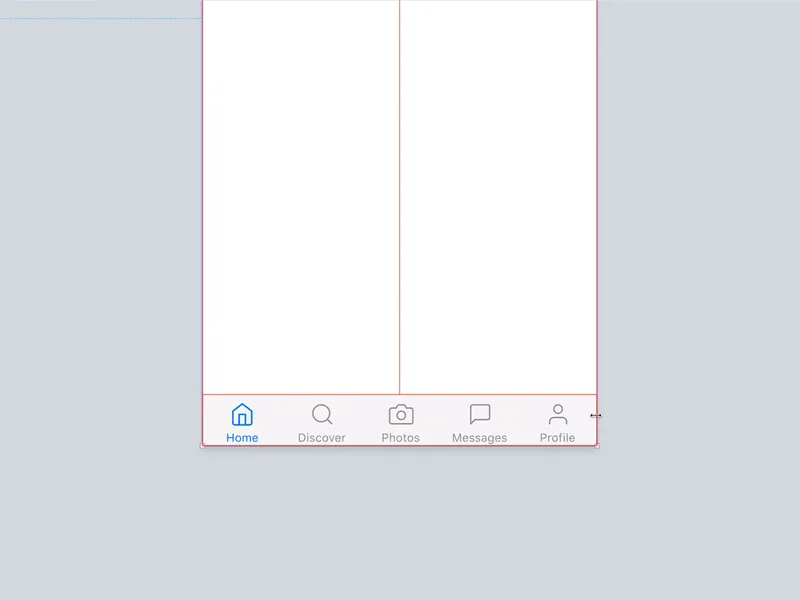
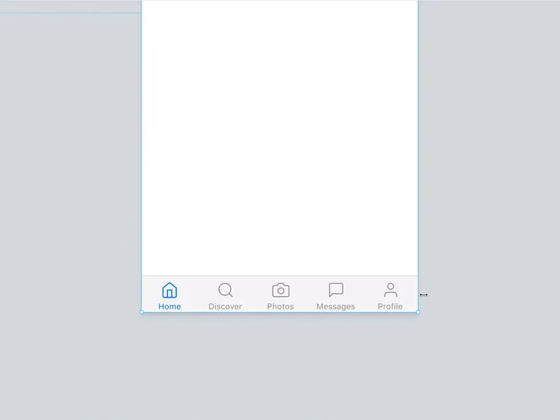
Most likely you will throw such an icon through Figma's left panel inside the Tab Bar and add an inscription when you start creating a component. And the problem is that with such constraints the icon will always be squeezed inside the Tab Bar at resizing if you want to get an adaptive component:

There are several methods to solve the problem
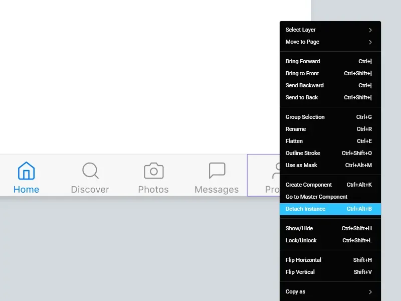
{{spacer-64}}

{{setproduct-gpt}}

{{spacer-64}}

<span class="blog_subtitle-caps">METHOD 1</span>

Immediately detach icons

I suggested above that within your design system, all the component icons are in the Scale mode, it means when you create the Tab Bar, you can immediately break the connection with them and assign each icon individual Center constraints. It, in turn, will remain in the frame, which you need to assign the Scale mode.

Pros: speed
Cons: disconnecting the component from the system

{{spacer-64}}

<span class="blog_subtitle-caps">METHOD 2</span>

Keep 2 types of icons in the system

This method may be suitable if there are not so many icons in the project. Just duplicate your entire Scale set, detach, change constraints to Center, re-create the components and submit to a new page with a different name. Recently, I think it's a good idea that several hundred icons in any Figma system can be stored both as Scaleable and as Centered. So, once you dropped a Tab Bar onto your canvas, you just need to swap the icons and you can keep it as the Instance in your project.

Pros: flexibility
Cons: if there many icons, they are a lot harder to organise

{{spacer-64}}

<span class="blog_subtitle-caps">METHOD 3</span>

Add an intermediate component

According to the concept of Atomic design, such a component will be considered a molecule. Pack an icon and an inscription in it, then feel free to put Center constraints to both and put the Scale mode for the molecule itself. After that, put them in your Tab Bar. Thus icon constraints will be ignored and no squeeze happening anymore. In addition, the icon with the inscription is an effective navigation pattern. So why not reuse this component somewhere else in the project?

Pros: efficiency
Cons: an extra component of the system

{{spacer-24}}

{{stars-conclusion}}

https://webflow.com/@foursets{{spacer-24}}

Personally I prefer Method 3. I think it is more elegant and professional. Maybe you have your own methods?

By the way, many components in the Figma iOS toolkit are made according to this method. I recommend you to pay attention if you are prototyping mobile interfaces in Figma or in case your team concentrated on mobile development.

Share this post

Subscribe to Setproduct

Once per week we send a newsletter with new releases, freebies and blog publications
Oops! Something went wrong while submitting the form.

By clicking Sign Up you're confirming that you agree with our Terms and Conditions.

Congratulations!

You're in! Expect awesome updates in your inbox

Related posts

Lorem ipsum dolor sit amet, consectetur adipiscing elit.

Tutorials

5 mins read

Checkbox UI design – Unlocking anatomy, proven UX tips, and inspiring use cases

Get practical solutions for Checkbox design dilemmas, from styling complexity to inclusive user experience, in this dedicated tutorial.

Tutorials

6 mins read

Input UI Design – Optimize data forms UX with expertly crafted text fields

Learn how to design and optimize Input components for improved forms filling experience and UI. Our in-depth guide will help you create seamless and user-friendly designs.

Tutorials

9 mins read

Creating app settings UI design: Usability tips and best practices

Learn about key design patterns and elements for settings apps to enhance user experience and accessibility in your own app's settings section.

Figma Templates & UI kits

Save time and human resources by reusing hundreds of pre-made templates crafted by us. Based on top notch UX taken from the World's best apps.

Material X for Figma

Figma library with 1100+ components & 40 app templates beyond Material Design. Powered by top-notch shapes and Manrope font. Customizable & Adjustable UI kit now available for Angular & Figma

Material You UI kit

Figma & React library with 2600+ variants of 32 components compatible with Material Design 3. Plus 220+ dashboard templates for all the viewports. Now available for NextJS & TailwindCSS.

Figma React UI kit

Designed and well-organized in Figma React-based UI toolkit for the web. Optimized for building complex data-dense interfaces for desktop and mobile applications.

Panda Design System

Figma library with dashboard, calendar, kanban, profile, table, ecommerce and 80+ templates in total. Components with variants, dark theme included.

Eclipse UI kit

Figma library with 1100+ components & 74 templates for data-driven web applications. Powered by auto-layout. Supercharged by Figma's variants.

Rome UI kit for Figma

Customizable and well-organized team library. Contains 250+ components & 30 web app templates powered by stylish and trendy guidelines.

Material Design System

Figma library is based on 100% guidelines compliance with Material.io. Contains ready‑to-use templates to accelerate app UI design.

Neolex Dashboard UI kit

Customizable & adjustable dashboard design system with 50+ ready-to-use app layouts, 1900+ variants for 30 components with auto-layout.

Material Desktop Dashboard UI kit

Figma library with 48+ dashboard templates based on reusable desktop app patterns carefully handpicked from the most popular web apps.

Xela UI kit for Figma

Figma library with 1900+ variants of 30 components categories to craft perfectly shaped desktop & mobile apps. Customizable & Adjustable dashboard design system with 50+ web app templates.

Figma S8 Design System

Figma design library for mobile and desktop apps made of high quality styled components. Full version includes 67 dashboard templates.

OE Figma Design System

Customizable and well-organized Figma library. This design system aimed to build highly loaded interfaces, boost the speed and save more costs.

Figma iOS kit

Figma library of iOS patterns served as ready-made templates. This UI kit inspired by World's best apps. Based on Human Interface guidelines.

Figma S8 Design System

Figma design library for mobile and desktop apps made of high quality styled components. Full version includes 67 dashboard templates.

Most iOS UI kit for Figma

iOS native components and app templates organized into a «Most Design System» fully compatible with Apple's Human Interface guidelines.

Rome UI kit for Figma

Customizable and well-organized team library. Contains 250+ components & 30 web app templates powered by stylish and trendy guidelines.

Material Design System

Figma library is based on 100% guidelines compliance with Material.io. Contains ready‑to-use templates to accelerate app UI design.

Nucleus UI

Nucleus UI contains 1000 components and variants with 500+ mobile screens designed for Figma (including 9 themes from Event, E-commerce, Finance, NFT, etc.).

Figma Android UI kit

Components-driven Android mobile UI library for Figma. Consists of 140 high quality application templates made of total 250+ UI components.

Mobile X UI kit

Customizable & adjustable iOS / Android design system loaded with ready-made 157 app templates based on 860+ variants for 20 components.

Appka iOS UI kit

Customizable & adjustable iOS design system with 4100+ variants for 28 components and 280+ ready-to-use app layouts crafted for Figma.

Full iOS UI kit

Customizable iOS design system with 320 ready-to-use app layouts. You can modify them or use as it is to save time and never design from scratch again.

Xela for Flutter

XelaUI for Flutter is a simple, modular and accessible component library that gives you the building Flutter apps for mobile and desktop.

Xela for Android

Ready-made collection of fully customizable widgets, UI screens and reusable components for Android coded with Jetpack Compose.

Xela for Swift

Designed for iOS Developers. We provide fully coded customizable components, widgets and well-organized iOS screens for Figma & SwiftUI.

Material You UI kit

Figma & React library with 2600+ variants of 32 components compatible with Material Design 3. Plus 220+ dashboard templates for all the viewports. Now available for NextJS & TailwindCSS.

Figma Charts UI kit

Components-driven graphs design kit for dashboards, presentations, infographics & data visualisation. Includes 25+ charts types for all the viewports.

Hyper Charts

Create impressive visuals with Figma's graphs templates – dozens of scalable and customizable data visualization blocks for dark and light modes.

Orion UI kit

Figma library with 40+ full-width charts templates served in light & dark themes. Contains 200+ of dataviz widgets that look perfect on desktop & mobile screens.

Xela for React

React based components library for beautiful user interface in React apps. Lightweight library for your projects. Contains pre-made web app templates.

Figma React UI kit

Designed and well-organized in Figma React-based UI toolkit for the web. Optimized for building complex data-dense interfaces for desktop and mobile applications.

Material X for Figma

Figma library with 1100+ components & 40 app templates beyond Material Design. Powered by top-notch shapes and Manrope font. Customizable & Adjustable UI kit now available for Angular & Figma

Xela for Flutter

XelaUI for Flutter is a simple, modular and accessible component library that gives you the building Flutter apps for mobile and desktop.

Xela for Android

Ready-made collection of fully customizable widgets, UI screens and reusable components for Android coded with Jetpack Compose.

Xela for Swift

Designed for iOS Developers. We provide fully coded customizable components, widgets and well-organized iOS screens for Figma & SwiftUI.

Material You UI kit

Figma & React library with 2600+ variants of 32 components compatible with Material Design 3. Plus 220+ dashboard templates for all the viewports. Now available for NextJS & TailwindCSS.

Xela for React

React based components library for beautiful user interface in React apps. Lightweight library for your projects. Contains pre-made web app templates.

Levitate 3D kit for Figma

Components-driven 3D kit to design eye-catching Figma presentations. Helps to enhance your landing page, product or app, brand ident, etc.

Website templates UI kit

Landing pages reusable templates kit based on most effective web design patterns. 140+ dark & light constrained design blocks.

Figma Landing Pages UI kit

Landing pages templates library based on constrained & organized components aimed to speed-up the production of effective websites.

Zeus UI kit

Create hassle-free landing pages in Figma. This kit is based on 10 landing page templates, powered by 1600+ variants for 630+ web blocks.

Research, copy and ideate with SetGPT!

We've launched the alternative ChatGPT clone dedicated to UI designers, UX researchers, writers and indiehackers.

Powered by the latest OpenAI gtp-3.5-turbo model, this free chatbot is the perfect tool for those in need of intelligent and innovative insights, wrapped with a slick UI and sophisticated user experience.

Start now

SetGPT is a free service; however, authentication is required

This is some text inside of a div block.