Campaign marketing dashboards designed right. Know who cares, where they live, and why they click

A designer’s guide to ethical, privacy-focused campaign analytics templates.

Campaign marketing dashboards designed right. Know who cares, where they live, and why they click
Research

Published on

March 18, 2025

|

3 min read

Blog

Campaign marketing dashboards designed right. Know who cares, where they live, and why they click

Navigation

Subscribe to new posts

Thank you! Your submission has been received!
Oops! Something went wrong while submitting the form.

By subscribing you agree to with our Privacy Policy.

Share this post

Author image

Roman Kamushken

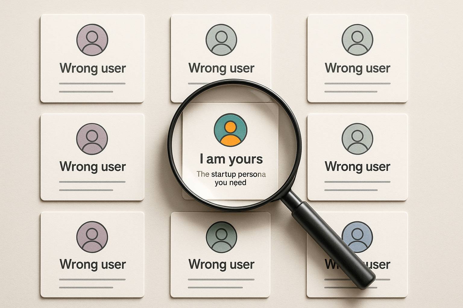
Why audience blind spots kill campaigns

Most campaign dashboards treat audiences like faceless blobs. You see clicks, conversions, and bounce rates, but not the people behind them. That’s like analyzing a movie’s success without knowing who watched it.

Was it teens? Grandparents? Cat influencers?

If your dashboard doesn’t answer these questions, you’re flying blind. Let’s fix that.

Demographic dashboards that don’t stereotype

Age, gender, income: these aren’t checkboxes. They’re clues. Here’s how to visualize them without insulting your audience.

Age groups: Ditch the pie chart. Use a sliding histogram. Example: Show spikes for 18–24 (TikTok crowd) vs. 45–54 (email loyalists). Let users drag the range to see how spending habits shift.

Income brackets: Never display exact numbers. Bucket them. “Under $50k,” “$50k–$100k,” “Over $100k.” Use a stacked bar chart to compare purchase frequency across brackets.

Gender: Add a “non-binary/other” category. If your data doesn’t include it, you’re part of the problem. Visualize with a split bar chart, but keep it simple.

Pro tip: Use Venice.ai to generate fake demographic data for mockups. Upload your campaign brief, and get realistic age/income distributions in seconds.

Mapping where your audience actually lives

Geographic data isn’t just for global brands. Even local campaigns need to know if their ads work in the suburbs vs. downtown.

Heatmaps lie: Avoid rainbow color schemes. Use two shades: light for low engagement, dark for high.

Example: A coffee chain’s coupon campaign might show dark zones near office parks (8 AM rush) and light zones in residential areas (noon).

City-level insights: Add a toggle between map and list view. Some marketers prefer scanning top cities by conversion rate. Sort alphabetically and by performance.

Time zones matter: For global campaigns, display a live clock bar showing peak activity in LA, NYC, London, and Tokyo. Color-code it: red for sleeping hours, green for prime time.

Stalking your audience behavior (Legally)

Behavioral data tells you what people do, not what they claim in surveys. Track these three things:

Click pathways: Show the three most common journeys from ad click to purchase. Example:

  1. Instagram ad → Product page → Cart → Checkout (2 mins).
  2. Google Search → Blog post → Cart → Abandon (5 days later).

Use a flow diagram with thickness indicating drop-off rates.

Device wars: Mobile vs. desktop isn’t enough. Break it down:

  • Mobile: iOS vs. Android, app vs. browser.
  • Desktop: Chrome vs. Safari, ad blockers on/off.

Visualize with split donut charts (yes, donuts are allowed here).

Content binging: Which campaign assets get repeat views? A 10-second TikTok clip vs. a 30-minute YouTube tutorial. Use a scatter plot with X-axis = time spent, Y-axis = shares.

Avoid "Creepy" factor in audience analytics

Nobody wants to feel like you’re reading their DMs. Design with privacy in mind.

Anonymize aggressively: Never show groups smaller than 100 people. Replace exact locations with neighborhoods.

Explain your data: Add a tiny “?” icon next to demographics that links to a plain-English disclaimer. Example: “Age data sourced from first-party sign-ups, not third-party tracking.”

Let users opt out: Include a toggle to hide demographic insights. Some brands (or laws) require it.

Squeeze demographics into a watch screen 📲

Tiny screens + detailed analytics = disaster. Here’s how to simplify:

Demographic priority: On mobile, show only the top two segments. Example: “68% female, 60% aged 25–34.” Tap to expand.

Geo filters: Let users search their city or drop a pin on a mini-map. Autocomplete is mandatory.

Behavioral Snippets: Rotate bite-sized stats every 10 seconds. “7 AM: Mobile traffic spikes. 12 PM: Desktop purchases peak.”

Making data engineers love you (Handoff)

Demographic and behavioral data means messy databases. Prepare your dev team.

Data sources table: List every API and its refresh rate. Example:

  • Google Analytics: Every 24 hrs.
  • CRM: Real-time.
  • Survey Data: Manual upload.

Error handling: What if age data stops flowing? Show a placeholder: “Demographic insights paused for privacy review.”

Cache rules: Specify how long geographic data stays fresh. City-level: 1 hour. Country-level: 1 day.

So, Designers, stop guessing. Start listening.

Marketers aren’t mystical creatures. They’re stressed humans with bosses breathing down their necks about ROAS and CTR.

The best campaign dashboards aren’t built in design sprints — they’re built in conversation.

Ask marketers what keeps them up at night. Is it proving ROI before the quarterly review? Spotting a dying campaign before the budget’s gone?

The worst dashboards happen when designers treat marketers like toddlers who can’t handle complexity.

Newsflash: Marketers eat spreadsheets for breakfast.

Next time a marketer says, “I waste hours digging for this metric,” that’s your goldmine. Build a shortcut, not a Dribbble shot.

Here’s the kicker: A dashboard’s job isn’t to look clean. It’s to turn panic into action. Use Venice.ai to mock up their nightmare scenarios. Hand them Setproduct’s Figma Chart templates and say, “Break this. Show me where it hurts.” The faster you stop designing for applause and start designing for sweaty-palmed marketers refreshing data at 2 AM, the faster your dashboards actually matter.

Share this post

Subscribe to Setproduct

Once per week we send a newsletter with new releases, freebies and blog publications
Thank you! Your submission has been received!
Oops! Something went wrong while submitting the form.

By clicking Sign Up you're confirming that you agree with our Terms and Conditions.

Congratulations!

You're in! Expect awesome updates in your inbox

FAQs

Lorem ipsum dolor sit amet, consectetur adipiscing elit. Suspendisse varius enim in eros elementum tristique.
No items found.

Our Dashboard Templates Will Make It A Treat To View Data

Experience the magic of data visualization with our user-friendly dashboard templates. Try out our dashboards now and enjoy efficient reporting processes, greater transparency in, among others monitoring and making educated decisions easily.
Material X for Figma

Material X for Figma

Figma library with 1100+ components & 40 app templates beyond Material Design. Powered by top-notch shapes and Manrope font. Customizable & Adjustable UI kit now available for Angular & Figma

Material You UI kit

Material You UI kit

Figma & React library with 2600+ variants of 32 components compatible with Material Design 3. Plus 220+ dashboard templates for all the viewports. Now available for NextJS & TailwindCSS.

Figma React UI kit

Figma React UI kit

Designed and well-organized in Figma React-based UI toolkit for the web. Optimized for building complex data-dense interfaces for desktop and mobile applications.

Panda Design System

Panda Design System

Figma library with dashboard, calendar, kanban, profile, table, ecommerce and 80+ templates in total. Components with variants, dark theme included.

Eclipse UI kit

Eclipse UI kit

Figma library with 1100+ components & 74 templates for data-driven web applications. Powered by auto-layout. Supercharged by Figma's variants.

Rome UI kit for Figma

Rome UI kit for Figma

Customizable and well-organized team library. Contains 250+ components & 30 web app templates powered by stylish and trendy guidelines.

Material Design System

Material Design System

Figma library is based on 100% guidelines compliance with Material.io. Contains ready‑to-use templates to accelerate app UI design.

Neolex Dashboard UI kit

Neolex Dashboard UI kit

Customizable & adjustable dashboard design system with 50+ ready-to-use app layouts, 1900+ variants for 30 components with auto-layout.

Material Desktop Dashboard UI kit

Material Desktop Dashboard UI kit

Figma library with 48+ dashboard templates based on reusable desktop app patterns carefully handpicked from the most popular web apps.

Xela UI kit for Figma

Xela UI kit for Figma

Figma library with 1900+ variants of 30 components categories to craft perfectly shaped desktop & mobile apps. Customizable & Adjustable dashboard design system with 50+ web app templates.

Figma S8 Design System

Figma S8 Design System

Figma design library for mobile and desktop apps made of high quality styled components. Full version includes 67 dashboard templates.

OE Figma Design System

OE Figma Design System

Customizable and well-organized Figma library. This design system aimed to build highly loaded interfaces, boost the speed and save more costs.

Related posts

Lorem ipsum dolor sit amet, consectetur adipiscing elit.

Research

4 min read

Why your favorite apps UX is getting worse

Explore the decline in user experience of popular apps like Google Maps, Spotify, and Amazon, and discover the reasons behind this trend. Learn about enshittification and its impact on app quality.

Research

4 min read

Guest Blogging Benefits: Unlock SEO Success and Boost Your Brand

Boost your brand visibility and SEO with guest posting. This article explores how publishing content on authoritative websites can build backlinks, improve rankings, and drive business growth.

Research

6 min read

Niche Edits vs Guest Post Links: Choosing the Best Link-Building Strategy

Discover the key differences between niche edits and guest posts in this comprehensive 2025 guide. Learn how to choose the best strategy to boost your SEO and drive results

Figma Templates & UI kits

Save time and human resources by reusing hundreds of pre-made templates crafted by us. Based on top notch UX taken from the World's best apps.

Material X for Figma

Figma library with 1100+ components & 40 app templates beyond Material Design. Powered by top-notch shapes and Manrope font. Customizable & Adjustable UI kit now available for Angular & Figma

Material You UI kit

Figma & React library with 2600+ variants of 32 components compatible with Material Design 3. Plus 220+ dashboard templates for all the viewports. Now available for NextJS & TailwindCSS.

Figma React UI kit

Designed and well-organized in Figma React-based UI toolkit for the web. Optimized for building complex data-dense interfaces for desktop and mobile applications.

Panda Design System

Figma library with dashboard, calendar, kanban, profile, table, ecommerce and 80+ templates in total. Components with variants, dark theme included.

Eclipse UI kit

Figma library with 1100+ components & 74 templates for data-driven web applications. Powered by auto-layout. Supercharged by Figma's variants.

Rome UI kit for Figma

Customizable and well-organized team library. Contains 250+ components & 30 web app templates powered by stylish and trendy guidelines.

Material Design System

Figma library is based on 100% guidelines compliance with Material.io. Contains ready‑to-use templates to accelerate app UI design.

Neolex Dashboard UI kit

Customizable & adjustable dashboard design system with 50+ ready-to-use app layouts, 1900+ variants for 30 components with auto-layout.

Material Desktop Dashboard UI kit

Figma library with 48+ dashboard templates based on reusable desktop app patterns carefully handpicked from the most popular web apps.

Xela UI kit for Figma

Figma library with 1900+ variants of 30 components categories to craft perfectly shaped desktop & mobile apps. Customizable & Adjustable dashboard design system with 50+ web app templates.

Figma S8 Design System

Figma design library for mobile and desktop apps made of high quality styled components. Full version includes 67 dashboard templates.

OE Figma Design System

Customizable and well-organized Figma library. This design system aimed to build highly loaded interfaces, boost the speed and save more costs.

Figma iOS kit

Figma library of iOS patterns served as ready-made templates. This UI kit inspired by World's best apps. Based on Human Interface guidelines.

Figma S8 Design System

Figma design library for mobile and desktop apps made of high quality styled components. Full version includes 67 dashboard templates.

Most iOS UI kit for Figma

iOS native components and app templates organized into a «Most Design System» fully compatible with Apple's Human Interface guidelines.

Rome UI kit for Figma

Customizable and well-organized team library. Contains 250+ components & 30 web app templates powered by stylish and trendy guidelines.

Material Design System

Figma library is based on 100% guidelines compliance with Material.io. Contains ready‑to-use templates to accelerate app UI design.

Nucleus UI

Nucleus UI contains 1000 components and variants with 500+ mobile screens designed for Figma (including 9 themes from Event, E-commerce, Finance, NFT, etc.).

Figma Android UI kit

Components-driven Android mobile UI library for Figma. Consists of 140 high quality application templates made of total 250+ UI components.

Mobile X UI kit

Customizable & adjustable iOS / Android design system loaded with ready-made 157 app templates based on 860+ variants for 20 components.

Appka iOS UI kit

Customizable & adjustable iOS design system with 4100+ variants for 28 components and 280+ ready-to-use app layouts crafted for Figma.

Full iOS UI kit

Customizable iOS design system with 320 ready-to-use app layouts. You can modify them or use as it is to save time and never design from scratch again.

Xela for Flutter

XelaUI for Flutter is a simple, modular and accessible component library that gives you the building Flutter apps for mobile and desktop.

Xela for Android

Ready-made collection of fully customizable widgets, UI screens and reusable components for Android coded with Jetpack Compose.

Xela for Swift

Designed for iOS Developers. We provide fully coded customizable components, widgets and well-organized iOS screens for Figma & SwiftUI.

Material You UI kit

Figma & React library with 2600+ variants of 32 components compatible with Material Design 3. Plus 220+ dashboard templates for all the viewports. Now available for NextJS & TailwindCSS.

Figma Charts UI kit

Components-driven graphs design kit for dashboards, presentations, infographics & data visualisation. Includes 25+ charts types for all the viewports.

Hyper Charts

Create impressive visuals with Figma's graphs templates – dozens of scalable and customizable data visualization blocks for dark and light modes.

Orion UI kit

Figma library with 40+ full-width charts templates served in light & dark themes. Contains 200+ of dataviz widgets that look perfect on desktop & mobile screens.

Xela for React

React based components library for beautiful user interface in React apps. Lightweight library for your projects. Contains pre-made web app templates.

Figma React UI kit

Designed and well-organized in Figma React-based UI toolkit for the web. Optimized for building complex data-dense interfaces for desktop and mobile applications.

Material X for Figma

Figma library with 1100+ components & 40 app templates beyond Material Design. Powered by top-notch shapes and Manrope font. Customizable & Adjustable UI kit now available for Angular & Figma

Xela for Flutter

XelaUI for Flutter is a simple, modular and accessible component library that gives you the building Flutter apps for mobile and desktop.

Xela for Android

Ready-made collection of fully customizable widgets, UI screens and reusable components for Android coded with Jetpack Compose.

Xela for Swift

Designed for iOS Developers. We provide fully coded customizable components, widgets and well-organized iOS screens for Figma & SwiftUI.

Material You UI kit

Figma & React library with 2600+ variants of 32 components compatible with Material Design 3. Plus 220+ dashboard templates for all the viewports. Now available for NextJS & TailwindCSS.

Xela for React

React based components library for beautiful user interface in React apps. Lightweight library for your projects. Contains pre-made web app templates.

Levitate 3D kit for Figma

Components-driven 3D kit to design eye-catching Figma presentations. Helps to enhance your landing page, product or app, brand ident, etc.

Website templates UI kit

Landing pages reusable templates kit based on most effective web design patterns. 140+ dark & light constrained design blocks.

Figma Landing Pages UI kit

Landing pages templates library based on constrained & organized components aimed to speed-up the production of effective websites.

Zeus UI kit

Create hassle-free landing pages in Figma. This kit is based on 10 landing page templates, powered by 1600+ variants for 630+ web blocks.

This is some text inside of a div block.