
Figma templates & UI kits
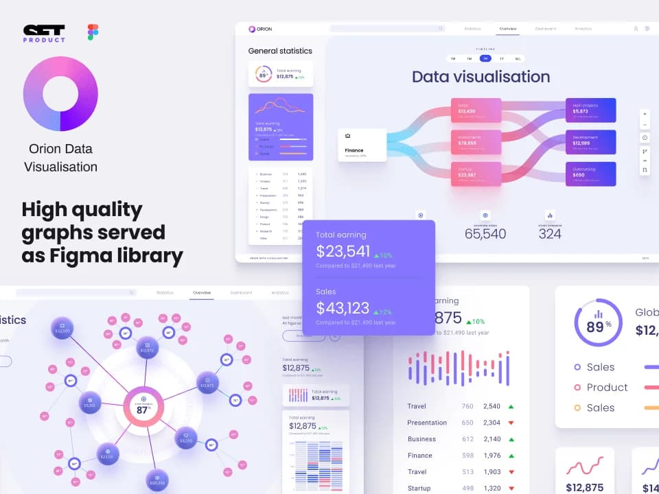
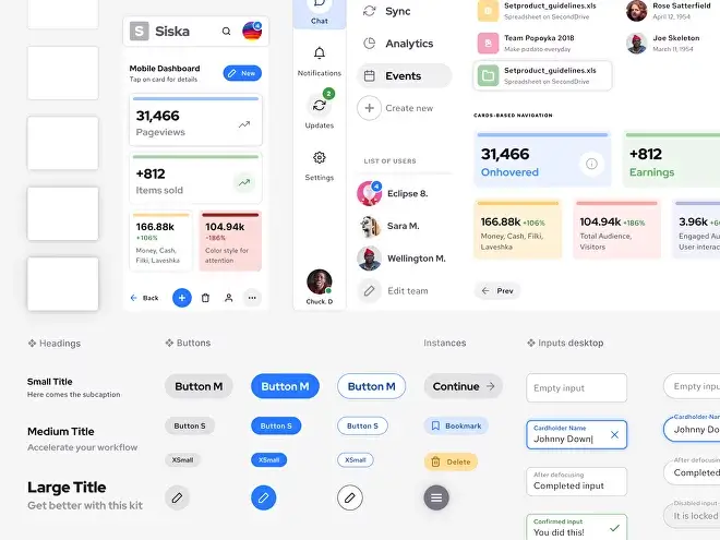
Orion UI kit
Figma library with 40+ full-width charts templates served in light & dark themes. Contains 200+ of dataviz widgets that look perfect on desktop & mobile screens.
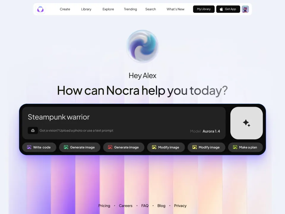
Nocra UI kit
Nocra is a design system for AI products. Built specifically for startups harnessing AI generation: images, video, audio, music, prompts, and beyond.
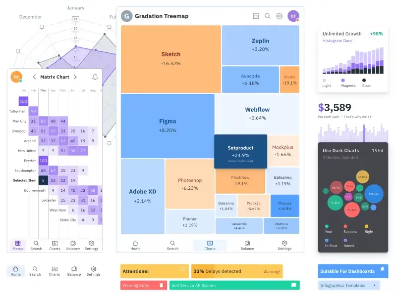
Figma Charts UI kit
Components-driven graphs design kit for dashboards, presentations, infographics & data visualisation. Includes 25+ charts types for all the viewports.
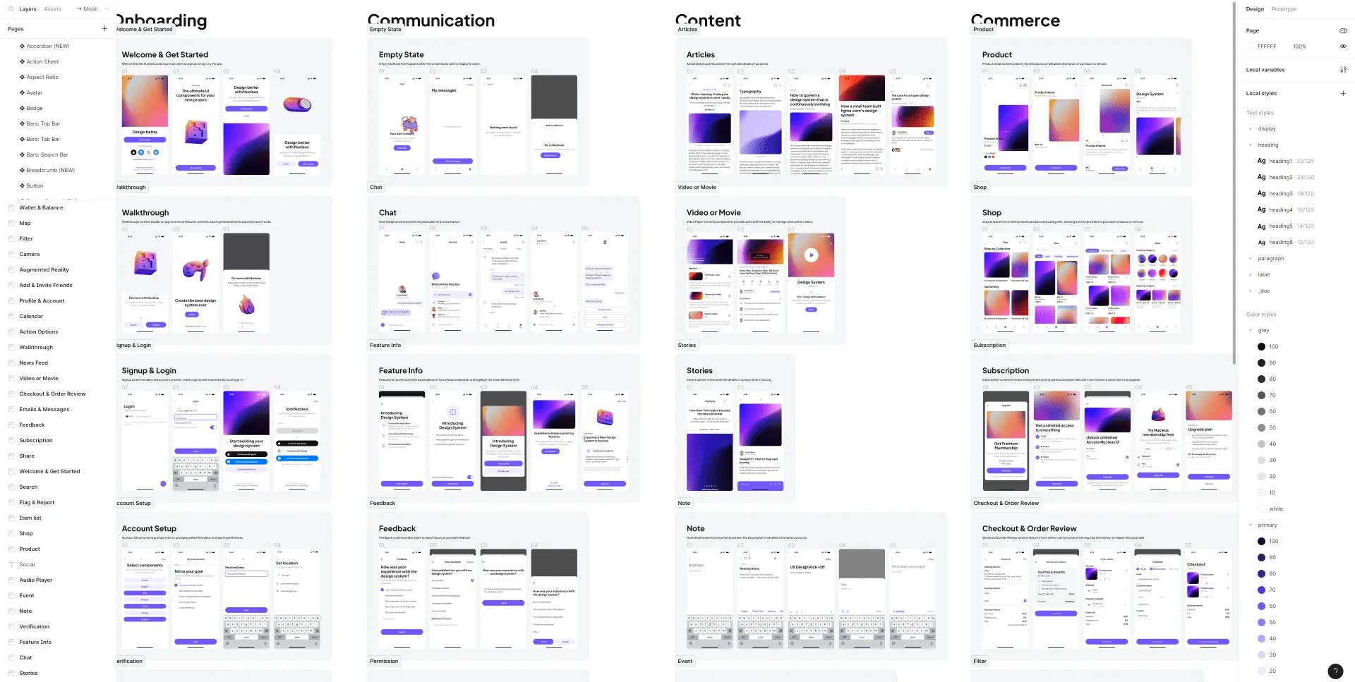
Nucleus UI
Nucleus UI contains 1000 components and variants with 500+ mobile screens designed for Figma (including 9 themes from Event, E-commerce, Finance, NFT, etc.).
.webp&w=1920&q=75)
Material X for Figma
Figma library with 1100+ components & 40 app templates beyond Material Design. Powered by top-notch shapes and Manrope font. Customizable & Adjustable UI kit now available for Angular & Figma
.webp&w=1920&q=75)
Material You UI kit
Figma & React library with 2600+ variants of 32 components compatible with Material Design 3. Plus 220+ dashboard templates for all the viewports. Now available for NextJS & TailwindCSS.
Figma React UI kit
Designed and well-organized in Figma React-based UI toolkit for the web. Optimized for building complex data-dense interfaces for desktop and mobile applications.
.webp&w=1920&q=75)
Panda Design System
Figma library with dashboard, calendar, kanban, profile, table, ecommerce and 80+ templates in total. Components with variants, dark theme included.
Subscribe to Setproduct
By clicking Sign Up you're confirming that you agree with our Terms and Conditions.
FAQs
How to start with this design system?
After the successful purchase via Gumroad (it's safe and encrypted) you will be taken to a download page. You will also get the download link in your email (check the SPAM folder sometimes). Then just simply drag and drop .FIG file onto your Figma app. Do not drop it onto the project. Drop it over the starting screen with recent projects grid.
l am new to Figma. Should I try your kits?
Definitely! Our products help customers who learning Figma from scratch. By exploring and studying commercial UI kits you learn how the components and layouts were crafted, which styles being used and which styling tricks have been applied.
How to import your kits?
Importing .FIG files into Figma: https://help.figma.com/hc/en-us/articles/360041003114-Import-files-to-the-file-browser
Which license type should I choose?
You must select the proper license type according to the number of users in Figma if you're purchasing our product for the business.
Business license — for startups or enterprise organizations to use for a local team or publish in Figma library.
Individual license — for freelancers, indie developers, or solopreneurs working on a single project.
Can I build commercial proiects with your products?
Yes! You can build an unlimited amount of commercial projects using Setproduct assets. But, please, consider a license type before making a purchase.
I have a project. Can I hire you?
We're open-minded to your custom design & development projects. We can create complex templates based on our Figma libraries and code them in the production using a wide variety of popular frameworks and technologies.
If you have a project to design & develop, simply contact us describing your brief, budget, and expectations.
I 💜 Your designs, but can I have a discount?
We provide discounts for those, who scrolled to the bottom and revealed our proposal. Just drop us a message with a short story about how you plan to use our product and we will give you a ✨30% off coupon for the upcoming purchase. Please, provide a specific product name you've put your eye on.

