Visual dynamics for design layouts to make templates more eye-catching

8 simple tricks of dynamics addition for a static prototype without animating it.

Tutorials

Published on

July 16, 2019

|

4 mins read

Blog

8 simple UI design tricks for more dynamics in static prototypes

Navigation

Subscribe to newsletter

Thank you! Your submission has been received!
Oops! Something went wrong while submitting the form.

By subscribing you agree to with our Privacy Policy.

Share this post

Roman Kamushken

Devil is in the UI details

The material of this article is the result of my design experiments and conclusions for the last year or year and a half of continuous design grind. I've been tirelessly raising UI kits, experimenting with content in placeholders, styles, shadows, texts and states to see if this affects conversion any way. In other words, to see if I can increase sales of Figma templates if I add some visual dynamics to static design layouts to make templates more interesting and functional.

Below I'll show some simple techniques to add some useful effects to ordinary static prototypes. That won't affect quality, a visual variety in the repeating elements will be added up. Perhaps this will help to make your best shot on Dribbble or win a few points in the eyes of the customer or the team-lead, because of the use of these techniques positions you as a performer attentive to UI details.

If I implement some feature in the design and see how the metrics are growing on Setproduct website, it is difficult for me to be sure what exact action caused these changes. However, as the Figma design systems marketplace was developing, I started to notice an increase in the number of regular visitors who come back for some reason. If people didn't buy any products, they came again and again to look at something. But what at?

Alas, I haven't yet found a way to determine the metrics of certain visual techniques that I regularly experiment with. I tried to analyse all my UI design developments and organise them from my subconscious into a convenient and understandable list of simple tricks to make the design a little more fun. Maybe it's just fun and catches the eye, maybe this causes more subscribers to come, maybe it's something from the near future, and maybe it doesn't make any sense. As I said above, I can't be sure that the attendance and browsing performance of my site is growing thanks to these techniques of adding "visual dynamics" to static layouts. But I like to believe that the UI effects I'm describing below directly or indirectly influenced my overall progress.
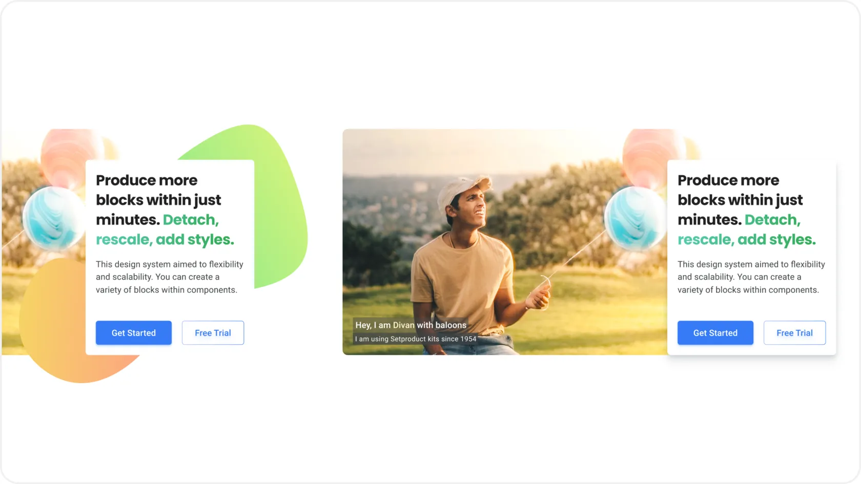
{{spacer-64}}

Slightly raised

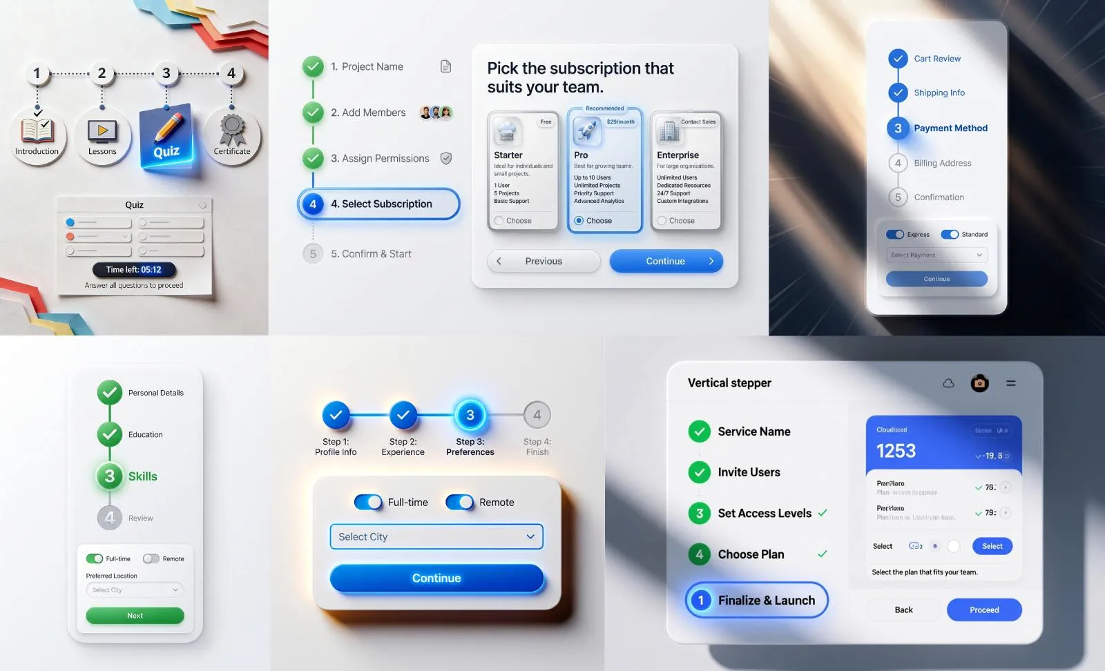
If your art-board uses a lot of cards, blocks and other similar elements, one of the sample can be "raised" by a shadow. This technique is appropriate both for large elements, such as cards, and for small UI components, such as menu sections in the side navigation. It seems that we've put the cursor on the card and can click it:

Cards UI design templates

{{spacer-64}}

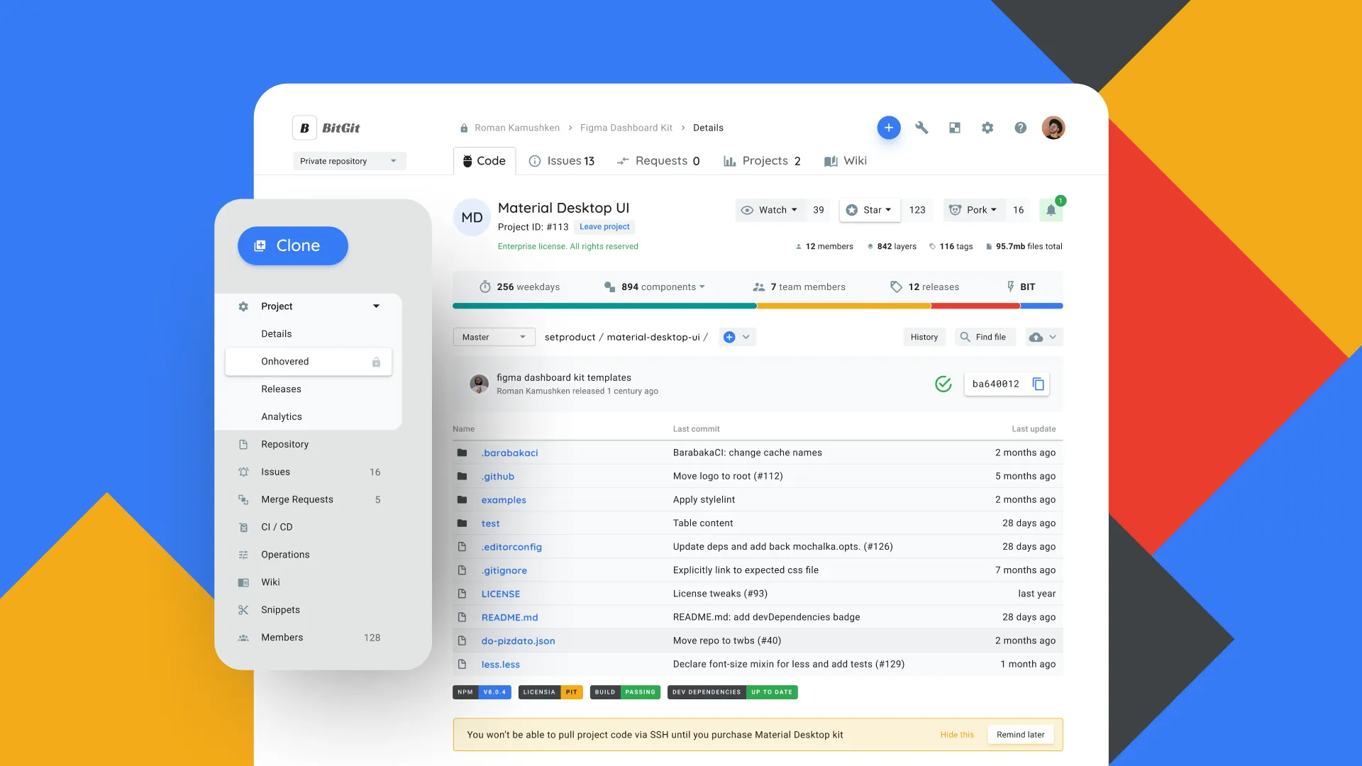
Hovered or activated

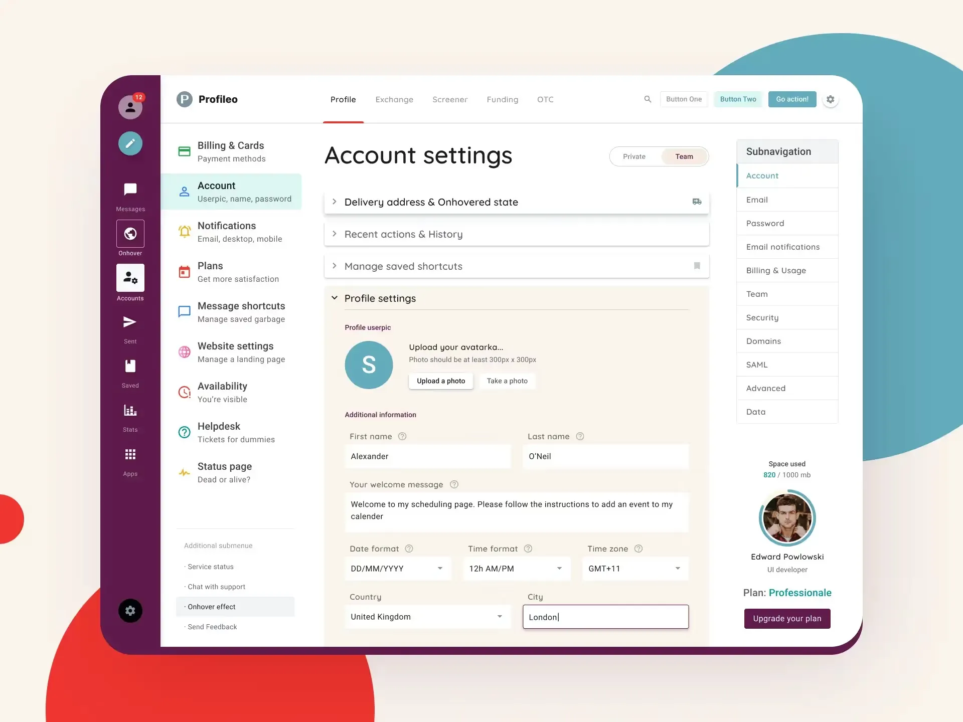
For example, navigation to several depth levels is often used when prototyping dashboards. To give it some dynamics, I made the first level of Getting Started activated and added the onHover style on one of the unfolded submenu elements. In addition, it'll help developers to get all the necessary menu states and see how integrally it looks holistically and in the context of navigation:

Guidelines docs UI design templates
I left the "empty" option on the right on purpose, so that you could compare and decide which one is most attractive:) Although the focus is shifted to the option on the left, for it to seem even MORE attractive. A kind of design micromanipulation.
Table UI design templates
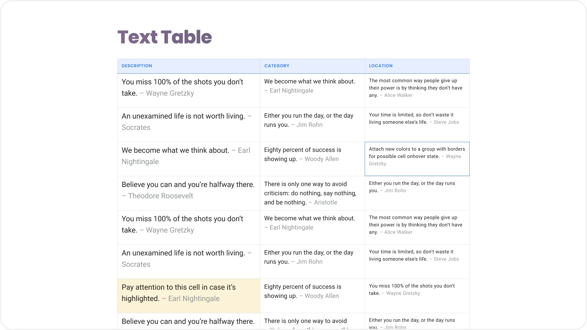
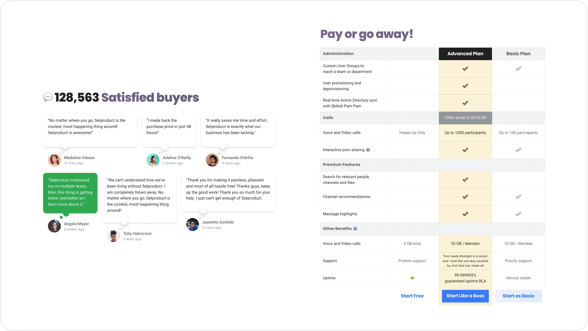
A simple table can be made more dynamic if the hovered cursor state is simulated on one of the cells, and some other is painted light yellow, showing something conditionally important on it. If it catches the eye, the goal is achieved.
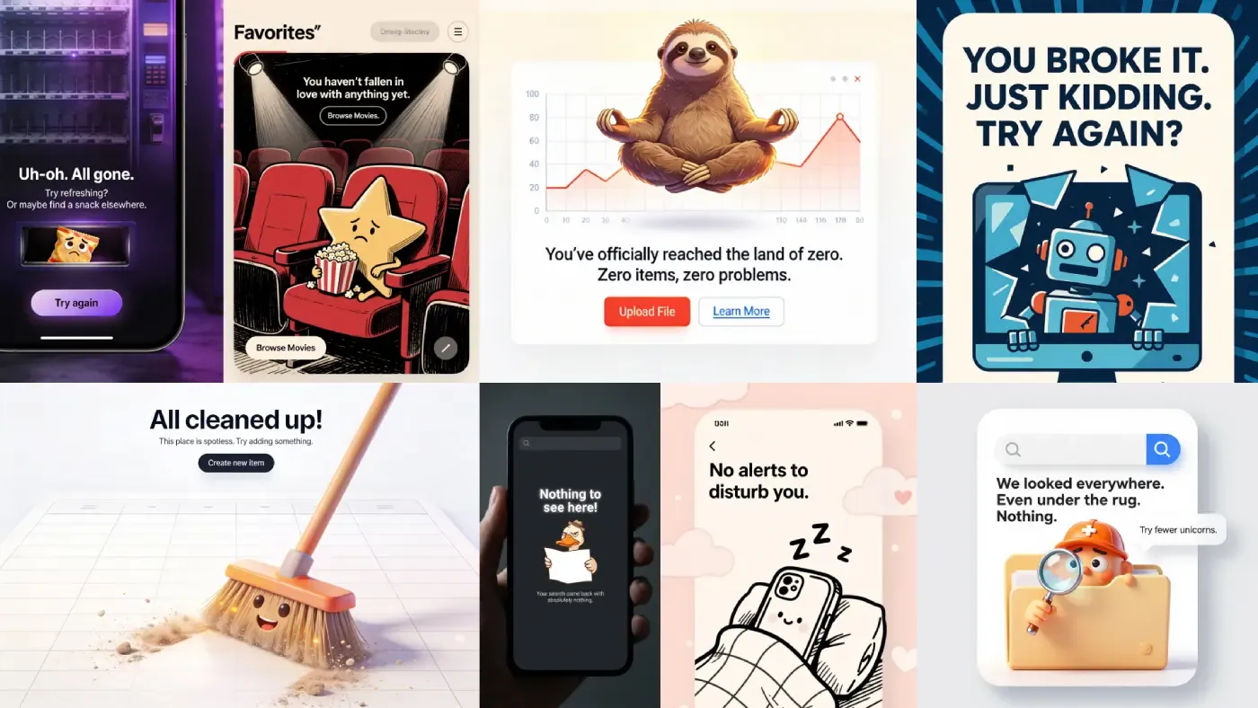
{{spacer-64}}

Useful rubbish

The circles, squares, crosses, blobs and other visual rubbish flying at the background are an integral part of the UI design craft, especially if you want to promote your profile on Dribbble. The only thing that is changing is the geometry and shape fashion. I started thinking about how to give it more sense and use it for the benefit of the user experience:

Footer UI design templates
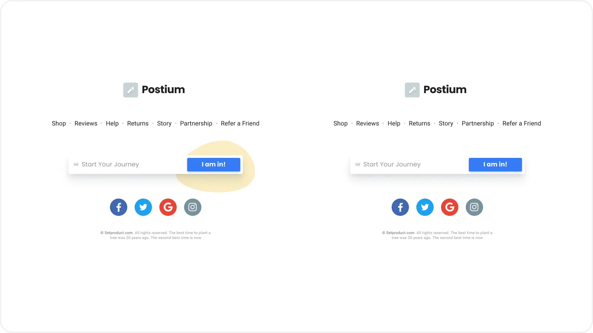
Does it look like the blob under the blue button makes it larger and more attractive in the truest sense of the word?

Running some useless element as the background sometimes becomes useful if it helps to delimit the objects:

Header cover UI design templates
As you can see in the option on the left, the green spot adds shape and dynamics to the card, although the stroke or shadow are also appropriate to use here as some options.

{{spacer-64}}

Selected or highlighted

Simulating the ability to make a selection or highlighting an element as active is a great way to add variety to a prototype. Even if there is no logic in this choice, in the end, such a technique will at least show you as quite competent in understanding of the UI components states after a fictional interaction with them:

iOS list UI design templates
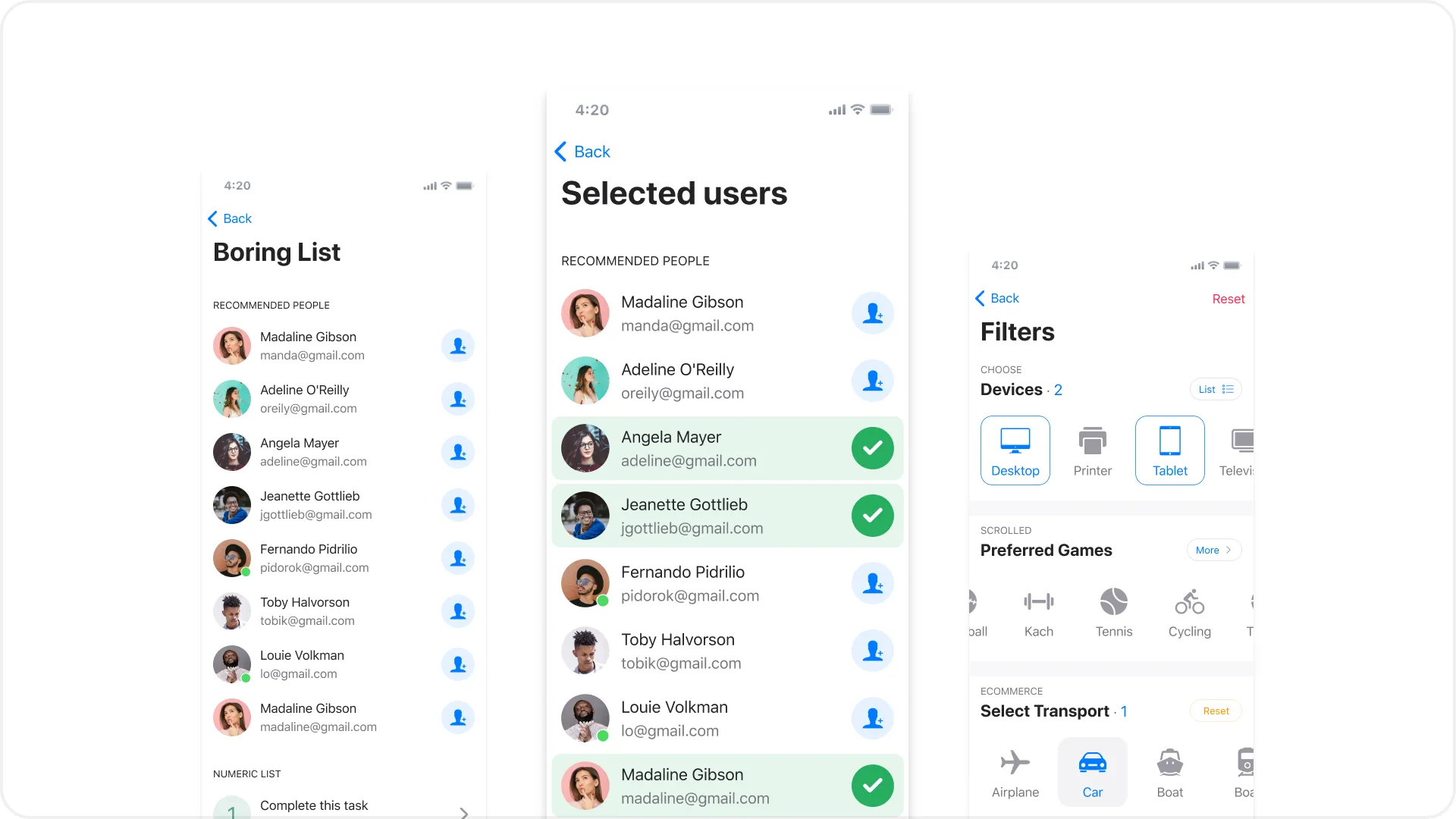
Nothing happens on the screen on the left, while the selection is allegedly made and the element changed its state on the right and center screens.

{{spacer-64}}

Power of emoji

From time to time, Emoji is found in apps as a way to amplify a message to the user or as part of a design language. When prototyping, you can quickly assemble a logo, taking any icon as a basis or strengthening the message of the Empty state screen. By the way, sometimes it is faster to stick an emoji symbol than to select an icon from the library. Figma renders them perfectly well, but if you overdo it with the text height, pixels pop up. Anyways, Emoji will help to add some personalisation and positive, or even meaning to your layout:

Emoji UI design templates

{{spacer-64}}

Former highlight

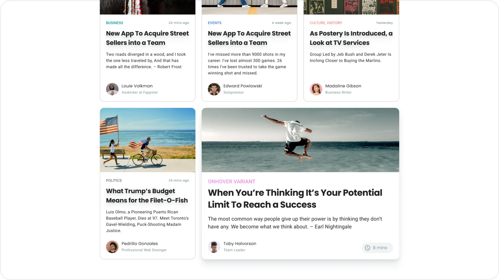
We face some situations where design pushes us to make a choice that is beneficial for business every day. Basically, this is done by highlighting or prioritising the desired area, block, button, or any other part. According to these principles, you can somehow highlight or contrast one of the repeating objects in the group. Some column in the table or a speech bubble with the product review, unendingly drawing attention to it:
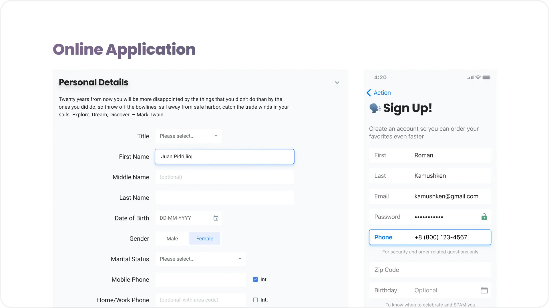
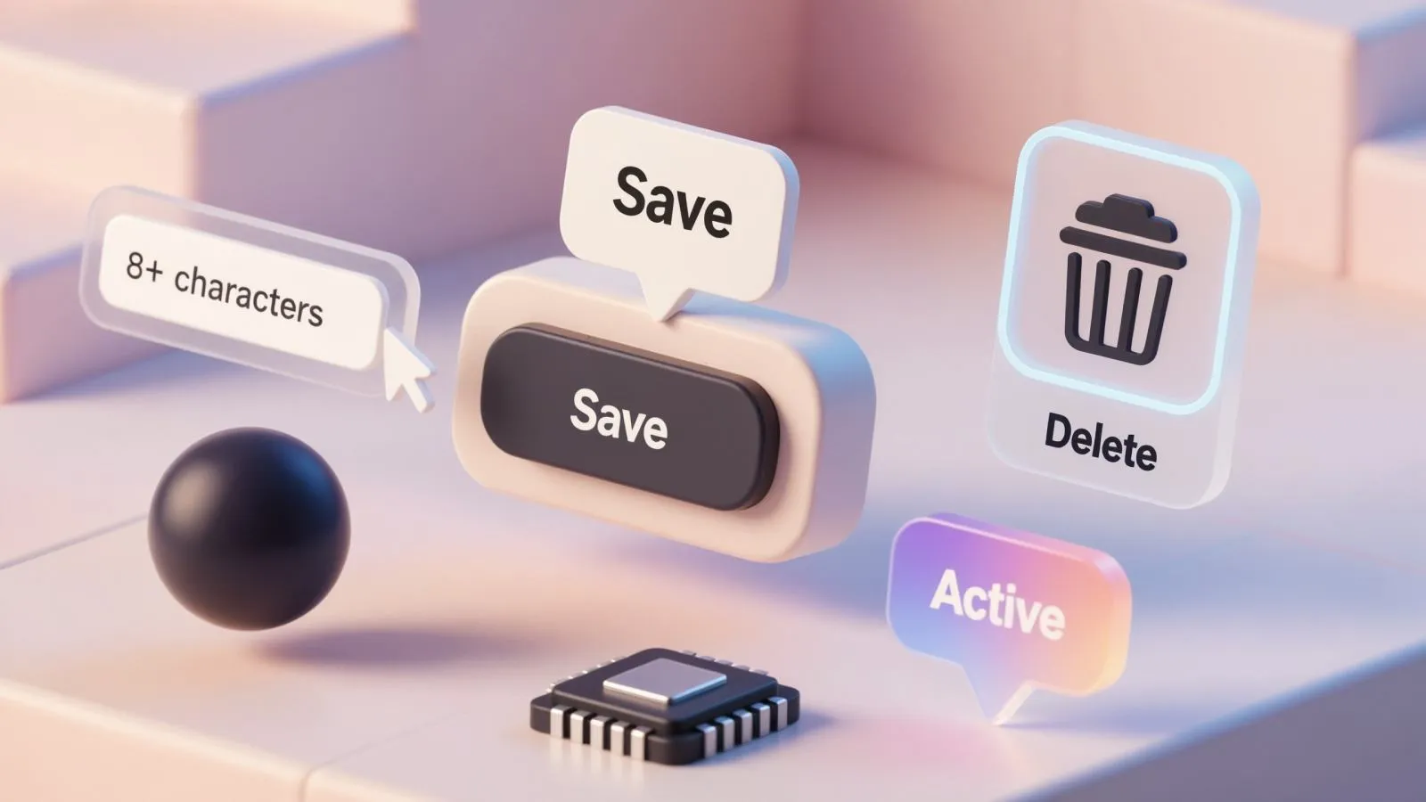
Pricing plans UI design templates

{{spacer-64}}

Active input

When you design a prototype that uses many text fields, it looks great if one of the inputs is highlighted as active. This can be a focus, an error, or a validation state when something has already been entered. Use your imagination, reproducing the real situations that are possible when filling in inputs, and it will help you to simulate the most realistic picture:

Input text field UI design templates

{{spacer-64}}

Shadows to elevate

Every designer should understand the physics of space. Now the shadows from UI objects have returned to our service, but they've come back reinterpreted after several years of oblivion, being replaced by the flat-trend. Now they are more realistic and more organically used in the design to create the desired effect. Therefore, you should have a good idea of the objects on the canvas in space and make the blur and transparency of each shadow logical, depending on the effect you want to get:

Git repository UI design templates

It's simple: the "higher" the object from the zero plane (background), the greater the transparency, blur and offset of the shadow. By the way, in Figma, it's often more convenient to create realistic shadows with the usual Rectangle, which I've rounded corners and applied blur >200 to in this example. Next, I brought it to the most realistic view, creating the effect of navigation "soaring" over the dashboard with the simple Resize. Fortunately, you won't see that in production. You have to resort to such tricks to understand which Dribbble posts the audience reacts better to. But that's a separate topic of the design product promotion, we'll talk about it some other time.

{{spacer-64}}

{{stars-conclusion}}

{{spacer-64}}

Conclusion

Today's UI design is damn interesting. Over the last year of constant UI experiments, it seemed to me that design is like an open-source product: everyone in the community can bring something of their own to it, and if this fork turns out to be promising, the rest will pick up this wave and carry it to distant shores.

Now, looking back, I can honestly admit to myself: all my previous years of design experience weren't worth a penny. Switching to my own products and creating one UI kit after another, I managed to make a huge leap in my practice, simultaneously polishing the experience of the organisation and improving the architecture of design systems in Figma.

If you are wondering whether to build your UI kit and try to sell it, I'll tell you that it's definitely worth it. It turned out to be much more interesting to invent design tasks for yourself than to wallow in a lot of clueless edits from another customer. In the worst case, you'll gain more experience. With a good combination of circumstances, you will get the first sales, which will probably spur and motivate you even more.

Go for it!

Share this post

Subscribe to Setproduct

Once per week we send a newsletter with new releases, freebies and blog publications
Oops! Something went wrong while submitting the form.

By clicking Sign Up you're confirming that you agree with our Terms and Conditions.

Congratulations!

You're in! Expect awesome updates in your inbox

Related posts

Lorem ipsum dolor sit amet, consectetur adipiscing elit.

Tutorials

5 mins read

Checkbox UI design – Unlocking anatomy, proven UX tips, and inspiring use cases

Get practical solutions for Checkbox design dilemmas, from styling complexity to inclusive user experience, in this dedicated tutorial.

Tutorials

6 mins read

Input UI Design – Optimize data forms UX with expertly crafted text fields

Learn how to design and optimize Input components for improved forms filling experience and UI. Our in-depth guide will help you create seamless and user-friendly designs.

Tutorials

9 mins read

Creating app settings UI design: Usability tips and best practices

Learn about key design patterns and elements for settings apps to enhance user experience and accessibility in your own app's settings section.

Figma Templates & UI kits

Save time and human resources by reusing hundreds of pre-made templates crafted by us. Based on top notch UX taken from the World's best apps.

Material X for Figma

Figma library with 1100+ components & 40 app templates beyond Material Design. Powered by top-notch shapes and Manrope font. Customizable & Adjustable UI kit now available for Angular & Figma

Material You UI kit

Figma & React library with 2600+ variants of 32 components compatible with Material Design 3. Plus 220+ dashboard templates for all the viewports. Now available for NextJS & TailwindCSS.

Figma React UI kit

Designed and well-organized in Figma React-based UI toolkit for the web. Optimized for building complex data-dense interfaces for desktop and mobile applications.

Panda Design System

Figma library with dashboard, calendar, kanban, profile, table, ecommerce and 80+ templates in total. Components with variants, dark theme included.

Eclipse UI kit

Figma library with 1100+ components & 74 templates for data-driven web applications. Powered by auto-layout. Supercharged by Figma's variants.

Rome UI kit for Figma

Customizable and well-organized team library. Contains 250+ components & 30 web app templates powered by stylish and trendy guidelines.

Material Design System

Figma library is based on 100% guidelines compliance with Material.io. Contains ready‑to-use templates to accelerate app UI design.

Neolex Dashboard UI kit

Customizable & adjustable dashboard design system with 50+ ready-to-use app layouts, 1900+ variants for 30 components with auto-layout.

Material Desktop Dashboard UI kit

Figma library with 48+ dashboard templates based on reusable desktop app patterns carefully handpicked from the most popular web apps.

Xela UI kit for Figma

Figma library with 1900+ variants of 30 components categories to craft perfectly shaped desktop & mobile apps. Customizable & Adjustable dashboard design system with 50+ web app templates.

Figma S8 Design System

Figma design library for mobile and desktop apps made of high quality styled components. Full version includes 67 dashboard templates.

OE Figma Design System

Customizable and well-organized Figma library. This design system aimed to build highly loaded interfaces, boost the speed and save more costs.

Figma iOS kit

Figma library of iOS patterns served as ready-made templates. This UI kit inspired by World's best apps. Based on Human Interface guidelines.

Figma S8 Design System

Figma design library for mobile and desktop apps made of high quality styled components. Full version includes 67 dashboard templates.

Most iOS UI kit for Figma

iOS native components and app templates organized into a «Most Design System» fully compatible with Apple's Human Interface guidelines.

Rome UI kit for Figma

Customizable and well-organized team library. Contains 250+ components & 30 web app templates powered by stylish and trendy guidelines.

Material Design System

Figma library is based on 100% guidelines compliance with Material.io. Contains ready‑to-use templates to accelerate app UI design.

Nucleus UI

Nucleus UI contains 1000 components and variants with 500+ mobile screens designed for Figma (including 9 themes from Event, E-commerce, Finance, NFT, etc.).

Figma Android UI kit

Components-driven Android mobile UI library for Figma. Consists of 140 high quality application templates made of total 250+ UI components.

Mobile X UI kit

Customizable & adjustable iOS / Android design system loaded with ready-made 157 app templates based on 860+ variants for 20 components.

Appka iOS UI kit

Customizable & adjustable iOS design system with 4100+ variants for 28 components and 280+ ready-to-use app layouts crafted for Figma.

Full iOS UI kit

Customizable iOS design system with 320 ready-to-use app layouts. You can modify them or use as it is to save time and never design from scratch again.

Xela for Flutter

XelaUI for Flutter is a simple, modular and accessible component library that gives you the building Flutter apps for mobile and desktop.

Xela for Android

Ready-made collection of fully customizable widgets, UI screens and reusable components for Android coded with Jetpack Compose.

Xela for Swift

Designed for iOS Developers. We provide fully coded customizable components, widgets and well-organized iOS screens for Figma & SwiftUI.

Material You UI kit

Figma & React library with 2600+ variants of 32 components compatible with Material Design 3. Plus 220+ dashboard templates for all the viewports. Now available for NextJS & TailwindCSS.

Figma Charts UI kit

Components-driven graphs design kit for dashboards, presentations, infographics & data visualisation. Includes 25+ charts types for all the viewports.

Hyper Charts

Create impressive visuals with Figma's graphs templates – dozens of scalable and customizable data visualization blocks for dark and light modes.

Orion UI kit

Figma library with 40+ full-width charts templates served in light & dark themes. Contains 200+ of dataviz widgets that look perfect on desktop & mobile screens.

Xela for React

React based components library for beautiful user interface in React apps. Lightweight library for your projects. Contains pre-made web app templates.

Figma React UI kit

Designed and well-organized in Figma React-based UI toolkit for the web. Optimized for building complex data-dense interfaces for desktop and mobile applications.

Material X for Figma

Figma library with 1100+ components & 40 app templates beyond Material Design. Powered by top-notch shapes and Manrope font. Customizable & Adjustable UI kit now available for Angular & Figma

Xela for Flutter

XelaUI for Flutter is a simple, modular and accessible component library that gives you the building Flutter apps for mobile and desktop.

Xela for Android

Ready-made collection of fully customizable widgets, UI screens and reusable components for Android coded with Jetpack Compose.

Xela for Swift

Designed for iOS Developers. We provide fully coded customizable components, widgets and well-organized iOS screens for Figma & SwiftUI.

Material You UI kit

Figma & React library with 2600+ variants of 32 components compatible with Material Design 3. Plus 220+ dashboard templates for all the viewports. Now available for NextJS & TailwindCSS.

Xela for React

React based components library for beautiful user interface in React apps. Lightweight library for your projects. Contains pre-made web app templates.

Levitate 3D kit for Figma

Components-driven 3D kit to design eye-catching Figma presentations. Helps to enhance your landing page, product or app, brand ident, etc.

Website templates UI kit

Landing pages reusable templates kit based on most effective web design patterns. 140+ dark & light constrained design blocks.

Figma Landing Pages UI kit

Landing pages templates library based on constrained & organized components aimed to speed-up the production of effective websites.

Zeus UI kit

Create hassle-free landing pages in Figma. This kit is based on 10 landing page templates, powered by 1600+ variants for 630+ web blocks.

Research, copy and ideate with SetGPT!

We've launched the alternative ChatGPT clone dedicated to UI designers, UX researchers, writers and indiehackers.

Powered by the latest OpenAI gtp-3.5-turbo model, this free chatbot is the perfect tool for those in need of intelligent and innovative insights, wrapped with a slick UI and sophisticated user experience.

Start now

SetGPT is a free service; however, authentication is required

This is some text inside of a div block.