


Roman Kamushken
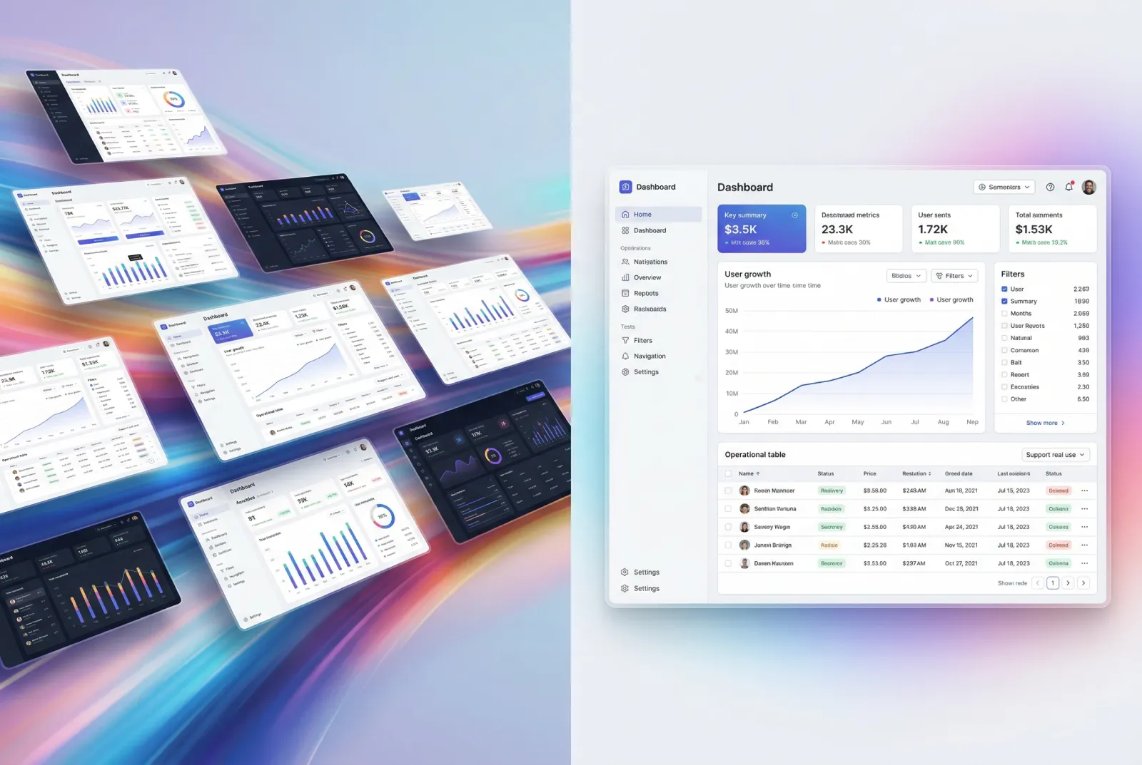
Instant access to critical data is a necessity in the real-time business environment we operate in order to make more informed decisions. This is where amazing dashboard designs take over. What are Dashboards? Dashboards can be defined as visual diagrams which display various key metrics and performance indicators combined into a single integrated interface. Because they make complicated data - simple, allowing managers and teams to instantly grasp the present situation of their business. From customer satisfaction data to financial health metrics to marketing KPIs, dashboards deliver an overarching view for strategic planning and operational efficiency. Dashboard templates contain immediately-graspable data and are in line with best practices in user interface design, and have become common across all market industries. Through this article I'll take you to some of the best dashboard UI design examples that can inspire your next project.
Dashboard as a modern business intelligence tool helps to visualize the data and information related to an organization's performance. Business intelligence has come a long way from its origins in the simple dials of automotive dashboards, for example by displaying vehicle speed or fuel levels, to today's far more comprehensive analytics tools that allow businesses to make sense of their complex data. The adoption of creative dashboard design ideas has improved the utility, making it mandatory to visualize and interpret intricate data.
Purpose of Dashboards
Dashboard templates serve several key purposes within organizations:
- Historical Data Aggregated: Summarized historical data provides a single view of this information allowing stakeholders to see how the numbers are changing over time.
- Dynamic Data: Unlike traditional reports that are static, dashboards provide users the ability to view current business metrics and conditions.
- Visualization of Selected Information: They extract large quantities of heterogeneous data from multiple sources and present the data in an integrated format (e.g. create graphs, charts and other forms of visual representation).
- Objective Performance Insights: Dashboards consolidate data into practical metrics, enabling informed decision-making across all levels of an organization.
They provide a snapshot of the most important insights about your business, helping you keep an eye on KPIs, trends, and how you are performing against your strategic goals. They enable users to view data effectively, make data informed decisions and improve business agility. These examples of dashboard layout examples can be modified to present chosen metrics and information most useful for teams, departments, or processes - which in turn helps improve operational efficiency and supports the achievement of organizational goals.
At their core, dashboards act as central command centers allowing companies to leverage data to gain valuable new insights that fuel success and competitive edge across industries.
.avif)
Dashboards Benefits
Compelling dashboard templates bring with them a host of benefits that greatly enhance organizational functioning and decision-making. Main benefits of utilizing great dashboard designs:
Business Performance and Trends: Dashboards visualize complex data in a manner that enables stakeholders to gain clarity and know how the business is performing. Dashboards analyze specific data, presenting them in charts or graphs or as summaries on a single screen to help filter information that provides insights for decision-making. If you are still looking for dashboard inspiration, it is a powerful example on how to convert data in a valuable visual representation.
Improved Decision-making: The use of dashboards provides managers and decision-makers with real-time data and historical information needed to make decisions in a timely manner. You are able to quickly see how you are performing against your goals, even at a very high-level view of the data (e.g. KPIs and metrics), and ensure that the right focus can take place at any level or area in the organization where necessary to make proactive changes or strategic plans.
Increased Responsiveness: Responsive dashboard embedded with real-time data functionality allow companies to respond faster to market changes, customer needs, and internal issues. This level of agility is essential to remaining competitive and efficient as a business.
Facilitated Collaboration: Dashboards bring data and performance metrics into a single place, to keep everyone on the same page-even if that page is about user-reported bugs. This allows for clear communication around the company's goals and metrics, providing transparency in terms of where everyone is on the mission and vision.
Forecasting Capabilities: Effective dashboards should be able to not only display current data but also forecast potential future trends and outcomes This function is important because Analyzing historical patterns, and performance trends, helps enterprises predict future behavior or as a consequence they can take new steps in advance.
Increased User Engagement and Accessibility: Interactive dashboards encourage users to explore data with a variety of filters, drill-down capabilities, and views. This interactivity increases the seamless user experience and guarantees insights are relevant to the user type, from executives to operational staff. Effective UX dashboard examples demonstrate how intuitive design and ease of use could significantly increase user engagement and data availability.
Operational Efficiency: Dashboards enable organizations to quickly surface data and result in significant time reductions in manual report generation and data discovery efforts. This enables teams to spend more time on strategic initiatives and profit-driven tasks, rather than data processing.
Strategic Alignment: Real-time tracking of KPIs and performance metrics to align business activities with strategic goals via dashboards. By this alignment, we are ensuring that resources are not wasted and the efforts encase into organizational objectives.
To sum up, dashboard templates play a crucial role for businesses trying to improve and optimize decision-making processes, improving collaboration and meeting strategic objectives. With better visualization capabilities driving analytics and real-time insights to the dashboard layout, and drawing from dashboard UI design inspiration, businesses can stay ahead in this competitive world and on top of the ever-changing market condition.
Common Dashboard Components
A dashboard is made up of various important elements that work together to allow users to visualize and understand data quickly. Business Intelligence, Operational Monitoring and Strategic Analysis can in-turn be enhanced with these modules to impart better insights for improved decision making:
Charts and Graphs: Bar charts, line graphs, pie charts and scatter plots are the meat of the dashboards. They show trends, comparisons, and distributions within data sets in order to turn the complex information much more digestible and actionable.
Tables: When you need detailed, raw data, in a systematic way then tables are the best to represent that. These methods are useful for displaying data points over different categories or dimensions, thereby providing a complete view in conjunction with visualizations.
KPIs & Metrics: Key Performance Indicators (KPIs) are essential metrics to gauge the achievement of certain objectives, or tactics. Metrics are essentially additional measurements around KPIs, which give you more context, and detail a deeper sublevel of what the most important data those measurements pertain to provide.
Filters & Controls: allow users to interact with your dashboard in real time, selecting filter values, entering URLs, choosing selection ranges for date fields in Date Pickers and more. This provides the ability to dynamically explore data and focus on certain segments or time periods useful for the analysis.
Navigation: Navigational ease is important with minimal clicks for users to get the desired answer. Customers should be able to tip and switch between screens with intuition.
Widgets and Cards: Dashboards typically use widgets or cards as modular components that encapsulate each type of information, from summaries, alerts and featured data points. These modules encourage an organized visual layout which in turn increases attention and visibility.
Data Alerts: Automated alerts notify users of significant changes or anomalies in data trends, ensuring timely responses to critical developments without requiring constant monitoring.
Annotations: Adding annotations to charts and graphs provides additional context or explanations, helping users interpret data accurately and make informed decisions based on contextual insights.
The ultimate goal for a dashboard is to digest many different sources of data into coherent, actionable insights that shed light on how an organization or individual can make intelligent decisions and operate more efficiently. Dashboard designers can leverage these key components to create user-friendly interfaces that enable users to effectively utilize data within their operational and strategic planning activities. In this article, we will go over different dashboard UI ideas and hopefully give you inspiration while designing your next dashboard.
Main Dashboards Types
There are different types of dashboards which fall into segmentation according to the objective they are designed for and the insight level. All three types have specific uses in an organization, offering various amounts of detail and functionality (to meet different level-of-need requirements):
Operational Dashboards
Real-time dashboards are essentially operational dashboards and they help in the real-time monitoring, tracking of operations processes and activities. They normally present Key Performance Indicators (KPIs), and daily operation metrics. So, an operational dashboard is quite critical for the day-to-day operations of frontline workers and managers that depend on immediate insight into current performance to make timely decisions and intervene when necessary. Some UI dashboard examples may include checking call center metrics, even traffic in e-commerce, or efficiency in production lines at manufacture.
.avif)
Strategic Dashboards
Strategic Dashboards provide a futuristic picture of what is happening in an organization. They deliver a bird's eye view of top performance metrics that are linked to strategic objectives, business goals. Strategic dashboards focus on past trends and future forecasts, rather than real-time data which is more common with operational dashboards. Executives and senior management use them to understand the production process, evaluate trends, and make strategic decisions. These dashboards track key metrics around market share growth, revenue targets, customer satisfaction trends, and competitive analysis. You can take a look at different dashboard UX examples for inspiration, and see how a strategic dashboard is designed to make better user experience that helps in decision-making.
.avif)
Analytical Dashboards
Analytical dashboard aimed to provide some complex data analysis and discovery. These can be used to extract insights, correlations & patterns that will lead to data informed decisions. These analytical dashboards will frequently use very specialized data visualization and analytics techniques that can perform complex queries, test hypotheses and more. Data analysts, as well as business analysts and data scientists use these dashboards to explore data, investigate the root cause behind business performance and discover rich insights from complex datasets.
.avif)
Key Features Across Types:
- Customization: Dashboards are customizable, allowing them to reveal role- and organization-specific information.
- Visualization: Charts, graphs and other visual elements so that data can be understood at a glance.
- Interactivity: In many dashboards, interactivity is built into the dashboards with features like filtering, sorting and drill-down capabilities to dive deeper into the data.
- Alert & Notification: Auto alerts and notifications to keep users informed of change in important Data metrics amount
- Data Integration: Dashboards combine data from various sources like databases, spreadsheets, and third-party applications to give a holistic view of your business transactions.
With a deeper understanding of how operational, strategic and analytic dashboards serve unique roles, businesses can maximize their use of dashboards to handle performance monitoring, address strategic initiatives, and take informed action in support of business decisions. In addition, looking for some dashboard inspo might also help to design nicer and more effective-looking dashboards that would inspire data-driven decision-making.
How to Choose a Dashboard
This is also necessary to pick the right dashboard, which as you know would be custom tailored to satisfy the needs and objectives of organizations. So, in order to assist you in making the correct choice, we have compiled a checklist of the most important steps that are used throughout this selection process:
- Define Objectives and Requirements: Begin by setting out in detail your criteria and expectations when planning the dashboard. Define the primary questions you answer and KPIs by which performance is measured. Talk to all your stakeholders working in different departments, and get input on what kind of functionalities & data visualizations you need.
- Evaluate Data Sources & Integration: Compare the data sources that exist within your organization. So, find out if the solutions of your dashboards could be compatible backed by databases, spreadsheets, CRM systems and other apps. Make sure it is compatible before working with the type of data that has any secondary consequences leading to compatibility and then application data silos.
- Consider User Needs and Accessibility: This is the bit where you need to look at a map of users of your dashboard and also at their coolness. Develop the dashboard interface and navigation in such a way that users can quickly access their required data while having a better understanding and application as per their role. Use interactive filters, drill down and custom views for great usability and ease of use.
- Select the Appropriate Dashboard: It can either be an operational, strategic or analytic dashboard depending on the user's requirements. Dashboard Design for Various Use Case Operational Dashboards - An immediate decision-making tool with real-time insight Strategic Dashboards - A long-term trend and goal focus Analytical dashboards offers deep dive into data for hypothesis building on.
- Assess Visualization Options: Identify data visualization techniques best suited to convey insights and trends Some visualization tools include charts, graphs, heatmaps and regional or geographical maps. Design the dashboard carefully to look visually appealing yet should highlight the information very clearly and relevant.
- Ensure Scalability and Flexibility: scalability is very important to evaluate the solution by future point of view as the company will grow and so as the data volume. Select a platform that can scale to add more users or sources, as well as deploy new analytical capabilities by design. Flexibility in configuration and customization options are equally but also important to meet growing business demands.
- Test and Validate: Ensure testing and validation is completed before freezing the dashboard solution. Approve or recommend work on improvements/adjustments to the process based on feedback around usability, accuracy of data and performance.
By following these steps, organizations can effectively select a dashboard solution that aligns with their strategic goals, enhances data-driven decision-making, and empowers users with actionable insights from data analysis.
7 Best Examples of Dashboard by Choice of the Client
Dashboards are powerful tools of displaying comprehensive data swiftly that enable users to take rapid decisions based on the information provided. Widely used in business analytics, through SEO, web development, and project management. There is an incredible collection of the best types of the dashboards list available on Setproduct, and we want to demonstrate Figma dashboard examples with awesome features and functionalities for different applications, including some of the best web dashboard designs in the market today.
Purpose and Benefits: Material You Dashboard uses Material design by Google, offers a visual and an interactive system for data representation. It does so with a range of options like variable color scheme to bring a personalized and intuitive component that meets any branding styling. If you are seeking to present variety data more concisely and clearly, this dashboard template is the best choice for creating applications.
.avif)
Key Features:
- Customizable color schemes, components.
- Interactive charts, graphs, and data tables.
- Responsive design for best use cases between devices.
Who Can Use: Developers, UX/UI designers, product managers who need the capabilities to include modern, customizable dashboards in web and mobile applications.
Type of Device: Compatible with the desktop version, as well as mobile devices to offer an unvaried customer experience from all different platforms.
Other Uses: Perfect for any startup or enterprise looking to standardize data visualization, built around user-centric design principles.
Purpose and Benefits: Material X Dashboard is made for simplicity and clarity, using bold typography and white space to provide a great overview. To simplify app development, it provides a set of built-in components and widgets. This is an ideal template for any form of deployment, whether low or light weight, and can be designed to the needs of your project without constraint.
.avif)
Key Features:
- Minimalist layout, with heavy typography.
- Pre-built components and widgets.
- Support for APIs updating of real-time data.
Who It's For: Software developers, startups, and IT departments looking for a simple yet powerful dashboard solution catering for data-driven applications.
Device Type: Flexibility in deployment that includes desktop and mobile devices.
Other Use Cases: Agile project management, data monitoring and executive reporting.
Purpose and Benefits: Material Desktop Dashboard is designed for desktop applications with respect to the use of screen space, and offers an exhaustive set of data visualization features. It comes with user configurable navigation with multi-panel layouts, which makes it perfect for large, desktop-oriented enterprise solutions that need to integrate responsive dashboards.

Key Features:
- Desktop optimized layout, multiple panels supported configurations.
- Extensive data visualization capabilities, including heat maps and geographic maps.
- Drag-and-drop to offer interactive smooth user experience.
Who Can Use: Enterprise IT departments, BI analysts and project managers seeking powerful desktop dashboards used for depth of data analysis, charts, and reporting.
Device Type: It comes with advanced functionalities and features designed specifically for a desktop environment.
Other uses: Well-suited for logistics, finance, and healthcare sectors benefiting from sophisticated analysis and operational details.
Purpose and Benefits: Neolex Dashboard represents a bold step towards a more futuristic and modern visual aesthetic with bright colors and neat animated elements. React provides a collection of UI components that work with the same APIs, tested and polished with backend services in addition making it handy for tech startups and corporate giants displaying a shining dashboard interface.
.avif)
Key Features:
- Looks futuristic with vibrant transitions.
- Comprehensive UI components for customization.
- Separate RESTful APIs to exchange data.
Who Can Use: Ideal for tech startups, digital agencies or software development teams looking for appealing and interactive dashboard solutions.
Device Type: Both desktop and mobile - A hybrid solution that is designed for deployment to cater to various device types.
Other Use Case: For IoT (Internet of Things), project management tools, real-time analytics dashboards.
Purpose and Benefits: The unique dark theme of Eclipse Dashboard makes it readable and fashionable. It uses high-contrast color palettes for improved readability and modular components designed to be easily used across different applications with varying needs.

Key Features:
- Professional interface in dark themes.
- Modular components and grid-based layouts.
- Support of third-party plugins & extended functionalities.
Who Can Use: Banks, marketing companies and data science looking for a better look to a dashboard tool for visualizing and data analysis.
Type of Device: Functional on desktop and mobile devices for usability on all platforms.
Other Uses: Perfect for corporate environments, company research, sales monitoring and executive dashboards.
Purpose and Benefits: Material Dashboard follows Google's Material Design specifications and provides consistency in usage through application. It has a responsive design with plenty of UI components and different data visualization you need to use to build any type of dashboards or panel, thus making it perfect for the developers wanting a strong and charming dashboard solution.

Key Features:
- Google Material Design with responsive layout.
- Rich Built-in UI components and visualization options.
- Support for interactive charts and statistical widgets.
Suitable for: Developers, Software engineers, UX/UI designers, and product managers searching for a flexible and versatile example of a dashboard template that works with different types of applications.
Device Type: Responsive and scalable for all the platforms (Web and mobile).
Other Uses: E-commerce apps, customer analytics dashboards, and SaaS app applications.
Purpose and Benefits: Panda Dashboard is made based on a user's design style with a touch of soft color gradients and rounded elements. This lightweight wonder focuses on ease of use, while offering custom themes and responsive design elements for better mobile viewability.

Key Features:
- User-friendly interface with soft gradient colors.
- Adjustable themes and layout.
- Responsive design for mobile access.
For Whom: Marketing teams, startups and small business looking for dashboard solution that is beautiful, functional to track core performance metrics
Device Type: Built to be a mobile-first experience and delivers high-speed websites tailored for smartphones and tablets.
Other Uses: Great for conducting social media analytics, campaign monitoring, performance tracking in digital marketing environments.
Our dashboard templates from Setproduct cover different design tastes and needful things, allowing developers and businesses to have a variety of tools that can be used for data visualization in apps and web-services. Every template comes with special features to help easy crafting of dashboards and detect powerful insights out of your data. These are the top dashboard designs that come with a high-quality design and excellent functionality to cover all business requirements.
Dashboards Design Best Practices
The best dashboard templates are those that are designed with usability, visual clarity, and functionality in mind so that they can assist users to the fullest extent. If you are building a dashboard for business analytics, task tracking or monitoring key performance indicators (KPIs), following best practices helps make your dashboards user-friendly and provides cleaner insights. Given the above backdrop, here are some core tips to consider when designing dashboard templates and improving their functionality:
- Define the Goals: Before creating your dashboard, lay out clear and concise goals and objectives that you would like to achieve with your dashboard. From keeping tabs on sales performances to up-to-date KPIs and trends, the goals should be absolutely clear as it will eventually help in obtaining pertinent dashboards.
- Design to be Simple and Intuitive: Do not clutter things with complexity, give priority to design simplicity. Clean layouts, minimalistic visuals and intuitive navigation provide a framework for the information hierarchy within the dashboard.
- Unified Layout & Visual Design: Ensuring accurate use of layout, typography and color schemes from one dashboard screen to another. It provides consistency so that it is easier to absorb data and navigate the system efficiently.
- Focus on Data Visualization: Wet in on how data will be represented, through which charts, graphs and heatmap as per the nature of data and kind of insights that are needed. Use interactive elements and layers wisely so there is room for users to play and not too many in the intuitive interface.
- Responsive and Scalable Design: Make your dashboard responsive and scalable for different devices, screen sizes, etc. Building responsiveness supports the best user experience on a desk, tablet or phone.
- Effective Use of White Spaces: Use white space (also known as negative space) to cut back on visual noise and highlight key data points. Maintain enough white space to divide the various elements, to aid in making it easier to the eye and to highlight key information.
- Context & Insights: All the data should be interpreted, contextualized, translated into the story about something meaningful and fit for some kind of action. Annotate, tooltip and legend, present relationships in the data credible.
- Interactive Filters, Dropdown and Drill-Down: Use interactive elements like filters which give control to the user to explore data at different levels of granularity. It Increases the engagement of students and allows them to deep dive into data Runtime interactivity spark.
- Performance and Loading Time: Make fast loading dashboards dealing with large datasets. Use caching and aggregation to get real or quasi-real time updates without sacrificing speed.
- Continuous User Testing and Feedback: Provide regular user-level testing and real user feedback about pain points, usability issues, and areas for improvement. Continue to improve the dashboard by user feedback both in usability and impact
Adhering to these dashboard design best practices would not only result in higher user satisfaction and engagement, but also make the most out of data visualization in order to help decision-makers across industry domains. Designing with a focus on engagements that are clear, simple, functional and action-oriented allows for dashboards to be accurate in conveying insights; as well as ensuring actions that need implementing societal change will occur.
Conclusion
Dashboards, when designed effectively, serve their purpose the best. So, understanding these purposes & then choosing the right components and developing in a way that communicates & clarifies ideas to the end-users is what make dashboard templates very important. Dashboards are meant to help users make informed, actionable insights across many different areas. This list of 10 best practices for designing dashboards that businesses can use to create dashboards to circumvent any operations and view the essential KPIs to get success-oriented goals accomplished.
.avif)
.avif)

.avif)
.avif)


.avif)
.avif)


.avif)
.avif)
.avif)


.avif)


%20(1).avif)

%20(1).avif)
.avif)
.avif)


