
Design, Build, Scale: Publications for ambitious creators & founders
Hard-won UI/UX lessons, technical deep dives, and growth playbooks for designers, coders and indie hackers
View all
UI Design
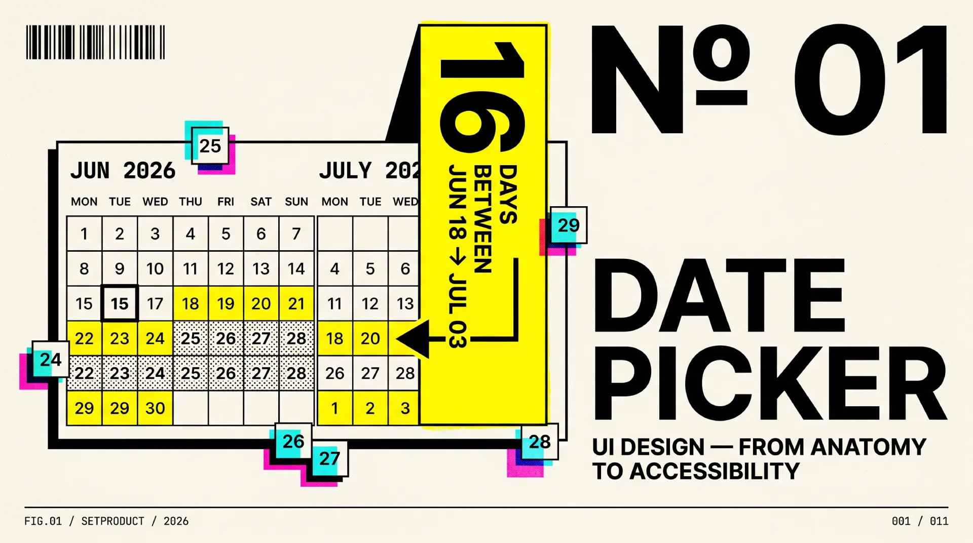
Date picker UI design, from anatomy to accessibility
Anatomy, 7 types, range selection, states, accessibility, i18n, and a ship checklist. The reference for date picker UI design.
UI Design
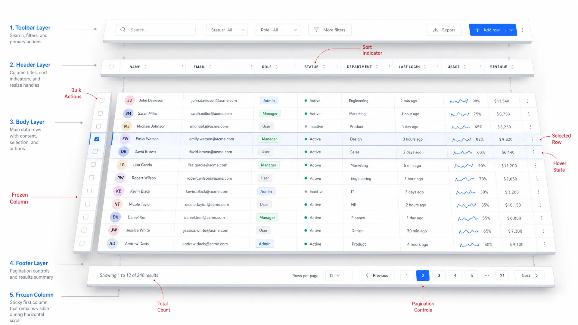
Data table UI design reference guide for 2026
Anatomy, cell types, density, sorting, filtering, pagination vs virtualization, accessibility, and a ship checklist. The reference for data table UI design.
Technology
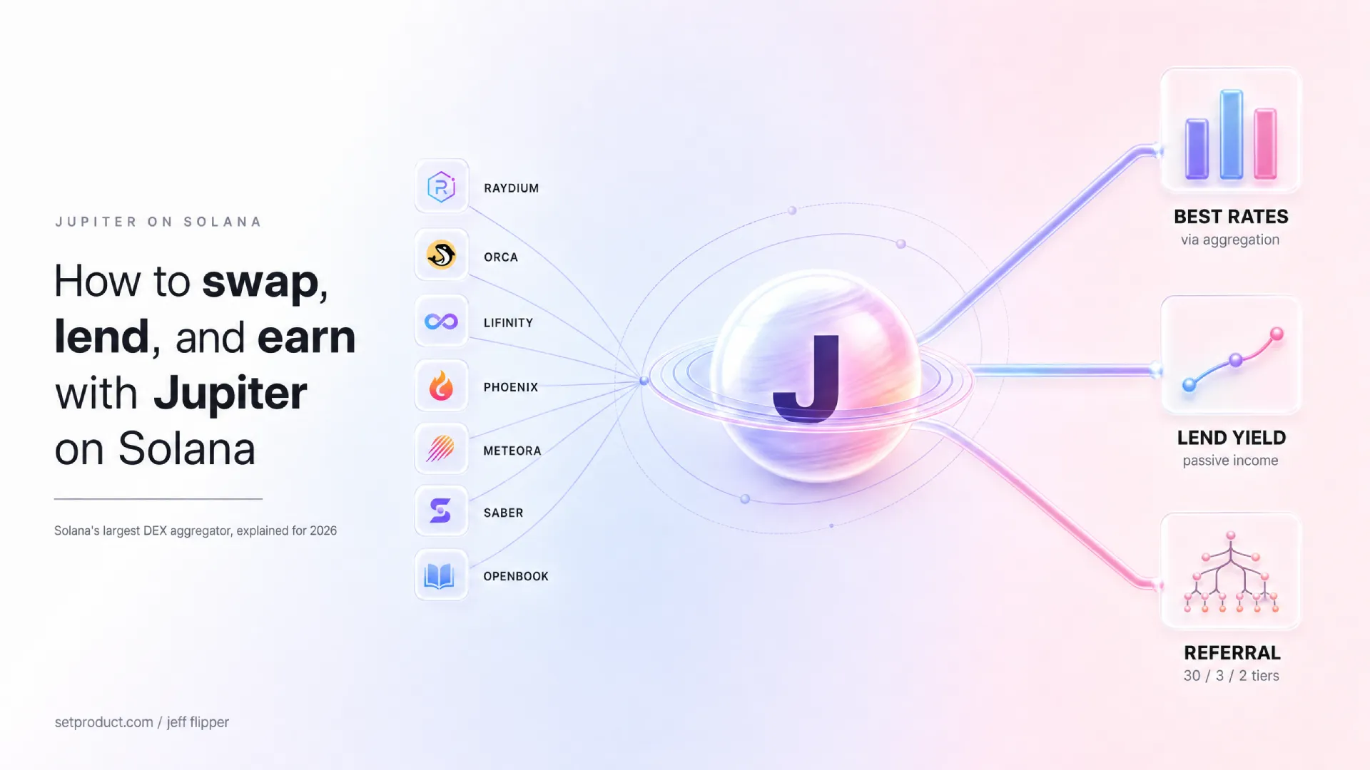
How to swap, lend, and earn with Jupiter on Solana
Swaps, stablecoin yield, fee comparisons, and a rare 3-tier referral program on Solana, explained by a designer turned creator.
Design Trends
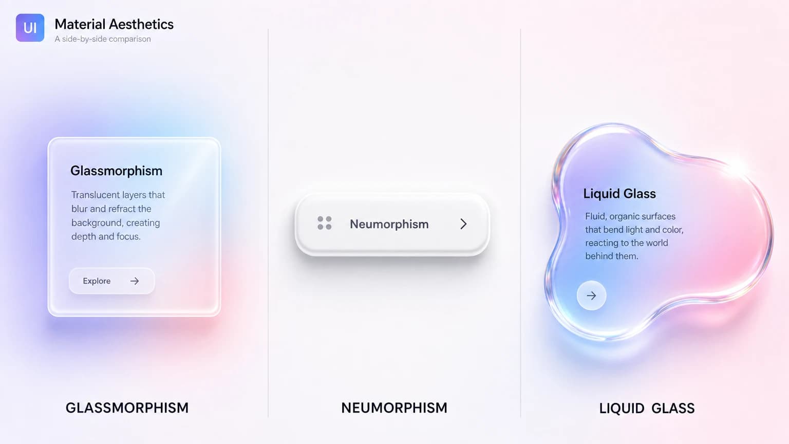
Glassmorphism, neumorphism, liquid glass: what to use in 2026
A side-by-side breakdown of glass UI aesthetics — and how to pick the right one.
Design Trends
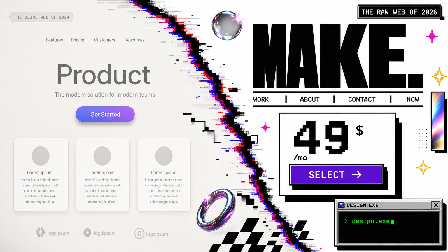
Retro and brutalist UI design: a 2026 field guide
The 2026 counter-trend to clean minimalism, explained with real examples, a comparison table, and a decision framework.
UI Design
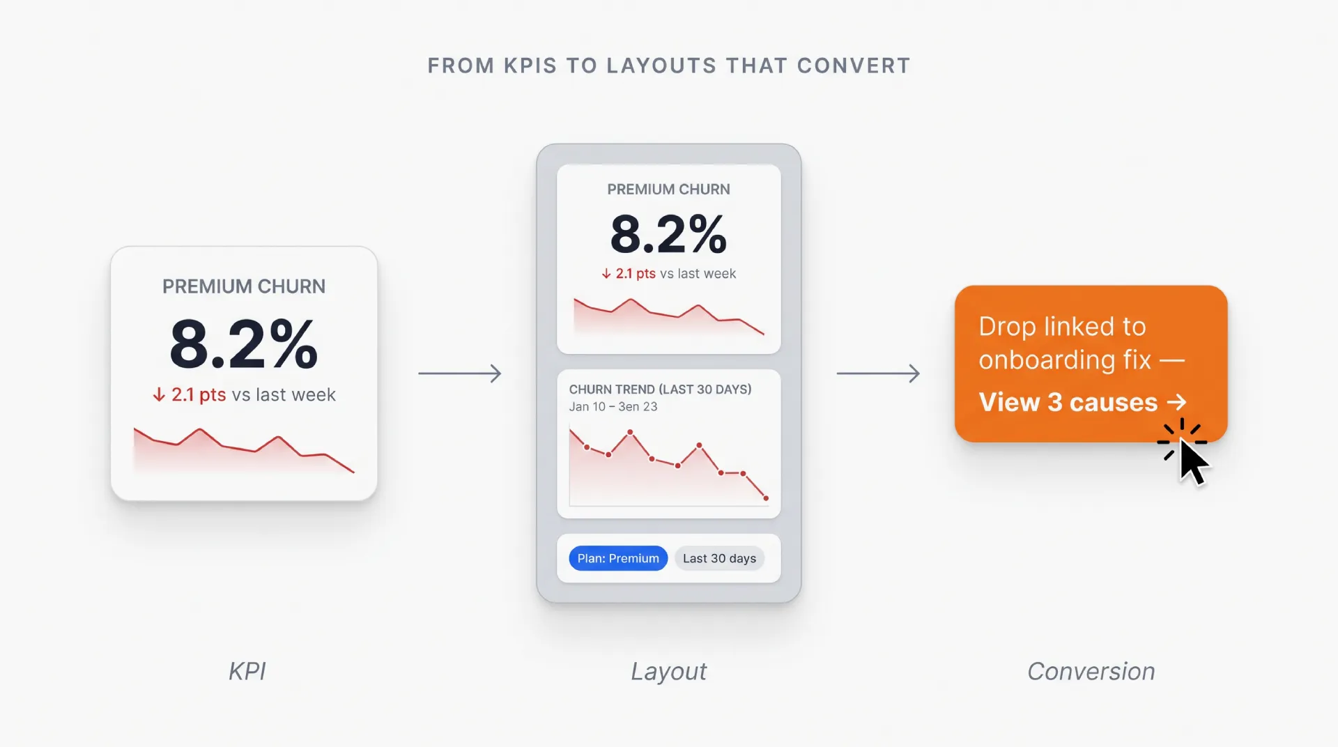
Dashboard UI design: From KPIs to layouts that convert
Master dashboard UI design from the ground up: anatomy, layout patterns, data visualization, mobile, and anti-patterns to avoid. With examples and FAQ.

Career
What gets designers to $300k, according to six who did it
Six senior designers shared how they reached $300k+ total comp. The pattern was not craft. It was five behaviors you can start practicing this week.

Growth Hacking
Landing page optimization: 8 rules that move conversion
8 rules of landing page CRO that turn paid and organic traffic into qualified leads. Hero, social proof, forms, mobile, speed, testing.
Subscribe to Setproduct
By clicking Sign Up you're confirming that you agree with our Terms and Conditions.
Figma Templates & UI kits
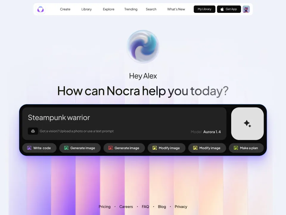
Nocra UI kit
Nocra is a design system for AI products. Built specifically for startups harnessing AI generation: images, video, audio, music, prompts, and beyond.
.webp&w=1920&q=75)
Material X for Figma
Figma library with 1100+ components & 40 app templates beyond Material Design. Powered by top-notch shapes and Manrope font. Customizable & Adjustable UI kit now available for Angular & Figma
.webp&w=1920&q=75)
Material You UI kit
Figma & React library with 2600+ variants of 32 components compatible with Material Design 3. Plus 220+ dashboard templates for all the viewports. Now available for NextJS & TailwindCSS.
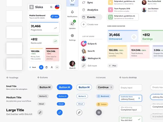
Figma React UI kit
Designed and well-organized in Figma React-based UI toolkit for the web. Optimized for building complex data-dense interfaces for desktop and mobile applications.
.webp&w=1920&q=75)
Panda Design System
Figma library with dashboard, calendar, kanban, profile, table, ecommerce and 80+ templates in total. Components with variants, dark theme included.
.webp&w=1920&q=75)
Eclipse UI kit
Figma library with 1100+ components & 74 templates for data-driven web applications. Powered by auto-layout. Supercharged by Figma's variants.
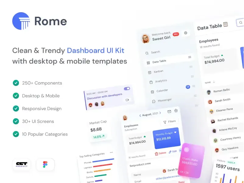
Rome UI kit for Figma
Customizable and well-organized team library. Contains 250+ components & 30 web app templates powered by stylish and trendy guidelines.
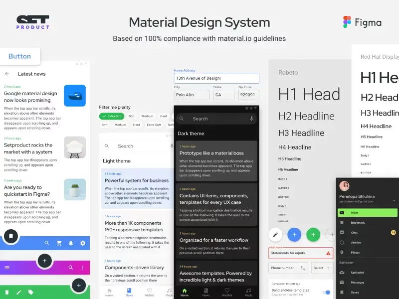
Material Design System
Figma library is based on 100% guidelines compliance with Material.io. Contains ready-to-use templates to accelerate app UI design.
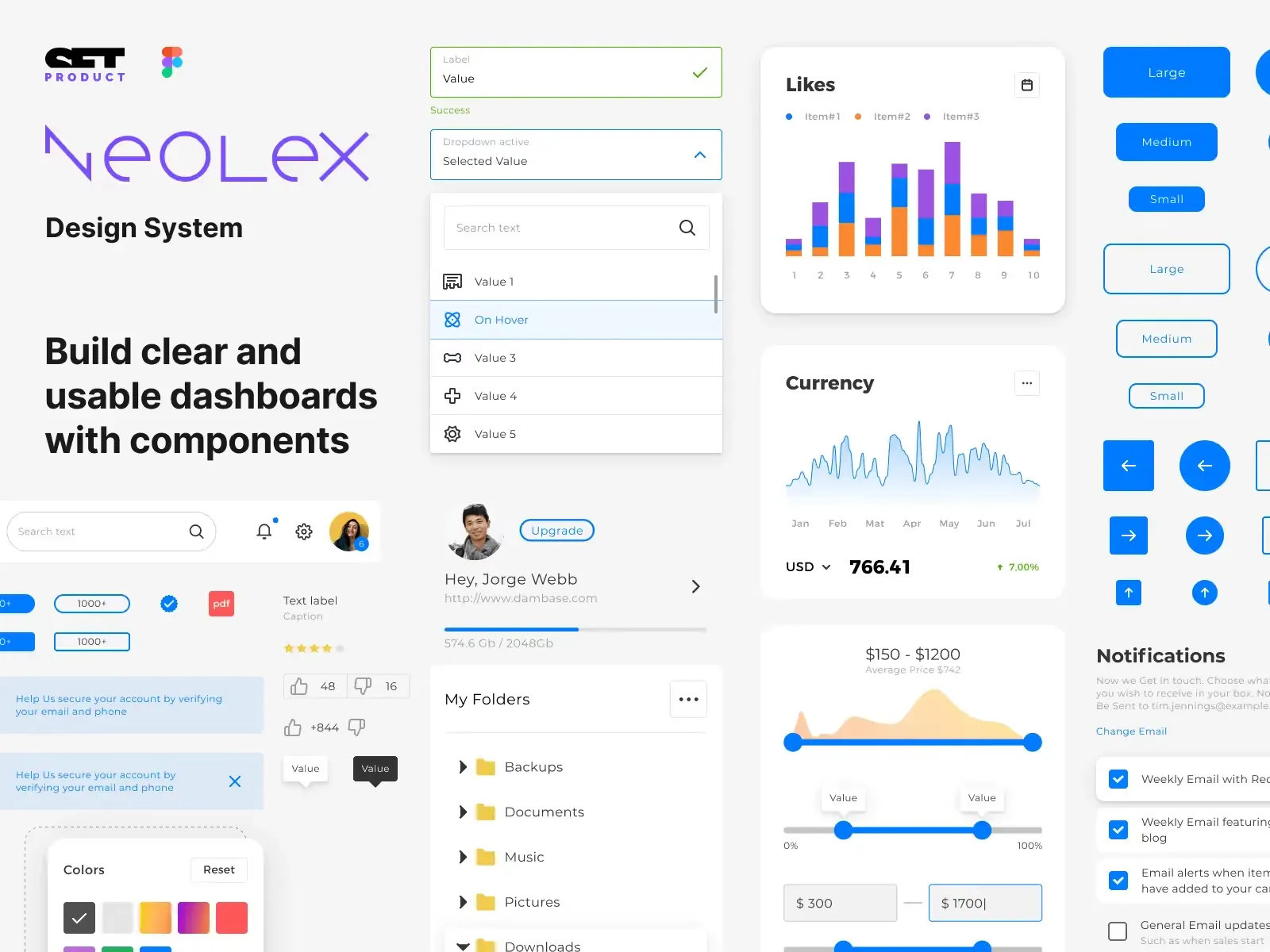
Neolex Dashboard UI kit
Customizable & adjustable dashboard design system with 50+ ready-to-use app layouts, 1900+ variants for 30 components with auto-layout.
.webp&w=1920&q=75)
Material Desktop Dashboard UI kit
Figma library with 48+ dashboard templates based on reusable desktop app patterns carefully handpicked from the most popular web apps.
.webp&w=1920&q=75)
Xela UI kit for Figma
Figma library with 1900+ variants of 30 components categories to craft perfectly shaped desktop & mobile apps. Customizable & Adjustable dashboard design system with 50+ web app templates.
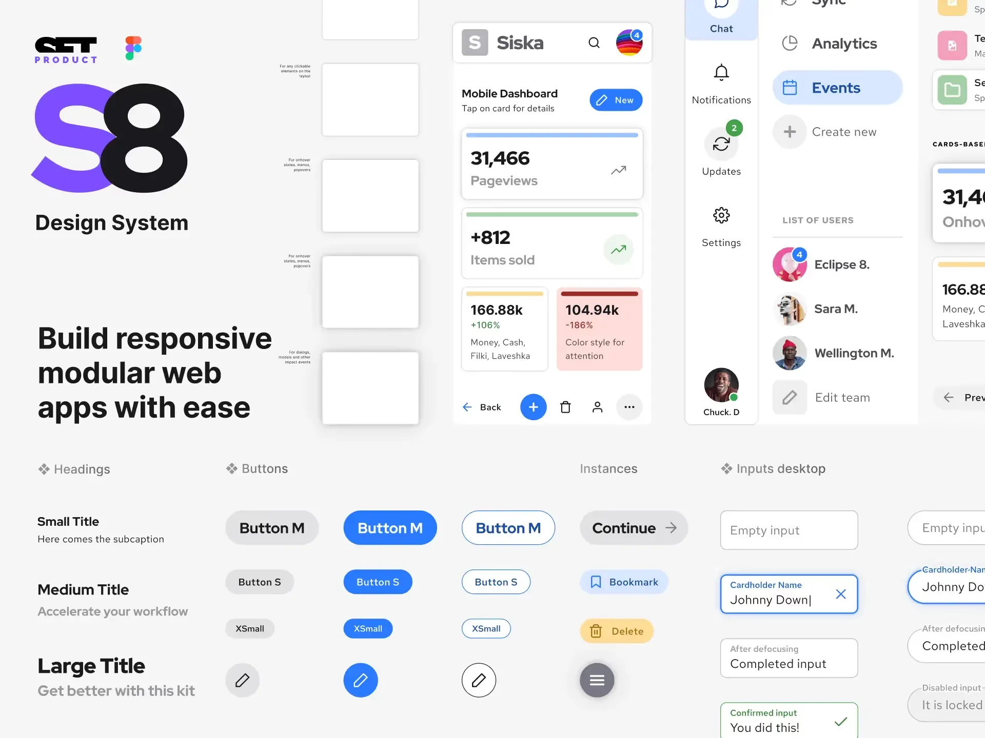
Figma S8 Design System
Figma design library for mobile and desktop apps made of high quality styled components. Full version includes 67 dashboard templates.
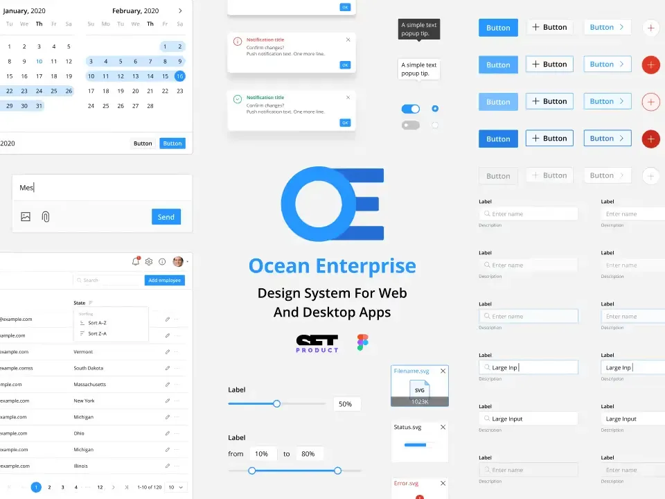
OE Figma Design System
Customizable and well-organized Figma library. This design system aimed to build highly loaded interfaces, boost the speed and save more costs.

