Marketing dashboard UI design guide: Layouts, chart types, and mobile optimization

Marketing dashboard UI design guide: Layouts, chart types, and mobile optimization
Inspiration

Published on

March 14, 2025

|

4 min read

Blog

Marketing dashboard UI design guide: Layouts, chart types, and mobile optimization

Navigation

Subscribe to new posts

Thank you! Your submission has been received!
Oops! Something went wrong while submitting the form.

By subscribing you agree to with our Privacy Policy.

Share this post

Author image

Roman Kamushken

Why dashboard design matters

Imagine this: Marketers are drowning in data. Developers are stuck rebuilding charts. Stakeholders demand “simple” reports that somehow include every metric.

The bridge between chaos and clarity? You, the UI designer.

Marketing dashboards aren’t just graphs on a screen. They’re decision-making engines. A poorly designed dashboard costs teams hours in meetings, missed opportunities, and money. 

When done right, it becomes a company’s compass.

This guide is not about fancy animations or the latest design trends.
It’s about creating dashboards that make data actionable, keep users up-to-date, and survive handoff to developers.
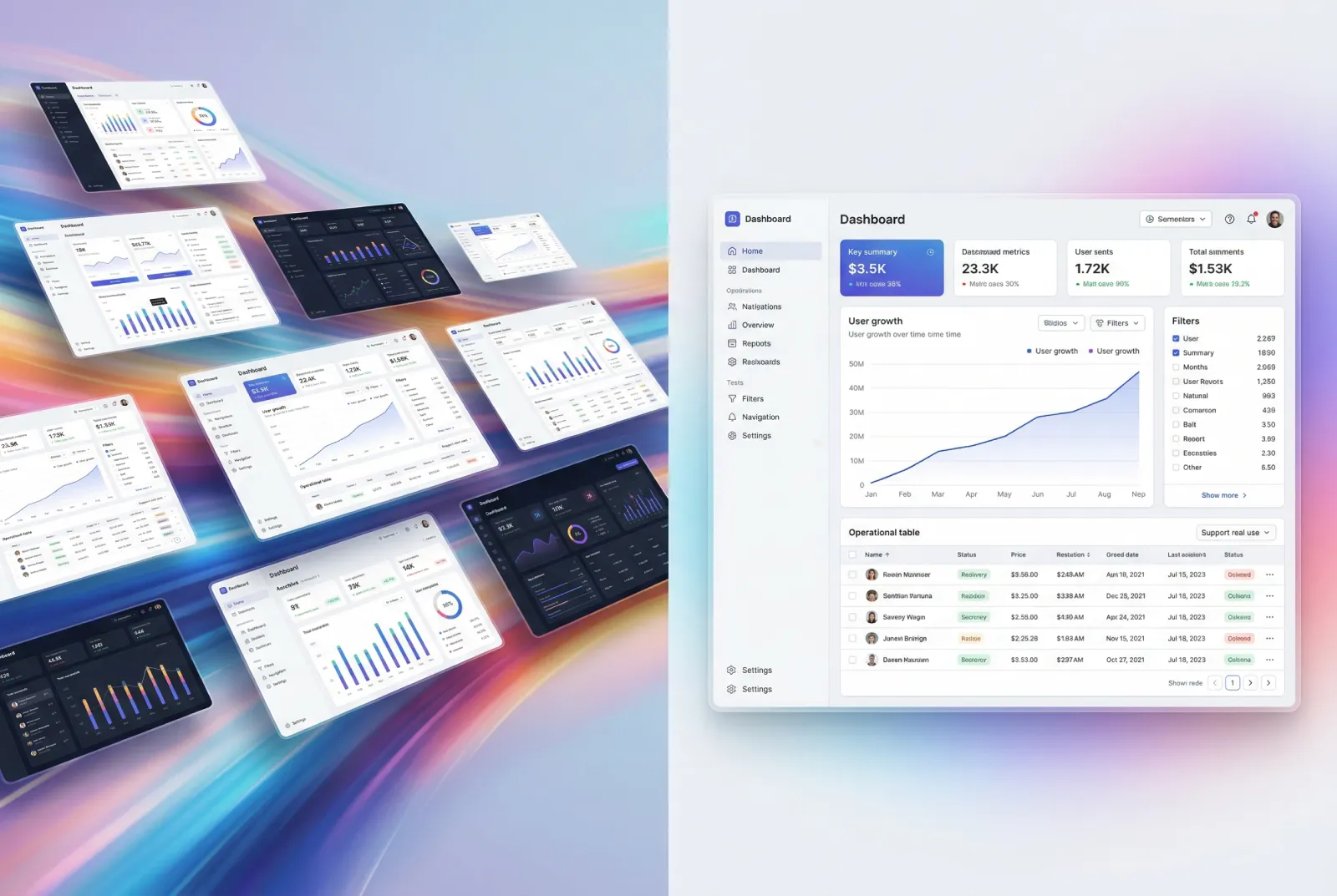
Marketing overview dashboard by Omotive

Dashboard anatomy

Every marketing dashboard has four non-negotiable parts. Miss one, and you’ll end up with a tool people avoid.

Start with global controls. These are the filters and dropdowns that let marketers tweak date ranges or campaigns. Place them at the top-left—that’s where eyes go first. Use simple toggles, not clunky menus.

Next, the key metrics bar. This is your headline act. Limit it to three to five numbers max. Example: "Website Visitors: 24k (↑12% vs. last month)." Big fonts, clean icons, no jargon.

Then, the visualization zone. This is where charts and graphs live. Never mix more than two chart types here. A line graph for trends and a bar chart for comparisons work 90% of the time.

Finally, action buttons. Every dashboard should answer "What do I do next?". Add clear CTAs like "Export Report" or "Set Alert" at the bottom-right.

Pro tip: Sketch a 12-column grid first. Developers will thank you later.

Picking right charts

Bad charts are why marketers lose trust in data. Here’s how to pick the right ones.

Use line charts for trends over time. Monthly website traffic? Perfect. Bar charts are for comparing stuff—like ad spend versus revenue. Scatter plots show relationships, like how social media clicks tie to sales.

Avoid pie charts. Always. They’re hard to read, especially on mobile. If you must show parts of a whole, use horizontal bars.

Labels matter. Put them directly on chart elements, not in a separate legend. And for colorblind users, add texture. Dots for one line, stripes for another.

Figma chart templates for marketing dashboards
Use Figma charts UI kit to save time when designing marketing dashboards

Designing for mobile screens

If your dashboard looks great on desktop but fails on mobile, you’ve wasted your time.

Stack everything vertically. Filters first, then metrics, then charts. Hide secondary data under a "See More" button.

Tap targets must be at least 48x48 pixels. Tiny buttons cause rage-quits.

Tables are tricky. Let users scroll horizontally instead of squeezing ten columns into a postage stamp.

Test on actual phones. Not simulators.

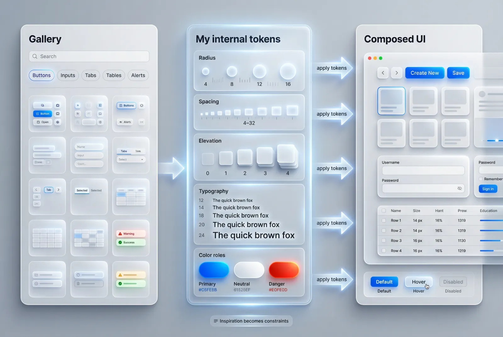
Handing off to developers

Developers aren’t mind readers. Your Figma file needs to be their bible.

Define a grid system. Use 8px or 4px increments for margins and padding. Write it down.

Create spacing tokens. For example: "Small = 8px," "Medium = 16px," "Large = 24px."

Document interactions. What happens when a user hovers over a chart? How do error messages look? Annotate every state.

Share HEX codes and CSS variables. Better yet, use Figma’s variables feature.

Track sales marketing dashboard by Bayu Sasmita

Accessibility check

Most dashboards fail here. Don’t be that designer.

Check color contrast. Tools like Stark or Contrast Checker will save you. Text needs a 4.5:1 ratio against backgrounds.

Keyboard navigation is a must. Can users tab through filters and buttons in a logical order?

Add hidden labels for screen readers. As well, Include onHover tooltips. Describe charts plainly: "Bar chart showing Q3 sales growth: 15%."

Offer a "low motion" mode. Some users get dizzy with animations.

Sales dashboard by Delisa Agency

Style guide tips

Your style guide is the glue holding everything together.

Pick two fonts max. One for headers (bold, modern), one for body text (clean, readable).

Stick to a tight color palette. One primary color, two neutrals (gray and white), and status colors (red for errors, green for success).

Icons need consistency. Same stroke weight, same corner radius. Use Venice.ai image generator to brainstorm ideas fast.

E-commerce marketing dashboard by Vetrick Wilsen

Do’s and Don’ts

Creating a marketing dashboard is like building a compass.

It has to point users in the right direction without making them decode hieroglyphics.

Stick to the essentials. Test early. Work closely with developers. And always ask, "Would a tired marketer understand this at 2 AM?"

Do:

  • Limit hero metrics to five.
  • Test on real mobile devices.
  • Annotate hover states for devs.

Don’t:

  • Use pie charts. Ever.
  • Skip contrast checks.
  • Hide critical filters behind multiple clicks.

{{stars-conclusion}}

This guide was crafted using Venice.ai - a privacy-first platform that lets you upload brand docs, generate design assets, and even mock data visualizations without Big Brother watching.

Need templates that actually work?

Browse the Setproduct Figma Dashboard Kits. It’s packed with customizable components, from responsive grids to accessibility-friendly charts.

Marketing campaign dark theme dashboard by Juliette Lagache

Share this post

Subscribe to Setproduct

Once per week we send a newsletter with new releases, freebies and blog publications
Thank you! Your submission has been received!
Oops! Something went wrong while submitting the form.

By clicking Sign Up you're confirming that you agree with our Terms and Conditions.

Congratulations!

You're in! Expect awesome updates in your inbox

FAQs

Lorem ipsum dolor sit amet, consectetur adipiscing elit. Suspendisse varius enim in eros elementum tristique.
No items found.

Our Dashboard Templates Will Make It A Treat To View Data

Experience the magic of data visualization with our user-friendly dashboard templates. Try out our dashboards now and enjoy efficient reporting processes, greater transparency in, among others monitoring and making educated decisions easily.
Material X for Figma

Material X for Figma

Figma library with 1100+ components & 40 app templates beyond Material Design. Powered by top-notch shapes and Manrope font. Customizable & Adjustable UI kit now available for Angular & Figma

Material You UI kit

Material You UI kit

Figma & React library with 2600+ variants of 32 components compatible with Material Design 3. Plus 220+ dashboard templates for all the viewports. Now available for NextJS & TailwindCSS.

Figma React UI kit

Figma React UI kit

Designed and well-organized in Figma React-based UI toolkit for the web. Optimized for building complex data-dense interfaces for desktop and mobile applications.

Panda Design System

Panda Design System

Figma library with dashboard, calendar, kanban, profile, table, ecommerce and 80+ templates in total. Components with variants, dark theme included.

Eclipse UI kit

Eclipse UI kit

Figma library with 1100+ components & 74 templates for data-driven web applications. Powered by auto-layout. Supercharged by Figma's variants.

Rome UI kit for Figma

Rome UI kit for Figma

Customizable and well-organized team library. Contains 250+ components & 30 web app templates powered by stylish and trendy guidelines.

Material Design System

Material Design System

Figma library is based on 100% guidelines compliance with Material.io. Contains ready‑to-use templates to accelerate app UI design.

Neolex Dashboard UI kit

Neolex Dashboard UI kit

Customizable & adjustable dashboard design system with 50+ ready-to-use app layouts, 1900+ variants for 30 components with auto-layout.

Material Desktop Dashboard UI kit

Material Desktop Dashboard UI kit

Figma library with 48+ dashboard templates based on reusable desktop app patterns carefully handpicked from the most popular web apps.

Xela UI kit for Figma

Xela UI kit for Figma

Figma library with 1900+ variants of 30 components categories to craft perfectly shaped desktop & mobile apps. Customizable & Adjustable dashboard design system with 50+ web app templates.

Figma S8 Design System

Figma S8 Design System

Figma design library for mobile and desktop apps made of high quality styled components. Full version includes 67 dashboard templates.

OE Figma Design System

OE Figma Design System

Customizable and well-organized Figma library. This design system aimed to build highly loaded interfaces, boost the speed and save more costs.

Related posts

Lorem ipsum dolor sit amet, consectetur adipiscing elit.

Inspiration

11 min read

Best SaaS Dashboard Examples. Dashboard Design Templates for SaaS Companies

Explore the benefits, features, and best practices of SaaS dashboards to enhance your business's data-driven decision-making.

Inspiration

8 min read

Best E-Commerce Dashboard Templates & Examples

Discover top E-commerce dashboard templates to streamline your data analysis and boost your online store's performance.

Inspiration

8 min read

Best Analytics Dashboard Examples

Explore the best analytics dashboard examples and design practices to transform your data into actionable insights.

Figma Templates & UI kits

Save time and human resources by reusing hundreds of pre-made templates crafted by us. Based on top notch UX taken from the World's best apps.

Material X for Figma

Figma library with 1100+ components & 40 app templates beyond Material Design. Powered by top-notch shapes and Manrope font. Customizable & Adjustable UI kit now available for Angular & Figma

Material You UI kit

Figma & React library with 2600+ variants of 32 components compatible with Material Design 3. Plus 220+ dashboard templates for all the viewports. Now available for NextJS & TailwindCSS.

Figma React UI kit

Designed and well-organized in Figma React-based UI toolkit for the web. Optimized for building complex data-dense interfaces for desktop and mobile applications.

Panda Design System

Figma library with dashboard, calendar, kanban, profile, table, ecommerce and 80+ templates in total. Components with variants, dark theme included.

Eclipse UI kit

Figma library with 1100+ components & 74 templates for data-driven web applications. Powered by auto-layout. Supercharged by Figma's variants.

Rome UI kit for Figma

Customizable and well-organized team library. Contains 250+ components & 30 web app templates powered by stylish and trendy guidelines.

Material Design System

Figma library is based on 100% guidelines compliance with Material.io. Contains ready‑to-use templates to accelerate app UI design.

Neolex Dashboard UI kit

Customizable & adjustable dashboard design system with 50+ ready-to-use app layouts, 1900+ variants for 30 components with auto-layout.

Material Desktop Dashboard UI kit

Figma library with 48+ dashboard templates based on reusable desktop app patterns carefully handpicked from the most popular web apps.

Xela UI kit for Figma

Figma library with 1900+ variants of 30 components categories to craft perfectly shaped desktop & mobile apps. Customizable & Adjustable dashboard design system with 50+ web app templates.

Figma S8 Design System

Figma design library for mobile and desktop apps made of high quality styled components. Full version includes 67 dashboard templates.

OE Figma Design System

Customizable and well-organized Figma library. This design system aimed to build highly loaded interfaces, boost the speed and save more costs.

Figma iOS kit

Figma library of iOS patterns served as ready-made templates. This UI kit inspired by World's best apps. Based on Human Interface guidelines.

Figma S8 Design System

Figma design library for mobile and desktop apps made of high quality styled components. Full version includes 67 dashboard templates.

Most iOS UI kit for Figma

iOS native components and app templates organized into a «Most Design System» fully compatible with Apple's Human Interface guidelines.

Rome UI kit for Figma

Customizable and well-organized team library. Contains 250+ components & 30 web app templates powered by stylish and trendy guidelines.

Material Design System

Figma library is based on 100% guidelines compliance with Material.io. Contains ready‑to-use templates to accelerate app UI design.

Nucleus UI

Nucleus UI contains 1000 components and variants with 500+ mobile screens designed for Figma (including 9 themes from Event, E-commerce, Finance, NFT, etc.).

Figma Android UI kit

Components-driven Android mobile UI library for Figma. Consists of 140 high quality application templates made of total 250+ UI components.

Mobile X UI kit

Customizable & adjustable iOS / Android design system loaded with ready-made 157 app templates based on 860+ variants for 20 components.

Appka iOS UI kit

Customizable & adjustable iOS design system with 4100+ variants for 28 components and 280+ ready-to-use app layouts crafted for Figma.

Full iOS UI kit

Customizable iOS design system with 320 ready-to-use app layouts. You can modify them or use as it is to save time and never design from scratch again.

Xela for Flutter

XelaUI for Flutter is a simple, modular and accessible component library that gives you the building Flutter apps for mobile and desktop.

Xela for Android

Ready-made collection of fully customizable widgets, UI screens and reusable components for Android coded with Jetpack Compose.

Xela for Swift

Designed for iOS Developers. We provide fully coded customizable components, widgets and well-organized iOS screens for Figma & SwiftUI.

Material You UI kit

Figma & React library with 2600+ variants of 32 components compatible with Material Design 3. Plus 220+ dashboard templates for all the viewports. Now available for NextJS & TailwindCSS.

Figma Charts UI kit

Components-driven graphs design kit for dashboards, presentations, infographics & data visualisation. Includes 25+ charts types for all the viewports.

Hyper Charts

Create impressive visuals with Figma's graphs templates – dozens of scalable and customizable data visualization blocks for dark and light modes.

Orion UI kit

Figma library with 40+ full-width charts templates served in light & dark themes. Contains 200+ of dataviz widgets that look perfect on desktop & mobile screens.

Xela for React

React based components library for beautiful user interface in React apps. Lightweight library for your projects. Contains pre-made web app templates.

Figma React UI kit

Designed and well-organized in Figma React-based UI toolkit for the web. Optimized for building complex data-dense interfaces for desktop and mobile applications.

Material X for Figma

Figma library with 1100+ components & 40 app templates beyond Material Design. Powered by top-notch shapes and Manrope font. Customizable & Adjustable UI kit now available for Angular & Figma

Xela for Flutter

XelaUI for Flutter is a simple, modular and accessible component library that gives you the building Flutter apps for mobile and desktop.

Xela for Android

Ready-made collection of fully customizable widgets, UI screens and reusable components for Android coded with Jetpack Compose.

Xela for Swift

Designed for iOS Developers. We provide fully coded customizable components, widgets and well-organized iOS screens for Figma & SwiftUI.

Material You UI kit

Figma & React library with 2600+ variants of 32 components compatible with Material Design 3. Plus 220+ dashboard templates for all the viewports. Now available for NextJS & TailwindCSS.

Xela for React

React based components library for beautiful user interface in React apps. Lightweight library for your projects. Contains pre-made web app templates.

Levitate 3D kit for Figma

Components-driven 3D kit to design eye-catching Figma presentations. Helps to enhance your landing page, product or app, brand ident, etc.

Website templates UI kit

Landing pages reusable templates kit based on most effective web design patterns. 140+ dark & light constrained design blocks.

Figma Landing Pages UI kit

Landing pages templates library based on constrained & organized components aimed to speed-up the production of effective websites.

Zeus UI kit

Create hassle-free landing pages in Figma. This kit is based on 10 landing page templates, powered by 1600+ variants for 630+ web blocks.

This is some text inside of a div block.