
Roman Kamushken
Breadcrumbs often sit quietly in the background of your app.
They don’t demand attention - they just do their job. But when they’re missing or poorly designed, users confused and get lost. That’s why getting breadcrumbs right is a subtle but essential part of interface design.
In this UI design tutorial, we’ll walk through everything you need to know before designing or implementing breadcrumbs. From clickable link anatomy and separators to edge cases like truncation, badges, close icons, and mobile behavior.
All illustrated with 22 visual examples, so you can stop guessing and start designing with clarity.
The anatomy of breadcrumb navigation
Breadcrumbs – are a type of navigation component commonly used to provide users with a hierarchical trail of links that represent their current location within a website or application's structure.
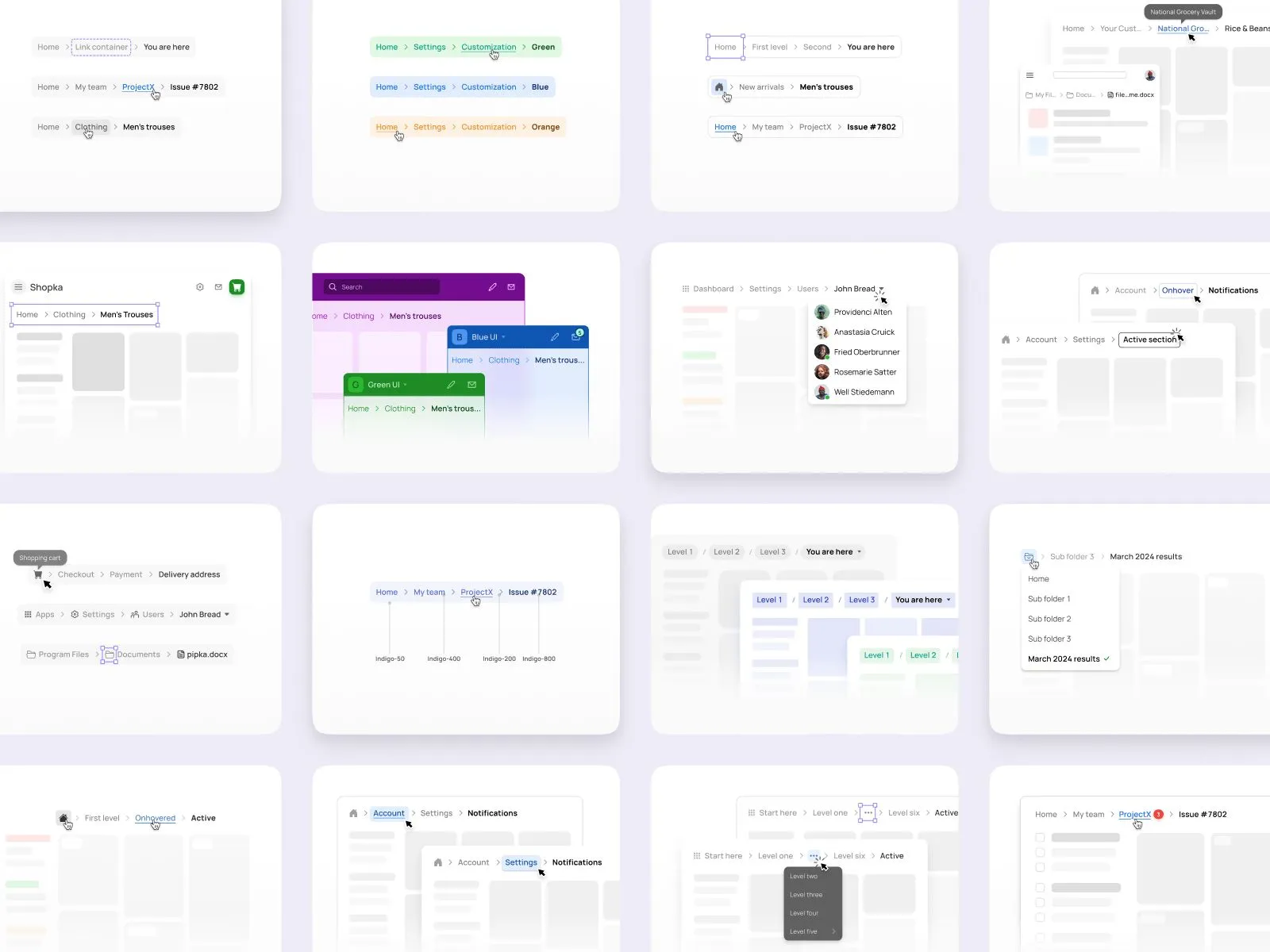
Links and wrappers
Every breadcrumb path is made up of individual clickable items. Each one acts as a navigational step backward in the app’s hierarchy. But designing them goes beyond text links, they need to be wrapped in containers to allow for consistent spacing, hover feedback, keyboard focus, and state styling.
The container makes each item feel like a tactile UI element, ready to be clicked. This improves both usability and accessibility. Without the wrapper, you’re limited in how you show states like hover,
Wrap each breadcrumb item inside a container, even if it’s just padding + a border-radius. It gives the component space to “breathe” and makes interactive states easier to manage.
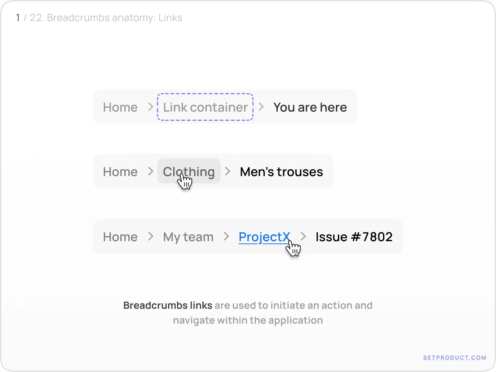
Separators: tiny but mighty
Separators help visually break up each breadcrumb level and guide the eye along the path. While they don’t carry data or interactivity, they have a surprising impact on scannability.
Common options:
- › chevrons (default for many UIs)
- / slashes (minimal, works well in file-based apps)
- : colons (less common, more visual pause)
Spacing is crucial here. The separator should never feel cramped between links. It should float, not sit.
Choose a separator that matches your app’s tone. Chevrons feel familiar, slashes are minimalist, colons are assertive. Just be consistent.
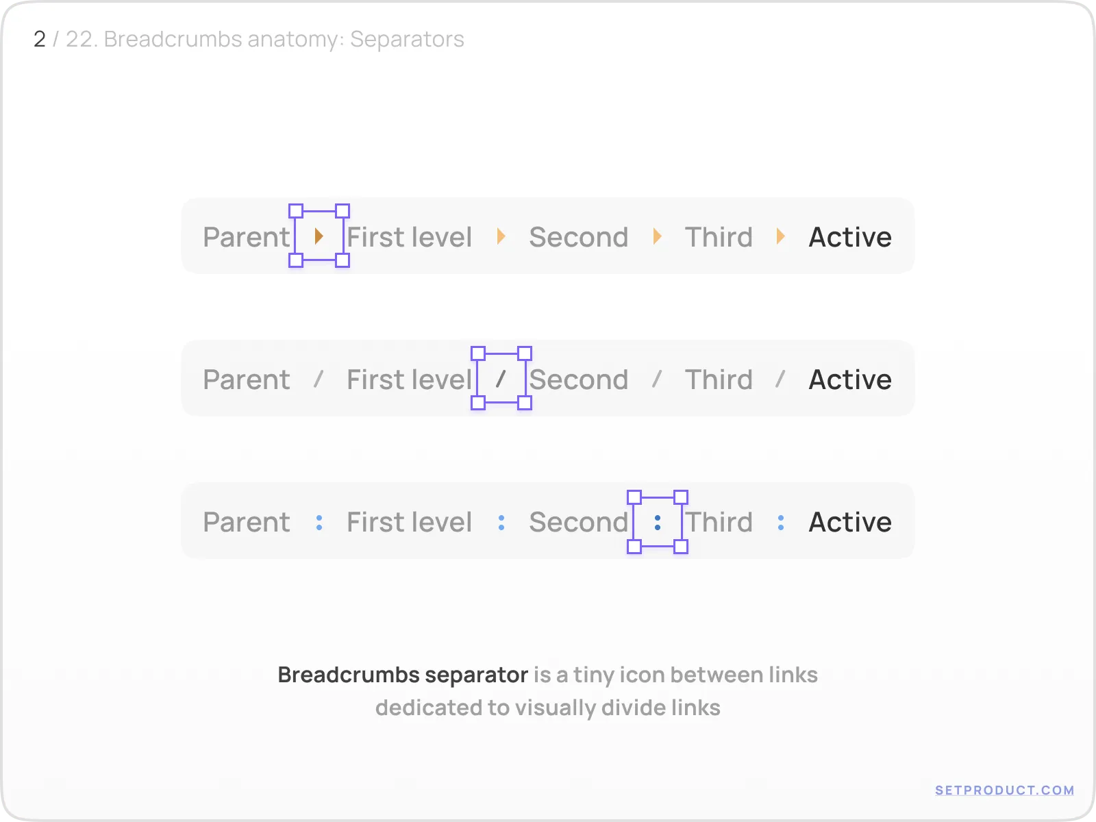
Icons inside breadcrumbs
Breadcrumbs are primarily text-based, but icons can subtly improve usability, especially when the path includes abstract or frequently used objects. Imagine a user navigating a file system, switching teams in a dashboard, or adjusting app-level settings. In each case, a tiny icon helps users orient themselves faster.
In this example, the breadcrumb path includes icons for:
- A shopping cart (Clothing)
- App settings (Apps > Settings)
- Folders and file types (Documents > pipka.docx)
The icon placement must be carefully balanced, it should precede the label, align with the text baseline, and never overpower the label itself. Ideally, it’s monochromatic and muted, not competing for attention.
Use icons to add clarity, not decoration. If the path is already clear, you might not need them. But when dealing with ambiguous labels, categories, or systems with repeated labels (e.g. “Settings” in multiple scopes), icons help reduce cognitive load.
And don't forget accessibility: label the icon with aria-hidden="true" unless it's informative, and always keep the text visible. Breadcrumbs shouldn’t become tooltips.
Breadcrumb states explained
Breadcrumbs may be minimal in appearance, but their behavior is complex. Each state (hover, focus, active, disabled) needs to be clearly defined for a seamless experience.
Active state
The active breadcrumb shows where the user currently is. It’s usually the last item in the trail, and it should not be a link. Instead, it becomes a visual anchor: bolded, darkened, or otherwise styled differently from the others.
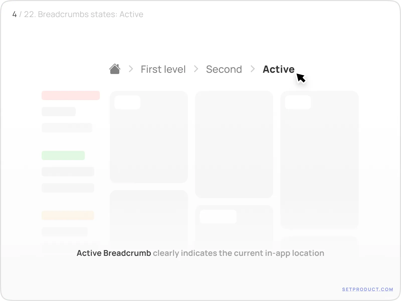
The UI in this example dims the surrounding items and places visual emphasis on the “Active” label. This reinforces the user’s location and discourages unnecessary interaction.
Never make the active breadcrumb clickable unless there's a very specific reason (e.g. to open a context menu). Otherwise, it creates confusion: why link to the page the user is already on?
Hover state
Hover feedback signals interactivity. In breadcrumbs, it's essential because the items often look similar to plain text.
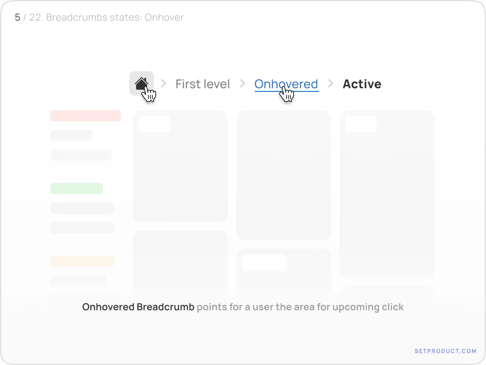
Good hover states:
- Slight underline or text color shift
- Pointer cursor
- Optional container background fill
Bad hover states:
- No feedback at all
- Full bolding (conflicts with active state)
- Delay in pointer change
Hover isn't just a visual effect. It's a hint that says “you can click here.”
Disabled state
Sometimes a breadcrumb path may contain items that look like links but aren’t actionable in context — such as when a user lacks permission or a step is temporarily locked.
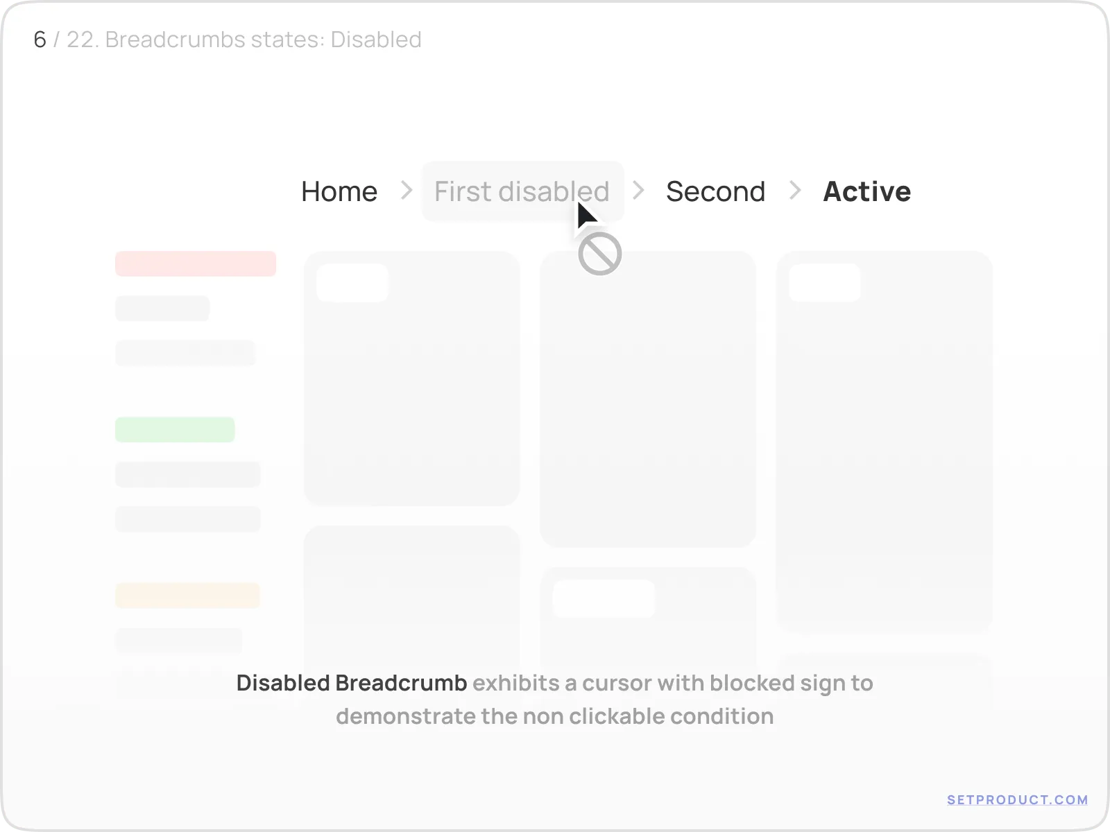
A good disabled state includes:
- Greyed-out styling
- not-allowed cursor
- No href or click action
Disabled breadcrumbs shouldn’t be common, but when you use them, make sure it’s obvious that they’re unavailable, not broken.
Focus state (keyboard navigation)
Not every user clicks. Some tab through the interface, especially power users or those relying on assistive technologies. Focus states ensure that breadcrumb items can be clearly selected via keyboard.
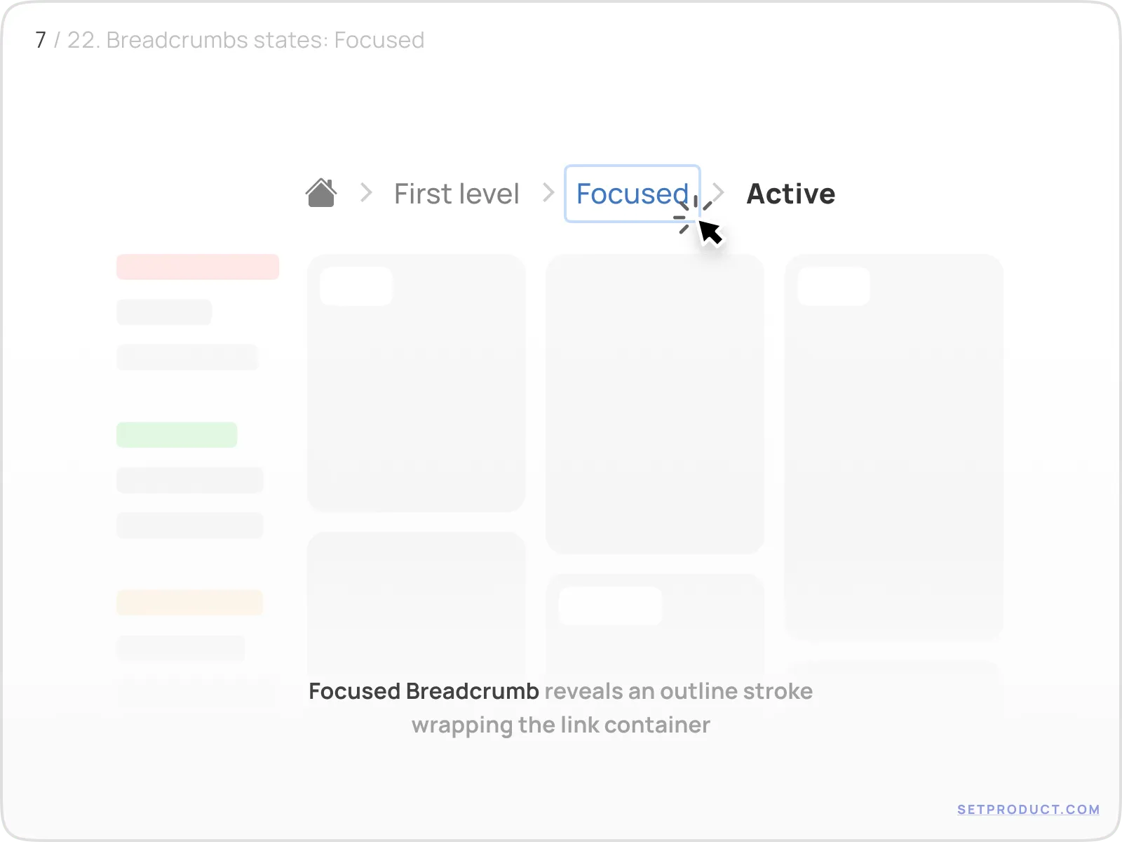
The best practice: apply a clear outline (stroke or box-shadow) that wraps the entire link container. Avoid relying solely on color.
If your app is WCAG-conscious, keyboard focus isn’t optional. It’s mandatory.
Filled backgrounds for interaction states
Some design systems prefer to highlight interactive breadcrumb items using soft background fills. This is especially common in admin panels, tables, and areas with strong layout grids. A filled breadcrumb draws the eye and reinforces actionability, while still maintaining hierarchy.
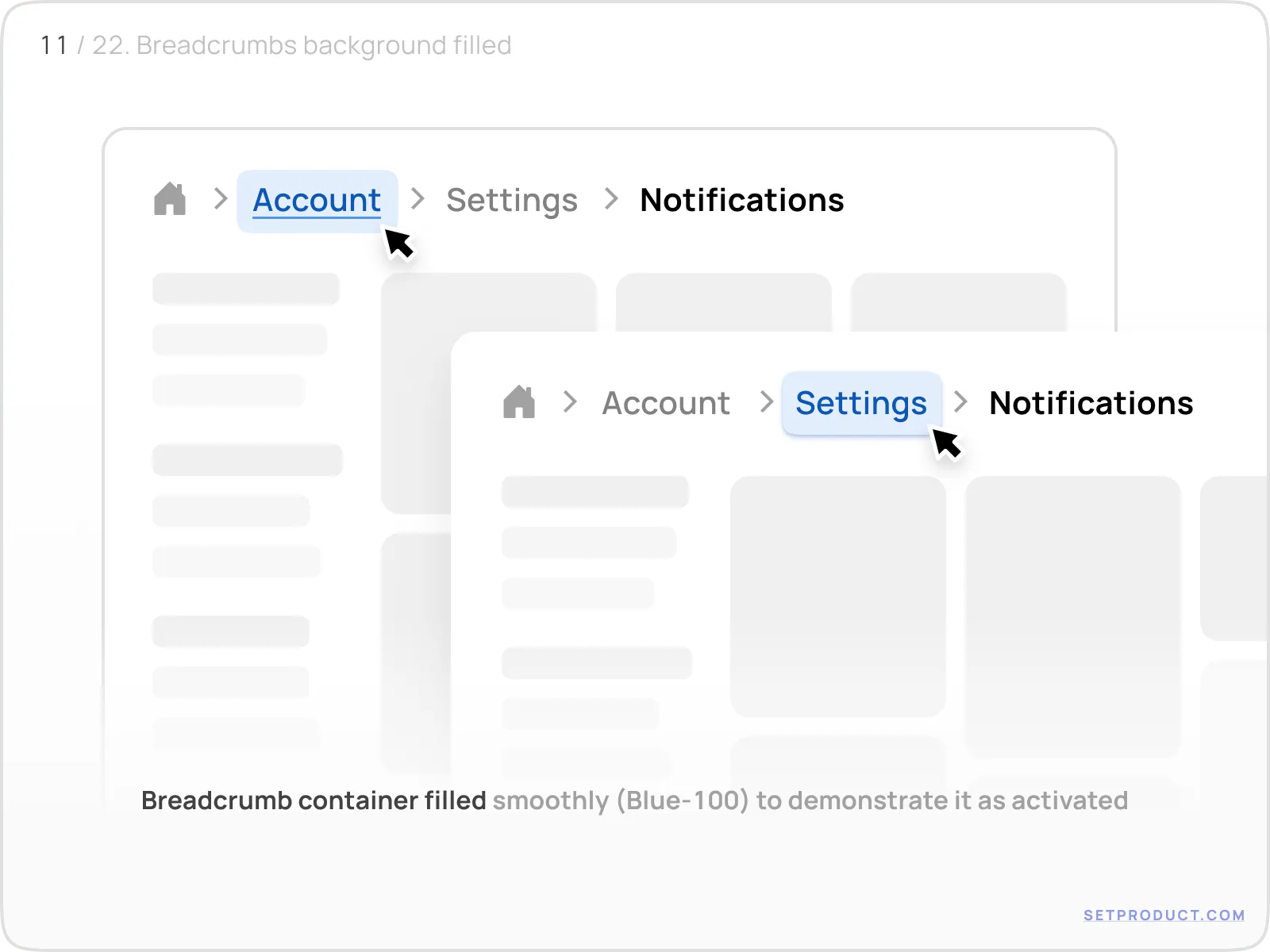
In the example above, breadcrumbs like "Account" or "Settings" are styled with a subtle Blue-100 background on hover or focus. This makes the link stand out without overwhelming the rest of the navigation.
Background fills should be used selectively. They’re great for reinforcing interactivity, but can clutter the UI if overused. Reserve them for hovered, focused, or high-priority items.
Stroke instead of fill (alternative approach)
For a more lightweight touch, strokes can replace solid backgrounds. They provide similar clarity without adding weight. This works especially well in flat or light UI themes where fills might feel too heavy.
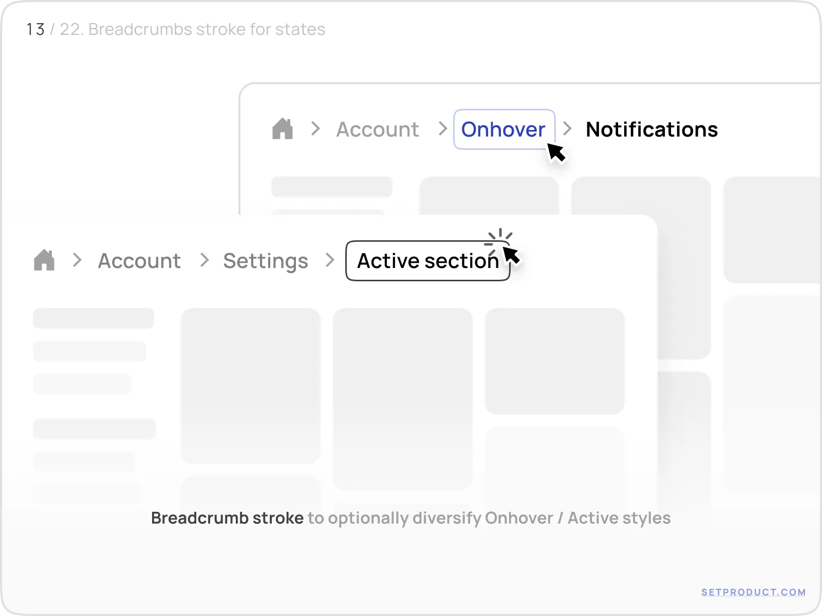
In this case, the hovered or selected item uses a soft stroke (border) with rounded corners and additional spacing, giving it room to stand out cleanly.
A thin stroke offers just enough visual emphasis without breaking the flow. It’s a great compromise between minimal and expressive.
Corner radius matters more than you think
Subtle changes to border-radius can dramatically affect the overall vibe of your breadcrumbs. Rounded breadcrumbs feel friendlier and more modern; square ones suggest a utilitarian, data-heavy interface.
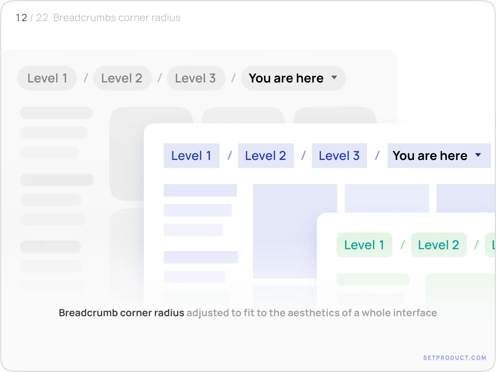
The same path, shown with varying radius settings (from sharp to soft), instantly feels more tailored to the rest of the UI.
Always match breadcrumb shape to the tone of your product. Soft? Use rounded corners. B2B analytics? Keep them sharp.
Start strong with the home link
The “Home” link is more than just tradition
Every breadcrumb path begins somewhere, and in 90% of cases, it begins with “Home”. But this element plays a deeper role than just showing the top level. It acts as an anchor, a reset point, and a fallback when users want to escape nested depth.
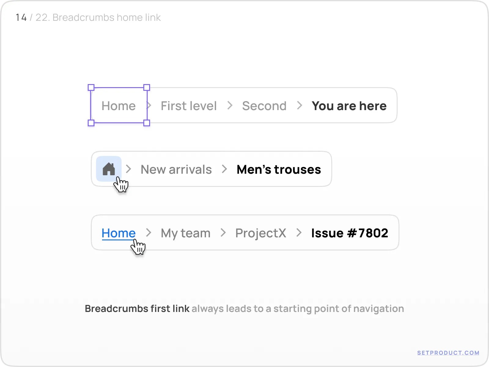
You’ll notice a few patterns here:
- The Home link can be a house icon, the word “Home”, or both
- It’s always clickable
- It never disappears — even when breadcrumbs are truncated
If users get lost, they look for Home. Don’t hide it. Don’t replace it with a logo. Don’t remove it when the viewport is small.
Breadcrumb navigation is all about orientation. And nothing anchors that orientation better than a clear, persistent, reliable starting point. Whether it leads to a dashboard, a root folder, or the homepage; make sure Home always shows the way out.
Popovers, dropdowns & contextual menus
Breadcrumbs with popovers: actions on click
Breadcrumbs can offer more than just navigation. In some cases, they double as dropdown triggers, opening menus with options or additional paths. This is common in collaborative tools, where a breadcrumb might represent an entity (like a project, user, or folder) and clicking it shows a context-specific menu.
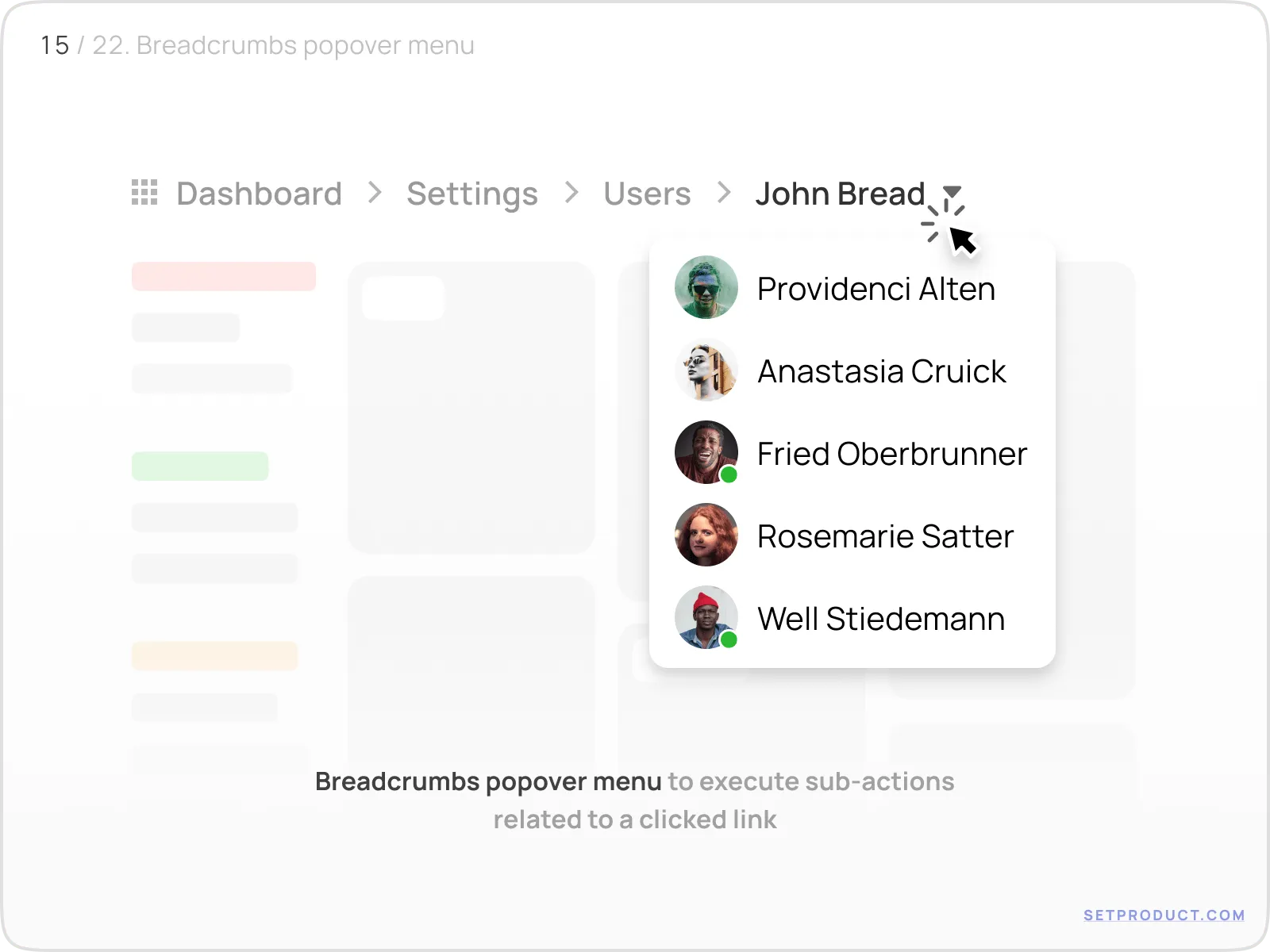
In this example, the "Jason Leung" breadcrumb opens a menu with teammate avatars. The breadcrumb serves as both location and interaction trigger.
Use cases include:
- Switching between teams or workspaces
- Reassigning ownership (users, clients)
- Jumping to recently visited sibling pages
If a breadcrumb acts like a dropdown, style it like one. Add a chevron, or hover indicator. Don’t make users guess it’s interactive.
Hover-triggered submenus
Some systems allow breadcrumbs to open menus on hover (especially in dashboards or internal tools). This can speed up navigation when users revisit deep sections repeatedly.
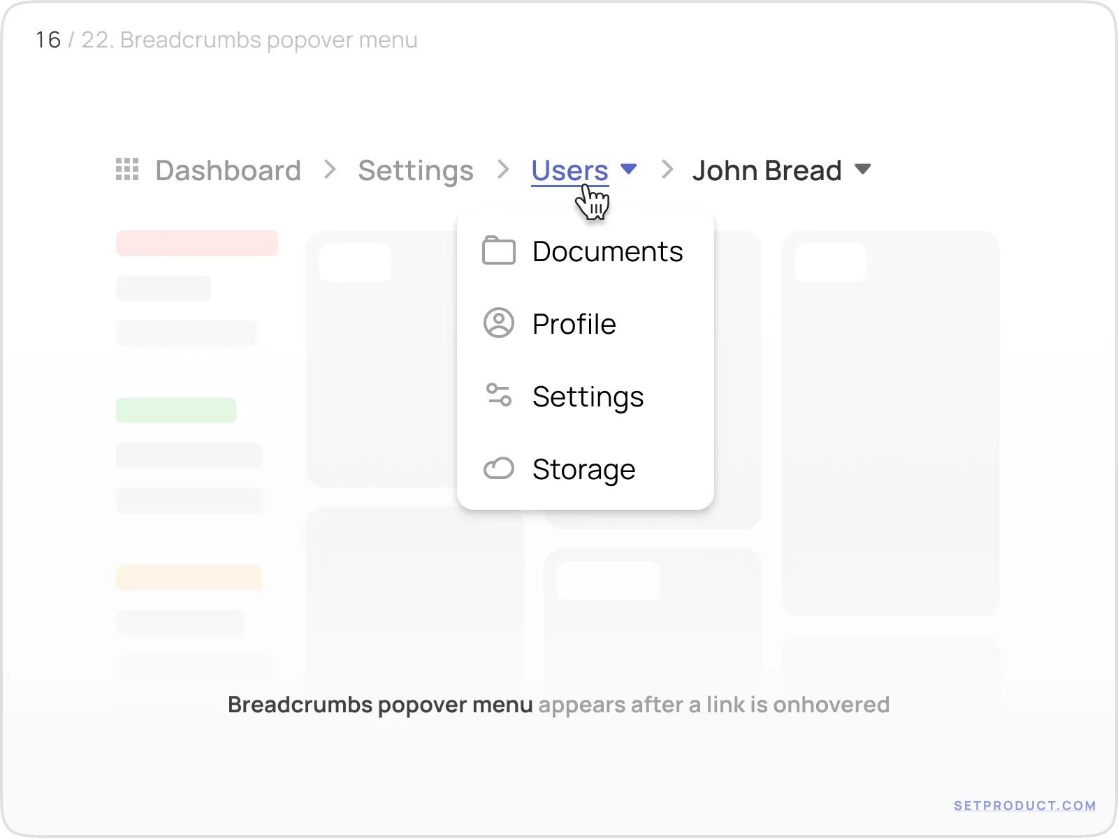
In this view, hovering over the "Users" item opens a menu with all available user-related pages. It’s fast, frictionless, and works well with pointer devices.
Caveats:
- Avoid hover menus on mobile (tap target confusion)
- Don’t replace the link’s primary action - clicking should still work
- Add a slight delay to avoid flickering or misfires
Hover popovers are power-user features. Keep them discoverable but optional; they shouldn’t block core flows.
Overflow, truncation & responsive design
Truncated breadcrumbs with ellipsis popover
In complex apps with deep navigation trees, you can’t always show the full breadcrumb path (especially on smaller screens). In such cases, you can collapse the middle items into a dropdown (commonly represented as “...” or an ellipsis).
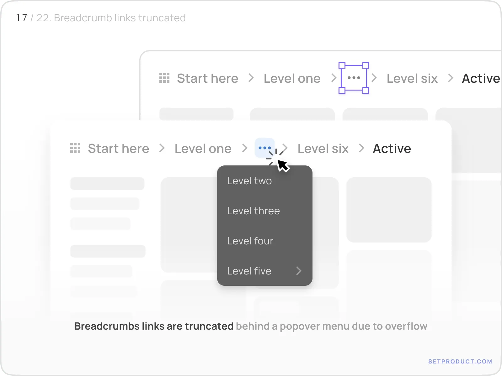
Clicking the ellipsis opens a menu with the skipped levels. This keeps the layout clean while still offering full navigation when needed.
The key here is discoverability. Use a clear icon (like "…") and show a tooltip like “More” or “Expand path” on hover or focus.
Long breadcrumb labels with hard truncation
Sometimes the issue isn’t depth, but label length.
Long names: like project titles, file names, or organization names - break layout or wrap awkwardly.
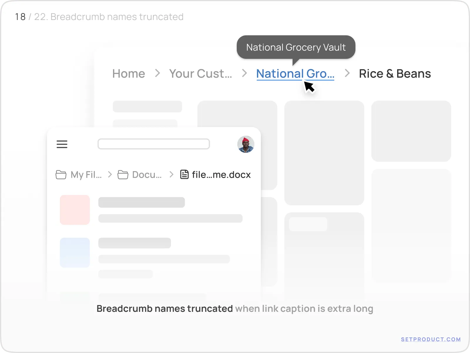
This example shows truncated text like “National Grocery Vault” with ellipsis. It looks clean, but it’s critical to include:
- Tooltip on hover
- Full label in aria-label
- Optional expandable view
Don’t sacrifice clarity for clean lines. If a user doesn’t know where “Nat…” leads, truncation failed.
Hierarchical popover with substructure
Advanced implementations may show full hierarchy in a dropdown, allowing users to jump between sibling or parent levels quickly.
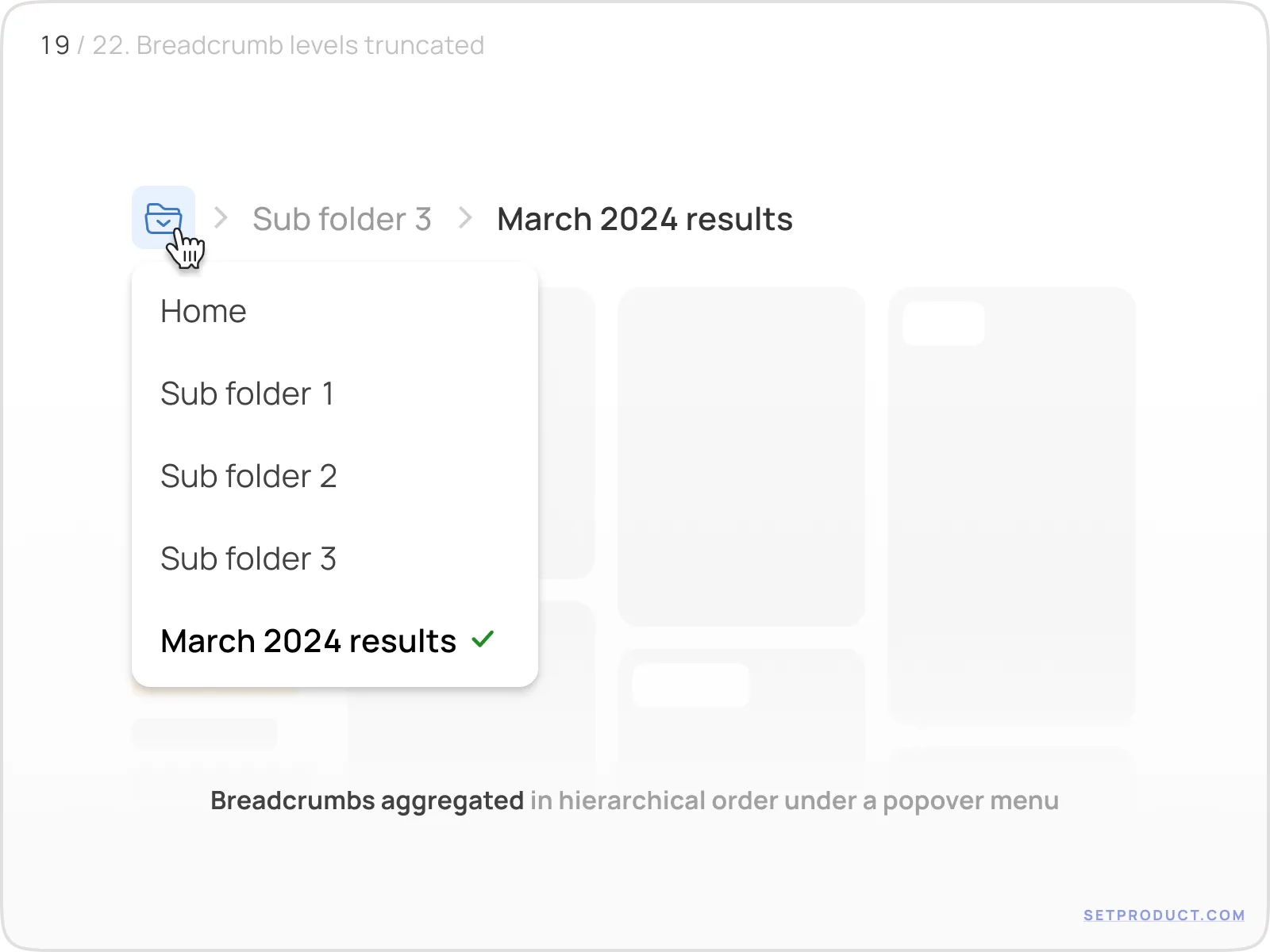
This layout mimics a file system: clicking a breadcrumb opens a structured menu with nested folders or options. It’s especially useful for content-heavy platforms.
Use indentation, icons, or sections to express hierarchy clearly. Without structure, the menu becomes overwhelming.
Mobile-friendly collapsed breadcrumbs
On mobile, space is precious. Breadcrumbs often collapse into a single button or icon, opening a vertically stacked list.
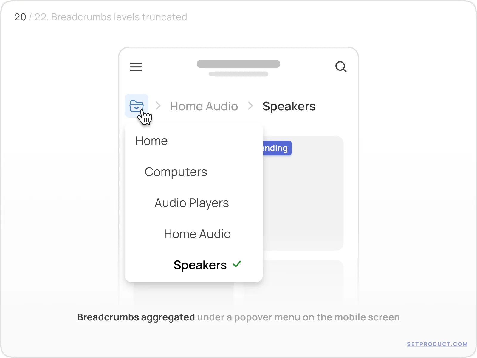
This solution preserves clarity without taking up horizontal space. But beware:
- Tap targets must be large enough
- The trigger icon must be recognizable
- Don’t hide the current page
Breadcrumbs on mobile should act like a backstack: giving users a quick escape route, not just a full path.
Styling with design tokens & themes
Tokens for color consistency
Modern design systems rely on tokens, semantic labels for colors like primary-600, gray-100, or accent-background. Applying tokens to breadcrumbs makes them easy to theme, update, and scale across different contexts.
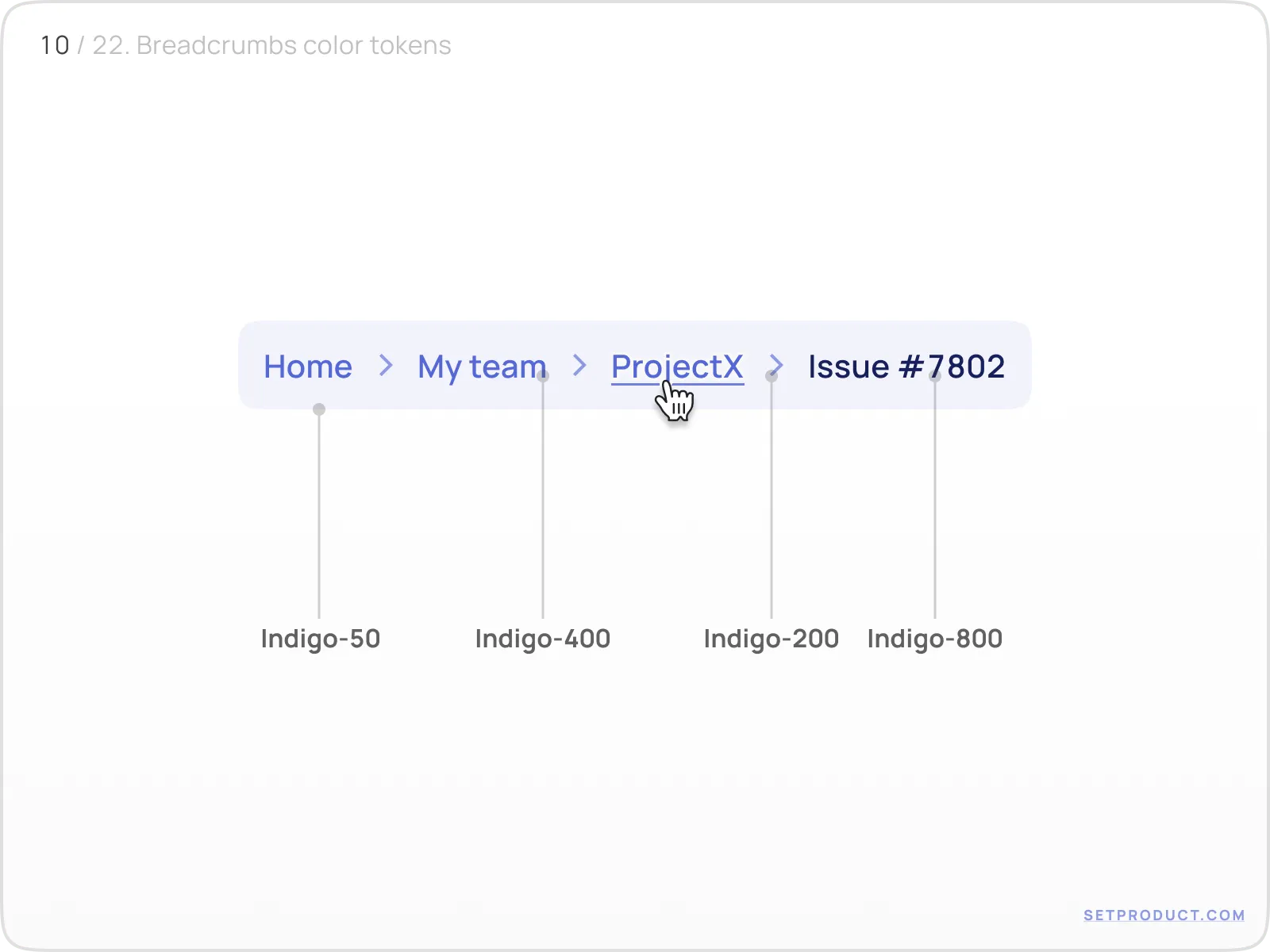
This visual showcases a full breadcrumb path styled with Indigo tokens:
Indigo-50 background
Indigo-400 text for normal state
Indigo-800 for active item
Using tokens ensures consistency across dark/light modes, brand variations, and components.
When breadcrumbs inherit from global tokens, they adapt effortlessly, making them low-maintenance across multiple products.
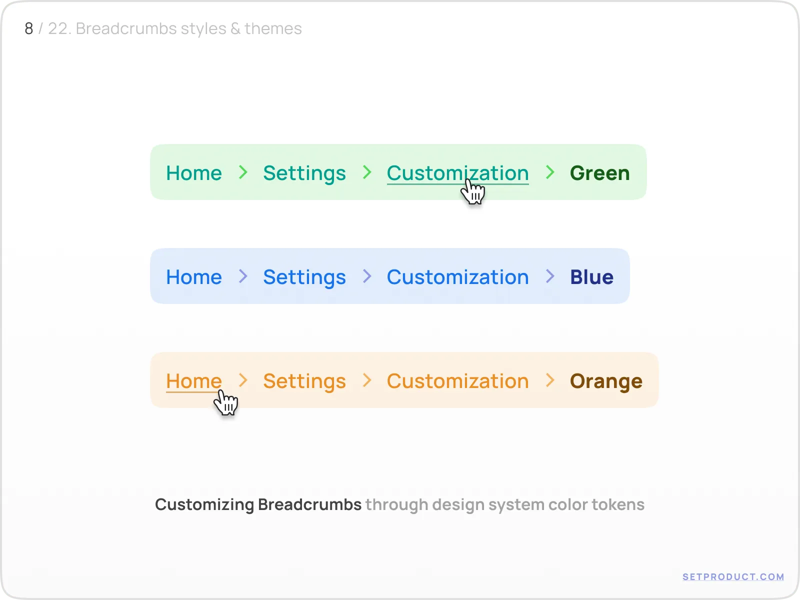
Theme application across UI systems
Tokens are powerful, but they shine brightest when applied consistently across themed layouts.
For example: SaaS dashboards in green, analytics tools in blue, creative spaces in purple - all with breadcrumbs following the brand tone.
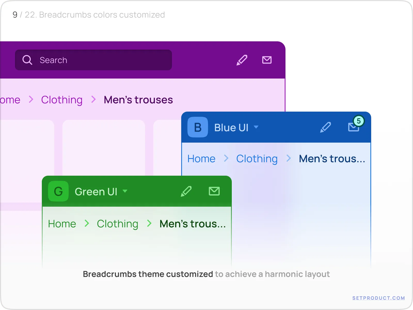
Each variation uses the same component structure but swaps token values to match the overall app palette.
Color isn’t just decoration, it communicates familiarity. Breadcrumbs should feel like they “belong” to the interface.
Token palettes as visual references
A simple grid of color combinations, like in this example, can help developers and designers align quickly on styling rules.
Tokens here include Green-100, Green-400, Green-800, etc. Having a token sheet improves collaboration, especially when breadcrumbs must match buttons, tabs, or page headers.
Include breadcrumb tokens in your system docs. It saves everyone time.
Functional UI add-ons
Breadcrumbs with dismiss buttons
Breadcrumbs sometimes reflect applied filters or search context and in such cases, being able to remove a level manually enhances control.
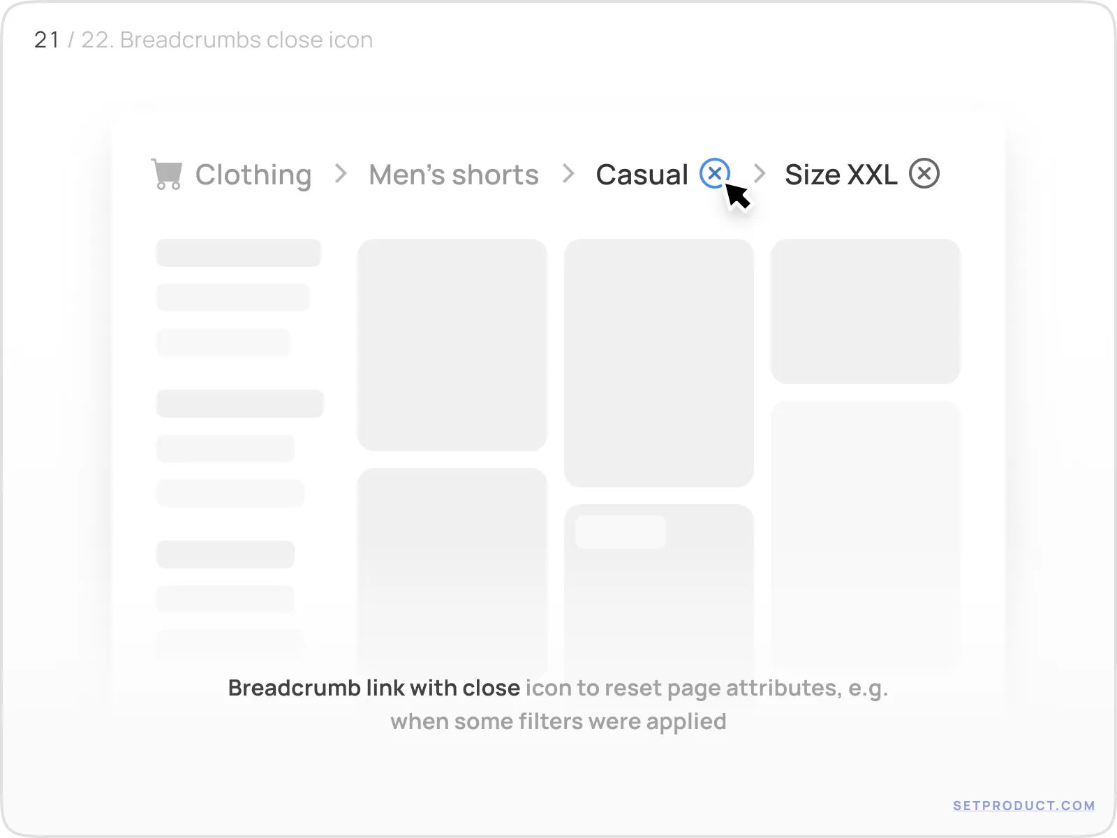
Here we see an “X” (close icon) next to each breadcrumb item, allowing the user to cancel that filter or tag. This is especially useful in:
- Ecommerce filtering
- Analytics dashboards
- Query-based UIs
Give the user full control, let them remove what they added.
Breadcrumbs with status indicators (badges)
Breadcrumbs don’t just show location - they can also communicate state. Adding badges for new items, notifications, or alerts makes navigation more informative.
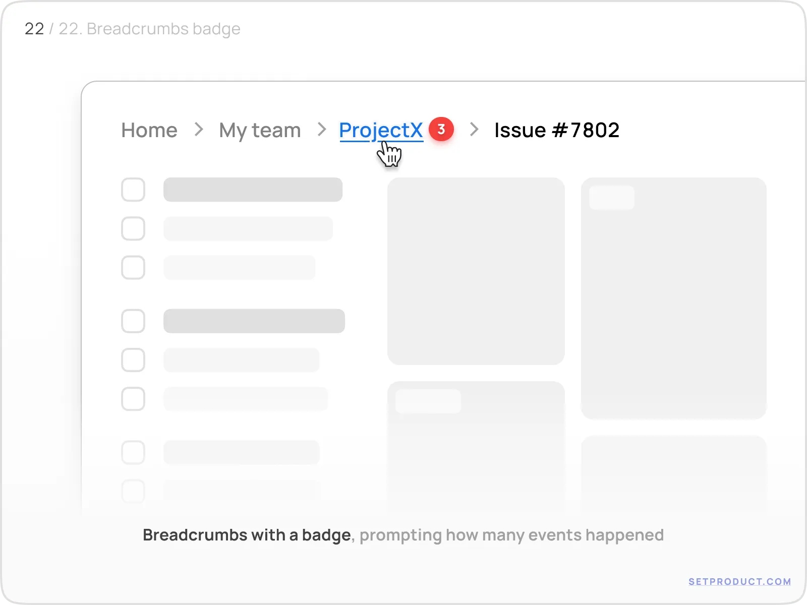
This layout shows small counters or colored dots indicating updates, unread items, or pending actions inside each breadcrumb segment.
Use cases:
- Notification centers
- Email or message threads
- Multi-step processes with dynamic states
Don’t overdo it: one or two signals are enough. Too many badges = stress.
Usability tips to make your breadcrumbs feel effortless
Start with “Home” : users expect a safe starting point
Don’t skip hover/focus/active states : even in minimalist designs
Match breadcrumb tone to UI tone : corporate, playful, minimal, vibrant
Truncate carefully : and always add tooltips for cut-off names
Never rely on color alone : use text weight or icons too
Ensure full keyboard support : use tabIndex, aria-current, and visible outlines
Collapse breadcrumbs on mobile, not remove them : they’re still valuable in small spaces
❓ Breadcrumbs Q&A
What is breadcrumb navigation in UI design?
Breadcrumbs are a secondary navigation pattern that shows the user’s current location in a hierarchy. They help users backtrack easily and understand context inside apps or websites.
Should the last breadcrumb be clickable?
Usually no. The last breadcrumb represents the current page or state and clicking it again does nothing useful. Exceptions: if it opens a dropdown or context menu.
What is the best separator to use in breadcrumbs?
The most common is the chevron (›), followed by the slash (/). Pick one that matches your visual tone and keep it consistent. Always give separators space and don’t let them crowd the text.
How to handle breadcrumbs on mobile devices?
Collapse the path into a single icon or menu button that expands into a vertical list. Never rely on horizontal scrolling alone, it's easy to miss levels that way.
Can breadcrumbs have dropdowns or popovers?
Yes, breadcrumbs can open menus on click or hover, especially when used for workspaces, file systems, or user roles. Just make sure it’s clearly indicated (with an arrow or visual cue).
How to style breadcrumbs using design tokens?
Use semantic tokens like text-secondary, link-hover, or container-soft so that your breadcrumbs adapt to themes without needing manual updates. This is essential for scalable systems.
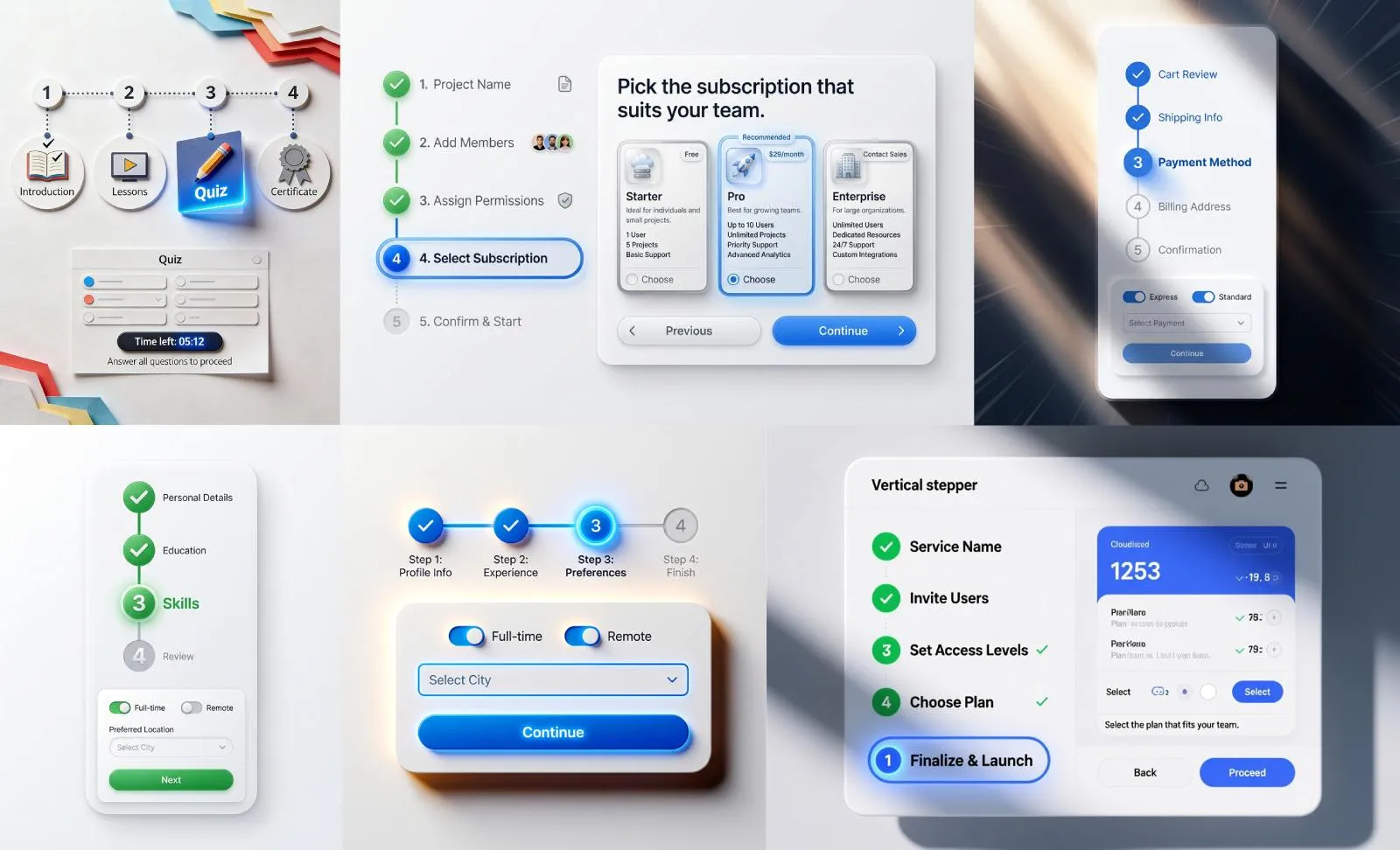
What’s the difference between breadcrumbs and steppers?
Breadcrumbs show location, steppers show progress. Use breadcrumbs for free-form exploration, and steppers for fixed, linear flows (like onboarding, checkout, or multi-step forms).


