Roman Kamushken
Introduction to pagination UI design
What is pagination?
Pagination is the process of dividing large sets of content: like search results, product listings, or data tables, into discrete pages. It’s a foundational UX pattern that helps users navigate sequentially or jump directly to specific sections of a dataset.
Why does it matter?
In an era of endless content, pagination prevents overwhelm by breaking information into manageable chunks. It improves performance (loading smaller data batches), guides user focus, and ensures accessibility for screen readers and keyboard-only navigation.
Done poorly, it confuses users. Done well, it becomes invisible - users just get where they’re going.
Why pagination isn’t optional
Imagine scrolling through 500 product listings without breaks. Users abandon sites that overwhelm them. Pagination isn’t just a feature, it’s a usability lifeline. It’s also a SEO tool: clear pagination helps search engines index your content properly.
Use pagination for structured, SEO-critical content (tables, e-commerce) and lazy-load for dynamic, endless browsing (social feeds, galleries).
What is lazy-load?
Lazy-loading is a technique where content loads incrementally as the user scrolls. Unlike pagination, it doesn’t split content into numbered pages but instead loads items “on the fly.” Think of social media feeds or endless product grids.
Let’s explore the rest to master design patterns for both approaches.
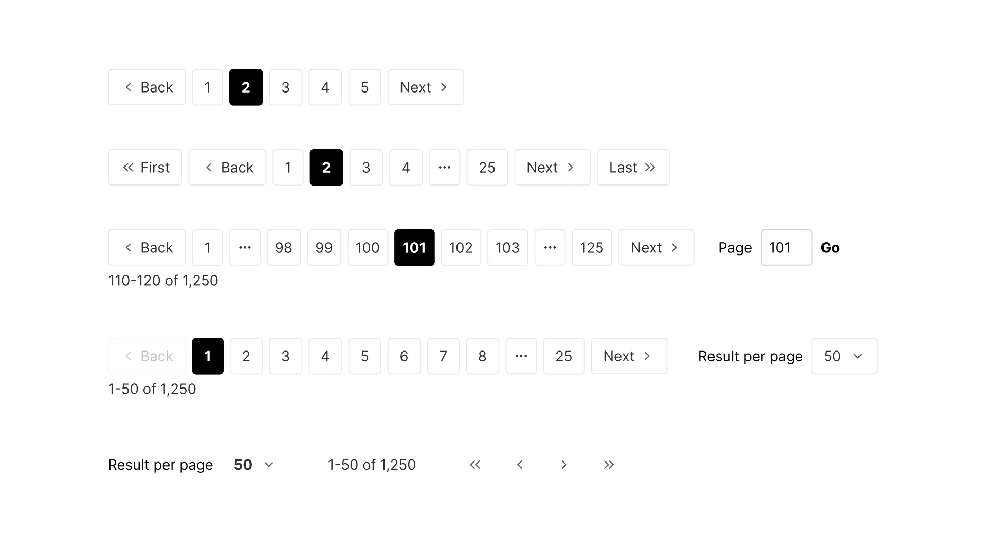
Andrew Coyle designed a better pagination. Duplicate in Figma
Pagination anatomy: Building the foundation
Core elements every pagination must include:
Previous/Next navigation
Always include Prev and Next buttons. Use arrows (‹/›) or text labels like “Previous” or “Next.” Material UI pagination component uses icons with fallback text for screen readers.
Page numbers
Display sequential numbers for quick jumps. Bootstrap recommends showing 3–5 pages around the current page. Truncate longer lists with ellipses (…) to avoid clutter.
Current page indicator
Highlight the active page with color, bold text, or a border. Pajamas Design System uses a different background to make it stand out.
Total pages/Items count
Add a helper text like “Page 2 of 50” to give context. This reduces confusion, especially on long lists.
Truncation
When pages exceed 10+, hide middle numbers. The … symbol indicates skipped pages. For example: 1 2 … 10 11 12 Next.
Pagination Best Practices by Uxcel.
Learn how to bunch content in logical groups using pagination best practices
Pagination anatomy UI design nuances:
Do’s
1. Maintain consistent spacing between elements. Keep equal gaps between page numbers, buttons, and truncation symbols. Uneven spacing disrupts rhythm and makes the UI feel unpolished.
2. Align pagination to the bottom or center of the content. For tables or grids, place pagination at the bottom of the viewport so users can scroll down and see it immediately. For sidebars or narrow layouts, center-align elements to avoid awkward gaps.
3. Test truncation on small screens. On mobile, truncate aggressively to prioritize the most critical elements. Hide middle pages entirely and show only Previous 1 … 10 Next to prevent overcrowding.
Don’ts
1. Don’t overcrowd the pagination area. Avoid packing too many elements (e.g., page numbers, input fields, and buttons) into a single row. This creates visual chaos. Prioritize core elements first.
2. Don’t use hover effects that shift layout. Subtle color changes are fine, but avoid effects like expanding buttons or sliding animations. Sudden layout shifts disorient users mid-interaction.
3. Don’t hide the first or last page numbers. Users often want to jump to the start or end of a list. Always show 1 and the final page number, even if truncation is enabled.
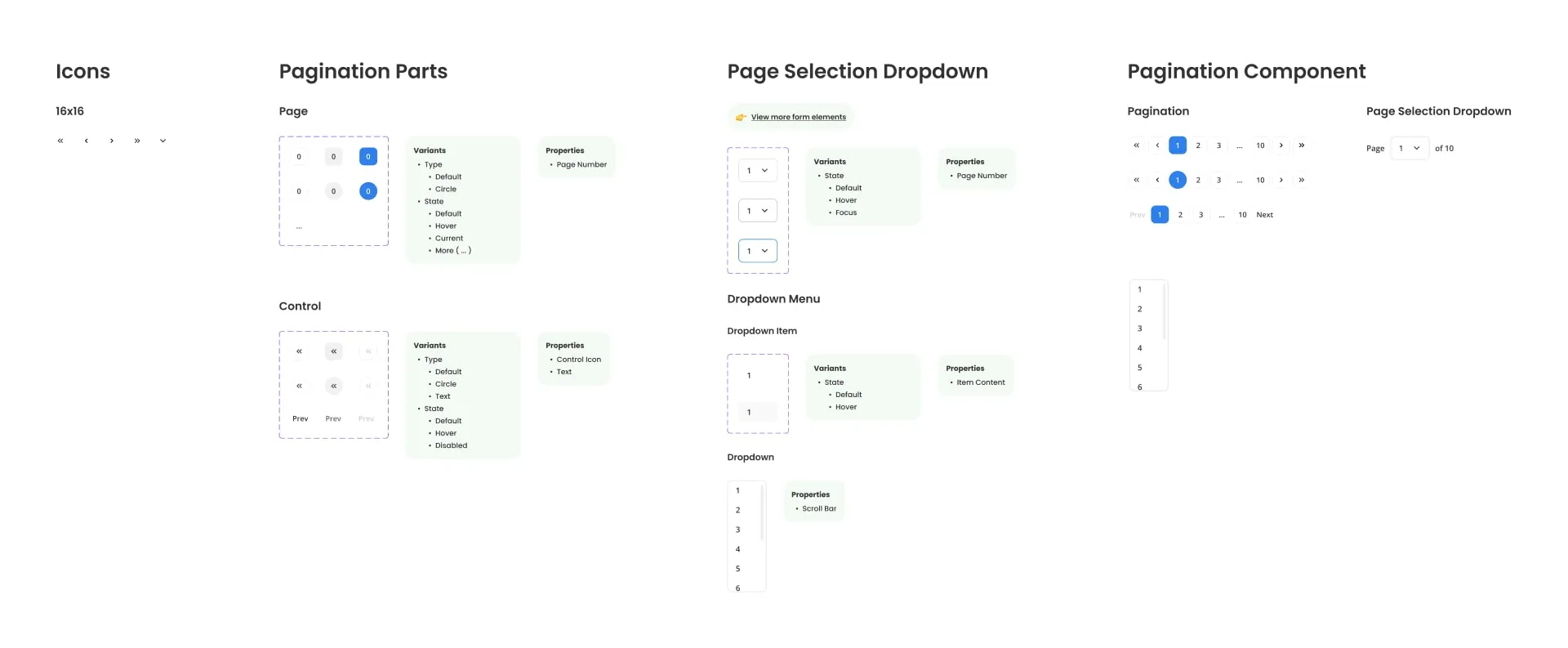
Pagination Collection: Built with auto layout and component properties & variants. Easy to apply & customise. Download from Figma community
States of pagination: Active, disabled, and hover
Design states to guide user actions:
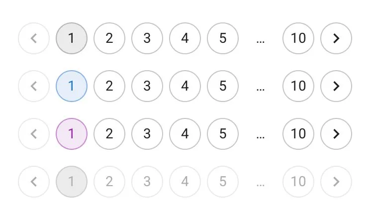
Outlined pagination component variation by MUI
Active state
Highlight the current page to orient users. Use bold text, contrasting colors, or a distinct background. For example, Material UI’s active page uses a colored button with a shadow, while Bootstrap applies a darker shade with bold text. Avoid subtle effects like faint outlines, as users must instantly recognize their position.
Disabled state
Gray out buttons (e.g., Previous on page 1) but keep them visible. Use reduced opacity (40–50%) and remove pointer effects (e.g., cursor: default). Always include aria-disabled="true" for screen readers. Never remove disabled buttons entirely; their presence signals navigation limits.
Hover state
Add subtle interactivity when users mouse over elements. A light background color shift (e.g., from #ddd to #bbb) or a slight drop shadow works well. Avoid drastic changes like sudden enlargements or animated transitions, these can feel jarring.
Focus state
Ensure keyboard users see their position. Outline active elements with a visible border (e.g., a 2px blue outline) or a bold glow effect. Bootstrap’s default uses a dashed outline, but customize it to match your brand’s style.
Loading state
The loading state is used to indicate that the content for the next page is being loaded. This is especially important for infinite scroll or load more button pagination. Use a loading spinner or progress bar to prevent users from becoming frustrated or confused.
Avoid common mistakes: Never hide disabled buttons entirely—users need to know why they can’t go further. Don’t rely on color alone. Use text labels (e.g., “Previous (disabled)”) for screen readers.
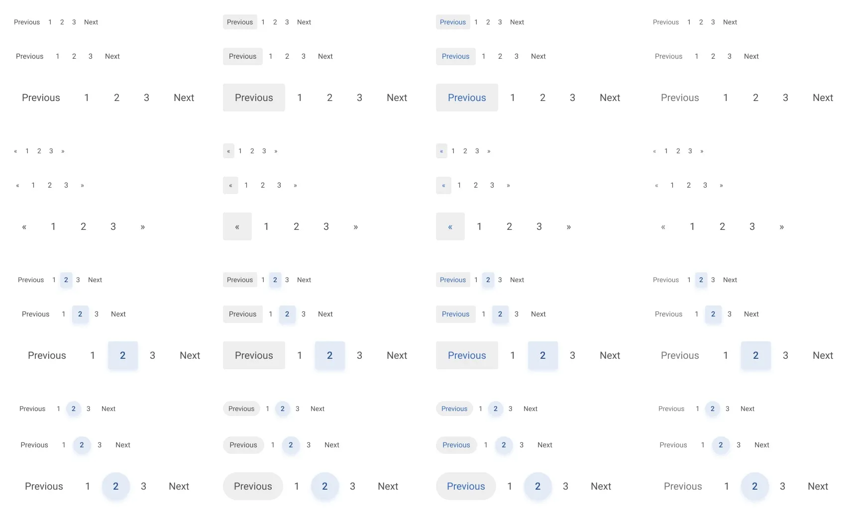
Create Tailwind Pagination in Figma with ease. Duplicate this free template
Types & variations: Offset, keyset, Infinite scroll, and more
Choose the right pattern for your use case:
Offset pagination
When to use: Lists with fixed page counts (e.g., blog posts, e-commerce grids).
Structure: Shows numbered pages, first/last links, and truncation. Example: Previous 1 2 3 … 10 Next.
Pro tip: Always show the first and last page numbers.
Keyset pagination
When to use: Dynamic data (e.g., social feeds, real-time listings).
Structure: Only Prev and Next buttons; no numbered pages.
Why it works: Avoids confusion when new items are added.
Infinite scroll
When to use: Content where users want seamless browsing (e.g., image galleries).
Hybrid approach: Combine with a “Load More” button as a fallback.
Accessibility note: Add visual cues like spinners to show loading.
Compact pagination
When to use: Mobile apps or narrow screens.
Design: Use icons-only (‹/›) and hide text labels. Add tooltips for clarity.
Range-based pagination
When to use: Large datasets (e.g., analytics tables).
Structure: Show page ranges instead of individual numbers. Example: “Page 1–10 of 100”.
Pick the right type:
Tables (Data grids) → Offset pagination with numbered pages.
E-Commerce product listings → Offset or infinite scroll (with “View All” option).
Search results → Offset with truncation and a “Jump to Page” input.
Social media feeds → Keyset pagination.
Admin dashboards → Compact pagination with icons-only.
Blogs/Article archives → Offset pagination. Users expect sequential browsing of dated content.
Forums/Comment threads → Keyset pagination. New comments disrupt fixed page numbers.
Theming ideas: Matching pagination to your visual style
Make pagination visually cohesive:
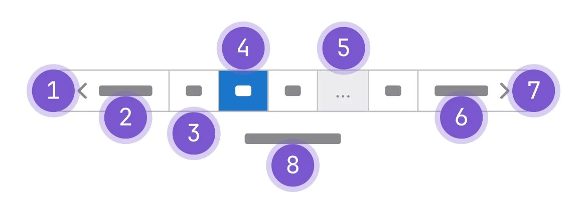
Pagination structure from Pajamas Design System
Styling borders
Borders define the edges of pagination elements. Use them to emphasize or blend with the layout. Solid borders (like Bootstrap’s default 1px solid #ddd) create subtle separation. Experiment with dashed lines for a modern twist or thick borders (2–3px) to make buttons pop. Gradient borders, such as a blue-to-cyan transition, can highlight active pages dynamically.
Shadows & Elevation
Shadows add depth and hierarchy. Material UI uses soft drop shadows on active pages to lift them from the background. Increase shadow intensity on hover to guide interaction. For minimalist designs, skip shadows entirely for a flat, clean look.
Corners & Rounded edges
Corner radiuses influence the UI’s mood. Sharp edges feel bold and industrial—great for tech or corporate brands. Material Design’s default 4px radius creates friendly, approachable buttons. Extreme rounded corners (like full circles) work for playful or creative brands.
Backgrounds & Textures
Backgrounds anchor pagination to your brand. Solid colors (e.g., your brand’s primary color) work well for active pages. Transparent backgrounds offer flexibility for light/dark modes, while subtle textures (gradients, noise) add depth without clutter.
Spacing & Alignment
Whitespace and alignment matter. Leave 10–15px gaps between page buttons for readability. Center pagination vertically to avoid clutter. Add bottom margins (20–30px) to separate it from content.
Text styling
Typography impacts readability and tone. Bold text for active pages contrasts with light/regular inactive text. Use 12–14px for body text, increasing to 16px for labels like “Next.” Uppercase text adds formality; lowercase feels casual.
Dynamic states
Animate states to enhance interactivity. Hover effects like scaling (101%) or subtle shadows guide clicks. Focus states (glowing outlines) help keyboard users. Loading spinners or pulse animations signal transitions.
Design consistency tips
Mirror your website’s header/footer styles. If your header uses rounded corners, apply them to pagination. Sync colors with CTA buttons, for example, make “Next” match an e-commerce checkout button. Use your brand’s spacing system (e.g., 8px grid increments) for consistent padding.

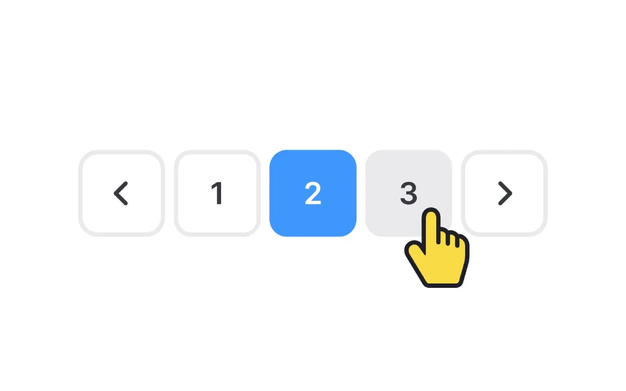
Darin Senneff has themed some fun pagination with a helpful Yeti hand. HTML, JS + GreenSock. View on Codepen
Use cases: Tables, E-Commerce, Search results, and beyond
Tailor pagination to the context by addressing specific user needs and data behaviors:
Tables (Data grids)
Data tables often require precise navigation, especially when sorting or filtering. Users need to audit, compare, or export rows without losing their place.
Design tips: Placement below the table keeps the workflow linear. Users scan the table, then decide to navigate. Rows-per-page selectors let users choose density (e.g., 10/25/50 rows), balancing screen real estate with control over data volume.
Keyset pagination works for real-time logs, as it avoids outdated page numbers when new entries shift the dataset.
Export buttons nearby streamline workflows, letting users download data from specific pages without context switches. This approach ensures users stay focused on tasks like auditing sales data, while dynamic content remains accessible.
E-Commerce product listings
Shoppers expect seamless browsing and quick access to desired items. Pagination must balance usability with conversion goals.
Design tips: Offset pagination with numbered pages reduces guesswork. Shoppers often recall or jump to specific pages (e.g., “Page 3 has that jacket”). Large, tappable buttons (44x44px+) prevent accidental clicks on mobile.
Filters above pagination let users refine results (price, category) without losing their place, keeping pagination tied to filtered subsets.
A “View All” option combines infinite scroll for quick scans with numbered pages for deliberate navigation. This caters to both casual browsers and goal-driven shoppers, ensuring clarity and ease of use.

Pagination component built by Ant Design System
Search results
Users want clarity on result scope and relevance. Pagination must guide them efficiently through vast datasets.
Design tips: Truncated page numbers with “Page X of Y” reduce visual noise while showing progress. “Sort By” options nearby let users reorder results (date, relevance) without restarting navigation.
Combining infinite scroll with numbered pages offers flexibility—users can scan quickly or jump directly to relevant sections. A “Jump to Page” input accommodates users returning to bookmarked results. These elements empower users to refine results without losing their place, enhancing decision-making.
Social media feeds
Feeds are dynamic: new posts, comments, or likes constantly shift content. Pagination must handle volatility without breaking navigation.
Design tips: Keyset pagination avoids numbered pages entirely, letting users scroll backward/forward without confusion caused by shifting page numbers.
A “Refresh” button lets users reload the feed to see new content without resetting their position.
Compact icons (‹/›) save mobile space, paired with tooltips for clarity. This setup ensures users can scroll endlessly on volatile content without disorientation.
Admin dashboards
Dashboards prioritize efficiency. Pagination must save space while enabling bulk actions.
Design tips: Compact pagination with icons (‹/›) keeps interfaces uncluttered in space-constrained panels. Export/action buttons nearby let admins perform bulk deletions or exports without switching contexts.
Range-based pagination (e.g., “Page 1–10 of 100”) reduces button clutter while showing dataset scale. This streamlines workflows for power users managing large datasets.
Blogs/Article archives
Readers expect chronological order. Pagination must reflect time-based content without breaking flow.
Design tips: Offset pagination with date labels (e.g., “Page 3: July 2023”) clarifies content relevance. “Older Posts”/“Newer Posts” labels replace generic Prev/Next, adding context.
Fixed page sizes ensure consistency when readers return, avoiding mismatches. These elements make navigation intuitive, so users know exactly what to expect on the next page.
Forums/Comment threads
Discussions evolve dynamically. Pagination must handle new replies without disrupting navigation.
Design tips: Keyset pagination avoids numbered pages, preventing confusion when new replies shift content. Thread-level pagination separates parent posts and replies. Paginate forum threads on the left, comments on the right.
“Load More” for nested comments pairs infinite scroll with keyset for top-level threads. This avoids broken page numbers and reduces confusion in multi-layered discussions.
Job listings
Job seekers scan quickly. Pagination must surface relevant opportunities efficiently.
Design tips: Filter-driven pagination lets users apply criteria (location, salary) before loading pages, reducing irrelevant results. Preview thumbnails in pagination (“Page 2 includes roles in SF”) guide users to key listings. Bookmarking allows saving pages for later. These features empower strategic decision-making, cutting through noise.
Event Listings
Events are time-sensitive. Pagination must highlight urgency and dates.
Design tips: Date-based sorting prioritizes upcoming events, paginated by month or category. Countdown timers (“Days Until Event”) emphasize urgency. Map integration pairs pagination with spatial context for location-based events. These elements guide users to timely opportunities while enhancing spatial awareness.

An npm React component for truly responsive pagination. Check it out
Usability tips for seamless navigation
Great pagination isn’t just about looks - it’s about making navigation intuitive, efficient, and frustration-free for all users. Here’s how to refine usability through deliberate design choices:
Clear visual hierarchy is essential for users to recognize pagination elements instantly. Contrast and color play a key role: let page numbers and buttons stand out from the background. High contrast (e.g., dark text on light backgrounds) makes elements readable at a glance. Highlight the active page with bold text, color, or a border to make it unmistakable. Placement matters too: position pagination consistently below the content it controls, avoiding scattered layouts that confuse users.
Predictable behavior builds trust. Users should know exactly what happens when they click a button. Use familiar terms like “Next” or “Previous” instead of vague icons. If arrows (‹/›) are necessary, pair them with text labels or tooltips to clarify their purpose. During page transitions, add spinners or progress bars to signal loading. This avoids frustration from unresponsive clicks. Visualize hover/focus states (e.g., a button’s background darkens on hover) to confirm interactivity and guide users toward actionable elements.
Mobile-friendly design is non-negotiable. Small screens demand careful optimization. Tap targets must be at least 44px × 44px (Apple’s touch target guideline) to prevent accidental clicks. On mobile, use icon-only buttons (‹/›) to save space, but add tooltips or hover text for clarity (e.g., showing “Next Page” when users interact). Center pagination vertically on mobile devices to keep it within thumb reach, ensuring effortless interaction without awkward scrolling.

AngularJS - Pagination Example with logic like Google. View on Codepen
Contextual navigation reduces confusion. Help users understand their position in the content flow by including page range labels like “Page 2 of 50.” This gives context and shows how much content remains. Pair pagination with filters or sorting options (e.g., “Sort by Price” above pagination) so users can refine results without resetting their navigation. For hierarchical content, add breadcrumbs (e.g., “Home > Products > Electronics”) alongside pagination to reinforce their location within the site structure.
Error prevention minimizes frustration. Gray out unavailable buttons (e.g., “Previous” on page 1) instead of hiding them entirely. This avoids confusion when users click empty spaces. Validate inputs for “Jump to Page” fields to prevent invalid entries, displaying an error message like “Page 100 doesn’t exist.” For irreversible actions (e.g., deleting a page of data), include confirmation dialogs or “Undo” buttons to reduce mistakes.
Consistency across platforms builds familiarity. Apply the same pagination logic to all data-heavy sections, if a table uses keyset pagination, extend this pattern to admin dashboards or forums. Ensure transitions adapt smoothly to screen sizes, testing how pagination shifts from desktop to mobile layouts. Maintain global styles: use consistent typography, colors, and spacing for pagination across all pages so users feel grounded in your interface.
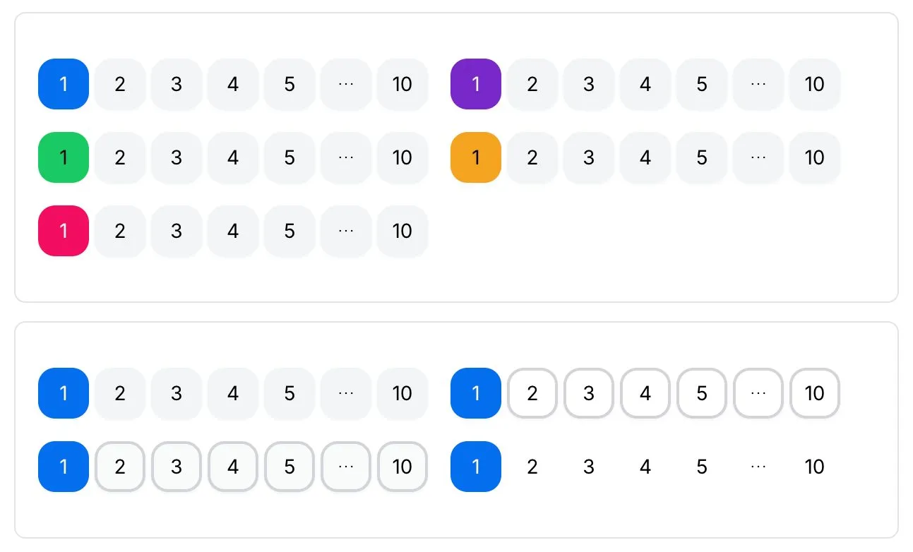
Pagination component styles and themes from Hero UI
Reduce cognitive load by simplifying choices. Limit visible page numbers to 3–5 with ellipses (…) to avoid overwhelming users. Auto-update filters instantly when users refine a search - avoid making them click “Apply” repeatedly. Prioritize primary actions by making “Next” and “Previous” larger or more prominent than numbered pages.
Cultural and language awareness ensures inclusivity. For right-to-left languages (Arabic, Hebrew), reverse pagination direction (e.g., “Next” on the left). Use translated terms (e.g., “Siguiente” for Spanish users) instead of hardcoded English text. Avoid ambiguous icons. Opt for clear labels like “Next” over region-specific symbols.




.webp&w=1920&q=75)
.webp&w=1920&q=75)
.webp&w=1920&q=75)
.webp&w=1920&q=75)
.webp&w=1920&q=75)
.webp&w=1920&q=75)
