


Roman Kamushken
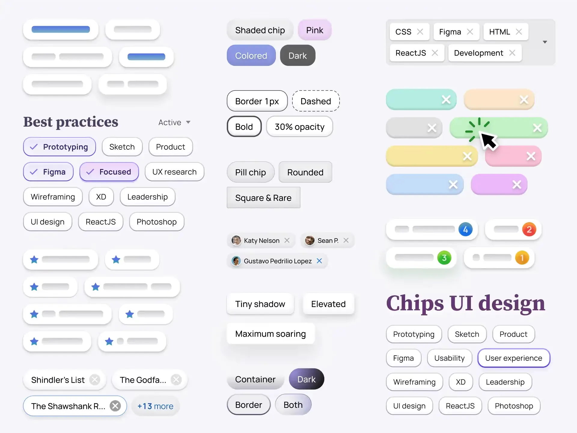
Chip — is a small, interactive component that serves as a visual representation of a specific input of attribute or an action. Also known as a Tag or Badge, a Chip typically consists of a simple shape or container with succinct text or an icon, often accompanied by additional visual cues or status indicators.
Chips are commonly used to showcase various types of content, such as categories, labels, status tags, or product attributes. By allowing users to click or tap on them, Chips can trigger actions, facilitate filtering options, or display more item's details.
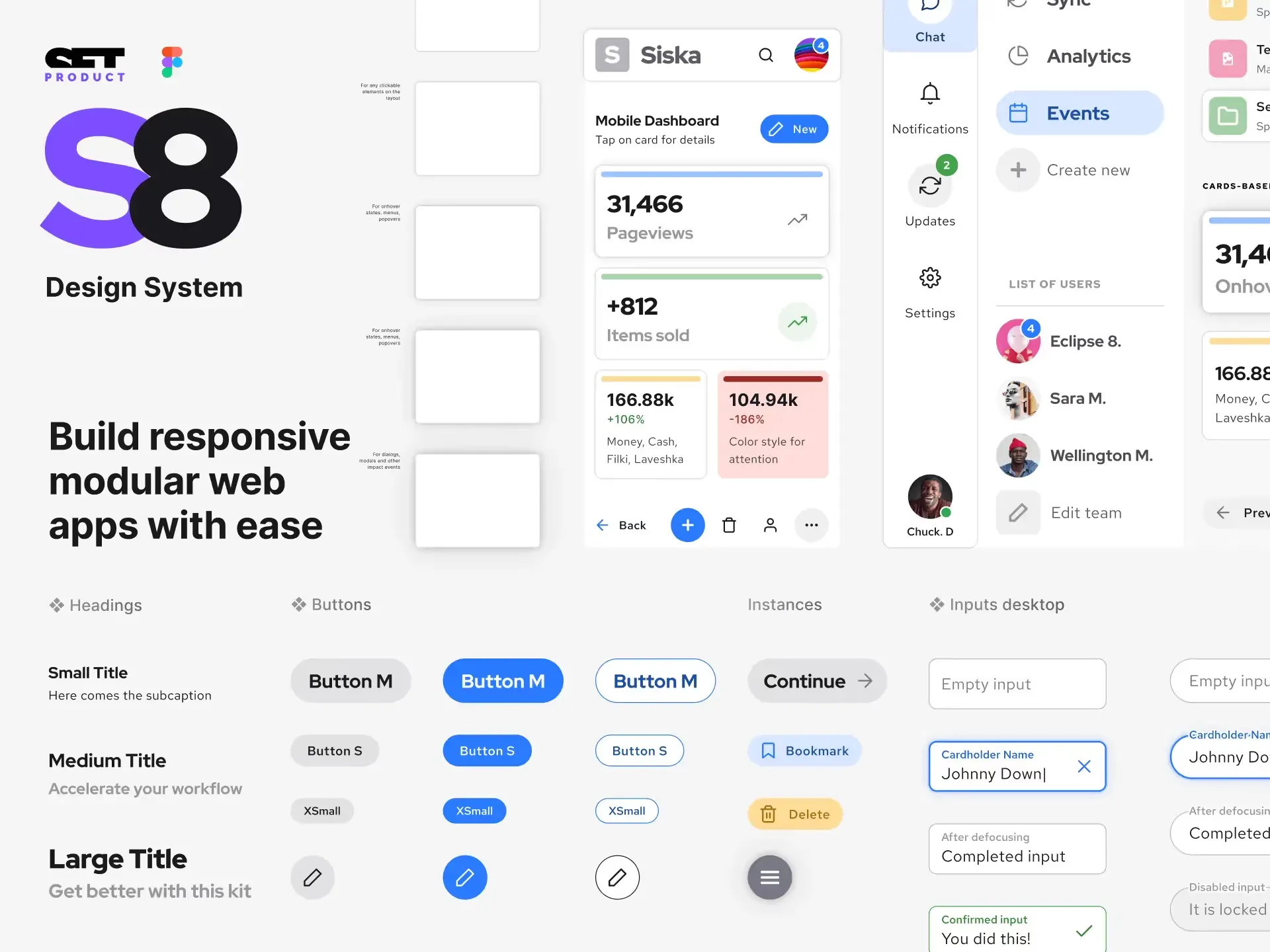
By the end of this UI design tutorial, you will have a solid understanding of how to create visually appealing and user-friendly Chip components that enhance the overall experience of your application.
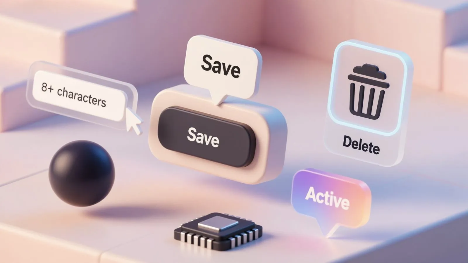
Chips Anatomy
Chip Container

Definition: The outer boundary or container that encapsulates the Chip's content, including the label, icon, and other optional elements.
Purpose: The container provides a visual frame around the Chip, separating it from other elements on the UI. It creates a distinct visual presence for the Chip and ensures its content stays contained within a designated space.
✍ Design tip: Ensure that the container has sufficient padding around the Chip's content, allowing it to breathe and not feel cramped. Proper spacing adds visual balance and readability to the overall Chip design.
Label

Definition: The primary text or label that represents the content or category associated with the Chip.
Purpose: The label provides information about the Chip's context, allowing users to quickly identify the purpose or meaning of the component.
✍ Choose a font and its size that is legible, considering factors such as readability at different sizes and alignment with the overall design system. Additionally, pay attention to the color contrast between the label and the Chip's container BG color to ensure accessibility.
Border

_Definition_: A visible line or stroke around the Chip's container, separating it from the surrounding interface elements.
Purpose: The border helps define the boundaries of the Chip visually. It provides a clear separation between the Chip and other adjacent elements, improving its visibility and ensuring a visually consistent layout.
✍ Experiment with border thickness and color to find the right balance. Opt for subtle borders that don't overpower the overall Chip design. Consider using different border styles, such as dashed or dotted stroke, to add a touch of elegance or match the UI visual style.
Icon

Definition: An optional visual element that accompanies the label, typically represented as a small symbol or image.
Purpose: Icons can enhance Chip's visual representation, providing additional context or reinforcing the label's meaning. They can be used to convey information quickly and enhance the overall visual design.
✍ Use icons that are clear, simple, and easily recognizable. Avoid overly complex or abstract icons that could confuse users. Consistency in icon style throughout the interface ensures a cohesive visual language.
Close/Remove Button

Definition: A small clickable element, often represented by an "x" symbol, placed within or close to the Chip.
Purpose: The close or remove button allows users to remove/delete the Chip. It provides a convenient way to deselected the Chip, especially in scenarios where multiple Chips can be selected and deselected.
✍ Ensure the close/remove button is visually distinguishable from the rest of the Chip. Use appropriate sizing, color, and hover state to make sure it stands out as an interactive element.
Userpic
Definition: An optional visual element that represents an avatar or profile picture associated with the Chip.
Purpose: Userpics personalize the Chip and can provide additional context or identification for the content represented by the Chip.
✍ Pay attention to the size and positioning of the userpic within the Chip. Ensure that the userpic is visually aligned with other elements and appropriately sized to maintain visual balance. Consider using circular or rounded userpics to match the Chip's overall visual style.
Counter

Definition: An optional visual element that displays a numerical value or count associated with the Chip.
Purpose: Counters can provide additional information or contextualize the content represented by the Chip, such as showing the number of unread notifications or items selected.
✍ Make sure the counter is legible and easily visible within the Chip. Choose an appropriate font size, color, and BG contrast to ensure the counter stands out without overwhelming Chip's content.
Chip States
Default State

The default state of a Chip represents its normal, unselected state and is used to display tags or labels for categorization or filtering options.
Recommendations:
- Ensure visual distinction from other states.
- Use a solid background color or outline.
- Include appropriate typography and iconography.
Hover State

The hover state of a Chip provides clear feedback when users hover over it, enhancing the user experience by indicating an interactive element.
Recommendations:
- Triggered when users hover over the Chip.
- Implement a subtle visual change to indicate interactivity.
- Change the background color, add shadow effect, or increase brightness.
Selected State
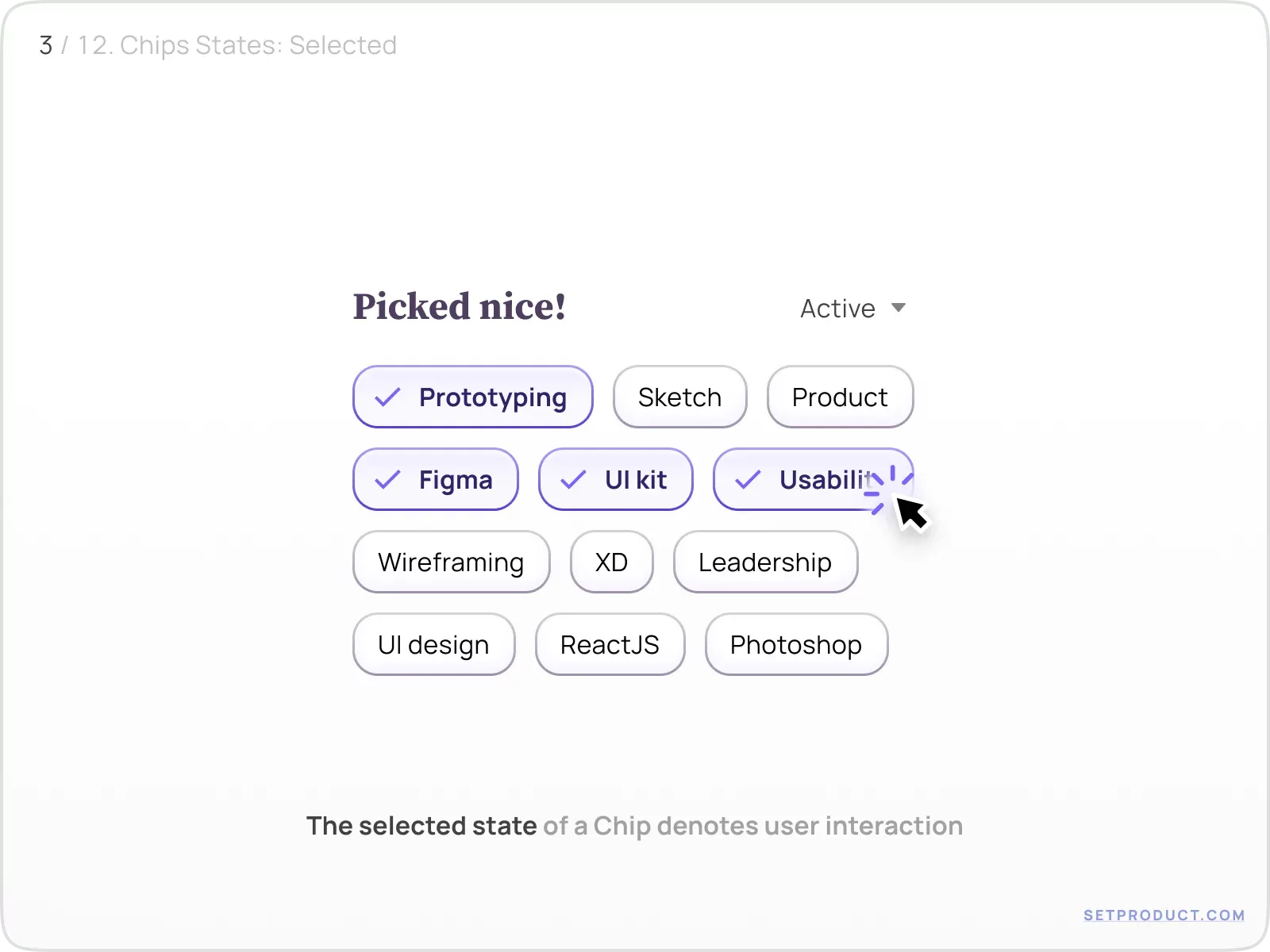
The selected state of a Chip indicates that the user has interacted with it. Use Case: Indicating active filters or selected options in a search/filter system.
Recommendations:
- Consider using a different background color.
- Add a checkmark or icon overlay to highlight selection.
- Change border or outline style to indicate active state.
Disabled State
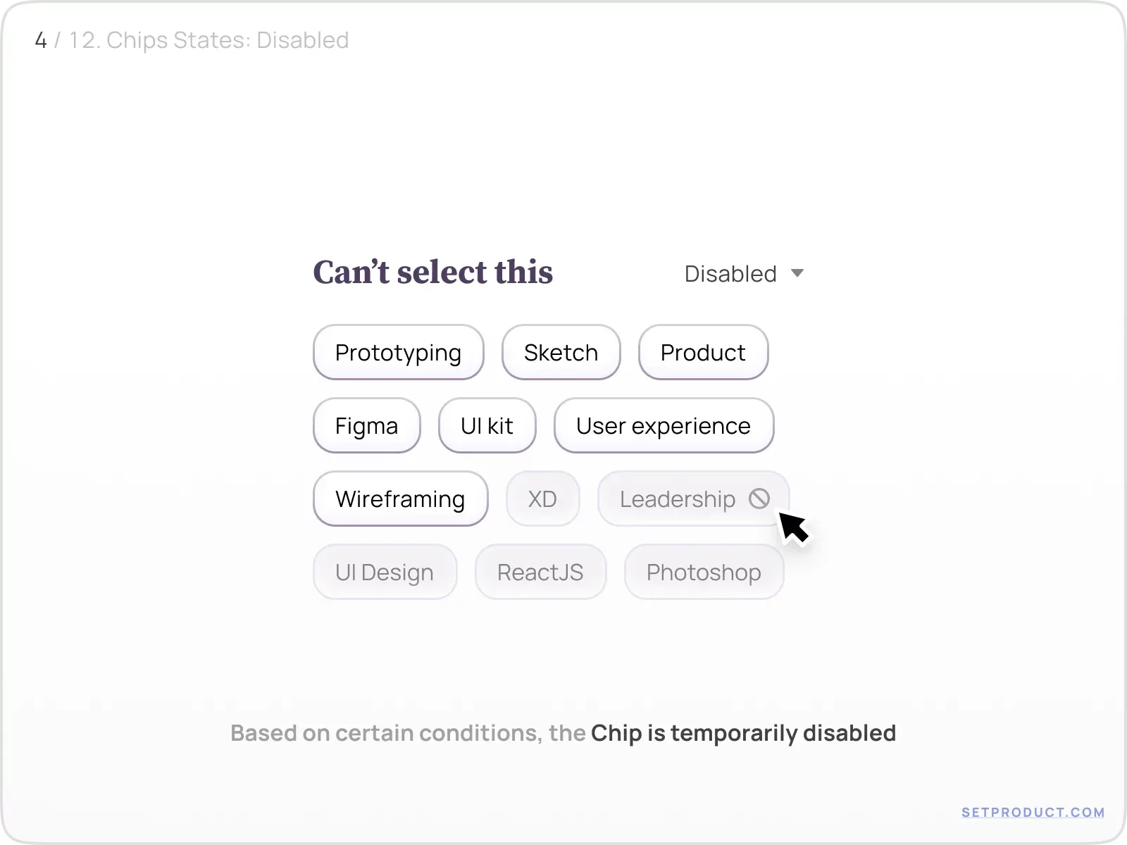
The disabled state temporarily disables the Chip based on certain conditions. Use Case: Indicating that a Chip is inactive or unavailable for interaction.
Recommendations:
- Visually respond to indicate inaccessibility.
- Use a muted color palette or reduced opacity.
- Implement a specific disabled state icon.
- Provide tooltip to explain the reason for the disabled state.
Active State
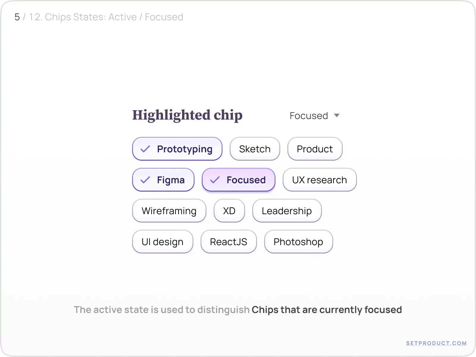
The active state differentiates Chips that are actively selected or focused. Use Case: Facilitating multi-select functionality or indicating current user input.
Recommendations:
- Highlight actively selected or focused Chips.
- Use a brighter color or increased border thickness.
- Include an active state icon or indicator.
Chips Customization
Background Fill

Purpose: Background fill refers to changing the color or pattern of the Chip's background. By customizing the background fill, graphic designers can achieve visual coherence, draw attention, or create contrast.
Goals: The goal of customizing the BG of a Chip is to establish visual hierarchy and enhance its prominence. By selecting a contrasting color or specific fill for the background layer, designers can make Chips stand out and draw attention to important information or actions.
Risks❗ Using a background fill that is too vibrant or distracting can overwhelm the UI and hinder overall readability. It's essential to maintain a balance between the Chip's appearance and its functional purpose.
Border Style

Purpose: Border style customization involves modifying the thickness, color, and border radius of the Chip. By adjusting it, designers can add meaning, indicate purpose or state, and a touch of elegance to Chips.
Goals: Customizing the border style of a Chip allows to define its shape and provide a distinct visual representation. By choosing different border thicknesses, styles, or opacity, designers can create Chips that convey specific conditions or contexts.
❗Overemphasizing the border style may result in a visually heavy or busy appearance that distracts from the Chip's content. Strike a balance between the border style and the Chip's functionality to ensure usability.
Corner Radius

Purpose: Corner radius customization involves adjusting the roundness of a Chip's corners. By modifying the radius, designers can create a softer, approachable visual style to align with the whole UI's theme.
Goals: Adjusting the Chip's corner radius allows designers to create different visual personalities, from sharp and angular to soft and rounded. This styling method helps to align it with the app's design language.
❗ Extreme corner radius values can result in visually unbalanced Chips that feel out of place within the UI. It's important to maintain consistency and coherence throughout the design when tuning corner radius.
Using Shadows

Purpose: Attaching shadows to Chips can create depth, hierarchy, and elevation effect. Shadows provide an illusion of soaring and enhance the overall Chips exterior.
Goals: Adding shadows to chips helps create visual separation between the component and surrounding space. This effect can enhance the Chip's position and afford a more tactile and interactive feeling.
❗ Overusing shadows or applying them incorrectly can result in a cluttered or confusing interface. Choose wisely the size, intensity, and positioning of shadows to achieve the desired effect without overpowering the chip's content.
Adding Gradients

Purpose: Introducing gradients to Chips can add depth, visual dynamics, and a touch of sophistication to their appearance. Gradients can be used to capture attention, convey emotion, and harmonize with the UI design.
Goals: Incorporating gradients into Chips allows to add depth, dimension, and visual interest. Gradients can create a sense of energy or vitality, making chips visually engaging the overall aesthetic appeal.
❗ Using gradients excessively or applying them inappropriately result in a chaotic UI. Maintain a balanced and harmonious composition, ensuring that gradients support the Chip's purpose instead of overpowering it.
Chips Use Cases
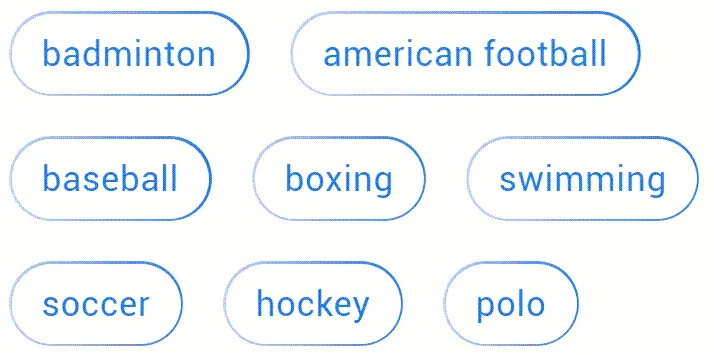
Content Filtering
Purpose: Chips can be used for filtering content by allowing users to select multiple filter options at once, providing a visual representation of the selected filters.
Example: In a booking app, users may be able to filter accommodation options based on amenities like free Wi-Fi, pool, gym, parking, etc. Each amenity can be represented as a Chip, and users can select or deselect each item to refine their search results.

Multi-select Forms
Purpose: Chips can be used for multi-selection scenarios where users need to choose multiple options from a predefined set.
Example: UI design software application that allows users to select multiple colors for a graphic design project. In this case, the user needs to choose from a range of colors to represent the Chips in the design.
Tagging
Purpose: Chips can be used as tags to categorize or identify content. They provide a visual representation of attributes associated with the content.
Example: A task management application where users can tag their tasks with labels like "Important," "Urgent," or "Completed." Each tag is represented as a Chip, allowing users to easily identify and manage their tasks.

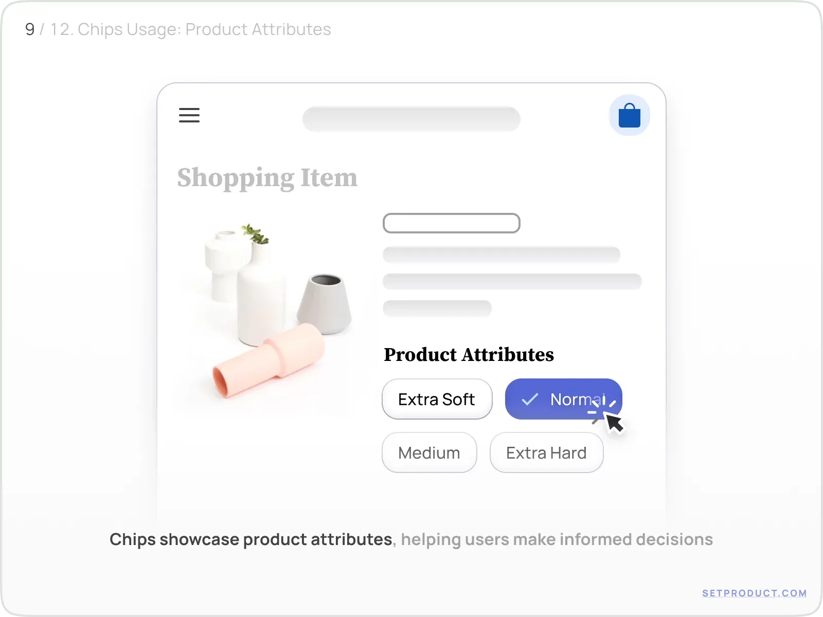
Product Attributes
Purpose: Chips can be used to display and highlight various attributes or specifications of a product, helping users make informed decisions during the selection process.
Example: An e-commerce website section that showcases different product attributes, such as "Camera Quality," "Battery Life," and "Storage Capacity." Each attribute is represented as a Chip, allowing users to compare and prioritize their preferences.
Autocomplete
Purpose: Chips can be used to display autocomplete suggestions as users type in a form field.
Example: A search engine utilizes autocomplete to suggest search queries as users start typing. As users types, a dropdown appears with a list of related search queries based on popular or trending searches, assisting users in finding faster.

Marketing Purposes
Purpose: Chips can be used for marketing purposes to highlight specific attributes, promotions, or features of a product or service. They serve as attention-grabbing visual cues that can entice users to explore or engage further.
Example: A subscription-based streaming service that offers different pricing tiers, such as basic, standard, and premium. Each pricing plan offer represented as a Chip, displaying the social proof, or drawing attention to discounts or exclusive benefits.

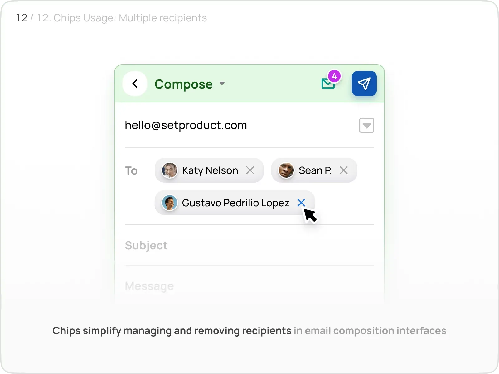
Multiple Recipients
Purpose: Chips can be used to display multiple recipients in email composition interfaces, making it easy for users to manage and remove recipients.
Example: An email client where users can add multiple recipients while composing an email. Each recipient's name or email address is converted into a Chip, allowing users to edit or remove recipients individually.
UX & Usability Tips
Size and Spacing

UX Problem: Chips that are too small or closely spaced can lead to difficulties in interacting with them, especially on touch devices.
Solution: Ensure an adequate size and spacing for chips, allowing users to easily tap or click on them. Maintain a consistent size across different screen resolutions to maintain usability.
Use Hover & Active States

UX Problem: Lack of visual feedback when hovering over or interacting with Chips can make the interface feel unresponsive.
Solution: Implement Chip hover and active states to provide visual feedback by changing the background color or applying a subtle animation, when users interact. This reinforces the clickable Chip nature.
Clear Selection State

UX Problem: Unclear selection states can create confusion and lead to users accidentally selecting or deselecting chips.
Solution: Clearly indicate the selected state of chips using visual cues, such as changing the border color, using checkmarks or highlighting the BG. Ensure that it's easy to distinguish between selected and unselected Chips.
Enable Chip Removal

UX Problem: Users may struggle to remove unwanted Chips or feel frustrated when they mistakenly select a Chip.
Solution: Include a clear and accessible close button or an ❌ icon next to each Chip (on hover state), allowing users to easily remove unwanted selections. Consider providing additional confirmation if permanent removal is required to prevent accidental deletions.
Use Micro-interactions
UX Problem: Lack of UI animation when users interact with Chips can leave them uncertain about the actions they have triggered.
Solution: Provide visual feedback on Chip selection, hover, or tap through animations, color changes, or subtle micro-interactions to affirm user actions and enhance an interface response.
Multiline Chip Handling

UX Problem: Long labels or excessive content in chips can cause layout issues or readability problems.
Solution: Implement clear and consistent rules for handling multiline chips. Use truncation, tooltips, or ellipses to indicate that the content exceeds the available space. Consider responsive design approaches to accommodate different screen sizes.
Related links
- Chips in Figma React UI kit
- Tags in Materail X Angular
- Chips in Material You Design System
- Chips in Xela UI kit
- Chips in iOS app design
.webp&w=1920&q=75)
.webp&w=1920&q=75)
.webp&w=1920&q=75)
.webp&w=1920&q=75)
.webp&w=1920&q=75)
.webp&w=1920&q=75)