


.webp)


Roman Kamushken
Introduction
<span class="blog_big-paragraph">A carousel is one of GUI component types. It serves to display a series of different content (such as text or images) in a rotating or sliding way vertically or horizontally.</span>
Its main application is showing various items in a limited space on websites, mobile or desktop apps. There are also other names for carousels: a gallery, a slider, or slide shows.
Website carousel usage in UI design has some advantages and disadvantages, including the following:
Advantages:
- Space-saving: Carousels are designed to display different items in a limited space, thus they are perfect for using in mobile devices or in rooms with restricted space.
- Visual interest: Such components as carousels attract viewers` attention. They make watching the content interesting and interactive.
- Easy to update: Carousel sliders make a great way to keep a webpage or an app constantly updated by exchanging the items to the new ones.
Disadvantages:
- Can be distracting: In case carousels contain too many items or they are too bright, have too much animation, they may dissipate focus. The problem can also be caused by incorrect implementation.
- Not for all sorts of content: They are suitable for a limited number of content types. In case some complicated or too detailed information should be implemented, carousels can be unsuitable.
- Performance issues: Such features as heavy content, a great number of images or the fact that carousels aren`t customized specifically for mobile devices can cause certain performance issues.
What Is A Carousel in Web Design? Carousel Anatomy
A carousel is made of a number of key UI elements. These elements operate together in order to create the experience that users will find attractive and interactive. Here we will isolate these elements and deal with them, outlining what should or shouldn't be done to create the carousels that will work effectively..

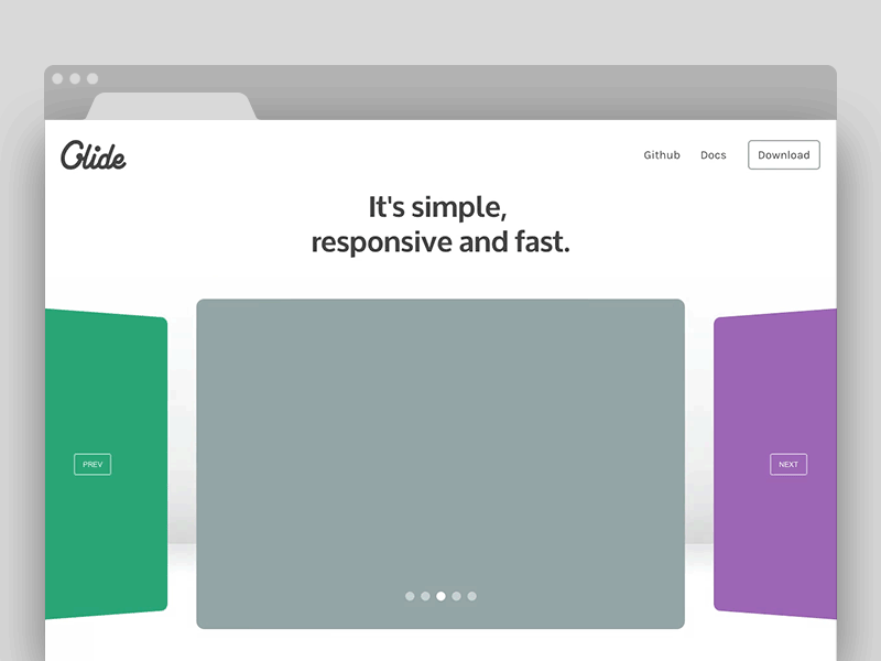
1. Image Carousel/Content Container
It is a crucial element of web design that stores the content that is present in the carousel. The content can include any items, such as text, video, image or any other UI carousel design templates combination.
Do:
- Make sure that the images are of high quality and are comfortably viewed on different devices.
- Optimize the content for various sizes of both screens and devices in general.
Don't:
- Implement or create low-quality images that can have a bad influence on the user's experience.
- Overcrowd the container with too much content, making it difficult to view.
2. Navigation Controls (Arrows, Dots, etc.)
Dots, arrows and thumbnails are the most popular navigation controls when designing a slider gallery. Overall, navigation controls are the items that give website visitors an opportunity to move between different elements in the carousel.
Do:
- Design the navigation controls that are recognizable and can easily be clicked on.
- Grant more access, use various options for navigation, for example, with the keyboard.
Don't:
- Apply the controls that can be hard to click on or whose size is inconvenient to use.
- Complicate the carousel navigation by hiding navigation controls.
3. Caption/Description Text
Caption/description text element gives the carousel content some supplementary information.
Do:
- Create easily readable text that is clear and laconic.
- make the background of the text that is contrasting enough.
Don't:
- Design long texts that are complicated for understanding.
- Choose the font sizes that are difficult to read because of their size.
4. Background/Overlay
This element creates a visual basis for a slider component. It can also have an overall improving effect on the whole carousel.
Do:
- Use only complementary overlay / background making the general appearance attractive.
- Avoid overpowering the content.
Don't:
- Design overwhelming or excessive overlay or background.
- Create content that is difficult to explore.
Additional Tips
- Check the operation of all the elements of the carousel on both different devices and sizes of their screens is proper.
- Both transitions and animation effects should be used wisely as not to overcomplicate the user experience.
- Make the web carousel accessible to all the user types by providing corresponding features such as screen reader support or keyboard navigation.
The above tips and overall knowledge of the carousel template and the ways they operate will help you to design an engaging and effective gallery react component.

Additional Elements
The elements described above can also be supplemented by several other items, which include the following:
1. Header or title
- As can be seen from the name, this element gives the carousel a title or a header to clarify its purpose.
- Best practice: Contrast the background with the main part and use the fonts that are clear and easy to read.
2. CTA (Call-to-Action) button
- They make the call-to-action understandable and clear for a user.
- Best practice: the CTA buttons should have readable labels and provide sufficient contrast.
3. Pagination
- The Pagination component makes carousel navigation simple and understandable.
- Best practice: Contrast the background with the main part and use the pagination states efficiently to make sure a user understands his page location.
Carousel Types and Use Cases
There exist slider galleries of different sizes and shapes, each of which has their own benefits and drawbacks. This section provides analysis of several most common carousel types and the ways they are used.
Full-screen Carousels
This type of carousel is characterized by their size as they cover all the viewport thus occupying most of the section on a website or being the main feature in a mobile app. Full-screen carousels are usually used for displaying images or other content that is of high quality and can make a positive impression on the users.
Use cases:
- Websites / Apps about traveling (showing various locations)
- Travel websites (e.g., destination showcases)
- Photography portfolios
Examples:
- Apple's iPhone website (the front page is a full-screen carousel that shows IPhone and its functions)
- Airbnb's homepage (the front page displays a full-screen carousel that shows great locations)
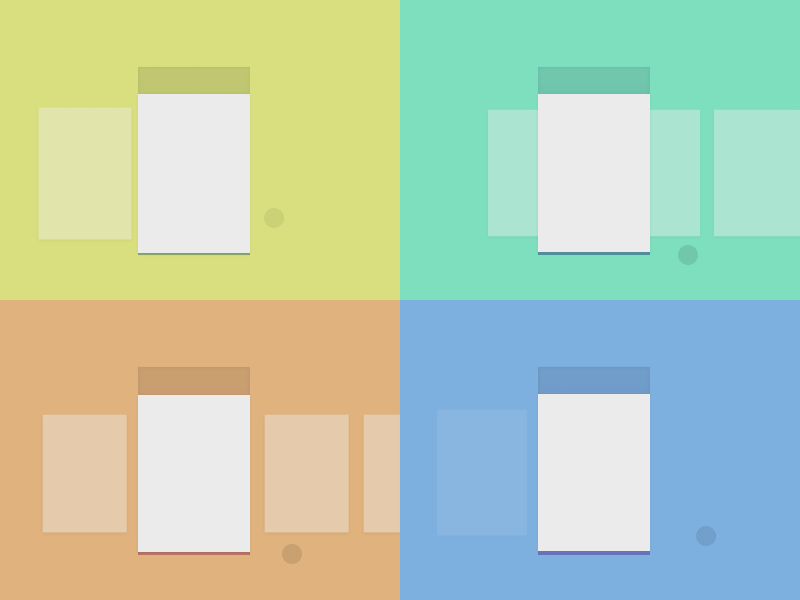
Thumbnail Carousels
The name of the carousel implies the usage of a number of various small images or thumbnails. These multiple images are placed in a row helping the users have a quick overview of the content.
Use cases:
- Image galleries
- Product categories
- Video playlists
Examples:
- YouTube's video playlist carousel
- Amazon's product thumbnail carousel
Vertical Carousels
This type of carousel UI UX design layout is used when there's not enough space for horizontal carousel display of the content or when it's necessary to create some lists. Vertical carousels scroll the content from top to bottom and back.
Use cases:
- Mobile apps (e.g., scrolling through a list of items)
- Website sidebars (e.g., scrolling through a list of related articles)
- Feeds on social media sites
Examples:
- Instagram's mobile app (features a vertical carousel for scrolling through posts)
- Mobile app of X social network (vertical carousel is used here to view the tweets)
Multi-item Carousels
UX carousel design of this type use different items simultaneously to display the content that is related in a certain way.
Use cases:
- E-commerce websites (for displaying a series of products)
- Blog websites (for showing a series of articles)
- News websites (for pop-in various news reports)
Examples:
- Carousel for the items frequently bought together at Amazon
- Carousel for related stories at CNN website
Real-life Website Carousel Examples
Here's a list of some websites and platforms that use different types of web carousels:
- Instagram (uses a vertical carousel for scrolling through posts)
- Apple (uses a full-screen carousel on their website to showcase iPhone features)
- Airbnb (uses a full-screen homepage carousel to showcase popular destinations)
- YouTube (uses a thumbnail carousel for video playlists)
- Amazon (uses a thumbnail carousel for product categories and a multi-item carousel for showcasing related products)
When you need to make a decision on what React carousel to use in landing page, it is necessary to take into consideration the content to be displayed, the impression you want the user to get and the space given for the carousel. This way you will be able to design the Figma carousel that will meet your needs in a certain project.
Carousel Web Usability Tips
On the one hand, carousel slider UI design template can be effectively used to display the content you need, but, on the other hand, without correct implementation, it can be difficult to use them or they can cause annoyance with the users. In order to avoid these effects, it is vital to use some tips to make your web carousel design user-friendly that are presented below.
1. Keyboard Navigation
There are a lot of users who prefer keyboard navigation due to different reasons, which may include habitual actions or disabilities. So, to make your carousel more user-friendly, you should definitely include it into your carousel.
Do:
- Right or left arrow keys are best to be used for keyboard navigation.
- Consistent and clear focus state should be provided for any carousel.
Don't:
- Navigation only by mouse shouldn't be required from the users.
- It's not advisable to use JavaScript to override the default keyboard navigation behavior.
2. Touch Support
As the number of touchscreen devices is increasing, it is wise to apply touch support to the carousels designed for mobile devices, tablets or laptops with a touch screen.
Do:
- Swipe is the gesture most frequently used on the touchscreen, so, implement it for navigating your carousel.
- A touch target that is quite clear and consistent needs to be used for navigation controls.
Don't:
- The touch targets shouldn’t be too small so as not to miss them while swiping or tapping.
- It's not advisable to use JavaScript to override the default touch behavior.
3. Timing between Slides
This point can hugely influence the experience of the user viewing the carousel. It is important that the user can clearly see the carousel items during sufficient time.
Do:
- Reasonable timing between slides is usually between 3 and 5 seconds. So, set it accordingly.
- Design the carousel pausing so that the user can view the elements comfortably.
Don't:
- Avoid user frustration by setting the timing that is either too short or too long.
- Try not to set automatic timing as the user can get some annoying experience if they don't see the items comfortably.
4. Loop after last click
Loops are useful elements to display the content, but it is important to design them reasonably so as not to cause the user frustration when loops appear unexpectedly. So, you need to make a decision on whether to use them or not.
Do:
- Indicate the carousel looping so that users can expect it.
- Make looping optional.
Don't:
- Avoid the carousel looping without any indication.
- Don't use this element to enable users to watch more content.
5. Autoslide ON/OFF
Autosliding is beneficial for displaying the content, but users can find it overwhelming or it can distract them from viewing some other content. So, it is advisable to use autosliding by default reasonably.
Do:
- Design a visible indication that autosliding is enabled.
- Make it optional for users whether to enable autosliding or not.
Don't:
- Avoid using autosliding without any indication.
- Don't use this element to enable users to watch more content.
6. Accessibility Considerations
It is crucial that all user categories, including those with disabilities gain access to your carousel.
Do:
- Think deeper on this issue and offer alternative content types.
- Provide assistive technologies to make navigation controls accessible to different users.
Don't:
- Don`t use JavaScript to override the default accessibility features.
- Avoid applying the navigation controls that can`t be used with assistive technologies.

7. Mobile-Specific Considerations
Mobile devices differ from desktop computers or laptops in terms of displaying carousels, so take into consideration the mobile devices` characteristics when designing your perfect slider.
Do:
- Make your carousel suitable for mobile devices with touch screens and with various screen sizes.
- Gestures and navigation controls should also be optimized for this type of device.
Don't:
- Avoid designing the layouts that are difficult to see on a small screen.
- Don't use too much content in your carousel so as not to complicate the user experience.
Thus, by sticking to these tips, you can design user-friendly carousels that will make a positive impression and deliver desired user practice.
How To Design A Carousel:Carousel UI Design Best Practices
There exist some website carousel best practices to be used when implementing different carousels into your UI designs. This section covers several useful libraries and frameworks for creating carousels and provides some techniques to level your carousels up from the standard level.
1. React
This framework provides a number of components and libraries so that you can look through and make a decision. These are some of the most popular ones:
- react-slick: This component has such features as pagination dots, navigation arrows and various slides. It is highly customizable and thus very popular.
- react-multi-carousel: This component has various navigation arrows and multiple slides and is user-friendly. One of the most important features is that it is quite lightweight.
- react-carousel: This component features different pagination dots and slides and is easily customizable.
A great example of how to implement a basic carousel using react-slick:
import React from 'react';
import Slider from 'react-slick';

const Carousel = () => {
  const settings = {
    dots: true,
    infinite: true,
    speed: 500,
    slidesToShow: 1,
    slidesToScroll: 1
  };

  return (
    <Slider {...settings}>
      <div>
        <h3>Slide 1</h3>
      </div>
      <div>
        <h3>Slide 2</h3>
      </div>
      <div>
        <h3>Slide 3</h3>
      </div>
    </Slider>
  );
};

export default Carousel;
{{spacer-24}}
2. Vue
Vue has also got several libraries for designing a carousel. Here`s a short overview of the most common ones:
- vue-slick: This component provides navigation arrows and various slides. It is customizable and is frequently used by designers.
- vue-multi-carousel: This component has various navigation arrows and slides and is user-friendly. One of the most important features is that it is easy to use.
- vue-carousel: This component features different pagination dots and slides and it is not difficult to customize.
How you can implement a basic carousel using vue-slick:
<template>
  <div>
    <slick ref="slick" :options="slickOptions">
      <div v-for="(slide, index) in slides" :key="index">
        <h3>{{ slide }}</h3>
      </div>
    </slick>
  </div>
</template>

<script>
import Slick from 'vue-slick';

export default {
  components: { Slick },
  data() {
    return {
      slickOptions: {
        dots: true,
        infinite: true,
        speed: 500,
        slidesToShow: 1,
        slidesToScroll: 1
      },
      slides: ['Slide 1', 'Slide 2', 'Slide 3']
    };
  }
};
</script>
{{spacer-24}}
3. Pure CSS
Creating a carousel with pure CSS is preferable for the people who don't enjoy working with JavaScript libraries or frameworks. It creates the lightweight slide effect with CSS animations and transforms.
Below is an example of using pure CSS for designing a simple carousel:
<div class="carousel">
  <div class="slide">Slide 1</div>
  <div class="slide">Slide 2</div>
  <div class="slide">Slide 3</div>
</div>

.carousel {
  position: relative;
  width: 100%;
  height: 300px;
  overflow: hidden;
}

.slide {
  position: absolute;
  top: 0;
  left: 0;
  width: 100%;
  height: 100%;
  background-color: #fff;
  transform: translateX(100%);
  transition: transform 0.5s ease-in-out;
}

.slide.active {
  transform: translateX(0);
}

.carousel:hover .slide {
  transform: translateX(-100%);
}

.carousel:hover .slide.active {
  transform: translateX(0);
}
{{spacer-24}}
4. Bootstrap (5)
This framework has a carousel component that is built in it. You can design your own carousel using it.
Using Bootstrap 5 for designing a simple carousel might look like:
<div id="carouselExample" class="carousel slide" data-bs-ride="carousel">
  <div class="carousel-inner">
    <div class="carousel-item active">
      <h3>Slide 1</h3>
    </div>
    <div class="carousel-item">
      <h3>Slide 2</h3>
    </div>
    <div class="carousel-item">
      <h3>Slide 3</h3>
    </div>
  </div>
  <button class="carousel-control-prev" type="button" data-bs-target="#carouselExample" data-bs-slide="prev">
    <span class="carousel-control-prev-icon" aria-hidden="true"></span>
    <span class="visually-hidden">Previous</span>
  </button>
  <button class="carousel-control-next" type="button" data-bs-target="#carouselExample" data-bs-slide="next">
    <span class="carousel-control-next-icon" aria-hidden="true"></span>
    <span class="visually-hidden">Next</span>
  </button>
</div>
{{spacer-24}}
5. 3D Carousel
This type of web carousel builds 3D effects with the help of CSS transformations. This advanced tool is meant to create the website carousels that are more attractive, engaging and provide better UX.
<div class="carousel-3d">
  <div class="slide">Slide 1</div>
  <div class="slide">Slide 2</div>
  <div class="slide">Slide 3</div>
</div>

.carousel-3d {
  perspective: 1000px;
  perspective-origin: 50% 50%;
}

.slide {
  transform-style: preserve-3d;
  transform: rotateY(0deg) translateZ(0px);
  transition: transform 0.5s ease-in-out;
}

.slide.active {
  transform: rotateY(0deg) translateZ(100px);
}

.carousel-3d:hover .slide {
  transform: rotateY(-10deg) translateZ(-100px);
}

.carousel-3d:hover .slide.active {
  transform: rotateY(0deg) translateZ(100px);
}
{{spacer-24}}
Codepen Samples and Figma Templates
You can get examples of different great Figma UI components, including carousels, at Codepen:
- React Carousel
- Vue Carousel
- 3D Carousel
- Pure CSS Carousel
- Bootstrap 5 Carousel
- Figma prototypes: One, Two, Three
.avif)
.avif)

.avif)
.avif)


.avif)
.avif)


.avif)
.avif)
.avif)


.avif)


%20(1).avif)

%20(1).avif)
.avif)
.avif)


