
Jamshed Kasimov
Background
We ❤ to receive letters from grateful customers who solved their problems with our products.
Recently, we received a letter from a young designer from India - Narendra Ram @narenkram. He used our Material X UI kit and made a high-quality and professional redesign of the seller's panel of the GTrendz e-shop.
UI kits like Material-X allow designers, developers, and corporations to create user-friendly, visually stunning, and useful app and website designs in the shortest possible time. As a result, you don't have to spend time drawing components from scratch, because you already have a UI kit that lets you get creative and design cool stuff.
Narendra has been working as a freelance designer since 2020. He has a background as a developer, he also loves to write texts, he and his friend own an internet company that specializes in creating web products. But his main passion is design. Being a Full-stack designer, he likes creating graphic elements and selling them online, as well as working in the projects as a contract UX/UI designer.
Project details
The project Narendra has been involved in is the website of the multi-vendor ecommerce platform called GTrendz. It is the largest footwear products and accessories online store in India.
The home page and product pages looked good, but the Control Panel of the seller left a lot to be desired. The UI design lacked aesthetics and usability. The customer's requirement was to make the UI of the dashboard more convenient, modern, harmonious, and intuitive.
“Working on an existing project when you inherit someone else's work is not an easy thing. A redesign requires responsibility, knowledge, research, and analysis from the designer."
— Narendra Ram, freelance UI designer
UX phase
The main problem for users was that there was not enough breathing room in the Seller's Panel, and it was overloaded with different elements. Narendra needed to add more space while making the design beautiful and easy to use.
After collecting much feedback from existing users and new users / sellers, he put up an affinity diagram and made lo-fi wireframes of the future screens.
UI phase
Narendra already had experience in designing dashboards, but it was time consuming.
“I did not know anything about UI Kits. As I was scrolling through Dribbble, I found Setproduct's Material-X UI Kit. The components were aesthetically pleasing. Every UI component was grouped and properly put together in a way that the designer can use flawlessly. That's it, I immediately purchased it."
— Narendra Ram, freelance UI designer
One of the main challenges was to follow the ideas of consistency in colors, layout details and selection of patterns.
Narendra designed 10 screens of different functionality:
- Seller Landing Page
- Dashboard screen
- Orders screen
- Products screen
- Inventory screen
- Earnings screen
- Shipping screen
- Reports screen
- Returns screen
- Account screen
He also did a bit of Live usability testing with existing users. Users loved the new design.
The customer was also pleased with the new look of the Seller's Panel. The overall style, choices of buttons and icons (which were already pre-designed), patterns and other details were highly praised by GTrendz management.
Redesign results
The sidebar has been narrowed - now there is more space in the control panel. The subcategories have been moved to the main section of the dashboard as a tab bar or buttons, giving users more flexibility. And the overall design is visually much more pleasant and elegant.
Let's take a look at each section (7):
1. Dashboard screen
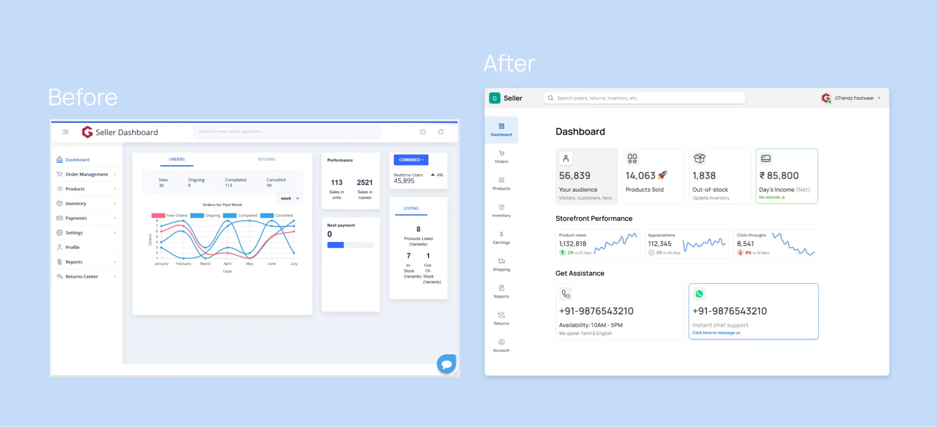
Made with Metrics component • Preview in Figma
The main elements of the dashboard are enlarged, which focuses the user's attention on the most important indicators.
Here, the pre-made Metrics and Card components were used, which have been only slightly reworked to suit the needs of the project. Swap icons, put your subcaptions, fill with numeric values and you're good to go.
2. Orders screen
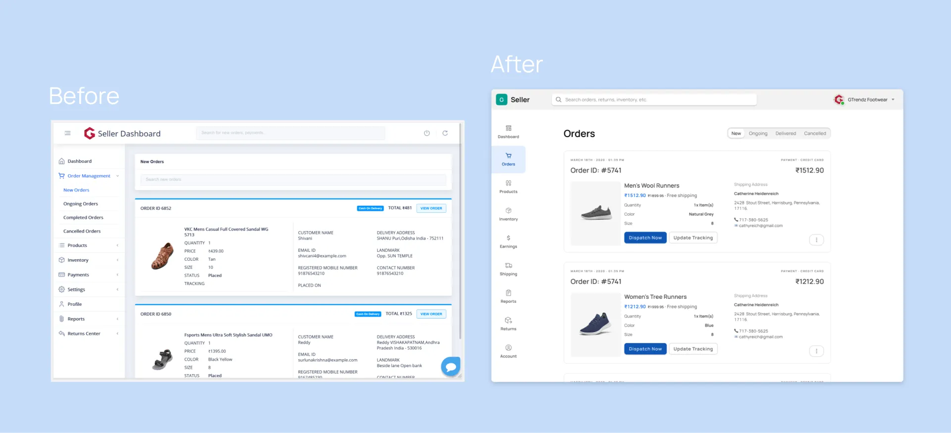
Made with Navigation component • Preview in Figma
The order ID has been optimized. Thanks to the "Segments" component, you can easily switch between order subcategories (New, Ongoing, Delivered and Canceled). The "Cards", "Buttons" (in different variations), and drop-down menus components are also used, making it easier to perceive the content without overloading the screen. And such buttons as "Print Invoice" and "Print Delivery Label" are grouped in the "Settings" button.
3. Products screen
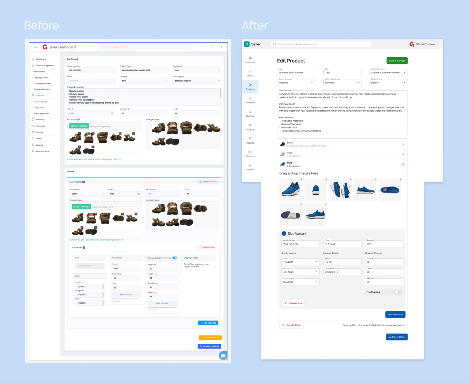
Made with Input component • Preview in Figma
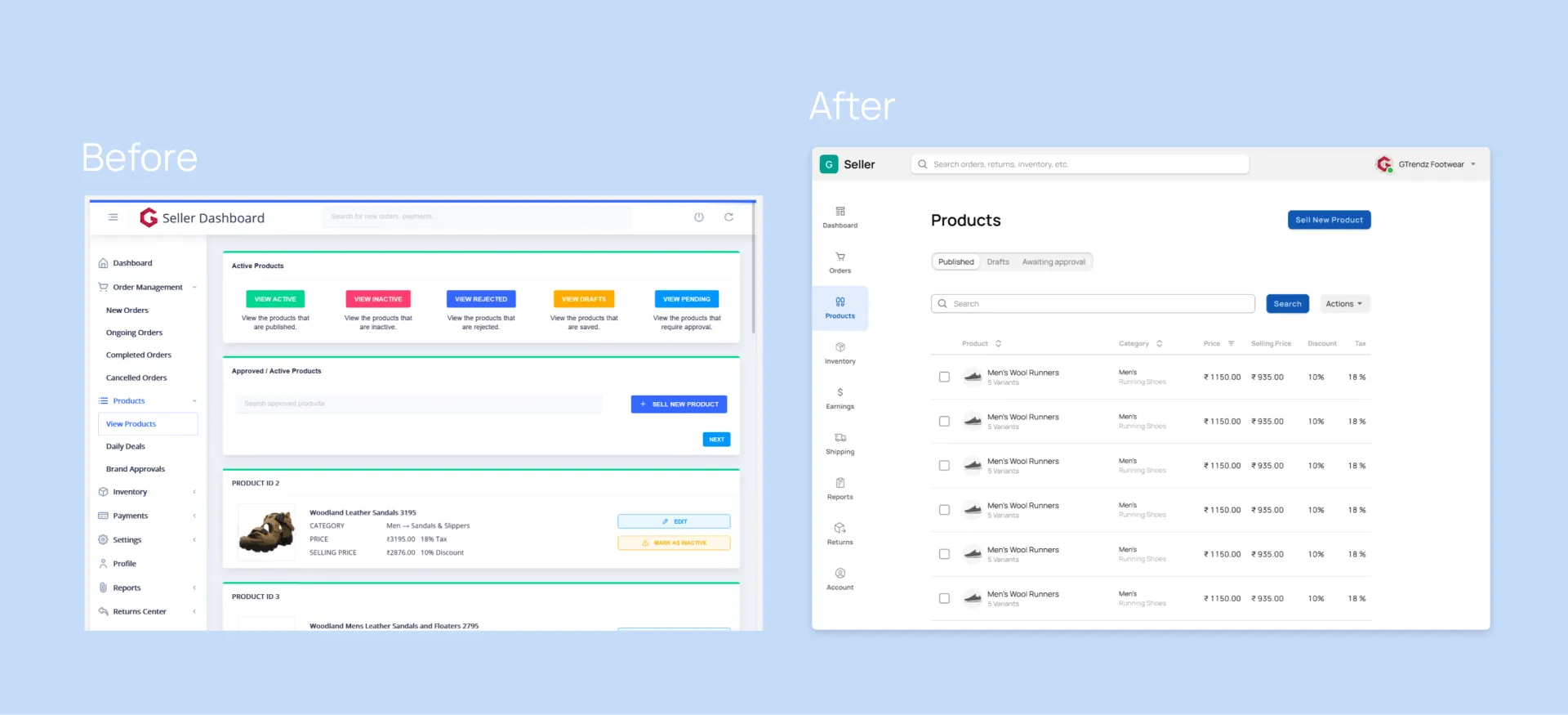
Made with Table component • Preview in Figma
In the Products category, elements like inputs, buttons, toggle switches, etc. have been replaced by components from Material-X (plus a Datagrid table has been added, which allows you to view and filter products). The data grid in our kit is made of components. So it's easy to adjust cells within their Masters.
The process of creating forms like "Size Variants'' or "Drag & Drop Images" has been simplified many times over. Also, a great decision of the designer was to reduce the number of colors (originally the buttons on the screen had 5 different color variations).
4. Earnings screen
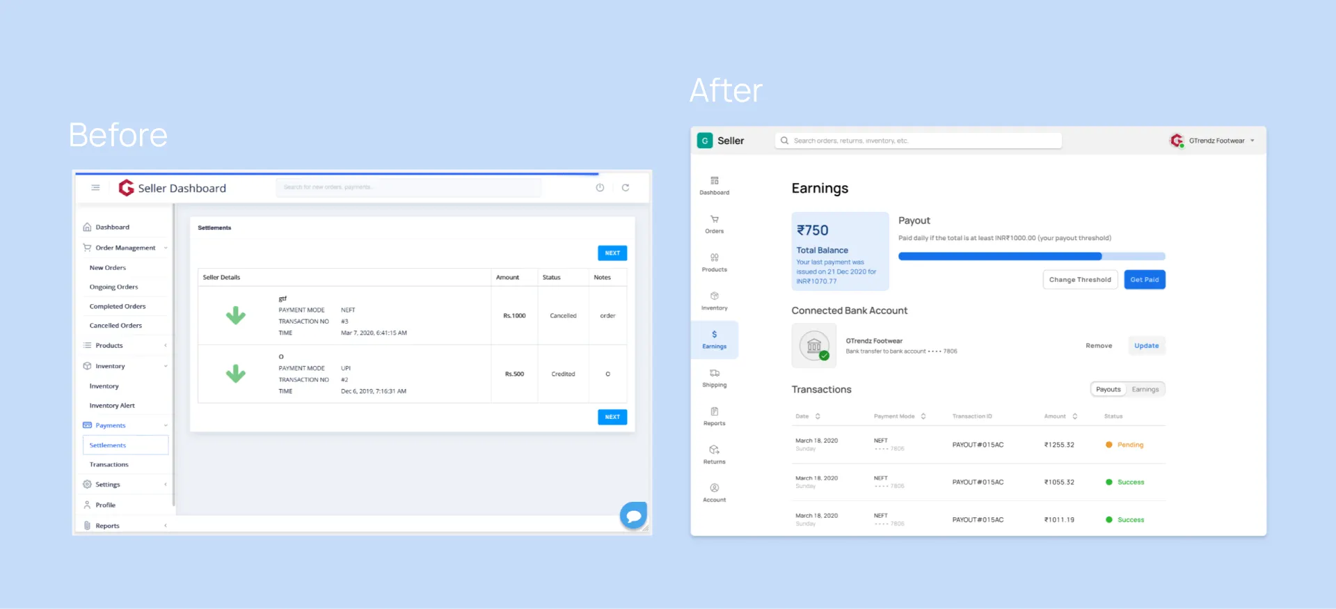
Made with Progress bar • Preview in Figma
This screen became alive thanks to the components such as "Cards", "Stats Bars", "Segments" (you can switch to Payments and Earnings), icons and buttons. Also, a very flexible "Datagrid" table has been added, which now displays all kinds of information (date, payment mode, transaction ID, amount and more).
5. Account screen

Made with Navigation component • Preview in Figma
Before, this screen had nothing but plain text. After the redesign, the Account screen has become more interactive with the addition of inputs, forms, buttons, and drop-down menus. The designer wrapped the detailed information in those dropdowns - another smart move.
Material-X contains a full range of detailed widgets and the Settings template is one of them. It's easy to replace text and fill with your content expanded variant to show panels in action.
6. Reports screen
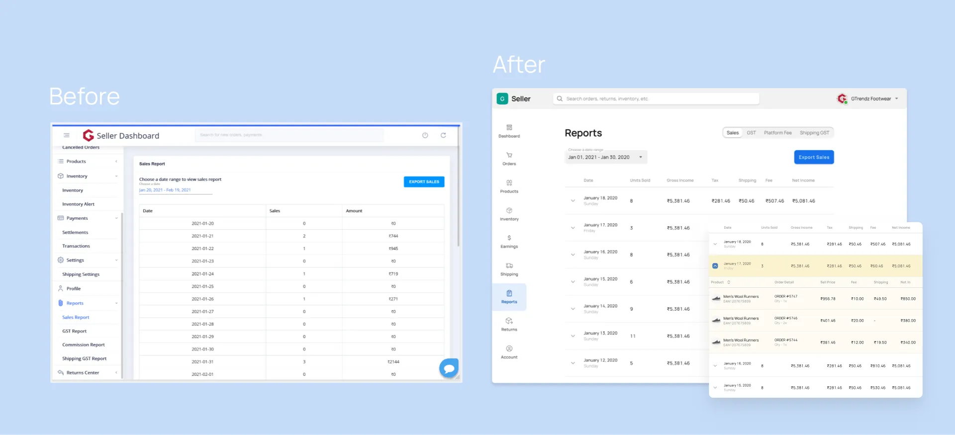
See it as live prototype in Figma
The table of the Reports category has been updated with the help of dropdowns and Datagrid components. With the updated table, the author has added more categories, and in the dropdown menus you can find more detailed information on the product. The expanded UI has also been improved with shoe images and the addition of space - this has added elegance to the user interface.
7. Inventory screen
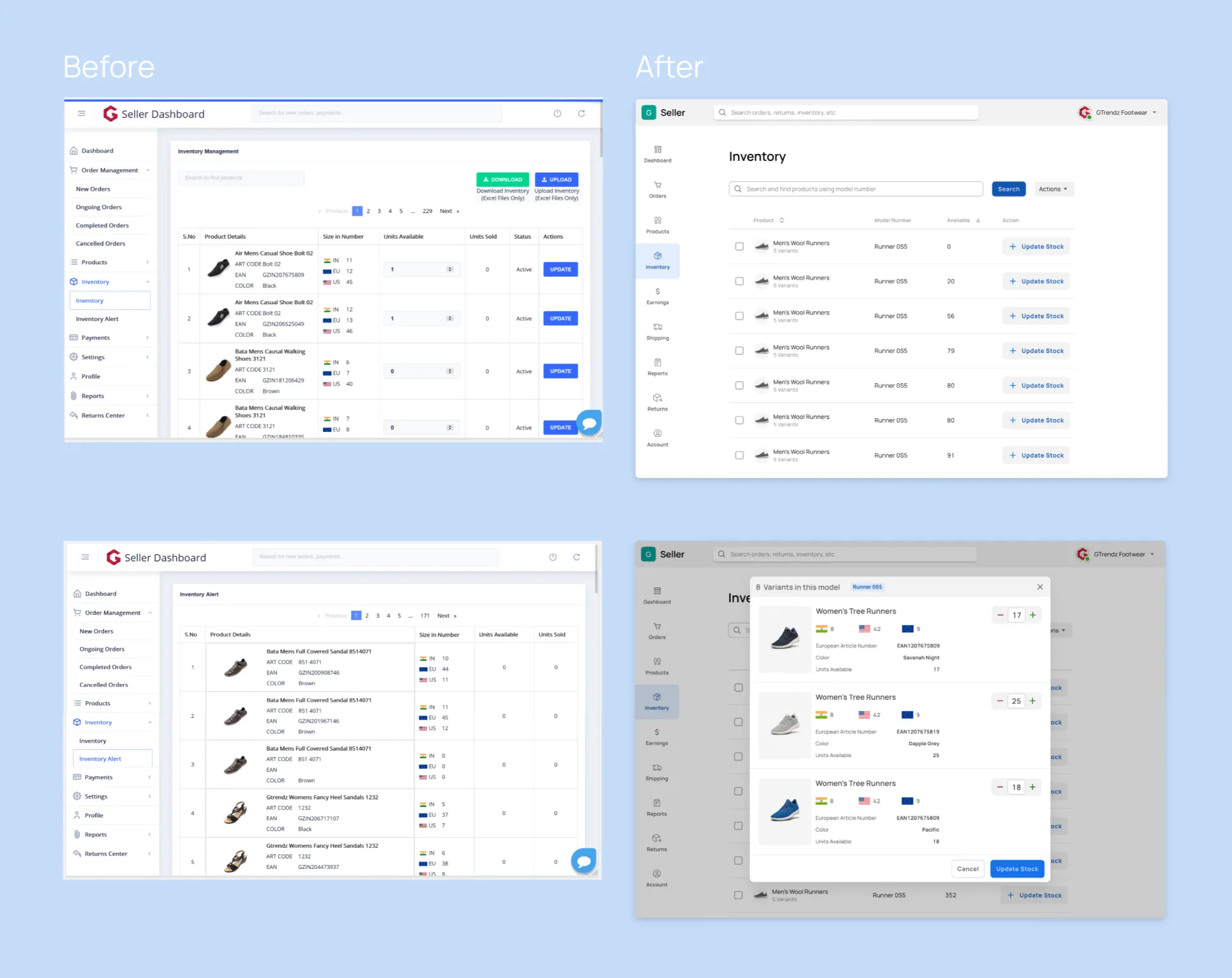
Made with Dialogs • Preview in Figma
This screen features the following items from Material-X: Datagrid, counters, buttons, etc. The inventory table has been updated and looks more organic due to better structured elements. All product-specific data is now in a separate overlay window, where counters and buttons came in handy.
Prototyping stage
Narendra combined all the basic functions of the screens, creating a minimal high-fidelity prototype.
He then handed his work over to the company's developers. You can see a video of how the prototype works.
Material X takeaway
Narendra notes that Material X design system has everything any designer needs.
He created his own components by selecting different elements, detaching them, and then creating new design items as required for the project.
The hidden UI elements inside the component proved to be very useful and handy. Thanks to this feature, the component transformed into another variant with a new feature/option. Narendra totally loved such subtlety and thoughtfulness.
“Material-X is the first UI kit I've ever bought. And it was totally worth it! It's scalable, transformable and aesthetically pleasing. The number of components is enormous. It's like Setproduct thought of every possible requirement. What more a designer could need?"
— Narendra Ram, freelance UI designer
Conclusion
This was a very interesting assignment for Narendra. He not only completed the work in a short time but also gained invaluable work experience, which he can add to his portfolio. By the way, you can check out his presentation regarding the Gtrendz on Behance. You can ask him anything via Twitter or LinkedIn.
From our side, we want to mention the value that UI kits provide - with minimal investment, the startups, designers and developers save precious time and resources by completing customer orders faster. The more orders you have, the more money you earn and the more customer base you create.
If you want to find out more information about Material-X - make sure to check out the Product page or read about all its advantages in this post.


