


Roman Kamushken
Analytics dashboard templates are powerful tools for organizations looking to leverage their data in today's fast-evolving business world which is highly dependent on data. These are also visualization tools built to give you a high-level overview of your most important metrics and KPIs. Analytics dashboards convert raw data to visual formats, making it easier to make decisions faster and better. They rose to fame because of their capability to de-clutter columns of complex data, making it easier for businesses to keep an eye on performance, detect trends and even spot actionable insights if any. In the following article, we will discuss several analytics dashboard examples and how specific designs can help you monitor key metrics that push your business forward.
What is an Analytics Dashboard?
An analytics dashboard is a visualization tool that displays your Key Performance Indicators (KPIs) in an easy-to-understand manner. The functionality and ease of reading analytics results make this tool worthwhile for business teams. This way businesses can leverage these dashboards to share crucial insights across teams, improving collaboration and keeping everyone in sync. On the other hand, Analytical dashboards help in tracking data changes in real-time and then using this fresh information to make meaningful decisions.
.avif)
Benefits of Analytics Dashboards
Here are some of the benefits a business can enjoy when using analytics dashboards:
Live Performance Monitoring
They integrate analytics dashboards to get quick access to trends-specific business functions like digital marketing and sales. Stakeholders can also see and check how well they are tracking toward goals as the data is in real-time, without having to mine through copious amounts of data or request custom reports.
Quick Issue Identification and Resolution
This enables teams to quickly understand what might be going wrong and respond. For example, two websites experience a traffic drop because of a technical issue - by watching a website analytics dashboard on a daily basis, the experienced marketing team can pick it right away and hopefully fix it before any negative impact is caused. The difference is that a team who evaluates their metrics only during monthly meetings could lose hundreds of thousands of dollars before realizing they have a problem.
Comprehensive Reporting
Analytics dashboards help not only in monitoring but also assists with detailed reporting. They give performance snapshots in certain dates, which serves the divestment of storing and updating those who are less frequent to everyday operations. These reports can be so broad as to include any category of information, including competitive intelligence (and thus, they can be useful for long term planning).
Enhanced Collaboration
Organizations cultivate transparency and collaboration by spreading analytics dashboards through departments. Interoperable teams have the advantage of working with a common set of data, which results in more transparent, converged strategies.
Data-Driven Decision Making
Data visualization through web analytics dashboards delivers information in a way that is attractive and highly consumable, helping organizations take action based on data. This allows the strategies to be evidence-based rather than intuition-based.
To wrap it up, reporting dashboards for analytics help in easy monitoring of data and making decisions, this is what makes them an indispensable part of today's era businesses having data on priority.
Top 5 Analytics Dashboards Examples Based on the Client’s Choice
Here in this post, we will be taking a look at some of the finest analytics dashboards examples from across the web and are well appreciated for not only their visual appeal but also functionality. The dashboards are picked out of a list of popular & effective dashboards for businesses to see useful data insights.
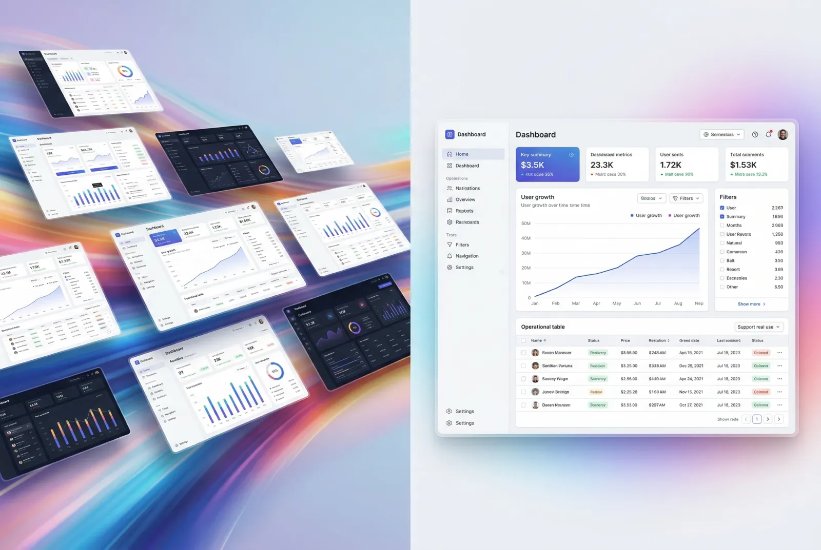
1. React UI Kit
React UI Kit – a collection of the best components for data visualization you can use in your analytics app. Using React (a popular JavaScript library for building user interfaces) allows a very high customizability both at design and business levels.
.avif)
Key features include:
- Interactive Charts: More than data seems to be required, as these diverse kinds of interactive charts (including line, bar, and pie charts) can help work with data visually.
- Updated Data in Real Time: The saved data of the users is real time updated means the current updated.
- Responsive Design: Use the tools they need on any device (desktop, tablet, and smartphone).
- Customizable Components: Easy-to-customize components for specific business requirements & branding.
The React UI Kit is the ideal choice for companies who want to build dashboards for analytics imbued with data visualization that is feature-rich and highly adaptable.
2. Material Design System
Material Design System: A fine granular design system that contains a number of components & tools for defining data analytical dashboards. This presented the user with a consistent experience, meeting all the requirements of Google's Material Design principles.

Key features include:
- Ready-made Templates: It has ready-to-be-used templates for different types of analytics dashboards, so you can start building right away
- Data Integration: Ability to integrate with all your data sources to import data from multiple systems & databases.
- User management: Allows you to manage the user roles and permissions, so that only the appropriate personnel can view certain data.
- Custom Widgets: Custom widgets can be designed to show specific business-related metrics/KPIs.
When your organization needs a reliable and scalable solution for its data analytics dashboard design, the Material Design System is perfect for you.
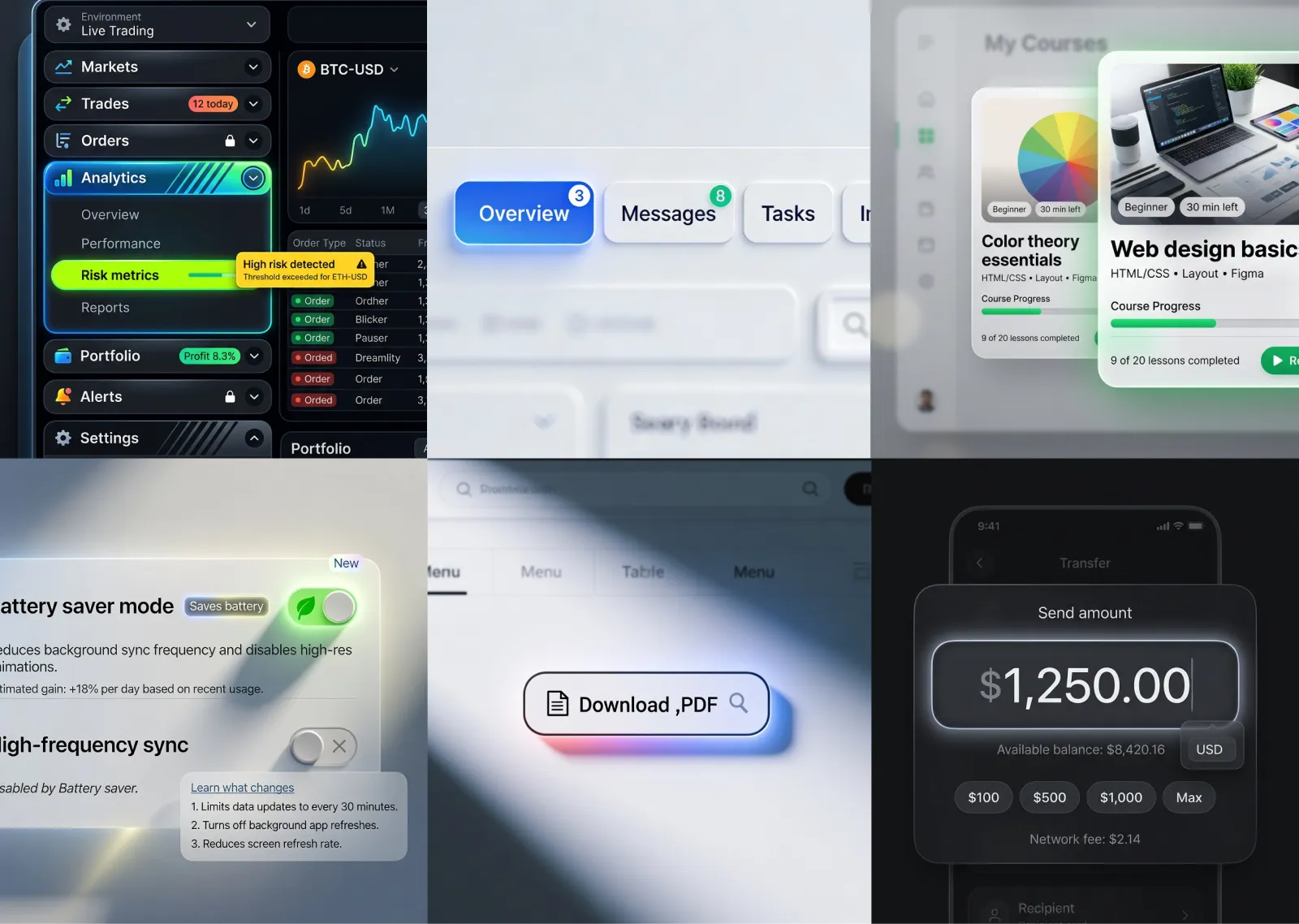
3. Xela
Using a super-detailed dashboard as Xela for analytics, and reporting purposes. Businesses that will find it the most useful are those who need extensive and detailed reporting.
.avif)
Key features include:
- Advanced Analytics: Offers advanced analytics solutions that can unearth important data using tools such as predictive analytics and machine learning models.
- Detailed Reporting: Rich reports with a variety of visualization settings to help communicate findings to stakeholders.
- Personalized Dashboards: It empowers customers to build their own dashboards according to business requirements allows drag & drop for ease of use.
- Data Export: Export data and reports in various formats including PDF, Excel, or CSV to analyze and share data with other stakeholders.
As a way to dig into the data and create robust reports, Xela is among one of the great options available for businesses.
4. Neolex Dashboard UI Kit
Neolex Dashboard UI Kit is a versatile solution that includes different types of analytic & reporting templates. This kit is meant to allow businesses to spin up useful, well designed dashboards as quickly as possible.
.avif)
Key features include:
- Modular Design: Uses a modular design method that lets users select their own components to generate custom dashboards.
- Rich Library: Includes a vast library of pre-designed components such as charts, graphs, tables, and forms for better visualizing the data.
- User-Friendly Interface: Simple dashboard structure with a user-friendly interface.
- Real-time analytics: Get real-time analytics capabilities to track important metrics and performance indicators happening at this moment.
The Neolex Dashboard UI Kit is perfectly suitable for any business that would like to make use of ready-made templates and components so as to create high-quality dashboards for data analytics.
5. Material-X
Material-X is a full-featured dashboard ideal for in-depth data analytics. Integrating Material Design principles and robust analytics tools, offers an optimized user journey from registration to consumption and beyond.
.avif)
Key features include:
- Rich Visualization Options: In numerous configurations of charts, diagrams, etc., providing a rich color palette for visualizing data is crucial to having an intuitive and accurate representation of data.
- Customization Options: The ability to allow users to customize the dashboard to their exact requirements, data, reports and full editing capabilities
- Improved Performance: Maintained performance always, making sure the dashboard continues to be a responsive and fast UI experience even with huge datasets.
- Integration Capabilities: Integrate with multiple data sources, and other third-party applications that allows consolidation of data from different systems.
Material-X is perfect for businesses that need a detailed and customized dashboard for analytics to the maximum extent in order to gain the most possibility out of it.
These top five analytical dashboard examples show the diversity and power of modern dashboard solutions, enabling businesses to easily visualize their data and analyze it effectively.
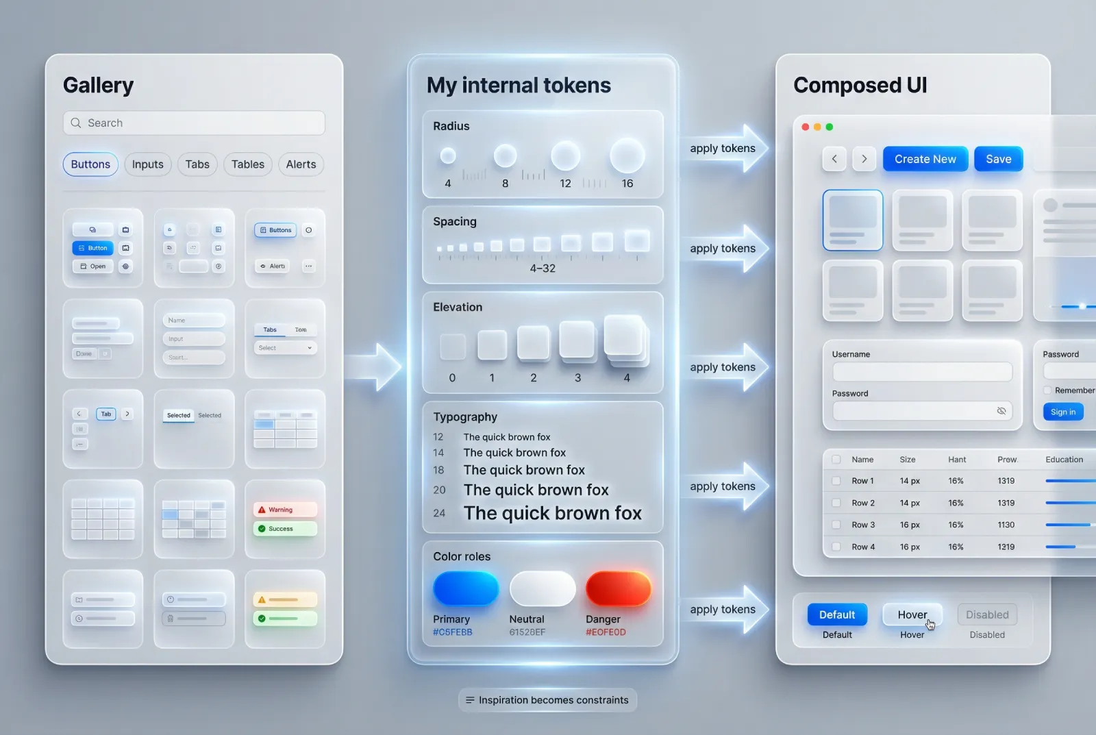
Analytics Dashboards Design Best Practices
Creating a useful and usable analytics dashboard involves more than simply designing charts and graphs. It is all about creating an effective tool to deliver strong insights that are human, easy to digest, and graphically appealing. Here are some best practices for designing the best analytics dashboard UI:
1. Define Clear Objectives
Before you even begin to decide how you want the graphic design of your dashboard for analytics, you need to know what you hope to accomplish using it. Ask yourself:
- What should the dashboard tell me?
- Who is the audience for the dashboard, and what do they need?
- Which data sources will be leveraged, how often those datasets will be refreshed?
By answering these questions, you can make sure your dashboard stays on-topic and relevant to its users.
2. Prioritize Key Metrics
Determine and rank the most important metrics that you want to show. Do not drown in data, pay attention to the most important information that can support your business objectives. Access to key metrics should be direct and above the fold.
3. Use the Right Visualization Types
Different data types need different visualizations to be best understood. Use the appropriate chart types:
- Bar Charts for categorical comparisons
- Line Chart for representing trends over time.
- Pie Chart for visualizing parts of a whole.
- Heatmaps to visualize the density of data.
Once the data is prepared, we need to visualize the data in a way that makes sense and is easy for other people to digest straight away.
4. Ensure Consistency
Design adoption needs to be consistent so that the user can easily navigate throughout his analytics dashboard. Keep color, font, and chart styles constant across all your visuals. Uniformity in labeling and formatting allows users to quickly grasp the data with which they are presented.
5. Design for User Experience
When it comes to dashboards, user experience (UX) is the key. Have an easy to read and use dashboard:
- Layout: Group related metrics and use a logical layout.
- Navigation: Convey straightforward navigation to help give users the ability to deep dive when necessary.
- Adaptability: Create dashboards that also work on other devices like desktops, tablets, and especially smartphones.
6. Highlight Key Insights
Emphasize key insights with visual cues. This can include:
- Color Coding: Apply color to draw attention to high-impact metrics, trends, and outliers pop.
- Annotations: Attach notes or highlighting as context for important data points.
- Threshold Indicators: Signify via things like red/green colors that a metric is out of acceptable range.
7. Provide Real-Time Data
Make sure that your analytical dashboards have data in real-time. This enables them to take decisions right when they need to, relying on the newest possible information.
8. Allow for Customization
Therefore, different users might have other needs. Allowing users to customize the views on their dashboard can be good as it can make for a better experience, ensure that they are getting relevant information. This might include things like ways to filter data, change date ranges, views and metrics industries.
9. Incorporate Interactivity
This can vastly improve user engagement and comprehension as interactive dashboards make analysis more accessible. Tooltips, drill down features and clickable elements can empower those familiar with the data to investigate it further in ways that might otherwise be missed when looking at static reports.
10. Test and Iterate
Once your data analytics dashboards design is complete, you should get real users to test it. Take advantage of this feedback to make the changes and improvements needed. The dashboard is never stagnant, it must be updated and refined regularly to keep fulfilling the users' necessities and to align with any potential changes of goals or data source sites.
Conclusion
Analytics dashboards are powerful tools that transform raw data into meaningful insights. By leveraging the best practices in design and functionality, you can create dashboards that not only look great but also serve as invaluable assets for decision-making. Whether you are using a React UI Kit or a Material Design System, focusing on clarity, relevance, and user experience will ensure your dashboards deliver maximum value.
In short, analytics dashboards are super useful in turning your important data into meaningful insights. You can make your dashboards not just well-designed and functional but also great decision-support assets using best practices in design and functionality. This way, when using a React UI Kit or even going with the Material Design System, focusing on clarity, relevance, and user experience will ensure your dashboards deliver maximum value.
.avif)
.avif)

.avif)
.avif)


.avif)
.avif)


.avif)
.avif)
.avif)


.avif)


%20(1).avif)

%20(1).avif)
.avif)
.avif)


