How to make 3D animation effect (like AirPods website) as you scroll the page

Apple implemented this effect by using a smart trick. Everything is done with a canvas element supported by JavaScript that writes the path for new images when you scroll.

Tutorials

Published on

September 7, 2022

|

4 mins read

Blog

How to make 3D animation effect on page scroll HTML & JS

Navigation

Subscribe to newsletter

Thank you! Your submission has been received!
Oops! Something went wrong while submitting the form.

By subscribing you agree to with our Privacy Policy.

Share this post

Jamshed Kasimov

Why to animate on scroll

<span class="blog_big-paragraph">Scroll-triggered animation is an elegant effect that grabs attention and makes the person/company stand out. If the scroll-triggered animations are well-thought, then the users' attention will be captured very quickly, engulfing them in intriguing content that follows their scrolling pace.</span>

This technique is called «scrollytelling». 3D graphics play an important role here. The digital experience becomes way more interactive and immersive than just a static webpage and Apple is one of the flagships in this field.

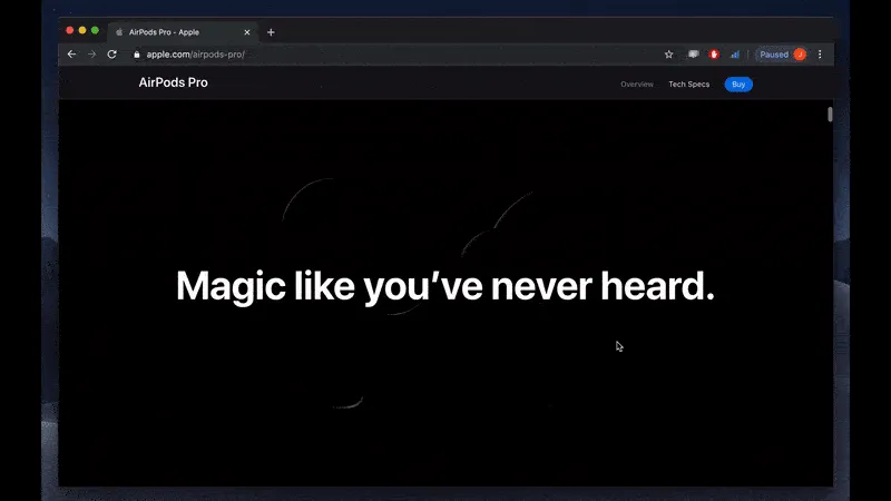
AirPods page with 3D animation is truly impressive. Beautiful transitions create a narrative while maintaining the user's attention. And for e-commerce, the biggest obstacle is purchasing something we haven't seen in person. That's why the most effective technique to foster a physical discovery experience and boost sales is through interactive product presentation.

In this guide, we'll take the Apple AirPods page as an example and show you how to get this effect if you want to create a webpage with the same effect.

{{spacer-64}}

{{setproduct-gpt}}

{{spacer-64}}

The basic concept of such animation

So, before actually diving into the process of making such animation, let's first understand the magic behind it.

Apple implemented this effect by using a smart trick. Everything is done with a canvas element supported by JavaScript that writes the path for new images when you scroll.

What they did is they pre-downloaded hundreds of images and when you scroll them - these images will load one frame at a time.

{{spacer-16}}

{{spacer-16}}

As a result, the behavior of the page is as follows:

  • The body of a page is very long, but the elements stay in the same spot on the screen rather than moving vertically with the scroll.
  • Animations occur when the user scrolls, and pause when he/she stops scrolling.
  • If you scroll up – you have the previous animations coming back.
  • Some animations keep playing after the user stops scrolling or when the scroll position reaches a specific point.
  • Headlines and text body appear and disappear as you scroll.

{{spacer-64}}

Step 1. It all starts with the canvas

The core of everything in this tutorial is the canvas element. This is where all the main processes will take place, including rendering the animation (with JavaScript). Let's go into the HTML where we'll write a couple of lines of code and provide our canvas with a class 'animation-scrolling'. Also, let's write the path for our JavaScript file.

HTML code

{{spacer-16}}

So far this is the only code that we will need inside HTML. Now let's go to CSS.We'll set the height of a page to be 100vh (viewport height), and the body will be 400vh. This will give us enough room to work with.We will also set the canvas properties, where it will be positioned at the center, its maximum width and height will be limited to ensure that they do not exceed the viewport's boundaries.

CSS code

{{spacer-64}}

Step 2. Adding images with JS

Substep 1. Getting the right images

First, let's create variables to get our HTML file and canvas, as well as create the context for the canvas element.

JavaScript code

{{spacer-16}}

Now, we'll create a function for our current frame that returns the file path and file number of the desired image file. Assuming that the file names are numbered sequentially in ascending order within the same directory (i.e. 0001.jpg, 0002.jpg, etc.), we want to change those numbers dynamically using JavaScript.Since the image number is an integer, we need to convert it to a string and prepend zeros to the front of our index until it reaches four digits to match our file names. This may be done by using padStart(4, '0').

JavaScript code #

Thanks to this code, the static file will be updated in accordance with the user's scroll position.Next, we need to create a variable for the still images that we are going to have, as well as the code that will generate the images on the canvas.

JavaScript code

{{spacer-24}}

Substep 2. Tying images to user scroll progress

In this phase, we need to make sure that when we scroll, we are changing the image. We will add an event listener for this.

JavaScript code

{{spacer-16}}

Let's break down what's going on at this stage with the code above.

We'll use scrollTop to determine the element's vertical scroll position, which in this case is the top of the document. Subtracting the window height from the document scroll height gives us the end (or maximum) value. The user's scroll progress is then determined by dividing the scrollTop value by the highest number the user may scroll down.

The right image must then be returned to that place by converting the scroll progress into an index number that matches the image numbering sequence. This can be accomplished by dividing the progress value by the number of frames (images) available.

To ensure that it never surpasses the total number of frames, we'll use Math.floor() to round that number down and wrap it in Math.min() with our maximum frame count.

{{spacer-24}}

Substep 3. Putting the right image in canvas

The requestAnimationFrame function (in the last code from Substep 2) will make sure that there are no image flashes as we make transitions from one frame to another.

Although the image sequence begins at 0001.jpg, our scroll progress computation actually begins at 0, therefore we are increasing the frameIndex by 1. The two values are always in line thanks to this.

Next and the last thing to do here is to create a function that will update the image. Basically, we are adding an index to the image source that helps us to draw again. So, every time an image is updating, it's going to render again and again inside canvas.

JavaScript code

{{spacer-64}}

Step 3. The final touch –Preloading images

In this final step let's add softness and smoothness to this effect. Since we scroll the page quickly, there may be a slight delay between images. This is because each new image sends a new network request for a new download. You need to make sure that each image is already preloaded. This way, transitions will be much faster and smoother.

JavaScript code

{{spacer-16}}

And voila, we're done. That's how you create scroll-triggered animations for your website. The final result will look like this:

{{spacer-16}}

{{spacer-64}}

Images or video?

There is a perception that instead of using hundreds of pictures, a single video file could be a better approach. If we talk about it globally, then yes, it is doable. However, there are several factors to consider:

  • If you want the animation to function appropriately, then it must be encoded and formatted correctly. The experience can be ruined if you use the wrong format and only a few frames of the video might be shown
  • You might experience some problems in searching the specific keyframe when utilizing a video because different browsers' implementations depend on the platform and codec being used. On lots of gadgets, it won't look as smooth.
  • The video quality is substantially lower, and there isn't much support for codecs other than h264.

From a code and dependability perspective, using images is a much simpler approach. The only drawback here is that occasionally, images are larger from the size perspective than well-compressed videos.

However, if you think the video approach is the most appropriate idea for you then definitely go for it. In this amazing and very interactive tutorial by Dev Ed, you'll get all the instructions needed.

{{spacer-64}}

So is this effect worth it?

In general: yes, it's worth it. Essentially, you are making a complete product/service presentation movie. But it's more interactive, because you give the visitor control, which enables him to explore the product at his own pace and rhythm.

And especially If your business is design-oriented, or if you provide products that need to be promoted with high-quality and large images, then this effect on the website would be a huge plus. Your job as a business owner or service provider is to stand out and create a wow effect by giving a visual experience to the users, almost having them feel the product.

However, take into account that availability and performance may be affected. We are talking about the 50+ Mb of downloaded data, it's a pressure for browser resources. That may be acceptable for customers with a high-speed internet connection, but not for those who don't have such luxuries. So, if the page loads slower, resulting in website abandonment and lost sales, you've made the situation worse for yourself.

Also, keep in mind that people access websites from mobile devices. Thus, it's better to find some creative solutions for such scenarios. That's why Apple created the option of replacing the entire image sequence with a single fallback image.

{{spacer-64}}

Conclusion

In summary, what at first glance seems like magic is an interesting and cool trick that will bring life and creativity to your web page. This effect is extremely versatile and practical and can be used on a wide variety of projects. So definitely consider this option too. Because as we can see, the web continues to evolve, becoming more interactive and its potential continues to expand.

Hopefully, this guide was useful for you. Now that you know how to create 3D animations just like Apple's AirPods website, go ahead and try something cool yourself. And if you need help in custom design and development - we are here for you!

See it live on Codepen

Share this post

Subscribe to Setproduct

Once per week we send a newsletter with new releases, freebies and blog publications
Oops! Something went wrong while submitting the form.

By clicking Sign Up you're confirming that you agree with our Terms and Conditions.

Congratulations!

You're in! Expect awesome updates in your inbox

Related posts

Lorem ipsum dolor sit amet, consectetur adipiscing elit.

Tutorials

5 mins read

Checkbox UI design – Unlocking anatomy, proven UX tips, and inspiring use cases

Get practical solutions for Checkbox design dilemmas, from styling complexity to inclusive user experience, in this dedicated tutorial.

Tutorials

6 mins read

Input UI Design – Optimize data forms UX with expertly crafted text fields

Learn how to design and optimize Input components for improved forms filling experience and UI. Our in-depth guide will help you create seamless and user-friendly designs.

Tutorials

9 mins read

Creating app settings UI design: Usability tips and best practices

Learn about key design patterns and elements for settings apps to enhance user experience and accessibility in your own app's settings section.

Figma Templates & UI kits

Save time and human resources by reusing hundreds of pre-made templates crafted by us. Based on top notch UX taken from the World's best apps.

Material X for Figma

Figma library with 1100+ components & 40 app templates beyond Material Design. Powered by top-notch shapes and Manrope font. Customizable & Adjustable UI kit now available for Angular & Figma

Material You UI kit

Figma & React library with 2600+ variants of 32 components compatible with Material Design 3. Plus 220+ dashboard templates for all the viewports. Now available for NextJS & TailwindCSS.

Figma React UI kit

Designed and well-organized in Figma React-based UI toolkit for the web. Optimized for building complex data-dense interfaces for desktop and mobile applications.

Panda Design System

Figma library with dashboard, calendar, kanban, profile, table, ecommerce and 80+ templates in total. Components with variants, dark theme included.

Eclipse UI kit

Figma library with 1100+ components & 74 templates for data-driven web applications. Powered by auto-layout. Supercharged by Figma's variants.

Rome UI kit for Figma

Customizable and well-organized team library. Contains 250+ components & 30 web app templates powered by stylish and trendy guidelines.

Material Design System

Figma library is based on 100% guidelines compliance with Material.io. Contains ready‑to-use templates to accelerate app UI design.

Neolex Dashboard UI kit

Customizable & adjustable dashboard design system with 50+ ready-to-use app layouts, 1900+ variants for 30 components with auto-layout.

Material Desktop Dashboard UI kit

Figma library with 48+ dashboard templates based on reusable desktop app patterns carefully handpicked from the most popular web apps.

Xela UI kit for Figma

Figma library with 1900+ variants of 30 components categories to craft perfectly shaped desktop & mobile apps. Customizable & Adjustable dashboard design system with 50+ web app templates.

Figma S8 Design System

Figma design library for mobile and desktop apps made of high quality styled components. Full version includes 67 dashboard templates.

OE Figma Design System

Customizable and well-organized Figma library. This design system aimed to build highly loaded interfaces, boost the speed and save more costs.

Figma iOS kit

Figma library of iOS patterns served as ready-made templates. This UI kit inspired by World's best apps. Based on Human Interface guidelines.

Figma S8 Design System

Figma design library for mobile and desktop apps made of high quality styled components. Full version includes 67 dashboard templates.

Most iOS UI kit for Figma

iOS native components and app templates organized into a «Most Design System» fully compatible with Apple's Human Interface guidelines.

Rome UI kit for Figma

Customizable and well-organized team library. Contains 250+ components & 30 web app templates powered by stylish and trendy guidelines.

Material Design System

Figma library is based on 100% guidelines compliance with Material.io. Contains ready‑to-use templates to accelerate app UI design.

Nucleus UI

Nucleus UI contains 1000 components and variants with 500+ mobile screens designed for Figma (including 9 themes from Event, E-commerce, Finance, NFT, etc.).

Figma Android UI kit

Components-driven Android mobile UI library for Figma. Consists of 140 high quality application templates made of total 250+ UI components.

Mobile X UI kit

Customizable & adjustable iOS / Android design system loaded with ready-made 157 app templates based on 860+ variants for 20 components.

Appka iOS UI kit

Customizable & adjustable iOS design system with 4100+ variants for 28 components and 280+ ready-to-use app layouts crafted for Figma.

Full iOS UI kit

Customizable iOS design system with 320 ready-to-use app layouts. You can modify them or use as it is to save time and never design from scratch again.

Xela for Flutter

XelaUI for Flutter is a simple, modular and accessible component library that gives you the building Flutter apps for mobile and desktop.

Xela for Android

Ready-made collection of fully customizable widgets, UI screens and reusable components for Android coded with Jetpack Compose.

Xela for Swift

Designed for iOS Developers. We provide fully coded customizable components, widgets and well-organized iOS screens for Figma & SwiftUI.

Material You UI kit

Figma & React library with 2600+ variants of 32 components compatible with Material Design 3. Plus 220+ dashboard templates for all the viewports. Now available for NextJS & TailwindCSS.

Figma Charts UI kit

Components-driven graphs design kit for dashboards, presentations, infographics & data visualisation. Includes 25+ charts types for all the viewports.

Hyper Charts

Create impressive visuals with Figma's graphs templates – dozens of scalable and customizable data visualization blocks for dark and light modes.

Orion UI kit

Figma library with 40+ full-width charts templates served in light & dark themes. Contains 200+ of dataviz widgets that look perfect on desktop & mobile screens.

Xela for React

React based components library for beautiful user interface in React apps. Lightweight library for your projects. Contains pre-made web app templates.

Figma React UI kit

Designed and well-organized in Figma React-based UI toolkit for the web. Optimized for building complex data-dense interfaces for desktop and mobile applications.

Material X for Figma

Figma library with 1100+ components & 40 app templates beyond Material Design. Powered by top-notch shapes and Manrope font. Customizable & Adjustable UI kit now available for Angular & Figma

Xela for Flutter

XelaUI for Flutter is a simple, modular and accessible component library that gives you the building Flutter apps for mobile and desktop.

Xela for Android

Ready-made collection of fully customizable widgets, UI screens and reusable components for Android coded with Jetpack Compose.

Xela for Swift

Designed for iOS Developers. We provide fully coded customizable components, widgets and well-organized iOS screens for Figma & SwiftUI.

Material You UI kit

Figma & React library with 2600+ variants of 32 components compatible with Material Design 3. Plus 220+ dashboard templates for all the viewports. Now available for NextJS & TailwindCSS.

Xela for React

React based components library for beautiful user interface in React apps. Lightweight library for your projects. Contains pre-made web app templates.

Levitate 3D kit for Figma

Components-driven 3D kit to design eye-catching Figma presentations. Helps to enhance your landing page, product or app, brand ident, etc.

Website templates UI kit

Landing pages reusable templates kit based on most effective web design patterns. 140+ dark & light constrained design blocks.

Figma Landing Pages UI kit

Landing pages templates library based on constrained & organized components aimed to speed-up the production of effective websites.

Zeus UI kit

Create hassle-free landing pages in Figma. This kit is based on 10 landing page templates, powered by 1600+ variants for 630+ web blocks.

Research, copy and ideate with SetGPT!

We've launched the alternative ChatGPT clone dedicated to UI designers, UX researchers, writers and indiehackers.

Powered by the latest OpenAI gtp-3.5-turbo model, this free chatbot is the perfect tool for those in need of intelligent and innovative insights, wrapped with a slick UI and sophisticated user experience.

Start now

SetGPT is a free service; however, authentication is required

This is some text inside of a div block.