
Nick Rybak
Landing page purpose
Currently, landing pages are one of the most effective and well-known resources for acquiring potential customers. When you have a new product that needs to be launched, or you have a specific service that needs to be highlighted, you want to use a landing page to get massive traffic.And with traffic comes the opportunity for more downloads of trial versions of your product, more sign-ups, more subscriptions, more generated leads, etc. Together, all this gives more conversions.
And UI/UX design plays a huge part in the process of making a high-converting landing pages. This means that not only do you need to capture attention, but also help visitors make an informed decision before clicking through to another page or leaving the site altogether. Through this guide, we've put together design rules and outlined the structure of a successful landing page that will help you in your design process, taking into account the UI/UX trends. And as a bonus, you'll get [number] free templates.
But before that, let's first understand why landing pages are important.
A landing page is a web page that appears after clicking on an advertisement. This is how users "land" when they click on the ad or the link in their email. The main purpose of a landing page is to convert website visitors into customers. But you can't just throw up a simple sales pitch and expect that people will buy it. You need to create an engaging experience for your visitors, which will ultimately increase your conversion rates and boost your profits.
Landing page can be created for many reasons including lead generation, e-commerce transactions, driving traffic, and increasing sales. And the process of converting visitors into buyers is carried out through the lead generation forms and calls to action. The primary role here is played by the task because everything is built around it. Having said that, we should always look at the metrics, heat maps of clicks, observe the behavior of visitors, make structural changes to the landing pages, continue working on traffic and expect conversion optimization.
Now let's dive into the main structure for creating a high-converting landing page.
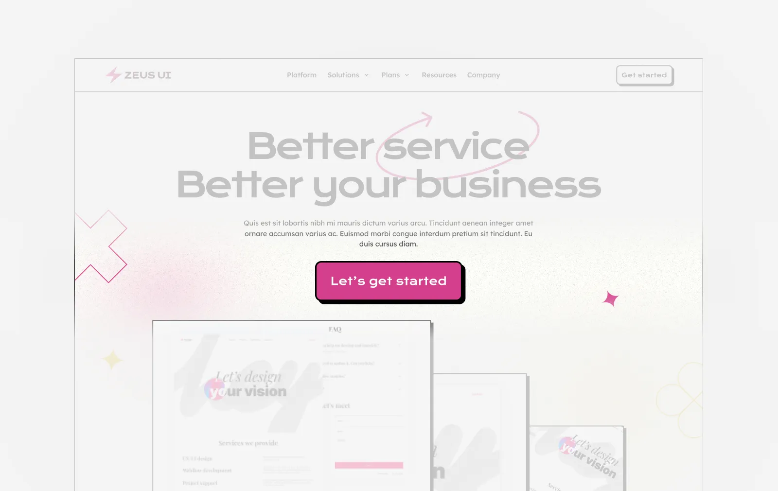
First screen equals first impression
When we have defined the mission of our landing page and made an assumption of what the visitor's interest is, we can proceed to the page structure. And we start with the first screen of the landing page. This is a very important section because according to research, 57% of website visitors pay the most attention to the first screen and might leave the page if the content is not engaging.
Therefore, we should write a catchy and persuasive headline and subheading, so that the user immediately understands where he landed and what this website is about. Sometimes your headline can be written in the first person (I or we), as this will make it feel more personal to your prospect. Finally, because readers' eyes tend to gloss over large blocks of text unless they're particularly compelling or relevant (and nothing is more compelling than money!), keep it short — no more than seven words long if possible.
After that, comes the most important part – a call to action or CTA. And we need to make sure that this call to action stands out. It's what makes or breaks conversion rates. You can have a beautiful design and strong copy, but nothing will work if you don't have a clear call to action. In some cases there are two CTAs that work complement each other: primary and secondary CTA buttons. Primary call-to-action is a dominant button, and secondary is a complimenting one. For example, if there are two CTAs, the primary can provide the function of buying a product ("Buy Now" or "Get Premium") and the secondary gives the users the option of getting the product for free or at least giving it a free try ("Free Download" or "Free Trial").
Here are some tips for designing an effective CTA:
- Use contrasting colors: Use color to draw attention to your CTA. Contrasting colors work best because they create contrast between background and foreground elements on your landing page, helping them pop out more naturally than if both were similar shades of blue or green for example.
- Make your CTA big enough. Of course, you should not make it gigantic, it should naturally fit into the interface, but at the same time it should encourage the user to take action.
Also, don't forget about using visual information in this section - images, videos, illustrations, infographics (and we highlighted all of them in the "Design tips to consider" section down below). Graphics is the most attractive type of data for people and the visual data on your main screen will be the first thing they notice, so this type of content should convey the essence of your site as best as possible. Plus, high-quality multimedia content not only shows what users are getting but also evokes emotions in them.
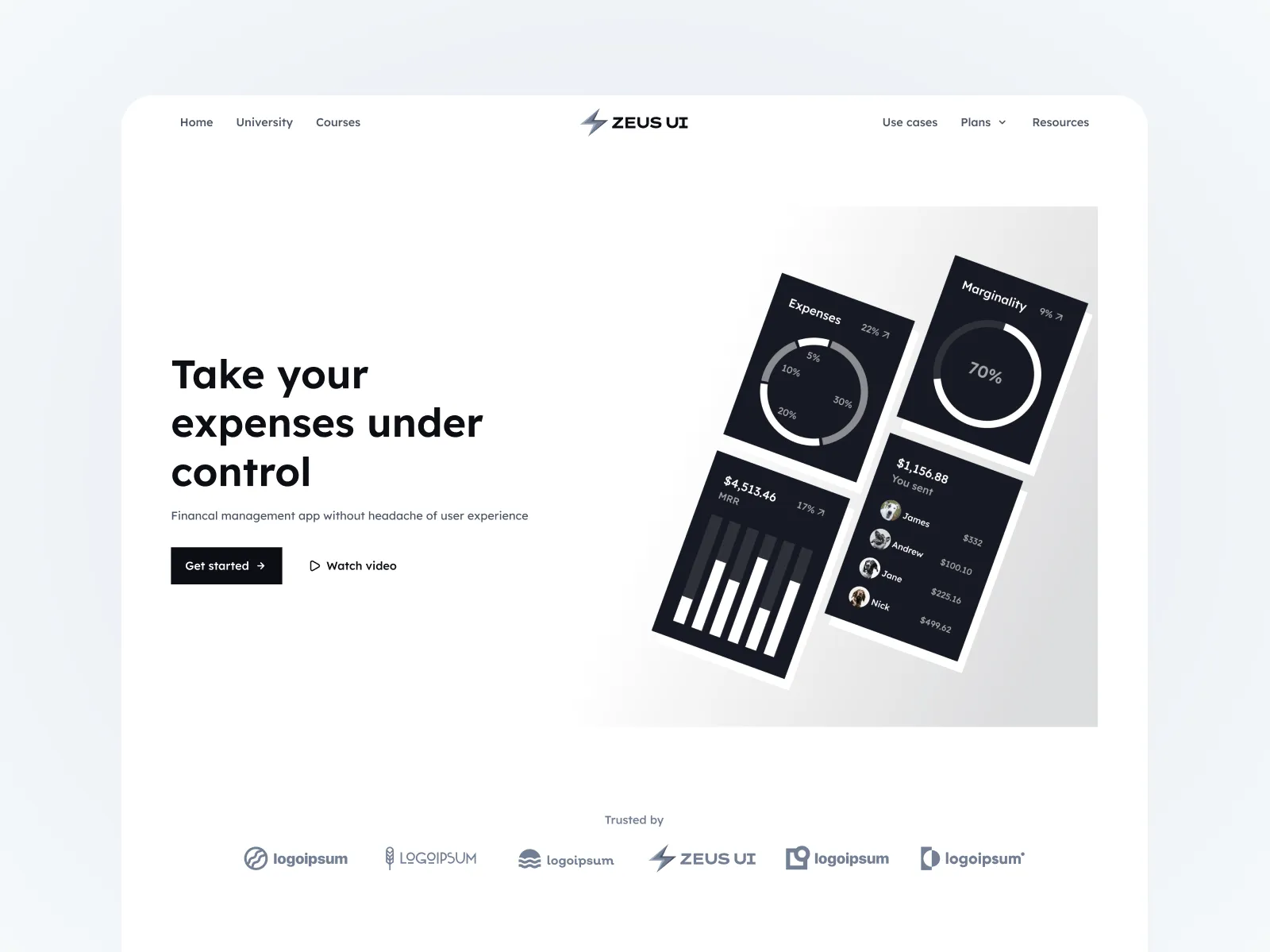
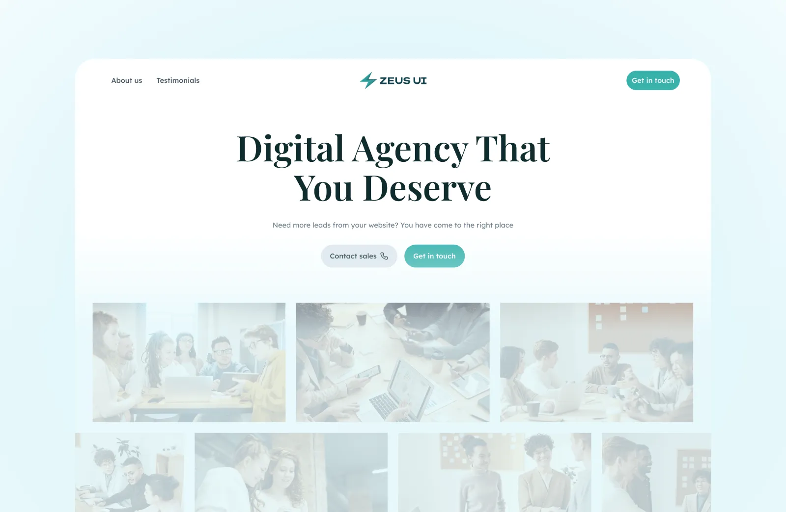
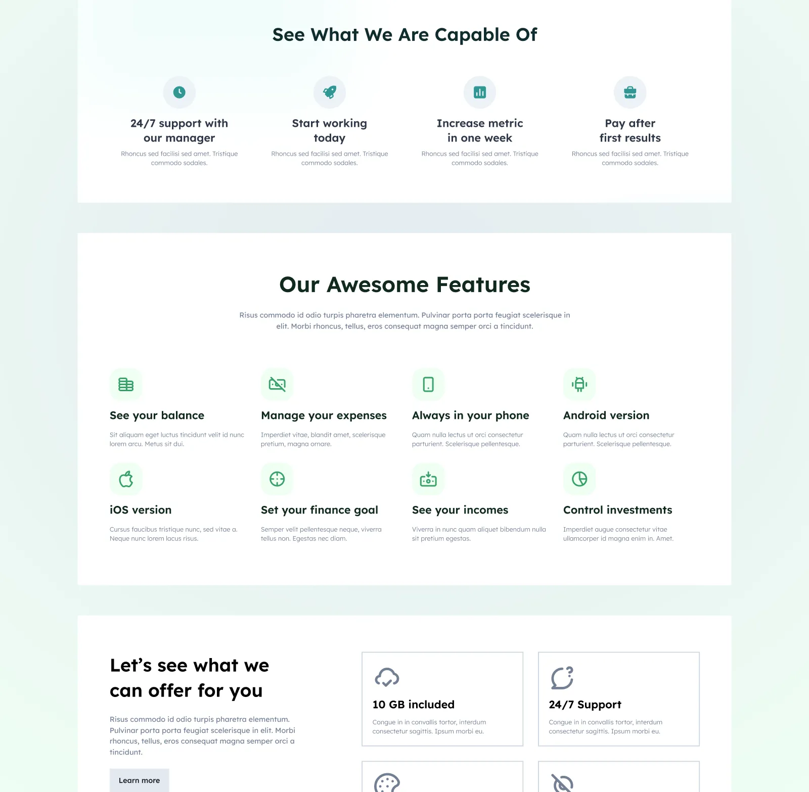
Describe your product/service and outline the benefits
After the first screen, it's time to highlight the info about the product and its competitive advantages with the help of one or two blocks. In this section we use the Features block. Do not forget that you need not only to praise your product or service but also to get into the pain points of your target audience.
You don't want to use jargon or technical terms, as these can confuse people and make it hard for them to know what you're trying to say. Similarly, if you do use too many words, this can make visitors feel like they're reading an essay rather than learning more about your product/service.
The best practice for creating a Features section would be to design it in several blocks with a prominent title and some explanatory text below, with subtitles of 2-3 lines that reveal the essence of the feature. You can use noticeable icons or images that help visualize the meaning. It is best to use from 3 to 6 main features - this way you don't overload the section with content.
Use social proof
Now we can proceed with the next screen. Please note that if the user has stayed on your website and scrolled the page below the main screen, but has not yet completed the target action, it means that he has become interested, but he does not yet fully understand the essence of the landing or he wants to study your product in more detail. As a rule, after the first screen, landing page owners immediately want to gain some kind of user trust and therefore place a block with the logos of their eminent clients (or it could be a rating with the number of reviews). This is the so-called social proof.
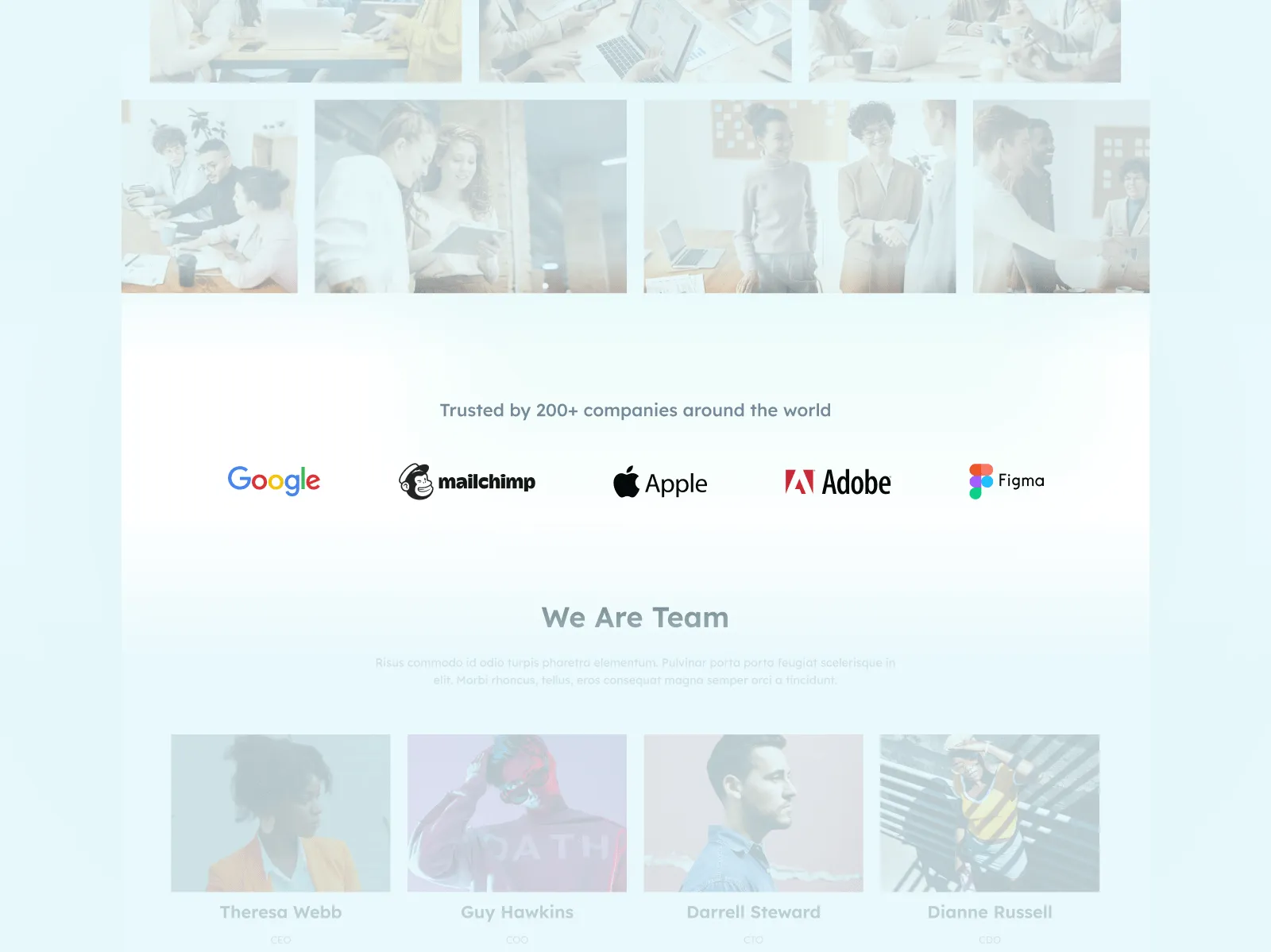
Social proof is a very common and popular tactic in marketing. According to a 2019 survey, 93.4% of respondents said they read customer reviews before making a purchase. During the survey period, it was also found that 77.5% of respondents compared prices from multiple sellers before making a purchase. This is where the bandwagon effect comes into play, a concept in social psychology that states that people are more likely to take action if other people are doing it. Thus, by placing the social proof on your LP website, you let the potential customer know that if others liked your product/service, then this customer will probably like it too.
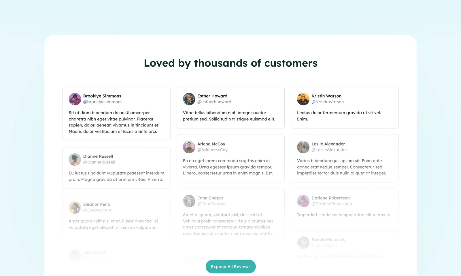
More detailed social proof with testimonials
Next, we will need a more detailed social proof. For instance, your clients' testimonials and success stories. By using detailed testimonials or reviews, you are allowing the customers to sell your product/service on your behalf.
It can be a video or written statement that demonstrates the benefits of using your product or service, as well as how those benefits have impacted their life in some way. Testimonials are typically used on landing pages to convince visitors that what you're offering will work for them too — and it's one of the easiest ways to accomplish this goal!
Embedding people's tweets as a testimonial is a good example. Because this way, users can immediately check the tweet itself, and at the same time check how authoritative the author of the review is.
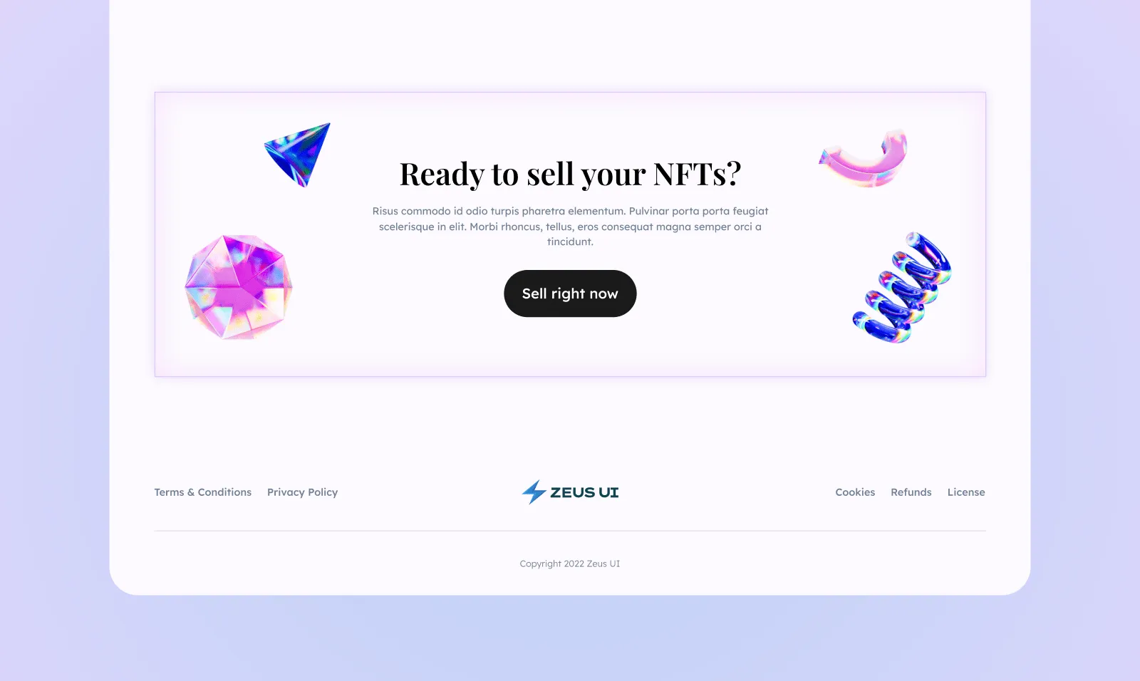
Emplace another CTA – it can be decisive
After you have provided the user with all the information that is needed and you made his/her journey through your landing page convenient enough to take action, it is time to put another CTA. This step is very important, as by this point the visitor may already want to become your client or at least find out more. Additionally, this is a nice trick to offer the user to convert without scrolling back to the top.
Create a good FAQ section
For those who have not yet converted to a client, it is worth posting a FAQ section with frequently asked questions. Please note that with this section you handle typical objections from your audience, as well as posting information that was not listed in other sections, especially where you need to answer users' questions. So here you should think about what questions your potential customers may have and answer them.
The most common questions in this section are usually questions about acquiring a product, like "What happens after I download", managing your account, like "How to log in and out", fixing a problem, like "Unsubscribe from emails", legal and privacy, like "How do I edit account privacy" and lots more. Of course, how you will compose questions on your site will depend entirely on the characteristics of your business.
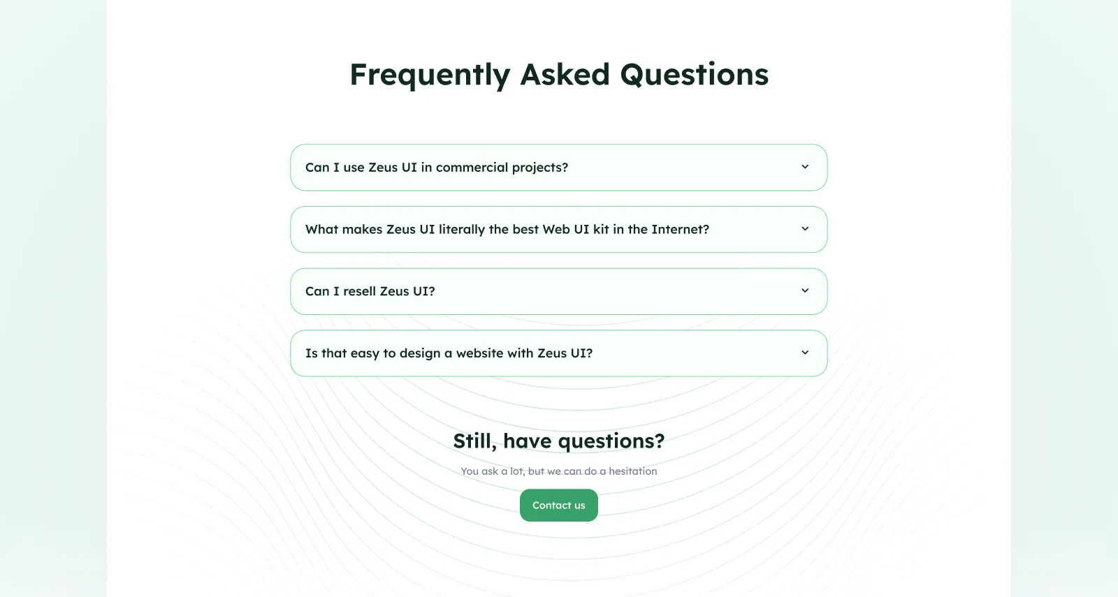
Creating an effective FAQ section takes some thought, but it's worth the effort. Here are some best practices:
-
Keep it short and sweet - The shorter and easier for people to find, the better! Make sure each question has only one answer (ideally) so that visitors can quickly scan through your FAQs without getting lost in paragraphs of text. It's also important not to overwhelm them with too many options—keep things simple!
-
Don't use technical jargon - If a visitor has reached your landing page, they probably already know what an "API" is and would rather hear plain English instead of industry language when reading through your FAQ section.
Include a footer with contact details
The above mentioned blocks will be enough to generate interest in your service or product, or even convert a user into a client. Therefore, at the very bottom, it is worth placing a footer with your contacts and links to other pages as a navigation throughout the site. Contact info is needed so that a visitor who is not yet ready to use your services can contact you or go to another page for a more detailed study.
The navigation links are arranged in the "glossary" mode in blocks, thanks to which you can immediately jump to the desired section. Because some users often hold down the "PgDN" button, go down to the desired section for specific technical information on the product, e.g. policy refunds, policy, etc.
As we mentioned above, your contact information and navigation links should be visible on every page of your website, so visitors can find it easily. This is especially important if you have multiple landing pages for different types of visitors. Customers who have already bought from you will remember your name and have an idea of what products or services you offer, but new customers need to know how they can reach out to get in touch with you. Always include your phone number and an email address in case the customer wants to contact with you.
Make Pricing section reachable
The pricing section shows the different pricing options that are available to clients and the benefits and features included in each tier. In fact, your pricing page is one of the most important pages on the site, because if its design and text are not good enough, you will lose a lot of potential income. On the contrary, when you have a well-optimized pricing page, a visitor will be more likely to make a purchase.
So, your Pricing section shouldn't stand out, but must be accessible. Because we've seen a lot of cases when users enter the main page, and without scrolling down much, they immediately want to know what the price of the product/service is. And if the price suits them, this is an instant sale in most cases.
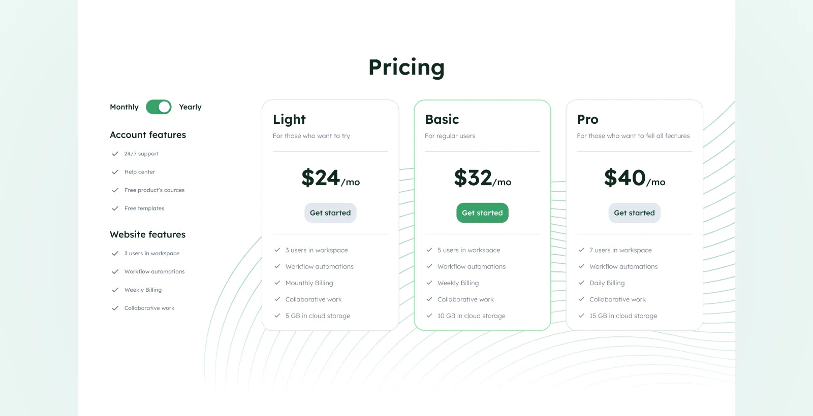
Here are the best practices for creating catchy Pricing sections:
-
Your content should be simple and clear. When it comes to price page design, your goal is to keep the visual and text content simple and uncluttered. You show the user what he pays money for and what he gets. Therefore, the perception of information here should be as clear as possible. And do not even think about adding unnecessary elements there, such as top navigation and sidebars. This will help the user to focus on the main information.
-
Highlight the recommended plan. You know better than anyone which option will satisfy the needs of most of your customers. Save your potential buyers the confusion by highlighting the plan that you think will suit the majority of your visitors.
-
Test constantly. Testing is a necessary step in marketing campaigns. Based on the information received and without having to guess - you can make important decisions regarding a pricing policy,
Therefore, try to test everything: prices, text content, headlines, page design, and call to action.
Design tips to consider
Color palettes are very important
Color is a crucial part of your landing page's design, and it's the first thing that users will notice when they land on your page. Color helps you to convey specific emotions and feelings to visitors, so you must use appropriate colors for different purposes.
For example, orange conveys a feeling of excitement and energy (think about how red works in this context), while blue is often used as a calming color or to give an impression of trustworthiness or stability (think about how much we associate white with purity). Sometimes designers use contrasting colors to grab attention; other times they use complementary pairs like blue/orange or black/white because their association evokes positive feelings within us humans!
Therefore, it is very important to understand and know that by applying certain colors to your website, you can drastically increase sales. This wonderful article will give you everything you need to understand the color psychology in marketing.
Use a variety of visual info
The power of graphic elements cannot be underestimated. They will help brighten up the monotony of your designs and help engage users by encouraging them to take action. Here is a list of elements that you should consider if you want to make a most effective landing page design.
-
Attractive images. Images and media are still among the most powerful means of communication. They are useful for conveying concepts and information, and can also help improve understanding by reinforcing the information presented in the text. Here is the hard fact: tweets with images receive 150% more retweets than tweets without them.
-
**Infographics.**Landing pages should showcase the effectiveness of your products/services, so it will be worthwhile to display a lot of statistics and numbers. Thus, you will show your effectiveness. And of course, when you present your data in the form of graphs, charts, or other beautiful visual elements, this will help to attract the attention and interest of the visitor.
-
Illustrations. Illustrations breathe creativity into your landing pages. According to a study, people are 323% more likely to follow directions when there are illustrations in addition to text. Depending on the scale of the images, illustrations could be a faster and more economical solution than organizing photo shoots for real images. Consider using 3D illustrations as this is still a hot trend in 2022.
-
Videos. According to Vidyard report, video content is the top performer for driving conversions. No surprise here, video is a wonderful way of having storytelling on the landing page. With videos, you can make a compilation of your product's features, as well as create a compilation of your customers' testimonials.
Maintain focus and apply the KISS Rule
One of the most important aspects of a landing page is keeping it simple. This can be accomplished by applying the KISS rule — Keep It Super Simple. The more you try to pack into one landing page, the more likely you are to annoy your customers and lose their interest.
If you're going to include multiple sections on your landing page, make sure that each section has its clear purpose. If it's not adding value for the visitor or improving usability, then it doesn't belong on your page!
The same goes with the lead generation form - the more steps you have there, the less likely customers will complete it. So, keep it as short as possible and make sure each question is necessary for your business goals. Plus, not only does a long-form increase the abandonment rate but it can also negatively impact user experience too!
Conclusion
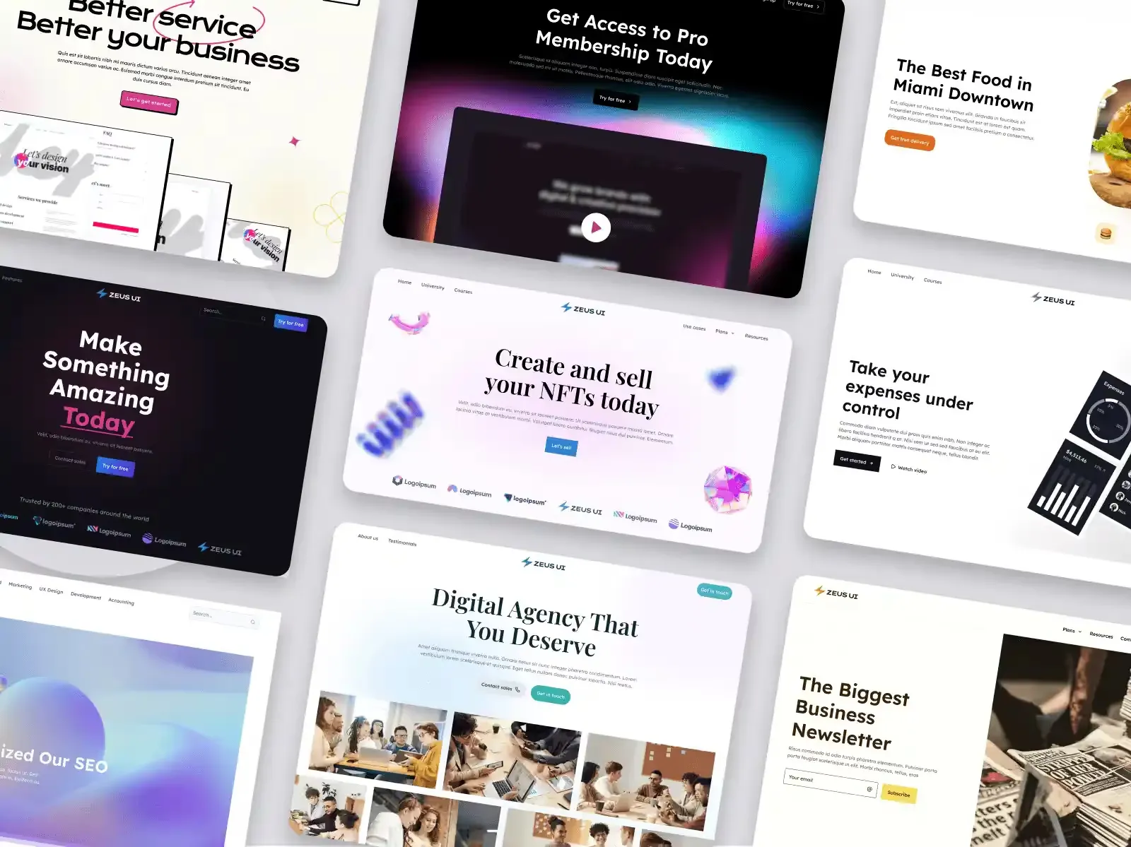
Landing page design is a difficult task because your product or service must overcome the mental barrier in the mind of every user on their journey from visiting your site to converting into a customer. And to successfully convert visitors, you need to not only talk about your product or service but also try to satisfy their interest and help them achieve the goals for which they came to your website. Landing pages are tested through rigorous user research, A/B testing, and adherence to top-notch UI/UX design principles. And to create successful landing pages, we developed Zeus UI Kit.
Do you need a landing page SaaS template? Or probably a landing page templates for a digital marketing agency? We got you covered. With this digital product for multi-purpose webpages, you'll get your design work done faster with over 630 pre-made blocks that you can use as-is.
We hope you found this post helpful. By following these tips and keeping in mind how to make your content more engaging, you'll soon see results.
Stay tuned and happy designing!


