
Roman Kamushken
Filter – is a tool that allows users to refine and limit a dataset or content based on specific criteria, helping them easily find the desired information by eliminating irrelevant elements.
This publication will be incredibly valuable for UX / UI designers, and web devs involved in the product design and development of user interfaces. After reading the entire article, you will gain a wealth of knowledge, including:
- A comprehensive understanding of the essential components and considerations in filter UI design anatomy.
- Insight into various filter layout types, their advantages, and important factors to consider when choosing one.
- Real-life use cases of filters in popular niches like e-commerce, travel, real estate, and job portals, providing practical examples and inspiration.
- Strategies for improving filter usability, such as prioritizing options, implementing real-time feedback, and incorporating helpful inline helpers and tooltips.
- Recognition of the unique considerations and best practices for mobile and desktop filter usage, including responsive design approaches.
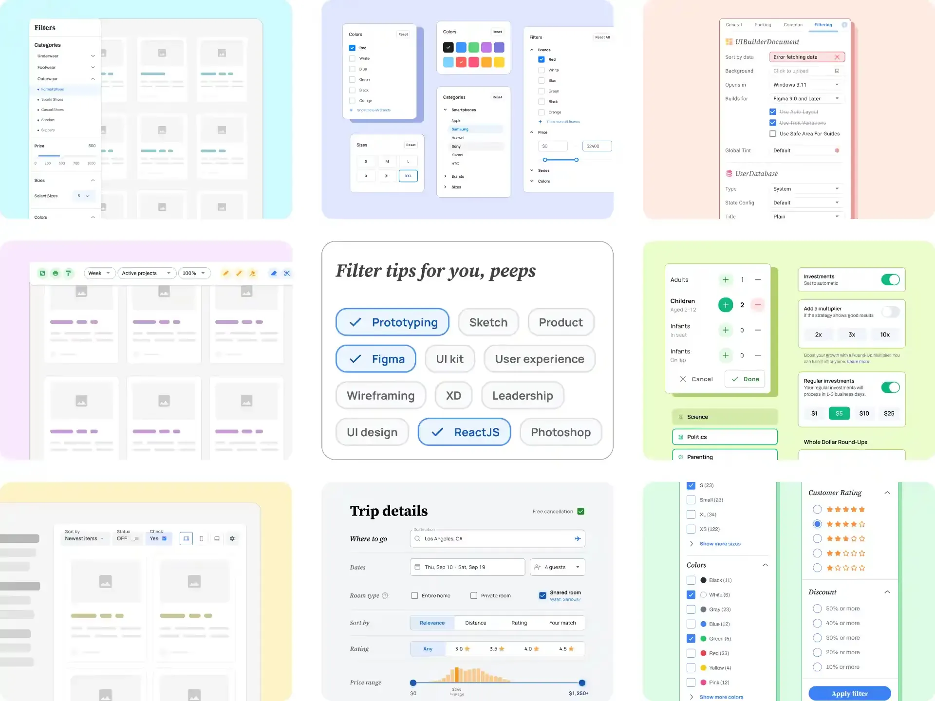
Filters Anatomy
Input Fields

Inputs Inspiration by Material-X
Input fields in filter UI design are interactive elements that allow users to enter specific criteria or values to refine the displayed content. They provide a means for users to customize and narrow down information within a dataset or search results.
Filter inputs can be used in various use cases, such as:
- Price Ranges: Input fields allow users to specify a range of prices, helping them filter products or services based on their budget.
- Date Ranges: Users can input specific start and end dates to filter search results based on a particular time period.
- Numerical Values: Inputs can be used to filter results based on numerical ranges, such as ratings, distances, or quantities.
- Textual Keywords: Users can input specific keywords to filter search results based on specific attributes or characteristics.
Some design tips for Input Fields:
- Clear Labeling: Use concise and user-friendly labels for input fields. Labels should align with users' expectations and clearly indicate what input is required.
- Input Validation and Feedback: Implement input validation to provide real-time feedback on errors or invalid data.
- UX Enhancements: Consider incorporating input tweaks, such as auto-suggest options or pre-populated values where it might help fit their desired criteria.
A well-designed filter input UI enhances usability and enables users to find exactly what they are looking for. Designers must build intuitive inputs that empower users to refine their search results effectively.
Dropdowns

Dropdown Inspiration by Material Me
Dropdowns in filtering flow are commonly used for a large number of sorting options or when there is a hierarchical structure to the filtering criteria. They assist users to customize their results by selecting specific filter terms from a dropdown menu.
Filtering dropdowns can be used in various use cases, such as:
- Categorizing to provide a list of sections or tags for a user to select for the filtering.
- Sorting to arrange the displayed content based on various criteria such as price, popularity, or relevance.
- Multiselect to handle multiple selections, enabling users to choose multiple criteria simultaneously to apply complex filters.
Keep in mind when designing dropdowns for a filter flow:
- Default Selection: Consider providing a default selection that aligns with user expectations and saves them time. For example, having the "Sort by: Relevance" option selected by default can provide a logical starting point for users.
- Search functionality: Implement a search mechanism within the dropdown to assist users in finding specific filter options quickly. It's useful when dealing with a long list of choices or when users are unsure about the available options.
- Multi-Selection Support: Consider implementing multi-selection functionality for dropdown filters, especially when users may want to apply multiple filters simultaneously. This allows for greater flexibility and tailored results.
Dropdown menus are powerful tools for implementing filters due to their compact nature and ability to handle multiple options selected.
Checkboxes

Checkboxes Inspiration by Appka UI
Checkboxes allowing users to select multiple options from a list of choices; giving the ability to select multiple options simultaneously, you make them ideal for filtering large datasets.
Here are a few common use cases for checkboxes in filter UI design:
- Filtering by Attributes: Checkboxes are used to assist in filtering products or items based on their parameters, such as size, color, material, or manufacturer.
- Multiple Selections: Users may want to select multiple options within a single filtering scenario (e.g. choosing several genres in a music app).
- Boolean Filtering: Useful to narrow output where each checkbox represents a binary option, like on/off or true/false selections.
Here are tips to consider about filtering checkboxes:
- Grouping: If you have multiple checkbox filters, consider organizing them based on related criteria. Use headings or dividers to visually separate different groups.
- Visual Affordance: Use visual cues to signify the active/hover state of checkboxes, such as color changes, checkmark symbols, or backgrounds highlight.
- Persistent Selections: If possible, retain the selected checkboxes even after users navigate away from the filter page. This helps users maintain their preferences when returning to the page, avoiding the need to re-select their choices.
When used properly, checkboxes should enhance the user experience by simplifying the filtering process, making it easier for users to navigate through large datasets.
Radio Buttons

Radio buttons Inspiration by iOS UI kit
Radio buttons, a type of input control, allow users to select one option from a set of mutually exclusive choices. In filtering patterns, they serve the purpose of allowing users to make single selections from a range of available options.
Radio button sample use cases are:
- Product search: E-commerce websites often provide filtering options to help users find the desired products. Radio buttons can be used to filter products by different attributes like price range ("Under $50," "$50-$100," "$100+"), size ("Small," "Medium," "Large"), or color ("Red," "Blue," "Green").
- Content filtering: In applications that display various types of content, such as news websites or social media platforms, radio buttons can be used to filter content by category ("News," "Sports," "Entertainment") or sorting options ("Most Recent," "Popular," "Trending").
- Job search: When users are looking for job opportunities, radio buttons can be used to filter job listings by industry ("Technology," "Finance," "Healthcare"), job type ("Full-time," "Part-time," "Contract"), or location ("Remote," "On-site").
- Event filtering: In case of searching for events or activities, radio buttons can be employed to filter events by date ("Today," "This Week," "This Month") or location ("Local," "National," "International").
Some additional advices (previously listed Checkbox design tips applies here):
- Default selection: Consider implementing a default selection for categories that commonly have one prevailing option or for the most common use-case.
- Limited number of options: Avoid overwhelming users with too many radio button options at once. Keep the limit up to 5 variants to select from.
- Progressive disclosure: Show only a subset of options initially, and provide an option to expand or show more choices if needed.
By selecting a Radio Button, users indicate their preference or choice among the available options, and the filter is applied accordingly.
Sliders

Sliders Inspiration by Full iOS
Sliders are interactive input controls that allow users to select a range of values by moving a handle along a track. They are commonly used in filtering patterns to enable users to refine their search or filter results based on a continuous numerical range.
Sliders mainly used in filtering numeric ranges, such as:
- Price Range Filter: Users can easily slide the handle to select a specific minimum and maximum price, refining their search results accordingly.
- Size or Quantity Filter: Sliders are ideal for filtering items based on size or quantity. Users can specify the desired range of product dimensions or quantity, ensuring the filtered results meet their specific needs.
- Distance Filter: Sliders can be employed in location-based filtering, allowing users to set desired distance range from a particular location.
Here are design tips specific for Sliders:
- Handle Design: Use an intuitive and visually distinct handle design to make it easy for users to grab and slide. Avoid small or crowded handles that can make interaction challenging, especially on touchscreens.
- Tooltips: Include tooltips that display the specific value or range selected by the user as they slide the handle. This real-time feedback helps users understand the impact of their selection.
- Snap-to-Value: Implement a snap-to-value feature that aligns the slider handle to specific values or increments. This ensures that users can easily select precise values rather than struggling to hit exact points on the slider.
In the context of filtering flows, sliders are key elements that empower users to fine-tune their numeric search criteria and narrow it effortlessly.
Toggle Switches

Toggles Inspiration by Appka UI kit
Toggle switches are compact UI elements that provide a simple on/off control. They are frequently employed in filter designs to enable users to choose between two options that cannot be simultaneously chosen.
Filtering toggles usually utilized for:
- Inclusion/Exclusion Options: Toggle switches are often used to allow users to include or exclude certain filter options. For example, in an e-commerce website, users may want to toggle on or off filter options such as "In Stock" or "On Sale".
- Binary Options Filtering: Toggles are also convenient when dealing with binary filter options, where only two choices are available. For instance, users may toggle a switch to filter flight results for "Direct Flights" or "Connecting Flights" only.
- Filter Status Indicators: Toggled switches can also serve as status indicators for applied filters. Thus users can see at a glance which filters are activated now.
Keep in mind when designing switches:
- Highlight the Active State: Make sure the active state of the toggle switch is clearly highlighted so that users can easily identify which filter is currently selected.
- Support Multiple Selections: If users need to select multiple filter options simultaneously, consider using checkboxes instead of toggle switches. This allows users to choose more than one filter option at a time, gaining more control.
- Order Filters Smartly: Prioritize captions first, then position toggle switches in the right column. When ordering, consider user preferences and arrange commonly used or significant switches at the top or left for easier access.
By incorporating toggle switches into filtering patterns, designers can provide users with more control and flexibility in their search and navigation processes.
Chips

Chips Inspiration by Material X
Chips are small, self-contained elements that represent selected filter options within a larger set of choices. The primary chip purpose is to provide a clear visual indication of active filters and enable easy modification or removal.
Implement chips for:
- Visual representation: Chips serve as a visual representation of the applied filters, making it easier for users to see and understand the current filtering criteria.
- Quick removal: Chips allow users to easily remove individual filters by clicking on the respective chips, providing a convenient way to refine their search criteria.
- Multiple selections: Chips enable users to select and apply multiple filters simultaneously, allowing for more refined and granular filtering options.
Here are several design tips for chips:
- Visual indication of active filters: Provide a visual cue, such as color, border or highlight, to differentiate between active and inactive chips.
- Provide a counter indicator: Include a summary showing the total number of applied filters, especially if not all chips are visible at once. This helps users easily understand the current filter selection.
- Easy removal and modification: Include a clear and accessible way to remove or modify selected filters, such as an "x" icon or an editable input field.
In general, chips make it easier for users to comprehend and control complex filter settings by visually organizing and representing their selections.
Counters

Counters Inspiration by Full iOS
In filtering scenarios, a counter refers to a numeric indicator that shows the number of items or results associated with a specific filter option. It provides details about the quantity of triggered options within each filter category.
Use cases for counters:
- Product Listings: Displaying the number of items under each filter option, such as "Shoes" or "Clothing," helps users assess the quantity of options inside each.
- Search Results: Indicating the number of search results associated with filter options like location, price, or rating to allow users refine the content effectively.
- Collapsed Filter Categories: Counters can also be useful when filter categories are collapsed or hidden. Thus users can prioritize which filters to explore further and save time by avoiding unnecessary clicks.
Key design guidelines for counters:
- Visibility: Ensure the counter is prominently displayed near the filter option or category for easy association, using font size, color contrast, or placement.
- Real-Time Updates: Dynamically update the counter as users apply or remove filters to provide accurate information for their decision-making process.
- Simplify Long Numbers: If the counter is too large, use abbreviations, rounding to avoid visual overload. Display "1.2k" or "1K+" instead of "1,234."
- Use Animation: Use animated counter step when it changes value to draw attention without distractions. This creates a subtle visual effect and UI interactivity.
Integrating counters into your filter UI design offers users valuable insights into the number of options available within each filter category, especially when collapsed.
Clear/Reset Buttons

Reset Buttons Inspiration by Material X
Clear/Reset Buttons are user interface elements that allow users to quickly discard all applied filters and revert to the default state.
Few use cases where such buttons are beneficial:
- Complex filter combinations: When multiple filters applied, a Clear/Reset Button allows them to start fresh and modify their selection criteria without any hassle.
- Error correction: In cases where users mistakenly apply incorrect filters or want to undo, a Clear/Reset Button provides a straightforward method to start over.
- Enhanced usability: Such buttons contribute to a more intuitive filtering experience by giving users an easily accessible way to return to the initial filter state.
Consider the following tips for Reset feature:
- Clearly label the button: Use descriptive labels such as "Clear Filters" or "Reset" to accurately communicate the button's purpose and its function at a glance.
- Position appropriately: Place the Clear/Reset Button in a prominent location within the filter interface, ideally near the other filter controls.
So, Reset buttons provide a convenient way for users to start their filtering process anew or undo their selections without having to manually deselect each filter option.
Filter Layout Types
Sidebar template

Filters sidebar template inspiration by Panda UI kit
The sidebar template involves placing the filter options in a vertical sidebar, typically positioned on either the left or right side of the content area.
The Sidebar finds utility in many use cases where popular are:
- E-commerce websites: Users can filter products based on attributes like price, size, color, brand, and more.
- Booking platforms: Users can narrow down their hotel search by filtering based on star rating, amenities, guest ratings, price range, and location.
- Productivity apps: Users can filter tasks, notes, or files based on categories, tags, dates, and other properties.
- Media libraries: Users can filter media content, such as photos, videos, or audio files, based on filters like date, location, tags, and file type.
**Pros of Sidebar Template:
**
- Space-efficient: The sidebar layout optimizes screen real estate by keeping the filters compactly organized in a vertical menu, leaving more room for content.
- Constant visibility: Filters remain visible at all times, providing users with a consistent reference point while browsing or navigating the interface.
**Cons:
**
- Limited filter visibility: Displaying numerous filters in a sidebar can lead to a long list that might result in some options being hidden or requiring scrolling, potentially impacting discoverability.
- Reduced content width: In cases where the sidebar is fixed, it can reduce the available horizontal space for displaying content, especially on smaller screens.
Design Tips for Desktop Resolutions:
- Keep the sidebar always visible: Make sure the sidebar remains fixed and easily accessible even when users scroll through the page.
- Use clear labels and visual cues: Clearly label each filter option and consider using visual indicators, such as icons or color coding, to enhance usability.
- Allow collapsible sections: If there are multiple filter categories, consider using collapsible sections to help users navigate and reduce visual overload.
Adapting to Mobile:
- Prioritize essential filters: Due to limited screen on mobile devices, prioritize the most critical filters and consider implementing expandable content sections.
- Utilize off-canvas menus: Use off-canvas menus or drawer-style overlays to accommodate the sidebar filters on smaller screens without sacrificing space.
**When to Use Side Bar Filters:**
Side bar filters are best suited for scenarios where there is a need to display a wide range of filter options or when the filters are an essential part of the user journey.
Top Bar Layout

Top Filters Bar inspiration by Material Desktop UI kit
The Top Bar Layout is a type of filter layout where the filtering options are displayed horizontally at the top of the interface, usually in the form of buttons or tabs.
This layout is ideal when you want to provide users with quick access to frequently used filtering options without taking up a significant amount of screen space.
**Use Cases for the Filters Top Bar positioning:
**
- Search engines: Allowing users to refine search results by filtering through different categories like images, videos, news, etc.
- Job search websites: Allowing users to filter job listings by location, industry, job type (full-time, part-time, remote), experience level, and salary range.
- News websites: Filters at the top allow users to narrow down news articles based on categories, dates, or specific topics of interest.
**Pros of the Top Bar Layout:
**
- Visibility: Placing the filter at the top of the page ensures its immediate visibility, enabling users to easily locate and access filtering options.
- Efficient use of space: The top bar layout utilizes horizontal space efficiently, allowing for more filter options to be displayed without overwhelming the user.
**Cons:
**
- Limited space: If there are filter options with longer labels or multiple choices, the top bar layout may become restrictive and result in truncated or hidden options.
- Potential distraction: Placing filters at the top might draw users' attention away from the primary content, especially if the filters are visually dominating.
Design Tips for Desktop Resolutions:
- Ensure clear visual distinction between the filter bar and the rest of the UI to make it easily identifiable.
- Use concise and descriptive captions for filter inputs to maximize space utilization.
- Provide a filter status indication by highlighting selected filter options or indicating the number of active filters to ensure visibility and comprehension.
Adapting to Mobile:
- Сollapse the filter options into a dropdown menu or an expandable panel helps prioritize screen space and provide a clutter-free experience.
- Optimize touch sizes of spots to avoid accidental taps on adjacent filters.
**When to choose Top Bar Filters:**
Filters at the top are suitable when filtering criteria are simple and limited in number. They work best when the filters are not the primary focus of the user's interaction but still need to be easily accessible.
Inline Placement

Inline filters template design inspiration by Material Desktop UI kit
Inline Placement refers to the placement of filters horizontally within the content area of a webpage or application, allowing users to modify their filter selections without navigating away from the main content.
**Use Cases for Inline Placement:
**
- E-commerce Product Filtering: Inline filters are commonly used in e-commerce websites to allow users to refine their product searches. This helps easily access and modify filter selections while simultaneously viewing the product listings.
- Data Analysis and Reporting: Inline filters are also frequently employed in data-intensive applications where users need to filter and analyze large data grids.
**Pros of Inline Placement:
**
- Compact and Efficient: Inline filters minimize visual clutter and save space by integrating them with the content area, providing a seamless user experience.
- Immediate Contextual Understanding: By placing filters inline, users can easily understand the relationship between the filters and the displayed content.
**Cons:
**
- Limited Visibility: Inline filters may become less noticeable, especially when the content area is extensive or visually dense.
- Limited Filter Options: Due to space constraints, the number of available filter options or filter types may be limited, potentially hindering advanced capabilities.
Designing for Desktop & Mobiles
For desktop apps, ensure that the inline filters are visible above the fold, allowing users to easily access them without scrolling. Utilize dropdown menus or collapsible sections to save space and enhance the layout's tidiness.
On mobiles consider collapsing the filters initially and providing a clear and easily accessible button to expand. Implement sticky filters on mobile to ensure they remain easily accessible as users scroll through the content.
**When to prefer Inline Placement:**
Inline filters are ideal for scenarios where immediate visual feedback is important, and the filters need to be closely tied to the content being filtered.
Filtering Usability Tips
Accessibility in Filters

Accessible filters inspiration by Neolex UI kit
Filtering accessibility refers to designing and implementing filters in a way that ensures users with disabilities and impairments can access and utilize them effectively. It involves creating inclusive filtering experiences that provide equal access and usability for all users.
Goals of Having Accessible Filters:
- Inclusivity: Ensure that filters are usable by everyone, including individuals with disabilities such as visual impairments, motor limitations, or cognitive challenges.
- Better User Experience: Improve the overall usability and satisfaction of all users by providing clear and intuitive filtering options.
- Faster and Efficient Navigation: Well-designed filters help users quickly find the desired information and improve the efficiency of their searching experience.
- Improved User Satisfaction: Accessible filters improve the overall usability of a website or application, boosting user satisfaction when filtering content.
**Design Tips for Accessible Filters:
**
- Clear Reset Functionality: Include a clear and easily accessible option to reset all filter selections, allowing users to start anew if needed.
- Progressive Disclosure: Use it to reveal advanced filters or secondary filter options, allowing users to see relevant options without overwhelming them initially.
- Multiple Select Options: Allow users to select multiple options within a filter category to accommodate diverse preferences and refine search results.
- Search or Type-ahead Filters: Offer such a functionality for filters with many options – users can quickly find needed options instead of scrolling a lot.
Visual Feedback in Filters

Filters visual feedback inspiration by Appka UI kit
Filtering visual feedback refers to the visual cues and indications given to users to communicate the status and impact of their filter selections. It allows users to quickly understand the effects of their filters and aids in their decision-making process.
Methods of Visual Feedback:
- Applied Filters Display: Display the selected filters prominently, either in a separate section or within the filter interface itself. Provide clear visual indicators, such as tags or labels, to show which filters are active.
- Active Filter Count: Show the number of active filters alongside the applied filters display. This gives users a quick overview of how many filters are currently active and encourages them to review their selections if needed.
- Results Count: Display the number of results that match the active filters. This helps users understand the impact of their selections and provides reassurance that their filtering is producing the desired outcomes.
- Filter Highlighting: Highlight the selected filter options to distinguish them from the available options. This makes it easier to locate and modify their selections.
- Show Tooltips: Tooltips can be used to provide additional information and context about specific filters. When users hover over a filter option, a tooltip can appear, offering a brief clarification of the filter's purpose or expected results.
- Feedback on Empty Results: If a filter combination yields no results, provide clear and informative feedback to guide users in adjusting their filters. Explain why no results were found and suggest alternative options.
One of the most crucial benefits of providing visual feedback is that it enhances the user's sense of control and confidence. By clearly displaying the selected filters and their impact on the results, users feel more empowered in their filtering process.
Visual feedback helps them make informed decisions, understand the consequences of their choices, and adjust their selections as needed.
Data Fetching in Filters

Filters data fetching inspiration by Material X UI kit
Data fetching refers to the process of retrieving and presenting filtered data to the user based on their selected filter criteria. The efficiency and responsiveness of data fetching significantly impact the usability of filters.
There are 3 common methods of data fetching:
- Live data fetching involves retrieving and updating data in real-time as the user selects or modifies filter options.
- Batch data fetching is a method of retrieving and updating data in groups or batches at specific intervals or triggers, rather than instantly in real-time.
- Per-filter data fetching is a method that enables the retrieval and updating of data for individual selected filter options independently.
Choosing the Right Fetching in Filters
The choice depends the nature of the application, the size and complexity of the dataset and technical considerations. It is essential to consider:
- Performance requirements: Evaluate the impact of each data fetching method on performance, considering factors like response time, server load, and network bandwidth consumption.
- Real-time updates: Determine whether immediate real-time updates are necessary for the filtering experience or if a slight delay is acceptable.
- Offline Accessibility: If offline usability is crucial for your app, consider batch data fetching as it allows users to refine filters even without an internet connection.
- Data and server constraints: Take into account the size and frequency of updates in the dataset, as well as the capacity of the server infrastructure.
Progressive Disclosure in Filters

Filters progressive disclosure inspiration by Panda UI kit
Progressive disclosure is a technique used in filters design where information or options are revealed gradually, based on the user's needs or level of engagement.
Techniques of Progressive Disclosure when building Filters:
- Initial Display: Display a limited number of essential filters initially, ensuring a clean and uncluttered interface.
- Expandable/Collapsible Categories: Merge related filters into expandable or collapsible categories, reducing visual overload and enabling users to delve into specific criteria when needed.
- Show More/Less Options: Provide users with a way to reveal or hide additional filter options based on their level of interest or specific search needs.
- Conditional Filtering: Based on user interactions or selected criteria, dynamically present relevant filters or hide irrelevant ones.
- Search-as-You-Type Filtering: Implement real-time search that filters options as users type, helping them find specific choices quickly.
The benefit of progressive disclosure in filtering is reducing cognitive load for users. By presenting filters gradually, users are not overwhelmed with a multitude of options at once, making the decision-making process less intimidating.
Errors Prevention in Filters

Filters error state by Material Desktop UI kit
Filtering errors prevention refers to the design strategies and techniques employed to minimize user errors when working with filters. By anticipating potential errors and providing clear indications, designers can help users make informed choices.
Here are common errors related to filters:
- Selection Errors: Users may inadvertently select incorrect options or make unintended choices.
- Overlapping Filters: Users might select conflicting filter options, resulting in a lack of or inaccurate results.
- Forgotten Filters: Users may fail to notice or remember which filters they have applied, leading to confusion.
- Filter Misinterpretation: Users may misinterpret the purpose or functionality of certain filters, leading to erroneous selections.
Indicating filtering errors is crucial for helping users identify and resolve any issues. Consider the following methods for indicating filtering errors:
- Borders Color: Highlighting the borders of selected filter options or conflicting options with a distinct color helps draw attention to potential errors.
- Components Background Color: Changing the BG color of inputs, checkboxes or sliders can indicate the applied filter and provide visual confirmation to the user.
- Iconography: Use icons to visually convey the state of applied filters, indicating when a filter is active, inactive, or conflicting.
- Microanimations: Employ subtle animations to provide visual feedback when users select or change filter options, assisting in understanding the impact of a choice.
Using UI Animation in Filters

Filters UI animation by Yaro Zubko
UI animation in filtering patterns refers to the strategic use of motion and transitions within the filter UI design to enhance the user experience. Micro-interactions guide users' attention, communicate changes, and provide visual feedback.
Use Cases for Filters Micro-Interactions:
- Selection Feedback: Animate the selected filter state to provide visual cues and confirm actions.
- Clearing Filters: Use animation to smoothly reset or clear selected filters, giving users a clear indication of the action.
- Show/Hide Filters: Apply animations to show or hide additional filter options, improving the discoverability and functionality of filters.
- Input Validation: Employ animations to validate user input in filter forms, highlighting errors or providing visual confirmation.
- Loading States: Use loading animations to prevent user frustration and provide feedback when filters are fetching or processing data.
Design tips to consider for good UI animation:
-
Timing and Duration:
-
Keep animations fast and snappy to maintain a sense of responsiveness.
-
Avoid overly long or slow animations to prevent users from feeling frustrated.
-
Smooth Transitions:
-
Apply easing functions to create smooth transitions between filter states, providing a more natural feel.
-
Implement transitions that align with the brand's overall visual aesthetic to maintain consistency.
-
Visual Clarity and Affordance:
-
Ensure that the animation clearly communicates the action being performed, avoiding ambiguity.
-
Use visual cues such as fade-ins, slide-ins, or scaling effects to indicate changes caused by filter interactions.
-
Subtle Feedback:
-
Utilize subtle animations to provide immediate feedback when users hover over or interact with filter options.
-
Highlight selected filters with a gentle animation to reinforce the action and aid user understanding.
By carefully applying CSS animations, designers can create visually appealing and intuitive filter templates that guide users seamlessly through the filtering process. The key is to strike a balance between aesthetically pleasing animations and ensuring they do not slow down the user's filters utilization.
Filter Popular Use-cases
Using Filters in Ecommerce
Most Popular Filter Categories in Ecommerce:
- Price Range: Enables users to filter products based on their budget preferences.
- Brand: Allows users to filter products by specific brands they prefer.
- Size/Dimensions: Particularly significant for clothing, furniture, and electronic items.
- Color: Enables users to filter products by their desired color or shade.
- Ratings/Reviews: Lets users filter products based on customer ratings and reviews.
- Availability: Allows users to filter products based on their availability status (in stock, out of stock, pre-order, etc.).
**"Jake's Going for Adventure"**
Jake, an avid traveler, is planning his next adventure. He wants to purchase a lightweight travel backpack that fits within his budget, from a reputable brand, and has a capacity of at least 40 liters. Jake is also specifically looking for a backpack with a hip belt for added comfort. He wants to ensure he can easily find the perfect backpack through effective filtering options.
Jake's Filtering Flow:
- Jake visits an ecommerce website specializing in travel gear and navigates to the "Backpacks" category.
- He applies the "Price Range" filter to narrow down his options based on his budget.
- Jake selects his desired brand using the "Brand" filter option.
- Next, he filters the backpacks by choosing the "Size/Dimensions" option and selects a minimum capacity of 40 liters.
- Jake further refines his search by selecting the "Hip Belt" filter option to ensure the backpacks displayed have this feature.
- Finally, he reviews the filtered products, paying close attention to ratings and reviews before making his purchase decision.
UX Pitfalls and Challenges:
-
Insufficient Filters: When the e-commerce website lacks specific filter options such as hip belt or lightweight design, Jake may find it challenging to narrow down his search results effectively.
-
Ambiguous Filter Labels: If the filter labels are unclear or use technical jargon, Jake may struggle to understand the purpose of each filter option, leading to confusion and inefficient filtering.
-
Limited Filter Categories: If the website only offers general filter categories like brand and price range, without considering important features like capacity and comfort, Jake may have difficulty finding required backpacks.
Possible Solutions:
-
Comprehensive Filter Options: Provide specific filter options such as hip belt, lightweight design, and backpack capacity to cater to Jake's specific requirements, ensuring he can easily find suitable backpacks.
-
Clear and Understandable Labels: Use descriptive labels that are easily understood, avoiding technical terms or jargon. For example, instead of "Adjustable Suspension System," use "Hip Belt for Added Comfort" to clearly convey the purpose of the filter.
-
Relevant Filter Categories: Include filter categories that cover important features like capacity, brand reputation, and comfort. This ensures Jake can efficiently filter down his search results based on his specific needs.
Real Estate Filters
Filter Categories in Real Estate Search:
- Location: This filter allows users to specify their preferred location, ensuring that the search results are tailored to their desired area.
- Property Type: Users can filter the results based on the type of property they are interested in, such as apartments, houses, or commercial spaces.
- Price Range: This filter enables users to set a minimum and maximum price range, helping them find properties within their budget.
- Bedrooms and Bathrooms: Users can specify the required number of bedrooms and bathrooms to narrow down their search to properties that meet their space requirements.
- Amenities: This filter allows users to select desired property amenities, such as a pool, gym, or pet-friendly options, ensuring that the search results align with their preferences.
- Square Footage: Users can filter properties based on their desired size, ensuring that the search results match their space needs.
- Nearby Facilities: This category includes filters for proximity to schools, hospitals, public transportation, and other amenities that users consider important for their lifestyle.
**"Emily's Quest for a Dream Home"**
Emily, a young professional searching for her dream home, wants a spacious apartment with a gym and within walking distance to a park. Emily plans to rely on filters to narrow down her options and find the perfect property.
Emily's Filtering Flow:
- Emily begins by entering her desired location and selecting the property type as an apartment.
- The system presents a list of apartments available in the chosen location.
- Emily sets a maximum price to ensure the search results only display properties within her budget.
- Then she selects the gym option to find apartments with fitness facilities.
- Emily narrows down her search by using the nearby facilities filter and selects the park option to find apartments within walking distance to a park.
- Suddenly, she realizes that applying multiple filters has reduced the number of options available, resulting in a more tailored search.
- If the search yields limited results, Emily can adjust filters, such as expanding the price range or removing the park filter if it is not essential to her.
- The system presents a refined list of apartments that meet Emily's preferences.
UX Pitfalls and Challenges:
- Overlapping Filters: Users might encounter difficulties when filters overlap, such as when a property with an on-site gym is also required to have parking.
- Insufficient Filter Options: In some cases, the available filter options may not cover all the user's desired criteria, limiting their ability to narrow down the search results effectively.
- Cluttered Filter Interface: A cluttered or overwhelming filter interface can result in a poor user experience, making it challenging for users to navigate and select the desired filtering options.
Possible Solutions:
- Offering Advanced Filtering: Provide users with advanced filtering options, such as the ability to combine or exclude certain filter criteria, ensuring they can fine-tune their search based on their specific requirements.
- Intelligent Recommendations: Implement intelligent recommendations based on user preferences and previous search patterns, suggesting relevant filter options to streamline the user's decision-making process.
- Clear Feedback and Error Handling: Offer clear and concise feedback when a filter selection leads to no results, guiding users to adjust their filter choices. Additionally, provide error handling mechanisms to prevent users from encountering broken or incorrect filter functionalities.
Travel & Flights Filters
Popular Filtering Categories in Booking & Accommodation:
- Destination: Users can input their desired destination to find flights and travel options specifically tailored to that location, ensuring their travel needs are met.
- Departure and Return Dates: Filters allow users to specify their preferred travel dates, filtering out flights that do not align with their desired timeframe.
- Price Range: Users can set a budget by specifying the minimum and maximum price they are willing to pay for flights, helping them find options within their financial constraints.
- Cabin Class: Enables users to filter by cabin class (economy, business, first class) to find flights that meet their comfort preferences.
- Airlines: Filters enable users to choose specific airlines or filter them out, allowing travelers to select flights based on their preferences or loyalty programs.
- Layovers: This filter allows users to specify their preference for direct flights or ones with layovers. Users can choose the maximum acceptable layover duration or opt for non-stop flights, depending on their travel priorities.
**"Emma's trip to Tokyo"**
Searching for a Desired Destination Emma is planning a trip to Tokyo to explore the vibrant city and experience its rich culture. Let's follow Emma's UX flow as she uses filters to find her desired destination.
Emma's Filtering Flow:
- Emma enters "Tokyo" as her destination and the preferred departure and return dates for her trip.
- She sets her price range filter to find flights within her budget.
- Emma uses the airlines filter to select her preferred airline or exclude certain airlines from the search results.
- She reviews the search results based on her applied filters, considering factors such as duration, layovers, and departure times.
- Finally, Emma selects a flight that best fits her requirements and proceeds to complete the booking process.
UX Pitfalls and Challenges:
- Lack of flexibility in date filters: Provide users with a flexible date option that displays a wider range of travel dates, allowing travelers to easily find cheaper or more convenient flights.
- Overwhelm with numerous flight options: Introduce sorting and filtering options that enable users to sort flights by price, duration, or other relevant factors, helping them make informed decisions.
- Difficulty in comparing prices and features: Implement a side-by-side comparison feature that allows users to compare multiple flights based on price, amenities, baggage allowance, or other relevant factors.
Possible Solutions:
- Incorporate a "Price Calendar" feature that displays a visual representation of flight prices across a range of dates, enabling users to identify the cheapest options easily.
- Introduce a "Smart Recommendations" feature that utilizes machine learning algorithms to suggest flight options based on user preferences, previous bookings, and popular routes.
- Provide a "Flexible Destination" filter that allows users to browse flights based on their preferred travel dates, departing from their nearest airport, without specifying a particular destination.
Job Search Filers
Popular Filtering Categories in Job Search:
- Location: Enables users to filter job opportunities based on preferred geographic area.
- Job Type: Allows users to specify whether they are seeking full-time, part-time, freelance, or remote positions.
- Industry: Allows users to focus their search on specific industries or sectors.
- Salary Range: Helps users find job listings within their desired salary expectations.
- Experience Level: Allows users to filter job postings based on their level of experience.
- Education Level: Allows users to filter job listings based on the required educational qualifications, such as high school diploma, bachelor's degree, or advanced degrees. This helps users find jobs that match their educational background and credentials.
- Company Size: Enables users to filter job listings based on the size of the company, such as startups, small businesses, medium-sized enterprises, or large corporations. This allows users to focus on opportunities that align with their preferred work environment and company culture.
- Job Title: Helps users specify their desired job title or role, allowing them to narrow down their search to positions that match their career aspirations and skills
**"John's Job Search Journey"**
John is a software developer with three years of experience, currently looking for a new job that offers more challenging projects and a higher salary. He decides to use a popular job search platform called "JobFinder" to find his ideal position.
John's Filtering Flow:
-
John lands on the "JobFinder" homepage and enters his desired job title in the search bar, such as "Software Developer."
-
The platform displays a list of relevant job listings. John decides to use filters to refine his search further.
-
John notices the popular filtering categories, including Location, Industry, Job Type, Experience Level, and Salary Range.
-
He selects the Location filter and chooses "San Francisco" to narrow down his search to job opportunities in that city.
-
John utilizes the Industry filter and selects "Technology" to filter out positions in other sectors.
-
He uses the Job Type filter and chooses "Full-time" to focus on permanent positions.
-
John then moves on to the Experience Level filter, selecting "Mid-Level" to find suitable roles that match his experience.
-
Lastly, he sets his preferred Salary Range filter to "$80,000 - $100,000" to ensure he finds jobs that offer the salary range he desires.
UX Pitfalls and Challenges:
- Overwhelming options: Users may be faced with numerous filter options, making it challenging to identify the most relevant ones.
- Lack of filter history: When job seekers use filters such as location, industry, experience level, and salary range to refine their job search, having a filter history feature would be helpful.
- Complex filter combinations leading to empty search results.
Possible Solutions:
- Implement a "Recommended Job Filters" section based on the user's search query, guiding them towards the most popular and relevant filters.
- Incorporate a filter history or recent searches feature that allows users to revisit and modify their previously applied filters, facilitating iterative job searches.
- Provide real-time feedback when users apply filters, indicating if the resulting job listings are too limited, and suggest alternative filters or adjustments.
Recipes and food delivery
Popular Filtering Categories in this niches:
- Cuisine: Users can filter recipes or food delivery options based on their preferred cuisine, such as Italian, Mexican, or Asian. This category allows users to narrow down their search to specific culinary styles.
- Ingredients: Filters based on ingredients allow users to find recipes or food options that match their dietary needs or preferences. They can exclude or include specific ingredients such as meat, dairy, gluten, or nuts.
- Dietary restrictions: This category helps users filter recipes or food delivery based on dietary restrictions like vegetarian, vegan, pescatarian, or keto. It ensures that users find suitable options that align with their specific dietary requirements.
- Meal type: Filters for meal type enable users to search specifically for breakfast, lunch, dinner, snacks, or desserts. This ensures they find the most relevant recipes or food delivery options based on their current mealtime needs.
- Cooking Time: This filter allows users to search for recipes or food delivery options based on the desired cooking or preparation time. Users can select filters such as "quick and easy," "under 30 minutes," or "slow-cooked" to find recipes that match their time constraints or desired cooking methods.
- Price Range: For food delivery services, a price range filter can be helpful to allow users to filter options based on their budget. This can include filters like "affordable," "mid-range," or "premium," ensuring that users find food options that align with their financial preferences.
- Allergies: This category enables users to specify any allergies they may have, such as gluten, dairy, or shellfish. By selecting appropriate allergy filters, users can ensure that the recipes or food they order are safe and suitable for their specific needs.
"Tom's Quest for Veg Recipes and Food"
Tom is a vegan who loves exploring new recipes and occasionally orders food online. He wants to find some new vegetarian recipes to cook at home and also check if any nearby restaurants offer vegetarian dishes for delivery.
Tom's Filtering Flow:
- Tom visits a recipe or food delivery website/app and starts by entering his location.
- He notices the filters available on the page, including cuisine, ingredients, dietary restrictions, prep time, and rating/popularity.
- Tom selects "Vegetarian" under the dietary restrictions filter to narrow down his options.
- He further refines his search by choosing "Italian" under the cuisine filter to find vegetarian Italian recipes or dishes.
- Tom also uses the ingredients filter to exclude mushrooms, as he dislikes them.
- After applying the filters, Tom reviews the available recipes or food options that match his preferences.
- If he finds a recipe he likes, Tom can view the detailed instructions or add the necessary ingredients to his shopping list.
- In case he wishes to order food, Tom can check the delivery details and place an order directly from a nearby restaurant.
UX Pitfalls and Challenges:
- Lack of Clear Dietary Labels: Inaccurate or unclear dietary labels for grocery items can lead to confusion for users seeking vegan products.
- Insufficient Ingredient Filtering Options: Some platforms may not have sufficient ingredient filtering options, leading to ineffective searches for users like Tom, who want precise ingredient-oriented filtering.
- Difficulty in Filtering or searching for specific dietary preferences or restrictions (e.g., gluten-free, dairy-free, nut-free).
Possible Solutions:
- Implement a rigorous labeling system and ensure that all vegan products are clearly labeled and verified. This helps avoid any misunderstandings and ensures the accuracy of the search results.
- Enhance the ingredient filtering system by including a wider variety of vegan ingredients and allowing users to include or exclude specific items based on their preferences.
- Improve the tagging system to accurately label dishes with relevant dietary information. Additionally, allow users to save their dietary preferences to personalize search results.
Conclusion
Grasp Filter UI design anatomy, layout types, niche use cases, usability tips, and adapt to mobile and desktop.
User-centric design principles are paramount in keeping users engaged and satisfied when interacting with filters, ultimately leading to increased usability and success of the overall product or web app.
- Understand Filter UI Design Anatomy: By familiarizing themselves with the components of a filter and employing visual cues and feedback, designers can enhance usability and intuitiveness.
- Consider Various Filter Layout Types: Selecting an appropriate filter layout, such as vertical, horizontal, or collapsible, can significantly impact the ease of use, readability, and space efficiency of the UI.
- Tailor Filters to Specific Use Cases: In different industries, such as e-commerce, travel, news, and real estate, filters play a crucial role in allowing users to refine search results based on specific criteria.
- Prioritize Filter Usability: Clear and consistent terminology, progressive disclosure, smart defaults, and accessible help and support are all key elements in enhancing filter usability.
- Consider Mobile and Desktop Filter Usage: Adapting filter templates for different platforms requires careful consideration. Mobile filter design should prioritize gesture-based interactions and optimize for smaller screens.
Add-on: Average filtering metrics in user tests
This table helps UX designers identify areas for app enhancement, set specific goals, evaluate performance, gather valuable data, enhance designs, and ultimately optimize the filtering process to meet user needs.


