Calendar UI design best practices & Datepicker inspiration

Calendars and date pickers use cases, anatomy, and samples. States, ranges, timelines, and managing event patterns are now studied and explained. Enjoy, steal, and remake with this Figma calendar template.

Inspiration

Published on

November 7, 2022

|

4 mins read

Blog

Calendar UI design – Date picker best practices & inspiration

Navigation

Subscribe to newsletter

Thank you! Your submission has been received!
Oops! Something went wrong while submitting the form.

By subscribing you agree to with our Privacy Policy.

Share this post

Roman Kamushken

How to design a calendar

<span class="blog_big-paragraph">
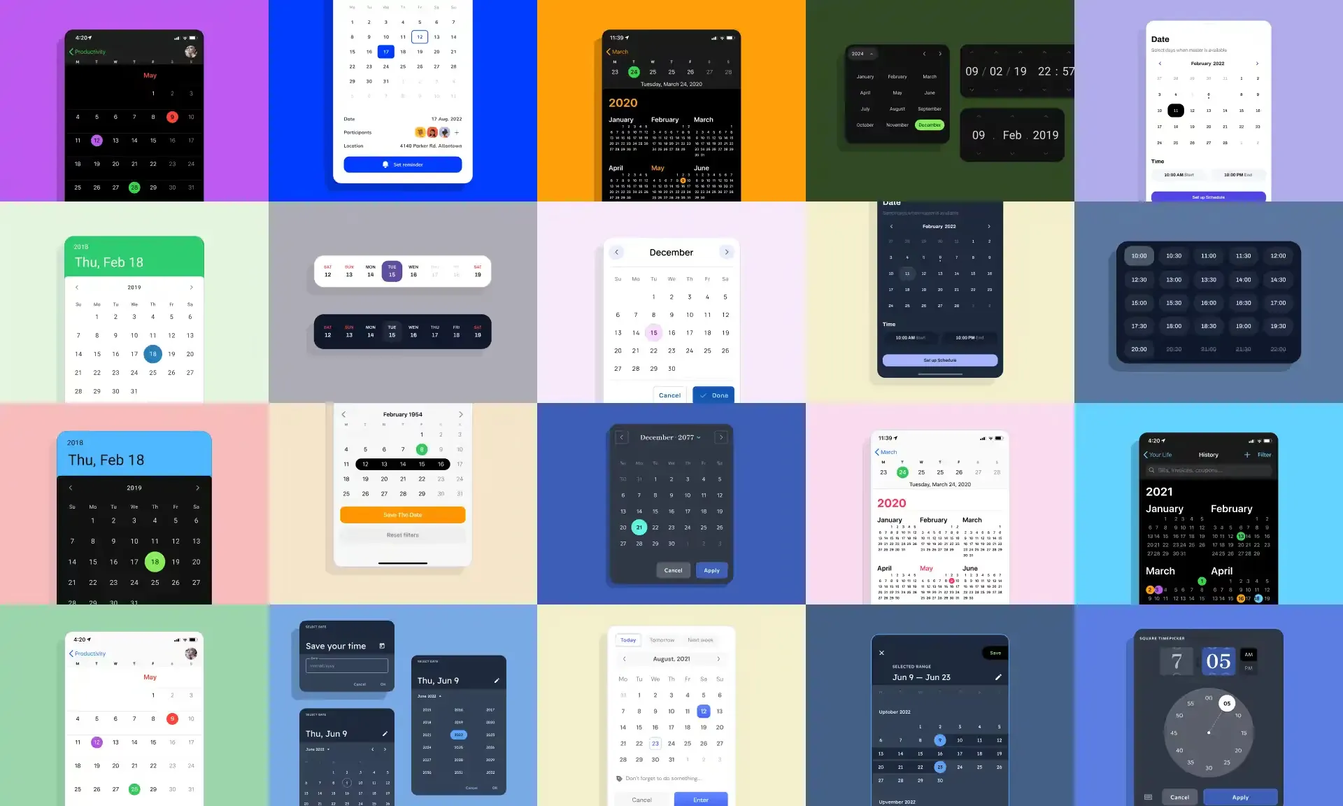
Today's publication includes all the best samples of calendars, planners, event managers, and other datepicker variations. Either it's aimed to get you into the states and use cases of calendars UI design and inspire you to design better data picker.</span>

Frankly, we designed a ton of calendars. Mostly each of our Figma design systems contain components for date picking, time management, event tracking, etc. Without pre-designed calendars, a commercial UI kit is not complete, because there are many user scenarios in dashboards, and travel apps, where a time and date input is required. The buyer wants to have calendars on hand to produce app screens faster.

So, we examined them all and compiled a comprehensive 56 calendars template for Figma, as not to miss any date picker tiny detail. Especially, when you are stuck on your design task or tired of googling everywhere for calendar design inspiration.

{{spacer-64}}

Calendar or date picker?

Let's get acquainted on how to differentiate those two components depending on purposes; because generally both of them are associated with date & time UX flows, but the use cases and goals are different.

{{spacer-16}}

Date picker is a component to allow users to select a specific date, or a range of dates by picking the interval on the numbered grid, which is a month by default.

While calendar is a complex template based on Gantt chart, aimed to let users manage their timeline of tasks, events, or other plans.

{{spacer-64}}

Anatomy of base elements

Calendar base components
Check out our Figma resources preloaded with calendars to save your time on design

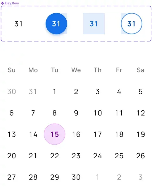
For a date picker, a Day item is an essential particle to initiate the interaction; situated as seven items placed in a row to represent one full week. There are several states for the Day as a base element: Active, Inactive, Today (highlighted), Range Start, and Range End (when the user picked a period).

At the same time, for a Calendar, the base item is a colored rectangle, representing the user's event and situated on a marked plot. Such a block may contain a label, or an icon and the width may vary.

Below you could see variations of calendars with the events placed:

{{image-gallery-1}}

{{spacer-64}}

{{setproduct-gpt}}

{{spacer-64}}

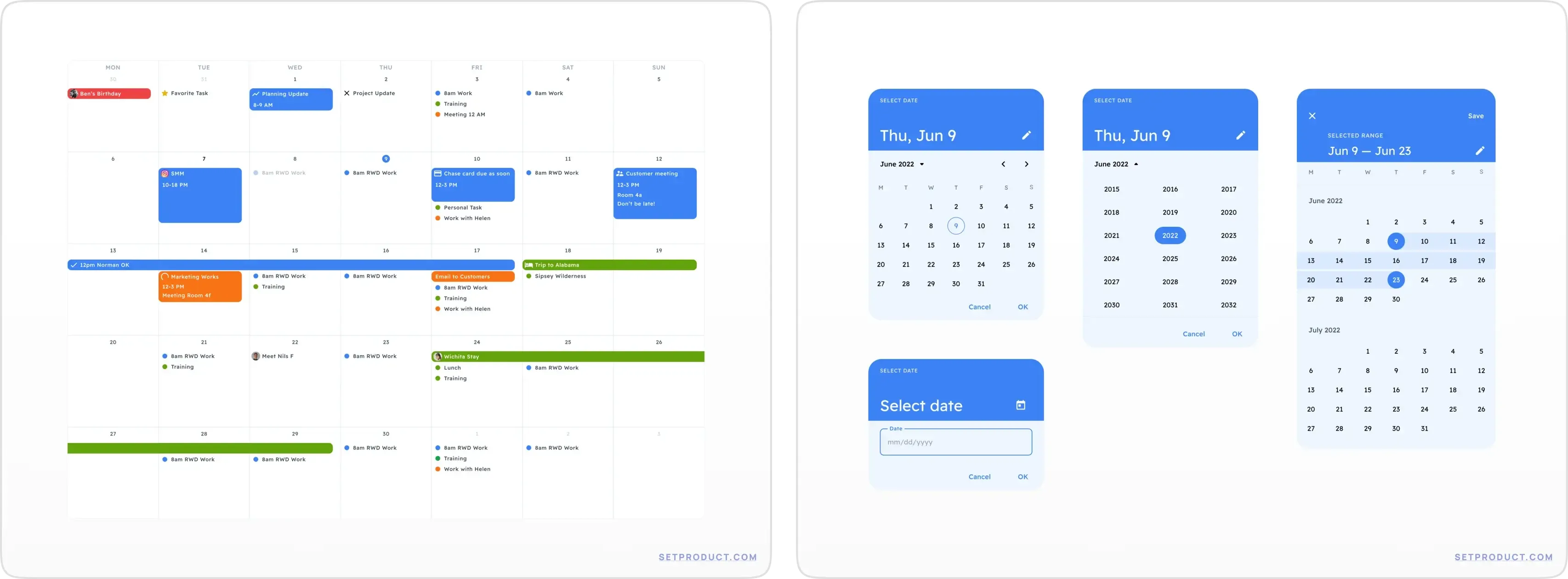
Date picker with range

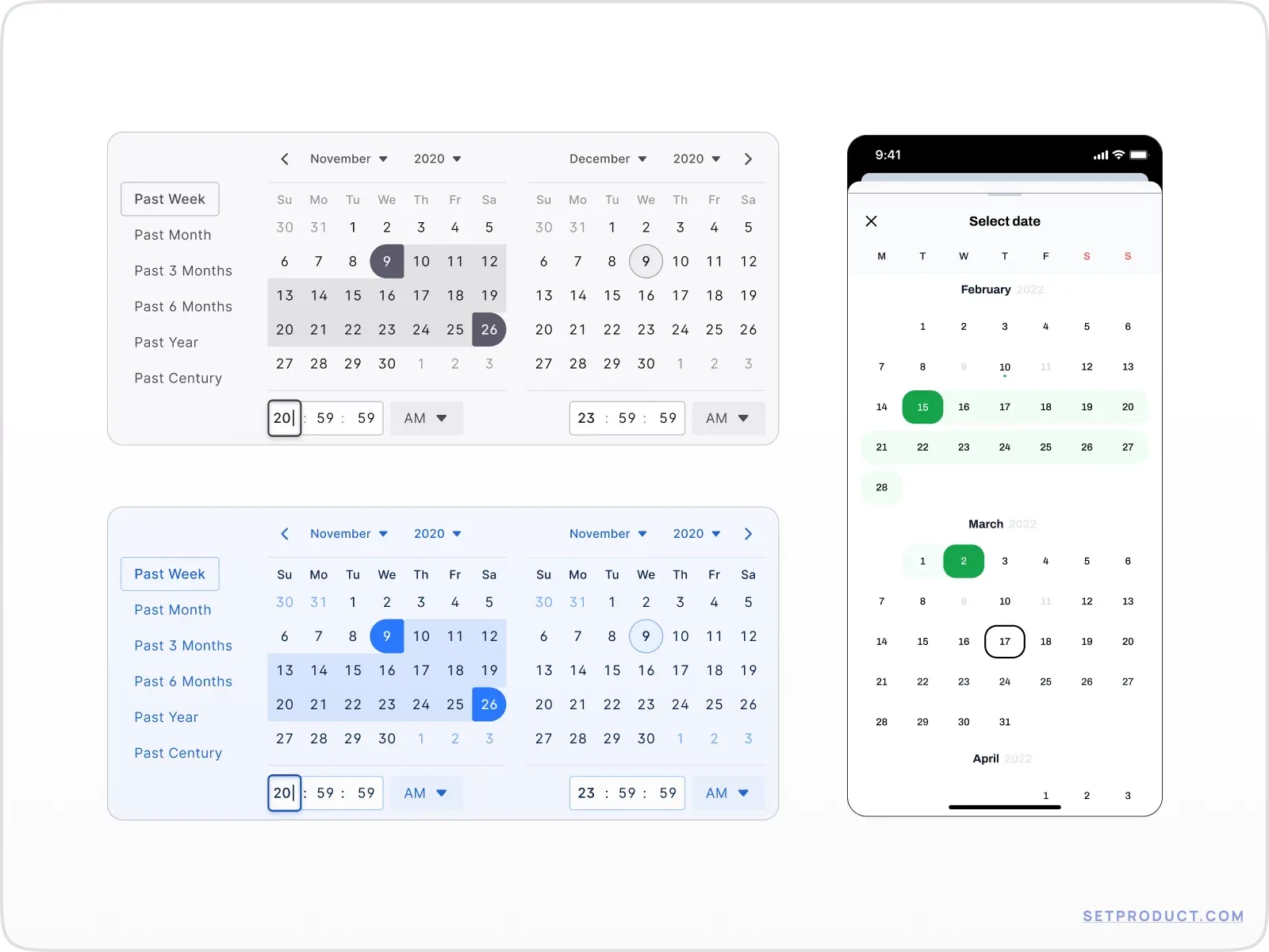
Selecting a range is actual in the only case when a date picker component is implemented, because by default a calendar in it's substance represents a range as the whole picture of what is going on with user's events, plans, meetings, etc.

The purpose of a date picker range is to input the necessary amount of days within a single action. Depending on the in-app use case, this data-in may relate only to Start / End days (e.g. flight tickets purchase), or a whole amount of days inside the selection (e.g. travel patterns, booking).

To let users pick the range properly, mainly for desktop apps, you should divide the picker, and place the current month together with previous. It helps the user to select a range with the gap between months (e.g. Google Analytics reveals even a triple date picker).

Check out all the ranges we've extracted out of our Figma design systems:

{{image-gallery-2}}

{{spacer-64}}

Structure of the calendar

As mentioned above, the idea of visualizing events on a monthly calendar is based on a modified Gantt chart. This technique fits ideally to represent and scale various blocks' width onto the timeline, giving the informative whole view.

Each block on a grid corresponds with tasks, plans, reminders, meetups, and other kinds of events. The colors of these rectangles may vary. It depends on event categories, preset by the user in advance (e.g. Work, Family, Friends, etc.). Some blocks may cross several days, representing the duration of this particular event. The starting and ending points of it, as a rule, sticked to a timeline. Thus it's obvious – the wider the block, the more time this event requires.

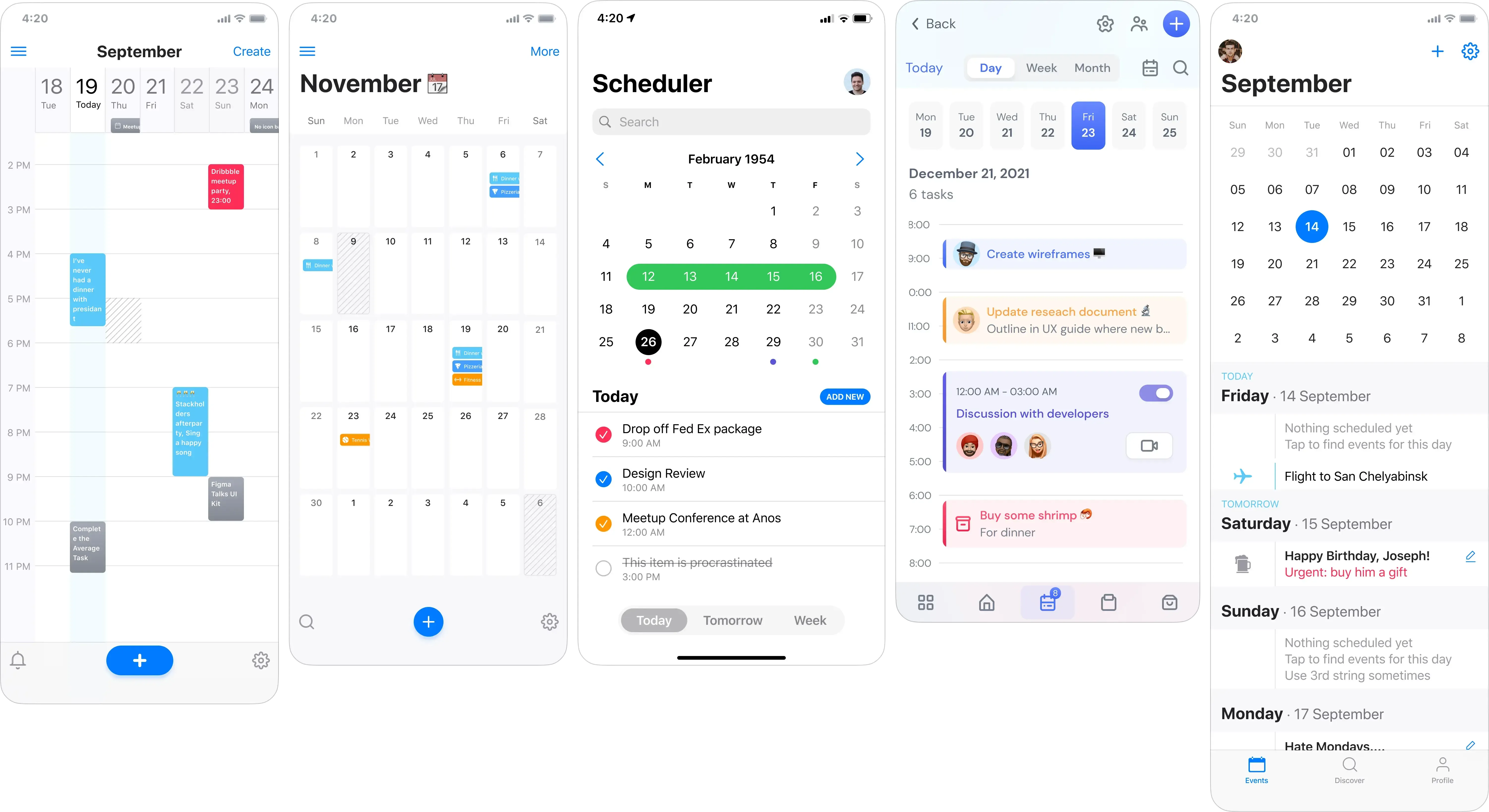
The calendar timeline is a plot made of cells, laid behind event rectangles to easily differentiate what block relates to a concrete day. By default, a calendar is shown as a monthly grid, however, it could be a week, a year, or even an intraday timeline.

{{spacer-16}}

{{spacer-64}}

Mobile & desktop usage

Calendar

Desktop screen accommodates more information, than other devices, thus we're tended to appear a whole month with the details for each day. It's conventional to implement vertical, or horizontal scrollbars, when the grid overflow is experienced in cases you're utilizing a calendar as a single row, or column.

On mobiles there is no other way, except to re-organize calendar content vertically as a column. Compound 7 days into a row, utilizing full mobile width, to keep each day accessible to tap. You can keep the calendar functional by minimizing blocks with tasks into small circular colored dots, to give at least minimum information.
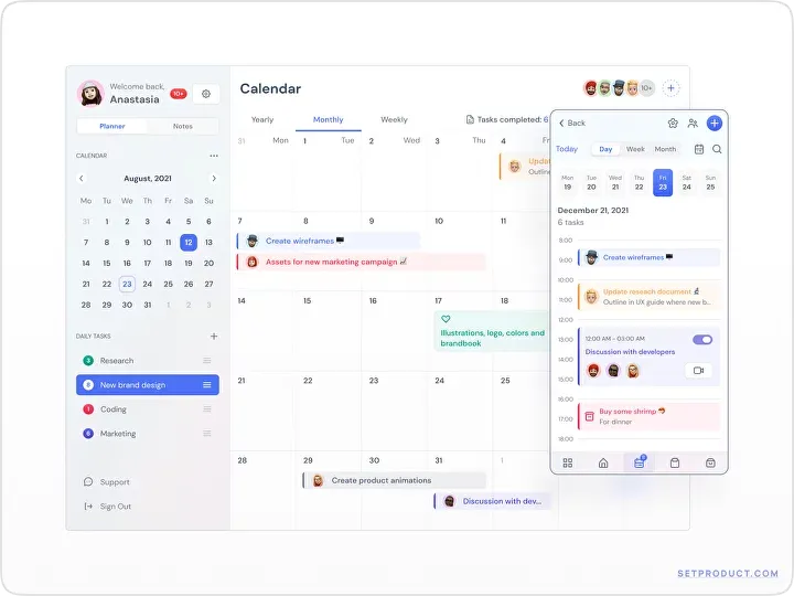
Calendar & date picker UI design inspiration mobile desktop

{{spacer-24}}

Datepicker

On desktop screens, a merged double data picker (or even triple) should be positioned horizontally, as all the users are familiar with this placement. Moreover, it's a benefit to have various presets with the most popular intervals when you're permitted to apply a custom range. They could be: Last 7 days, Last 30 days, Quarter, Half of a year, etc. Thus you're enhancing a date picker UX.

Mobile date picker appears within additional pop-ups (backdrops), or dialogs, where it's easy to pick a specific day, but to change month/year it's required to go deeper. Yes, you can swap months consequently using the left-right chevrons, but you can't step back for e.g 5 years ago until a year picker popped up in a new window.

Calendar & date picker UI design inspiration mobile desktop

{{spacer-64}}

More calendar & date picker UI design inspiration

Apart from default date picker and calendar use cases, all the category related to date & time user patterns, concludes a lot more components, variations, and combinations.

Take a look of those more templates to inspire you and assist to not miss any detail in calendar design process:

{{image-gallery-3}}

{{image-gallery-4}}

{{spacer-64}}

{{stars-conclusion}}

{{spacer-64}}

Use this Figma template

Before you probably go further to read the next post at our blog, Duplicate this calendar UI design resource, where you will find calendars & date pickers represented in this post. A lot of samples, everything is editable, yours free for any purpose.

Share this post

Subscribe to Setproduct

Once per week we send a newsletter with new releases, freebies and blog publications
Oops! Something went wrong while submitting the form.

By clicking Sign Up you're confirming that you agree with our Terms and Conditions.

Congratulations!

You're in! Expect awesome updates in your inbox

Related posts

Lorem ipsum dolor sit amet, consectetur adipiscing elit.

Inspiration

6 mins read

Monetizing the design: what I learned after a year of non-stop UI grinding

Discover 15 key insights for successful digital products, from a UI designer who took matters into his own hands to create innovative designs for everyone.

Inspiration

2 mins read

Buttons UI design - Figma to React styled components

Enhance Material Design components for improved performance, usability, and visual appeal. Get our expert retouching services for your web design needs.

Inspiration

3 mins read

How to create UI kit - Design system to sell worldwide

Boost productivity and earn rewards with our design asset that accelerates work processes. Start optimizing your workflow today.

Figma Templates & UI kits

Save time and human resources by reusing hundreds of pre-made templates crafted by us. Based on top notch UX taken from the World's best apps.

Material X for Figma

Figma library with 1100+ components & 40 app templates beyond Material Design. Powered by top-notch shapes and Manrope font. Customizable & Adjustable UI kit now available for Angular & Figma

Material You UI kit

Figma & React library with 2600+ variants of 32 components compatible with Material Design 3. Plus 220+ dashboard templates for all the viewports. Now available for NextJS & TailwindCSS.

Figma React UI kit

Designed and well-organized in Figma React-based UI toolkit for the web. Optimized for building complex data-dense interfaces for desktop and mobile applications.

Panda Design System

Figma library with dashboard, calendar, kanban, profile, table, ecommerce and 80+ templates in total. Components with variants, dark theme included.

Eclipse UI kit

Figma library with 1100+ components & 74 templates for data-driven web applications. Powered by auto-layout. Supercharged by Figma's variants.

Rome UI kit for Figma

Customizable and well-organized team library. Contains 250+ components & 30 web app templates powered by stylish and trendy guidelines.

Material Design System

Figma library is based on 100% guidelines compliance with Material.io. Contains ready‑to-use templates to accelerate app UI design.

Neolex Dashboard UI kit

Customizable & adjustable dashboard design system with 50+ ready-to-use app layouts, 1900+ variants for 30 components with auto-layout.

Material Desktop Dashboard UI kit

Figma library with 48+ dashboard templates based on reusable desktop app patterns carefully handpicked from the most popular web apps.

Xela UI kit for Figma

Figma library with 1900+ variants of 30 components categories to craft perfectly shaped desktop & mobile apps. Customizable & Adjustable dashboard design system with 50+ web app templates.

Figma S8 Design System

Figma design library for mobile and desktop apps made of high quality styled components. Full version includes 67 dashboard templates.

OE Figma Design System

Customizable and well-organized Figma library. This design system aimed to build highly loaded interfaces, boost the speed and save more costs.

Figma iOS kit

Figma library of iOS patterns served as ready-made templates. This UI kit inspired by World's best apps. Based on Human Interface guidelines.

Figma S8 Design System

Figma design library for mobile and desktop apps made of high quality styled components. Full version includes 67 dashboard templates.

Most iOS UI kit for Figma

iOS native components and app templates organized into a «Most Design System» fully compatible with Apple's Human Interface guidelines.

Rome UI kit for Figma

Customizable and well-organized team library. Contains 250+ components & 30 web app templates powered by stylish and trendy guidelines.

Material Design System

Figma library is based on 100% guidelines compliance with Material.io. Contains ready‑to-use templates to accelerate app UI design.

Nucleus UI

Nucleus UI contains 1000 components and variants with 500+ mobile screens designed for Figma (including 9 themes from Event, E-commerce, Finance, NFT, etc.).

Figma Android UI kit

Components-driven Android mobile UI library for Figma. Consists of 140 high quality application templates made of total 250+ UI components.

Mobile X UI kit

Customizable & adjustable iOS / Android design system loaded with ready-made 157 app templates based on 860+ variants for 20 components.

Appka iOS UI kit

Customizable & adjustable iOS design system with 4100+ variants for 28 components and 280+ ready-to-use app layouts crafted for Figma.

Full iOS UI kit

Customizable iOS design system with 320 ready-to-use app layouts. You can modify them or use as it is to save time and never design from scratch again.

Xela for Flutter

XelaUI for Flutter is a simple, modular and accessible component library that gives you the building Flutter apps for mobile and desktop.

Xela for Android

Ready-made collection of fully customizable widgets, UI screens and reusable components for Android coded with Jetpack Compose.

Xela for Swift

Designed for iOS Developers. We provide fully coded customizable components, widgets and well-organized iOS screens for Figma & SwiftUI.

Material You UI kit

Figma & React library with 2600+ variants of 32 components compatible with Material Design 3. Plus 220+ dashboard templates for all the viewports. Now available for NextJS & TailwindCSS.

Figma Charts UI kit

Components-driven graphs design kit for dashboards, presentations, infographics & data visualisation. Includes 25+ charts types for all the viewports.

Hyper Charts

Create impressive visuals with Figma's graphs templates – dozens of scalable and customizable data visualization blocks for dark and light modes.

Orion UI kit

Figma library with 40+ full-width charts templates served in light & dark themes. Contains 200+ of dataviz widgets that look perfect on desktop & mobile screens.

Xela for React

React based components library for beautiful user interface in React apps. Lightweight library for your projects. Contains pre-made web app templates.

Figma React UI kit

Designed and well-organized in Figma React-based UI toolkit for the web. Optimized for building complex data-dense interfaces for desktop and mobile applications.

Material X for Figma

Figma library with 1100+ components & 40 app templates beyond Material Design. Powered by top-notch shapes and Manrope font. Customizable & Adjustable UI kit now available for Angular & Figma

Xela for Flutter

XelaUI for Flutter is a simple, modular and accessible component library that gives you the building Flutter apps for mobile and desktop.

Xela for Android

Ready-made collection of fully customizable widgets, UI screens and reusable components for Android coded with Jetpack Compose.

Xela for Swift

Designed for iOS Developers. We provide fully coded customizable components, widgets and well-organized iOS screens for Figma & SwiftUI.

Material You UI kit

Figma & React library with 2600+ variants of 32 components compatible with Material Design 3. Plus 220+ dashboard templates for all the viewports. Now available for NextJS & TailwindCSS.

Xela for React

React based components library for beautiful user interface in React apps. Lightweight library for your projects. Contains pre-made web app templates.

Levitate 3D kit for Figma

Components-driven 3D kit to design eye-catching Figma presentations. Helps to enhance your landing page, product or app, brand ident, etc.

Website templates UI kit

Landing pages reusable templates kit based on most effective web design patterns. 140+ dark & light constrained design blocks.

Figma Landing Pages UI kit

Landing pages templates library based on constrained & organized components aimed to speed-up the production of effective websites.

Zeus UI kit

Create hassle-free landing pages in Figma. This kit is based on 10 landing page templates, powered by 1600+ variants for 630+ web blocks.

Research, copy and ideate with SetGPT!

We've launched the alternative ChatGPT clone dedicated to UI designers, UX researchers, writers and indiehackers.

Powered by the latest OpenAI gtp-3.5-turbo model, this free chatbot is the perfect tool for those in need of intelligent and innovative insights, wrapped with a slick UI and sophisticated user experience.

Start now

SetGPT is a free service; however, authentication is required

This is some text inside of a div block.