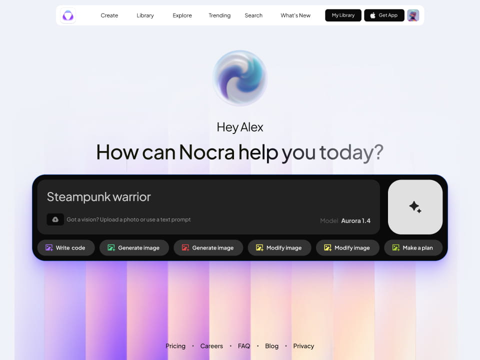
The Magic Behind Search Input Design
The search input field is a small yet mighty component of any UI — a tool that, when designed with intention, can significantly enhance the UX. But how to ensure your search boxes are not merely functional, but delightful to use?

The art of UX design lies in the subtle touches that seamlessly blend form and function—touches that transform everyday interactions like using a search input into effortless experiences. By mastering the design of this fundamental element, we forge a connection between user intent and seamless discovery.
By incorporating these Figma text fields into your workflow, your UI design will not only become more efficient and effective but will also resonate deeply with users, ensuring they return time and time again.
Strategic Search Input Placement
Picture the perfectly placed search input: accessible, intuitive, and inviting. Its strategic location is no accident. Like a chess master's calculated move, its placement on the screen dictates its effectiveness in guiding users to the information they crave.
Your Figma inputs can make or break the user's navigational experience. Aim for a spot that aligns with natural browsing patterns, creating a user-friendly interface.
Autocomplete: The Predictive Powerhouse
The hallmark of a great search input lies in its ability to anticipate and suggest. With a robust autocomplete feature, your input UI becomes more than a mere tool—it becomes a gateway to a tailored user journey. This subtle wizardry saves time, reduces errors, and makes for a noteworthy Figma inputs experience.
Personalizing with Search History
Nothing says personalization quite like a search input that remembers your preferences. A well-designed search input should save users' history, serving up a personalized inputs template for repeat visits. This not only streamlines the user experience but also fosters familiarity and loyalty.
Clarity in Labeling
Amidst the sea of UI elements, a clearly labeled search input stands as a beacon of clarity. Whether it's through an icon or text, communicating the function and purpose of your input ui design is crucial. Labels guide users with confidence, ensuring the path to information is always clear.
The Flexible Inputs Template
Responsive design is a cornerstone of modern UI, and your inputs template should be no exception. It must gracefully adapt to various screens and devices, offering a search input that's as functional on a smartphone as it is on a desktop. Flexibility is the key to accessibility for all users, anytime and anywhere.
Interactive Feedback: The Ripple Effect
In a world where every micro-interaction matters, the search input that offers instant feedback stands out. It's the subtle ripple that confirms a user's action, a nod of acknowledgment that their quest for answers is underway. Such immediate interaction reinforces user engagement and satisfaction.

Do's for Designing Search Inputs
- Do Optimize for Query Length: Ensure the search box is appropriately sized to handle the average length of user queries, allowing for a clear view of the inputted text.
- Do Leverage Natural Language Processing (NLP): Implement NLP to better understand user intent and provide more accurate search results, even with conversational or complex queries.
- Do Utilize Context Awareness: Design the search input to offer relevant suggestions based on the user's current context or previous interactions, enhancing the overall user experience.
- Do Analyze Search Data: Regularly monitor user search patterns and terms to continually refine and optimize the search experience based on real user behavior.
- Do Plan for Scalability: Make sure the search system is scalable and can handle increased user loads and content volumes without performance degradation.
Don'ts for Designing Search Inputs
- Don't Disregard Content Indexing: Ensure that the content is correctly indexed behind the scenes to provide accurate and rapid search results.
- Don't Ignore Security: Prioritize the security of the search input to prevent potential vulnerabilities, such as injection attacks or data breaches.
- Don't Skimp on Testing: Thoroughly test the search feature across different device types, usage scenarios, and user conditions to guarantee reliability and effectiveness.
- Don't Allow Stale Content: Keep the search results relevant by regularly updating and removing outdated or incorrect content from the search index.
- Don't Compromise on Accessibility Compliance: Ensure that both the search input and the results are fully accessible, adhering to WCAG standards and other accessibility guidelines.


For designers seeking to imbue their projects with these UX gems, our Search Inputs for Figma await. This carefully curated collection strikes the perfect balance between aesthetics and usability, providing a ready-made inputs template that embodies the best practices of search input design.
Enhance your design workflow today and duplicate our Inputs for Figma.
With each element thoughtfully crafted down to the last pixel, your designs will resonate with users and reflect the high standards of modern UX design. Let's create digital experiences that are not just functional but also joyful to use.
Subscribe to Setproduct
Congratulations!


.avif)


.avif)
.avif)

.avif)
.avif)


.avif)
.avif)


.avif)
.avif)
.avif)


.avif)


%20(1).avif)

%20(1).avif)
.avif)
.avif)


