
Responsive imagery cards
A variety of responsive cards templates for Figma. Constrained and scalable. Made with global styles for typography and colors.
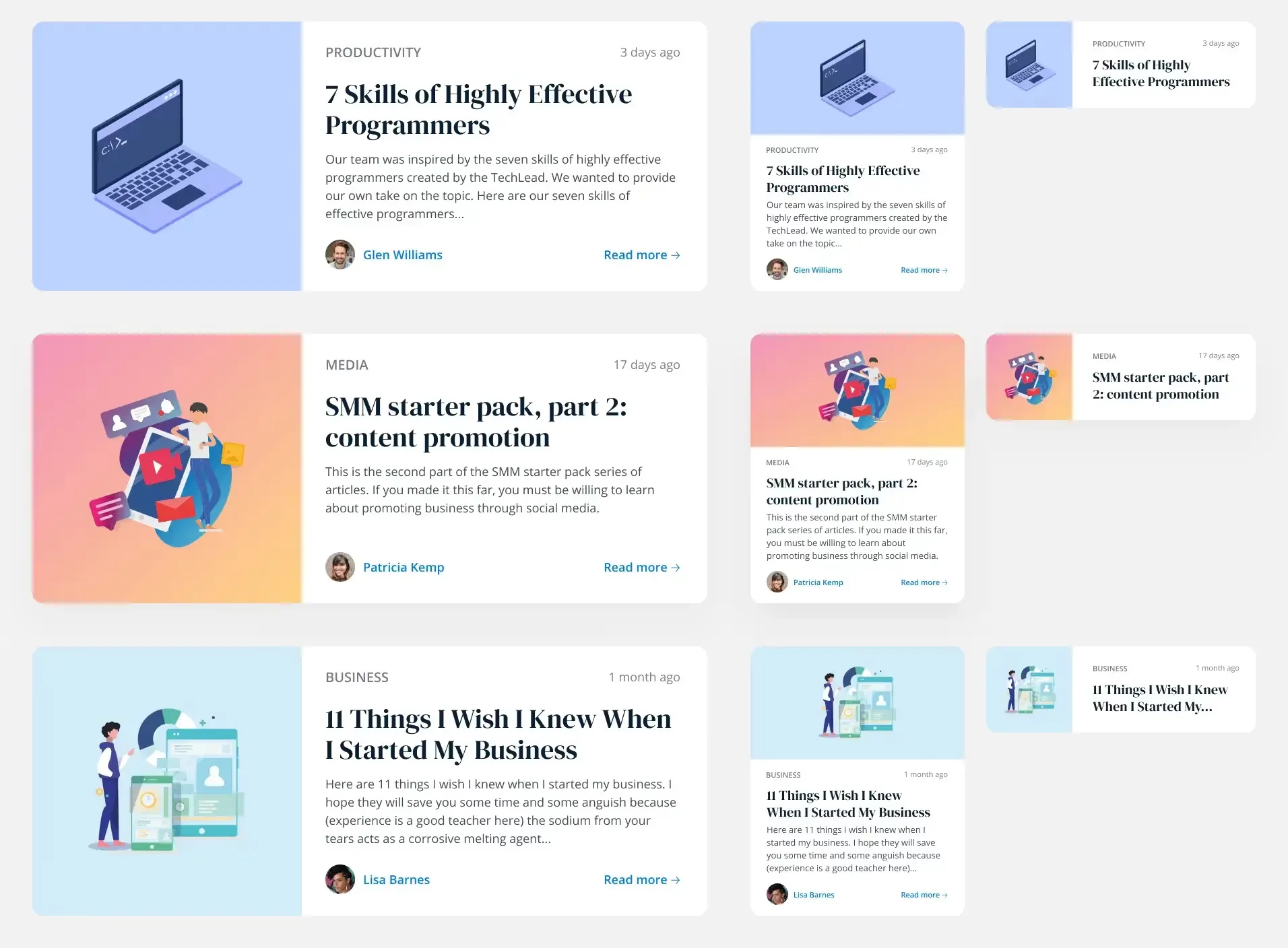
More Figma freebies

Code
Driver.js — product tours & onboarding
Lightweight, vanilla JavaScript library for building powerful product tours, feature highlights, and contextual onboarding. No dependencies, just 5kb gzipped, fully customizable and accessible by default.

Components
Free invoice template for Figma
Clear and simple table-based document for your business purposes. Powered by editable data grid, which is easy to manage.
Components
Avatar UI design templates & tips
A part of the upcomong design handbook «The State of Component». Colors, Styles & UI design for Avatar. Events, States and Actions. Including layout samples for inspiration.

Components
App Bar UI design templates & tips
Application Bar (aka Navigation Bar) — displays prior in-app controls related to the current app section. This freebie contains things to consider when designing App Bars.

Global Styles
Fonts Playground
Best web fonts precisely handpicked and optimised for better web legibility and ready to implement into your Figma project.

Web Design
Website Template
Landing page template made for Figma. Contains styled components UI kit, desktop & mobile versions. Global styles, Inter, FlatUI colors.

Mobile Templates
Android UI kit
8 mobile app templates based on popular Android UI design patterns: Calendar, Cards, Tasks, Kanban & Project management and more.

Mobile Templates
Figma iOS UI kit
iOS native components and app templates organised into a «Most Design System» fully compatible with Human Interface guidelines.

Mobile & Desktop
Material X Starter
Top-notch styled components in the design system powered by Auto-layout. Ready-to-use Figma UI kit with styles from the nearest future.

Data visualization
Radar Chart
Radar chart template made of components and available within a range of popular viewports: desktop, tablet and mobile. Light & Dark.

Mobile & Desktop
Rome UI kit lite
Components & templates for desktop & mobile apps. Powered by clean and trendy custom guidelines and DM Sans font (OFL).

Mobile & Desktop
Xela UI kit starter
100+ variants of several components to craft perfectly shaped desktop & mobile apps. Modern styleguides and free Nunito Sans font.

Mobile Templates
Free iOS UI kit
Customisable & adjustable mobile design system with 100+ variants for a set of components and 8 ready-to-use app layouts to try out.

Mobile Templates
Mobile-X UI kit
Meet Mobile-X Figma design system for mobile app design. Cross-compatible & stylish UI kit which fits both iOS / Android apps.

Tutorials & Education
Accordion guide
The exploration for Accordion component: styles, states, samples, and use cases for desktop & mobile viewports.

Mobile & Desktop
Eclipse UI kit
Fine components fully loaded with variants, auto-layout, global text & color styles. Hi-end customizable Figma design system (starter).

Mobile Templates
Appka iOS UI kit
Appka is a fine-themed & customized iOS design system with 4100+ variants for 28 components and 280+ ready-to-use app layouts for Figma.

Mobile & Desktop
Nav templates
This design resource represents navigation components. It contains sidebars, drawers and headers both in light & dark modes.

Chart Templates
Dark charts UI kit
Try out this handy source of graphs for your next dashboard, pitch, or even print materials. Contains most common dark chart templates.

Email Templates
Figma email templates
Five awesome and scalable free email templates to engage your subscribers. Dark & light themes. Contains buttons, lists and cards.

Chart Templates
Charts widgets dark & light
Line & Wave charts, Bars, Histograms, Ratings and more graphs widgets are available in this free Figma resource. For dashboards, mobile & desktop.

Desktop
Shopping layout for web app
Contains navigation, filtering components, tabs, cards and more. This layout was made with Angular and fully coded.

Data visualization
Orion dark templates
Figma library with 40+ desktop charts templates served in light & dark themes. Contains 200+ of dataviz widgets for every case.

Web Design
Landing page & web blocks
Use given blocks as a quickstarter for your very next web design mission. This freebie contains 3 landing pages for desktop, tablet & mobile.

Mobile Templates
Mobile tables several themes
Components-driven iOS layouts with data grid made from one singe cell. Based on different styles. Allows to create better tables in Figma.

Mobile Templates
12 free mobile templates
Use our Full iOS design system as the starter for your next mobile app. This freebie includes 12 screens dark & light powered by 200+ components.

Mobile & Desktop
Calendars & Date picker templates
UI design resource with 56 calendars extracted from our popular UI kits. All the best samples of schedule patterns, planners, event managers.

Desktop
Schedule & Events template
This clean calendar template has been made of a scalable grid, accurately made with colored items and wrapped for the desktop.

Mobile & Desktop
Material You for web apps
Figma Material Design 3 starter fully loaded with several desktop & mobile templates (with dark themes) and a bundle of components.

Tutorials & Education
iOS Datepickers
Stand out with our Figma iOS date picker. Offering a true-to-life isometric design and easy-to-edit text, it's the most realistic option.

Mobile Templates
Segment UI kit
Design stunning Android apps with our free Figma UI kit. Follow Android guidelines and components and use our fonts, colors, and templates.

Design & Code
Figma React UI kit
Our Figma React UI kit 2-in-1 makes web app building faster. Created in Figma, exported to React, and customised with Blueprint.js library.
.webp)
Desktop
Messenger app desktop template
Effortlessly create world-class communication design with our Messenger Template for Figma. With dark and light mode options.

Web Design
Zeus UI free website template
Zeus Web UI kit-inspired landing page template. Supports all viewports, card-driven UX, polished with Syne and Space Grotesk fonts.

Global Styles
Design system starter
Launch your project with confidence thanks to our Figma design system. Customize grids, text, color, gradients, and shadows with ease.

Mobile & Desktop
Navigation layout 4 samples
Sleek Navigation Menu for Material X design system in Figma. Various sizes and design options. Features badges and active state highlight.

Data visualization
Chart cards
Make your data pop with our easy-to-use Charts UI kit. Featuring bar charts and heatmaps, it's perfect for dataviz, dashboard, pitches and others.

Mobile & Desktop
Material UI styled
New and improved Material UI Kit, refreshed with enhanced material.io guidelines. Free and ready-to-use components included.

Data visualization
Hyper charts
Transform your data into captivating visuals with several Figma's chart templates based on Hyper Charts kit. You'll find 8 editable widgets inside.

Components
Search inputs
Explore how Figma inputs are revolutionizing search interface design. Gain key insights to enhance user experience with impeccable UIs.

Grid Layouts
Figma Grid Layouts
This template is designed to help you create templates that are beautifully balanced. Features both mobile and desktop layouts with 16/24 gutters.

Desktop
Panda dashboard template
Build sleek dashboards with our Panda UI kit starter! Featuring a 1920w desktop template, UI widgets, and components.

Dashboard Templates
Orion dataviz templates
The design system starter for your next application. This resource contains 6 dashboard templates and a bundle of UI design widgets.
Subscribe to Setproduct
By clicking Sign Up you're confirming that you agree with our Terms and Conditions.

