Driver.js — product tours & onboarding

Lightweight, vanilla JavaScript library for building powerful product tours, feature highlights, and contextual onboarding. No dependencies, just 5kb gzipped, fully customizable and accessible by default.

Driver.js — product tours & onboarding — Figma freebie
Home
Freebies

Driver.js — product tours & onboarding

You shipped the app. The AI wrote half the code. The feature works. Then the first real user opens it, stares at the screen, and leaves before they find the one button that mattered. Driver.js closes that gap with a single small file and a list of steps.

What driver.js actually does

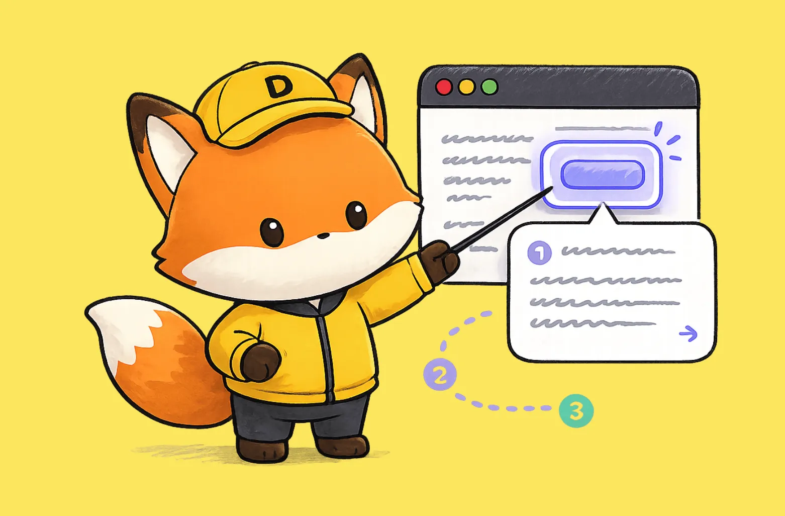
Driver.js highlights any element on a page, dims everything else, and walks the user through your interface one step at a time. You point it at a button, a menu, or a form field. It draws a spotlight around that element, shows a small popover with your text, and waits. The user clicks next, the spotlight moves, and the next idea lands. That is the whole mechanic, and it covers most of what onboarding needs.

The library ships as vanilla TypeScript with zero dependencies. It weighs around 5kb gzipped. It runs in every major browser, responds to the keyboard, and carries an MIT license, so you use it in personal and commercial work without paying anyone or asking permission. The numbers back the adoption: roughly 4.3 million downloads a month and 287 million jsDelivr hits a month.

Why onboarding is the thing you postpone

Onboarding is the distance between “it works” and “people use it.” Most solo founders skip it because the usual options feel heavy. A full product-tour SaaS wants a monthly fee and a script tag that loads a chunk of someone else’s framework. A hand-built tour eats a weekend you do not have. So the tour never ships, and new users keep churning on day one.

Driver.js removes that excuse. You add one file. You write a list of steps. You point each step at a CSS selector. The first session now ends with a user who understands the product instead of one who guessed and gave up.

How it works under the hood

A tour in driver.js is an array of steps. Each step names an element on the page and the text you want beside it:

  • element → the CSS selector you want to highlight
  • popover → the title and description shown next to it
  • side and align → where the popover sits relative to the element

You pass that array to a driver() call and run drive(). The library handles the overlay, the focus trap, the keyboard arrows, and the next and previous buttons. You write copy and selectors. It handles the rest.

The part that makes it flexible is the hooks. Driver.js gives you callbacks for the moment an element is about to be highlighted, the moment it gets highlighted, and the moment it is deselected. You use those hooks to change the page as the tour moves. Open a dropdown right before you point at an item inside it. Load chart data before you highlight the chart. Scroll a hidden panel into view. The tour and your app stay in step instead of fighting each other.

The size argument that matters

Five kilobytes sounds like a detail. It is not. Every script you add to onboarding loads before the user has done anything useful. A 12kb-plus tour library competes with your own app for that first second. Driver.js is roughly half the weight of the common alternatives, and it pulls in nothing else. No React requirement, no framework lock-in.

It drops into a Next.js app, a plain HTML page, or whatever the model generated for you, and it behaves the same way in each. That consistency is worth more than it looks: you write the tour once and trust it across browsers rather than chasing edge cases one device at a time.

More than tours

Calling it a tour library undersells it. A tour is one use case. The same spotlight mechanic covers a lot of ground:

  • ❶ Point at a single new feature and explain it in one popover
  • ❷ Open contextual help with the rest of the page dimmed
  • ❸ Shift focus to one form field so the user finishes signup
  • ❹ Build a “turn off the lights” widget that frames any section
  • ❺ Drive a simple modal without writing modal code

You learn one API and reuse it for half a dozen jobs you would otherwise solve with separate libraries and separate bugs.

Wiring it into an AI-built app

If you built your product by prompting an AI, this fits your workflow. You do not need to master a framework. You need three things: the file, a list of selectors, and your copy.

Ask your assistant to install driver.js, then describe the path in plain language. “Highlight the new-project button first, then the share menu, then the export icon.” Paste the selectors it returns. Write the popover text yourself, because that text is your product voice and the model does not know it yet. Trigger the tour the first time someone logs in, store a flag in local storage so it runs once, and you have onboarding that plenty of funded startups still skip.

Why it belongs in your stack

You care about activation. You want the first session to end with a user who gets the product. Driver.js gives you that for the price of one small file and an afternoon of writing steps. It is free, it is light, it is written in TypeScript, and it works the same in every browser.

For a solo founder shipping fast with AI, that combination is rare. Grab the code, point it at your three most important buttons, and watch how many more users make it past the first screen. When you want the interface those tours point at to look sharp, the rest of our free Figma resources and design and code kits are built for the same fast, solo-founder workflow.

More Figma freebies

Free invoice template for Figma

Components

Free invoice template for Figma

Clear and simple table-based document for your business purposes. Powered by editable data grid, which is easy to manage.

Avatar UI design templates & tips

Components

Avatar UI design templates & tips

A part of the upcomong design handbook «The State of Component». Colors, Styles & UI design for Avatar. Events, States and Actions. Including layout samples for inspiration.

App Bar UI design templates & tips

Components

App Bar UI design templates & tips

Application Bar (aka Navigation Bar) — displays prior in-app controls related to the current app section. This freebie contains things to consider when designing App Bars.

Fonts Playground

Global Styles

Fonts Playground

Best web fonts precisely handpicked and optimised for better web legibility and ready to implement into your Figma project.

Website Template

Web Design

Website Template

Landing page template made for Figma. Contains styled components UI kit, desktop & mobile versions. Global styles, Inter, FlatUI colors.

Android UI kit

Mobile Templates

Android UI kit

8 mobile app templates based on popular Android UI design patterns: Calendar, Cards, Tasks, Kanban & Project management and more.

Figma iOS UI kit

Mobile Templates

Figma iOS UI kit

iOS native components and app templates organised into a «Most Design System» fully compatible with Human Interface guidelines.

Material X Starter

Mobile & Desktop

Material X Starter

Top-notch styled components in the design system powered by Auto-layout. Ready-to-use Figma UI kit with styles from the nearest future.

Radar Chart

Data visualization

Radar Chart

Radar chart template made of components and available within a range of popular viewports: desktop, tablet and mobile. Light & Dark.

Rome UI kit lite

Mobile & Desktop

Rome UI kit lite

Components & templates for desktop & mobile apps. Powered by clean and trendy custom guidelines and DM Sans font (OFL).

Xela UI kit starter

Mobile & Desktop

Xela UI kit starter

100+ variants of several components to craft perfectly shaped desktop & mobile apps. Modern styleguides and free Nunito Sans font.

Free iOS UI kit

Mobile Templates

Free iOS UI kit

Customisable & adjustable mobile design system with 100+ variants for a set of components and 8 ready-to-use app layouts to try out.

Mobile-X UI kit

Mobile Templates

Mobile-X UI kit

Meet Mobile-X Figma design system for mobile app design. Cross-compatible & stylish UI kit which fits both iOS / Android apps.

Accordion guide

Tutorials & Education

Accordion guide

The exploration for Accordion component: styles, states, samples, and use cases for desktop & mobile viewports.

Eclipse UI kit

Mobile & Desktop

Eclipse UI kit

Fine components fully loaded with variants, auto-layout, global text & color styles. Hi-end customizable Figma design system (starter).

Appka iOS UI kit

Mobile Templates

Appka iOS UI kit

Appka is a fine-themed & customized iOS design system with 4100+ variants for 28 components and 280+ ready-to-use app layouts for Figma.

Nav templates

Mobile & Desktop

Nav templates

This design resource represents navigation components. It contains sidebars, drawers and headers both in light & dark modes.

Dark charts UI kit

Chart Templates

Dark charts UI kit

Try out this handy source of graphs for your next dashboard, pitch, or even print materials. Contains most common dark chart templates.

Figma email templates

Email Templates

Figma email templates

Five awesome and scalable free email templates to engage your subscribers. Dark & light themes. Contains buttons, lists and cards.

Charts widgets dark & light

Chart Templates

Charts widgets dark & light

Line & Wave charts, Bars, Histograms, Ratings and more graphs widgets are available in this free Figma resource. For dashboards, mobile & desktop.

Shopping layout for web app

Desktop

Shopping layout for web app

Contains navigation, filtering components, tabs, cards and more. This layout was made with Angular and fully coded.

Orion dark templates

Data visualization

Orion dark templates

Figma library with 40+ desktop charts templates served in light & dark themes. Contains 200+ of dataviz widgets for every case.

Responsive imagery cards

Card Templates

Responsive imagery cards

A variety of responsive cards templates for Figma. Constrained and scalable. Made with global styles for typography and colors.

Landing page & web blocks

Web Design

Landing page & web blocks

Use given blocks as a quickstarter for your very next web design mission. This freebie contains 3 landing pages for desktop, tablet & mobile.

Mobile tables several themes

Mobile Templates

Mobile tables several themes

Components-driven iOS layouts with data grid made from one singe cell. Based on different styles. Allows to create better tables in Figma.

12 free mobile templates

Mobile Templates

12 free mobile templates

Use our Full iOS design system as the starter for your next mobile app. This freebie includes 12 screens dark & light powered by 200+ components.

Calendars & Date picker templates

Mobile & Desktop

Calendars & Date picker templates

UI design resource with 56 calendars extracted from our popular UI kits. All the best samples of schedule patterns, planners, event managers.

Schedule & Events template

Desktop

Schedule & Events template

This clean calendar template has been made of a scalable grid, accurately made with colored items and wrapped for the desktop.

Material You for web apps

Mobile & Desktop

Material You for web apps

Figma Material Design 3 starter fully loaded with several desktop & mobile templates (with dark themes) and a bundle of components.

iOS Datepickers

Tutorials & Education

iOS Datepickers

Stand out with our Figma iOS date picker. Offering a true-to-life isometric design and easy-to-edit text, it's the most realistic option.

Segment UI kit

Mobile Templates

Segment UI kit

Design stunning Android apps with our free Figma UI kit. Follow Android guidelines and components and use our fonts, colors, and templates.

Figma React UI kit

Design & Code

Figma React UI kit

Our Figma React UI kit 2-in-1 makes web app building faster. Created in Figma, exported to React, and customised with Blueprint.js library.

Messenger app desktop template

Desktop

Messenger app desktop template

Effortlessly create world-class communication design with our Messenger Template for Figma. With dark and light mode options.

Zeus UI free website template

Web Design

Zeus UI free website template

Zeus Web UI kit-inspired landing page template. Supports all viewports, card-driven UX, polished with Syne and Space Grotesk fonts.

Design system starter

Global Styles

Design system starter

Launch your project with confidence thanks to our Figma design system. Customize grids, text, color, gradients, and shadows with ease.

Navigation layout 4 samples

Mobile & Desktop

Navigation layout 4 samples

Sleek Navigation Menu for Material X design system in Figma. Various sizes and design options. Features badges and active state highlight.

Chart cards

Data visualization

Chart cards

Make your data pop with our easy-to-use Charts UI kit. Featuring bar charts and heatmaps, it's perfect for dataviz, dashboard, pitches and others.

Material UI styled

Mobile & Desktop

Material UI styled

New and improved Material UI Kit, refreshed with enhanced material.io guidelines. Free and ready-to-use components included.

Hyper charts

Data visualization

Hyper charts

Transform your data into captivating visuals with several Figma's chart templates based on Hyper Charts kit. You'll find 8 editable widgets inside.

Search inputs

Components

Search inputs

Explore how Figma inputs are revolutionizing search interface design. Gain key insights to enhance user experience with impeccable UIs.

Figma Grid Layouts

Grid Layouts

Figma Grid Layouts

This template is designed to help you create templates that are beautifully balanced. Features both mobile and desktop layouts with 16/24 gutters.

Panda dashboard template

Desktop

Panda dashboard template

Build sleek dashboards with our Panda UI kit starter! Featuring a 1920w desktop template, UI widgets, and components.

Orion dataviz templates

Dashboard Templates

Orion dataviz templates

The design system starter for your next application. This resource contains 6 dashboard templates and a bundle of UI design widgets.

Subscribe to Setproduct

Once per week we send a newsletter with new releases, freebies and blog publications

By clicking Sign Up you're confirming that you agree with our Terms and Conditions.