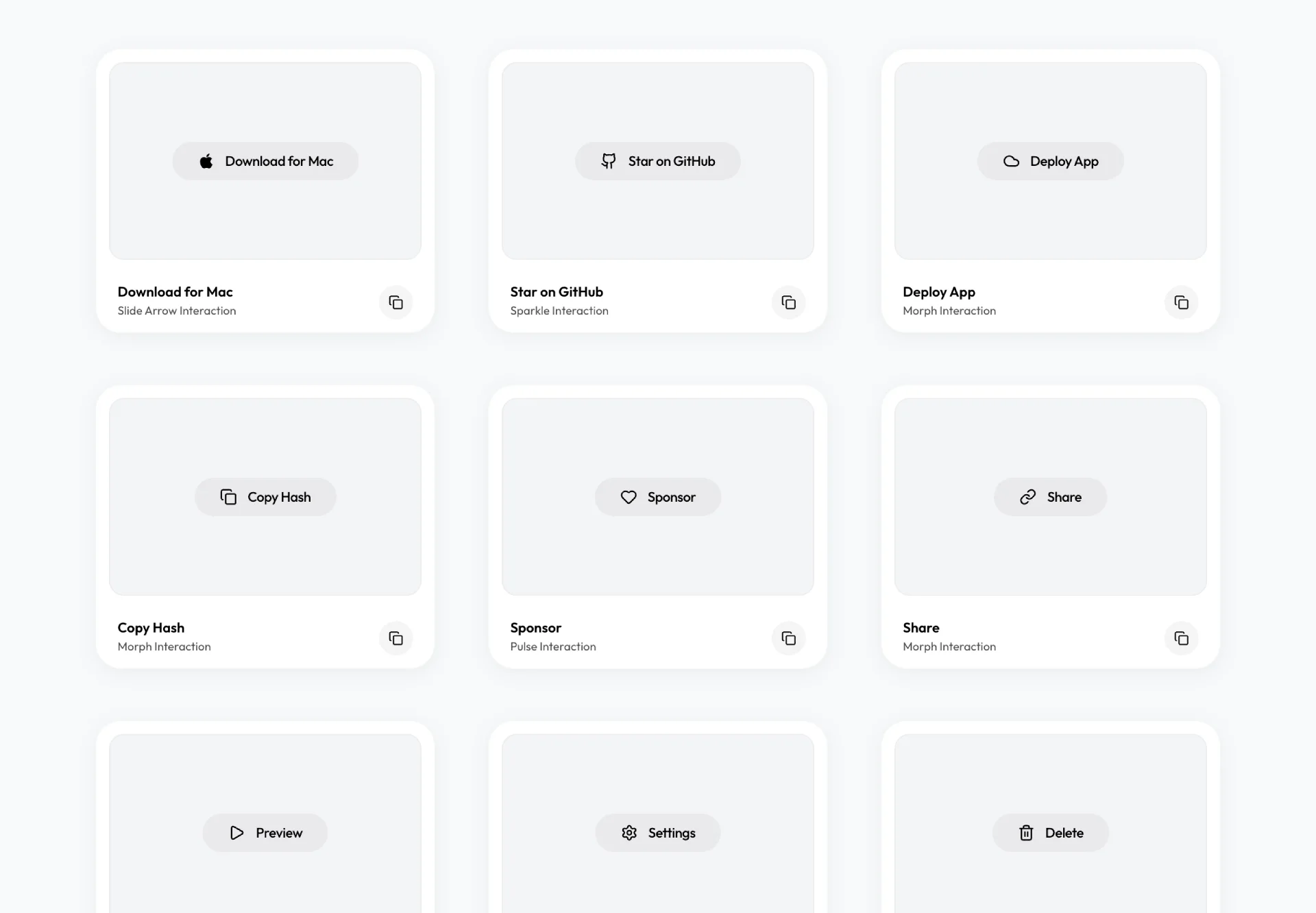
Amicro — micro-interactions for any landing page

Open source collection of ready-made micro-interactions: hover glow, magnetic buttons, scroll reveals. Copy a snippet, paste into any page, ship motion today.

Amicro — micro-interactions for any landing page — Figma freebie
Home
Freebies

Amicro — micro-interactions for any landing page

A page can be correct and still feel dead. The layout works, the copy is fine, the buttons are where they should be. It still reads as a template because nothing responds when you touch it. Amicro is a set of ready-made micro-interactions that fixes that feeling in an afternoon.

What Amicro actually does

Amicro is an open source collection of micro-interactions for the web. Each one is a small, self-contained piece of motion: a button that glows under the cursor, a card that lifts on hover, a heading that slides into place when you scroll to it, a cursor that stays glued to a magnetic element. You pick the effect you want, copy the snippet, and drop it into the page you already have.

There is no framework to adopt and no build step to add. The effects run on CSS and a little vanilla JavaScript, so they work inside a Next.js app, a plain HTML file, a Webflow export, or whatever your AI assistant generated last week. The code lives on GitHub and every effect has a live preview at amicro.vercel.app, so you can test the motion before you commit to it.

Why micro-interactions decide how a page feels

Micro-interactions are the small responses a page gives back when someone acts on it. A button darkens as the cursor reaches it. A form field glows when it takes focus. A section fades up as it enters the viewport. None of them change what the product does. All of them change whether it feels alive or inert.

The difference shows up in how much people trust the page. Motion signals that the interface heard the click, that the state changed, that the thing under the cursor is the thing you meant to press. A page with none of that feels broken in a way users cannot name. They do not file a bug. They just leave.

Most designers know this. The reason micro-interactions still get skipped is cost. Writing them by hand means touching requestAnimationFrame, transition timing, and reduced-motion fallbacks for every small effect. Amicro removes that cost by handing you the effects already written.

What ships in the box

The collection covers the effects landing pages reach for most:

  • ❶ Hover states that glow, lift, or tilt a card as the cursor passes over it
  • ❷ Magnetic buttons that pull toward the pointer and snap back when it leaves
  • ❸ Scroll reveals that fade and slide content into view as it enters the viewport
  • ❹ Text effects that animate a headline on load or on hover
  • ❺ Cursor effects that add a soft trail or a blending dot on desktop

Each effect is isolated. You take the one you need and leave the rest. Nothing pulls in a shared runtime, and removing an effect is as easy as deleting the snippet you pasted.

How to add one in five minutes

The workflow is short enough to do between two other tasks:

  • ❶ Open the live demo and find the effect that fits the section you have in mind
  • ❷ Copy the HTML, the CSS, and the small script for that effect
  • ❸ Paste them into your component and point the class names at your own elements
  • ❹ Adjust the timing values until the motion matches the pace of the rest of the page

If you build with an AI assistant, the snippet is also the prompt. Paste the effect into the chat, describe which element it should wrap, and let the model do the wiring. The effect is plain CSS and JS, so the assistant reads it cleanly and generates working code on the first pass.

Motion without the performance tax

The usual objection to adding motion is weight. Animation libraries can drag in hundreds of kilobytes and a render loop that runs on every frame. Amicro avoids that by staying close to the platform.

The effects lean on CSS transitions and transforms, which the browser can hand to the GPU. The JavaScript is limited to the few cases where a pointer position or a scroll threshold has to be read. When a section is off screen, nothing runs. On a mid-range phone the page keeps its scroll speed, and the motion still reads as smooth.

Accessible by default

Motion is not welcome for everyone. Some people get dizzy from parallax and large movement, and their operating system already tells your page to tone it down. A good micro-interaction respects that signal.

Amicro checks the prefers-reduced-motion setting before it animates. When a visitor has that preference on, the effects fall back to a static state instead of playing. The page still looks finished. It just stops moving. That check is built into the snippets, so you do not have to remember it for each one you paste.

Frequently asked questions

Do I need React to use Amicro?

No. The effects are plain CSS and vanilla JavaScript. React, Vue, and Next.js projects can use them, and so can a static HTML page. You paste the snippet wherever the element lives.

Will the effects slow my page down?

They use CSS transitions and transforms, so the browser can offload the work to the GPU. Most effects only run while the element is on screen and interacting. The heavier cursor effects are desktop-only by design.

Can I mix several effects on one page?

Yes. Each effect is independent and scoped to the element you apply it to. Add as many as the page can carry without competing. A good rule is one motion idea per section.

Is it really free?

Yes. The code is open source on GitHub. You read it, fork it, and ship it in personal or commercial work without a license fee.

Why it belongs in your build

You want the page to feel designed, not generated. Amicro gets you there by giving the interface a set of small, believable responses that cost almost nothing to add. Grab the effect that fits, paste it, tune the timing, and watch the page stop feeling flat.

For a solo builder shipping fast with AI, that is the useful part: real motion without writing animation code from scratch. When you want the static design underneath that motion to hold up, our free Figma resources and design and code kits are built for the same ship-it-yourself workflow.

More Figma freebies

RuneIcons — open source icon set for modern UIs

Components

RuneIcons — open source icon set for modern UIs

Thousands of clean, consistent SVG icons for web and app interfaces. Open source, MIT licensed, and ready to drop into Figma, React, or plain HTML today.

M3E Canvas — Material 3 Expressive UI builder

Code

M3E Canvas — Material 3 Expressive UI builder

Assemble Material 3 Expressive interfaces in your browser and export a ready-to-use prompt for AI. Open source, free, and built for Android vibe coding.

Driver.js — product tours & onboarding

Code

Driver.js — product tours & onboarding

Lightweight, vanilla JavaScript library for building powerful product tours, feature highlights, and contextual onboarding. No dependencies, just 5kb gzipped, fully customizable and accessible by default.

pdfcn — PDF viewer component for React

Code

pdfcn — PDF viewer component for React

Open source PDF viewer built on the shadcn stack. Renders documents inside your React app with zoom, search, and navigation. No iframe, no vendor lock-in, MIT license.

Free invoice template for Figma

Components

Free invoice template for Figma

Clear and simple table-based document for your business purposes. Powered by editable data grid, which is easy to manage.

Avatar UI design templates & tips

Components

Avatar UI design templates & tips

A part of the upcomong design handbook «The State of Component». Colors, Styles & UI design for Avatar. Events, States and Actions. Including layout samples for inspiration.

App Bar UI design templates & tips

Components

App Bar UI design templates & tips

Application Bar (aka Navigation Bar) — displays prior in-app controls related to the current app section. This freebie contains things to consider when designing App Bars.

Fonts Playground

Global Styles

Fonts Playground

Best web fonts precisely handpicked and optimised for better web legibility and ready to implement into your Figma project.

Website Template

Web Design

Website Template

Landing page template made for Figma. Contains styled components UI kit, desktop & mobile versions. Global styles, Inter, FlatUI colors.

Android UI kit

Mobile Templates

Android UI kit

8 mobile app templates based on popular Android UI design patterns: Calendar, Cards, Tasks, Kanban & Project management and more.

Figma iOS UI kit

Mobile Templates

Figma iOS UI kit

iOS native components and app templates organised into a «Most Design System» fully compatible with Human Interface guidelines.

Material X Starter

Mobile & Desktop

Material X Starter

Top-notch styled components in the design system powered by Auto-layout. Ready-to-use Figma UI kit with styles from the nearest future.

Radar Chart

Data visualization

Radar Chart

Radar chart template made of components and available within a range of popular viewports: desktop, tablet and mobile. Light & Dark.

Rome UI kit lite

Mobile & Desktop

Rome UI kit lite

Components & templates for desktop & mobile apps. Powered by clean and trendy custom guidelines and DM Sans font (OFL).

Xela UI kit starter

Mobile & Desktop

Xela UI kit starter

100+ variants of several components to craft perfectly shaped desktop & mobile apps. Modern styleguides and free Nunito Sans font.

Free iOS UI kit

Mobile Templates

Free iOS UI kit

Customisable & adjustable mobile design system with 100+ variants for a set of components and 8 ready-to-use app layouts to try out.

Mobile-X UI kit

Mobile Templates

Mobile-X UI kit

Meet Mobile-X Figma design system for mobile app design. Cross-compatible & stylish UI kit which fits both iOS / Android apps.

Accordion guide

Tutorials & Education

Accordion guide

The exploration for Accordion component: styles, states, samples, and use cases for desktop & mobile viewports.

Eclipse UI kit

Mobile & Desktop

Eclipse UI kit

Fine components fully loaded with variants, auto-layout, global text & color styles. Hi-end customizable Figma design system (starter).

Appka iOS UI kit

Mobile Templates

Appka iOS UI kit

Appka is a fine-themed & customized iOS design system with 4100+ variants for 28 components and 280+ ready-to-use app layouts for Figma.

Nav templates

Mobile & Desktop

Nav templates

This design resource represents navigation components. It contains sidebars, drawers and headers both in light & dark modes.

Dark charts UI kit

Chart Templates

Dark charts UI kit

Try out this handy source of graphs for your next dashboard, pitch, or even print materials. Contains most common dark chart templates.

Figma email templates

Email Templates

Figma email templates

Five awesome and scalable free email templates to engage your subscribers. Dark & light themes. Contains buttons, lists and cards.

Charts widgets dark & light

Chart Templates

Charts widgets dark & light

Line & Wave charts, Bars, Histograms, Ratings and more graphs widgets are available in this free Figma resource. For dashboards, mobile & desktop.

Shopping layout for web app

Desktop

Shopping layout for web app

Contains navigation, filtering components, tabs, cards and more. This layout was made with Angular and fully coded.

Orion dark templates

Data visualization

Orion dark templates

Figma library with 40+ desktop charts templates served in light & dark themes. Contains 200+ of dataviz widgets for every case.

Responsive imagery cards

Card Templates

Responsive imagery cards

A variety of responsive cards templates for Figma. Constrained and scalable. Made with global styles for typography and colors.

Landing page & web blocks

Web Design

Landing page & web blocks

Use given blocks as a quickstarter for your very next web design mission. This freebie contains 3 landing pages for desktop, tablet & mobile.

Mobile tables several themes

Mobile Templates

Mobile tables several themes

Components-driven iOS layouts with data grid made from one singe cell. Based on different styles. Allows to create better tables in Figma.

12 free mobile templates

Mobile Templates

12 free mobile templates

Use our Full iOS design system as the starter for your next mobile app. This freebie includes 12 screens dark & light powered by 200+ components.

Calendars & Date picker templates

Mobile & Desktop

Calendars & Date picker templates

UI design resource with 56 calendars extracted from our popular UI kits. All the best samples of schedule patterns, planners, event managers.

Schedule & Events template

Desktop

Schedule & Events template

This clean calendar template has been made of a scalable grid, accurately made with colored items and wrapped for the desktop.

Material You for web apps

Mobile & Desktop

Material You for web apps

Figma Material Design 3 starter fully loaded with several desktop & mobile templates (with dark themes) and a bundle of components.

iOS Datepickers

Tutorials & Education

iOS Datepickers

Stand out with our Figma iOS date picker. Offering a true-to-life isometric design and easy-to-edit text, it's the most realistic option.

Segment UI kit

Mobile Templates

Segment UI kit

Design stunning Android apps with our free Figma UI kit. Follow Android guidelines and components and use our fonts, colors, and templates.

Figma React UI kit

Design & Code

Figma React UI kit

Our Figma React UI kit 2-in-1 makes web app building faster. Created in Figma, exported to React, and customised with Blueprint.js library.

Messenger app desktop template

Desktop

Messenger app desktop template

Effortlessly create world-class communication design with our Messenger Template for Figma. With dark and light mode options.

Zeus UI free website template

Web Design

Zeus UI free website template

Zeus Web UI kit-inspired landing page template. Supports all viewports, card-driven UX, polished with Syne and Space Grotesk fonts.

Design system starter

Global Styles

Design system starter

Launch your project with confidence thanks to our Figma design system. Customize grids, text, color, gradients, and shadows with ease.

Navigation layout 4 samples

Mobile & Desktop

Navigation layout 4 samples

Sleek Navigation Menu for Material X design system in Figma. Various sizes and design options. Features badges and active state highlight.

Chart cards

Data visualization

Chart cards

Make your data pop with our easy-to-use Charts UI kit. Featuring bar charts and heatmaps, it's perfect for dataviz, dashboard, pitches and others.

Material UI styled

Mobile & Desktop

Material UI styled

New and improved Material UI Kit, refreshed with enhanced material.io guidelines. Free and ready-to-use components included.

Hyper charts

Data visualization

Hyper charts

Transform your data into captivating visuals with several Figma's chart templates based on Hyper Charts kit. You'll find 8 editable widgets inside.

Search inputs

Components

Search inputs

Explore how Figma inputs are revolutionizing search interface design. Gain key insights to enhance user experience with impeccable UIs.

Figma Grid Layouts

Grid Layouts

Figma Grid Layouts

This template is designed to help you create templates that are beautifully balanced. Features both mobile and desktop layouts with 16/24 gutters.

Panda dashboard template

Desktop

Panda dashboard template

Build sleek dashboards with our Panda UI kit starter! Featuring a 1920w desktop template, UI widgets, and components.

Orion dataviz templates

Dashboard Templates

Orion dataviz templates

The design system starter for your next application. This resource contains 6 dashboard templates and a bundle of UI design widgets.

Subscribe to Setproduct

Once per week we send a newsletter with new releases, freebies and blog publications

By clicking Sign Up you're confirming that you agree with our Terms and Conditions.