@sfinterface/numbers — rolling numbers for React

React component that turns only the digits that changed. 13 kB, no dependencies, Intl formatting, five transitions, and reduced-motion support.

@sfinterface/numbers — rolling numbers for React — code freebie
Home
Freebies

@sfinterface/numbers — rolling numbers for React

Your dashboard polls an API every ten seconds. Revenue ticks from 1,204 to 1,251. Or rather, it blinks. The old figure vanishes, the new one appears, and the change slides past your eye. @sfinterface/numbers turns that swap into motion, so the column you were watching rolls to its next value while you watch it happen.

What @sfinterface/numbers does

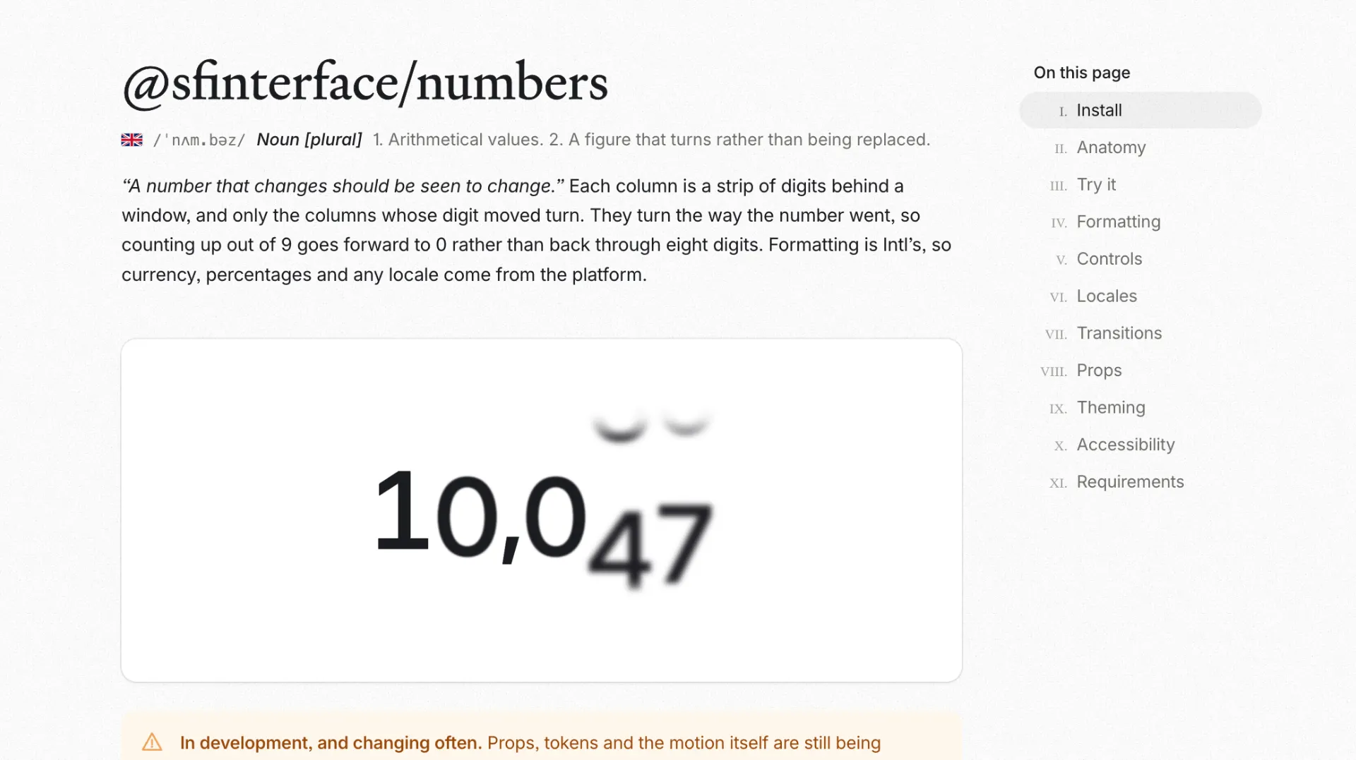
@sfinterface/numbers is a React component that renders numbers the way a mechanical counter does. Each digit sits in its own column, and each column is a strip of digits behind a window. When the value changes, only the columns whose digit actually moved turn. Add one to 1,204 and a single wheel goes round. Add forty-seven and three do, each by a different distance, on the same clock.

The install is two imports and a value:

  • npm i @sfinterface/numbers
  • import { Numbers } from "@sfinterface/numbers"
  • import "@sfinterface/numbers/styles.css"
  • <Numbers value={count} />

It comes from The San Francisco Interface and ships on its own, apart from the rest of that library. The source lives on GitHub, and the full prop reference with a playground sits at numbers.sfinterface.com. Both are open, so you can read the code, test the motion, or file an issue before you commit to anything.

Why a number that jumps feels broken

Counters are everywhere in a product: revenue, users, stock, cart totals, likes, progress. They update on almost every screen that shows live data. Most of them update by replacing the old figure with the new one in a single frame, and that hard cut hides the one thing the reader wants to know. Did it go up or down, and by how much?

Motion answers that question without a label. A wheel that turns forward reads as an increase. A wheel that turns back reads as a loss. The direction of the movement carries the meaning, which is why a rolling figure feels alive and a blinking one feels like a glitch.

The usual fix is an animated counter written by hand. You lerp a number from the old value to the new one and re-render sixty times a second. It works until the figure has a currency symbol, a thousands separator, or a locale that puts the decimal comma in a different place. Then you are writing number formatting on top of animation, and both are now your problem. If you have fought that before, the notes in our dashboard UI design guide cover where live figures tend to break layouts.

How the columns work

The geometry is worth understanding because it explains why the component stays light. A column is a strip of thirty digits behind a window one cell tall. That is each digit 0 to 9, repeated three times, so the strip can roll in either direction without hitting an end. Turning a column means moving the strip three cells. The window does not move. It is where it always was.

The window is slightly taller than the glyph, and the extra space at each end is the bleed. The veil lives in that overhang, and two props shape it. fade sets how far into the overhang a digit dissolves. softness sets the shape of that dissolve, from a crisp edge that lets go quickly to an even ramp with no knee in it. While a column turns, the fade deepens, so the passing digits go ghostly and settle back when the roll stops.

The turning direction follows the number. Counting up out of 9 goes forward to 0, the way an odometer does, rather than rewinding through eight digits. Set trend to up or down when you want to force the reading, and leave it on auto when you want the component to decide from the values.

Formatting comes from Intl

The component does not format numbers itself. It hands the value to Intl.NumberFormat, the browser API that already knows about currencies, percentages, compact notation, numbering systems, and every locale. You pass the standard options and the platform does the work:

  • Currency: <Numbers value={1125.64} format={{ style: "currency", currency: "USD" }} />
  • Percent: <Numbers value={0.0241} format={{ style: "percent", maximumFractionDigits: 2 }} />
  • Compact: <Numbers value={48200} format={{ notation: "compact" }} locale="en-GB" />

That choice removes a whole class of bugs. The separators, the symbol placement, and the rounding rules come from the platform instead of from a formatter you have to maintain. Change the locale prop and the readout follows the reader rather than the developer.

Five transitions, one prop

The motion is a single prop with five values, so you can match the feel of the number to the product:

  • roll turns the strip through every digit on the way, the classic counter
  • tick slides the old digit out and the new one in, quieter and more medical
  • blur dissolves the digit in place, defocused, good for live data that should feel soft
  • flip turns the digit over like a split-flap board, which reads as arrivals and departures
  • scale shrinks the old digit away and grows the new one, the lightest of the five

duration controls the clock in milliseconds and defaults to 520. blur is a boolean you can switch off when the smear feels like too much. prefix and suffix take any node, so a currency symbol, a percent sign, or an icon sits beside the digits. Because the box is one inline box, the affix travels with the number as it gains a column or loses one instead of staying put while the digits shift underneath it.

Theming and inherited type

The stylesheet describes motion and geometry and nothing else. It does not set a font, a size, a weight, a colour, or letter spacing. All of that is inherited from wherever you drop the component, so a readout inside a heading is the heading’s type, and the same component in a table cell takes the table’s type. You do not restyle a widget to make it fit.

When you do want to change the motion, every value is a CSS custom property. Set one on :root, on a wrapper, or inline. The tokens include --sfi-numbers-roll for how long a column takes to turn, --sfi-numbers-exit for how long a leaving column takes to go, --sfi-numbers-cell for the pitch the digits stack at, and --sfi-numbers-ease for the curve a column turns on. The stylesheet ships in one @layer arc, below your own rules, so a class of yours wins over the component without !important.

Accessible by default

A rolling digit is a visual trick, and visual tricks need a fallback. The digits in @sfinterface/numbers are marked aria-hidden, and one formatted string sits behind them. A screen reader announces one thousand two hundred and four, the number as a person would say it, instead of reading twelve glyphs one at a time. The animation is decoration. The value is the content.

Motion follows the accessibility guidance on animation from interaction. When the operating system reports prefers-reduced-motion: reduce, the columns do not turn, blur, or fade. The number changes and nothing moves, which is the behavior a reader who asked for less motion expects.

Server rendering is handled too. The component renders the formatted value into the markup on the server, so the first paint shows the real figure. There is no empty box, no placeholder width to reserve, and no hydration guard to write. The package requires React 18 or 19, carries no dependencies, and ships its own types.

Frequently asked questions

How do I animate a number in React without a chart library?

You install the package, import the stylesheet, and pass your value as a prop. The component handles the columns, the timing, and the formatting. You do not write a timer, a requestAnimationFrame loop, or a formatter. If you only need one figure to count up, this is less code than a custom hook.

Does it support currency, percentages, and compact notation?

Yes. Formatting runs through Intl.NumberFormat, so you pass the standard options for style, currency, and notation, plus a locale. That covers currency symbols, percent signs, compact values like 48K, and the separators each locale uses.

Will it work in a Next.js app with server rendering?

It will. The component is SSR ready and renders the formatted value into the markup, so the number shows on first paint. It supports React 18 and 19, and it has no runtime dependencies to fight over.

What happens for users who prefer reduced motion?

The component reads the reduced-motion preference and stops the animation. The value still updates, it just arrives without the roll, blur, or fade. The digits also stay hidden from screen readers, which read the number as a single formatted string.

How large is the package and is it free?

It weighs about 13 kB and pulls in nothing else. It is MIT licensed, so you can use it in personal and commercial work. Version 0.3.4 is current, and the changelog notes that the props and motion are still being settled, so pin an exact version if you need the behavior to hold still.

Why it belongs in your stack

You care about the moment a figure changes, because that is the moment the reader looks. A number that rolls tells them the direction and the size of the change in one gesture. A number that blinks makes them check the previous screen to be sure. That difference repeats on every live screen you ship.

For a solo builder shipping fast, the trade is clean: one small component, no dependencies, formatting from the platform, and motion that already respects the accessibility settings. Grab the package, point it at your revenue or user count, and let the figure move the way the data did. When you want the dashboard around that figure to look deliberate, our Orion charts UI kit and the rest of the design and code kits are built for the same workflow. If you are still wiring the screen the number lives on, the guide on studying a SaaS dashboard in the AI era is a useful starting point.

More Figma freebies

RuneIcons — open source icon set for modern UIs

Components

RuneIcons — open source icon set for modern UIs

Thousands of clean, consistent SVG icons for web and app interfaces. Open source, MIT licensed, and ready to drop into Figma, React, or plain HTML today.

Amicro — micro-interactions for any landing page

Code

Amicro — micro-interactions for any landing page

Open source collection of ready-made micro-interactions: hover glow, magnetic buttons, scroll reveals. Copy a snippet, paste into any page, ship motion today.

M3E Canvas — Material 3 Expressive UI builder

Code

M3E Canvas — Material 3 Expressive UI builder

Assemble Material 3 Expressive interfaces in your browser and export a ready-to-use prompt for AI. Open source, free, and built for Android vibe coding.

Driver.js — product tours & onboarding

Code

Driver.js — product tours & onboarding

Lightweight, vanilla JavaScript library for building powerful product tours, feature highlights, and contextual onboarding. No dependencies, just 5kb gzipped, fully customizable and accessible by default.

pdfcn — PDF viewer component for React

Code

pdfcn — PDF viewer component for React

Open source PDF viewer built on the shadcn stack. Renders documents inside your React app with zoom, search, and navigation. No iframe, no vendor lock-in, MIT license.

Free invoice template for Figma

Components

Free invoice template for Figma

Clear and simple table-based document for your business purposes. Powered by editable data grid, which is easy to manage.

Avatar UI design templates & tips

Components

Avatar UI design templates & tips

A part of the upcomong design handbook «The State of Component». Colors, Styles & UI design for Avatar. Events, States and Actions. Including layout samples for inspiration.

App Bar UI design templates & tips

Components

App Bar UI design templates & tips

Application Bar (aka Navigation Bar) — displays prior in-app controls related to the current app section. This freebie contains things to consider when designing App Bars.

Fonts Playground

Global Styles

Fonts Playground

Best web fonts precisely handpicked and optimised for better web legibility and ready to implement into your Figma project.

Website Template

Web Design

Website Template

Landing page template made for Figma. Contains styled components UI kit, desktop & mobile versions. Global styles, Inter, FlatUI colors.

Android UI kit

Mobile Templates

Android UI kit

8 mobile app templates based on popular Android UI design patterns: Calendar, Cards, Tasks, Kanban & Project management and more.

Figma iOS UI kit

Mobile Templates

Figma iOS UI kit

iOS native components and app templates organised into a «Most Design System» fully compatible with Human Interface guidelines.

Material X Starter

Mobile & Desktop

Material X Starter

Top-notch styled components in the design system powered by Auto-layout. Ready-to-use Figma UI kit with styles from the nearest future.

Radar Chart

Data visualization

Radar Chart

Radar chart template made of components and available within a range of popular viewports: desktop, tablet and mobile. Light & Dark.

Rome UI kit lite

Mobile & Desktop

Rome UI kit lite

Components & templates for desktop & mobile apps. Powered by clean and trendy custom guidelines and DM Sans font (OFL).

Xela UI kit starter

Mobile & Desktop

Xela UI kit starter

100+ variants of several components to craft perfectly shaped desktop & mobile apps. Modern styleguides and free Nunito Sans font.

Free iOS UI kit

Mobile Templates

Free iOS UI kit

Customisable & adjustable mobile design system with 100+ variants for a set of components and 8 ready-to-use app layouts to try out.

Mobile-X UI kit

Mobile Templates

Mobile-X UI kit

Meet Mobile-X Figma design system for mobile app design. Cross-compatible & stylish UI kit which fits both iOS / Android apps.

Accordion guide

Tutorials & Education

Accordion guide

The exploration for Accordion component: styles, states, samples, and use cases for desktop & mobile viewports.

Eclipse UI kit

Mobile & Desktop

Eclipse UI kit

Fine components fully loaded with variants, auto-layout, global text & color styles. Hi-end customizable Figma design system (starter).

Appka iOS UI kit

Mobile Templates

Appka iOS UI kit

Appka is a fine-themed & customized iOS design system with 4100+ variants for 28 components and 280+ ready-to-use app layouts for Figma.

Nav templates

Mobile & Desktop

Nav templates

This design resource represents navigation components. It contains sidebars, drawers and headers both in light & dark modes.

Dark charts UI kit

Chart Templates

Dark charts UI kit

Try out this handy source of graphs for your next dashboard, pitch, or even print materials. Contains most common dark chart templates.

Figma email templates

Email Templates

Figma email templates

Five awesome and scalable free email templates to engage your subscribers. Dark & light themes. Contains buttons, lists and cards.

Charts widgets dark & light

Chart Templates

Charts widgets dark & light

Line & Wave charts, Bars, Histograms, Ratings and more graphs widgets are available in this free Figma resource. For dashboards, mobile & desktop.

Shopping layout for web app

Desktop

Shopping layout for web app

Contains navigation, filtering components, tabs, cards and more. This layout was made with Angular and fully coded.

Orion dark templates

Data visualization

Orion dark templates

Figma library with 40+ desktop charts templates served in light & dark themes. Contains 200+ of dataviz widgets for every case.

Responsive imagery cards

Card Templates

Responsive imagery cards

A variety of responsive cards templates for Figma. Constrained and scalable. Made with global styles for typography and colors.

Landing page & web blocks

Web Design

Landing page & web blocks

Use given blocks as a quickstarter for your very next web design mission. This freebie contains 3 landing pages for desktop, tablet & mobile.

Mobile tables several themes

Mobile Templates

Mobile tables several themes

Components-driven iOS layouts with data grid made from one singe cell. Based on different styles. Allows to create better tables in Figma.

12 free mobile templates

Mobile Templates

12 free mobile templates

Use our Full iOS design system as the starter for your next mobile app. This freebie includes 12 screens dark & light powered by 200+ components.

Calendars & Date picker templates

Mobile & Desktop

Calendars & Date picker templates

UI design resource with 56 calendars extracted from our popular UI kits. All the best samples of schedule patterns, planners, event managers.

Schedule & Events template

Desktop

Schedule & Events template

This clean calendar template has been made of a scalable grid, accurately made with colored items and wrapped for the desktop.

Material You for web apps

Mobile & Desktop

Material You for web apps

Figma Material Design 3 starter fully loaded with several desktop & mobile templates (with dark themes) and a bundle of components.

iOS Datepickers

Tutorials & Education

iOS Datepickers

Stand out with our Figma iOS date picker. Offering a true-to-life isometric design and easy-to-edit text, it's the most realistic option.

Segment UI kit

Mobile Templates

Segment UI kit

Design stunning Android apps with our free Figma UI kit. Follow Android guidelines and components and use our fonts, colors, and templates.

Figma React UI kit

Design & Code

Figma React UI kit

Our Figma React UI kit 2-in-1 makes web app building faster. Created in Figma, exported to React, and customised with Blueprint.js library.

Messenger app desktop template

Desktop

Messenger app desktop template

Effortlessly create world-class communication design with our Messenger Template for Figma. With dark and light mode options.

Zeus UI free website template

Web Design

Zeus UI free website template

Zeus Web UI kit-inspired landing page template. Supports all viewports, card-driven UX, polished with Syne and Space Grotesk fonts.

Design system starter

Global Styles

Design system starter

Launch your project with confidence thanks to our Figma design system. Customize grids, text, color, gradients, and shadows with ease.

Navigation layout 4 samples

Mobile & Desktop

Navigation layout 4 samples

Sleek Navigation Menu for Material X design system in Figma. Various sizes and design options. Features badges and active state highlight.

Chart cards

Data visualization

Chart cards

Make your data pop with our easy-to-use Charts UI kit. Featuring bar charts and heatmaps, it's perfect for dataviz, dashboard, pitches and others.

Material UI styled

Mobile & Desktop

Material UI styled

New and improved Material UI Kit, refreshed with enhanced material.io guidelines. Free and ready-to-use components included.

Hyper charts

Data visualization

Hyper charts

Transform your data into captivating visuals with several Figma's chart templates based on Hyper Charts kit. You'll find 8 editable widgets inside.

Search inputs

Components

Search inputs

Explore how Figma inputs are revolutionizing search interface design. Gain key insights to enhance user experience with impeccable UIs.

Figma Grid Layouts

Grid Layouts

Figma Grid Layouts

This template is designed to help you create templates that are beautifully balanced. Features both mobile and desktop layouts with 16/24 gutters.

Panda dashboard template

Desktop

Panda dashboard template

Build sleek dashboards with our Panda UI kit starter! Featuring a 1920w desktop template, UI widgets, and components.

Orion dataviz templates

Dashboard Templates

Orion dataviz templates

The design system starter for your next application. This resource contains 6 dashboard templates and a bundle of UI design widgets.

Subscribe to Setproduct

Once per week we send a newsletter with new releases, freebies and blog publications

By clicking Sign Up you're confirming that you agree with our Terms and Conditions.