


Events & Calendar UI design template
This clean calendar template has been made of a scalable grid, accurately made with colored Tag components and wrapped as the events template.

UX tips and things to consider before you started to design a calendar, date picker, events manager
Creating a calendar user interface design can be a challenging task for many developers. There are many different aspects to consider and a lot of work to do in order to make sure the UI is visually appealing and user-friendly. This tutorial will cover all the basics you need to know in order to create a calendar UI that looks great and is easy to use.
The first step to designing a calendar UI is to determine the type of calendar you want to create. Are you creating a calendar for a website or an app? This will affect the overall look and feel of the design. You will also need to decide on the size of the calendar and the amount of data you want to display.
Once you have determined the type and size of the calendar, you will need to decide on the layout of the calendar. Do you want a traditional month view or a more modern timeline view? This will help you determine how to display the data and how many clicks it will take for a user to go from one date to another.
The next step is to decide on the colors and fonts you want to use. The colors should be consistent with the overall look and feel of the website or app, and the fonts should be easy to read and understand.
Once you have chosen the colors and fonts, you will need to decide on the placement of the calendar elements. Placement is an important part of the calendar UI design, as it determines how easy it is for a user to navigate the calendar.
When designing the calendar, it is important to keep the user experience in mind. The calendar should be easy to understand and navigate, and should be optimized for mobile devices. Consider adding features such as reminders and notifications to make the user's experience even better.
Finally, make sure that the calendar design is responsive and looks great across all devices.

Conclusion
Creating a calendar UI design can be a challenging task, but if you follow the steps outlined in this tutorial, you should be able to create a calendar UI that looks great and is easy to use.
To create a successful date picker UI design, consider the following tips:
- Determine the type and size of the calendar you want to create.
- Choose colors and fonts that are consistent with the overall look and feel of the website or app.
- Decide on the placement of calendar elements.
- Keep the user experience in mind and add features such as reminders and notifications.
- Make sure the calendar design is responsive and looks great across all devices.
.avif)
Panda Design System
Figma library with dashboard, calendar, kanban, profile, table, ecommerce and 80+ templates in total. Components with variants, dark theme included.
More Figma freebies

Components
Free invoice template for Figma
Clear and simple table-based document for your business purposes. Powered by editable data grid, which is easy to manage.
Components
Avatar UI design templates & tips
A part of the upcomong design handbook «The State of Component». Colors, Styles & UI design for Avatar. Events, States and Actions. Including layout samples for inspiration.

Components
App Bar UI design templates & tips
Application Bar (aka Navigation Bar) — displays prior in-app controls related to the current app section. This freebie contains things to consider when designing App Bars.

Global Styles
Fonts Playground
Best web fonts precisely handpicked and optimised for better web legibility and ready to implement into your Figma project.

Web Design
Website Template
Landing page template made for Figma. Contains styled components UI kit, desktop & mobile versions. Global styles, Inter, FlatUI colors.

Mobile Templates
Android UI kit
8 mobile app templates based on popular Android UI design patterns: Calendar, Cards, Tasks, Kanban & Project management and more.

Mobile Templates
Figma iOS UI kit
iOS native components and app templates organised into a «Most Design System» fully compatible with Human Interface guidelines.

Mobile & Desktop
Material X Starter
Top-notch styled components in the design system powered by Auto-layout. Ready-to-use Figma UI kit with styles from the nearest future.

Data visualization
Radar Chart
Radar chart template made of components and available within a range of popular viewports: desktop, tablet and mobile. Light & Dark.

Mobile & Desktop
Rome UI kit lite
Components & templates for desktop & mobile apps. Powered by clean and trendy custom guidelines and DM Sans font (OFL).

Mobile & Desktop
Xela UI kit starter
100+ variants of several components to craft perfectly shaped desktop & mobile apps. Modern styleguides and free Nunito Sans font.

Mobile Templates
Free iOS UI kit
Customisable & adjustable mobile design system with 100+ variants for a set of components and 8 ready-to-use app layouts to try out.

Mobile Templates
Mobile-X UI kit
Meet Mobile-X Figma design system for mobile app design. Cross-compatible & stylish UI kit which fits both iOS / Android apps.

Tutorials & Education
Accordion guide
The exploration for Accordion component: styles, states, samples, and use cases for desktop & mobile viewports.

Mobile & Desktop
Eclipse UI kit
Fine components fully loaded with variants, auto-layout, global text & color styles. Hi-end customizable Figma design system (starter).

Mobile Templates
Appka iOS UI kit
Appka is a fine-themed & customized iOS design system with 4100+ variants for 28 components and 280+ ready-to-use app layouts for Figma.

Mobile & Desktop
Nav templates
This design resource represents navigation components. It contains sidebars, drawers and headers both in light & dark modes.

Chart Templates
Dark charts UI kit
Try out this handy source of graphs for your next dashboard, pitch, or even print materials. Contains most common dark chart templates.

Email Templates
Figma email templates
Five awesome and scalable free email templates to engage your subscribers. Dark & light themes. Contains buttons, lists and cards.

Chart Templates
Charts widgets dark & light
Line & Wave charts, Bars, Histograms, Ratings and more graphs widgets are available in this free Figma resource. For dashboards, mobile & desktop.

Desktop
Shopping layout for web app
Contains navigation, filtering components, tabs, cards and more. This layout was made with Angular and fully coded.

Data visualization
Orion dark templates
Figma library with 40+ desktop charts templates served in light & dark themes. Contains 200+ of dataviz widgets for every case.

Card Templates
Responsive imagery cards
A variety of responsive cards templates for Figma. Constrained and scalable. Made with global styles for typography and colors.

Web Design
Landing page & web blocks
Use given blocks as a quickstarter for your very next web design mission. This freebie contains 3 landing pages for desktop, tablet & mobile.

Mobile Templates
Mobile tables several themes
Components-driven iOS layouts with data grid made from one singe cell. Based on different styles. Allows to create better tables in Figma.

Mobile Templates
12 free mobile templates
Use our Full iOS design system as the starter for your next mobile app. This freebie includes 12 screens dark & light powered by 200+ components.

Mobile & Desktop
Calendars & Date picker templates
UI design resource with 56 calendars extracted from our popular UI kits. All the best samples of schedule patterns, planners, event managers.

Mobile & Desktop
Material You for web apps
Figma Material Design 3 starter fully loaded with several desktop & mobile templates (with dark themes) and a bundle of components.

Tutorials & Education
iOS Datepickers
Stand out with our Figma iOS date picker. Offering a true-to-life isometric design and easy-to-edit text, it's the most realistic option.

Mobile Templates
Segment UI kit
Design stunning Android apps with our free Figma UI kit. Follow Android guidelines and components and use our fonts, colors, and templates.

Design & Code
Figma React UI kit
Our Figma React UI kit 2-in-1 makes web app building faster. Created in Figma, exported to React, and customised with Blueprint.js library.
.avif)
Desktop
Messenger app desktop template
Effortlessly create world-class communication design with our Messenger Template for Figma. With dark and light mode options.

Web Design
Zeus UI free website template
Zeus Web UI kit-inspired landing page template. Supports all viewports, card-driven UX, polished with Syne and Space Grotesk fonts.

Global Styles
Design system starter
Launch your project with confidence thanks to our Figma design system. Customize grids, text, color, gradients, and shadows with ease.

Mobile & Desktop
Navigation layout 4 samples
Sleek Navigation Menu for Material X design system in Figma. Various sizes and design options. Features badges and active state highlight.

Data visualization
Chart cards
Make your data pop with our easy-to-use Charts UI kit. Featuring bar charts and heatmaps, it's perfect for dataviz, dashboard, pitches and others.

Mobile & Desktop
Material UI styled
New and improved Material UI Kit, refreshed with enhanced material.io guidelines. Free and ready-to-use components included.

Data visualization
Hyper charts
Transform your data into captivating visuals with several Figma's chart templates based on Hyper Charts kit. You'll find 8 editable widgets inside.

Components
Search inputs
Explore how Figma inputs are revolutionizing search interface design. Gain key insights to enhance user experience with impeccable UIs.

Grid Layouts
Figma Grid Layouts
This template is designed to help you create templates that are beautifully balanced. Features both mobile and desktop layouts with 16/24 gutters.

Desktop
Panda dashboard template
Build sleek dashboards with our Panda UI kit starter! Featuring a 1920w desktop template, UI widgets, and components.

Dashboard Templates
Orion dataviz templates
The design system starter for your next application. This resource contains 6 dashboard templates and a bundle of UI design widgets.
Subscribe to Setproduct
Congratulations!
Figma Templates & UI kits
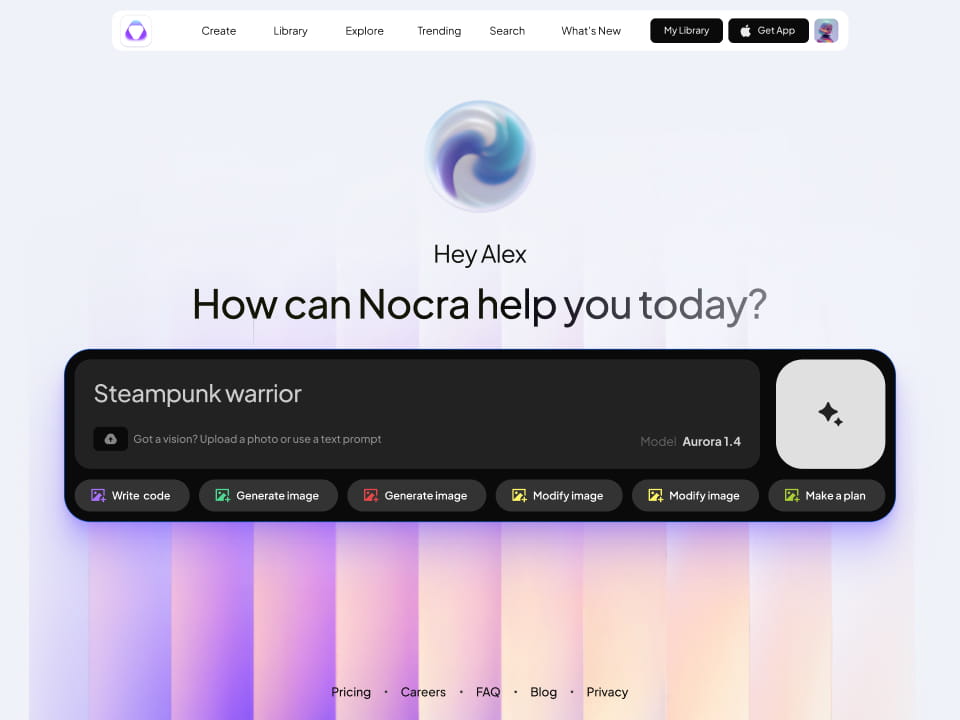
Nocra UI kit
Nocra is a design system for AI products. Built specifically for startups harnessing AI generation: images, video, audio, music, prompts, and beyond.
.avif)
Material X for Figma
Figma library with 1100+ components & 40 app templates beyond Material Design. Powered by top-notch shapes and Manrope font. Customizable & Adjustable UI kit now available for Angular & Figma
.avif)
Material You UI kit
Figma & React library with 2600+ variants of 32 components compatible with Material Design 3. Plus 220+ dashboard templates for all the viewports. Now available for NextJS & TailwindCSS.

Figma React UI kit
Designed and well-organized in Figma React-based UI toolkit for the web. Optimized for building complex data-dense interfaces for desktop and mobile applications.
Panda Design System
Figma library with dashboard, calendar, kanban, profile, table, ecommerce and 80+ templates in total. Components with variants, dark theme included.
.avif)
Eclipse UI kit
Figma library with 1100+ components & 74 templates for data-driven web applications. Powered by auto-layout. Supercharged by Figma's variants.

Rome UI kit for Figma
Customizable and well-organized team library. Contains 250+ components & 30 web app templates powered by stylish and trendy guidelines.

Material Design System
Figma library is based on 100% guidelines compliance with Material.io. Contains ready‑to-use templates to accelerate app UI design.

Neolex Dashboard UI kit
Customizable & adjustable dashboard design system with 50+ ready-to-use app layouts, 1900+ variants for 30 components with auto-layout.
.avif)
Material Desktop Dashboard UI kit
Figma library with 48+ dashboard templates based on reusable desktop app patterns carefully handpicked from the most popular web apps.
.avif)
Xela UI kit for Figma
Figma library with 1900+ variants of 30 components categories to craft perfectly shaped desktop & mobile apps. Customizable & Adjustable dashboard design system with 50+ web app templates.

Figma S8 Design System
Figma design library for mobile and desktop apps made of high quality styled components. Full version includes 67 dashboard templates.

OE Figma Design System
Customizable and well-organized Figma library. This design system aimed to build highly loaded interfaces, boost the speed and save more costs.

Figma iOS kit
Figma library of iOS patterns served as ready-made templates. This UI kit inspired by World's best apps. Based on Human Interface guidelines.
Figma S8 Design System
Figma design library for mobile and desktop apps made of high quality styled components. Full version includes 67 dashboard templates.
.avif)
Most iOS UI kit for Figma
iOS native components and app templates organized into a «Most Design System» fully compatible with Apple's Human Interface guidelines.
Rome UI kit for Figma
Customizable and well-organized team library. Contains 250+ components & 30 web app templates powered by stylish and trendy guidelines.
Material Design System
Figma library is based on 100% guidelines compliance with Material.io. Contains ready‑to-use templates to accelerate app UI design.
.avif)
Nucleus UI
Nucleus UI contains 1000 components and variants with 500+ mobile screens designed for Figma (including 9 themes from Event, E-commerce, Finance, NFT, etc.).
.avif)
Figma Android UI kit
Components-driven Android mobile UI library for Figma. Consists of 140 high quality application templates made of total 250+ UI components.

Mobile X UI kit
Customizable & adjustable iOS / Android design system loaded with ready-made 157 app templates based on 860+ variants for 20 components.

Appka iOS UI kit
Customizable & adjustable iOS design system with 4100+ variants for 28 components and 280+ ready-to-use app layouts crafted for Figma.
.avif)
Full iOS UI kit
Customizable iOS design system with 320 ready-to-use app layouts. You can modify them or use as it is to save time and never design from scratch again.

Xela for Flutter
XelaUI for Flutter is a simple, modular and accessible component library that gives you the building Flutter apps for mobile and desktop.

Xela for Android
Ready-made collection of fully customizable widgets, UI screens and reusable components for Android coded with Jetpack Compose.

Xela for Swift
Designed for iOS Developers. We provide fully coded customizable components, widgets and well-organized iOS screens for Figma & SwiftUI.
Material You UI kit
Figma & React library with 2600+ variants of 32 components compatible with Material Design 3. Plus 220+ dashboard templates for all the viewports. Now available for NextJS & TailwindCSS.

Figma Charts UI kit
Components-driven graphs design kit for dashboards, presentations, infographics & data visualisation. Includes 25+ charts types for all the viewports.

Hyper Charts
Create impressive visuals with Figma's graphs templates – dozens of scalable and customizable data visualization blocks for dark and light modes.

Orion UI kit
Figma library with 40+ full-width charts templates served in light & dark themes. Contains 200+ of dataviz widgets that look perfect on desktop & mobile screens.
%20(1).avif)
Xela for React
React based components library for beautiful user interface in React apps. Lightweight library for your projects. Contains pre-made web app templates.
Figma React UI kit
Designed and well-organized in Figma React-based UI toolkit for the web. Optimized for building complex data-dense interfaces for desktop and mobile applications.
Material X for Figma
Figma library with 1100+ components & 40 app templates beyond Material Design. Powered by top-notch shapes and Manrope font. Customizable & Adjustable UI kit now available for Angular & Figma
Xela for Flutter
XelaUI for Flutter is a simple, modular and accessible component library that gives you the building Flutter apps for mobile and desktop.
Xela for Android
Ready-made collection of fully customizable widgets, UI screens and reusable components for Android coded with Jetpack Compose.
Xela for Swift
Designed for iOS Developers. We provide fully coded customizable components, widgets and well-organized iOS screens for Figma & SwiftUI.
Material You UI kit
Figma & React library with 2600+ variants of 32 components compatible with Material Design 3. Plus 220+ dashboard templates for all the viewports. Now available for NextJS & TailwindCSS.
Xela for React
React based components library for beautiful user interface in React apps. Lightweight library for your projects. Contains pre-made web app templates.

Levitate 3D kit for Figma
Components-driven 3D kit to design eye-catching Figma presentations. Helps to enhance your landing page, product or app, brand ident, etc.
%20(1).avif)
Website templates UI kit
Landing pages reusable templates kit based on most effective web design patterns. 140+ dark & light constrained design blocks.
.avif)
Figma Landing Pages UI kit
Landing pages templates library based on constrained & organized components aimed to speed-up the production of effective websites.
.avif)
Zeus UI kit
Create hassle-free landing pages in Figma. This kit is based on 10 landing page templates, powered by 1600+ variants for 630+ web blocks.


