


%20(1).webp)


Roman Kamushken
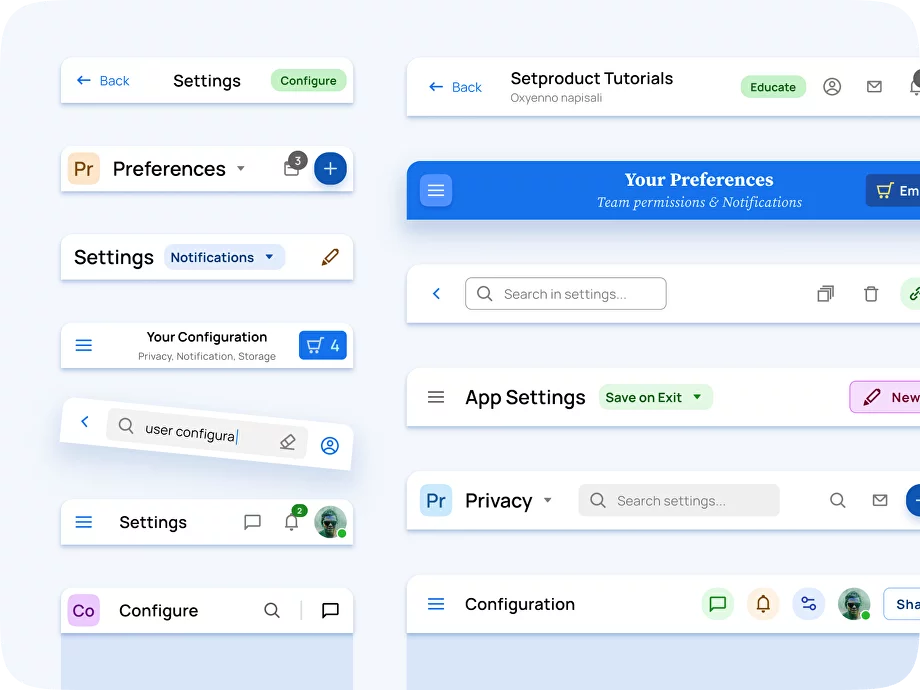
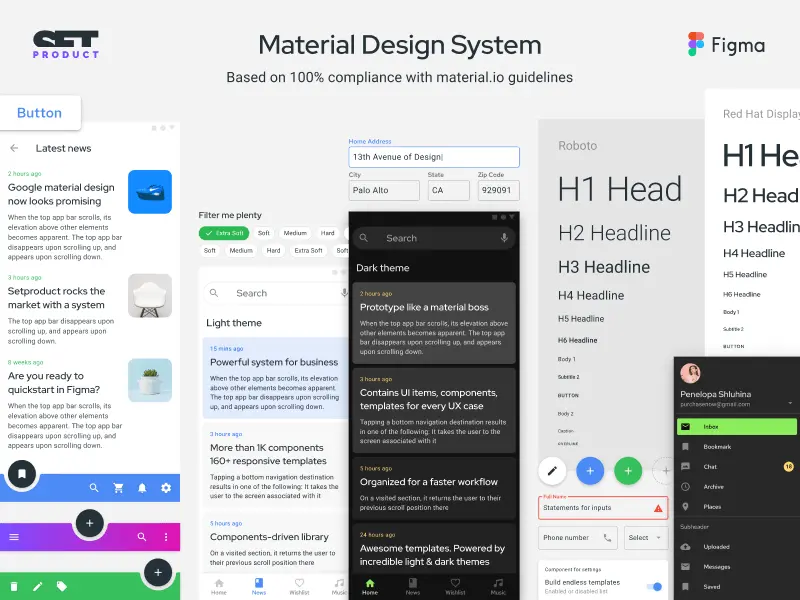
<span class="blog_big-paragraph">The app settings section is a designated area where users can customize and adjust various preferences, options, or configurations to tailor the UX according to user's needs and preferences.</span>
Settings UI design – facilitates ease of use, efficiency, and user satisfaction by providing users with a sense of control, customization, and flexibility. It ensures that users can easily find and modify settings, understand the impact of their changes, and have a seamless experience navigating and managing their preferences.
This article is perfect for UX/UI designers and developers aiming to enhance their skills in designing user-friendly and intuitive settings sections. Whether you're working on a web app or mobile interface, this comprehensive guide offers valuable insights and practical knowledge.
Today you will learn:
- Anatomy of a Settings Section: Gain a deep understanding of the key components and elements that make up an efficient and visually appealing settings section.
- Real-World Use Cases: Explore various scenarios and examples to better grasp how settings sections can be tailored to different types of applications or platforms.
- Layout Types and Best Practices: Discover different layout options, such as tabbed, hierarchical, or grouped, while understanding the pros and cons of each. Learn best practices for organizing settings effectively.
- Essential Usability Tips: Uncover design techniques and user-centric approaches to ensure seamless navigation and effortless customization within Settings sections.
{{spacer-64}}
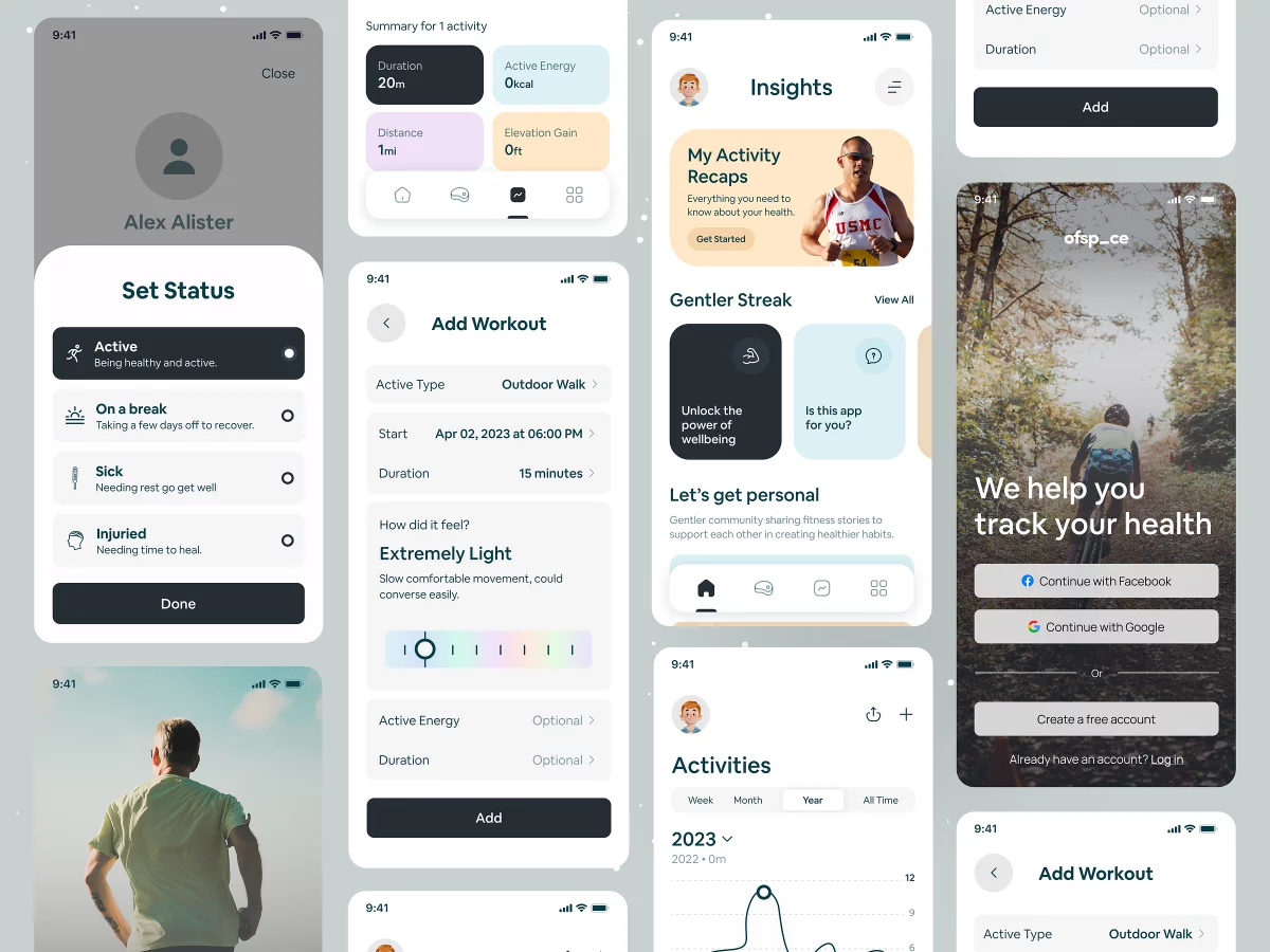
Settings Anatomy
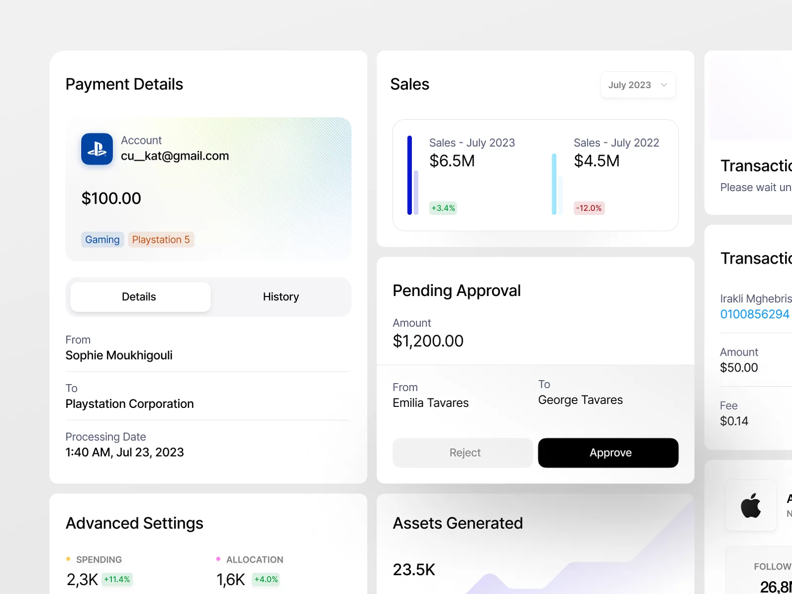
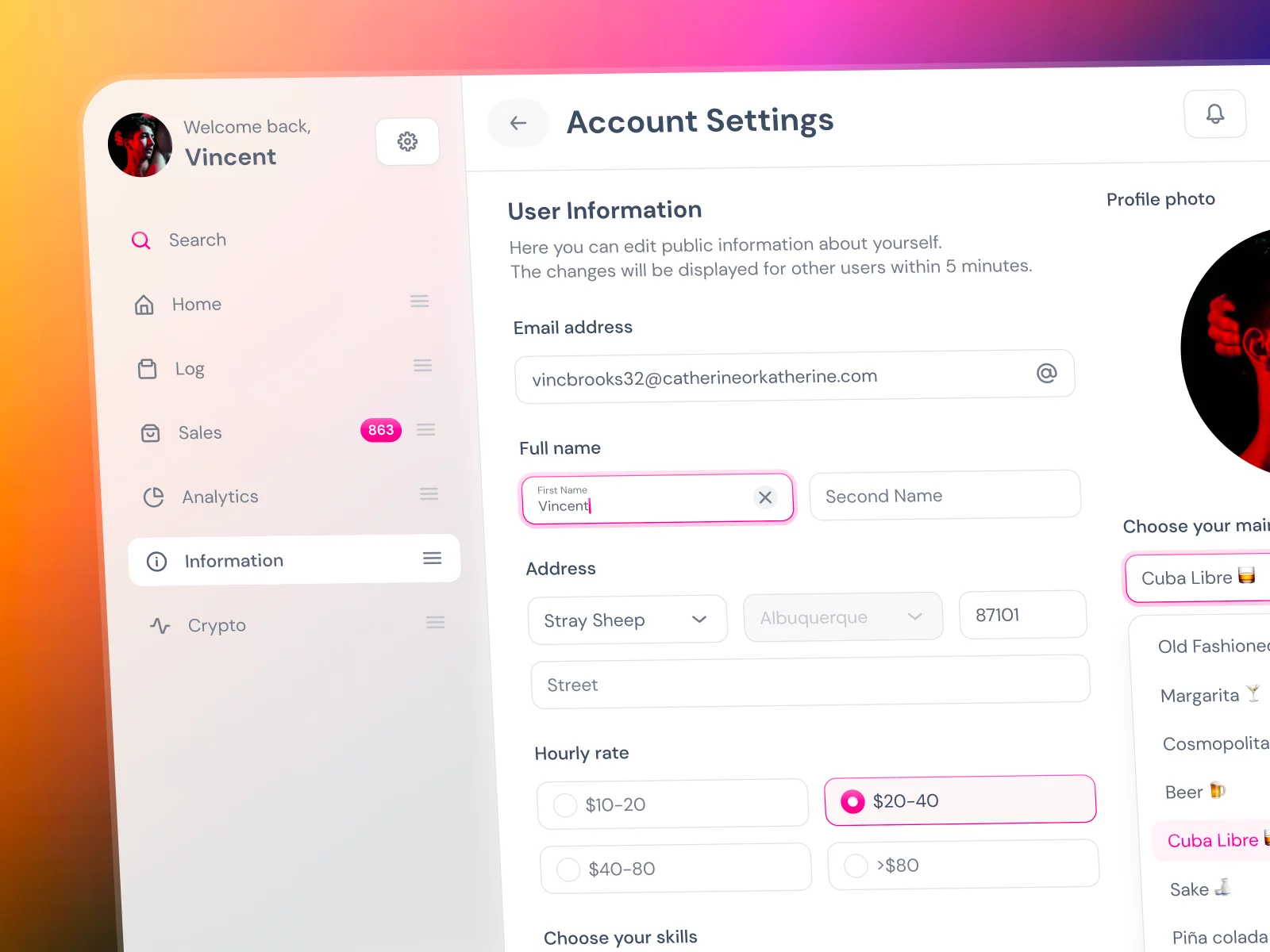
Header
Definition: The header component serves as the top section of the settings page, typically including the app logo, page title, and any relevant navigation elements.
Function: It provides visual branding and context to the settings section, reinforcing the app's identity and guiding users to navigate.
Use case example: A header in the settings section of a web app could include the app logo, the title "Settings," and navigation elements such as tabs or breadcrumbs to provide easy access to different settings categories.
Design tips:
- Ensure the header remains consistent across all pages of the website or application, allowing users to navigate effortlessly and maintain a sense of familiarity.
- Optimize the header for different device sizes and resolutions by implementing responsive design techniques.
- Make the header sticky/fixed to keep it visible and accessible as users scroll throughout the Settings section.
{{spacer-24}}
Side Navigation
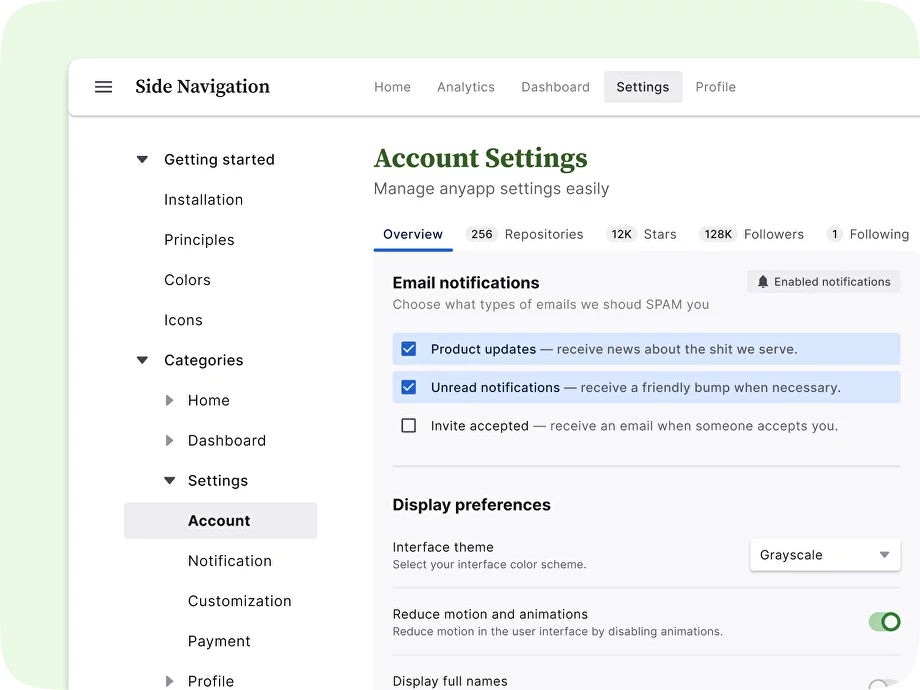
Definition: The side navigation component provides a vertical navigation menu on the left or right side of the page.
Function: Side navigation allows users to navigate through the various settings categories quickly and efficiently, making it easier to locate and update specific settings.
Use case example: It can be used to display a hierarchical menu structure, enabling users to easily navigate through different levels of content, such as categories, subcategories, and specific pages.
Design tips:
- Highlight the currently selected navigation item or provide visual cues to indicate the user's location within the settings section.
- Collapse or expand sections dynamically based on the user's interaction to reduce clutter and maintain a focused view.
- Ensure the side navigation adapts well to different screen sizes and devices, such as collapsing or transforming it into a hamburger menu for smaller screens.
{{spacer-24}}
Tabs
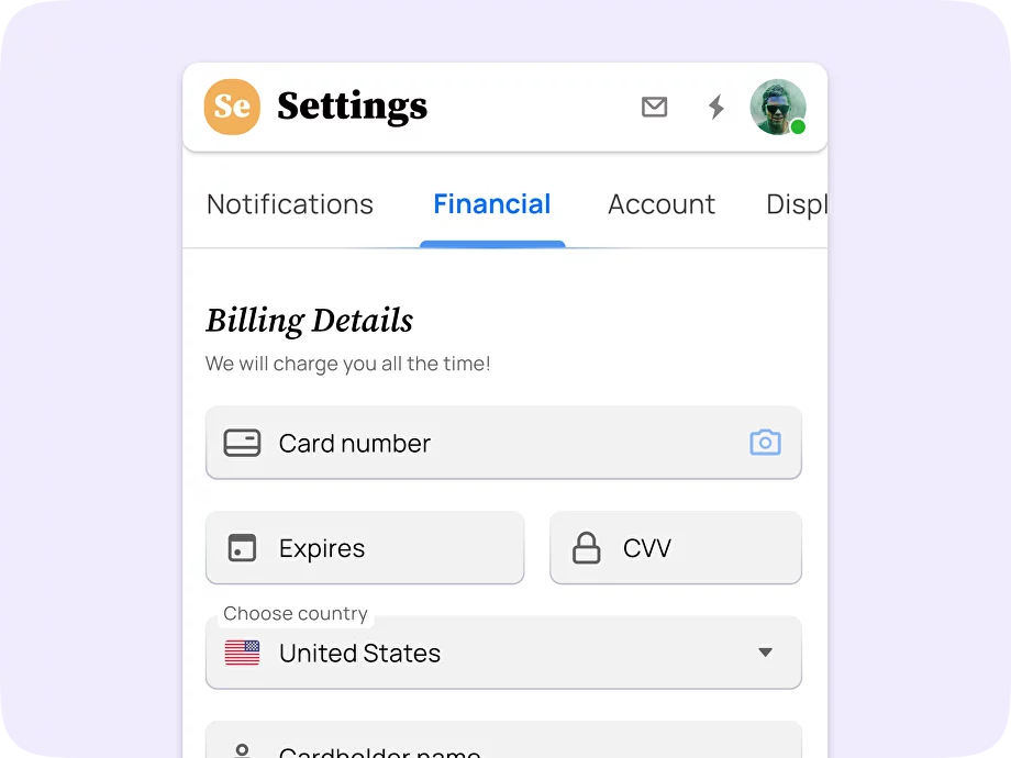
Definition: Tabs help categorize and organize different settings sections or groups, allowing users to switch between without cluttering the main view.
Function: Tabs provide a clear and structured way for users to navigate between different categories or feature sets, keeping settings easily scannable.
Use case example: Within the settings section, tabs can be used to separate categories such as General settings, Privacy, Notification Preferences, and Account Management.
Design tips:
- Use descriptive labels for each tab to clearly indicate what category or feature set it represents.
- Highlight the active tab to provide visual feedback and emphasize the user's current location.
- Consider the layout and placement of the tab navigation to ensure it remains accessible and visible, especially on smaller screens.
{{spacer-24}}
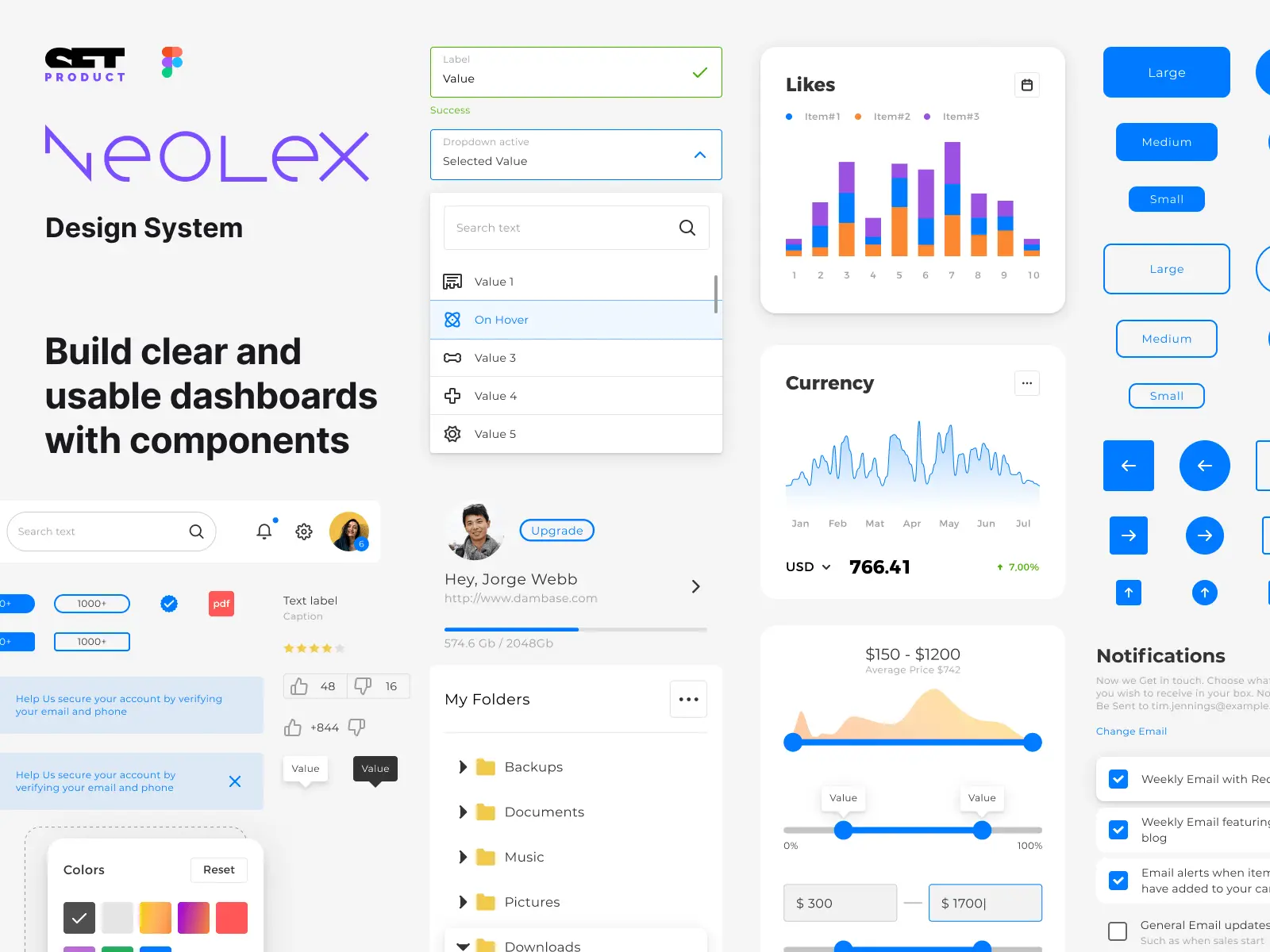
Form Fields
Definition: Forms are used to capture user input and manage configurations. They generally include input fields, checkboxes, dropdowns, and other relevant UI elements.
Function: Forms in the settings section provide a structured and interactive way for users to adjust their preferences or configure specific settings according to their needs.
Use case example: A form in the settings section could enable users to update their profile information, change their email notification preferences, or adjust privacy settings.
Design tips:
- Select appropriate input controls for different types of form fields (e.g., text fields, dropdown menus, checkboxes, radio buttons) to align with users' expectations.
- Provide helpful hints or tooltips to guide users on input requirements or the impact of certain settings.
- Validate user inputs in real-time and provide clear error messages if any required fields are missing or if there are input format conflicts.
{{spacer-24}}
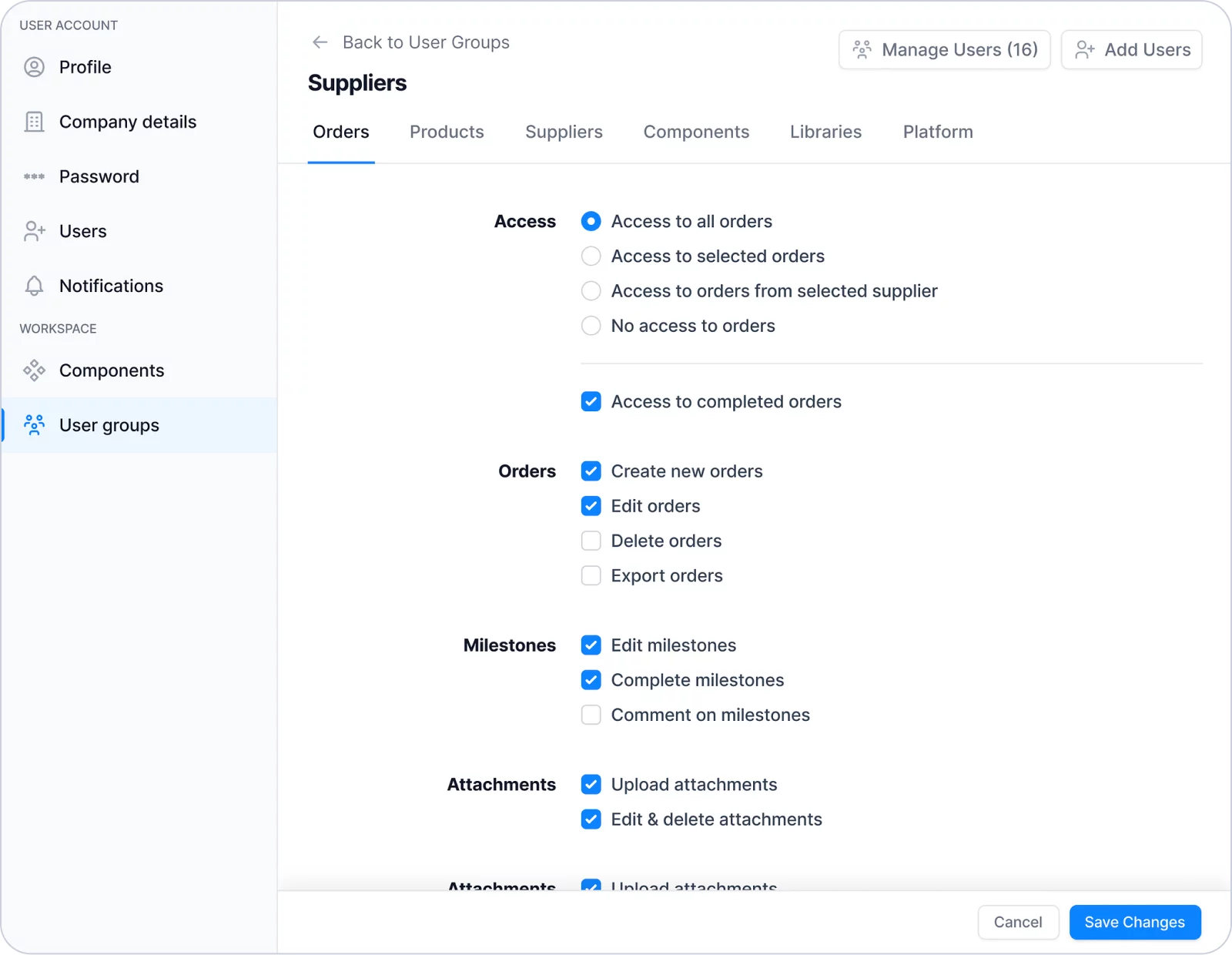
Checkboxes
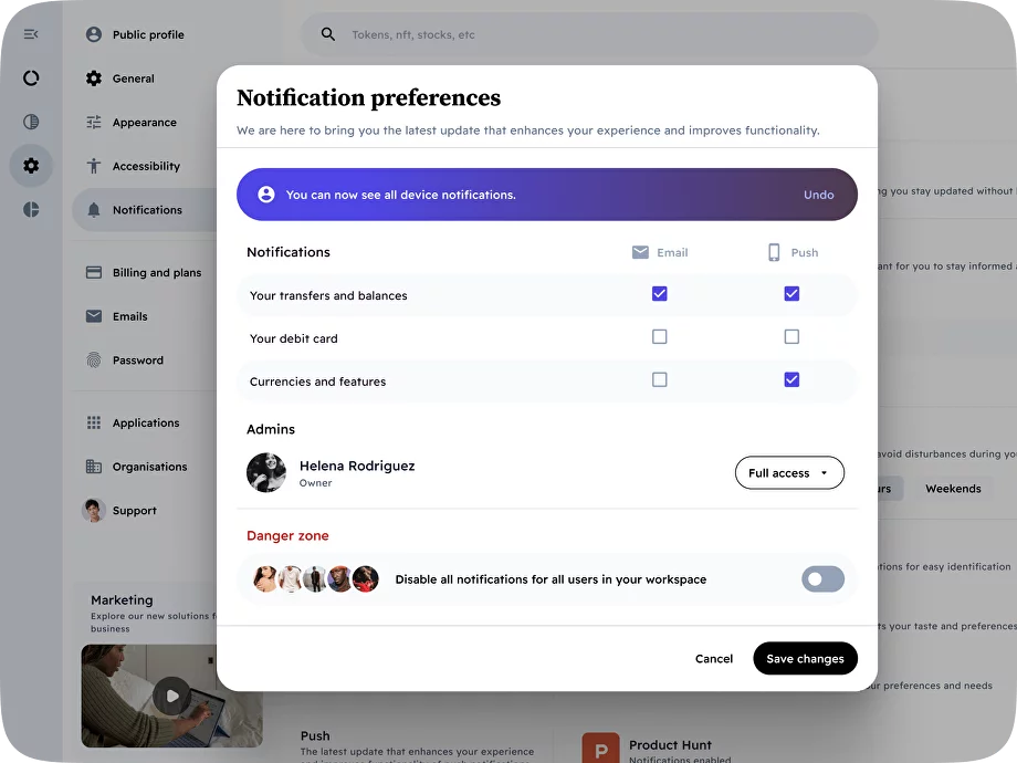
Definition: Checkboxes are used for enabling or disabling a single option. In the settings section, React checkboxes can be used for binary preferences or settings options that users can toggle ON or OFF.
Function: Checkboxes allow users to select or deselect specific preferences or settings, giving them control over whether certain features or options are enabled or disabled.
Use case example: Checkboxes in the app settings section could be used for preferences like enabling notification preferences, opting-in for newsletter subscriptions, or activating extra security measures.
Design tips:
- Present checkboxes as opt-in choices rather than opt-out choices. Checkboxes should default to an unchecked state, so users actively choose to enable a setting instead of disabling it.
- Provide additional information, such as tooltips or explanations, to help users understand the impact of enabling or disabling a particular setting.
- Group related checkboxes together and use proper spacing to enhance readability and scannability.
{{spacer-24}}
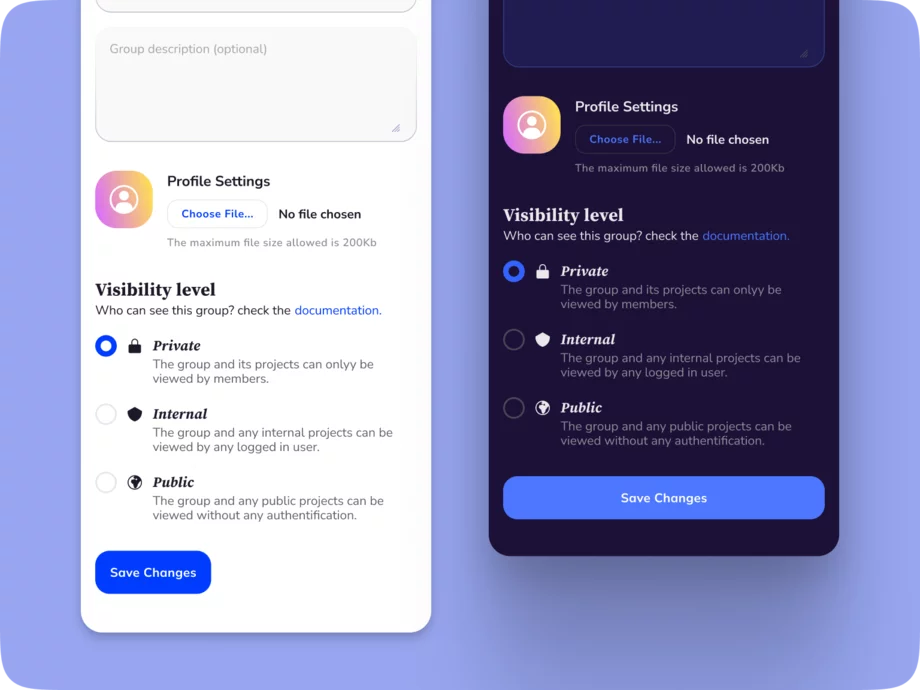
Radio Buttons
Definition: Radio buttons are used to present a group of mutually exclusive options, allowing users to select only one option from the available choices.
Function: In the settings section, radio buttons can be used when there is a need for the user to make a single selection from multiple options.
Use case sample: Radio buttons may be used for selecting the preferred language, choosing a default sorting order, or picking a timezone.
Design tips:
- Choose a default selection that aligns with the most common or recommended choice for users.
- Display the selected option prominently to provide clear feedback to the user.
- Ensure that the radio buttons are visually grouped together to bring attention to the set of choices and establish their exclusivity.
{{spacer-24}}
Buttons Group
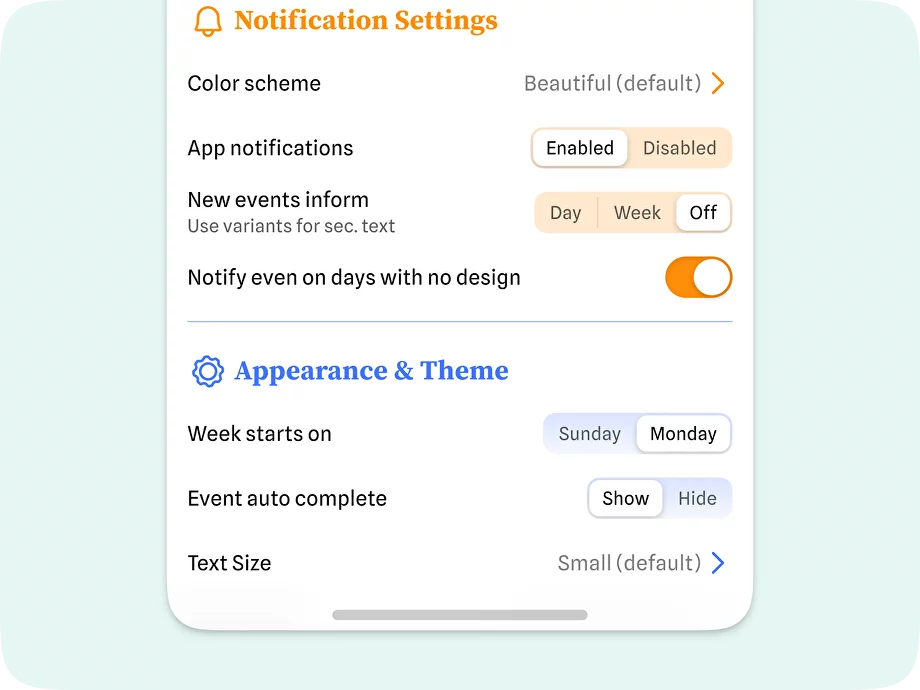
Definition: A buttons group is a UI element used in the settings section to present a collection of related buttons or options that allow users to make a selection or toggle between different settings or preferences.
Function: Buttons groups help users easily navigate and choose among various options or configurations available within a specific settings category. They provide a clear and organized presentation of choices.
Use case example: In the settings section, a buttons group can be used to display different themes or color scheme options, allowing users to switch between different visual styles.
Design tips:
- Group related buttons together visually, using consistent styling or grouping them within a container to create visual cohesion and make it clear that they are part of the same selection group.
- Use appropriate indicators or visual feedback to highlight the currently selected option or button within the group, helping users understand their current selection.
- Arrange the buttons within the group in a logical order that aligns with user expectations or follows a natural flow.
{{spacer-24}}
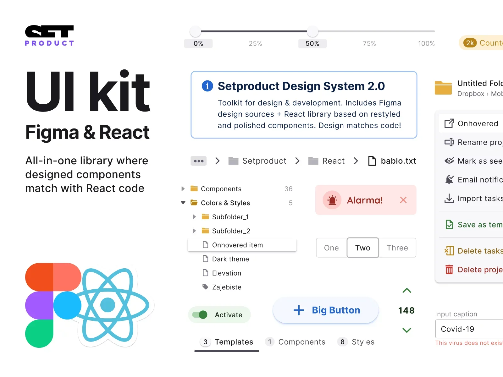
Dropdowns
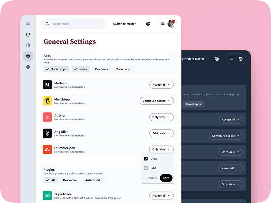
Definition: Dropdowns provide a list of options that users can choose from by clicking on a dropdown arrow. They are often used when there are multiple options but limited space available.
Function: Dropdowns offer users a compact and organized way to select from a list of options without overwhelming the interface with too many visible choices.
Use case example: Dropdowns in the settings section can be used for selecting the default currency, time zone, or notification sound.
Design tips:
- Set a default option within the dropdown that is most likely to be the commonly preferred choice. This reduces the effort required from users to select an option.
- Settings dropdowns should ideally have a limited number of options (5-7). If there are too many options, consider using another component.
- Ensure the dropdown is easily distinguishable from other UI elements and appears clickable to encourage user interaction.
{{spacer-24}}
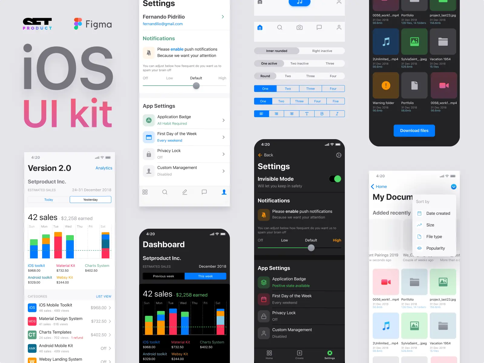
Toggle Switches
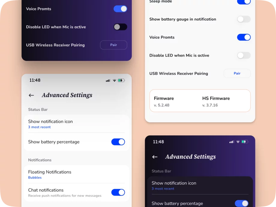
Definition: Toggle switches are used for on/off settings or binary choices. They visually represent the state of a setting and allow users to easily switch between the on and off states.
Function: Toggles are helpful in the settings section for options that require a quick and straightforward interaction.
Use case sample: Switches in the settings section can be used for options like enabling push notifications, activating autoplay, or enabling two-factor authentication.
Design tips:
- Use clear labels, such as "On" and "Off," or meaningful icons to convey the state of the toggle and the result of switching it.
- Provide visual feedback, such as color changes or animation, to indicate the state change when the user interacts with the toggle.
- Place the toggle in proximity to the settings it controls for better usability and comprehension.
{{spacer-24}}
Sliders
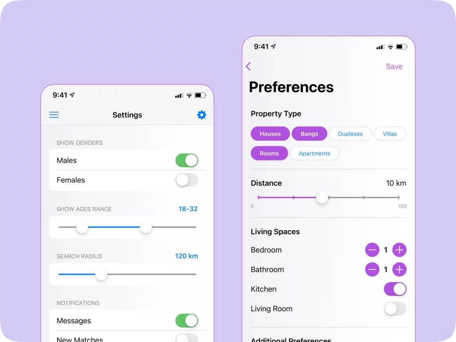
Definition: Sliders in the settings section are dynamic UI elements that allow users to adjust values within a specified range by moving a thumb or handle along a track.
Function: Sliders provide users with a intuitive way to fine-tune and manipulate numerical settings or preferences within a specified range.
Use case example: In the settings section, sliders can be used for adjusting volume levels, brightness levels, or font size options.
Design tips:
- Clearly indicate the current value or position of the slider, either by displaying a numeric value or by using visual cues like colors or icons.
- Provide appropriate indicators at the minimum and maximum points to give users a clear understanding of the range and the impact of their adjustment.
- Consider implementing additional feedback, such as real-time preview or dynamic update of the setting as the slider is adjusted, to provide immediate response.
{{spacer-24}}
Save Button
Definition: The save button is a UI element used in the settings section to allow users to confirm and save changes they have made to their settings or preferences.
Function: It provides users with an explicit way to apply the modifications they have made to their settings, ensuring that their changes are committed and taking effect.
Use case sample: In the settings section, after a user has made adjustments to their preferences or settings, the save button can be used to confirm and save those changes. For instance, when updating notification preferences or personal profile information.
Design tips:
- Clearly label the save button with an action-oriented label like "Save" or "Apply" to guide users on its purpose.
- Visually distinguish the save button to make it stand out and easily clickable, using appropriate colors or styling.
- Provide visual feedback, such as a success message or visual indicator, after the user clicks the save button, confirming that their changes have been successfully saved.
{{spacer-64}}
Settings Layout Types
Single Page Layout

This layout has all the settings options listed on a single page. Users can scroll through and find the settings they need easily. It is suitable for applications with limited settings and for smaller screen sizes on mobile devices.
For example, Facebook uses a single page layout for its settings, allowing users to access various settings options such as privacy, notification, security, and account settings without the need to navigate across different pages, making it convenient and easy to manage their preferences.
{{spacer-24}}
Tabbed Layout

In such a layout, settings options are organized into different tabs or sections. Each tab represents a particular category of settings, such as Account, Privacy, Notifications, etc. Users can switch between tabs to access the desired configuration trigger. It is ideal for applications with a moderate number of settings categories.
For example, Google Calendar utilizes a tabbed layout for its settings, which are categorized into tabs like General, Event Settings, Calendars, and Notifications. Users can easily navigate between tabs to configure specific settings related to their calendar usage.
{{spacer-24}}
Accordion Layout

This layout uses dropdown accordions to display settings options. Each accordion represents a category or section of settings, and users can expand or collapse each accordion to view or hide the options within. It is useful for applications with numerous settings categories, as it allows for a compact display of information.
For example, Gmail adopts an accordion layout for its settings, where users can expand and collapse different categories such as General, Labels, Inbox, and Chat. This allows users to focus on specific settings sections while keeping the interface visually clean and organized.
{{spacer-24}}
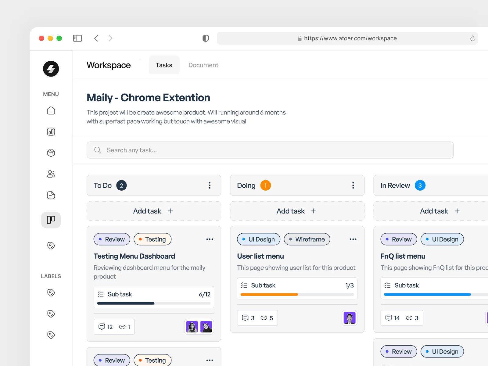
Card Layout

In this layout, settings options are presented as cards, with each card representing a particular category or section of settings. Users can navigate through the cards and access the desired settings. It is visually appealing and well-suited for mobile applications, as it allows for easy swiping and navigation.
For example, Trello employs a card layout for its settings, represented by individual cards that users can click on to access various settings options. The cards categorize settings related to account preferences, board display, notifications, and integrations, providing a visually appealing and interactive experience
{{spacer-24}}
Side Navigation Layout

This layout features a side navigation menu with a list of settings categories. When users select a category, the corresponding settings options are displayed in the main content area. It is ideal for applications with a large number of settings and provides a clear navigation structure for users.
For example, WordPress utilizes a side navigation layout for its extensive settings section. The various settings categories such as General, Writing, Reading, Media, and Plugins are listed in a side navigation menu, making it easy for users to navigate and configure their website's settings.
{{spacer-24}}
Step-by-Step Layout

This layout guides users through a series of steps or screens to set up their preferences and configure settings. Each step focuses on a specific category or section of settings, ensuring a structured and user-friendly experience. It is suitable for complex applications with extensive settings options.
For example, Dropbox employs a wizard/step-by-step layout for their initial setup process. When users create a new account, they go through a sequential series of steps to configure settings such as account details, file organization, sharing, and security, ensuring a guided and focused onboarding experience.
{{spacer-64}}
Settings Usability Tips
Contextual Search and Filtering

Incorporate search and filtering functionalities within the settings section to help users quickly locate specific settings or options based on keywords or predefined filters.
Purpose: Enhance efficiency and findability by allowing users to bypass extensive navigation or visual scanning and reach desired settings directly.
Goals:
- Enable users to navigate through a large number of settings more easily.
- Reduce user frustration and time spent searching for specific options.
- Provide a versatile way for users to discover and adjust settings based on their individual needs.
Recommendations:
- Implement a prominent search bar or filter options at the top of the settings page.
- Include auto-suggestions or predictive search functionalities to assist users in finding relevant settings.
- Ensure search results or filtered views clearly indicate how they match user queries.
{{spacer-24}}
Confirmation Dialogs and Error Prevention

Use error prevention mechanisms and confirmation dialogs to help users avoid accidental changes or irreversible actions within the settings.
Purpose: Enhance user control and confidence by providing safeguards against unintended outcomes or data loss, improving the overall usability and reliability of the settings interface.
Goals:
- Minimize user frustration caused by inadvertent actions or settings changes.
- Enable users to verify critical changes before they take effect.
- Maintain the integrity of user data and settings by preventing accidental losses.
Recommendations:
- Use confirmation dialogs for potentially risky or irreversible actions, such as deleting data or resetting settings.
- Provide clear and concise error messages when user inputs or selections are incorrect or incompatible.
- Offer an undo or revert option for settings changes whenever feasible.
{{spacer-24}}
Guided Setup and Orientation

Implement a guided setup process that assists users in navigating and familiarizing themselves with the app's key features and functionalities.
Purpose: Reduce user confusion and uncertainty during the initial stages of app usage, fostering a positive first impression and a smoother onboarding experience.
Goals:
- Help users understand how to effectively use the app and accomplish their goals.
- Minimize the learning curve required to become proficient in using the app.
- Establish trust and confidence in the app's usability and value.
Recommendations:
- Offer step-by-step instructions or tooltips to guide users through the setup process.
- Provide clear explanations and visuals to demonstrate key features and actions.
- Allow users to skip or pause the guided setup if desired.
{{spacer-24}}
Progressive Disclosure of Features

Introduce features and functionalities gradually over time, starting with the most essential or commonly used features and gradually unveiling more advanced or specialized options.
Purpose: Prevent overwhelming users with a complex interface and unfamiliar features, allowing them to gradually explore and adopt new capabilities at their own pace.
Goals:
- Minimize cognitive load during the initial stages of app usage.
- Promote iterative learning and adoption of new features over time.
- Encourage ongoing engagement and exploration within the app.
Recommendations:
- Present a simplified interface during the initial onboarding, gradually introducing additional features.
- Use contextual prompts or notifications to highlight new features or options as users become more comfortable with the app.
- Provide tips or suggestions based on users' interaction history or preferences.
{{spacer-24}}
Personalization Options

Offer users the ability to customize or personalize various settings to better align with their preferences and needs.
Purpose: Enhance the user experience by providing a sense of control and ownership over the app's settings, leading to increased satisfaction and engagement.
Goals:
- Allow users to tailor the app's behavior to their specific requirements.
- Empower users to make meaningful changes that reflect their individual preferences.
- Encourage users to explore and engage with the settings section.
Recommendations:
- Present customization options in a visually appealing and easily accessible manner.
- Include defaults that work for most users but allow for customization if desired.
- Provide explanations/examples of how customization affects the app's behavior.
{{spacer-24}}
Custom Theme Options

Integrate visual theme customization options that enable users to modify the app's appearance, such as choosing a different color scheme, font styles, or background images.
Purpose: Enhance user engagement and satisfaction by offering visual variety and allowing users to create an app interface that aligns with their style and preferences.
Goals:
- Provide users with the ability to create a visually pleasing and personalized app experience.
- Allow users to express their individuality and make the app feel like their own.
- Cater to diverse user preferences and aesthetics.
Recommendations:
- Offer pre-set themes as a starting point for customization.
- Provide a color picker or a selection of color palettes for users to choose from.
- Allow users to upload and set their own background images or graphics.
{{spacer-24}}
Intuitive/Breadcrumbs Navigation

Implement a clear and intuitive navigation system within the settings section that allows users to easily move between different levels, and use breadcrumbs to provide context and orientation.
Purpose: Improve the efficiency and ease of navigation, ensuring users can seamlessly explore and adjust settings without feeling lost or disoriented.
Goals:
- Enable users to navigate between different settings levels quickly and effortlessly.
- Allow users to understand their current location within the settings hierarchy.
- Reduce the cognitive load required for users to find and reach specific settings.
Recommendations:
- Use a persistent sidebar or tabs to display the main settings categories for easy access across different levels.
- Implement breadcrumbs to indicate the user's current location and provide clickable links for easy navigation.
- Highlight the active section or category to give users a clear visual indication of their current position.
{{spacer-24}}
Support Keyboard Shortcuts

Enabling keyboard shortcuts for important actions or frequently accessed settings allows users to navigate and configure the interface more efficiently using keyboard input.
Purpose: Enhances usability for users who prefer keyboard navigation and promotes faster interaction.
Goals:
- Enable faster navigation and interaction for keyboard-oriented users.
- Increase productivity and efficiency in accessing settings.
- Cater to power users who prefer keyboard-based interactions.
Recommendations:
- Provide a visible and easily accessible keyboard shortcuts reference or tooltip.
- Choose intuitive shortcut combinations that are easy to remember and consistent across the application.
- Ensure that keyboard-based interactions do not conflict with standard accessibility guidelines.
{{spacer-64}}
Settings Use Cases
Collaboration Tools
The settings in collaboration tools serve the purpose of customizing collaboration preferences and managing team settings to improve team productivity and communication.
Settings examples:
- Notification preferences: Users can configure which types of notifications they receive to prioritize important updates and reduce distractions.
- User roles and permissions: Offering granular control over user access and privileges to ensure the right level of collaboration and control.
- Integrations: Allowing users to connect and integrate with popular communication tools to streamline workflows and facilitate collaboration.
- Chat settings: Providing options for chat notifications, message history, and customization to enhance real-time communication.
- File sharing settings: Configuring file permissions, storage options, and version control to improve collaboration on shared documents.
{{spacer-24}}
Health & Wellness
The purpose of settings in health and wellness apps is to personalize health and wellness preferences, helping users achieve their fitness and lifestyle goals.
Possible Settings:
- Goal tracking: Allowing users to set specific targets and track their progress, providing motivation and helping them stay on track.
- Activity tracking settings: Customizing the way data is collected and displayed, such as choosing preferred metrics or syncing with different devices.
- Reminders: Setting reminders for activities, workouts, or medication adherence to help users stay consistent.
- Privacy settings: Giving users control over the visibility of their health and wellness data and the option to share achievements with others.
- Social sharing settings: Enabling users to choose what health and wellness information they want to share with their social networks.
{{spacer-24}}
Productivity Tools
Settings in productivity tools are designed to streamline workflows and improve productivity.
Possible Settings:
- Keyboard shortcuts: Allowing users to assign custom shortcuts to speed up repetitive tasks and reduce reliance on manual interactions.
- Display preferences: Providing options to personalize the app's interface, such as themes, font sizes, or color schemes, for optimal user comfort.
- Workspace organization: Offering customization options to arrange elements, layout, or modules according to user preferences and workflows.
- Integrations: Enabling seamless integration with popular productivity tools to enhance data exchange and streamline workflows.
- Backup/Restore settings: Providing the ability to back up app data or restore previous settings to safeguard user information and configurations.
{{spacer-24}}
Project Management
The purpose of project management settings is to customize project-specific settings and team collaboration preferences for efficient project planning and execution.
Possible Settings:
- Task assignment rules: Allowing project managers to define automatic task assignments based on specific criteria or workflows to distribute work evenly.
- Project templates: Providing preconfigured project templates for efficient project setup and consistent workflow management.
- Milestone tracking: Configuring milestone settings to track progress and keep teams aligned with project objectives and deadlines.
- Access control: Offering granular control over project visibility and editing rights to ensure security and proper collaboration.
- Notifications: Setting up notifications for project updates, milestones, or critical events to keep team members informed and engaged in the project.
{{spacer-24}}
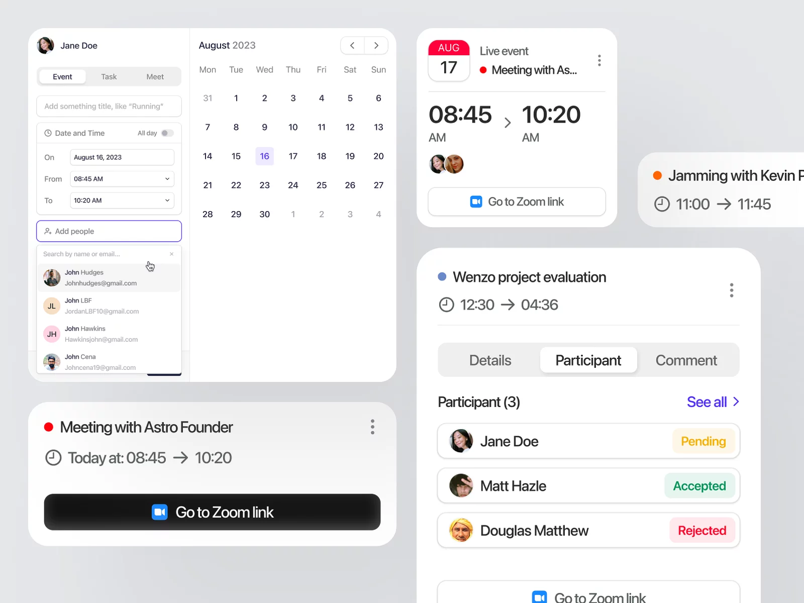
Scheduling Tools
The settings in scheduling tools serve the purpose of customizing scheduling preferences to optimize time management and improve efficiency.
Possible Settings:
- Time zone settings: Allowing users to set their preferred time zone for accurate scheduling and coordination across different locations.
- Availability settings: Configuring availability preferences, such as specifying working hours or non-working days, to optimize scheduling.
- Calendar integration: Enabling integration with popular calendar apps to synchronize events and improve schedule management.
- Reminder settings: Customizing reminders for upcoming events or appointments to ensure users stay on top of their schedule.
- Recurring events: Providing options for creating recurring events or appointments to save time on repetitive scheduling.
{{spacer-24}}
Finance
Finance settings are designed to personalize financial preferences and enhance control and security regarding financial data.
Possible Settings:
- Budgeting preferences: Allowing users to set budget goals, categories, and spending limits to track and manage personal finances effectively.
- Account settings: Configuring preferences for banking or payment accounts, such as adding or removing linked accounts or setting transaction notifications.
- Security settings: Customizing security measures, such as two-factor authentication or password reset options.
- Transaction categorization: Enabling users to categorize transactions automatically or manually to gain insights into spending habits and financial patterns.
- Currency settings: Providing options for setting default currency or managing multiple currency accounts for accurate financial tracking.
{{spacer-24}}
Social Networking
The purpose of settings in social networking platforms is to customize privacy preferences and profile settings to maintain control over online interactions and identity representation.
Possible Settings:
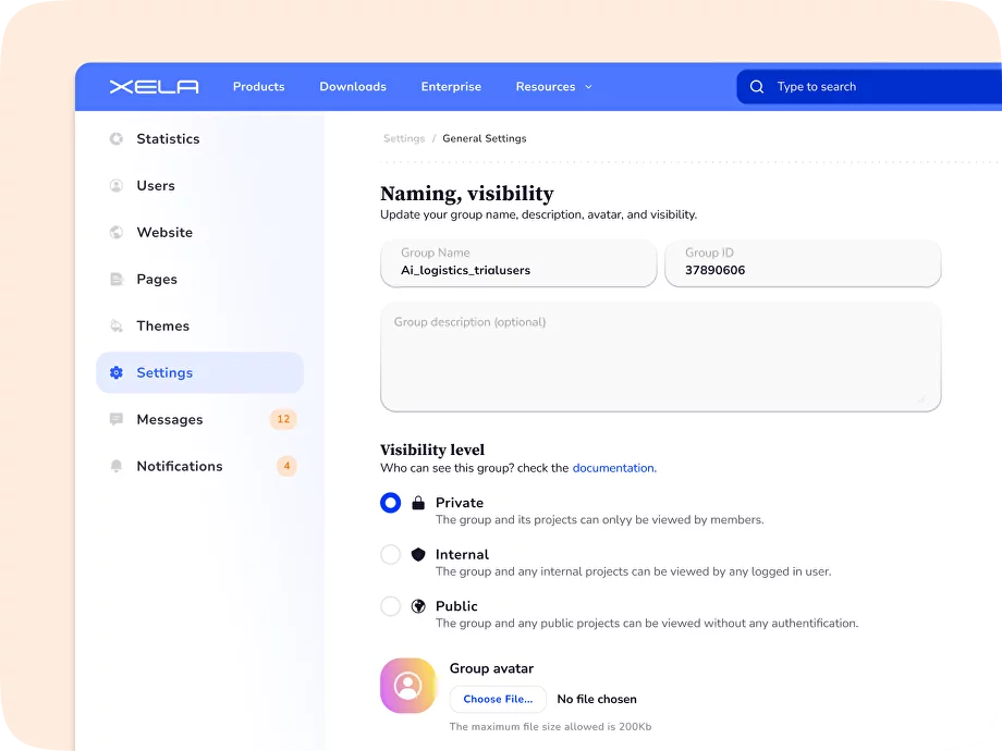
- Privacy settings: Configuring who can view posts, friend requests, or personal information to control the visibility and access of user content.
- Profile customization: Allowing users to personalize their profile by managing profile pictures, cover photos, or bio sections.
- Friend request settings: Defining preferences for friend requests, such as accepting, declining, or requiring approval for incoming requests.
- Content visibility settings: Providing options to hide specific posts or limit content visibility to specific groups or individuals.
- Block settings: Allowing users to block or report other users to manage unwanted interactions or spam.
{{spacer-64}}
{{stars-conclusion}}
{{spacer-64}}
Are my Settings good?
To determine if your Settings page is well-designed, you can follow these steps:
- User Testing: Conduct user testing with diverse participants to observe their interaction with the Settings page and gather feedback on usability and clarity.
- User Surveys or Feedback: Collect user feedback through surveys to examine their experience with Settings and gather insights for improvement.
- Analytics and Metrics: Analyze user behavior data using tools like heatmaps, click maps, or session recordings to understand how users engage with Settings.
- Comparative Analysis: Compare Settings with similar products or industry leaders to identify areas for improvement and potential design enhancements.
- Iterative Designing: Use an iterative design process, continuously A/B testing and refining the Settings page based on user feedback to enhance the app UX.
.webp)

.webp)
.webp)
.webp)
.webp)
.webp)
.webp)
.webp)

.webp)
.webp)
.webp)
.webp)


%20(1).webp)
%20(1).webp)
.webp)
.webp)


