


Roman Kamushken
Heya! Roman's here.
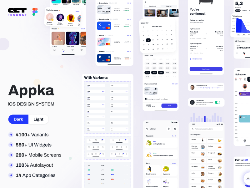
<span class="blog_big-paragraph">I am a UI designer, maker, and seller. It's been already 3+ years passed since I started to make templates for Figma and founded Setproduct to help startups and individuals save on design and release their apps faster.</span>
Working for 20+ years in graphic design, last years I've been browsing thousands of apps, screens, components, and layouts almost DAILY to gather the most complete ebook of how to design components, templates, and entire apps.
Fortunately, I've started with the 1st chapter related to the State of Avatar. Glad I was listed on some popular design resources and got a bunch of retweets and mentions. Which makes me decide to continue my explorations, so meet the research aimed to explain on how to design Accordions.
{{spacer-64}}
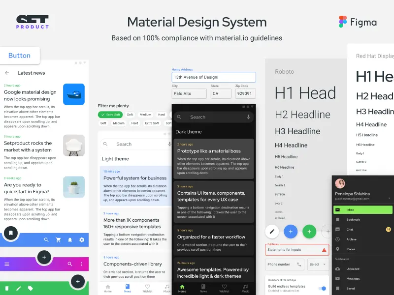
What is Accordion?
Accordion (aka Expansion panel) — vertically stacked list of options that can expand/collapse to reveal or hide more associated content.

{{spacer-64}}
{{setproduct-gpt}}
{{spacer-64}}
Anatomy
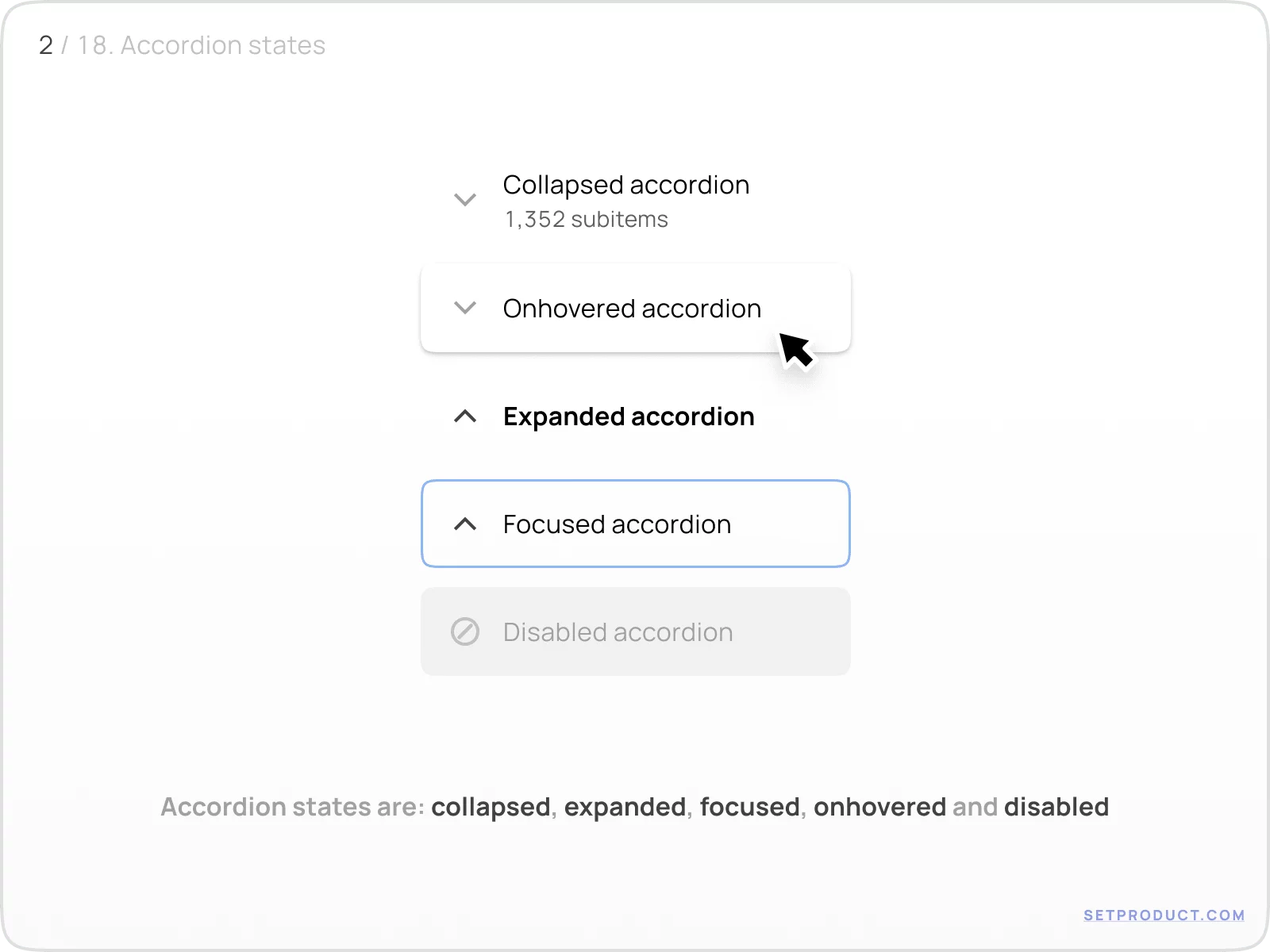
States
Default states for Accordion are:
- collapsed
- expanded
- onhovered
- focused
- disabled
{{spacer-24}}
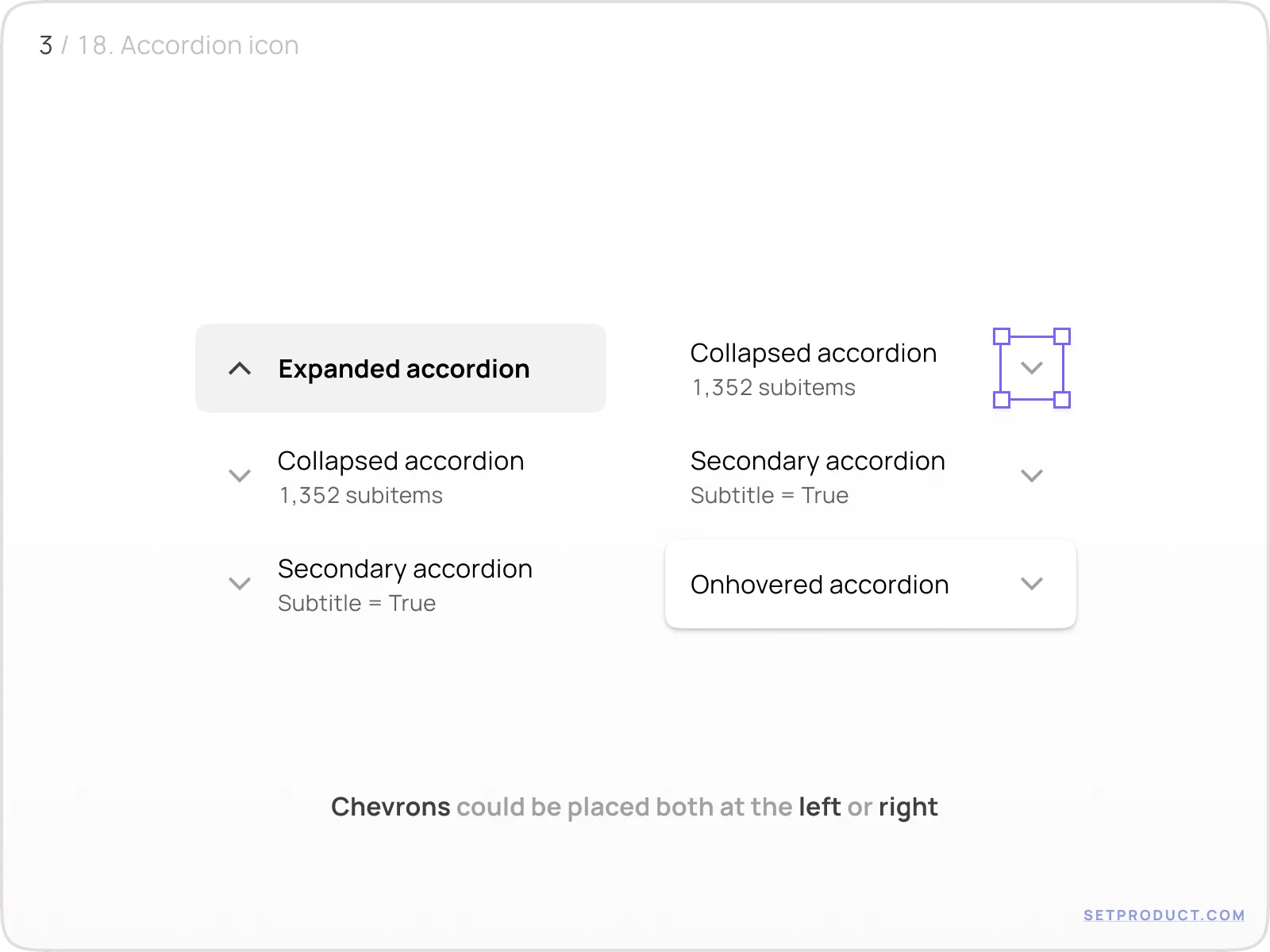
Chevrons placement
Chevron icon represents the opportunity to expand/collapse Accordion item. Once Accordion was clicked, the chevron rotates to indicate the successful expansion. Further collapse returns the chevron to a previous position.
{{spacer-16}}
Instead of a chevron, you may use the following symbols:
- Up / down caret
- Plus / Minus
- Up / down arrow

{{spacer-24}}
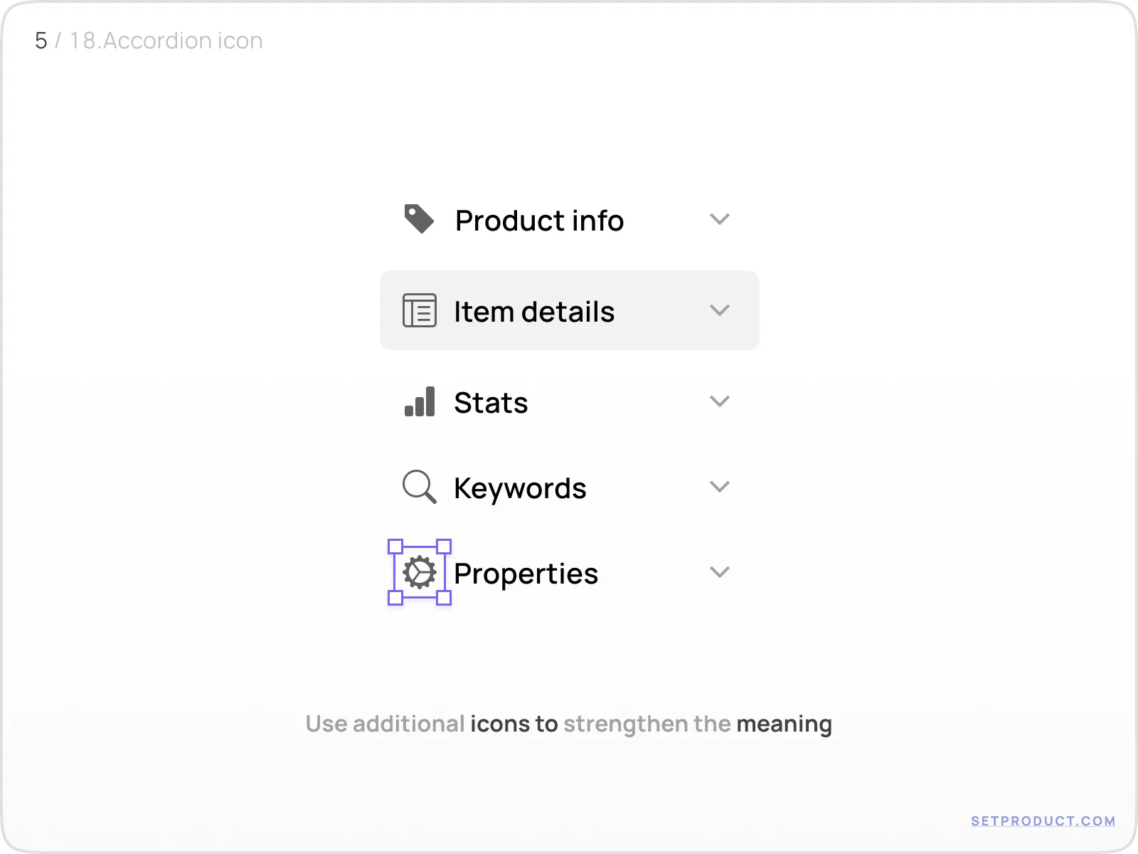
Additional icon
In the case of right-sided Accordion, you may place additional icons to strengthen the meaning. Use wisely not to overload the component.
{{spacer-16}}
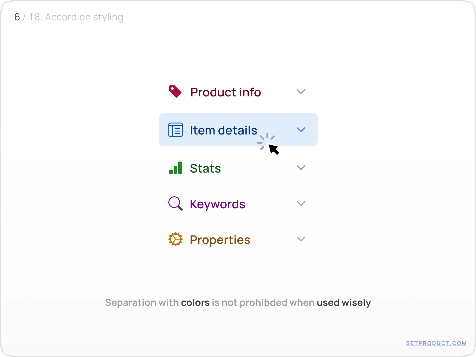
In some cases, you may apply colors to visually separate the items:
{{spacer-64}}
Styles & Themes
Expanded item
Highlight expanded state to let a user recognize what is opened in case of multiple Accordions. There are several possible styles for the highlighting:
- Elevation shadow
- Background fill
- Outline stroke
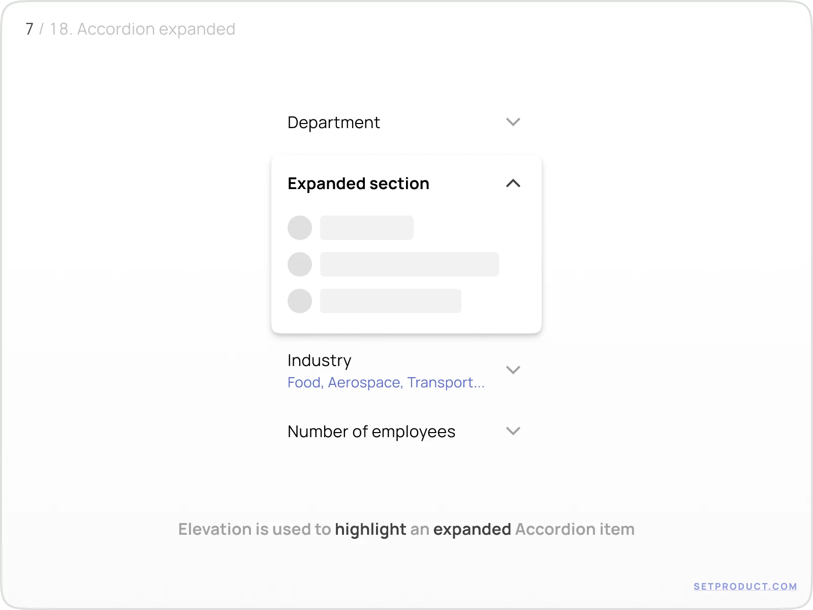
{{spacer-16}}
While the elevation works well on both smooth grey and white surfaces, you may fill the Accordion expanded item's background with 8–12% opacity fill. Fits good for white surfaces. Add outline stroke, if necessary.

{{spacer-24}}
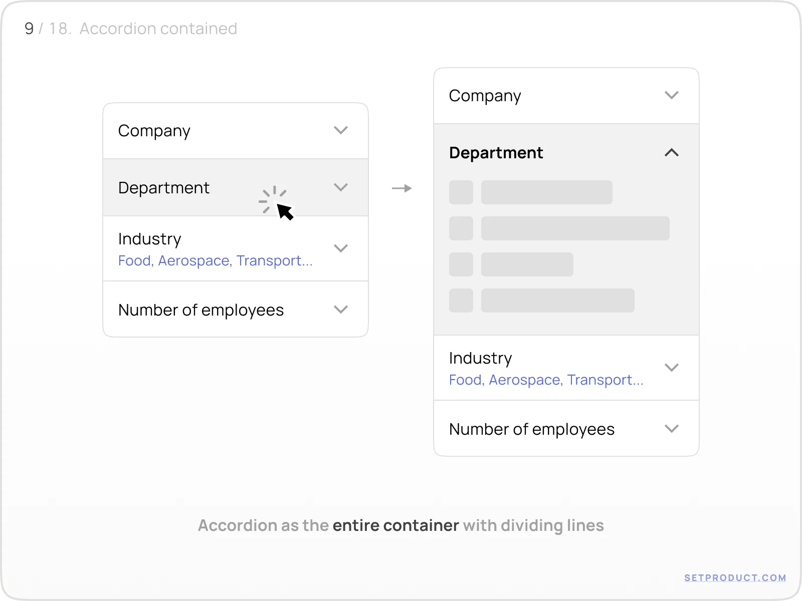
Contained Accordion
Use contained Accordion for most of the cases. Separate its items by a slightly visible divider. This placement either saves some vertical space.
{{spacer-24}}
Separated Accordion
There are some cases when you can separate Accordions with whitespace. Use this method to divide when it's needless to save vertical space.

{{spacer-64}}
Accordion UX & Usability
Subtitle to pre-know
Enable a subtitle to inform your users about what to expect when Accordion expands. This either helps to display the user's pick when everything is collapsed.

{{spacer-24}}
Badge to pre-know
Either use a badge to indicate the selection hastily, while Accordion is collapsed.

{{spacer-24}}
Helper text
Enable a helper text for Accordion to ergonomically show up a user's pick when collapsed, especially for mobile viewports.

{{spacer-64}}
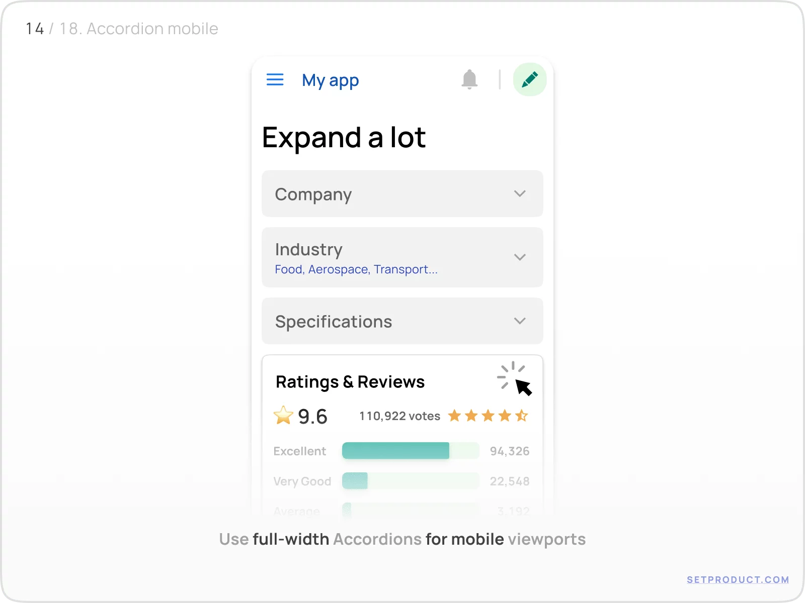
Mobile patterns
Full-width usage
On mobile devices use only full-width Accordions.
{{spacer-24}}
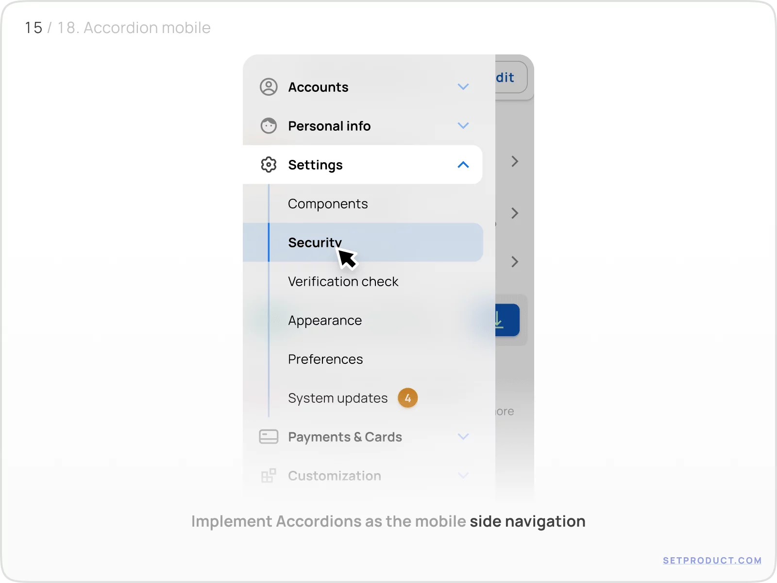
Side menu
Implement Accordions into the navigation drawer to reveal submenu items.
{{spacer-24}}
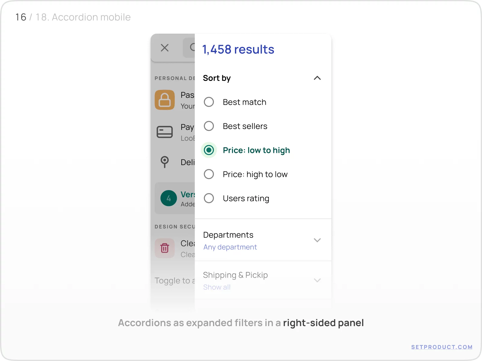
Filters
Use side panels with Accordions to utilize multiple filters, properties, etc.
{{spacer-64}}
Desktop patterns
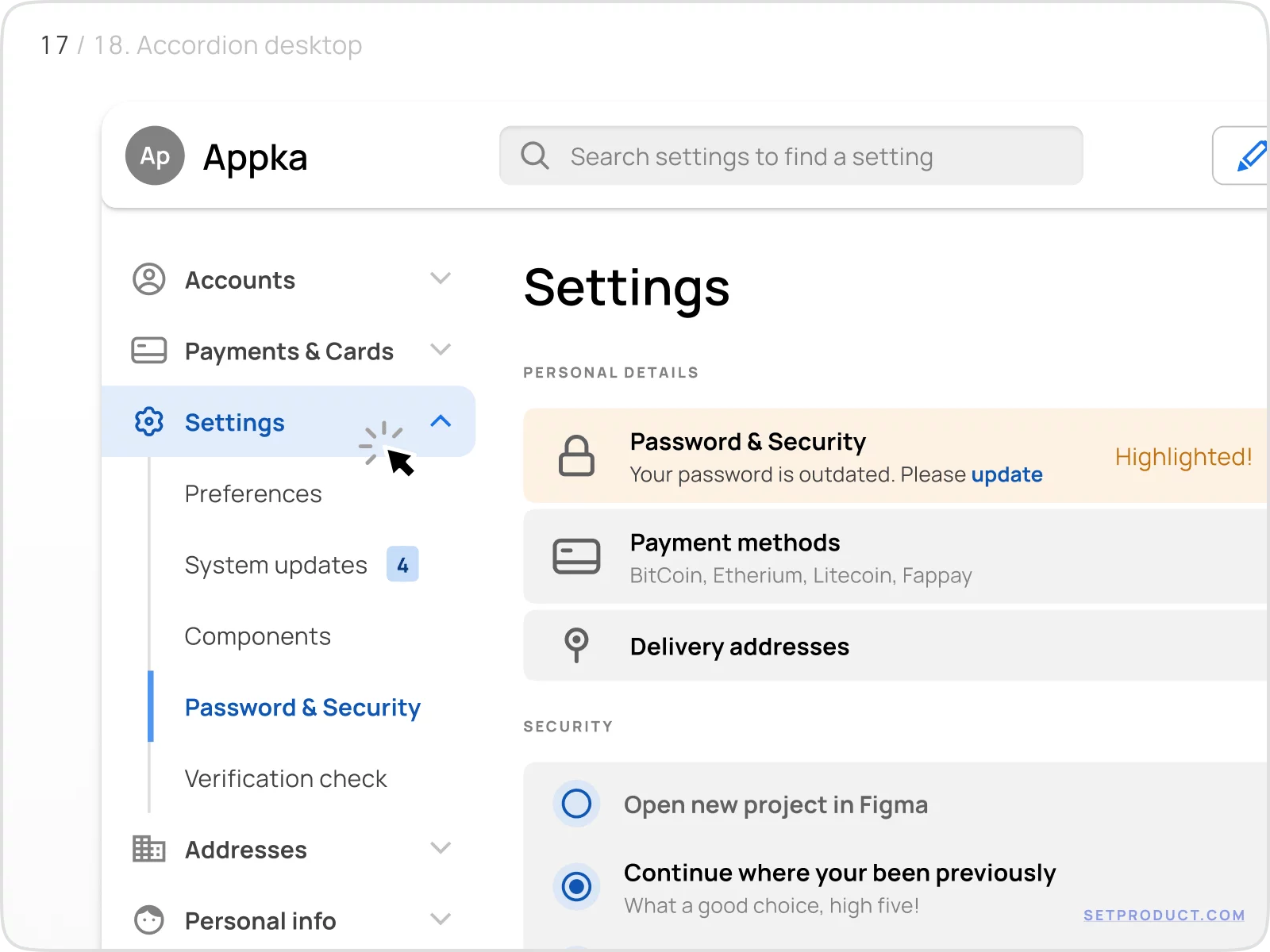
Side menu
Analogous as mobiles, you may implement Accordion-driven side navigation for desktop apps, dashboards, etc.
{{spacer-24}}
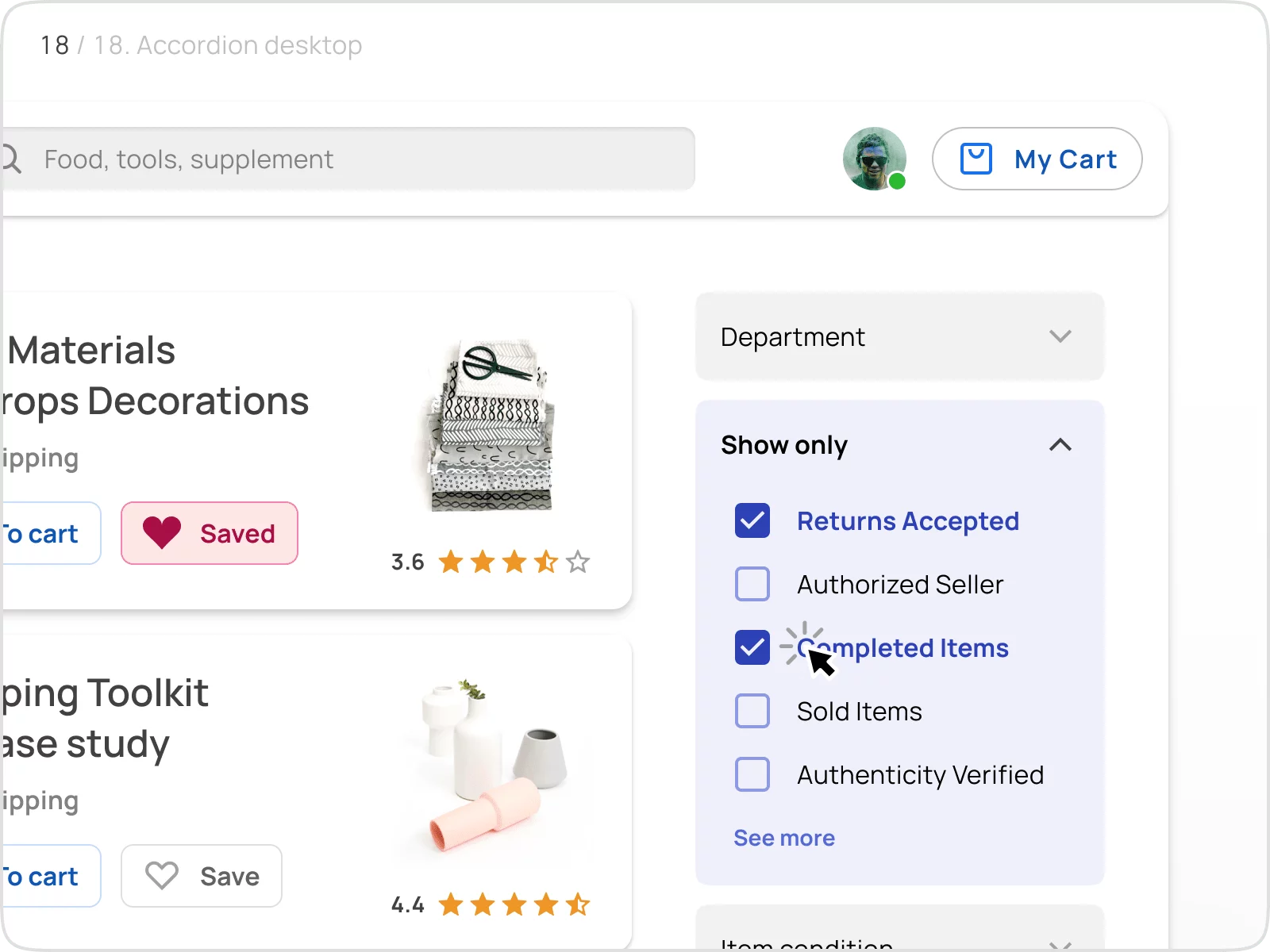
Filters
Depending on the desktop layout structure, Accordions (e.g. as Filters) could be placed as both left or right-sided.
{{spacer-24}}
{{stars-conclusion}}
{{spacer-24}}
This is all you need to know to design better Accordions.
Hope this exploration will help you to improve your in-app UX. The next chapter is for the App Bars, probably. Stay tuned!
{{spacer-64}}
Related links
- Accordion component (React)
- Accordions as Expansion panels (Angular)
- Material-X accordions (Figma)
.webp)

%20(1).webp)
.webp)
.webp)
.webp)
.webp)

.webp)
.webp)

.webp)
.webp)
.webp)

.webp)


%20(1).webp)

%20(1).webp)
.webp)
.webp)


