


Roman Kamushken
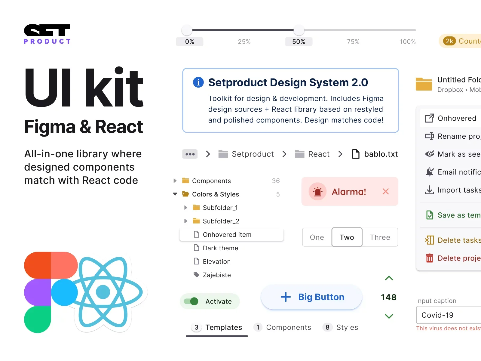
<span class="blog_big-paragraph"> Whether you are a UI/UX designer, a front-end developer, or simply interested in creating friendly interfaces, this Text fields UI design tutorial is packed with valuable insights and practical tips that will help you design efficient Input components. </span>
Input (also known as Text Field) – is an interactive element that enable users to enter various types of data. From simple text entries to complex data such as dates, numbers, or selections, Input components serve as a medium for users to interact with digital systems.
In this detailed documentation, I will explore the intricate anatomy of Input components, discuss various Input types, get into essential Input states, guide you through styling and custom theming options, shed light on practical use cases, and provide valuable usability tips.
So, without further ado, let's dive into the intricacies of designing an Input.
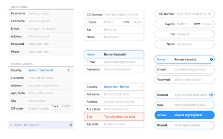
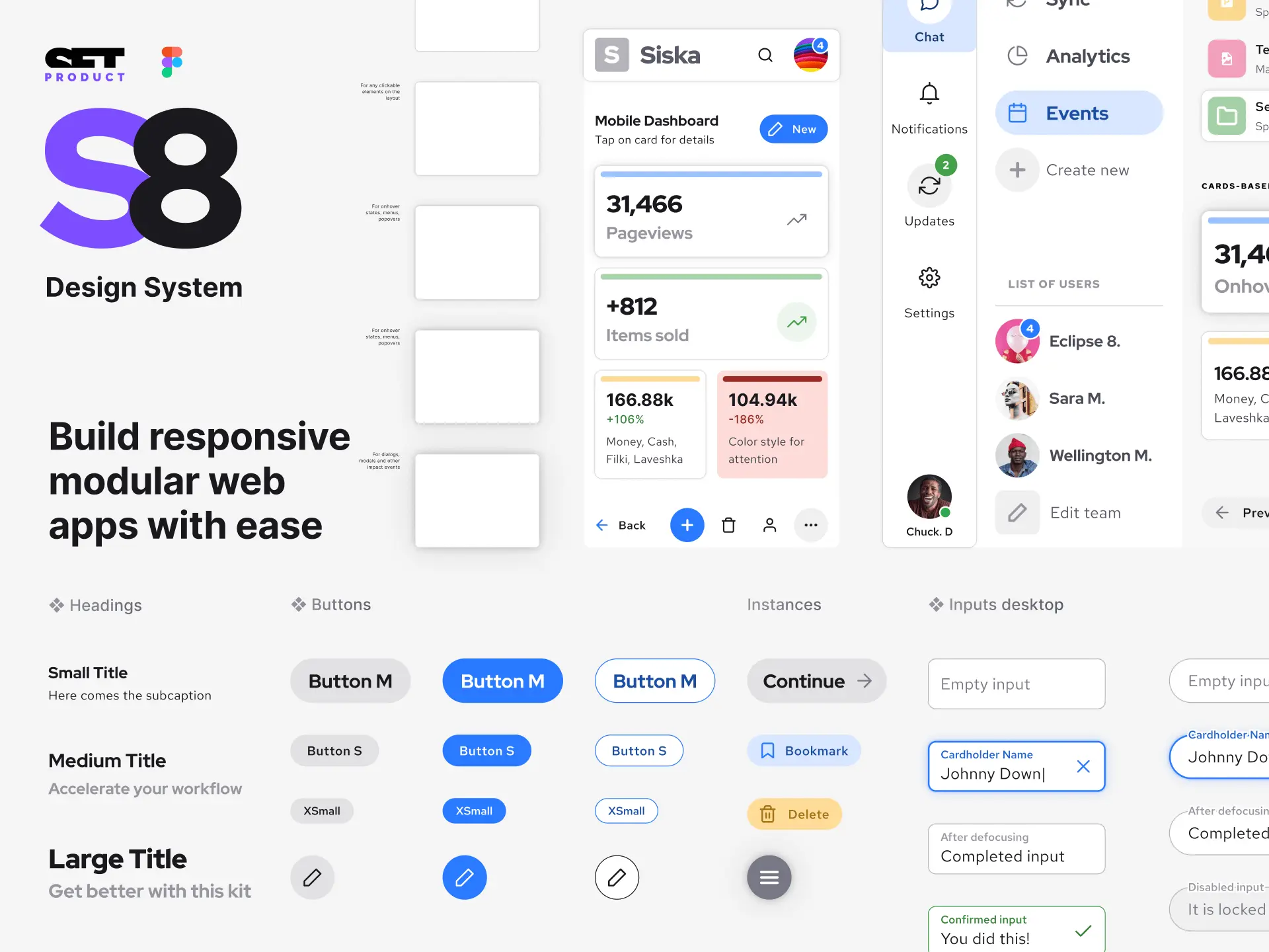
Input Anatomy

Label
Definition: A textual or visual description displayed near the input field, providing clear instructions or hints about the purpose or expected input.
Purpose: Labels provide context and help users understand what information is required.
✍ Design tips:
- Use a font size and color that distinguish the label from the input field.
- Place labels close to their respective input fields for easy identification and clarity.
- Use visual cues such as color or typography to distinguish required and optional fields.

Placeholder
Definition: An optional text displayed inside the input box as a temporary label or hint.
Purpose: Placeholders provide an example or an explanation of the expected data format, assisting users in understanding what kind of input is expected.
✍ Design tips:
- Use placeholders to provide additional context or examples.
- Ensure placeholder text is distinguishable from user-entered input.
- Consider using dynamic placeholders that transform into labels or hint text upon focus.

Icon
Definition: A visual representation, often an image or meaningful symbol, placed within the left or right part of input field.
Purpose: Leading or trailing icons can provide additional context, represent different input types, or offer supplemental actions related to the input field.
✍ Design tips:
- Use clear and recognizable icons that effectively convey their intended meaning.
- Consider using tooltips or microinteractions to provide additional information or functionality related to the icon.
- Utilize color or size variations to indicate different states or interactions.

Input Box
Definition: The interactive area where users can input data, generally in the form of text, numbers, or dates.
Purpose: It is the primary space where users interact and enter their desired input.
✍ Design tips:
- Provide ample width and height for comfortable input entry.
- Use appropriate validation states (e.g., borders, colors, tooltips) to indicate input errors or success.
- Consider adding a subtle animation or transition when the input is focused.

Reset Control
Definition: A small button or icon placed commonly within the right side of input field, typically represented by an "X" or similar symbol.
Purpose: The clear button allows users to quickly remove or delete the content they have entered in the input field, making it easier to start over or make corrections.
✍ Design tips:
- Include a clear button to improve overall UX and allow users to erase or reset the input.
- Consider using a visual cue, such as color change or hover effect, to indicate interactivity.
- Provide clear feedback or confirmation after the clear button is pressed.

Help/Hint Text
Definition: Supplementary information or guidance displayed near the input field to aid users in inputting data correctly.
Purpose: Help or hint text can offer suggestions, tips, or explanations related to the input, assisting users in completing the input accurately.
✍ Design tips:
- Keep help or hint text short and to the point.
- Use a distinguishable color or typography for hint text to differentiate it from labels.
- Consider displaying the help or hint text on hover or via tooltips to avoid cluttering the interface.

Character Counter
Definition: A numerical indicator that dynamically displays the number of characters or words entered in real-time.
Purpose: Character counters are particularly useful when there are specific length constraints for the input to ensure users stay within the allowed limits.
✍ Design tips:
- Ensure the character counter updates dynamically as the user types or deletes characters.
- Use color or animation to indicate when the input is approaching or exceeding the character limit.
- Consider accompanying the character counter with a clear explanation of the character limit, if necessary.
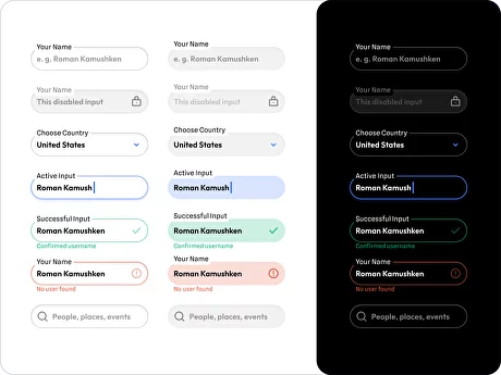
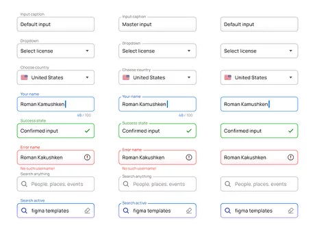
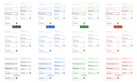
Input States
Default State

The default state refers to the initial appearance and behavior of an Input component when it is first loaded or when no user interaction has occurred. It represents the baseline state of the Text field before any specific action is taken by the user.
Recommendations:
- Ensure clear contrast between the Input field and surrounding elements, allowing users to easily identify it.
- Employ subtle visual cues, such as a soft shadow or a subtle border, to create a sense of depth and engagement.
- Consider using placeholder text to provide an example or description of the expected input format.
Hovered State

The hover state performs visual changes that occur when a user hovers their cursor over the Input component. This state provides immediate visual feedback and enhance the user's understanding of the element's clickable nature.
Recommendations:
- Enhance the hover state by subtly changing the background color, border color, or adding an overlay effect to the Input field.
- Consider animating the transition to the hover state, smoothly and gradually highlighting the field to draw attention.
- Provide tooltips or additional information when hovering over specific Input fields, offering context or guidance to users.
Focused State

The focused state initiates behavior of an Input component when it is actively being interacted with by the user. When a user clicks or taps on an Input field, it enters the focused state, indicating that it is ready to receive input.
Recommendations:
- Amplify the focused state by increasing the contrast between the Input field and its surroundings, using a bolder border or background color.
- Consider increasing the font size or boldness of the text within the Input field to improve readability and focus.
- Highlight or auto-select the existing text in the field when users focus on it, making it easier for them to edit or replace the content.
Success State

The success state communicates by visual and interactive indication to users that their input or action has been successfully completed or processed. It is a useful method that provides positive feedback, reassurance, and a sense of accomplishment.
Considerations:
- Utilize a color, such as green, to indicate success while considering appropriate contrast for accessibility.
- Display a checkmark, tick, or other positive symbols to denote successful input.
- Consider using a brief success message near the Input field to provide confirmation and a sense of accomplishment.
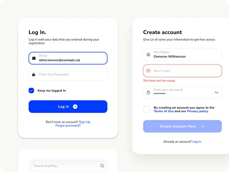
Error State

The error state occurs when users provide invalid or incorrect information. It is a common state that communicates to users that their input or action has not been successfully processed or was not in accordance with the expected requirements.
Recommendations:
- Use color, such as red, to signify an error state while ensuring adequate contrast for accessibility.
- Display concise and explicit error messages near the Input field, specifying the issue and offering guidance for correction.
- Consider using icons or symbols to signify errors visually, accompanied by text messages for clarity.
Disabled State

The disabled state helps users understand which Input fields are inactive or inaccessible for interaction. Such state disables user's attempt to input and prevents them from editing or entering data within the field.
Recommendations:
- Consider using a grayed-out or muted appearance to visually differentiate the disabled Input field from other states.
- Provide tooltip or hover text to explain why the Input field is disabled or offer guidance on how to enable it.
- Consider adjusting the cursor to indicate that the field is not clickable or editable.
Inputs Customization
Redesigning Input Background
Purpose: The purpose of redesigning the Input background is to enhance the visual appeal and align it with the overall design theme of the interface.
Benefits:
- Improved aesthetics: A redesigned background can make the Input component visually appealing and engaging for users.
- Enhanced brand identity: By using colors or images that align with the brand guidelines, the Input background can reinforce the brand identity and create a cohesive experience.
- Visual differentiation: Different background designs or patterns can help differentiate various Input fields, improving the visual hierarchy and aiding user navigation.
Risks❗ It's crucial to ensure that the redesigned background does not compromise readability or accessibility, especially for users with visual impairments. Sufficient contrast ratios are necessary for legibility.
Restyling Input Border
Purpose: The purpose of redesigning the Input border is to create a visually appealing and distinct style for the Text Field, enhancing its overall aesthetic appeal and usability.
Benefits:
- Improved visual hierarchy: Customizing the Input border elements such as color, thickness, or style can help establish a clear visual hierarchy, highlighting active or focused fields.
- Enhanced user experience: By personalizing the Input border, it can create a more visually engaging experience, ultimately impacting user satisfaction and enjoyment.
- Brand reinforcement: Aligning the border style with the overall design theme and brand identity can strengthen brand recognition and coherence.
❗ Overly complex or visually heavy border designs can be distracting and may detract from the usability and clarity of the input field. Care should be taken to ensure that the custom border does not clash with other UI elements or create visual conflicts.
Adjusting Corner Radius
Purpose: The purpose of defining corner radius is to establish a consistent and smooth UI by determining the curvature of the corners of Inputs. This design decision aims to enhance the style guides aesthetically, promote satisfaction, and reinforce the overall design language.
Benefits:
- Softening the visual appearance: Increase or decrease the corner radius can provide a more elegant or playful appearance, depending on the interface's design goals.
- Creating visual harmony: Adjusting the corner radius to match other interface components can help develop a consistent and cohesive visual language.
- Enhancing usability: Rounded corners can psychologically convey a friendlier and more approachable feel, thus positively influencing the user's perception of the Input field.
❗ Excessive corner radius values can reduce the clarity of the Input field shape, potentially impacting user recognition of the input interaction area. It's important to consider the impact of corner radius on different screen sizes and devices.
Customizing Input Icons
Purpose: The purpose of customizing leading and trailing icons in Input components is to provide visual aids, guidance, and feedback to users.
Benefits:
- Clear communication: Custom icons can provide intuitive visual cues to users, improving the communication and understanding of the intended input purpose or action.
- Brand representation: Designing icons that align with the overall brand style and visual language reinforce brand identity and create a cohesive interface experience.
- Enhanced usability: Well-designed icons can streamline user interactions, increase efficiency, and reduce cognitive load by providing context and functionality at a glance.
❗ Custom icons need to be clear and easily recognizable by users. Complex or ambiguous icons may lead to confusion or misinterpretation. But not to overload the Input Field with too many icons, potentially increasing visual noise.
Applying Shadows to Inputs
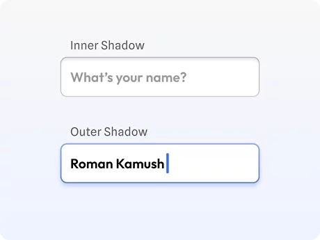
Purpose: The purpose of applying shadows to Input Fields is to create a sense of depth, visual hierarchy, and soaring affordance.
Benefits:
- Depth and dimension: Shadows can add depth, distinguishing the Input field from its surrounding elements and creating a visual layering effect.
- Affordance and interaction cues: Shadows can provide perceptual cues, indicating to users that the Input field is interactive and can be selected or focused.
- Improved visual balance: Shadows can help balance the overall interface design by visually grounding the Input field and creating a harmonious composition.
❗ Applying shadows to inputs can sometimes result in visual distractions, particularly if the shadows are too intense or exaggerated. This can overwhelm the user and make it difficult to focus on the input field itself, ultimately affecting the usability of the interface.
Adding Gradients
Purpose: The purpose of applying gradients to Input components is to add visual interest, light direction, and a dynamic touch to the visual design.
Benefits:
- Depth and realism: Gradients can be employed to simulate depth and realism within the interface. By carefully applying gradients to input fields, designers can create the illusion of physical or material elements, making the UI feel more tactile and immersive.
- Differentiation and hierarchy: Gradients can be used strategically to differentiate input fields and establish a clear visual hierarchy. By applying gradients to specific inputs, designers can guide the user's attention.
- Branding and customization: Gradients offer a versatile design element that can be customized to align with a brand's visual identity.
❗ Overuse or poorly executed gradients can result in visual clutter or distraction, overwhelming the user and hampering the readability and usability of an Input. Gradients that lack sufficient contrast between the background and the input label or text can pose challenges for users.
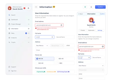
Adjusting Label Position
Purpose: The purpose of label position design is to determine the placement of labels in relation to the Input component, ensuring clarity of input purpose, efficient use of screen space, and eye-scanning efficiency.
Benefits:
- Clear input identification: Proper label placement helps users quickly understand the associated input field and its purpose.
- Efficient use of screen space: Optimizing label positioning can help maximize usable space, especially in constrained layouts or on smaller screens.
- Consistency in design language: A consistent label placement strategy across the interface helps establish a coherent visual language, improving overall UX.
❗ Poor label placement can lead to visual clutter, making it challenging for users to scan and focus on the input fields.
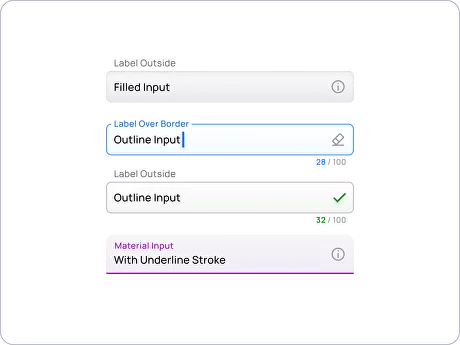
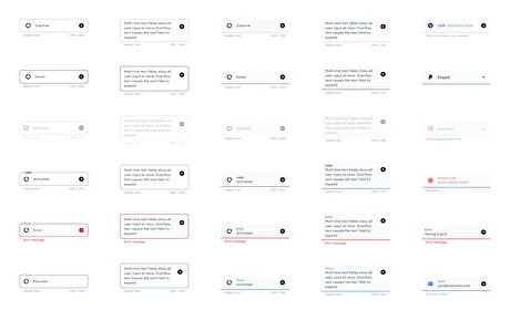
Variants of Label Position
Filled Inputs (Adaptive Label Inside) – In this style, the label is placed inside the input field when it is active or filled with user input.

Filled Inputs (Label Outside the Box) – In this style, the label is placed outside the input field but remains visibly connected.

Outlined Inputs (Adaptive Label Over Border) – In this style, the label is placed over the input field border when it is active or filled.

Outlined Inputs (Label Outside the Box) – In this style, the label is placed outside the input field, separate from the border.

Underline Inputs (Material Design style) – In this style, the label remains outside the input field, but the input field is underlined to create a distinct visual separation.

Left-Labeled Inputs – In this style, the label is positioned outside the box to the left of the input field (similar to a traditional form layout) for both outlined and filled Input styles.

Inputs Use Cases
Search Input

Purpose: Search input enables users to search for specific content within a system or website.
Anatomy: Consists of a text field with a search icon and sometimes a clear button for quick input removal.
✍ Design tips:
- Include an auto-suggest feature to assist users and provide quick search suggestions.
- Use a visually distinguishable search icon to make it easily recognizable.
- Consider providing a clear button for effortless removal of search input.
Password Input

Purpose: Password input allows users to securely enter sensitive information like passwords or PINs.
Anatomy: Similar to a regular text input, but obscures entered characters.
✍ Design tips:
- Use password strength indicators to provide real-time feedback on password complexity.
- Allow users to toggle visibility of the password to ensure input accuracy.
- Provide a clear explanation of any password requirements to guide users during input.
Date Input

Purpose: Date text field allows users to input dates, such as for booking appointments or entering birth dates.
Anatomy: Consists of a text field or dropdowns for day, month, and year selection.
✍ Design tips:
- Implement a date picker widget for an intuitive and visual date selection experience.
- Validate and format the entered date to prevent errors and ensure consistency.
- Consider providing shortcuts or presets for common date selections (e.g., today, tomorrow).
Time Input

Purpose: Time input enables users to enter specific times, such as for scheduling or event creation.
Anatomy: Typically includes separate input fields for hours and minutes.
✍ Design tips:
- Implement a time picker or slider for easier and more accurate time selection.
- Use appropriate placeholders or labels to indicate the expected time format.
- Consider including an AM/PM selector for 12-hour time formatting.
Phone Input

Purpose: Phone text field allows users to input phone numbers for verification or contact information.
Anatomy: May include country code selection dropdown and formatting for various regions.
✍ Design tips:
- Use input masking or auto-formatting to ensure consistent phone number formatting.
- Provide helpful hints or examples for users to understand the expected input format.
- Validate the input in real-time to catch any potential errors or typos.
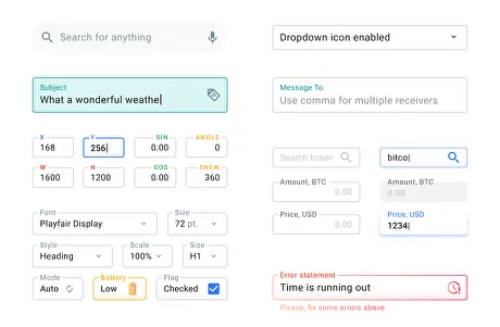
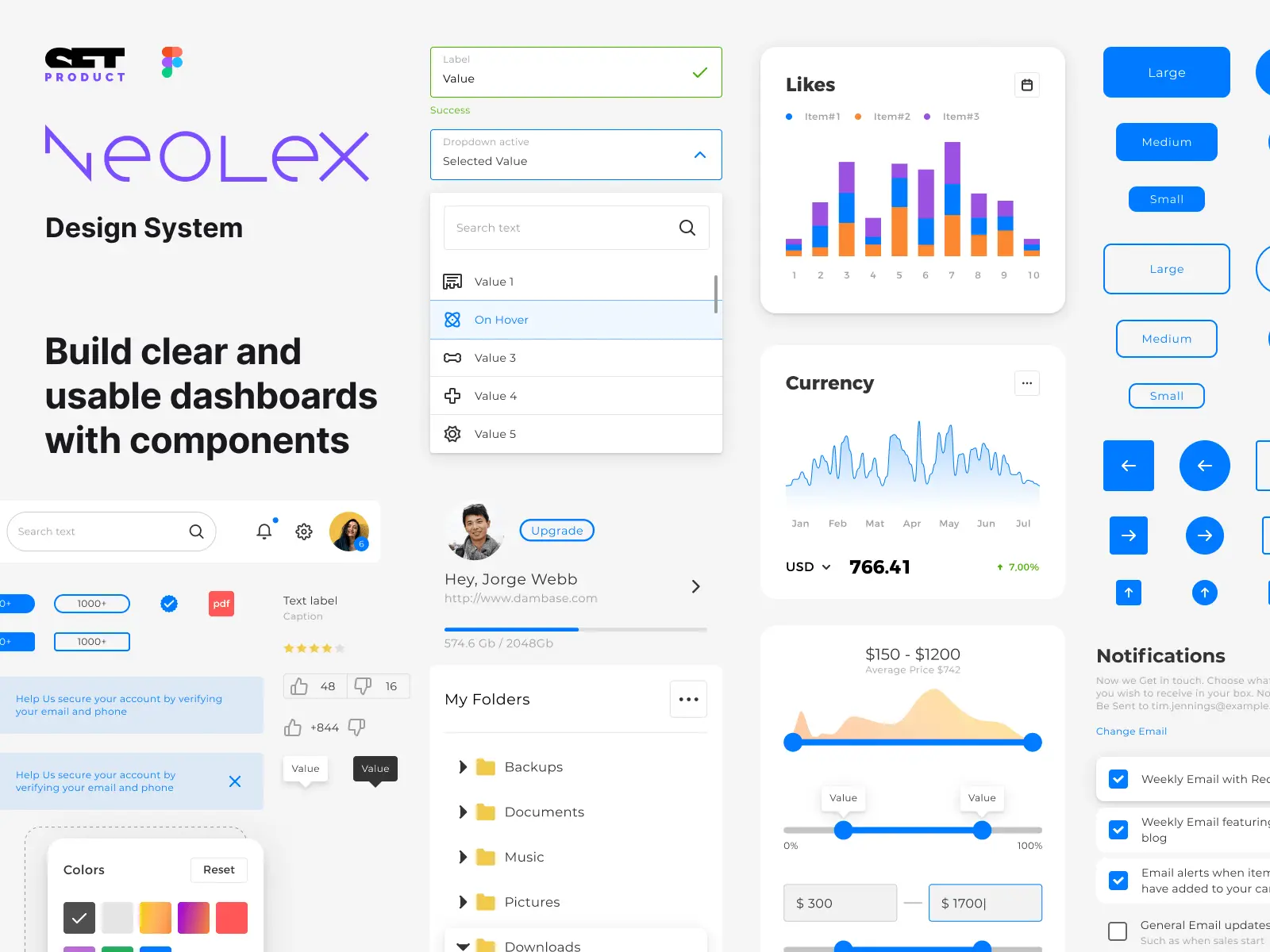
Dropdown

Purpose: Presents a list of options for users to select a single choice from.
Anatomy: Dropdown consists of a closed chevron/arrow element that expands to show available options.
✍ Design tips:
- Use descriptive labels or placeholders to indicate the purpose of the dropdown.
- Ensure the dropdown is easily scannable by organizing options logically or alphabetically.
- Allow to search or filter options within the dropdown for large lists.
Multi-Select

Purpose: Multi-select allows users to pick multiple options from a list.
Anatomy: Similar to a dropdown, but with the ability to select multiple choices.
✍ Design tips:
- Clearly indicate that multiple selections are allowed, possibly with a checkbox next to each option.
- Provide visual feedback to show selected items and allow users to easily remove selections.
- Consider organizing options into categories or providing search functionality for better usability.
Messaging/Comment

Purpose: Messaging text field facilitates user input for communication, leaving comments, or textual conversation.
Anatomy: Typically a larger text input field with options for formatting or attaching files.
✍ Design tips:
- Implement auto-resizing to accommodate longer messages, avoiding the need for manual scrolling.
- Provide formatting options (e.g., bold, italics) for emphasizing text within the input.
- Consider including character count or limit indicators for longer inputs or character-restricted platforms.
Website URL/Domain

Purpose: Website URL input enables users to enter website URLs or domains for website-related interactions.
Anatomy: Contains a text field with options to auto-complete or validate website addresses.
✍ Design tips:
- Use auto-complete to assist users by suggesting popular domains or previously entered URLs.
- Validate inputs to ensure proper formatting and provide real-time feedback on validity.
- Consider allowing users to preview or validate the entered URL to enhance the input's accuracy.
Input with Stepper

Purpose: Input with stepper facilitates numeric data enter with increment and decrement functionality.
Anatomy: Includes a text input field accompanied by buttons to increase or decrease the value.
✍ Design tips:
- Clearly indicate the range or limits of allowed values to prevent input errors.
- Ensure the stepper buttons are easily noticeable and accessible, especially on mobile devices.
- Provide visual feedback on the current value to keep users informed during input.
File Upload

Purpose: Allows users to upload files to a system or website.
Anatomy: Typically includes a "Choose File" button and a file name display area.
✍ Design tips:
- Clearly indicate the supported file types and maximum file size to set user expectations.
- Provide visual feedback when a file is successfully uploaded or if there is an error.
- Allow users to drag and drop files for a more intuitive upload UX.
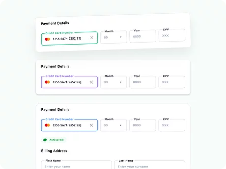
Financial Input

Purpose: Enables users to input financial values, such as prices, amounts, or currencies.
Anatomy: Usually a text input field with appropriate currency or decimal formatting.
✍ Design tips:
- Use input masking or automatic formatting to ensure consistency in financial input.
- Provide clear labels for the currency or units involved (e.g., USD, EUR, pounds, etc.).
- Consider including real-time currency conversion or calculators for complex financial inputs.
Input with Slider
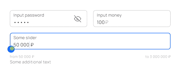
Purpose: Enables users to select a value within a specified range.
Anatomy: Consists of a slider control with a handle that can be dragged to select a value.
✍ Design tips:
- Clearly display the minimum and maximum values to set user expectations.
- Provide labels or indicators along the slider to help users understand the value range.
- Consider adding tooltips or real-time feedback to show the selected value as the slider moves.
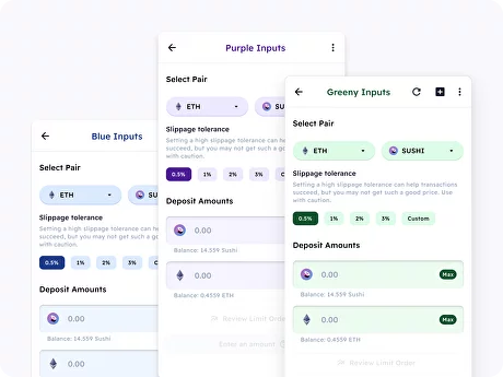
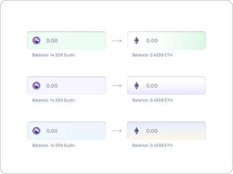
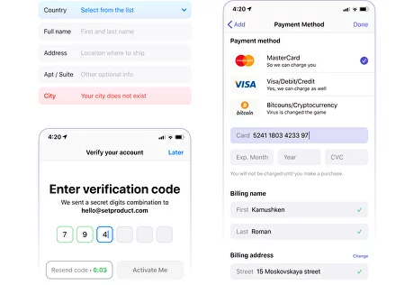
Credit Card Input

Purpose: Facilitates input for cryptocurrency swapping or trading.
Anatomy: Usually includes input fields for the amount to swap and selection of cryptocurrencies.
✍ Design tips:
- Provide real-time price updates or indicative rates to assist users in making informed decisions.
- Include visual icons or logos to represent various cryptocurrencies for easy recognition.
- Implement a step-by-step process with clear instructions to guide users through the swap.
Crypto Swap

Purpose: Facilitates input for cryptocurrency swapping or trading.
Anatomy: Usually includes input fields for the amount to swap and selection of cryptocurrencies.
✍ Design tips:
- Provide real-time price updates or indicative rates to assist users in making informed decisions.
- Include visual icons or logos to represent various cryptocurrencies for easy recognition.
- Implement a step-by-step process with clear instructions to guide users through the swap.
UX & Usability Tips
Add Placeholder Text
UX problem: Users may be unsure what information to input in an empty Input field.
Solution: Include descriptive placeholder text that provides clear instructions or examples of the expected input format. For example, for a date input field, use a placeholder like "YYYY-MM-DD" to indicate the required date format.
Utilize Input Masking
UX problem: Certain types of input require a specific format (e.g., phone numbers, credit card numbers).
Solution: Implement input masking to automatically format the user's input as they type. For example, to create a phone number input with masking, use a library or framework that allows you to define the desired format with built-in validation rules. This ensures that the user's input is formatted correctly from the moment they start typing.
Clear Input Field Reset
UX problem: Users may want to quickly clear their inputs without manually deleting the text.
Solution: Add a clear button (e.g., an "X" icon) within the Input field to allow users to clear their input with a single click. Bind an event to the clear button that empties the Input field value when clicked, instantly resetting the field to its initial state.
Input Length Limitations
UX problem: Users might exceed the specified input length, causing errors or truncation.
Solution: Indicate the maximum input length and provide real-time character count feedback. To implement this, listen for input events and update a character count display in real-time. If the user reaches the maximum allowable length, disable further input or display an error message indicating that the maximum length has been reached.
Real-Time Validation
UX problem: Users may submit incomplete or incorrect input without immediate feedback.
Solution: Implement real-time input validation by triggering validation events on input change or blur. Validate the input against the specified rules and display visual cues (e.g., changing the border color to red or displaying an error icon) to convey the validation status to the user.
Error Handling
UX problem: Users may encounter errors when submitting an input form.
Solution: Clearly communicate validation errors by displaying descriptive error messages near the Input component. To implement this, create an error state for the Input component and display the corresponding error message below or beside it. Provide concise instructions on how to rectify the error to help users resolve the issue.
Autocomplete and Suggestions
UX problem: Users may need assistance or suggestions for their input.
Solution: Offer autocomplete or suggestion functionality by leveraging data sources such as pre-existing user input, a predefined list of options, or an API. As the user types, display the available suggestions dynamically in a dropdown or similar UI component. Allow the user to navigate and select suggestions using keyboard interactions in addition to mouse clicks.
Thoughtful UI Animation

UX problem: Abrupt or confusing transitions can disrupt the user's flow or comprehension.
Solution: Utilize subtle animations to provide feedback during various input interactions, such as focus transitions or validation states. For example, when an Input field gains focus, animate the focus indicator to smoothly transition and highlight the field, creating a seamless flow. Use animations sparingly, ensuring they enhance the user's understanding and perception of the input behavior without overshadowing its purpose.
Use Helper Texts or Tooltips
UX problem: Users may require additional context or guidance for specific input requirements.
Solution: Provide helper texts or tooltips to clarify the expected format, usage, or any constraints associated with the input field. Position the helper text or tooltip near the Input component, either within the field itself or in close proximity for easy reference. Use a hover or click trigger to reveal the extra information and ensure it does not obstruct or distract from the input interaction.
{{spacer-24}}
{{stars-conclusion}}
{{spacer-24}}
Related links
- Inputs in Appka Mobile UI kit
- Text fields in Material Design 2
- Text fields in Material Me (Material Design 3)
- Search inputs in React UI kit
- Various inputs in Material X Angular
.webp)
%20(1).webp)
.webp)
.webp)
.webp)
.webp)
.webp)
.webp)
.webp)

.webp)
.webp)
.webp)

.webp)


%20(1).webp)

%20(1).webp)
.webp)
.webp)


