


Roman Kamushken
<span class="blog_big-paragraph">This documentation provides a comprehensive guide to Dropdowns UI design. It covers the anatomy of a component, common use cases, custom theming options, and emphasizes usability and accessibility. Readers will gain the knowledge to create user-friendly and visually appealing Dropdowns that align with user's needs and accessibility requirements.</span>
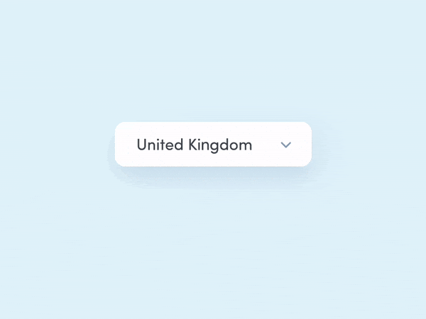
Dropdown – is a user interface (UI) element that allows users to select one option from a list of available choices.
Dropdowns are commonly used in interfaces to provide compact and efficient selection controls for various purposes. They can be triggered by clicking or tapping on a toggle button, which expands or collapses the dropdown menu.
{{spacer-64}}
Dropdown Anatomy
Types of Dropdowns
Standard Dropdown
Definition: A Dropdown that presents a list of options in a compact form where only one option can be selected at a time.
Use case: A standard Dropdown is commonly used for selecting a single option from a predefined set of choices, such as choosing a country, a font style, or a category.
Design tips: Ensure that the Dropdown can accommodate the maximum number of options without compromising usability or visibility. Avoid overcrowding with too many options, and consider implementing scrolling or grouping if necessary.

{{spacer-16}}
Multi-Level Dropdown
Definition: A Dropdown that allows for nested submenus or levels, allowing users to navigate through a hierarchical structure of options.
Use case: Multi-Level Dropdowns are useful when dealing with complex data or menu structures where options are organized in multiple levels or categories. They are commonly used in navigation menus or settings panels, where subcategories or submenus need to be accessed.
Design tips: Clearly indicate the hierarchy and relationship between the different levels of options. Use visual cues, such as indentation, arrows, or icons, to indicate the submenus or levels. Additionally, ensure that the dropdown menu is wide enough to accommodate the nested options, and consider providing a back button or breadcrumb navigation to help users easily navigate back to previous levels.

{{spacer-16}}
Searchable Dropdown
Definition: A Dropdown that includes a search input field to help users find and select options quickly from a long list.
Use case: Searchable Dropdowns are valuable when the list of options is extensive, such as selecting a city from a long list or choosing from a large database of products.
Design ✍: Optimize the search functionality to provide accurate and relevant results in real-time. Consider implementing features like suggestions, highlighting, and filtering to enhance the search experience and help users find options effortlessly.

{{spacer-16}}
Multi-select Dropdown
Definition: A Dropdown that allows multiple options to be selected simultaneously.
Use case: Multi-select Dropdowns are useful when users need to choose multiple options at once, like selecting multiple items for bulk actions, tagging items with multiple categories, or filtering search results.
✍ Provide a clear indicator to show which options are selected, and consider using a "Select All" option for convenience if applicable. Display selected options as chips within the Dropdown area, giving users a clear overview of their chosen items. Additionally, provide a "Clear All" option to remove all selected chips.

{{spacer-24}}
Key Elements and their Functions

Trigger/Button
Definition: The clickable element that triggers the Dropdown to open and close.
Use case: Used to save space in the interface when there are limited display options available.
✍ Design the trigger/button to be easily identifiable and clickable. Use clear and concise labels or icons to indicate its purpose. Consider adding a Caret Down icon next to the trigger/button to visually indicate its expandable nature. Apply a subtle background highlight or border on hover or focus to make it interactive.

Caret Down Icon
Definition: An arrow icon, typically pointing downward, placed next to the trigger/button.
Use case: Used to indicate that there are hidden options that can be revealed by activating the Dropdown.
✍ Design the Caret Down icon to be visually distinct and recognizable. Use an arrow icon pointing downward to let user know – they can expand a Dropdown. Ensure the icon is aligned with the trigger/button and has sufficient spacing to avoid accidental clicks or taps.

Dropdown Border
Definition: A visible outline or border surrounding the Dropdown component.
Use case: Used to visually distinguish the Dropdown from other elements on the screen.
✍ Apply a subtle border around the Dropdown component to create visual distinction. Use a color that contrasts with the background to ensure visibility. Adjust the border thickness to achieve an appropriate visual hierarchy within the interface.

Options/Items
Definition: Individual selectable elements within the Dropdown List.
Use case: Used to present a specific set of choices or actions to the user.
✍ Use clear labels for each option and maintain consistency in presentation (e.g., font size, alignment, color). Differentiate the selected option, such as by highlighting it or applying a different background color. Add a subtle hover effect to indicate interactivity.

Dropdown List/Menu
Definition: The list of items shown to the user when a Dropdown is open.
Use case: Used to present a set of options to select from.
✍ Add a thin border around the Dropdown List to visually separate it from other elements. Use ample spacing between items and maintain consistent alignment and typography for a clean and organized appearance. Consider adding a scrollbar or pagination if the list becomes too long to fit within the available space.
{{spacer-24}}
Dropdown States and Interactions
Default state
Definition: The initial state of the Dropdown before any interaction occurs.
Function: It displays a default text or placeholder within the Dropdown to indicate that a selection can be made.
✍ Ensure the default text or placeholder is visually distinct from user-selected options and clearly communicates that the Dropdown is interactive.

{{spacer-16}}
Hover state
Definition: The hover state occurs when a user hovers their cursor over the Dropdown options or dropdown toggle.
Function: It provides visual feedback to indicate that the Dropdown is interactive and the option is selectable.
✍ Use a visually distinguishable hover effect, such as changing the background color or adding a highlight, to make it clear which option is currently being hovered over.

{{spacer-16}}
Expanded/Open state
Definition: The expanded or open state occurs when the user clicks or interacts with the Dropdown toggle, revealing a list of options.
Function: It displays the available options for selection and allows to make a choice.
✍ Ensure the expanded state provides enough visual space to display all options clearly, consider using scrolling or pagination for long lists, and visually separate the Dropdown options from other page content.

{{spacer-16}}
Selected state
Definition: This state represents the user's choice from the Dropdown options.
Function: It shows the user's selected option when the Dropdown is collapsed, providing a quick reference for their choice.
✍ Clearly indicate the selected option, either through text, visual styling, or both, to avoid confusion and provide clarity to the user. Consider visual cues like checkmarks or highlighting the selected option.

{{spacer-16}}
Disabled state
Definition: The disabled state occurs when the Dropdown is not interactive or unavailable for selection.
Function: It conveys that the Dropdown is temporarily unavailable, often due to certain conditions or requirements not being met.
✍ Visually differentiate the disabled state to indicate that the Dropdown cannot be interacted with. Use reduced opacity, gray out the component, or add a visual indicator like a disabled icon.

{{spacer-16}}
Error state
Definition: The error state indicates that an invalid selection or input has been made within the Dropdown.
Function: It alerts the user that there is a problem with their selection and provides feedback on what needs to be corrected.
✍ Use visual cues such as error messages, color changes, or icons to clearly communicate the error state. Provide clear and concise error messages that guide users toward resolving the issue.

{{spacer-64}}
Dropdown Theming
Corner Radius
Set a convenient corner radius is to create a visually pleasing dropdown component that fits harmoniously within the overall design language of the interface.
✍ Pick a corner radius that aligns with the overall design language and matches the level of formality or informality desired. Aim for consistency in corner radius across different interface elements to promote visual coherence.

{{spacer-24}}
Border Style
Choose an appropriate border color is to define the boundaries of the dropdown component and provide a clear visual distinction from other elements.
✍ Select a border color that provides sufficient contrast with the background and text, ensuring clear separation and affordances. Test different border styles to find the one that complements the overall design and enhances usability.

{{spacer-24}}
Using Shadows
Shadows help to provide depth and separate the dropdown component from the background, making it appear interactive and stacked on top of other elements.
✍ Experiment with shadows to create depth and hierarchy. Use subtle shadows to add a sense of elevation to the dropdown, ensuring consistency across different states and interactions for a polished user experience.

{{spacer-24}}
Container Color
The container color helps to create visual cohesion and indicate the state of the dropdown (e.g., open, closed, selected).
✍ Choose a container color based on the interface's color palette, emphasizing legibility and accessibility. Use color psychology to evoke desired emotions and create visual harmony within the dropdown component.

{{spacer-24}}
Applying Gradients
Gradients can add depth, dimension, and visual interest to the dropdown component, making it more visually engaging and aesthetically appealing.
✍ Optionally utilize gradients to add depth and visual interest to the dropdown. Experiment with different gradient styles and color combinations while ensuring they align with the overall UI aesthetics and provide adequate contrast for easy readability.

{{spacer-24}}
Menu Expand/Collapse Animation
The animation helps to provide visual feedback and convey the interaction states of expanding and collapsing the dropdown menu.
✍ Create smooth and intuitive animations for opening and closing the dropdown. Pay attention to timing, easing, and speed to ensure a satisfying experience that enhances usability and provides clear visual feedback.
{{spacer-24}}
Icon Rotation Effect
The icon rotation effect visually communicates the state change of the dropdown, indicating whether it is open or closed.
✍ Implement a rotation effect for the dropdown icon to visually indicate its open or closed state. Ensure the rotation animation is easily understandable and visually appealing, aligning with the overall interface design and adding interactivity.
Dropdown Use Cases
Using in Navigation Menus
A navigation menu dropdown is commonly used on websites to help users explore web pages of the site, or web app sections. It provides a clear and organized structure for users to find the information they need.
Sample of a navigation menu dropdown from an e-commerce website:

{{spacer-24}}
Language Selection
Language/region selector dropdowns allow users to switch between different language or regional variations of a website. They simplify the user interface by avoiding cluttering the screen with language options.
Here's an example for such a use case:

{{spacer-24}}
Data Input Forms
Data input forms often use dropdowns to provide users with predefined options for selecting values or input. They ensure accurate and consistent data entry.
Here's a dropdown in a data input form for selecting a date format:

{{spacer-24}}
Filter and Sorting Options
Filter and sorting options dropdowns are commonly used in e-commerce or data-heavy applications to help users narrow down their search results or sort data based on specific criteria.
Here's a sample filtering options dropdown:

{{spacer-24}}
Configuration Settings
Dropdowns can be used for configuration settings, allowing users to customize their preferences or adjust various options within a system or application. This use case is commonly seen in software settings or account management interfaces.
Here's a configuration settings dropdown:

{{spacer-24}}
Selection of Single/Multiple Items
Dropdowns can also be used for selecting single or multiple items from a predefined list. They are commonly used in forms or settings where users need to make multiple selections.
Here's a selection of multiple items within a dropdown:

{{spacer-64}}
UX & Usability Tips

Default Values and Placeholder Text
UX problem: Users may be unsure about the initial state of the Dropdown or may not notice that a selection is required.
Solution: Include a default value or placeholder text in the Dropdown to provide users with an indication of the expected input. This helps users understand the purpose of the Dropdown and encourages them to make a selection. Placeholder should clearly convey the type of options available.
{{spacer-24}}
Logical and Intuitive Organization

UX problem: Users can feel overwhelmed or frustrated if Dropdown options are not logically organized or grouped.
Solution: Group options in a logical manner such as by category, relevance, or alphabetical order. Use visual cues, such as dividers or indentation, to indicate hierarchy or relationships between options. Implement a search or filter functionality for lengthy or nested lists.
{{spacer-24}}
{{spacer-64}}
Keyboard Accessibility

UX problem: Users who rely on keyboard navigation may struggle to interact with Dropdowns effectively.
Solution: Ensure Dropdowns can be navigated and activated using keyboard-only inputs. Provide clear keyboard focus indication and allow users to navigate through options using arrow keys. Use the Enter or Space key to select an option, and allow the Escape key to dismiss the Dropdown.
{{spacer-24}}
{{spacer-64}}
Selected Option Feedback

UX problem: Users may not be aware of the option they have selected in the Dropdown, especially if they inadvertently click outside the Dropdown or if the selected option is not immediately visible.
Solution: Provide clear visual feedback to indicate the selected option: highlight the selected option or display a checkmark next to it. Visually distinguish the selected option from the rest of the options by using a different font weight or color. Display the selected option above or next to the Dropdown as a temporary label, reinforcing users' selection and reminding them of their choice.
{{spacer-24}}
{{spacer-64}}
Color Contrast and Visual Accessibility

UX problem: Users with visual impairments may have difficulty discerning Dropdown options if the color contrast is insufficient.
Solution: Adhere to accessibility guidelines for color contrast, ensuring that the text and background colors within the Dropdown meet the recommended contrast ratio. Consider using additional visual cues, such as borders or icons, to differentiate selected or focused options.
{{spacer-24}}
{{spacer-64}}
Limiting number of options and incorporating search functionality

UX problem: Dropdowns with an extensive list of options can become overwhelming, making it challenging for users to locate their desired choice quickly.
Solution: Limit the number of visible options initially, either by displaying a set number of options or using scrollable menus to avoid overwhelming the user with a long list. Implement a search or filter functionality within the Dropdown to allow users to search for specific options by typing keywords. This enables users to find their desired option quickly, especially in Dropdowns with a large number of choices.
{{spacer-24}}
{{spacer-64}}
{{stars-conclusion}}
.png)

.webp)
.webp)
.webp)
.webp)
.webp)
.webp)

.webp)
.webp)
.webp)
.webp)


%20(1).webp)

%20(1).webp)
.webp)
.webp)


