


Roman Kamushken
<span class="blog_big-paragraph">App notifications are interactive messages that are delivered within the context of an application. They serve to inform, update, or engage users by providing timely and relevant information, alerts, or calls to action.</span>
Notifications UI design typically includes a combination of textual content, icons, imagery, and sometimes even sound or vibration effects. They are designed to grab the user's attention and provide valuable and timely information.
Notifications can vary in purpose, such as delivering personalized messages, notifying about new content, indicating system status or updates, requesting user actions, or providing reminders.
Today you will learn:
- Understand notification components: Learn about toasts, popovers, dialogs, and action buttons in notifications and how they contribute to effective communication.
- Types of notifications: Gain insight into system-generated, user-triggered, personalized, promotional notifications, exploring various contexts for its usage.
- Design best practices: Guidelines for attention-grabbing notifications that balance text and visuals, convey information effectively through tone, animation, sound.
- Usability tips: Techniques to ensure user-friendly notifications, avoiding overload, maintaining consistency, timeliness, relevance, and providing control over settings.
- Practical use cases: Explore onboarding, user engagement, account activity, transactional, and reminder notifications, understanding how they enhance UX.
{{spacer-64}}
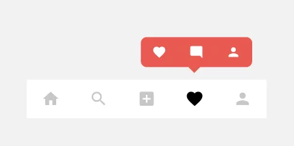
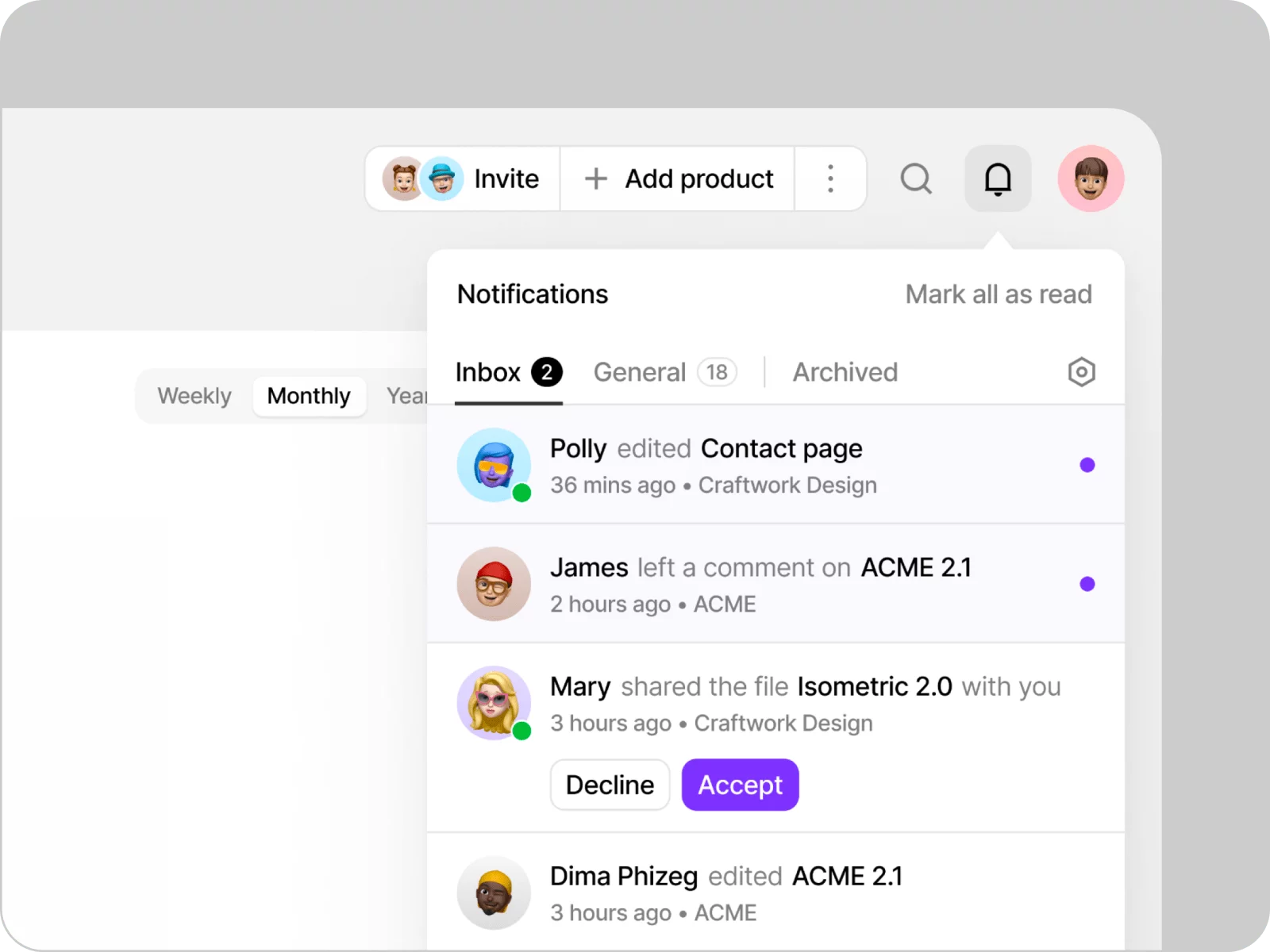
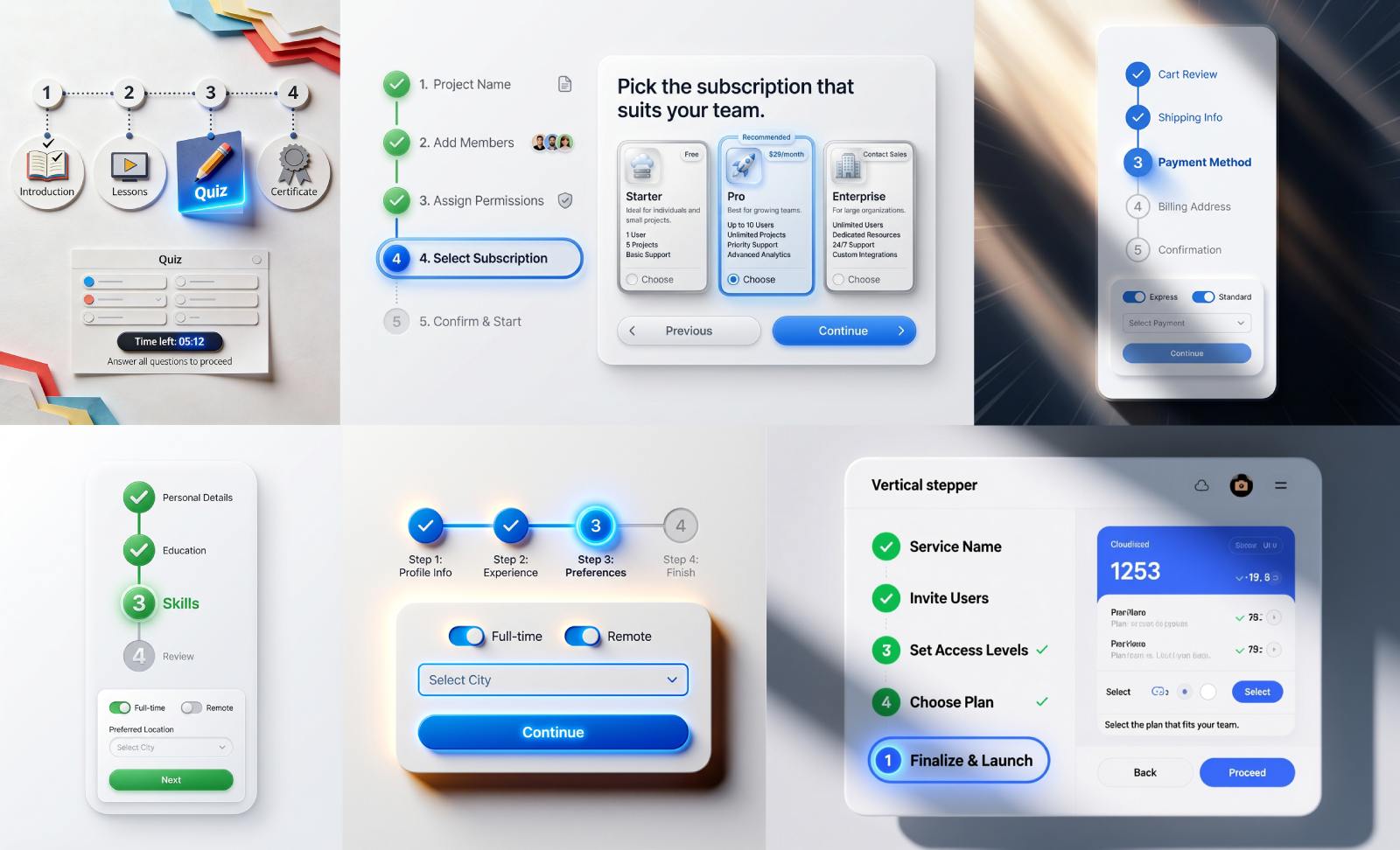
Notification Components
Badge
Definition: A badge is a visual indicator, typically represented by a number or small icon, that appears on app icons or within the app interface itself.
Purpose: Badges notify users of new or relevant updates, notifications, or actions associated with specific app features or content.
Badge design tips:
- Use badges sparingly and only for important or time-sensitive notifications.
- Ensure that badges are visually distinctive and easily noticeable.
- Use micro-animations to add an element of delight to the badge design.
{{spacer-24}}
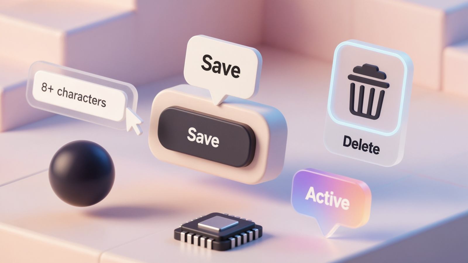
Toast/Snackbar
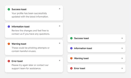
Definition: A toast (or snackbar) is a brief, transient message that appears at the bottom center or top of the screen corners to display non-interruptive updates or notifications.
Purpose: Toasts are used to inform users about a successful action, system message, or non-critical alerts.
Toast design tips:
- Use a short and clear message to convey the information effectively.
- Ensure sufficient contrast between the toast and the background for easy visibility.
- Provide a clear indication of how long the toast will remain visible.
{{spacer-24}}
Dialog/Modal
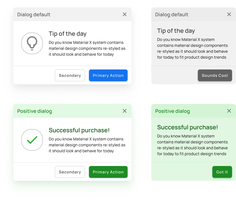
Definition: A dialog or modal is a temporary overlay that requires user interaction to resolve or acknowledge a notification or prompt.
Purpose: Dialogs prompt users to confirm decisions, show additional information, or acquire specific input before proceeding.
Dialog design tips:
- Clearly indicate the primary action(s) users should take within the dialog/modal.
- Use clear and intuitive visual cues (e.g., icons, buttons or background color) to indicate the purpose or outcome of each dialog option.
- Avoid overcrowding the dialog/modal with excessive information or options, as this can overwhelm users.
{{spacer-24}}
Popover
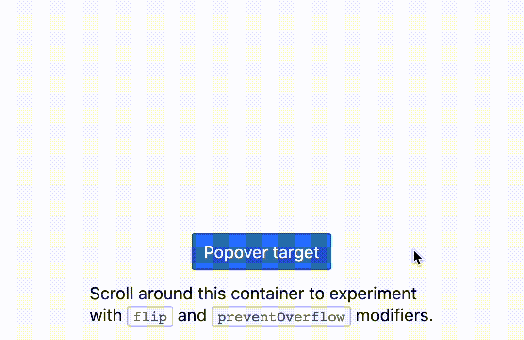
Definition: A popover is a small overlay or tooltip-style UI component that provides additional information or actions related to a specific element.
Purpose: Popovers offer users quick access to contextual information or supplementary options without disrupting the main UI.
Popover design tips:
- Make the trigger easily identifiable and accessible, such as using a question mark icon or an "i" icon.
- Provide visual cues (e.g., icons, arrows, or color) to indicate a popover is available.
- Use microinteractions to draw attention to the popover or its associated elements.
- Allow users to dismiss popovers easily to regain focus on the primary UI.
{{spacer-24}}
Tooltip
Definition: A tooltip is a small, contextual UI element that appears when users hover over or tap on an item, providing additional information or clarifying the purpose of the item.
Purpose: Tooltips enhance the user understanding of complex or unfamiliar elements, offering brief explanations or guidance.
Tooltip design tips:
- Use tooltips sparingly and only for critical or less obvious features.
- Provide a small delay before showing the tooltip to prevent accidental triggering.
- Fading in/out or sliding animations can help draw attention to the tooltip without being too distracting.
{{spacer-24}}
Banner
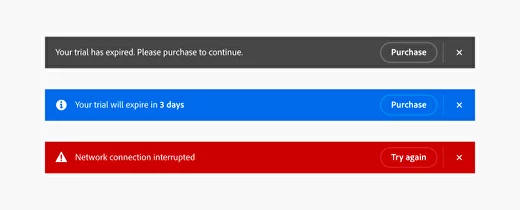
Definition: A banner is a prominent, horizontal UI element that appears at the top or bottom of the screen to convey important announcements, alerts, or notifications.
Purpose: Banners capture user attention with important or time-sensitive information, often prompting immediate action or acknowledgment.
Banner design tips:
- Make sure the banner stands out from the rest of UI by using contrasting colors.
- Ensure banners have a clear call-to-action and can be easily dismissed or closed.
- Ensure that the banner scales appropriately and remains legible on various devices.
- Include a clear and visually distinguishable call-to-action (CTA) button or link.
{{spacer-24}}
Progress Indicator

Definition: Progress indicators visually represent the completion status or ongoing progress of a task or process.
Purpose: Progress indicators keep users informed and alleviate uncertainty by conveying the current status of a time-consuming or complex action.
Progress design tips:
- Use progress indicators for time-consuming operations or actions that require background processing.
- Provide clear visual cues to indicate the progress status and estimated time remaining (if applicable).
- Combine progress indicators with informative messages to provide additional context and reassurance.
{{spacer-24}}
Sound Notifications
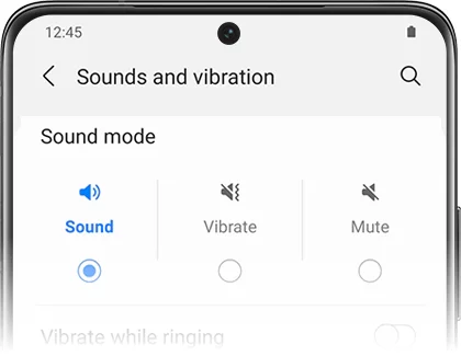
Definition: Sound notifications are auditory cues or alerts that accompany visual notifications to capture user attention.
Purpose: Sound notifications help users notice and respond to important information or events, even when they are not actively looking at the screen.
Sounds design tips:
- Provide users with the option to customize or mute the sound notifications based on their preferences.
- Select sounds that align with the purpose and context of the notification.
- Ensure the sound is not too loud or distracting, but still noticeable enough to capture the user's attention.
{{spacer-24}}
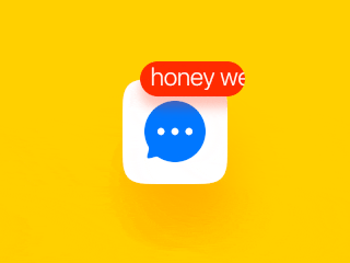
Push Notifications
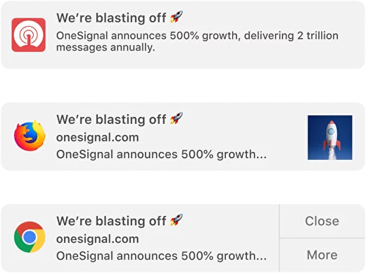
Definition: Push notifications are messages or alerts delivered directly to users' mobile devices or desktops outside of the app's interface.
Purpose: Push notifications are used to engage and re-engage users by delivering timely, relevant, and personalized information or updates.
Push design tips:
- Offer clear opt-in and opt-out options for push notifications to respect user privacy and preferences.
- Provide customization options that allow users to control the types and frequency of push notifications they receive.
- Consider using intelligent scheduling strategies (use metrics, data tracking), such as sending notifications during preferred times or when the user is most likely to engage with them.
{{spacer-64}}
Notification Types
Informational Notifications
Purpose: Informational notifications aim to keep users informed about relevant updates and important news related to their app or user account. They provide timely information to enhance user engagement and awareness.
⬛⬜⬜ Low Priority: These notifications provide non-critical information and do not require immediate user attention, but they are still valuable for user engagement and awareness.
Examples:
- Account Activity: Notifying users about recent activity on their accounts, such as successful logins, password changes, or suspicious login attempts.
- App Updates: Informing users about new features, bug fixes, or enhancements through release notes.
- News and Updates: Sharing relevant news or announcements related to the app or its industry.
Design considerations:
- Timing and Context: Deliver informational notifications at appropriate times and within relevant contexts to increase their usefulness and relevancy to the user.
- Actionable Content: Include appropriate and meaningful actions within the notification to allow to take immediate action without navigating through the app.
- Personalization: Tailor the content of the notification to match the user's preferences, location, or previous interactions to enhance relevance and engagement.
{{spacer-24}}
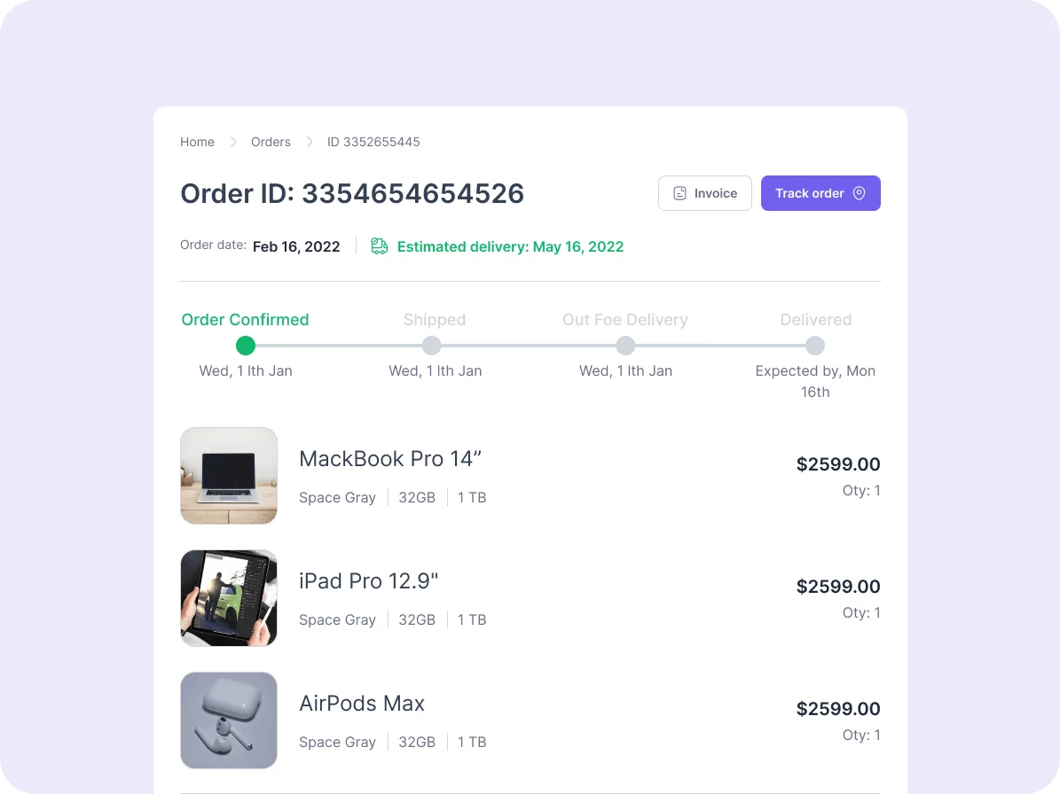
Transactional Notifications
Purpose: Transactional notifications are triggered based on specific user actions or events within the app. They provide immediate feedback, confirmation, or status updates related to user transactions..
⬛⬛⬜ Medium Priority: These notifications are more time-sensitive and require users' attention to ensure they stay up-to-date with important transactional information.
Examples:
- Order Status: Informing users about the status updates of their orders, such as order confirmation, shipped status, or delivery updates.
- Payment Confirmation: Notifying users about successful payments, failed transactions, or pending payment reminders.
- Booking Confirmation: Informing users about successful bookings, reservations, or ticket purchases.
Design considerations:
- Be Transparent with Timing: Clearly communicate any time-sensitive information, such as cutoff times, deadlines, or expected response times.
- Use Visual Cues: Utilize icons, colors, or progress indicators to visually represent the status or outcome of transactions within the notification.
- Provide Feedback and Confirmation: Once users complete the transaction-related action, provide immediate feedback or confirmation to reassure them that their action was successful.
{{spacer-24}}
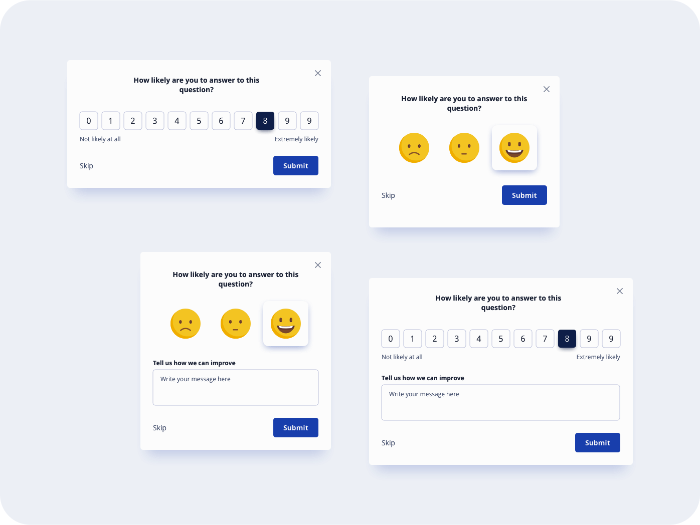
Feedback Notifications
Purpose: Feedback notifications are designed to inform users about the outcome or status of their interactions with the app. They aim to provide feedback, acknowledgement, or error alerts related to user actions.
⬛⬛⬜ Medium Priority: These notifications are important for user feedback and may require user attention to address errors or provide additional information.
Examples:
- Form Submission: Notifying users about the success or failure of submitting a form, ensuring they are aware of the outcome.
- Error Alerts: Alerting users to errors or issues encountered during their interactions, such as invalid inputs, network errors, or server maintenance.
- Ratings and Reviews: Prompting users to provide feedback, ratings, or reviews about the app or specific features.
Design considerations:
- Positive reinforcement: Whenever possible, provide positive feedback or acknowledge progress made by the user.
- Timely delivery: Send feedback notifications in a timely manner, when the user is actively engaged with the app or after they have completed a serious task.
- User-friendly dismiss actions: Provide simple and intuitive ways for users to dismiss or clear feedback notifications if they are not interested.
{{spacer-24}}
Error/Success Notifications
Purpose: Error and success notifications inform users about successful actions or identify errors or failures associated with a user's interactions within the app.
⬛⬛⬛ High Priority: These notifications require immediate user attention, as they indicate important outcomes or errors.
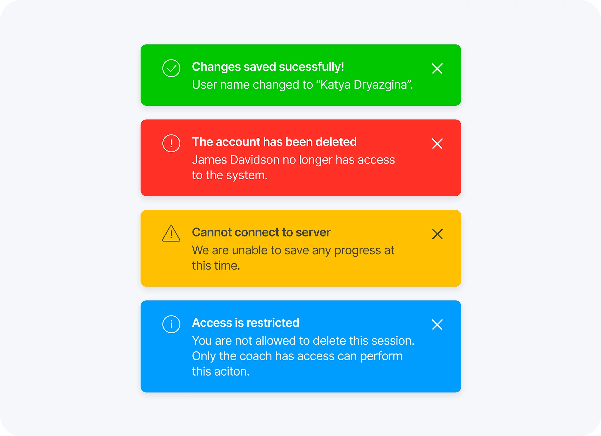
Examples:
- Successful Registration: Notifying users about the successful creation of their account or registration process.
- Password Reset: Confirming to users that their password reset has been successful.
- Invalid Input: Alerting users about errors in form submissions due to missing or incorrect inputs.
Design considerations:
- Visual Clarity: Utilize visual cues such as icons or color coding to quickly convey the nature of the notification.
- Error Reporting: Provide users with the means to easily report errors, ensuring that their feedback is properly recorded and addressed.
- Contextual Help: Include links or resources in error/success notifications that can provide users with additional context or assistance.
{{spacer-24}}
Actionable Notifications
Purpose: Actionable notifications allow users to take immediate action from within the notification itself, without the need to open the app. They enhance user convenience and efficiency.
⬛⬛⬛ High Priority: Actionable notifications require immediate user attention as they enable to take direct actions or perform tasks without navigating to the app.

Examples:
- Reply to Messages: Allowing users to respond to messages or conversations directly from the notification, saving them time and effort.
- Social Media Interactions: Enabling users to like, comment, or share posts directly from the notification without opening the social media app.
- Task Completion: Providing users with the ability to mark tasks as complete, snooze reminders, or perform necessary actions without opening the app.
Design considerations:
- Prioritize Actions: If there are multiple actions possible, prioritize them based on user needs and preferences. Make it easy for users to understand the most relevant or frequently used actions.
- Deep Linking: Utilize deep linking within your actionable notifications to take users directly to specific content or actions within your app.
- Confirmation Notifications: Send a follow-up notification or visual confirmation within the app to inform users that their action has been successfully completed.
{{spacer-24}}
System Notifications
Purpose: System notifications are sent by the operating system or device. They inform users about important device updates, settings, or actions outside of the app
⬜⬜ Low Priority: System notifications are often essential but do not require the same level of attention as other types of notifications.
Examples:
- Software Updates: Notifying about available software updates for their device.
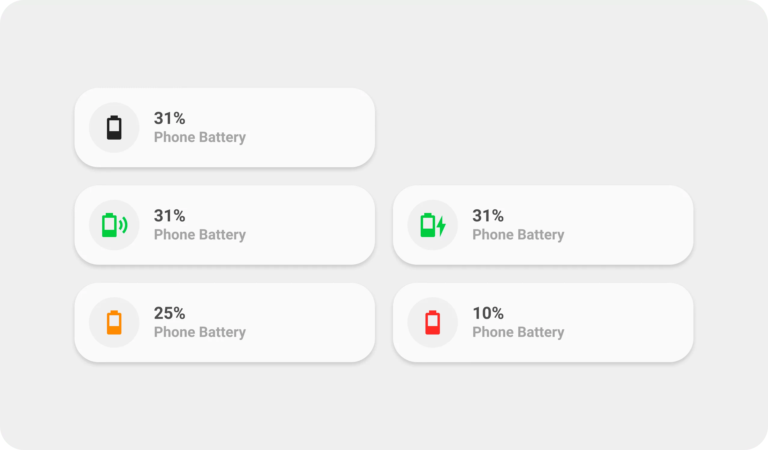
- Battery Level: Alerting users about low battery or when the device is fully charged.
- Do Not Disturb Mode: Informing users when device behavior is set to silent mode.
Design considerations:
- Short and Actionable Text: Keep the notification message short, using action-oriented language to guide users on what to do next
- Use Appropriate System Icons: Utilize recognizable system icons to enhance understandability and familiarity.
- Minimal Disruption: System notifications should not disrupt the user experience within the app, but instead provide valuable information or settings.
{{spacer-24}}
Reminders and Alerts
Purpose: Reminders and alerts prompt users about tasks, events, or time-sensitive actions that they need to take or be aware of within the app.
⬛⬛⬜ Medium Priority: These notifications require users' attention as they serve as time-sensitive reminders or alerts for important actions or events.

Examples:
- Appointment Reminders: Notifying users about upcoming appointments, scheduled meetings, or events they have on their calendar.
- Task Reminders: Reminding users about pending tasks, deadlines, or important to-do items within their task management app.
- Subscription Renewal: Prompting users to renew or upgrade their subscriptions, ensuring timely action to avoid interruption of services.
Design considerations:
- Timing and Frequency: Deliver reminder notifications at appropriate times and limit the frequency to avoid annoying or overwhelming the user.
- Opt-out or Snooze Options: Provide users with the ability to snooze or opt-out of receiving reminder notifications if they no longer require them or prefer a different mode of receiving reminders.
- Contextual Information: Include relevant details within the notification, such as event location, task description, or subscription details, to provide context.
{{spacer-24}}
Location-based Notifications
Purpose: Location-based notifications leverage a user's geographical location to provide targeted and relevant information.
⬛⬛⬜ Medium Priority: Location-based notifications are time-sensitive and require user attention, especially when they offer contextually relevant information.
Examples:
- Store Promotions: Notifying users of nearby stores offering discounts or promotions based on their location.
- Event Recommendations: Alerting users about events taking place nearby based on their current location.
- Geofencing Alerts: Sending notifications when a user enters or exits a specific geographic area.
Design considerations:
- Opt-in and Privacy: Clearly communicate and obtain user consent for accessing location information, while ensuring the privacy and security of user data.
- Proximity Awareness: Utilize proximity-based triggers to deliver notifications based on nearby points of interest or relevant locations to drive engagement.
- Visual cues: Incorporate maps, markers, or pin icons to provide users with a clear understanding of their current location in relation to the notification's content.
{{spacer-64}}
Notifications Usability Tips
Placement & Visibility

Purpose: Ensure notifications are placed in a prominent location and easily visible to users, enhancing their discoverability.
Benefit: Users can quickly and effortlessly notice notifications, leading to improved engagement and user satisfaction.
Example: YouTube places notifications in the top right corner of the app, ensuring that users can easily access them while browsing videos.
{{spacer-24}}
Allow Personalization

Purpose: Give users the ability to customize notification preferences, allowing them to control what information they receive and when.
Benefit: Personalization enhances UX by providing relevant and meaningful notifications, reducing unnecessary interruptions.
Example: Twitter allows users to choose which types of notifications they want to receive (e.g., new followers, likes, mentions)
{{spacer-24}}
Use Meaningful Icons

Purpose: Utilize icons in notifications to provide visual cues that convey information quickly and effectively.
Benefit: Icons help users understand the context of the notification, making it easier to grasp the content at a glance.
Example: Instagram employs icons like a heart for likes, a speech bubble for comments, and a tag for post tags.
{{spacer-24}}
Timing & Frequency

Purpose: Timely delivery and controlling the frequency of notifications prevent overwhelming users or interrupting their tasks.
Benefit: Well-timed and appropriately spaced notifications improve user engagement and minimize annoyance.
Example: LinkedIn carefully times notifications on job opportunities, connection requests, and industry insights, ensuring users stay connected without excessive interruptions.
{{spacer-24}}
Give a Feedback

Purpose: Offer clear and concise feedback within notifications to inform users about the status, action required, or any errors.
Benefit: Feedback ensures users are aware of the outcome or next steps, reducing confusion and improving overall usability.
Example: Instagram displays a heart animation and sound when a user likes a post and acknowledges the action
{{spacer-24}}
Utilize UI Animation
Purpose: Implement animations within notifications to enhance their visibility, draw attention, or provide a delightful experience.
Benefit: Well-designed animations contribute to a more engaging and visually appealing notification interface.
Example: Slack uses a sliding animation when new messages arrive, attracting the user's attention.
{{spacer-64}}
Notification Use Cases
Social Interactions

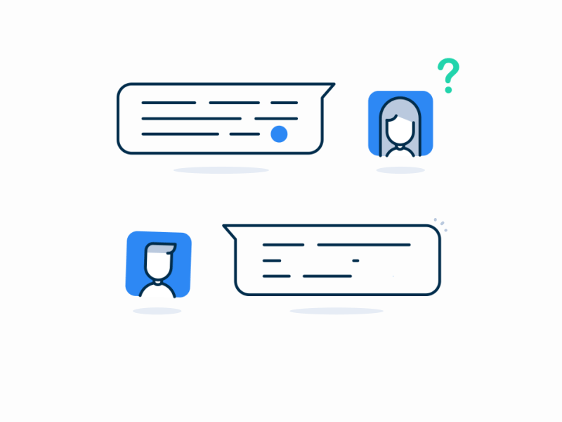
User Story: Sarah receives a push notification on her phone that she has a new message from her friend Lisa on a social media app. Sarah taps on the notification, which opens the app and takes her directly to the chat screen, where she can engage in a conversation with Lisa.
User steps:
- Sarah receives a push notification on her phone about a new message from Lisa.
- She taps on the notification, which opens the chat app.
- The app takes Sarah directly to the chat screen, where Lisa's new message is displayed.
- She reads the message and can reply or engage in a conversation with Lisa.
- After interacting with the message, Sarah can continue using other features of the chat app.
Suggested component: Direct Notification (Banner or Push Notification)
Explanation: Direct notifications are suitable for real-time social interactions as they deliver immediate information and encourage users to take action.
{{spacer-24}}
Promotional/Marketing
User Story: John receives a notification featuring a visually appealing image of a limited-time discount for his favorite online clothing store. Intrigued, he taps on the notification, which opens the app's product page showcasing the discounted items, leading to an increased chance of making a purchase.
User steps:
- John receives a push notification with a promotional offer from his favorite online clothing store.
- He taps on the notification, which opens the shopping app.
- The app displays the promotional content, showcasing the discounted items or time-limited offer.
- John can browse the promoted items, add them to the cart, or proceed with the promotional offer.
- After completing the desired actions or exploring further, he can continue using the app and make a purchase if desired.
Suggested component: Rich Media Notification (with an image or video)
Explanation: Rich media notifications with eye-catching visuals are more likely to grab users' attention and effectively convey promotional messages.
{{spacer-24}}
User Feedback

User Story: Emily submits a form on a banking app to report a fraudulent transaction. She instantly receives a toast notification confirming the successful submission, allowing her to continue her banking activities uninterrupted while having peace of mind.
User steps:
- Emily submits a form on a banking app to report a fraudulent transaction.
- She instantly receives a toast notification confirming the successful submission.
- Emily acknowledges the notification and continues with her banking activities.
- The notification may include additional information or instructions related to the submission if necessary.
- She can proceed with her activities while remaining informed about the feedback or action status.
Suggested component: Toast Notification
Explanation: Toasts are non-intrusive, temporary messages that provide feedback to users without interrupting their current task.
{{spacer-24}}
Permission Requests

User Story: Alex opens a photo editing app and attempts to access his photo gallery for editing. The app sends a system-level notification requesting access to his photos. Once Alex grants permission, he can seamlessly edit and save his photos.
User steps:
- Alex opens a photo editing app and attempts to access his photo gallery for editing.
- The app sends a system-level notification requesting access to his photos.
- Alex reads the notification, which explains the reason for the permission request and its implications.
- He chooses to grant permission, allowing the app to access his photos for editing.
- With the granted permission, Alex can seamlessly edit and save his photos using the app.
Suggested component: System-Level Notification (Permission Dialog)
Explanation: Permission dialogs, are crucial for gaining users' consent when requesting access to sensitive device features or personal information.
{{spacer-24}}
Onboarding/Welcome

User Story: Kate installs a productivity app for the first time and opens it. A popover component appears, guiding her through the app's key features and providing a brief tutorial on how to get started. She can easily dismiss the window once she feels confident navigating the app.
User steps:
- Kate installs a productivity app and opens it.
- A popover appears, introducing the key features and purpose of the each significant in-app control.
- The popover provides a brief tutorial or interactive elements to guide Kate through the app's initial setup.
- She dismisses the popover once she feels comfortable navigating the app.
- After the onboarding process, Kate gains a basic understanding of the app and can start using its features.
Suggested component: Popover Component
Explanation: In-app popovers are effective for providing onboarding or welcome messages as they draw users' focus to a specific spot and allow for interactive content.
{{spacer-24}}
Progress/Completion
User Story: Mark initiates a photo upload on a cloud storage app to backup his pictures. He receives a progress bar notification that displays the upload percentage, giving him a sense of progress and assurance that his photos are being securely stored in the cloud.
User steps:
- Mark initiates a photo upload on a cloud storage app to backup his pictures.
- He receives a progress bar notification illustrating the upload percentage.
- The notification visually shows the progress of the upload.
- Mark can continue using the app while keeping track of the progress.
- Once the upload reaches completion, Mark may receive a completion notification or can simply proceed with other tasks or actions.
Suggested component: Progress Bar
Explanation: Progress bar notifications visually indicate the progress of a task, reassuring users that their action is being processed.
{{spacer-24}}
Update Available
User Story: Jessica sees a small red notification badge on the app icon of her favorite news app. Curious, she taps on the app and finds a notification listing new articles in various categories that she can explore at her convenience.
User steps:
- Jessica sees a red notification badge on the app icon of her favorite news app.
- She taps on the app icon to open the news app.
- The app displays a notification listing new articles in various categories that Jessica can explore.
- She chooses to read the articles of interest or explore further details about specific news items.
- After staying updated and reading the news, Jessica can continue using the app and exploring more articles or topics.
Suggested component: App Icon Badge
Explanation: App icon badges are a subtle yet effective way to inform users about available updates without interrupting their current activities.
{{spacer-24}}
Upcoming Event
User Story: Sarah's favorite band announces a surprise concert near her location, and she receives a lock screen notification with details about the event. Even with her phone locked, she can quickly see the notification and tap on it to purchase tickets and secure her spot at the concert.
User steps:
- Sarah receives a lock screen notification about a surprise concert by her favorite band.
- She taps on the notification to view more details about the concert.
- The app provides additional information about the event, including location, time, and ticket availability.
- Sarah can purchase tickets, set reminders, or save the event for future reference.
- After interacting with the event notification, she can continue using the app or attend the concert as scheduled.
Suggested component: Lock Screen Notification
Explanation: Lock screen notifications are highly visible and suitable for time-sensitive events or reminders that users should be aware of at a glance.
{{spacer-24}}
{{stars-conclusion}}
{{spacer-24}}
Average Statistics for In-App Notifications
These figures are for reference purposes only and can vary depending on factors such as the app's industry, target audience, notification UI design, and other contextual factors. It's advisable to conduct user research and analyze app-specific data to get more accurate benchmarks for your particular app or project.
Cover Image Credit © Unread notifications (Codepen) by Joey Stevens
.avif)
.avif)

.avif)
.avif)


.avif)
.avif)


.avif)
.avif)
.avif)


.avif)


%20(1).avif)

%20(1).avif)
.avif)
.avif)


