Countdown to launch: How Figma iOS kits can help design your next mobile app faster

If you're a mobile app designer looking to quickly and efficiently create high-quality iOS app designs, incorporating Figma UI kits into your workflow is a great way to achieve your goals.

Optimisation

Published on

June 9, 2023

|

4 mins read

Blog

Expert advice: Choosing right Figma UI kit for iOS mobile app design

Navigation

Subscribe to newsletter

Thank you! Your submission has been received!
Oops! Something went wrong while submitting the form.

By subscribing you agree to with our Privacy Policy.

Share this post

Roman Kamushken

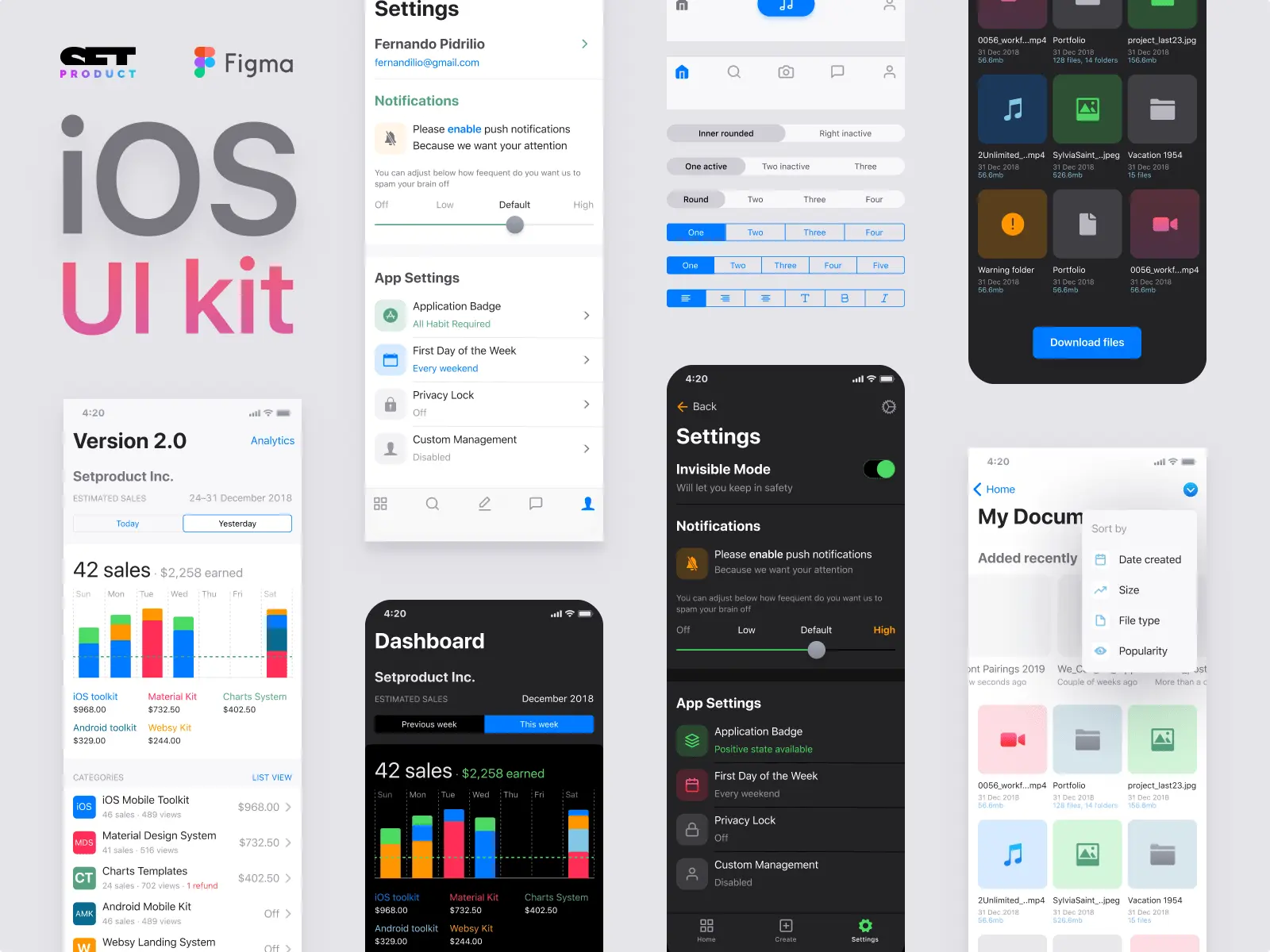
The full guide on choosing the proper iOS design kit

<span class="blog_big-paragraph">Creating a high-quality mobile user interface (UI) can be a time-consuming and costly process, especially when it comes to designing for iOS.</span>

With Apple's Human Interface Guidelines (HIG) constantly evolving, it can be challenging for designers to keep up with the changes and create a consistent user experience. One solution to this problem is to use a commercial UI kit in Figma.

In this article, we'll explore the advantages of using a commercial iOS UI kit in Figma and how it can streamline the design process, guarantee quality, and ensure compliance with industry standards.

{{spacer-24}}

TL/DR

  • Designing an iOS application can be complex, particularly without previous experience.
  • A solution to this problem is using a commercial UI kit in Figma that contains native iOS components, templates, styles and specifications that follow Apple's Human Interface Guidelines (HIG).
  • The use of a UI kit in Figma saves time, effort, improves consistency, and increases efficiency.
  • It allows designers to focus on unique features while creating a polished and professional design.
  • Using a Full iOS UI kit ensures greater accessibility and usability for all users.
  • It offers greater versatility, allowing for customization of components and templates based on specific requirements.
  • It is a cost-effective solution, as the subscription cost of the kit is much lower than the costs associated with designing custom UI components from scratch, or hiring a designer for that position.

{{spacer-24}}

Tips for selecting the UI / UX agency for application design and development
Designed with Full iOS kit in Figma

Problem definition

Designers working on iOS applications often face the issue of having to create all the UI elements themselves, which can prove to be both time-consuming and challenging, especially for those who are not well-versed with Apple's Human Interface Guidelines (HIG). Deviations from the guidelines can lead to inconsistencies in design, further impacting the overall quality of the app.

Pros

  • Experienced designers can mix and recreate customizable UI elements that align with HIG's principles.
  • Designing custom UI elements offers a chance for designers to experiment with new patterns and themes.

Cons

  • Some of designers may struggle with creating UI elements that adhere to Apple's HIG, making the process challenging.
  • Non-compliance with HIG guidelines can result in app design inconsistencies, which can affect the visual appeal & functionality.

{{spacer-64}}

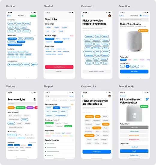
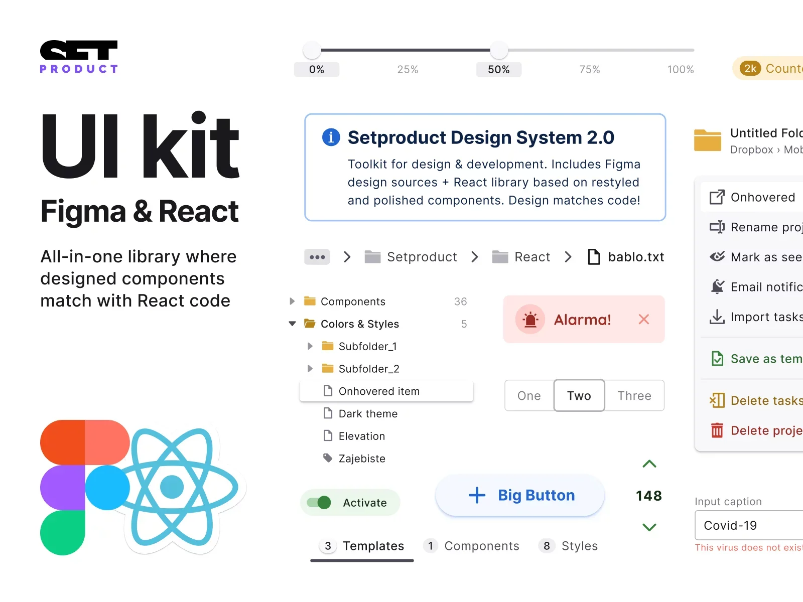
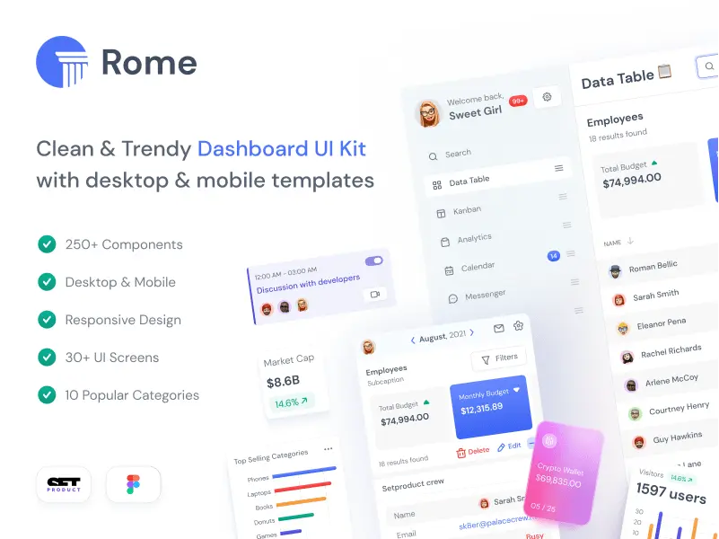
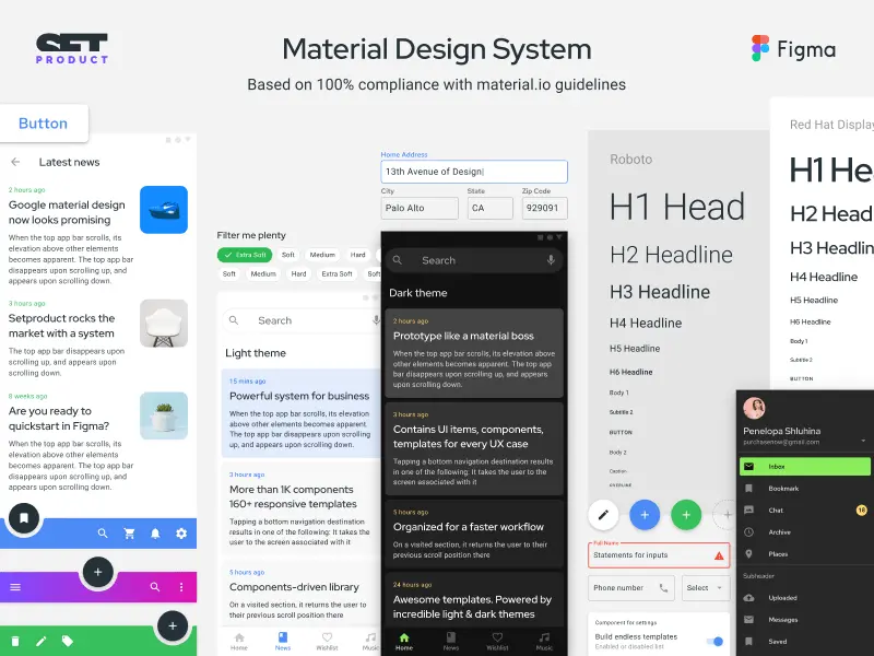
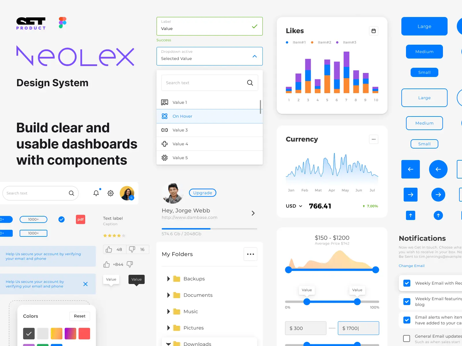
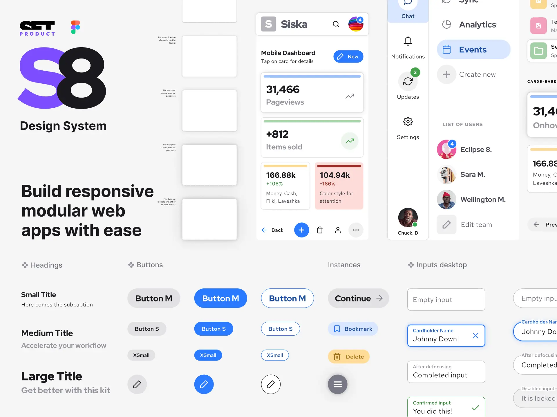
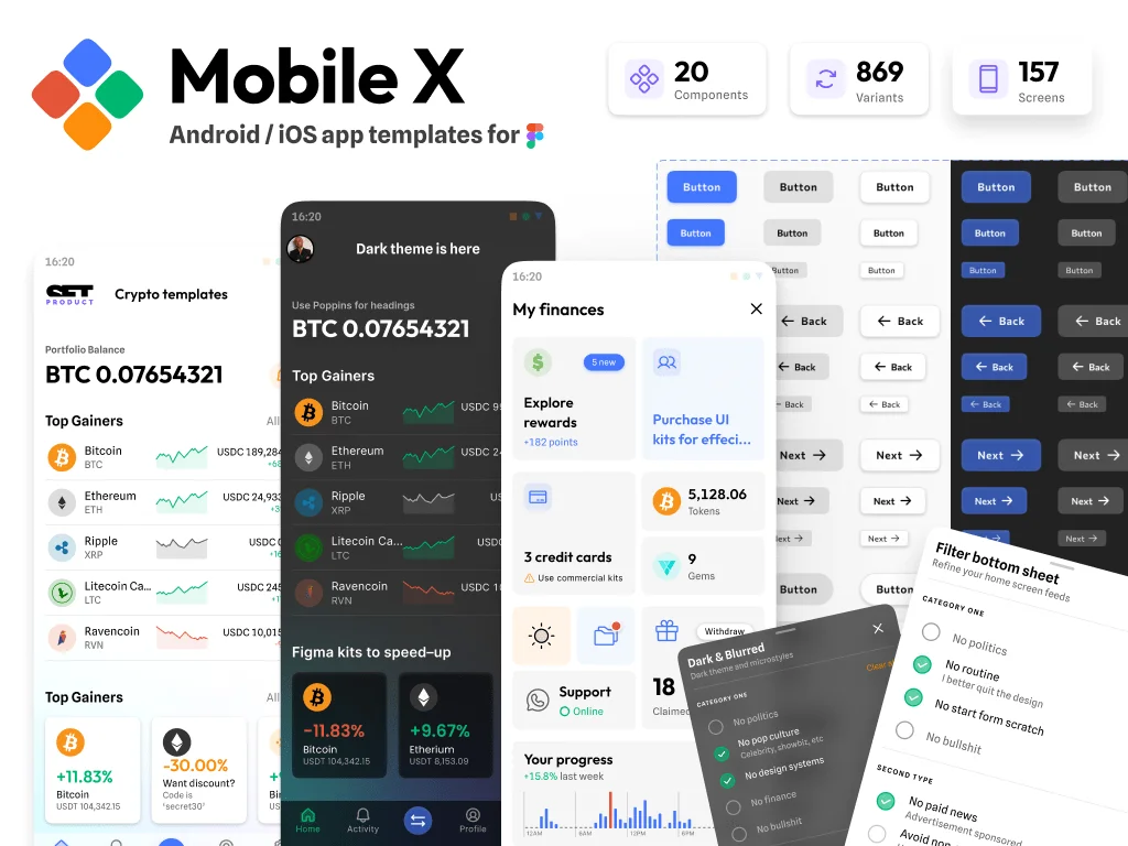
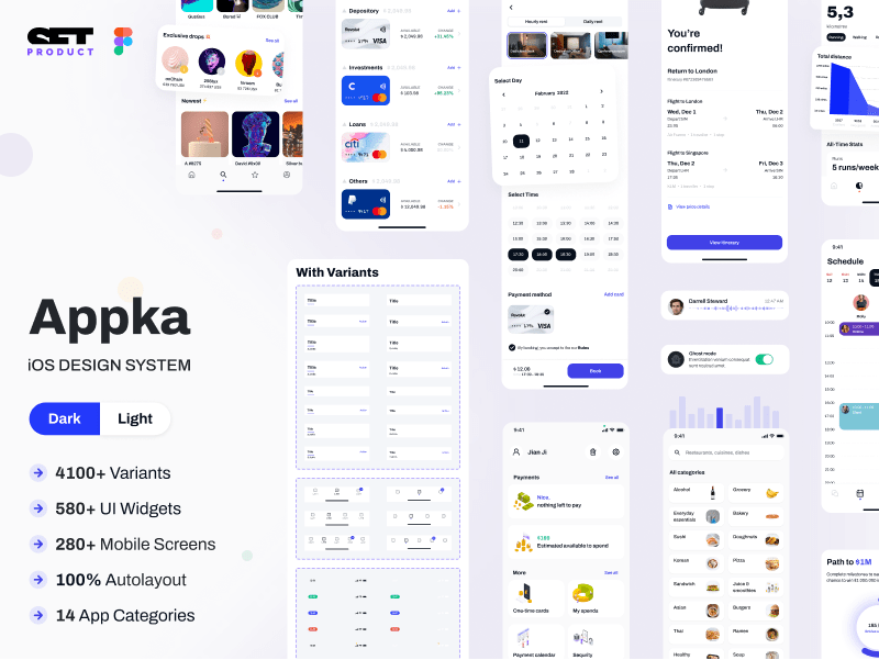
What is a commercial UI kit?

A commercial UI kit is a set of pre-designed user interface (UI) components, templates, styles, and specifications that are created and maintained by a third-party for use in design software, such as Figma. These kits are typically created to help designers create consistent, high-quality designs quickly and efficiently, without having to start from scratch every time.

{{spacer-24}}

Why use such a UI kit in Figma for iOS design?

Tips for selecting the UI / UX agency for application design and development

Designing for iOS can be a complex process, especially when it comes to creating a consistent UI that follows Apple's Human Interface Design (HID) guidelines. A commercial UI kit designed specifically for iOS can help streamline this process by providing native UI components and pre-designed templates that adhere to Apple's design standards. This can save designers a great deal of time, while also ensuring that their designs are user-friendly and consistent across different devices and iOS versions.

In addition to this, commercial UI kits often provide a range of customization options, allowing designers to personalize their designs while still maintaining consistency with the overall iOS design language.

Overall, using a commercial UI kit can help designers create better, more efficient designs that are consistent and user-friendly, while also saving time and reducing costs.

{{spacer-64}}

Advantages of the UI kit

  1. Saves time: Using a commercial UI kit in Figma can save a great deal of time as it provides pre-built components, templates, and styles. This avoids the need to create custom templates and styles from scratch, which could be time-consuming.

  2. Consistency: The iOS components in a commercial UI kit follow the Apple HID guidelines, ensuring consistency across the application. This is important as it helps users understand how to interact with the application and reduces the learning curve.

  3. User-friendly: Using a UI kit that follows the Apple HID guidelines ensures that the application is user-friendly and intuitive to use. This will enhance the user experience and make the application more enjoyable to use.

  4. High-quality design: The design of a commercial UI kit is generally of high quality, delivers a full spectre of UX patterns, ensuring that the application will look professional and polished.

  5. Scalability: A commercial UI kit in Figma can be easily scaled to fit different screen sizes, ensuring that the application can be used on various iOS devices without compromising the user experience.

  6. Reduced costs: Using a commercial UI kit can reduce costs and increase efficiency as it eliminates the need for custom UI design and development, which can be expensive and time-consuming.

{{spacer-16}}

{{spacer-64}}

How to choose right UI kit?

(A) Consider the needs of your project

When it comes to choosing the right commercial UI kit for your iOS design project, it's important to consider your specific needs. Take into account the complexity of the project, the audience flow, and any special design requirements. For instance, if you're working on a healthcare app, you might want to choose a UI kit that has specific medical related components.

{{spacer-24}}

(B) Read reviews and compare cost

Before purchasing a commercial UI kit, it's important to do some research. Read reviews from other designers to get a sense of the kit's quality, ease of use, and level of customer support. Additionally, compare prices and ensure that the kit fits within your budget. Some kits might include additional features, templates, or extras that could be worth considering despite a higher cost.

{{spacer-24}}

(C) Verify if a kit meets Apple's HID guidelines

To ensure that the iOS design meets Apple's HID guidelines, it's important to choose a commercial UI kit that adheres to them. Review the documentation provided with the kit to verify that it complies with Apple's guidelines and has been updated to reflect the latest standards. Designers who skip this step can run into problems later, resulting in time and cost overruns to address issues that could have been avoided.

{{spacer-24}}

(D) Ensure the level of UI customization

Some UI kits come with a flexible design system that allows for easy customization, while others are more rigid and may require extensive coding to modify. If you have a team of designers with a high degree of skill, you might opt for a UI kit with fewer pre-built components that require customization. However, if time is of the essence in your project, it may be more efficient to work with a more rigid UI kit.

{{spacer-24}}

(E) Check the compatibility to be coded

Certain iOS UI kits are designed to work seamlessly with specific frameworks or platforms, and using them with incompatible ones can cause issues during development. You should verify whether the selected UI kit has a version that supports your development framework or platform before making a purchase.

<span class="blog_big-paragraph">By following these guidelines, designers can narrow down their options and choose the right commercial UI kit that will save them time, aid in design consistency, and result in a polished final product that meets the standards of iOS design.</span>

{{spacer-64}}

{{stars-conclusion}}

{{spacer-64}}

Let's summarise

By leveraging a professional UI kit's pre-built components, designers can streamline the design process, ensure consistency throughout the project, and deliver visually appealing and user-friendly apps.

However, it is essential to carefully consider which UI kit to choose for your project. It is crucial to assess the kit's suitability for your needs, as well as its flexibility and scalability, to achieve optimal results.

I would highly recommend designers to consider using commercial UI kits in Figma for their iOS app design projects. The advantages of using pre-built components cannot be overstated, and they can significantly enhance the quality and efficiency of the design process.

Share this post

Subscribe to Setproduct

Once per week we send a newsletter with new releases, freebies and blog publications
Oops! Something went wrong while submitting the form.

By clicking Sign Up you're confirming that you agree with our Terms and Conditions.

Congratulations!

You're in! Expect awesome updates in your inbox

Related posts

Lorem ipsum dolor sit amet, consectetur adipiscing elit.
No items found.

Figma Templates & UI kits

Save time and human resources by reusing hundreds of pre-made templates crafted by us. Based on top notch UX taken from the World's best apps.

Material X for Figma

Figma library with 1100+ components & 40 app templates beyond Material Design. Powered by top-notch shapes and Manrope font. Customizable & Adjustable UI kit now available for Angular & Figma

Material You UI kit

Figma & React library with 2600+ variants of 32 components compatible with Material Design 3. Plus 220+ dashboard templates for all the viewports. Now available for NextJS & TailwindCSS.

Figma React UI kit

Designed and well-organized in Figma React-based UI toolkit for the web. Optimized for building complex data-dense interfaces for desktop and mobile applications.

Panda Design System

Figma library with dashboard, calendar, kanban, profile, table, ecommerce and 80+ templates in total. Components with variants, dark theme included.

Eclipse UI kit

Figma library with 1100+ components & 74 templates for data-driven web applications. Powered by auto-layout. Supercharged by Figma's variants.

Rome UI kit for Figma

Customizable and well-organized team library. Contains 250+ components & 30 web app templates powered by stylish and trendy guidelines.

Material Design System

Figma library is based on 100% guidelines compliance with Material.io. Contains ready‑to-use templates to accelerate app UI design.

Neolex Dashboard UI kit

Customizable & adjustable dashboard design system with 50+ ready-to-use app layouts, 1900+ variants for 30 components with auto-layout.

Material Desktop Dashboard UI kit

Figma library with 48+ dashboard templates based on reusable desktop app patterns carefully handpicked from the most popular web apps.

Xela UI kit for Figma

Figma library with 1900+ variants of 30 components categories to craft perfectly shaped desktop & mobile apps. Customizable & Adjustable dashboard design system with 50+ web app templates.

Figma S8 Design System

Figma design library for mobile and desktop apps made of high quality styled components. Full version includes 67 dashboard templates.

OE Figma Design System

Customizable and well-organized Figma library. This design system aimed to build highly loaded interfaces, boost the speed and save more costs.

Figma iOS kit

Figma library of iOS patterns served as ready-made templates. This UI kit inspired by World's best apps. Based on Human Interface guidelines.

Figma S8 Design System

Figma design library for mobile and desktop apps made of high quality styled components. Full version includes 67 dashboard templates.

Most iOS UI kit for Figma

iOS native components and app templates organized into a «Most Design System» fully compatible with Apple's Human Interface guidelines.

Rome UI kit for Figma

Customizable and well-organized team library. Contains 250+ components & 30 web app templates powered by stylish and trendy guidelines.

Material Design System

Figma library is based on 100% guidelines compliance with Material.io. Contains ready‑to-use templates to accelerate app UI design.

Nucleus UI

Nucleus UI contains 1000 components and variants with 500+ mobile screens designed for Figma (including 9 themes from Event, E-commerce, Finance, NFT, etc.).

Figma Android UI kit

Components-driven Android mobile UI library for Figma. Consists of 140 high quality application templates made of total 250+ UI components.

Mobile X UI kit

Customizable & adjustable iOS / Android design system loaded with ready-made 157 app templates based on 860+ variants for 20 components.

Appka iOS UI kit

Customizable & adjustable iOS design system with 4100+ variants for 28 components and 280+ ready-to-use app layouts crafted for Figma.

Full iOS UI kit

Customizable iOS design system with 320 ready-to-use app layouts. You can modify them or use as it is to save time and never design from scratch again.

Xela for Flutter

XelaUI for Flutter is a simple, modular and accessible component library that gives you the building Flutter apps for mobile and desktop.

Xela for Android

Ready-made collection of fully customizable widgets, UI screens and reusable components for Android coded with Jetpack Compose.

Xela for Swift

Designed for iOS Developers. We provide fully coded customizable components, widgets and well-organized iOS screens for Figma & SwiftUI.

Material You UI kit

Figma & React library with 2600+ variants of 32 components compatible with Material Design 3. Plus 220+ dashboard templates for all the viewports. Now available for NextJS & TailwindCSS.

Figma Charts UI kit

Components-driven graphs design kit for dashboards, presentations, infographics & data visualisation. Includes 25+ charts types for all the viewports.

Hyper Charts

Create impressive visuals with Figma's graphs templates – dozens of scalable and customizable data visualization blocks for dark and light modes.

Orion UI kit

Figma library with 40+ full-width charts templates served in light & dark themes. Contains 200+ of dataviz widgets that look perfect on desktop & mobile screens.

Xela for React

React based components library for beautiful user interface in React apps. Lightweight library for your projects. Contains pre-made web app templates.

Figma React UI kit

Designed and well-organized in Figma React-based UI toolkit for the web. Optimized for building complex data-dense interfaces for desktop and mobile applications.

Material X for Figma

Figma library with 1100+ components & 40 app templates beyond Material Design. Powered by top-notch shapes and Manrope font. Customizable & Adjustable UI kit now available for Angular & Figma

Xela for Flutter

XelaUI for Flutter is a simple, modular and accessible component library that gives you the building Flutter apps for mobile and desktop.

Xela for Android

Ready-made collection of fully customizable widgets, UI screens and reusable components for Android coded with Jetpack Compose.

Xela for Swift

Designed for iOS Developers. We provide fully coded customizable components, widgets and well-organized iOS screens for Figma & SwiftUI.

Material You UI kit

Figma & React library with 2600+ variants of 32 components compatible with Material Design 3. Plus 220+ dashboard templates for all the viewports. Now available for NextJS & TailwindCSS.

Xela for React

React based components library for beautiful user interface in React apps. Lightweight library for your projects. Contains pre-made web app templates.

Levitate 3D kit for Figma

Components-driven 3D kit to design eye-catching Figma presentations. Helps to enhance your landing page, product or app, brand ident, etc.

Website templates UI kit

Landing pages reusable templates kit based on most effective web design patterns. 140+ dark & light constrained design blocks.

Figma Landing Pages UI kit

Landing pages templates library based on constrained & organized components aimed to speed-up the production of effective websites.

Zeus UI kit

Create hassle-free landing pages in Figma. This kit is based on 10 landing page templates, powered by 1600+ variants for 630+ web blocks.

Research, copy and ideate with SetGPT!

We've launched the alternative ChatGPT clone dedicated to UI designers, UX researchers, writers and indiehackers.

Powered by the latest OpenAI gtp-3.5-turbo model, this free chatbot is the perfect tool for those in need of intelligent and innovative insights, wrapped with a slick UI and sophisticated user experience.

Start now

SetGPT is a free service; however, authentication is required

This is some text inside of a div block.