
Nucleus Plus - Figma UI kit and Design system
Nucleus UI contains 1000 components and variants with 500+ mobile screens designed for Figma.

1k+ Components with variants
With Text properties, Nested instances and other latest features

br/>
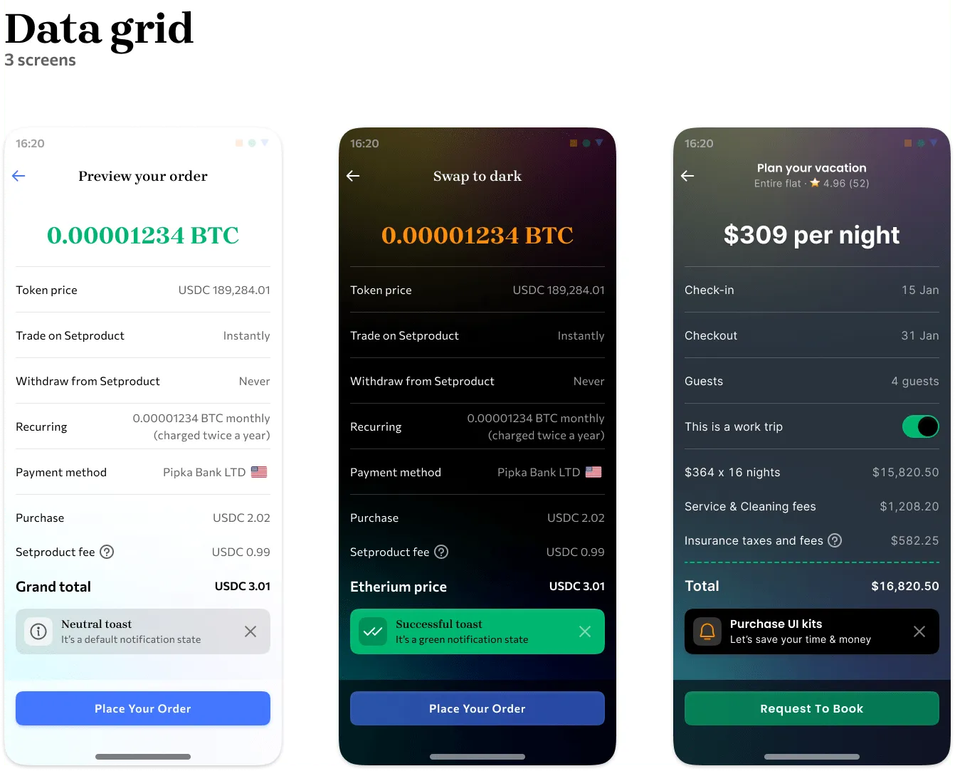
Light and dark templates via variables are now fully supported

Thoughtful UI kit architecture
Meticulously crafted components, designed with accessibility in mind
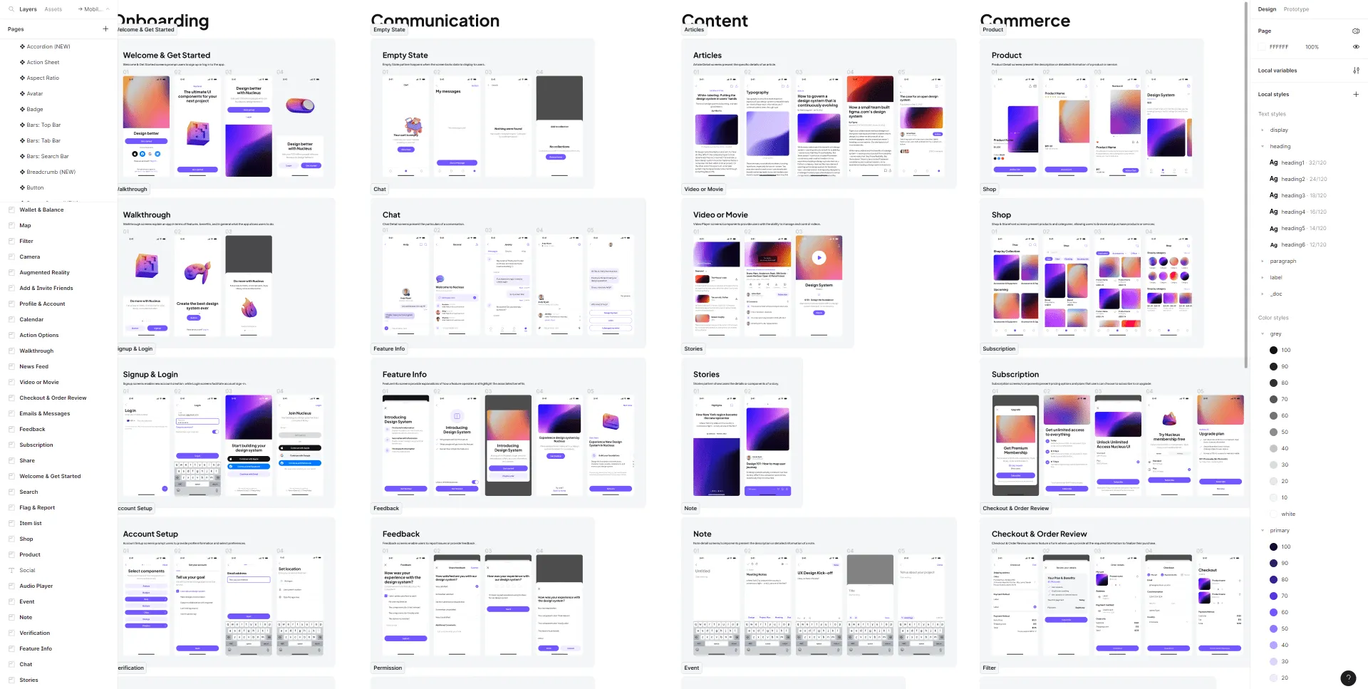
Preview mobile templates
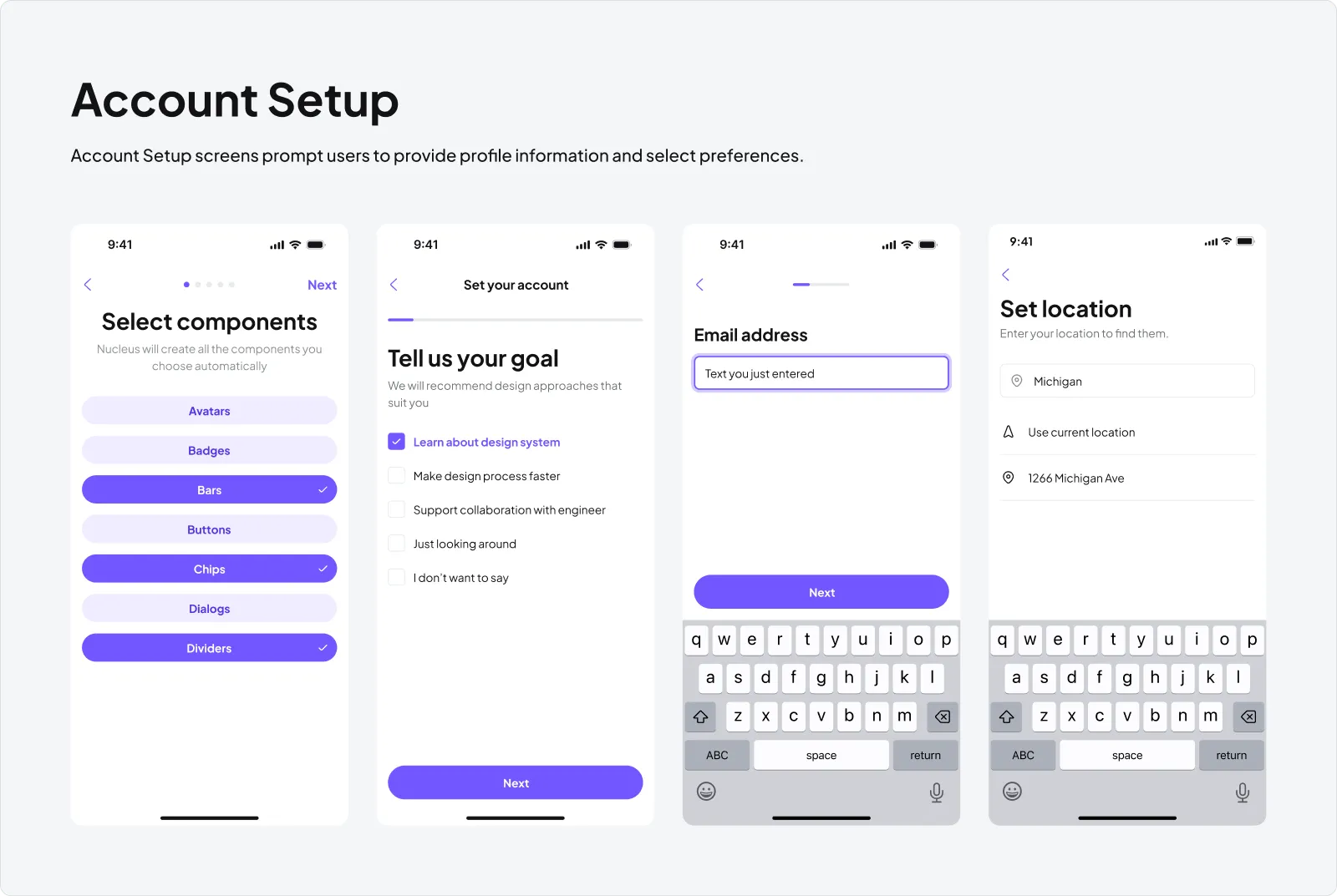
Account Setup
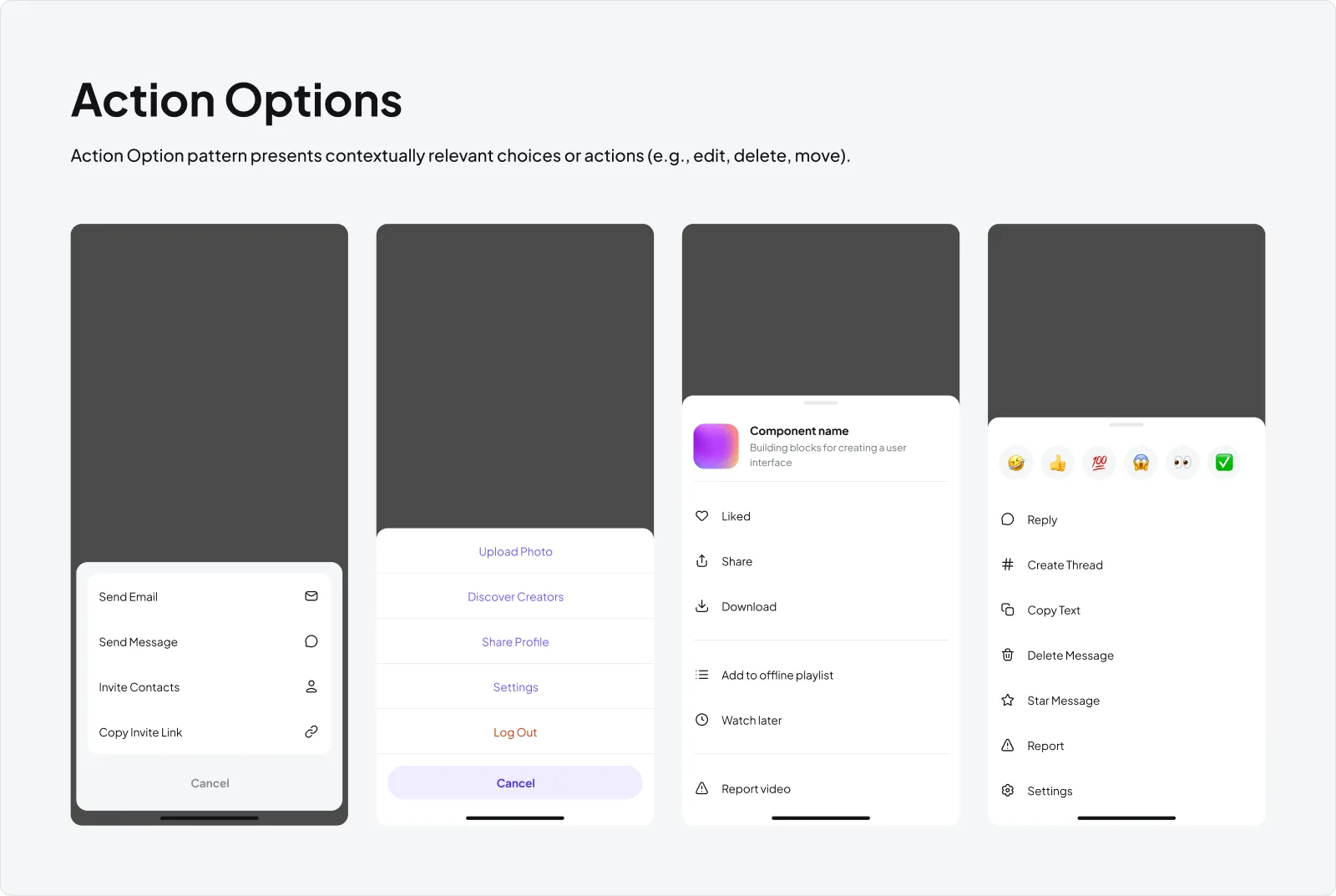
Action Options
Add & Invite Friends
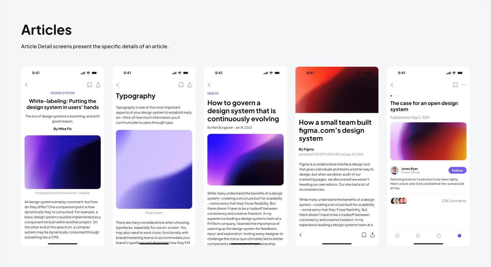
Articles
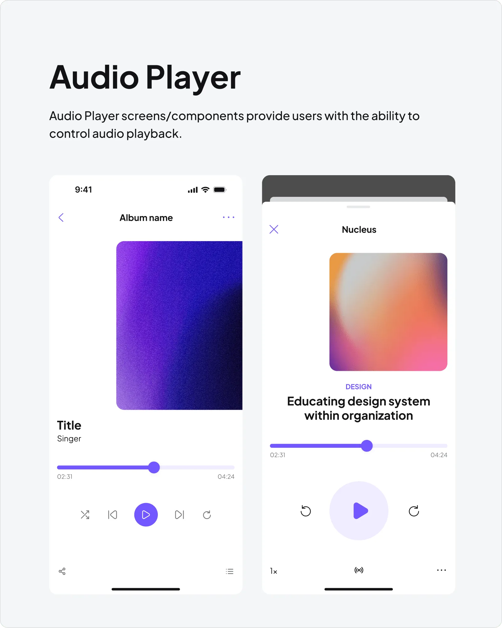
Audio Player
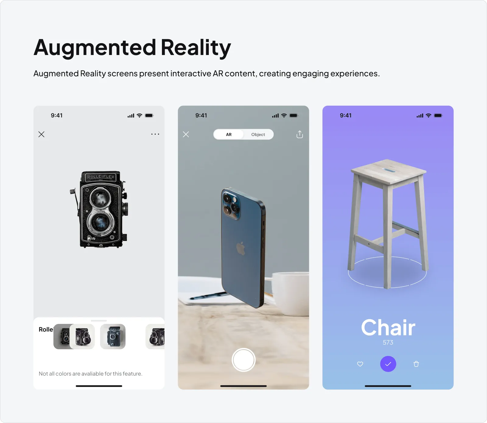
Augmented Reality
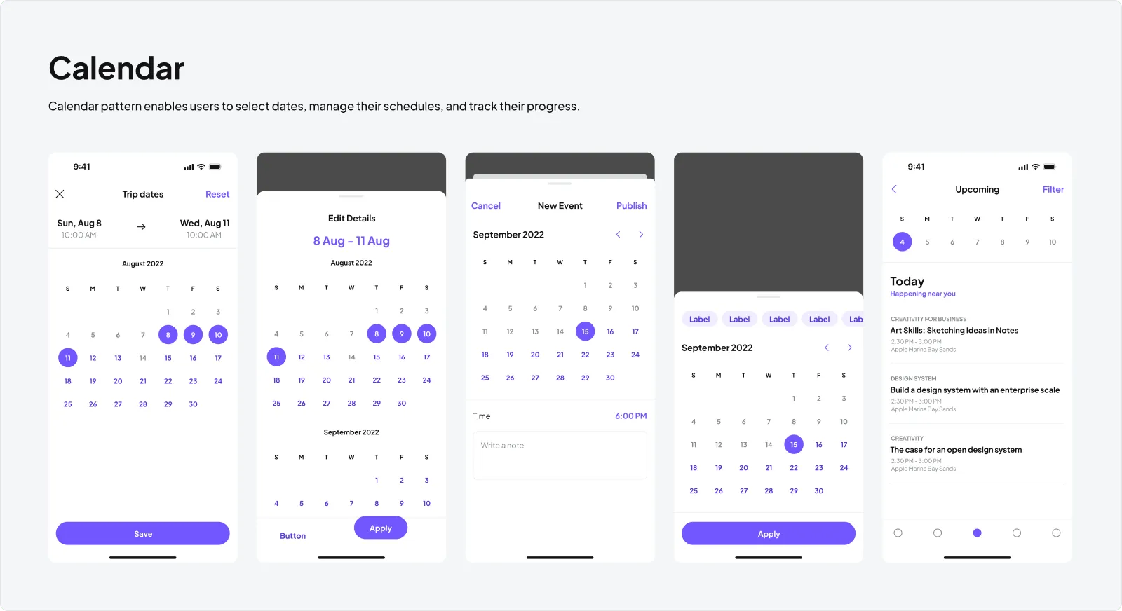
Calendar
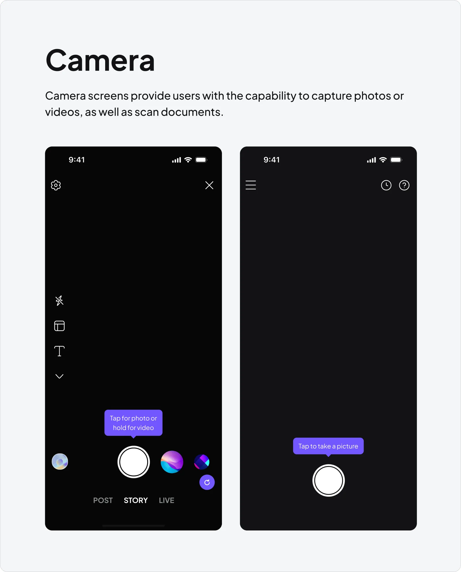
Camera
Timepickers
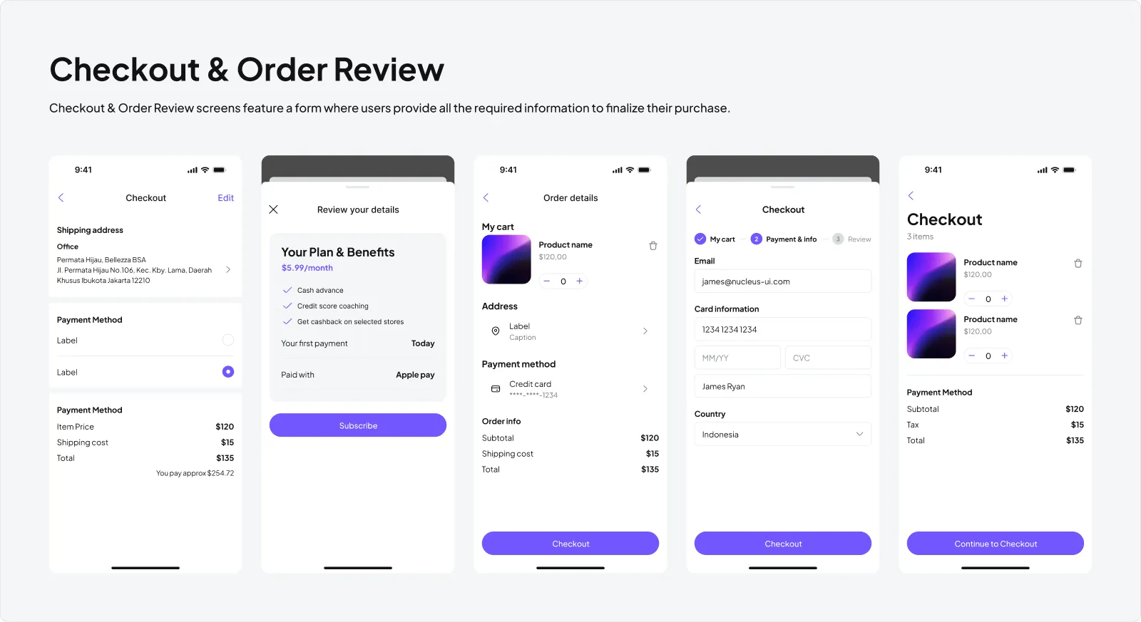
Checkout & Order Review
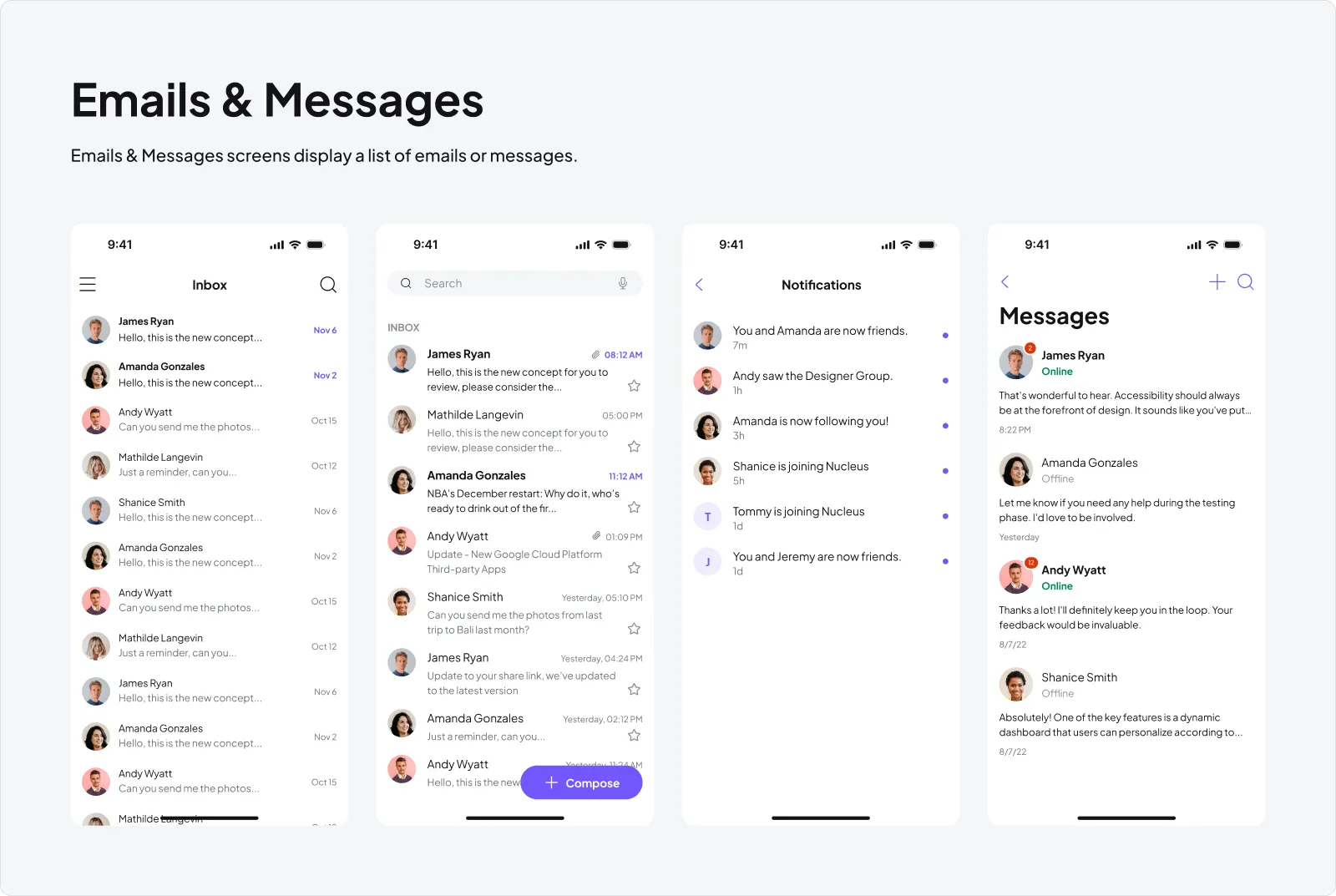
Emails & Messages
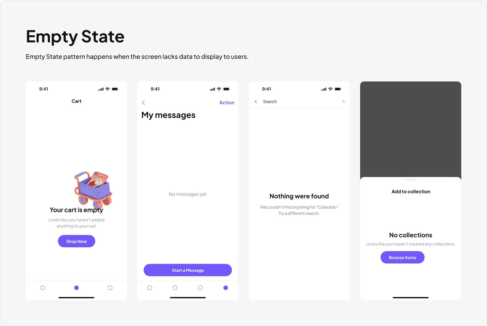
Empty State
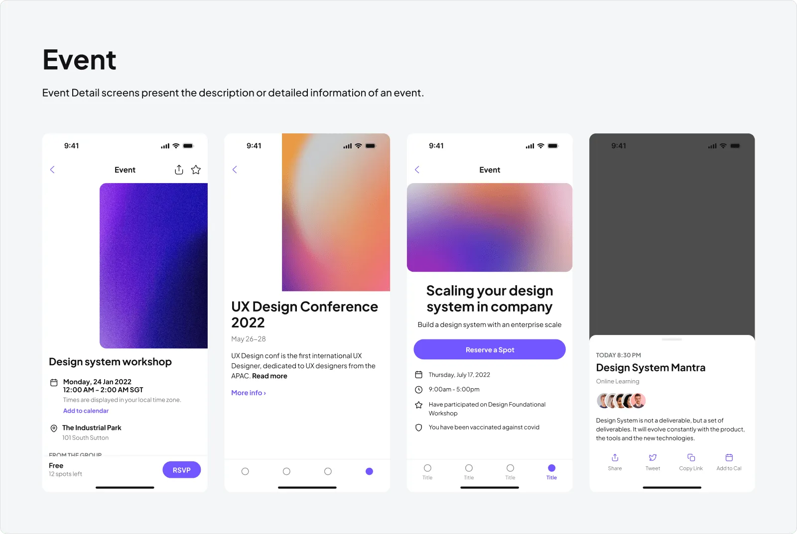
Event
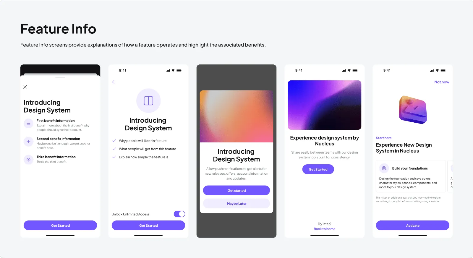
Feature Info
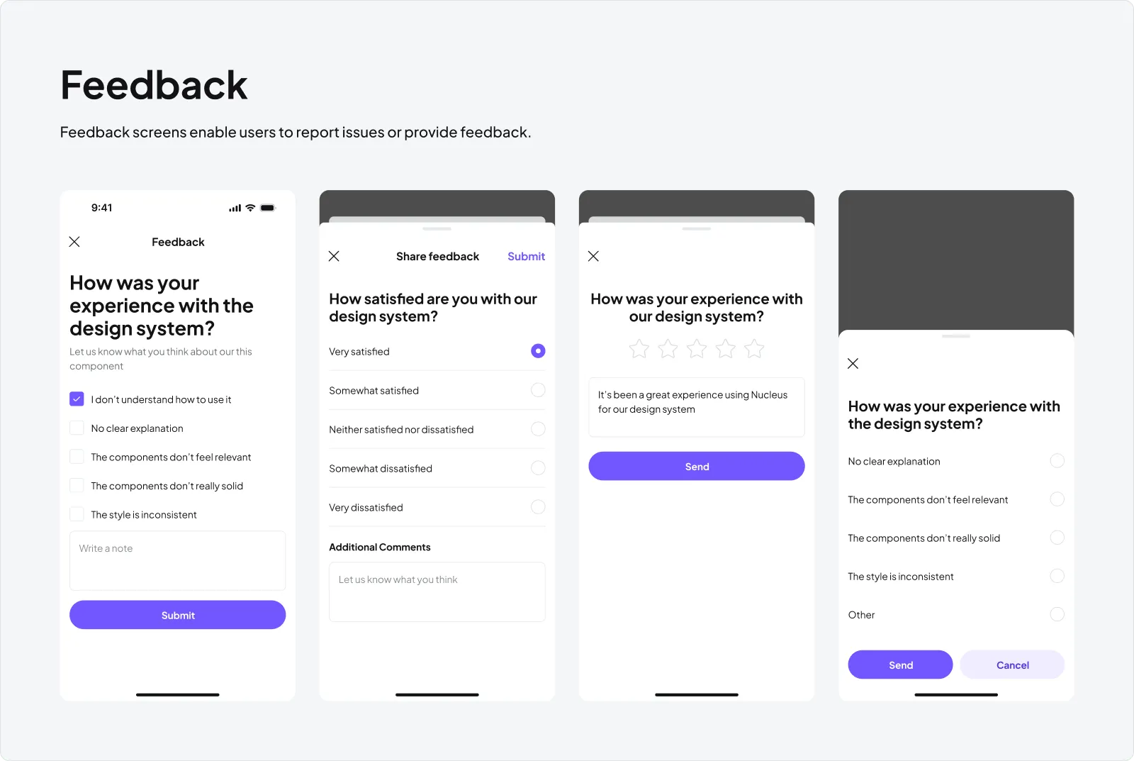
Feedback
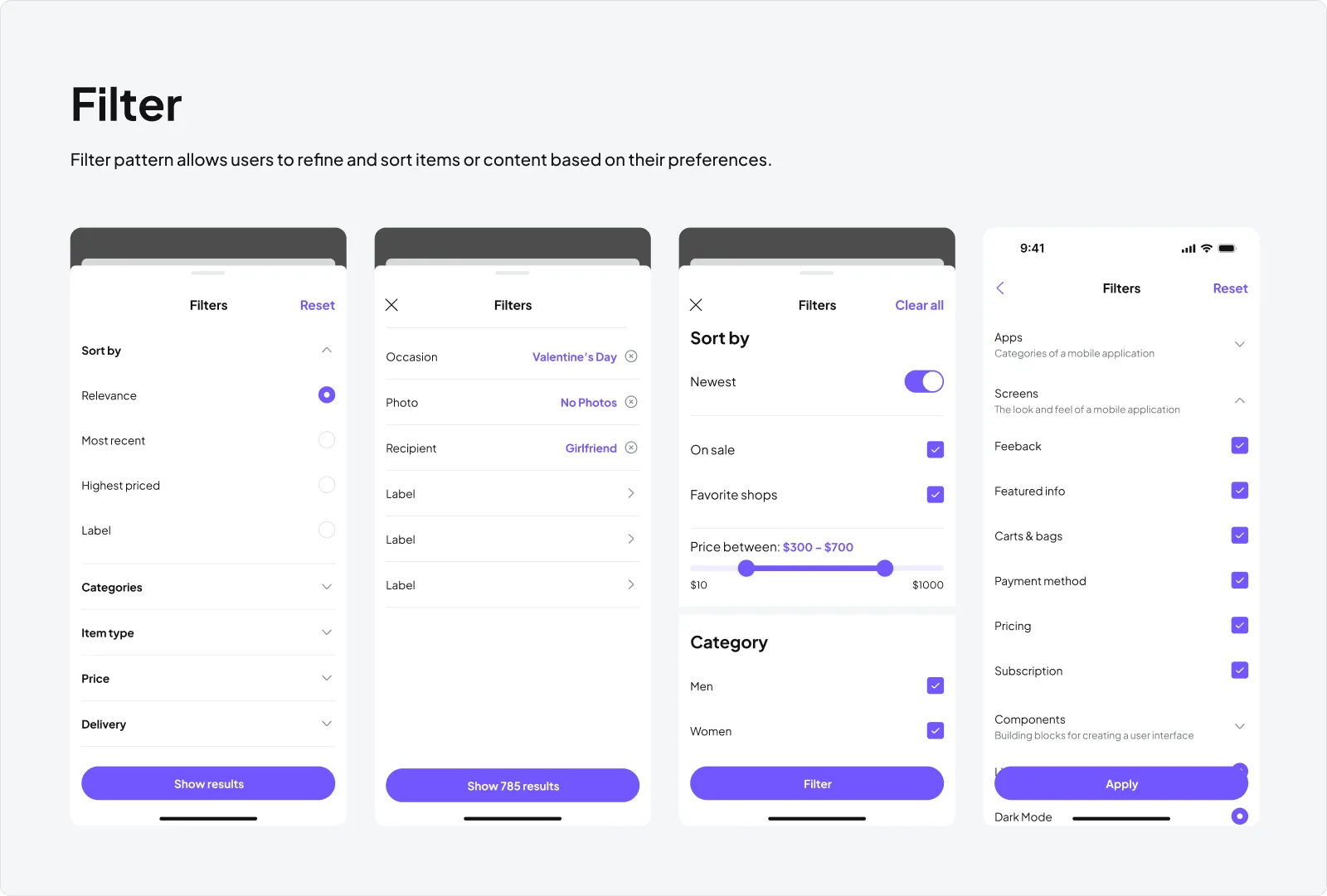
Filter
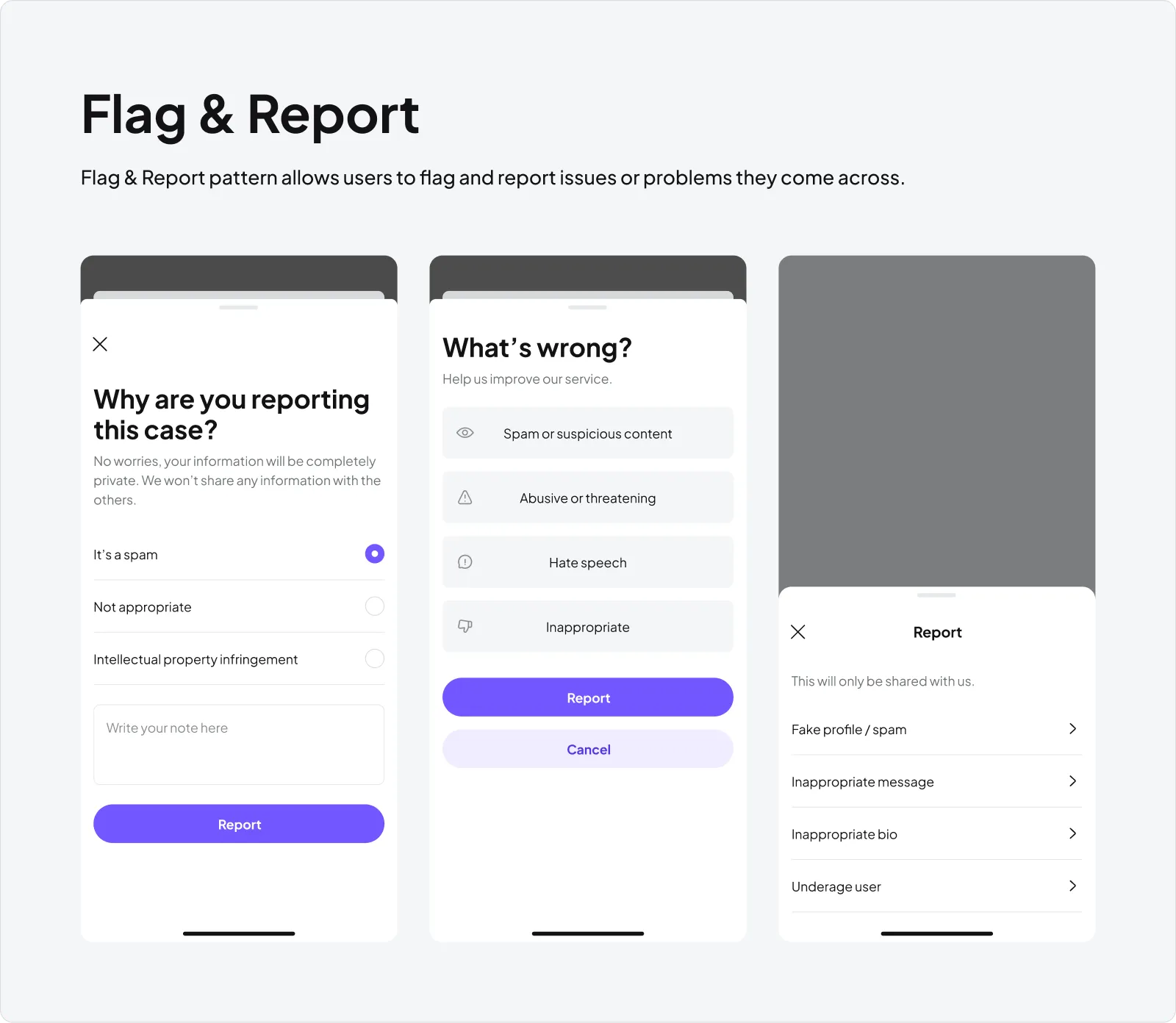
Flag & Report
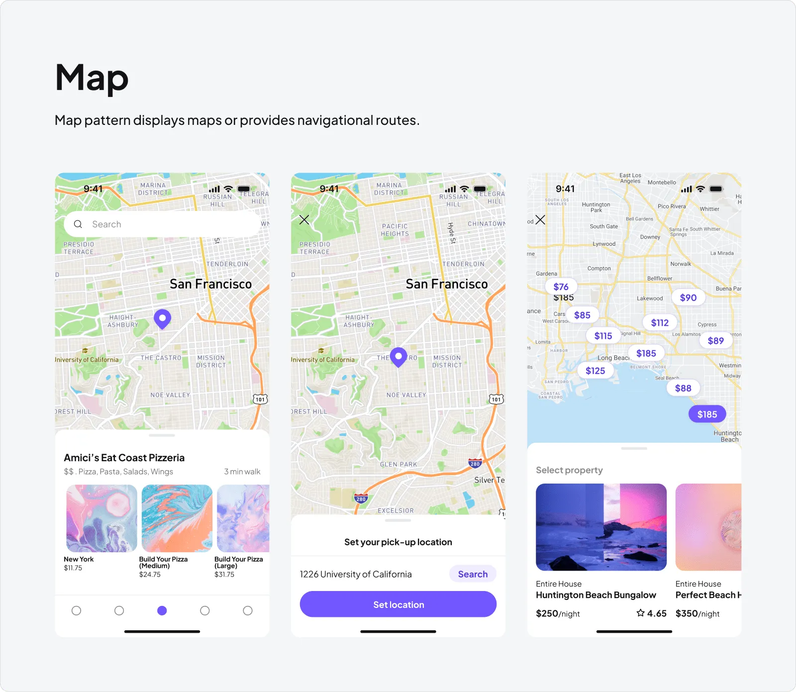
Map
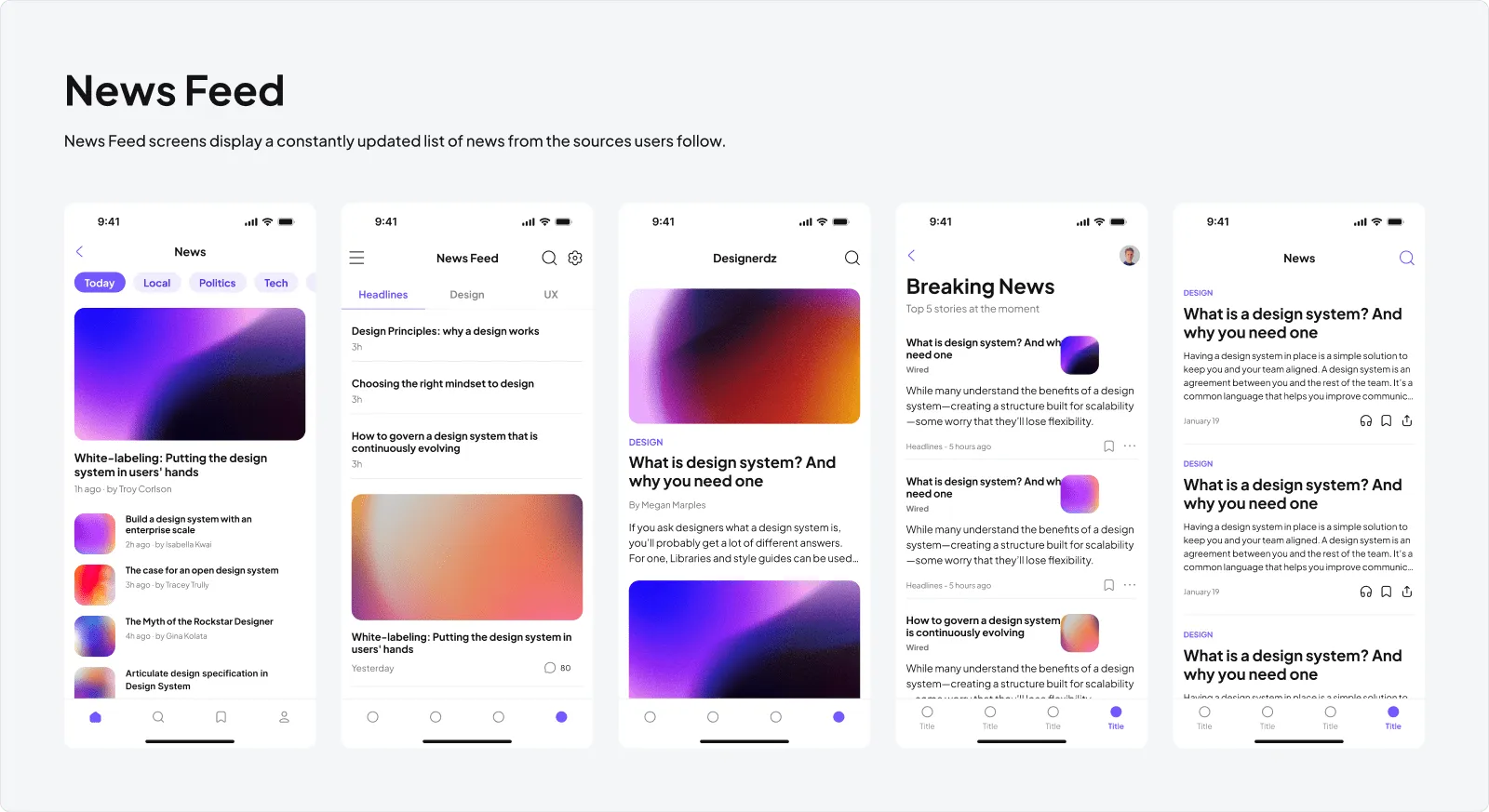
News Feed
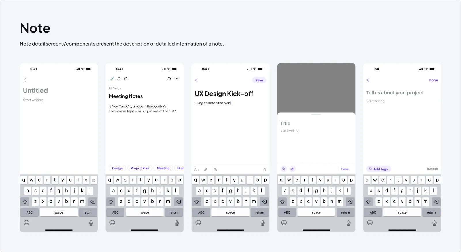
Note
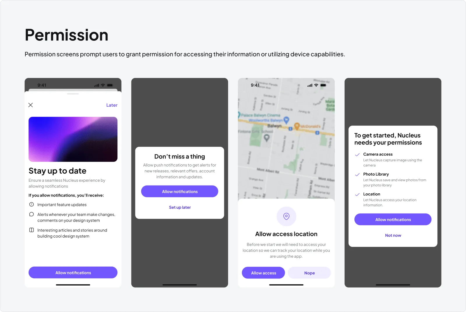
Permission
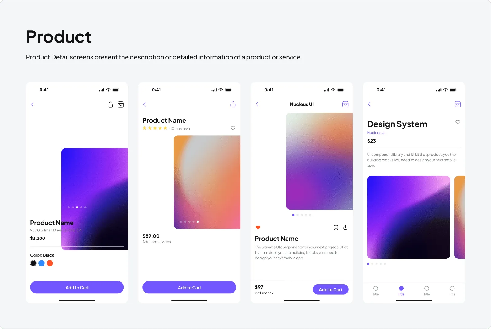
Product
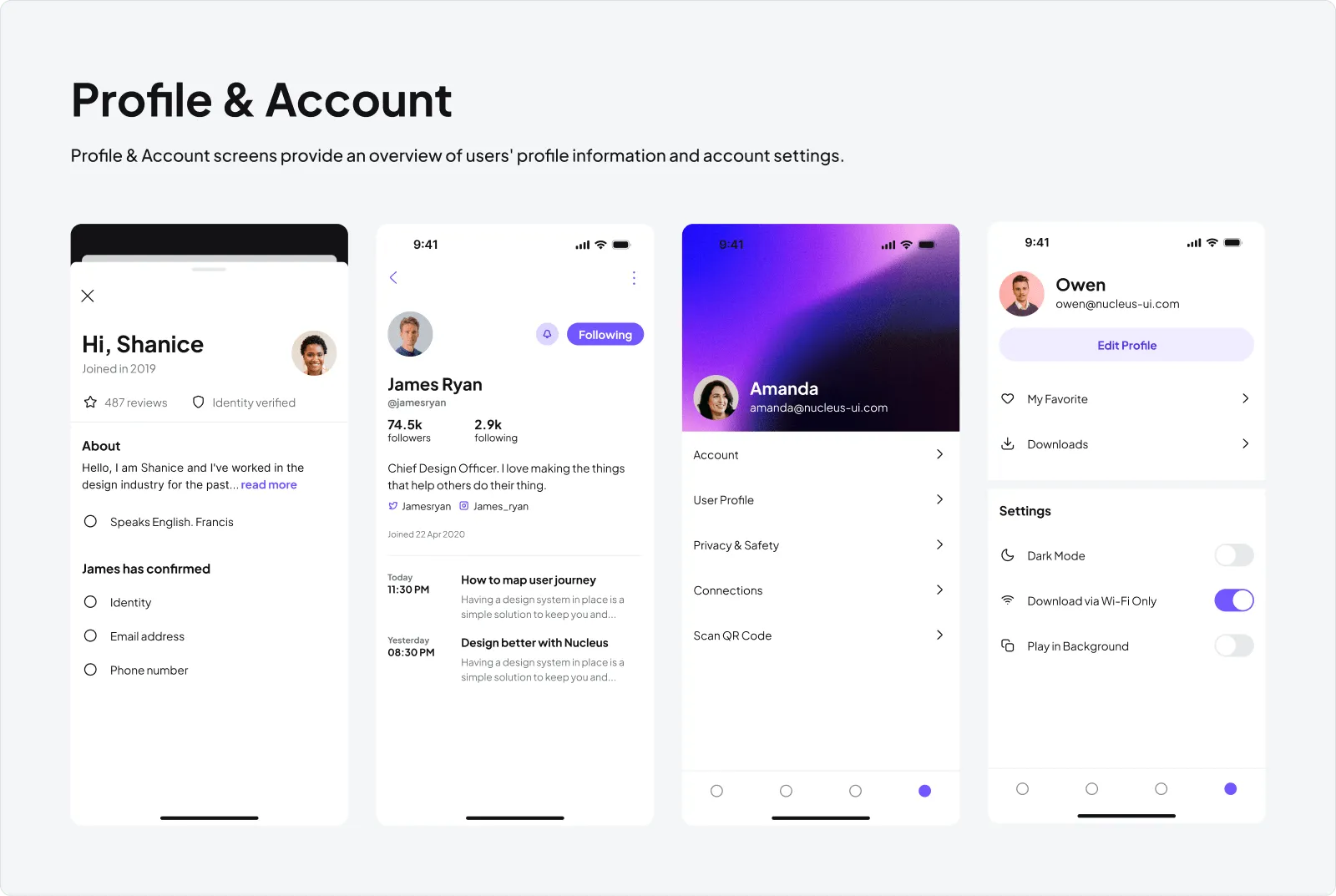
Profile & Account
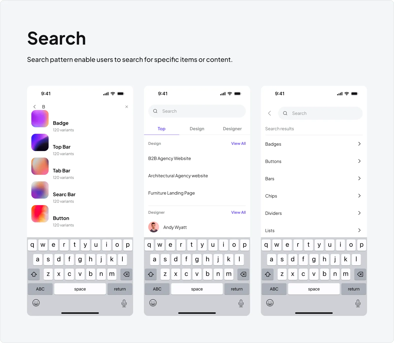
Search
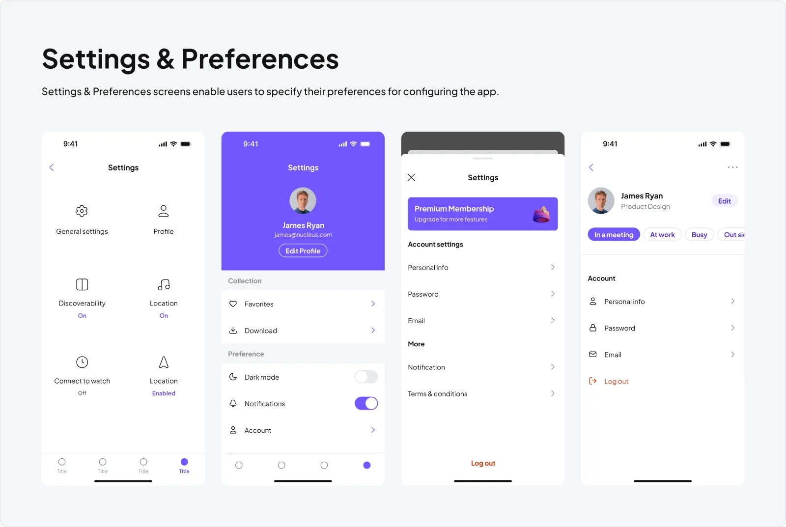
Settings & Preferences
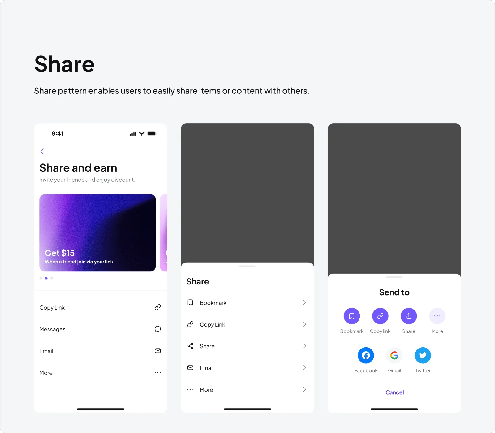
Share
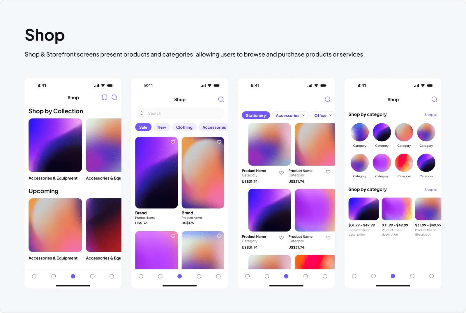
Shop
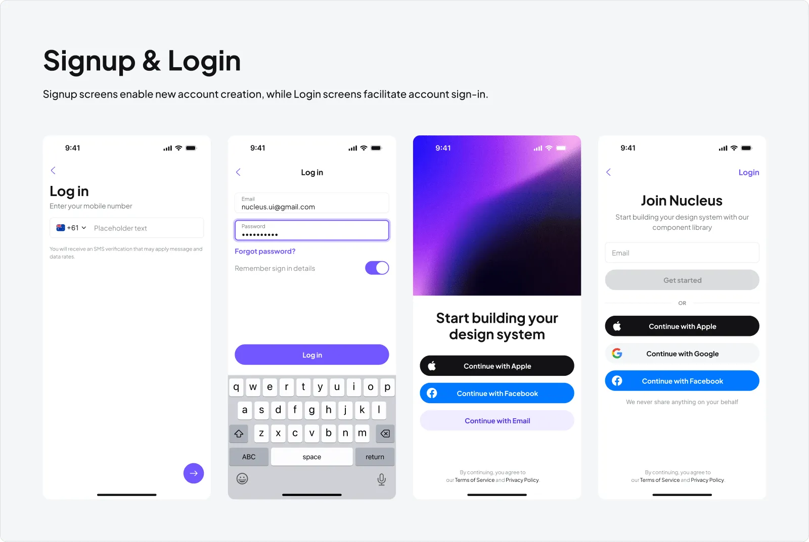
Signup & Login
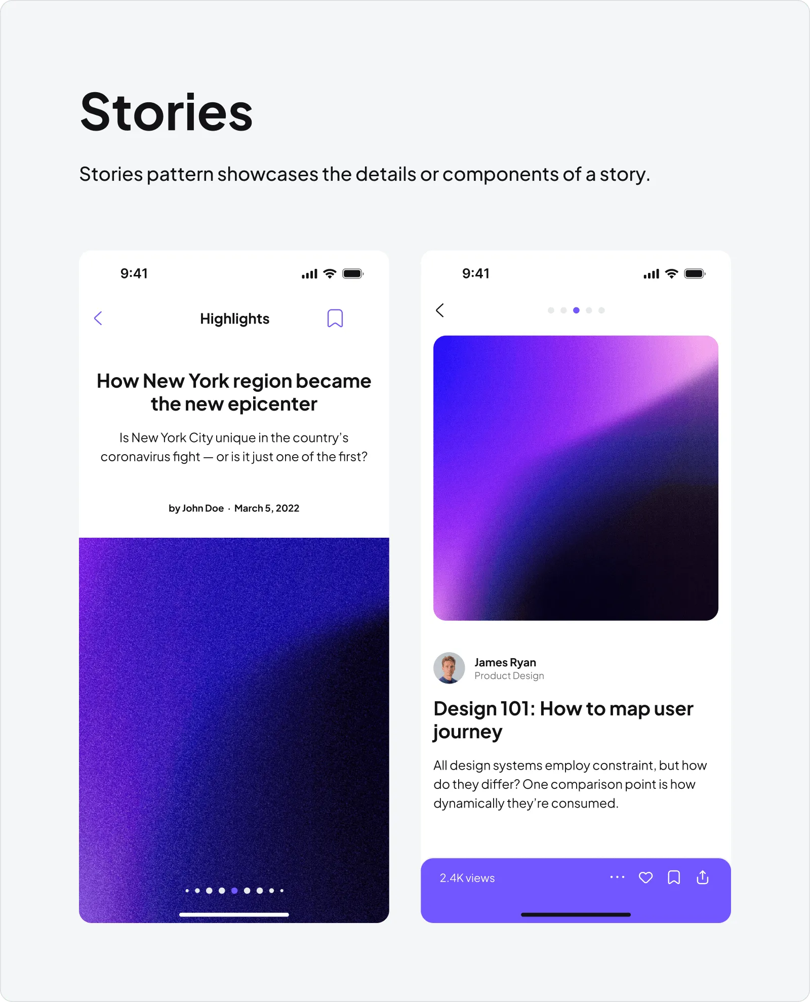
Stories
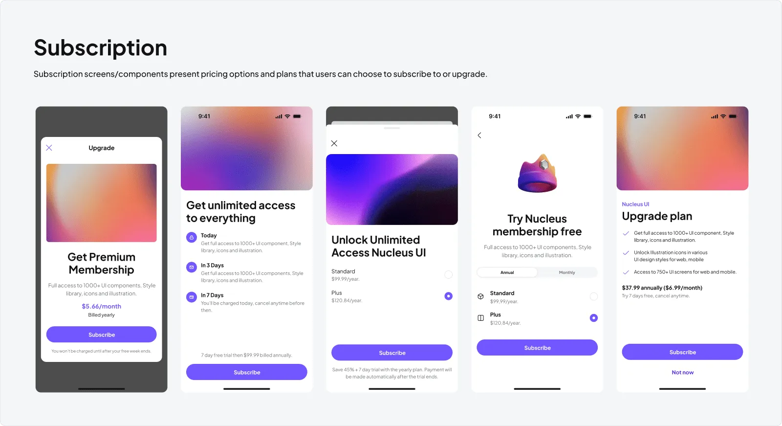
Subscription
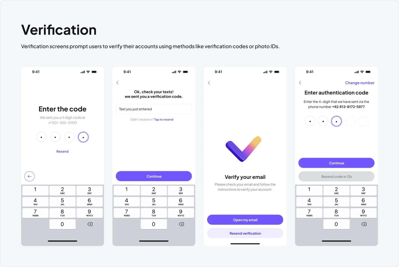
Verification
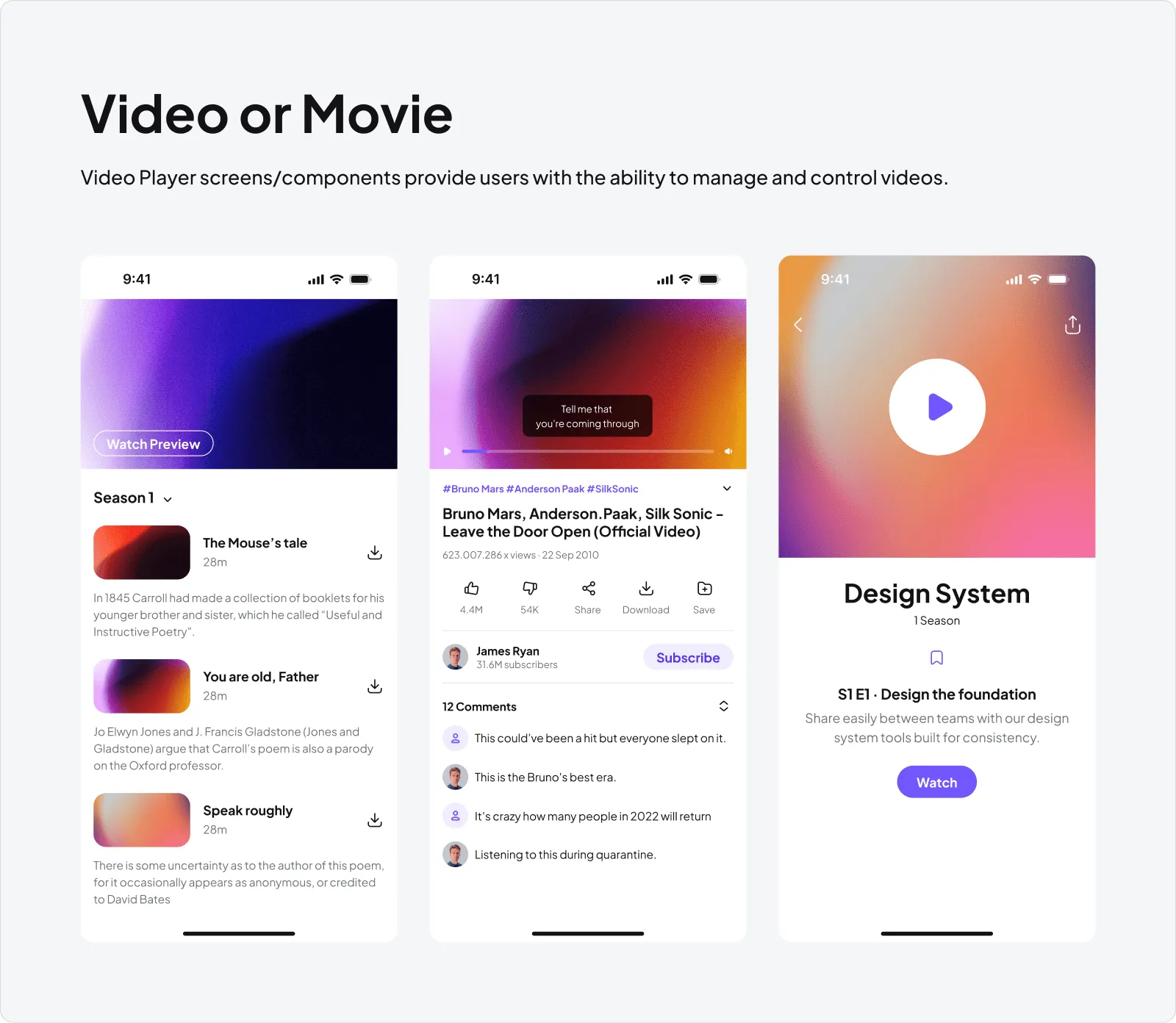
Video or Movie
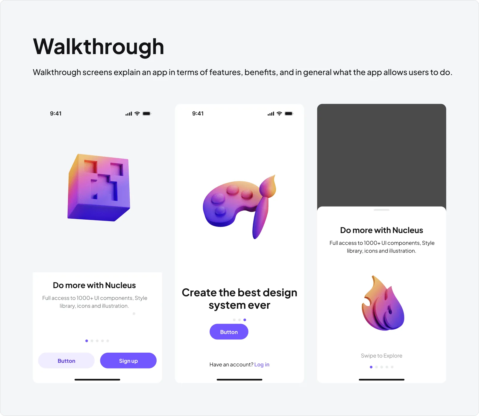
Walkthrough
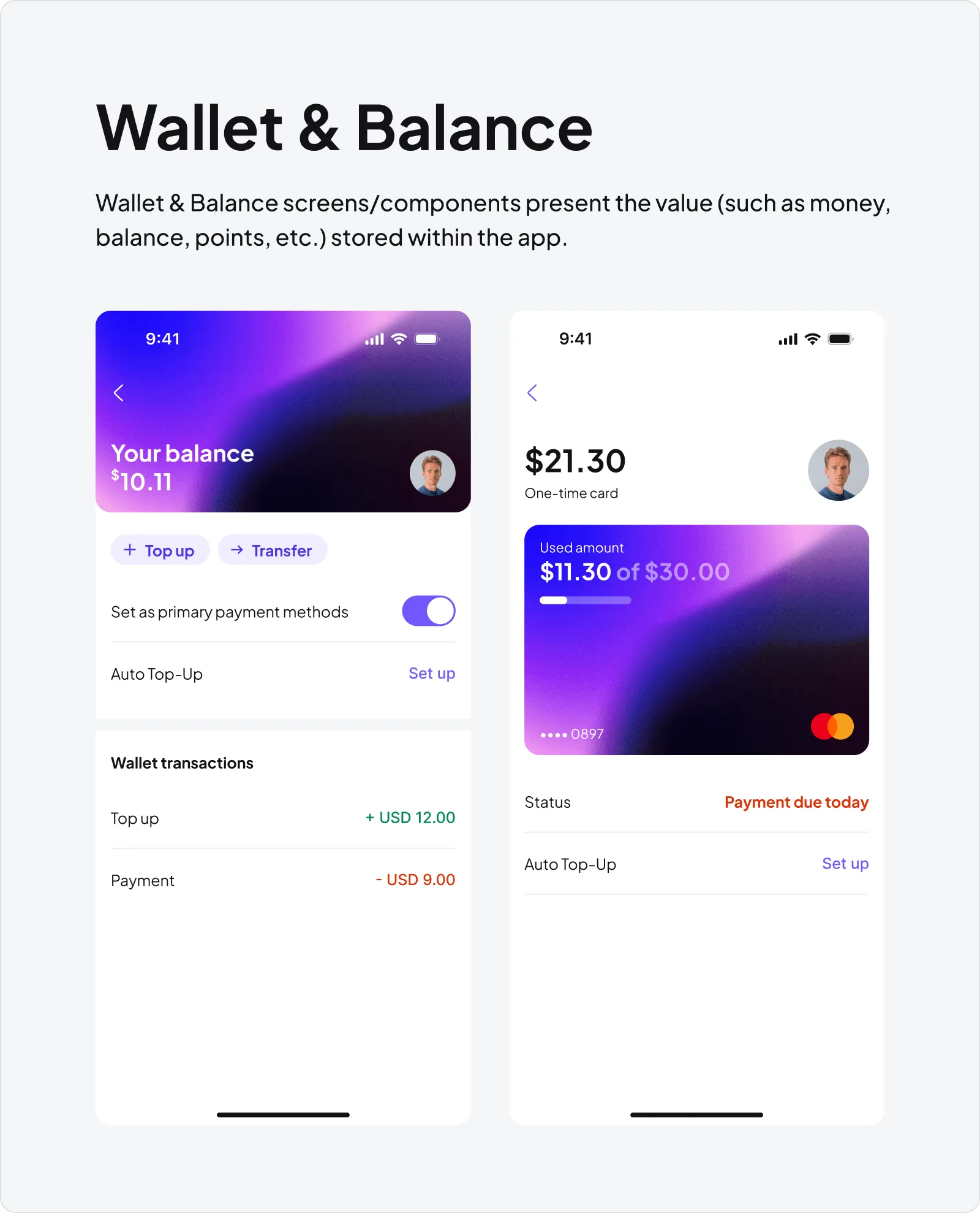
Wallet & Balance
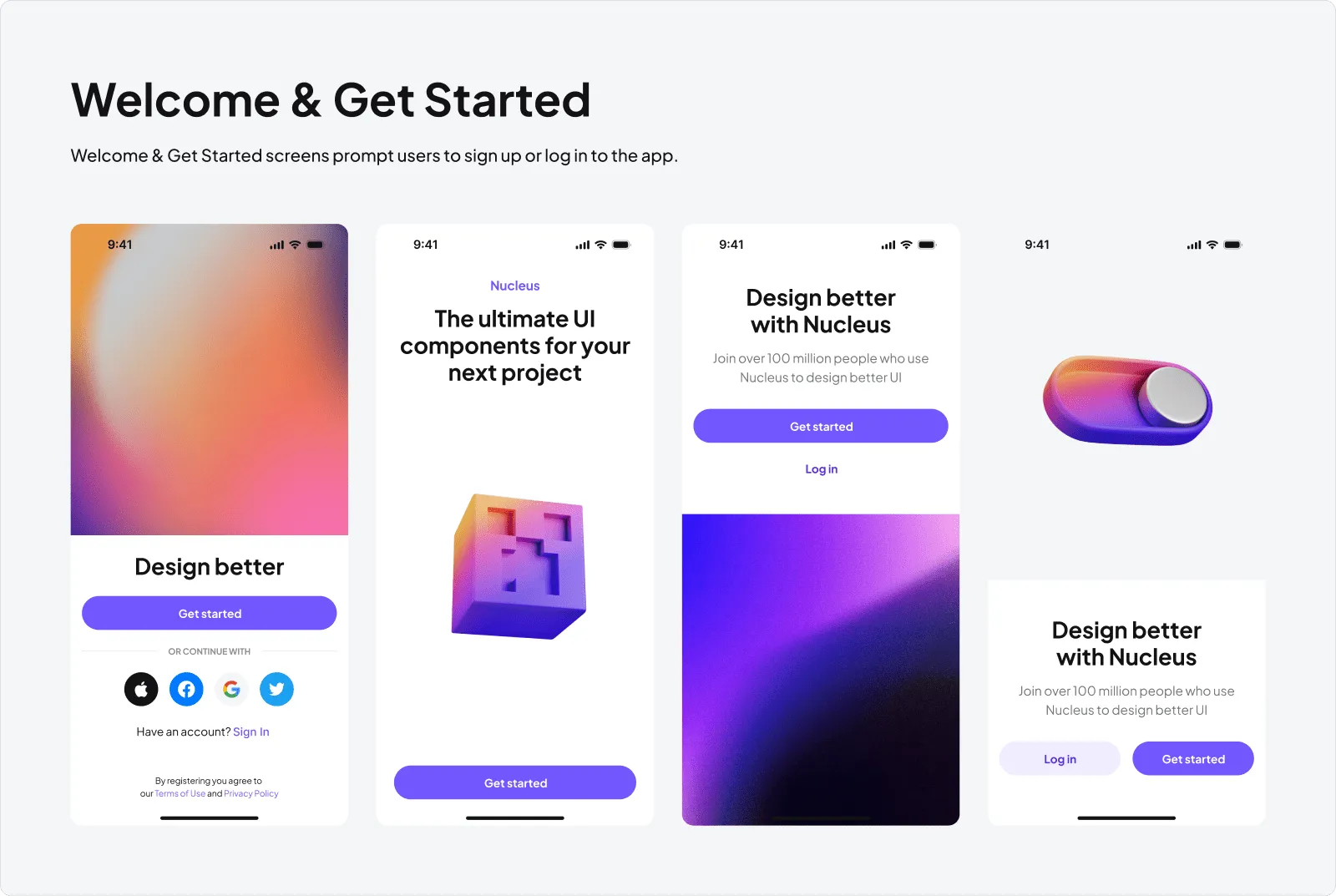
Welcome & Get Started
Preview 1000+ Components
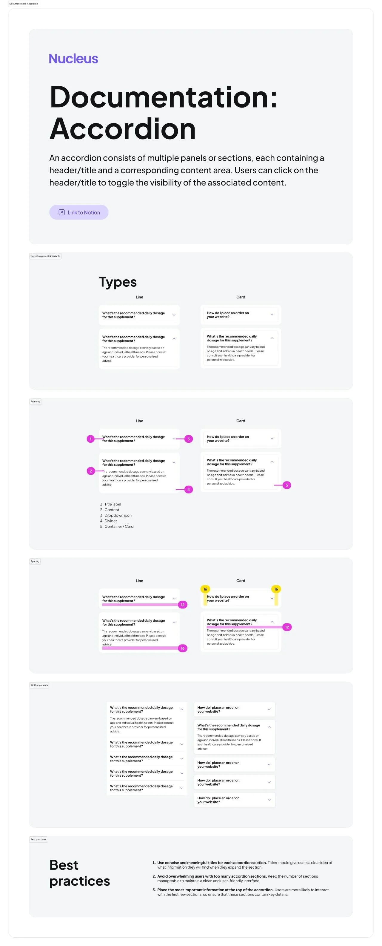
Accordion
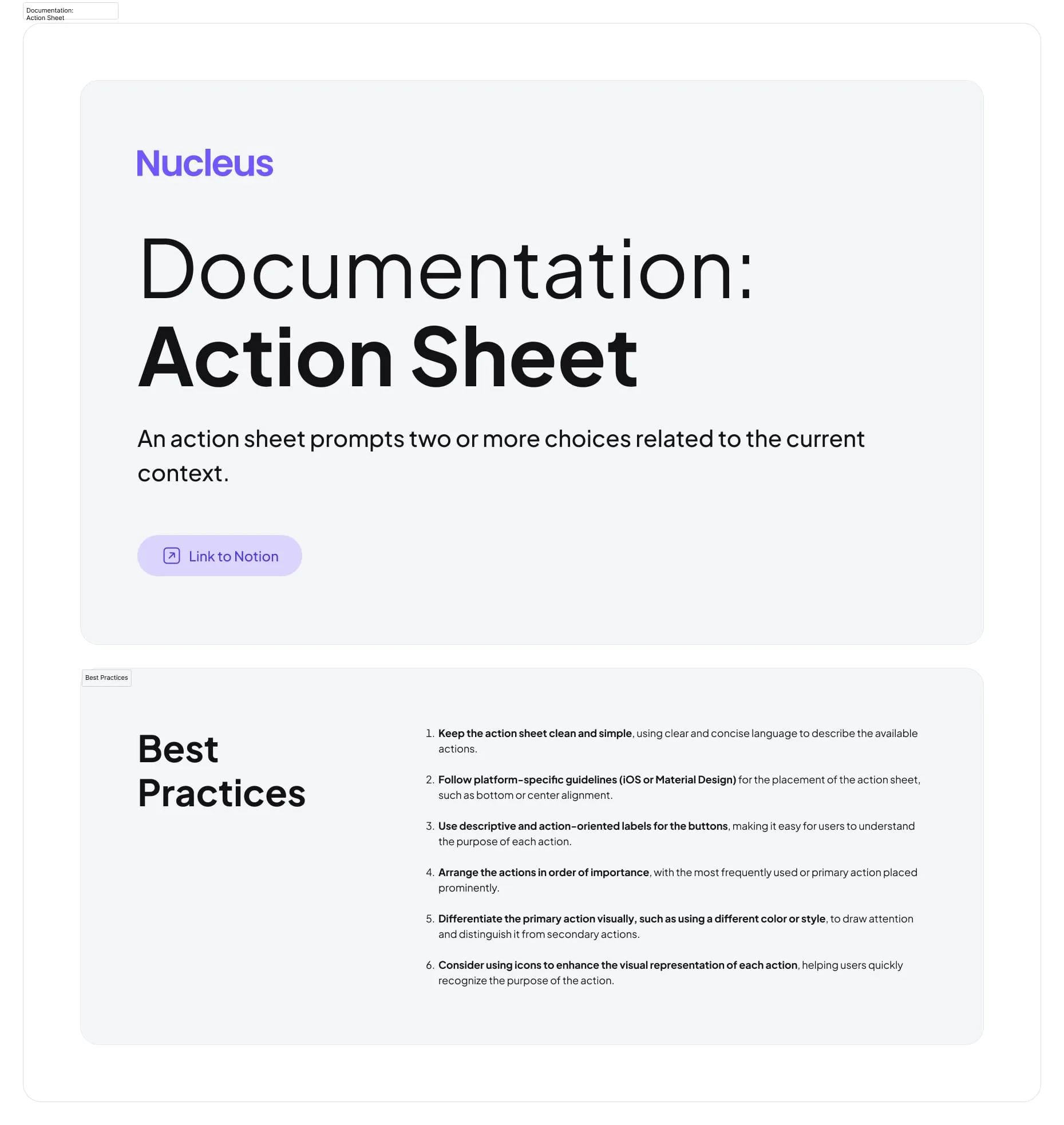
Action Sheet
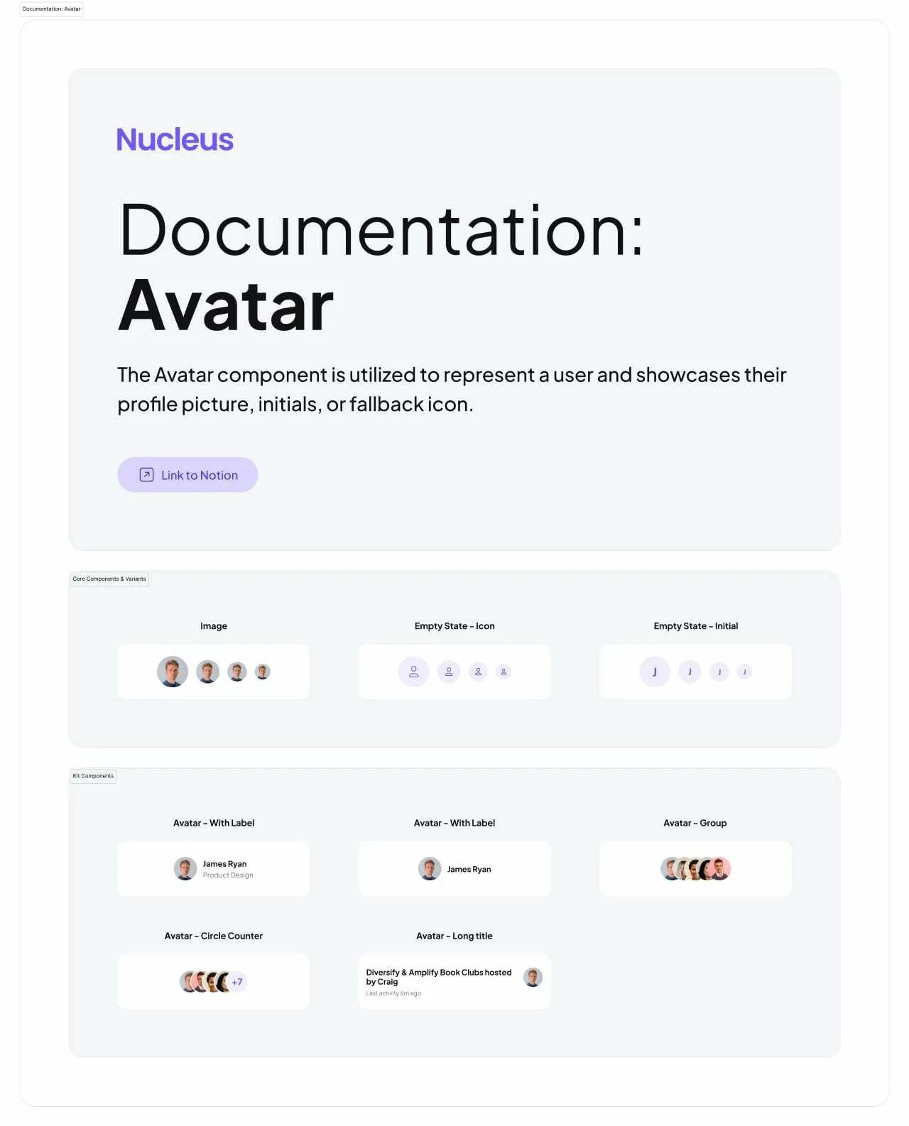
Avatar
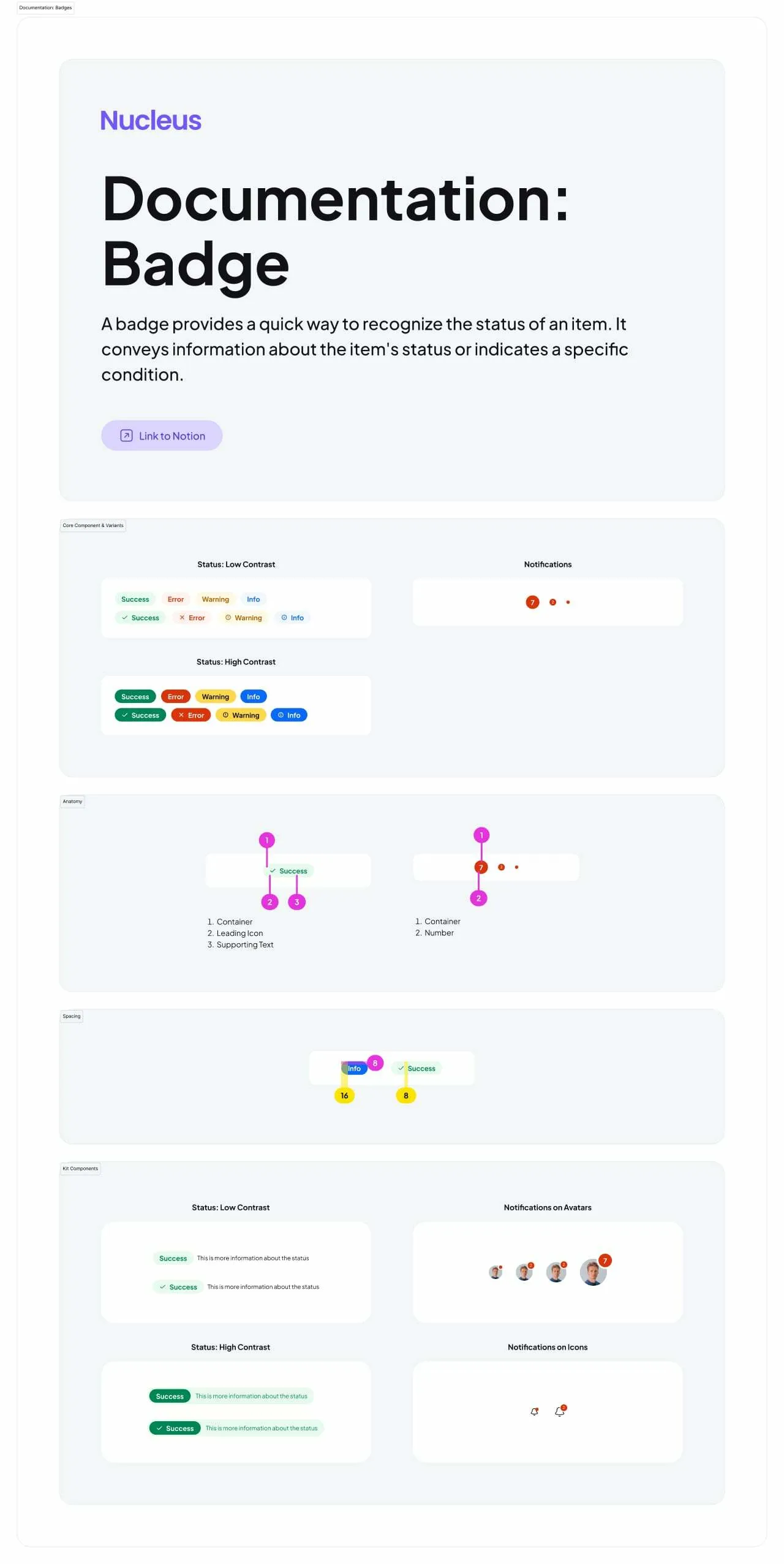
Badge
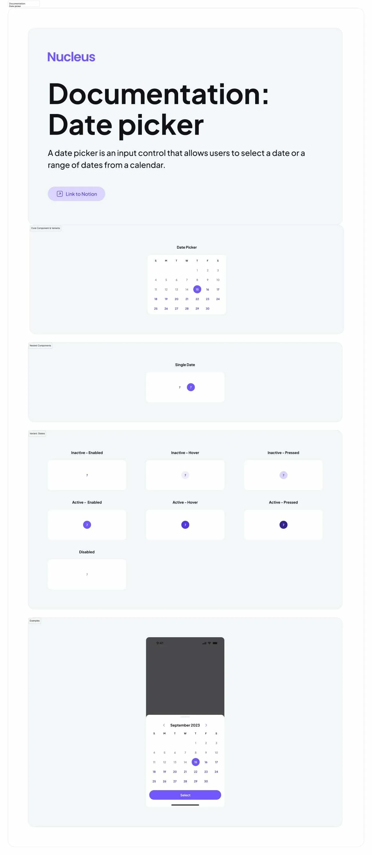
Date Picker
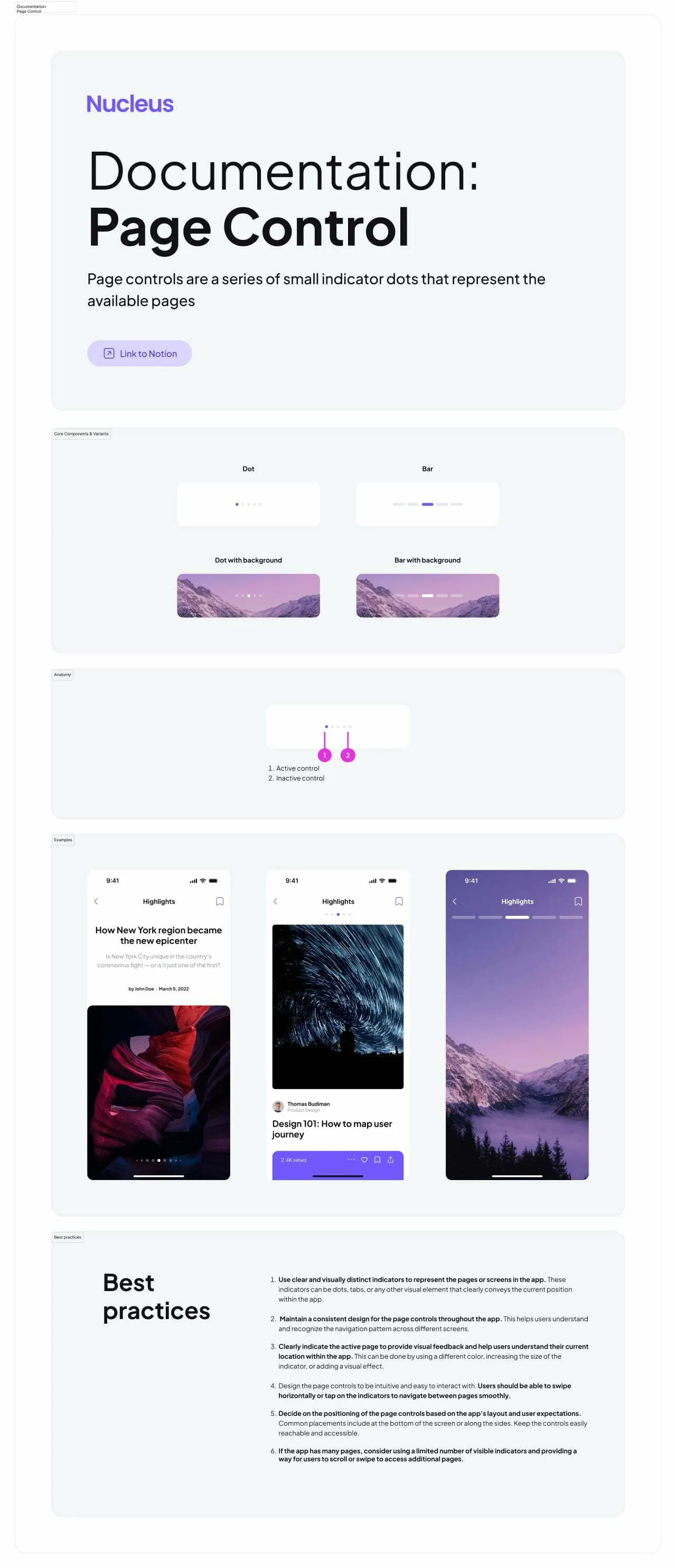
Page Control
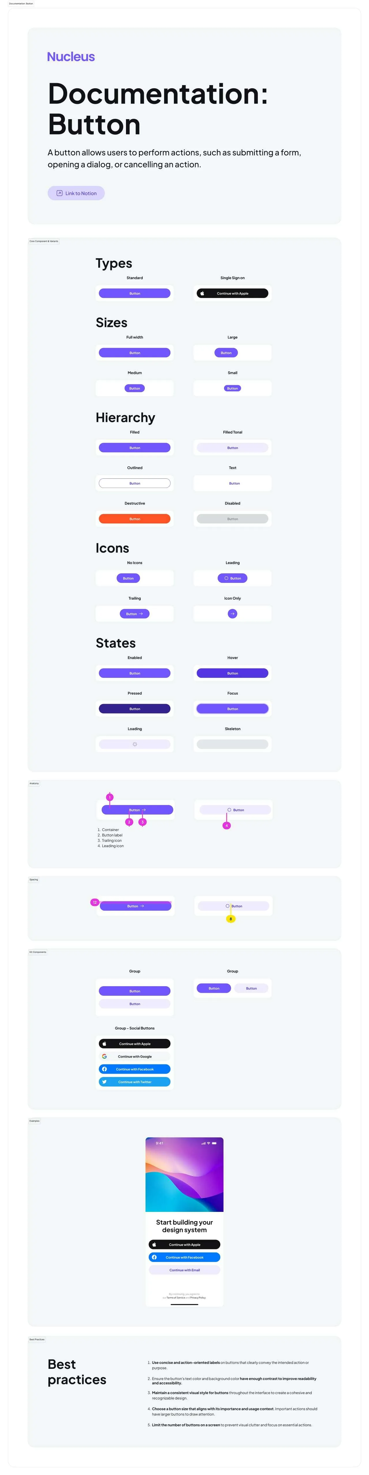
Button
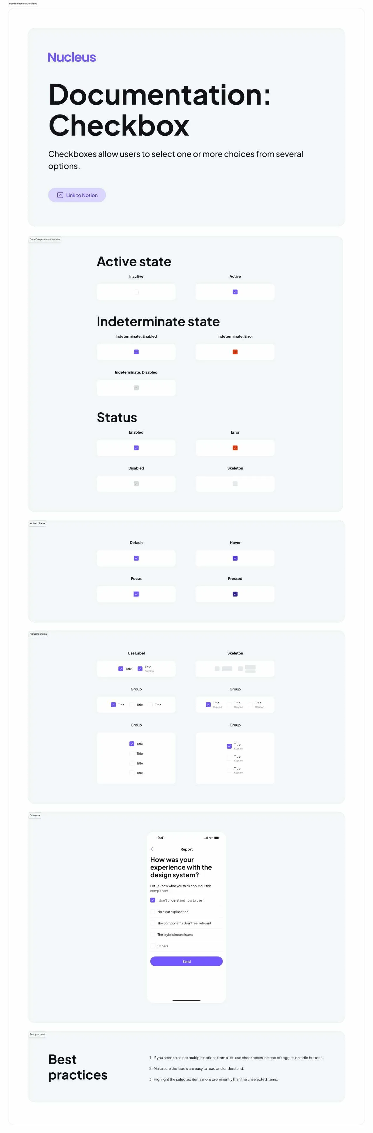
Checkbox
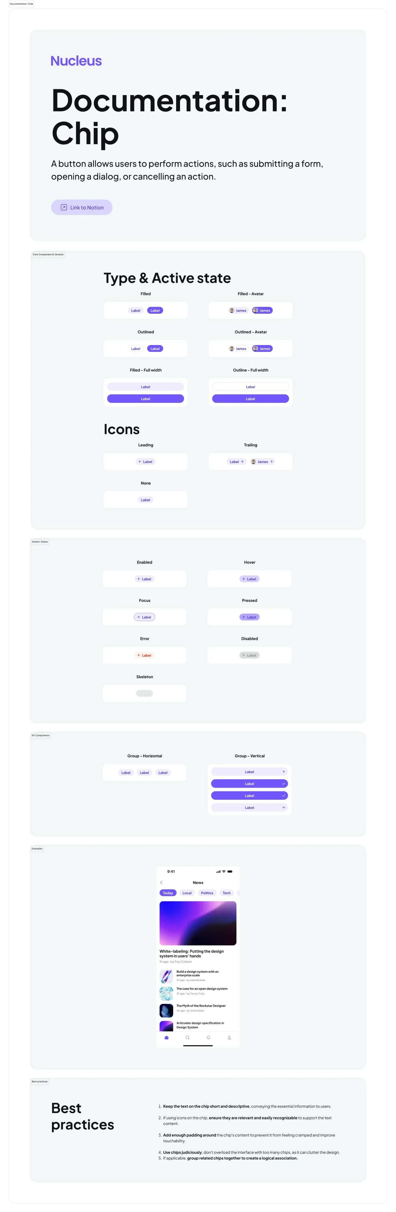
Chip
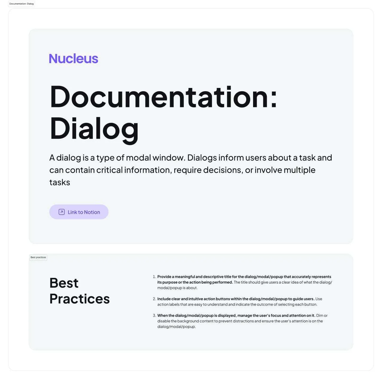
Dialog
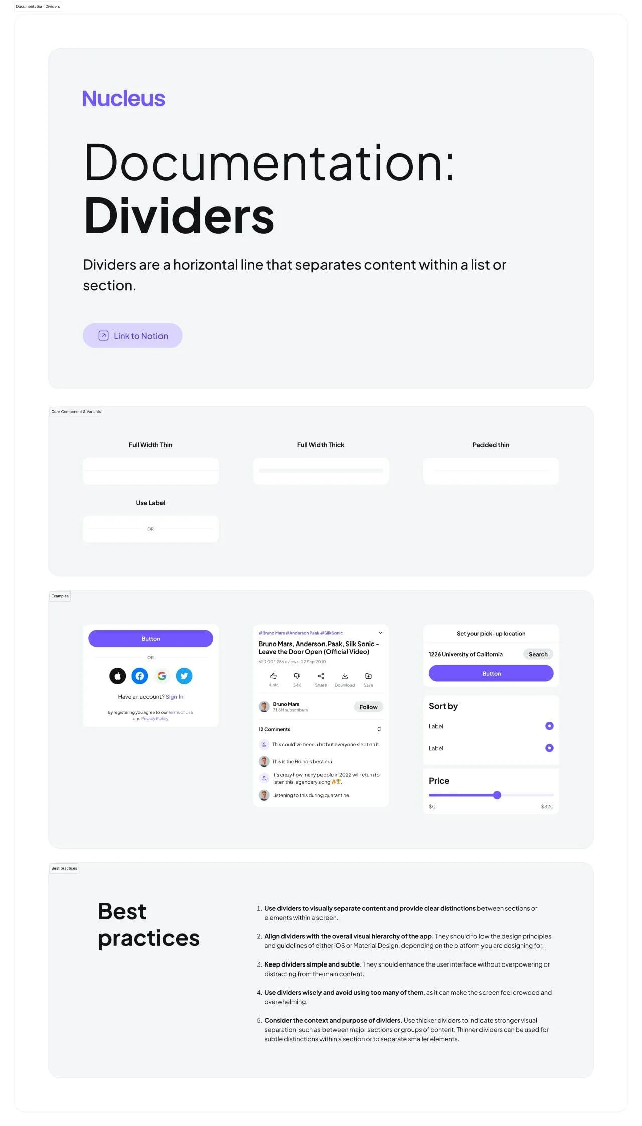
Divider
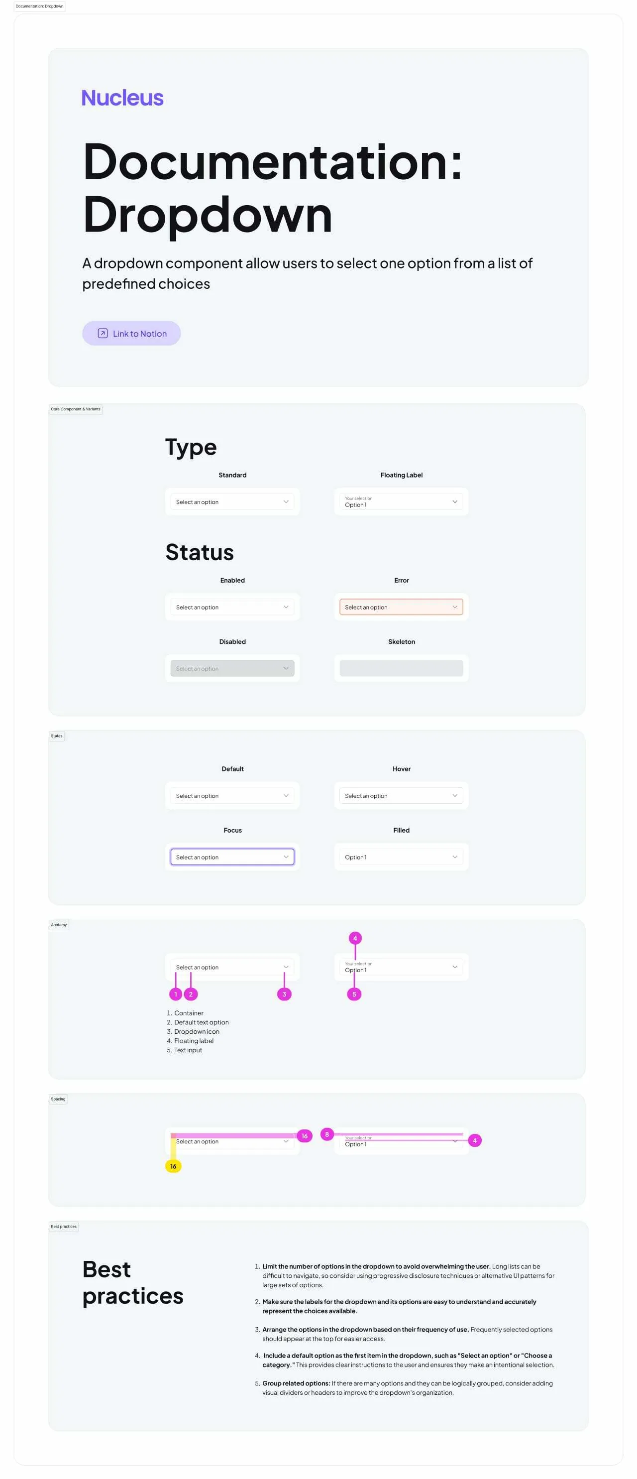
Dropdown
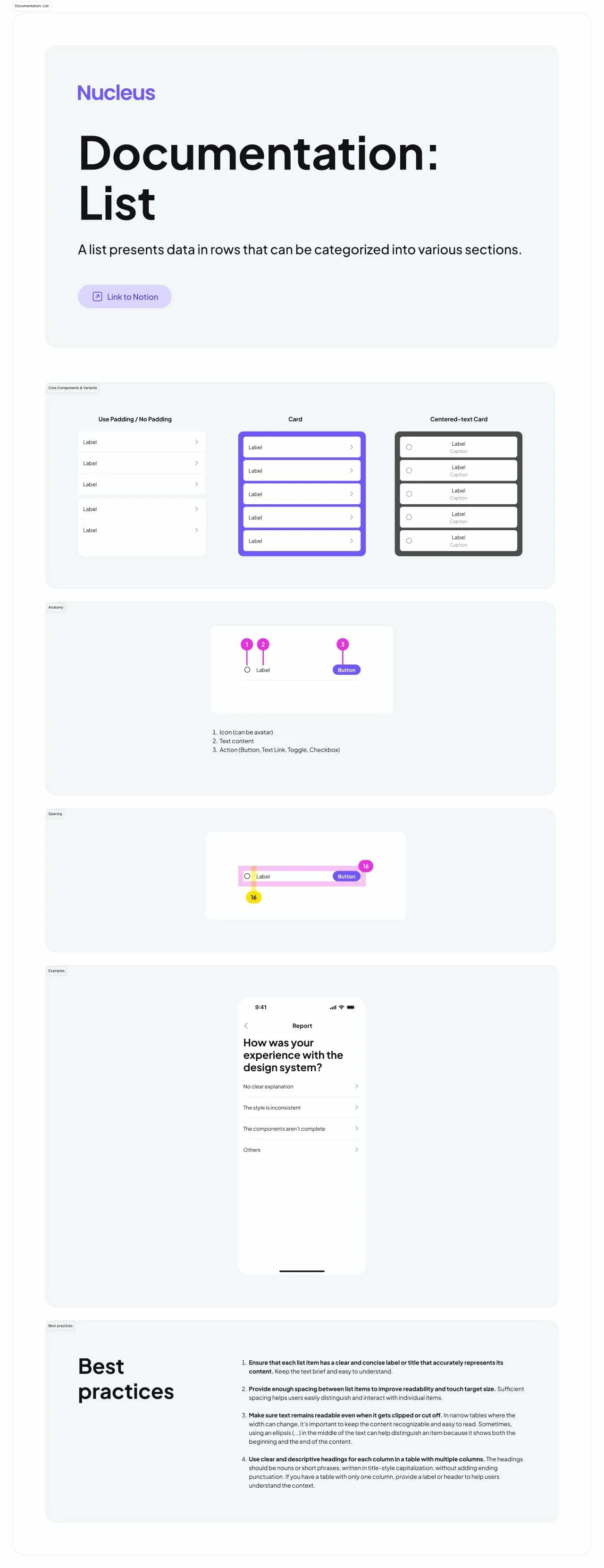
List
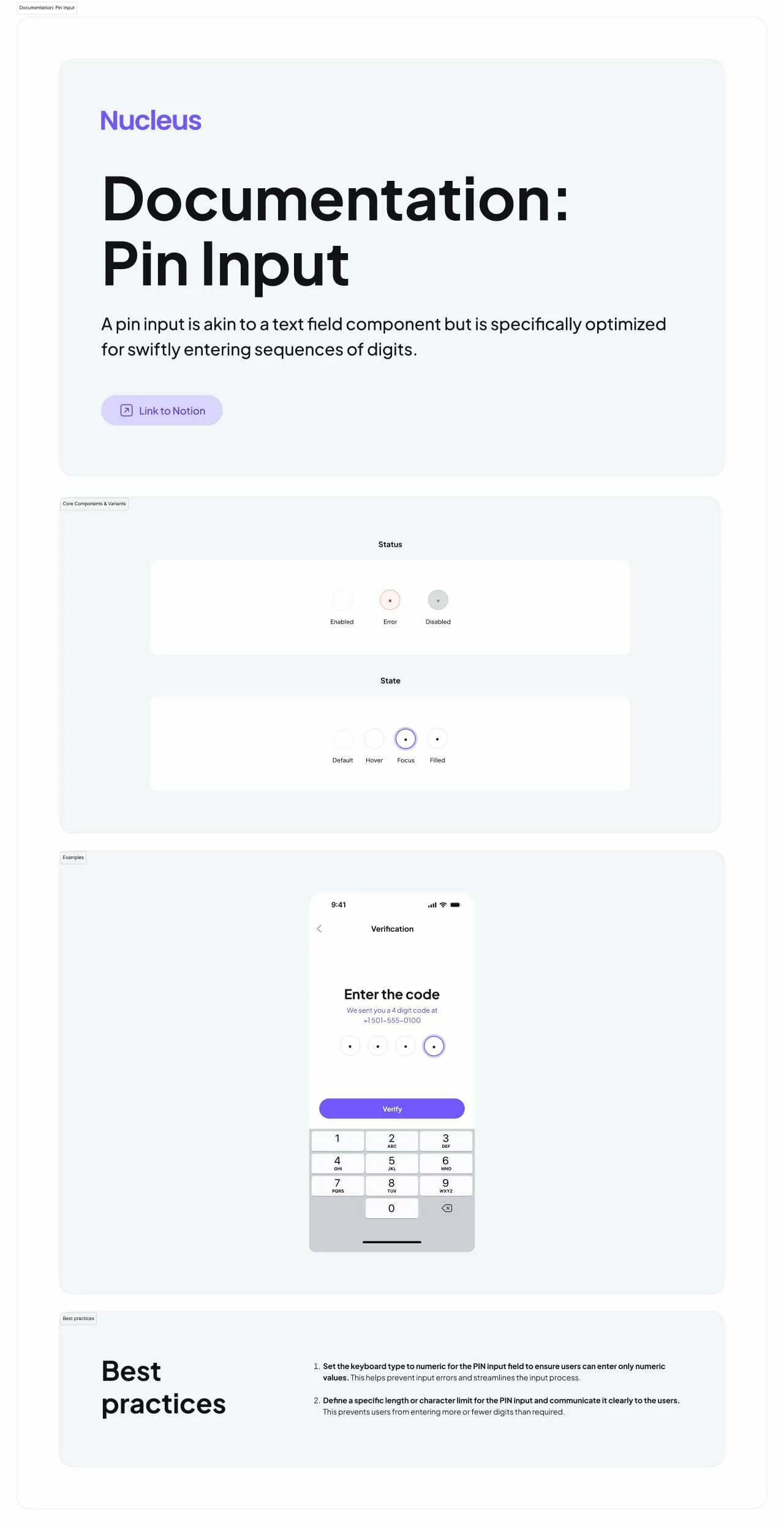
Pin Input
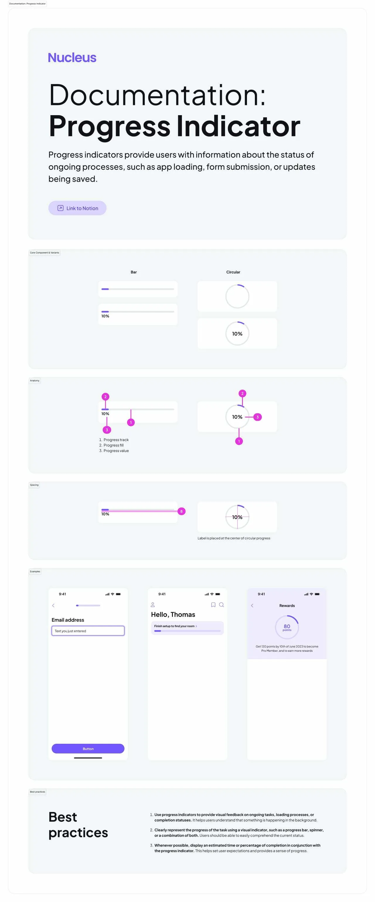
Progress Indicator
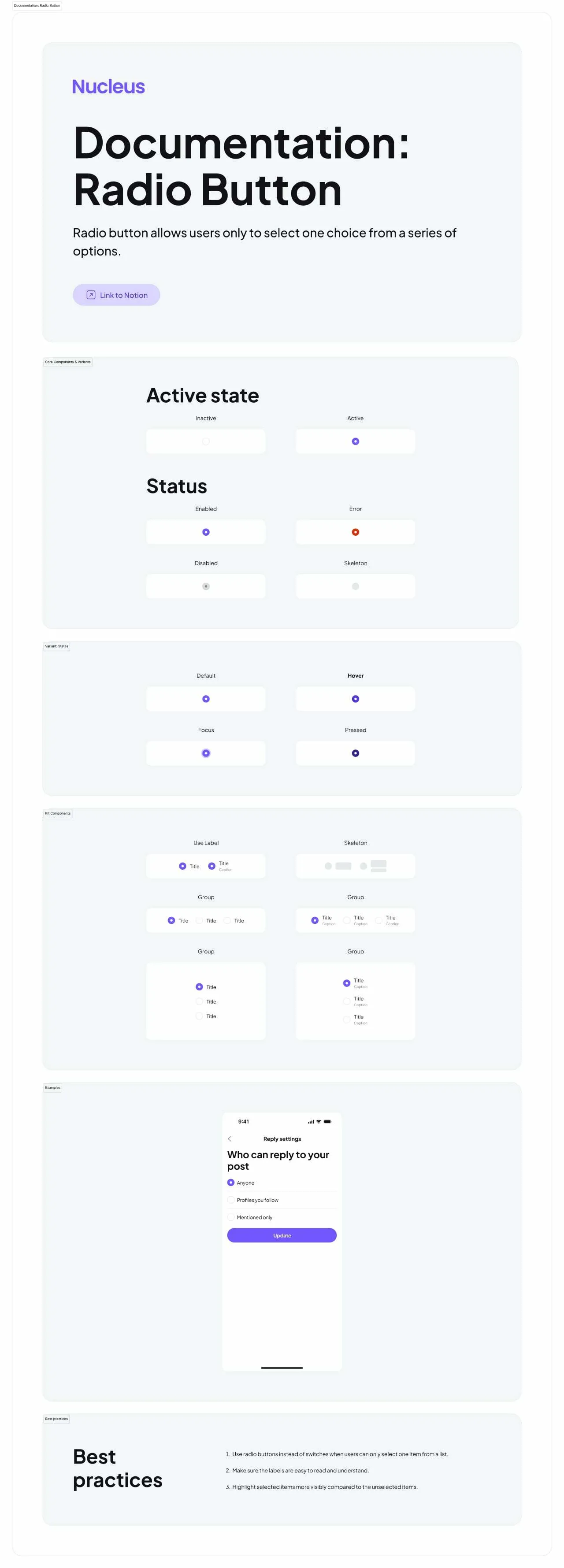
Radio Button
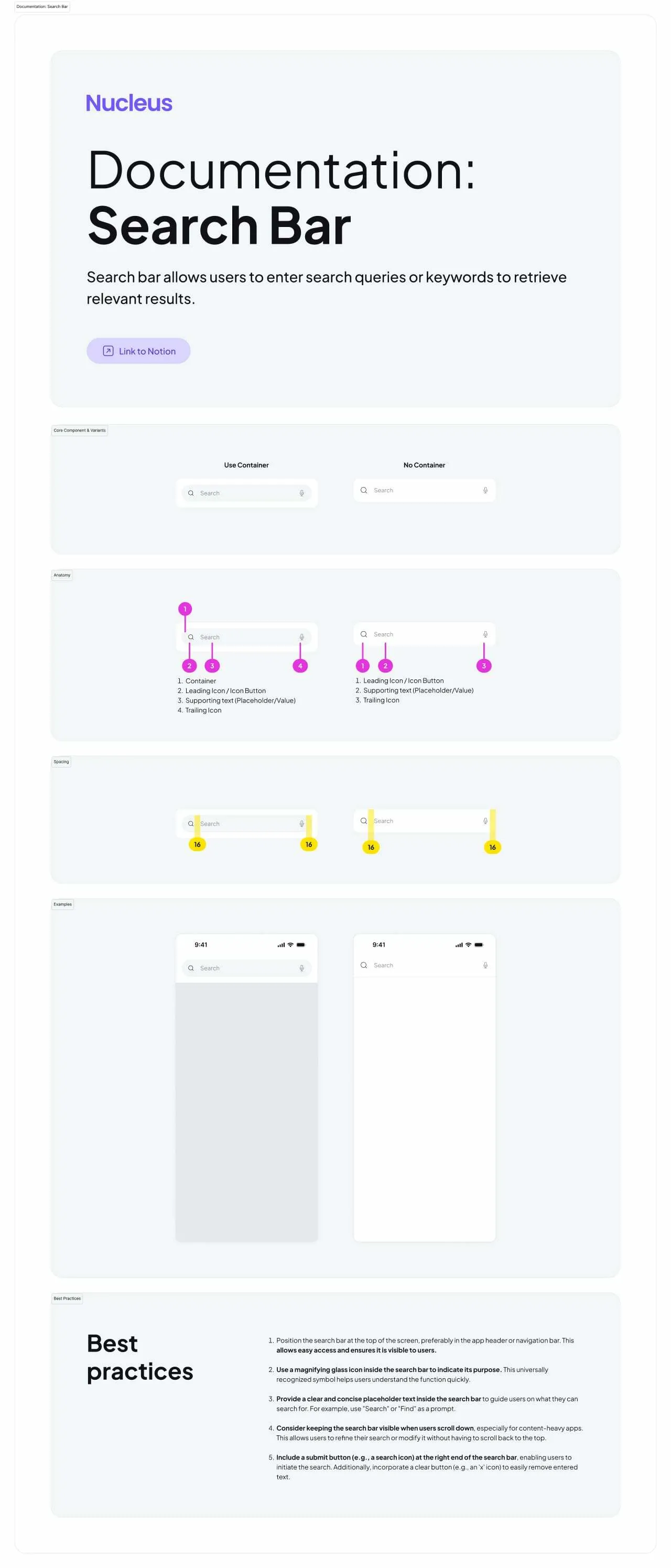
Search Bar
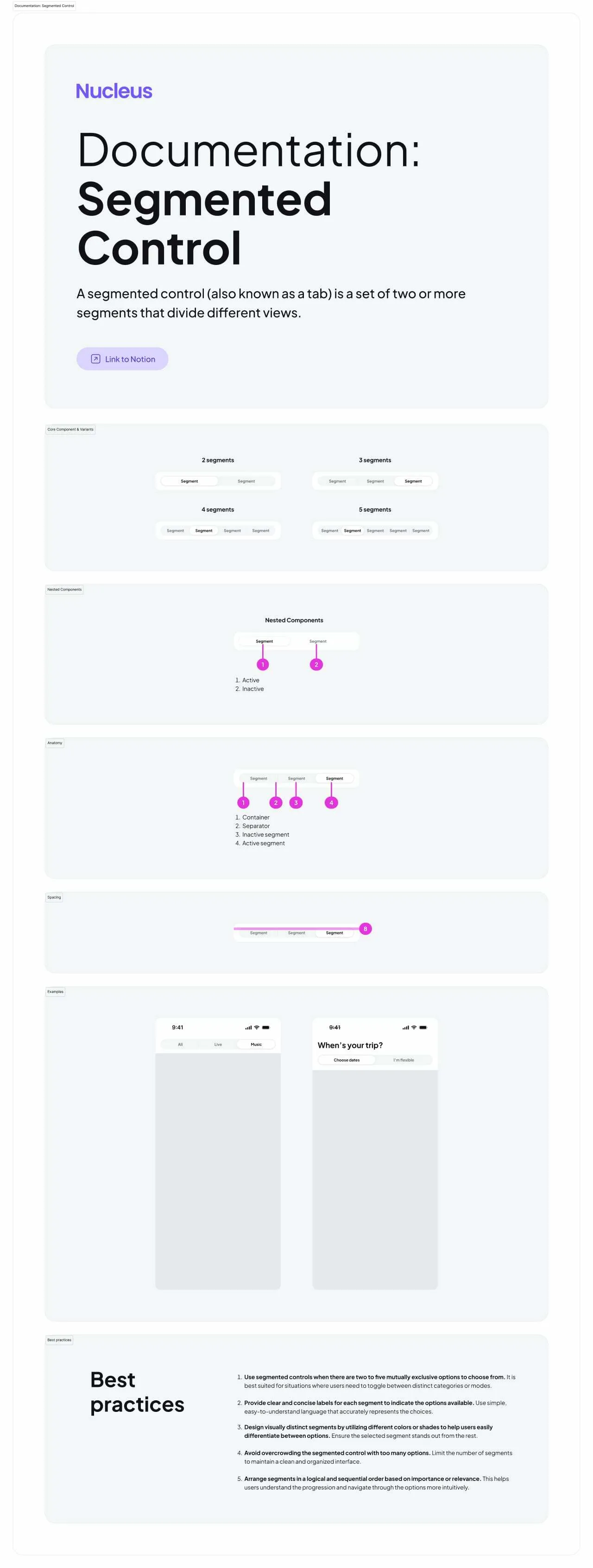
Segmented Control
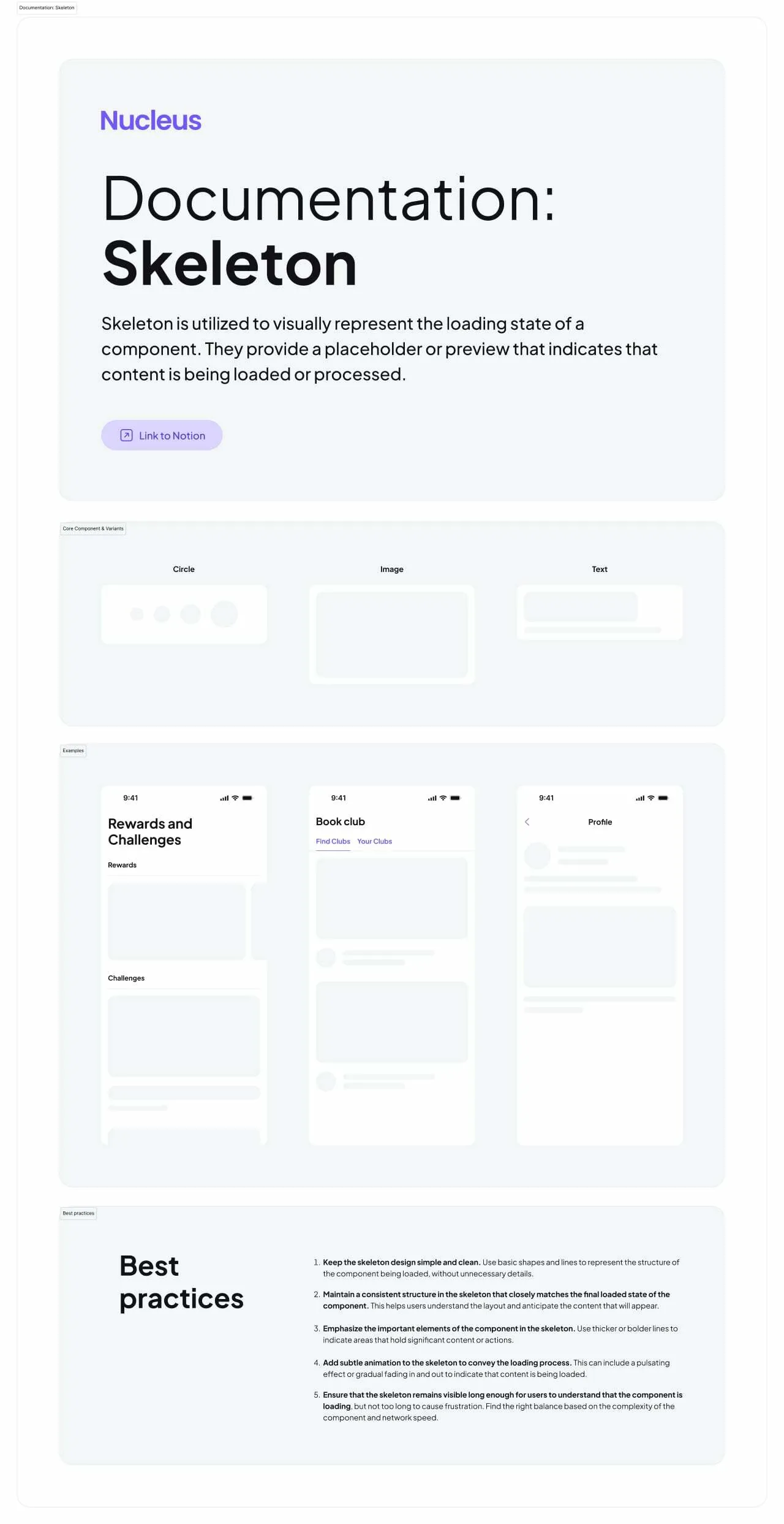
Skeleton
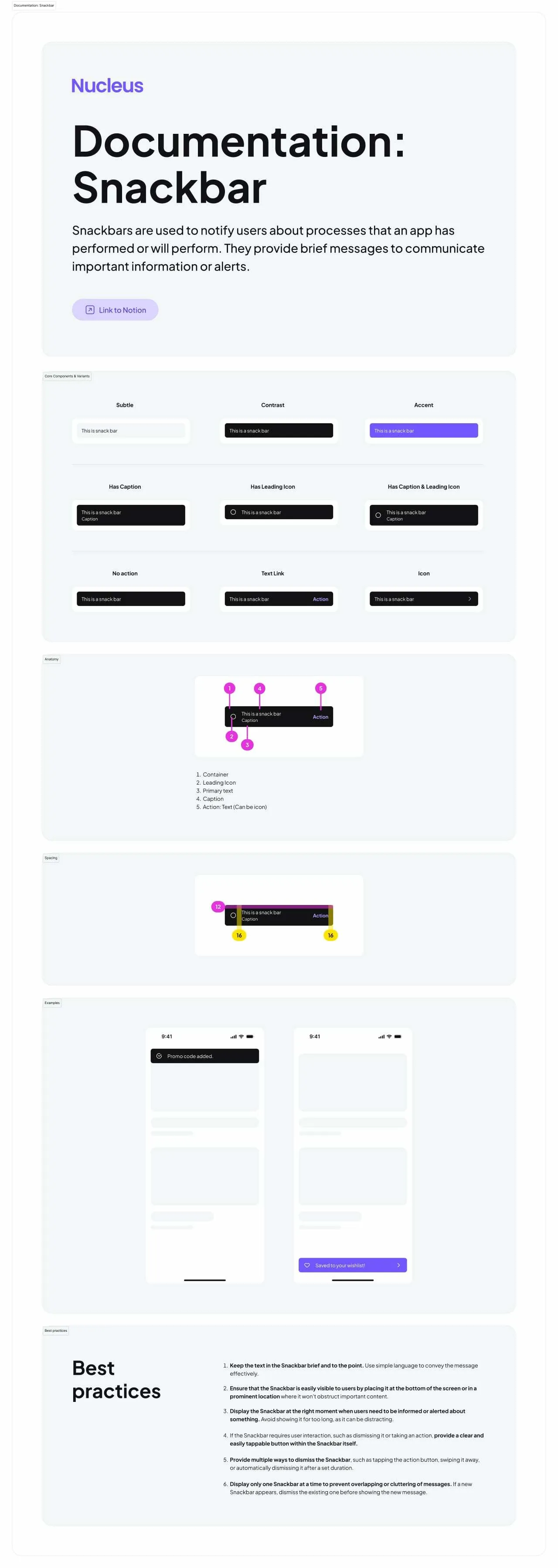
Snackbar
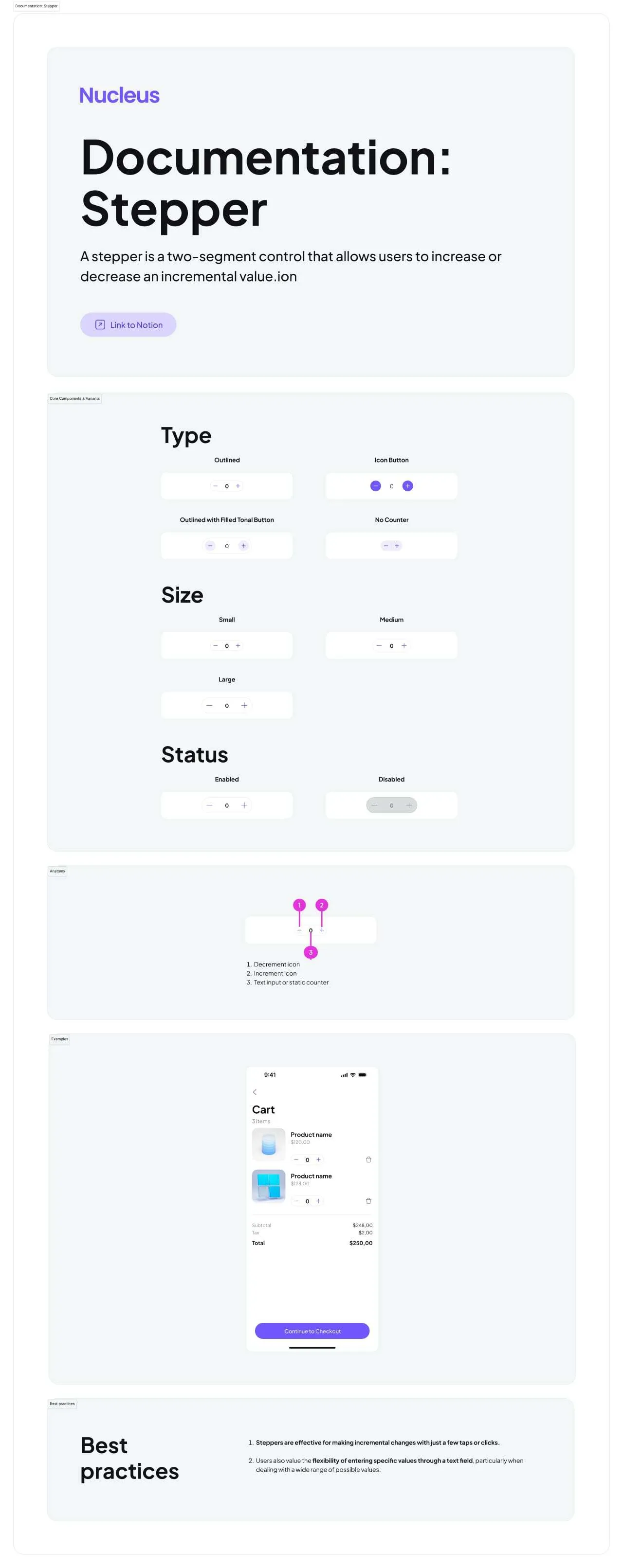
Stepper
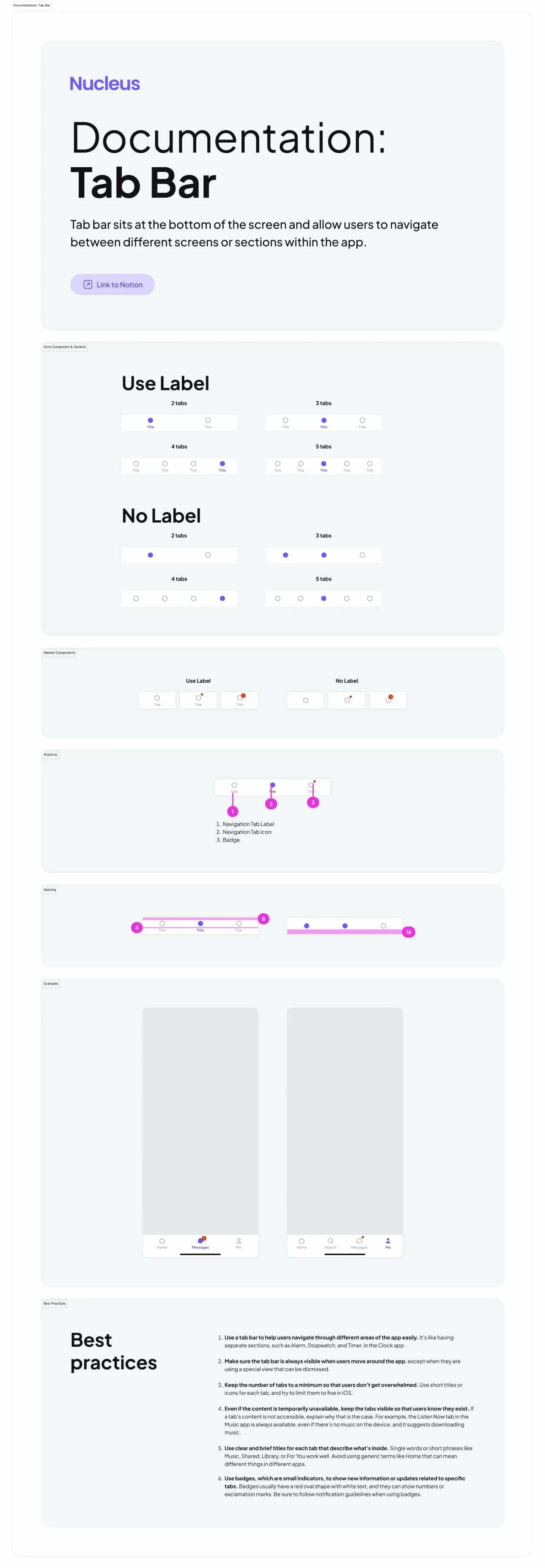
Tab Bar
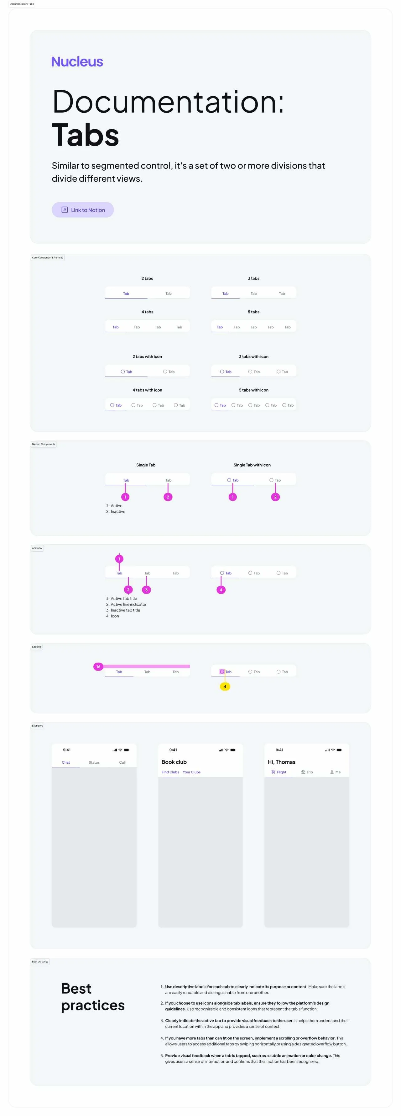
Tabs
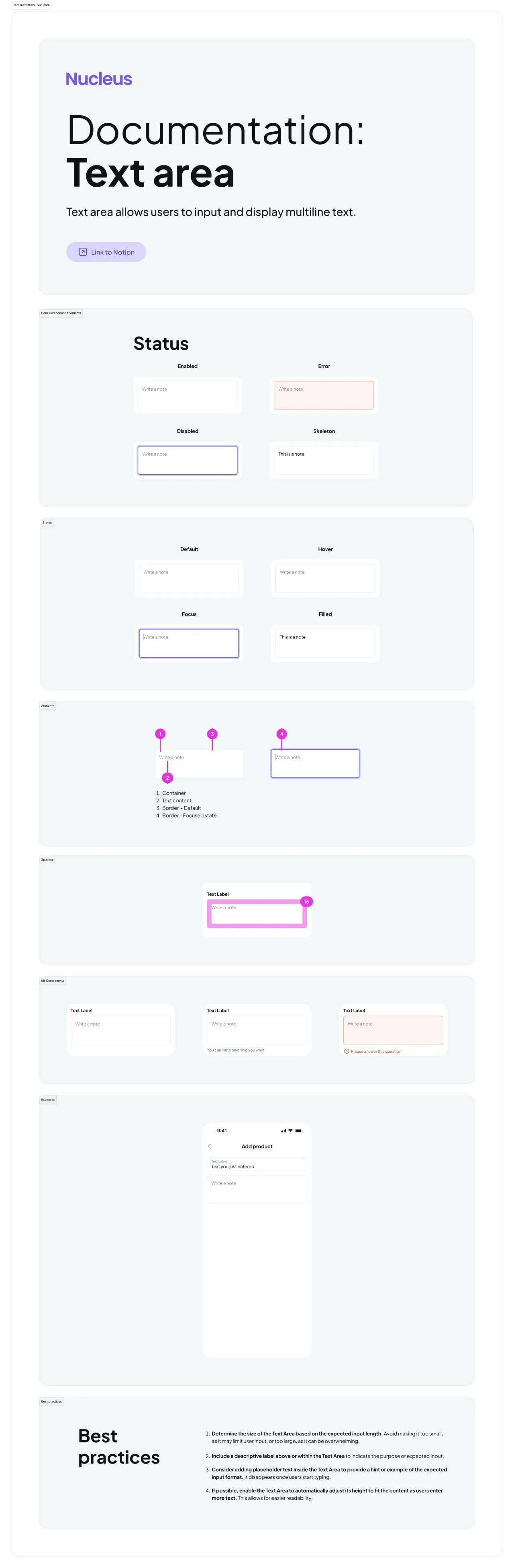
Text Area
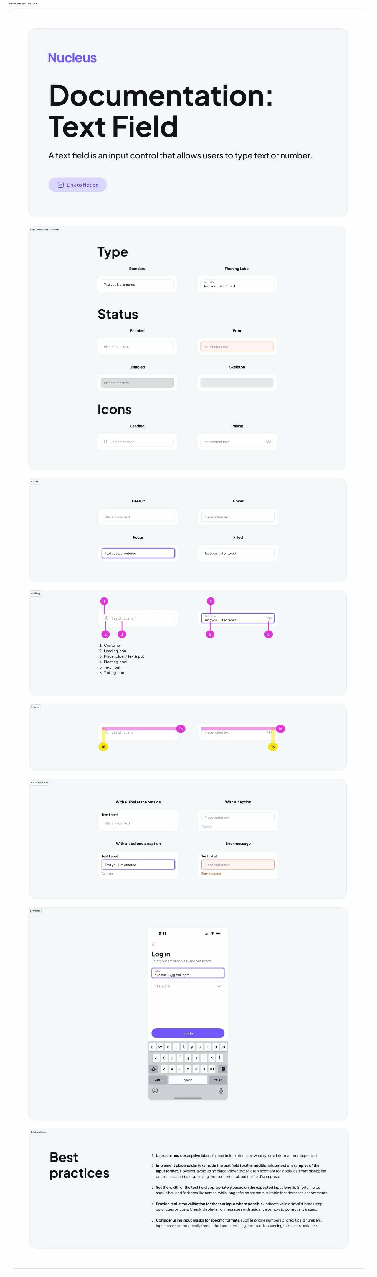
Text Field
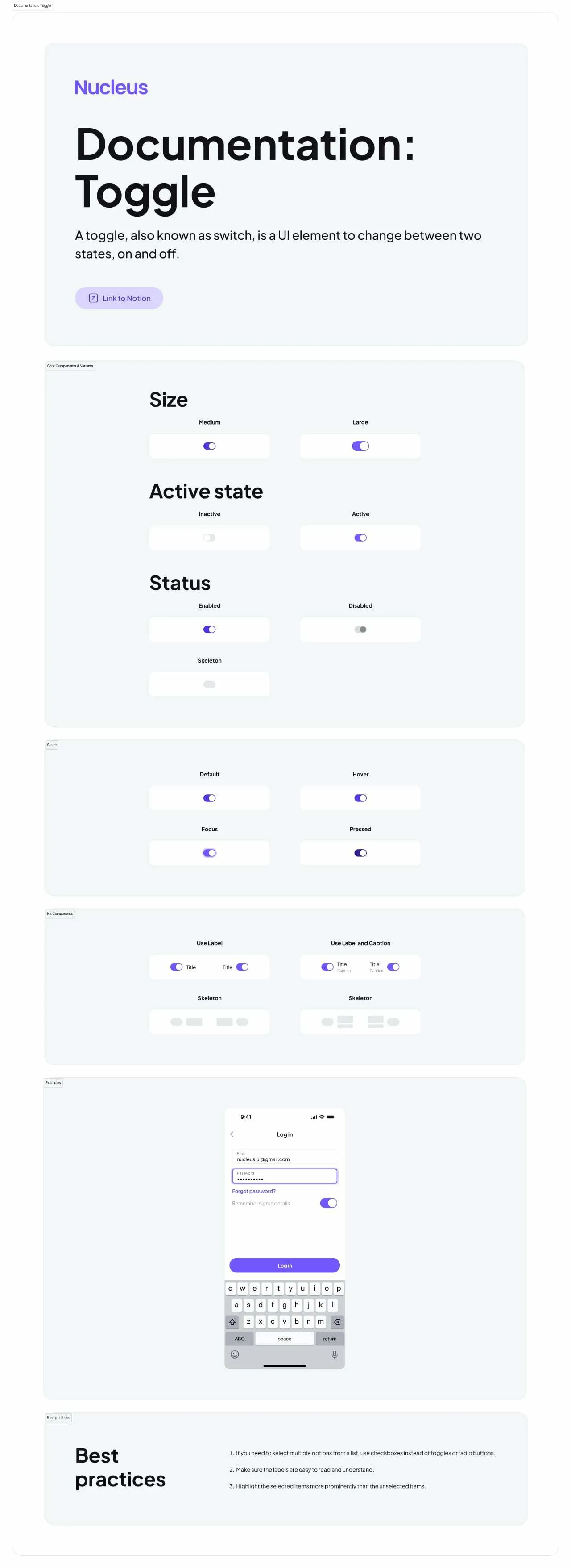
Toggle
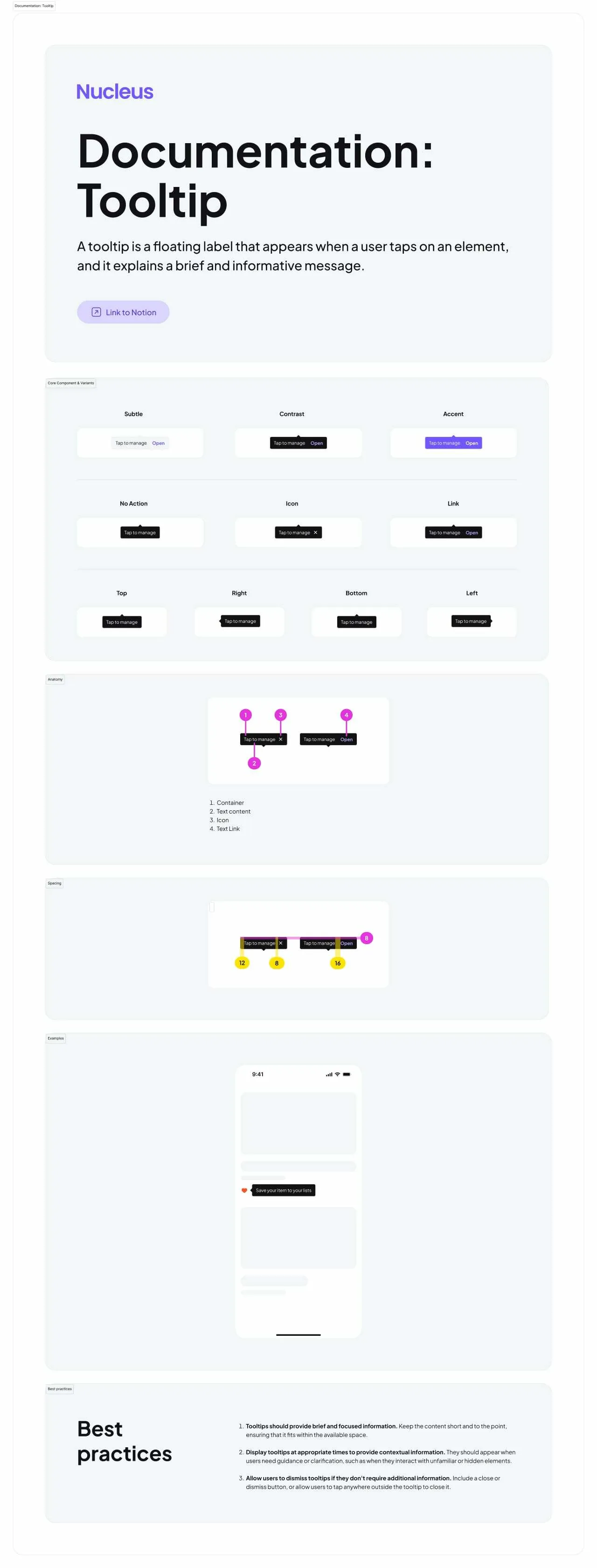
Tooltip
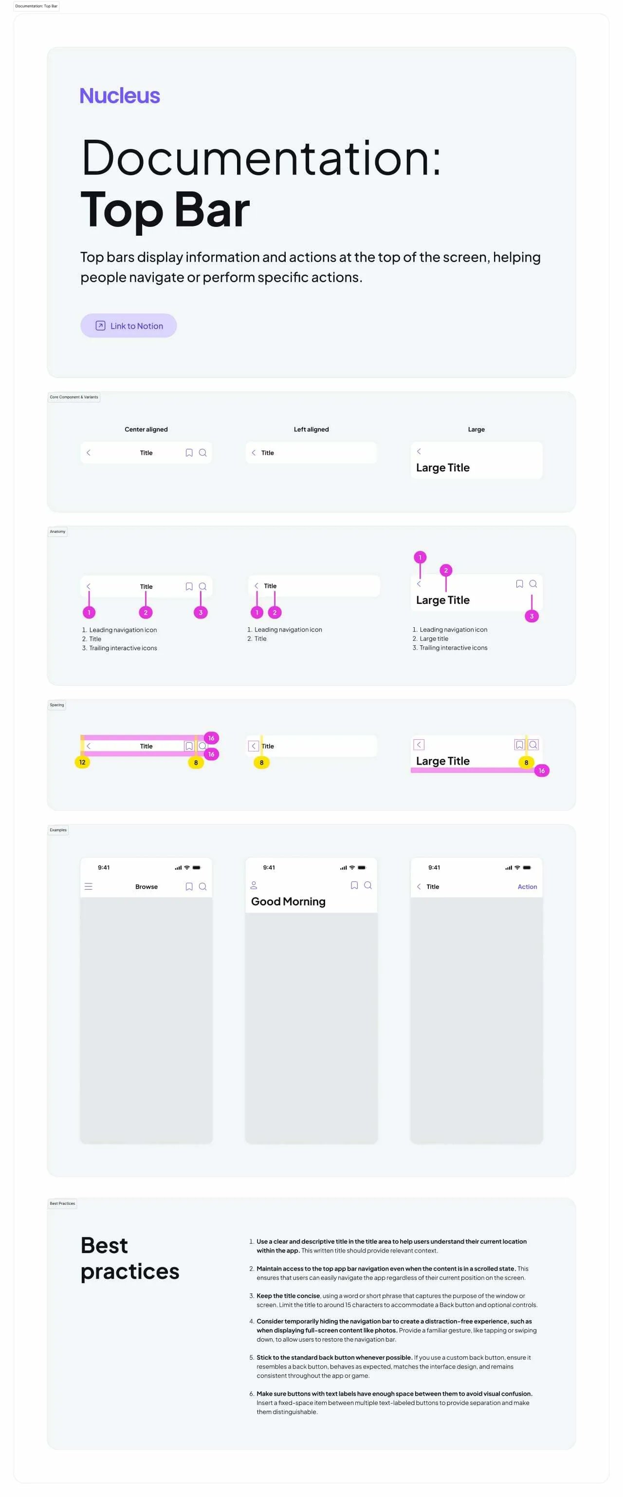
Top Bar
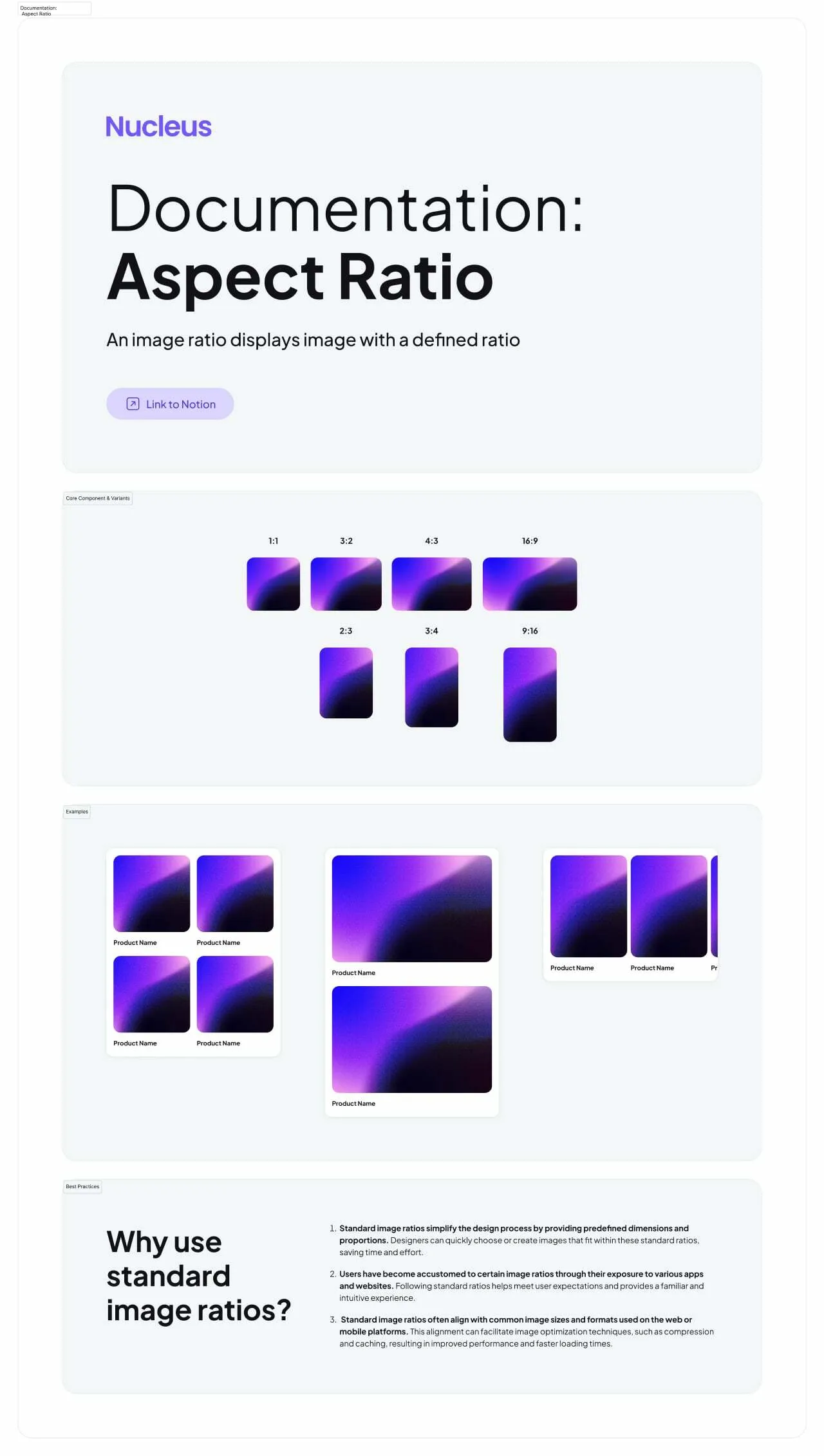
Aspect Ratio
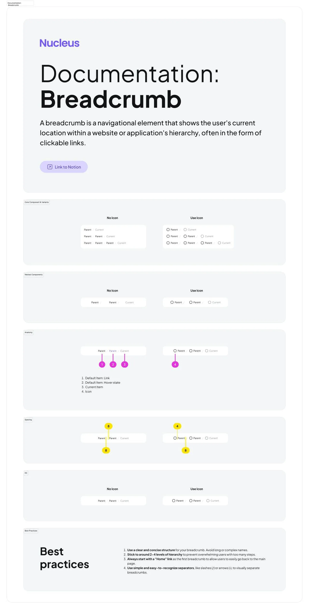
Breadcrumbs
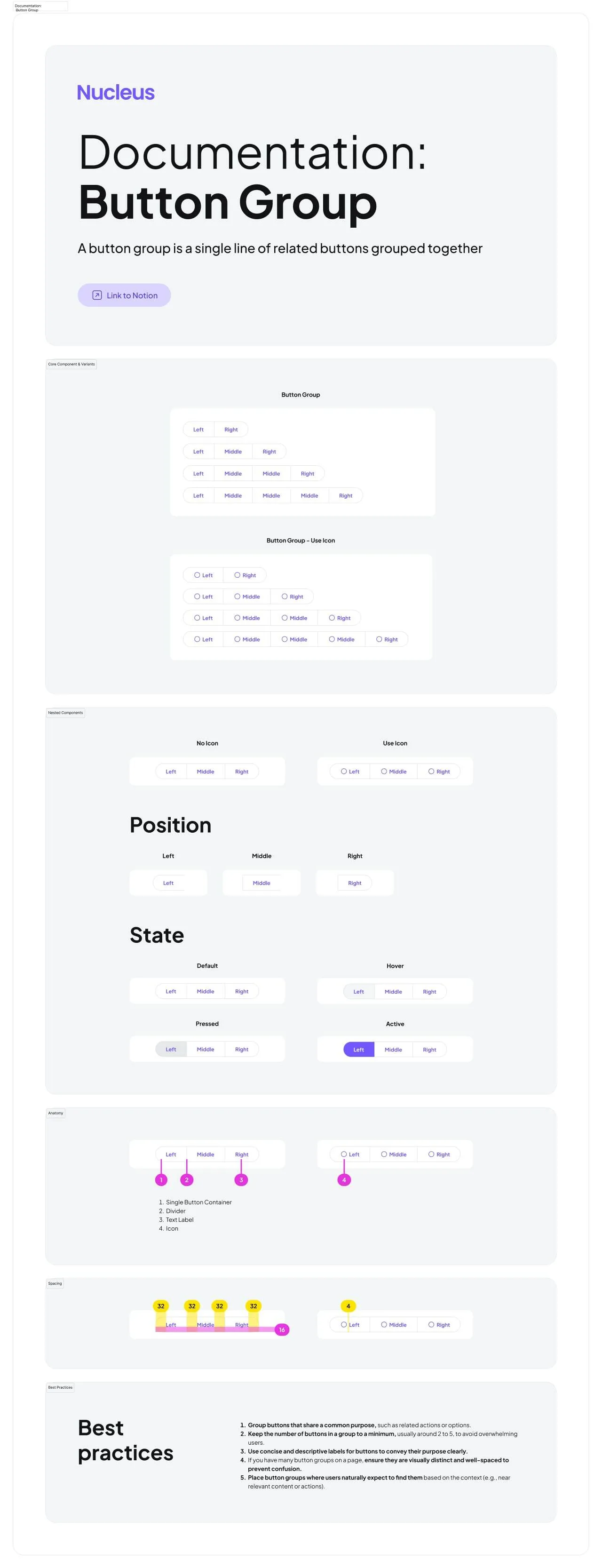
Button Group
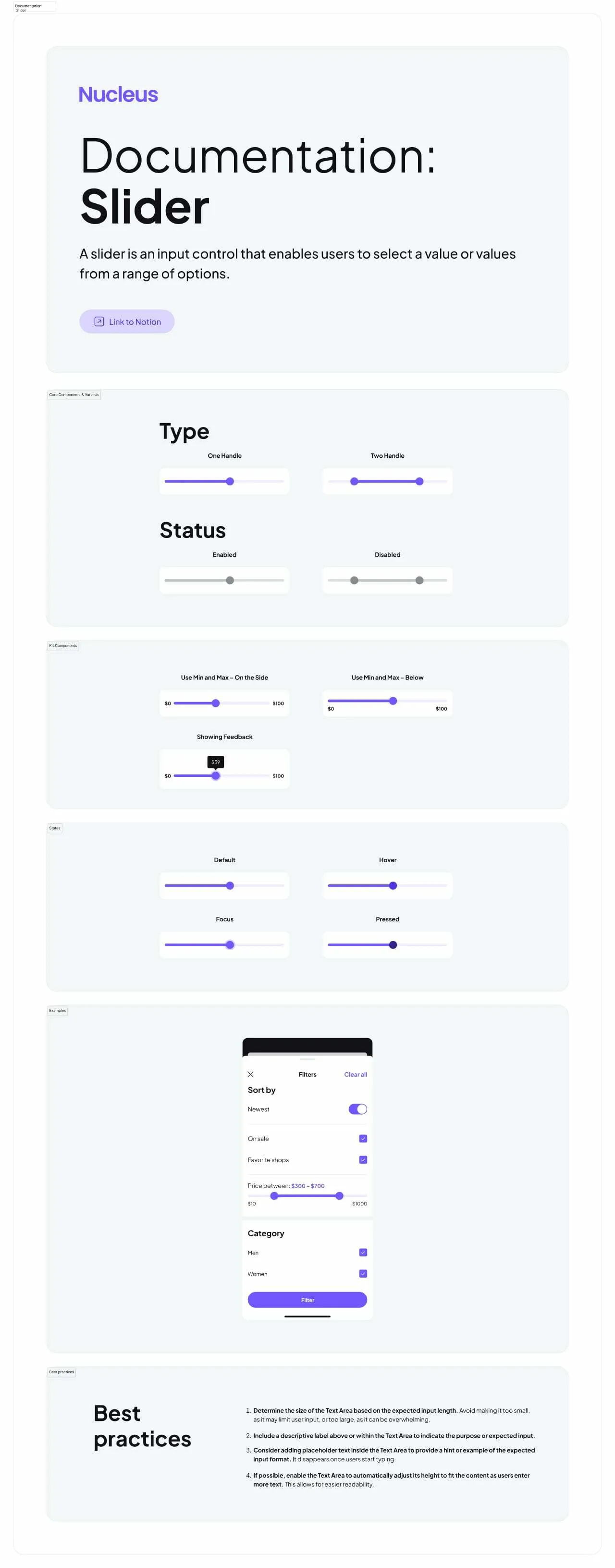
Slider
Hire us to custom design & code! Let's build together ✊
FAQs
How to start with this design system?
After the successful purchase via Gumroad (it's safe and encrypted) you will be taken to a download page. You will also get the download link in your email (check the SPAM folder sometimes). Then just simply drag and drop .FIG file onto your Figma app. Do not drop it onto the project. Drop it over the starting screen with recent projects grid.
l am new to Figma. Should I try your kits?
Definitely! Our products help customers who learning Figma from scratch. By exploring and studying commercial UI kits you learn how the components and layouts were crafted, which styles being used and which styling tricks have been applied.
How to import your kits?
Importing .FIG files into Figma: https://help.figma.com/hc/en-us/articles/360041003114-Import-files-to-the-file-browser
Which license type should I choose?
You must select the proper license type according to the number of users in Figma if you're purchasing our product for the business.
Business license — for startups or enterprise organizations to use for a local team or publish in Figma library.
Individual license — for freelancers, indie developers, or solopreneurs working on a single project.
Can I build commercial proiects with your products?
Yes! You can build an unlimited amount of commercial projects using Setproduct assets. But, please, consider a license type before making a purchase.
I have a project. Can I hire you?
We're open-minded to your custom design & development projects. We can create complex templates based on our Figma libraries and code them in the production using a wide variety of popular frameworks and technologies.
If you have a project to design & develop, simply contact us describing your brief, budget, and expectations.
I 💜 Your designs, but can I have a discount?
We provide discounts for those, who scrolled to the bottom and revealed our proposal. Just drop us a message with a short story about how you plan to use our product and we will give you a ✨30% off coupon for the upcoming purchase. Please, provide a specific product name you've put your eye on.
Figma Templates & UI kits
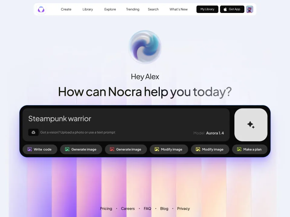
Nocra UI kit
Nocra is a design system for AI products. Built specifically for startups harnessing AI generation: images, video, audio, music, prompts, and beyond.
.webp&w=1920&q=75)
Material X for Figma
Figma library with 1100+ components & 40 app templates beyond Material Design. Powered by top-notch shapes and Manrope font. Customizable & Adjustable UI kit now available for Angular & Figma
.webp&w=1920&q=75)
Material You UI kit
Figma & React library with 2600+ variants of 32 components compatible with Material Design 3. Plus 220+ dashboard templates for all the viewports. Now available for NextJS & TailwindCSS.
Figma React UI kit
Designed and well-organized in Figma React-based UI toolkit for the web. Optimized for building complex data-dense interfaces for desktop and mobile applications.
.webp&w=1920&q=75)
Panda Design System
Figma library with dashboard, calendar, kanban, profile, table, ecommerce and 80+ templates in total. Components with variants, dark theme included.
.webp&w=1920&q=75)
Eclipse UI kit
Figma library with 1100+ components & 74 templates for data-driven web applications. Powered by auto-layout. Supercharged by Figma's variants.
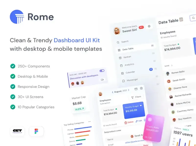
Rome UI kit for Figma
Customizable and well-organized team library. Contains 250+ components & 30 web app templates powered by stylish and trendy guidelines.
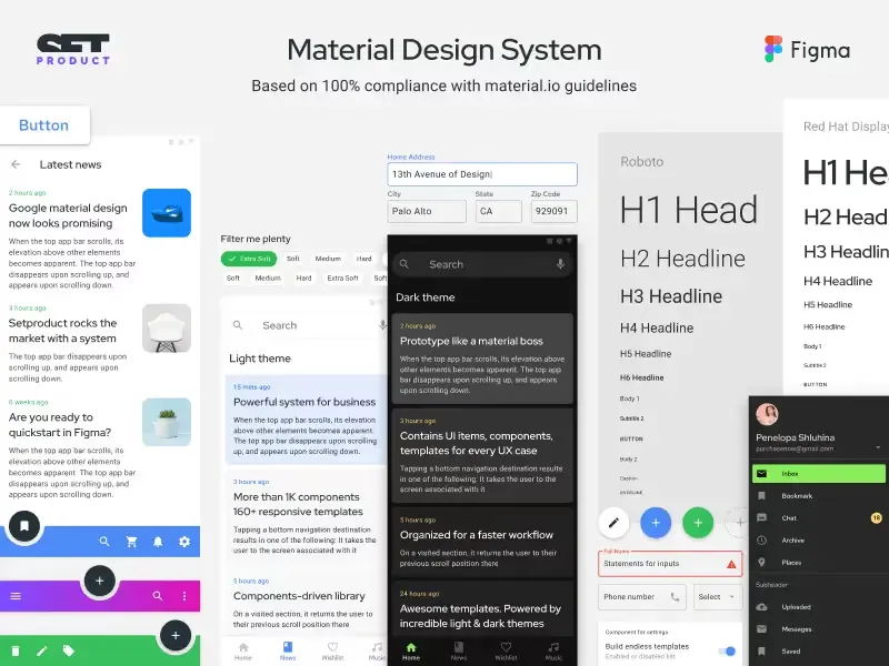
Material Design System
Figma library is based on 100% guidelines compliance with Material.io. Contains ready-to-use templates to accelerate app UI design.
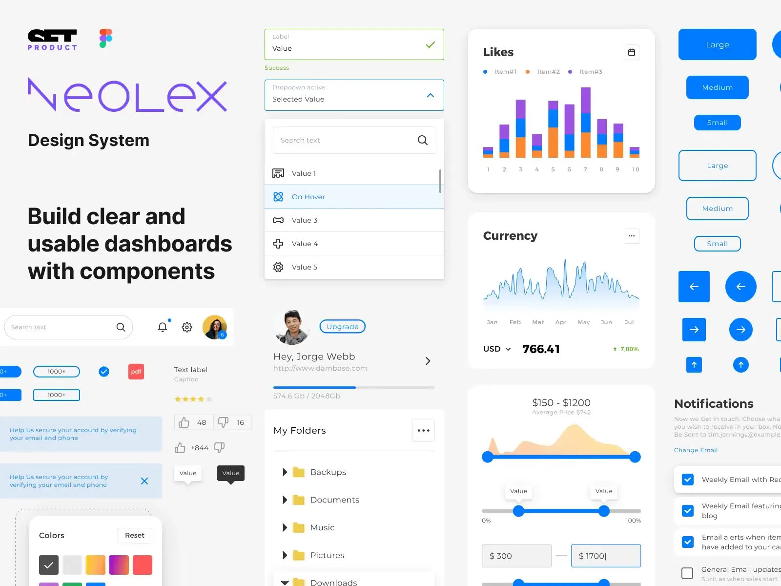
Neolex Dashboard UI kit
Customizable & adjustable dashboard design system with 50+ ready-to-use app layouts, 1900+ variants for 30 components with auto-layout.
.webp&w=1920&q=75)
Material Desktop Dashboard UI kit
Figma library with 48+ dashboard templates based on reusable desktop app patterns carefully handpicked from the most popular web apps.
.webp&w=1920&q=75)
Xela UI kit for Figma
Figma library with 1900+ variants of 30 components categories to craft perfectly shaped desktop & mobile apps. Customizable & Adjustable dashboard design system with 50+ web app templates.
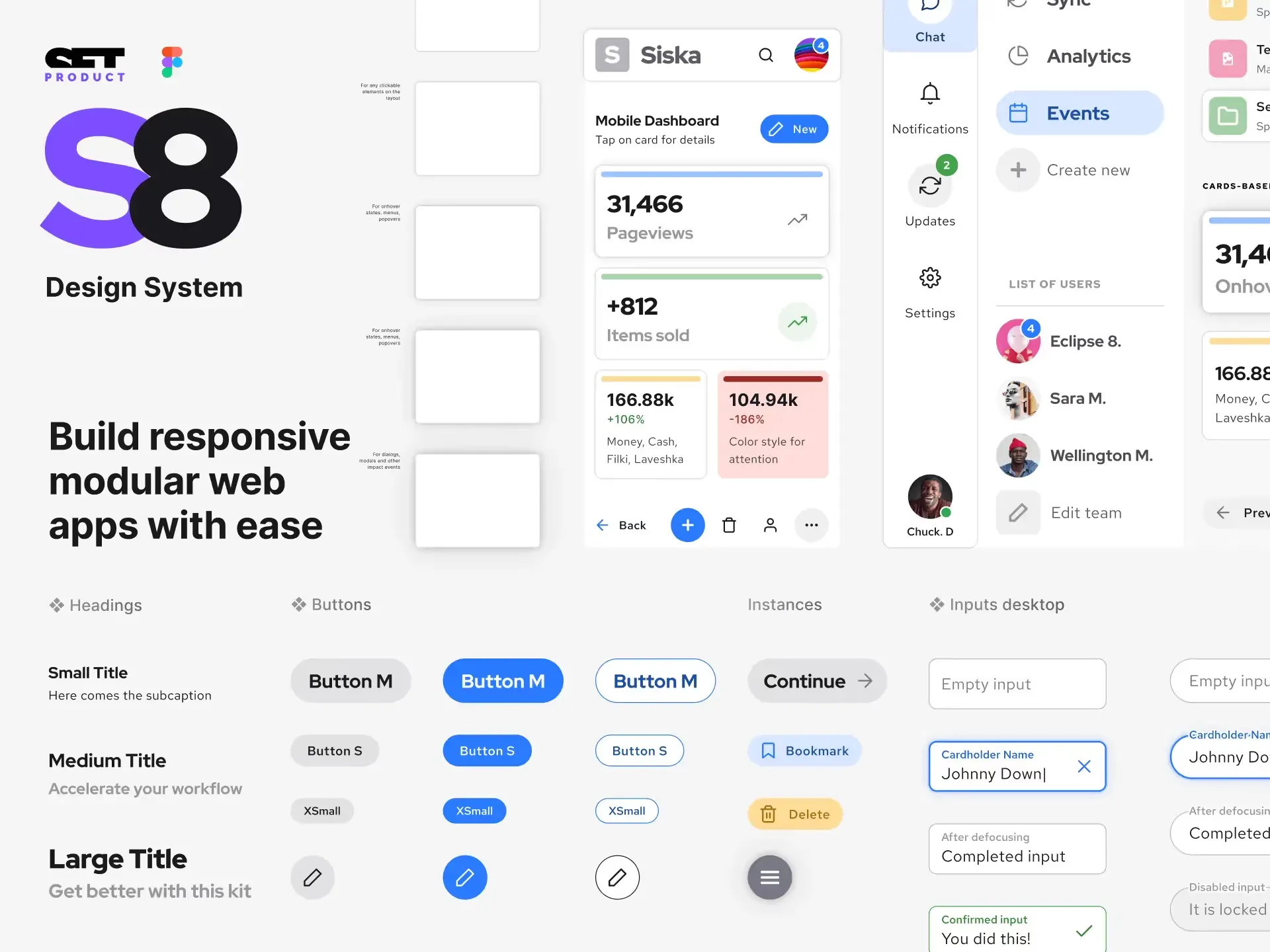
Figma S8 Design System
Figma design library for mobile and desktop apps made of high quality styled components. Full version includes 67 dashboard templates.
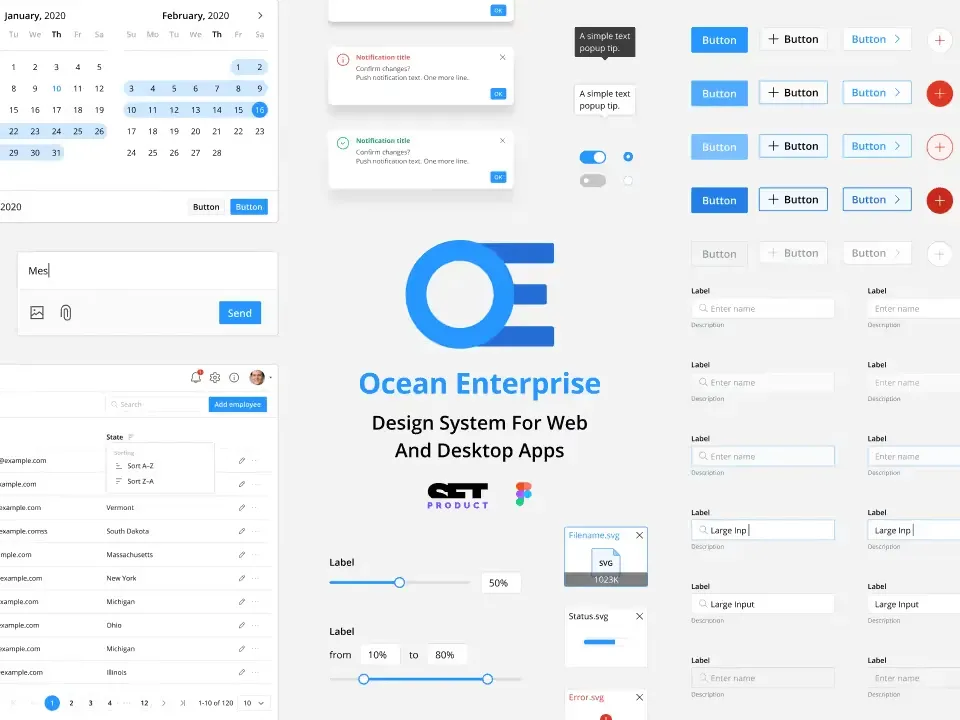
OE Figma Design System
Customizable and well-organized Figma library. This design system aimed to build highly loaded interfaces, boost the speed and save more costs.

