


.webp)


Roman Kamushken
<span class="blog_big-paragraph">In this post, I will tackle common Checkbox UI design challenges head-on. Whether it's breaches in styling, confusion surrounding Checkbox states, or accessibility hurdles, you'll gain expert solutions to help you overcome these obstacles for the slick UX.</span>
Checkbox – is a UI component that allows users to indicate a binary choice, typically represented by a small box that can be checked or unchecked. It plays a crucial role in capturing user input and facilitating options selection within forms or interfaces.
Checkbox Anatomy
Container

Definition: The outer boundary or frame of the Checkbox component.
Purpose: Provides visual separation and grouping for the Checkbox elements within an interface.
✍ Design Tip: Ensure that the container has sufficient spacing to avoid accidental clicks and differentiates the Checkbox from surrounding elements.
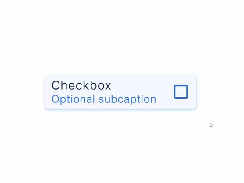
Label

Definition: Text or visual content accompanying the Checkbox.
Purpose: Communicates the meaning or purpose of the Checkbox to users.
✍ Tip: Position the label adjacent to the Checkbox and use concise and descriptive text for better association and understanding. Use a Subcaption if additional clarification or guidance is required, placing it below or next to the main Label.
Input

Definition: The clickable area within the Checkbox component.
Purpose: Enables users to select or deselect the Checkbox.
✍ Increase the clickable area by extending the input size and using appropriate padding, ensuring ease of selection on different devices and input methods.
Tick Mark

Definition: The visual indicator representing a checked or selected state.
Purpose: Provides immediate visual feedback and confirmation of the Checkbox selection.
✍ Utilize a clear and universally recognizable symbol for the tick mark, avoiding ambiguity or confusion with other symbols or UI elements.
Checkbox Types
Standard Checkbox
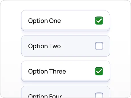
Definition: A Checkbox used to represent a single-choice selection. Users can select or deselect the Checkbox to indicate their choice.
Use Case: Selecting one option from a list, like choosing a preferred payment method.
Design Tips:
- Ensure adequate spacing between options to avoid accidental selection.
- Provide visual cues, such as color changes or checkmarks, to indicate the selected state.
- Make the selected Checkbox easily distinguishable from unselected options.
Indeterminate Checkbox
Definition: A Checkbox state indicating a mixed selection status when some, but not all, options within a group are selected.
Use Case: Selecting a subset of options within a larger group or hierarchy, like choosing individual files within a folder.
Design Tips:
- Clearly communicate the indeterminate state with a visual indicator, such as a horizontal dash or a minus sign.
- Allow users to select/deselect individual items, as well as select/deselect all items.
- Consider using a hierarchical structure to show the relationship between options.
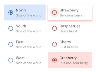
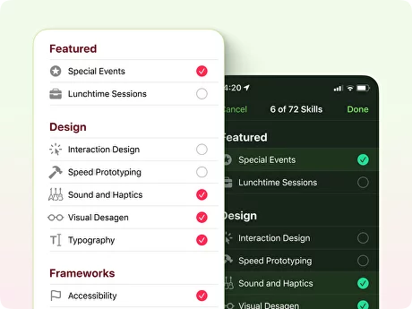
Circular Checkbox
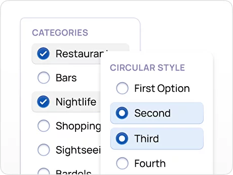
Definition: A Checkbox with a circular shape, typically used to represent selections.
Use Case: Various selection scenarios where a circular visual style is desired.
Risk:❗ Potential confusion if the circular shape is not adequately distinguishable as the selectable control.
Design Tips:
- Ensure the circular Checkbox is visually distinctive, with clear visual differences for the selected and unselected states.
- Consider using animations or transitions to provide visual feedback on selection changes.
Square Checkbox
Definition: A Checkbox with a square shape instead of a tick or checkmark, representing the selected state.
Use Case: Differentiating from standard Checkbox styles or aligning with specific visual themes.
Risk:❗ Potential misinterpretation due to the square shape resembling other rectangular UI elements.
Design Tips:
- Use a consistent size and spacing to maintain visual alignment with other interface elements.
- Consider utilizing color, shadows, or other visual cues to enhance the distinction between the selected and unselected states.
- Emphasize the square shape by using consistent rounded corners or sharp edges for visual consistency.
Toggle Switch Checkbox
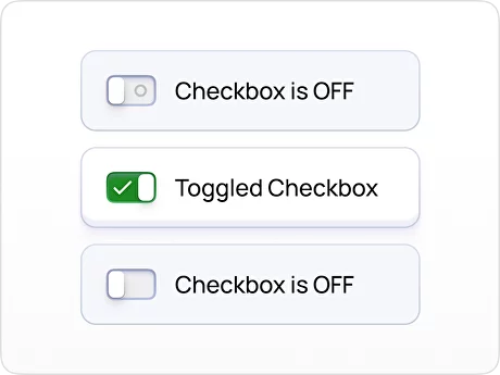
Definition: A Checkbox presented in the form of an on/off switch, visually representing a binary state.
Use Case: Enabling or disabling a feature or toggling a setting, where changes should be applied instantly.
Design Tips:
- Use labels or text, such as "on" and "off," to provide explicit guidance to the user.
- Utilize animations or transitions to create a smooth and responsive user experience, making it clear to the user that their action has been registered.
Checkbox States
Checked state
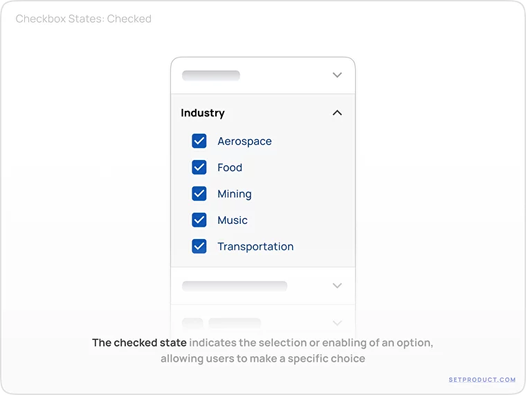
The checked state indicates that the option represented by the Checkbox is selected or enabled, allowing the user to make a specific choice.
Considerations:
- Consider offering alternative visual representations besides checkmarks for culturally diverse users who may interpret symbols differently.
- Ensure that the selected options are properly saved and reflected appropriately in the user interface.
- Provide clear visual feedback, such as highlighting or animating the Checkbox when it is checked, to ensure users have a clear understanding of their selection.
Unchecked state
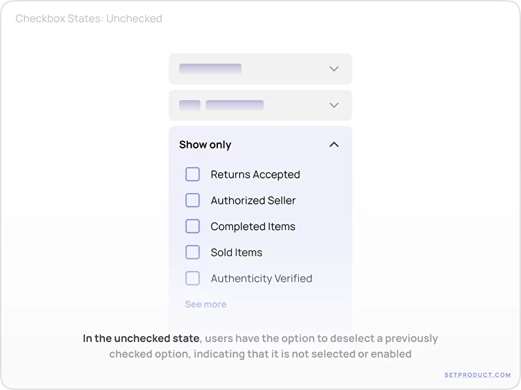
The unchecked state represents the default state where the option is not selected or enabled, providing users with the ability to opt-out or deselect a previously checked option.
Considerations:
- Use clear labels or descriptions that accurately convey the purpose of the Checkbox, allowing users to easily understand the option presented.
- Design the visual presentation of the unchecked state to be easily recognizable, preventing confusion or ambiguity for users looking for unselected options.
- Consider visually indicating the available choices and the current selection state to give users a clear overview of their options.
Hover state
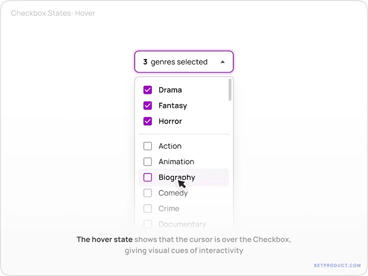
The hover state indicates that the user's cursor is positioned over the Checkbox, provoking visual feedback and encouraging interaction by giving visual cues of interactivity.
Considerations:
- Use subtle visual cues such as color changes, shadows, or animations to highlight the hover state without overwhelming or distracting users.
- Ensure adequate contrast between the Checkbox and background to support users with visual impairments and enable the hover state to be easily perceivable.
- Keep in mind that interactive elements adjacent to the Checkbox, such as labels or other interactive regions, respond accordingly when it's hovered over.
Focus state
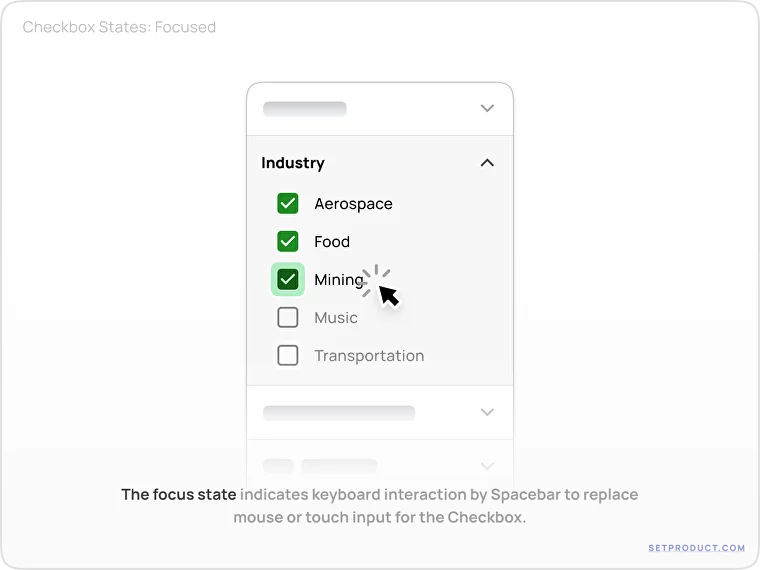
The focus state indicates that the Checkbox has received keyboard focus, allowing users to interact with it using the keyboard instead of the mouse or touch input.
Considerations:
- Provide a clear and visible focus indicator, such as an outline or color change, to help users understand which element currently has the focus.
- Ensure that users can interact with the Checkbox using keyboard navigation, such as using the Spacebar to toggle the state, to accommodate users with mobility limitations.
Disabled state
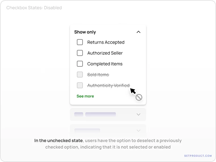
The disabled state represents that the Checkbox cannot be interacted with or selected, often due to system conditions or user permissions, providing users with information that the option is currently unavailable.
Considerations:
- Communicate the disabled state clearly through visual cues such as grayscale or opacity changes, making it visually distinct from other interactive or enabled states.
- Provide explanatory text or tooltips to explain why the Checkbox is disabled, offering users context or guidance on why certain options cannot be selected.
Indeterminate state
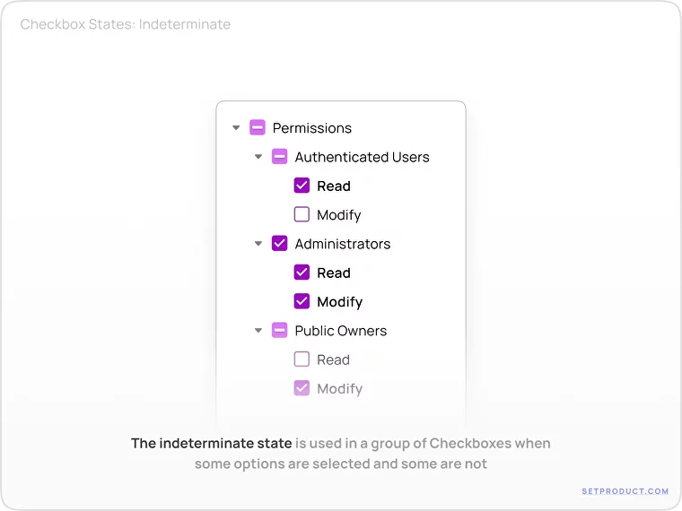
The indeterminate state is used in a group of Checkboxes to indicate that the state of the Checkbox is neither fully checked nor unchecked. It is commonly used when there are multiple options, and not all options are selected or deselected.
Considerations:
- Clearly communicate the meaning of the indeterminate state using visual cues like a dash or an intermediate icon to represent that the option is in an indeterminate state.
- Design the interaction behavior of the Checkbox to allow users to switch between the indeterminate, checked, and unchecked states, ensuring a smooth and intuitive user experience.
- Test the indeterminate state in relation to the overall functionality and behavior of the Checkbox group, ensuring that it integrates seamlessly in various user flows.
Checkbox Styling
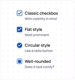
Customizing the Box
Purpose: Provide flexibility in customizing the visual appearance of the Checkbox box.
Goals: Enable designers to align the Checkbox box with the overall design system or specific branding requirements.
❗ Overly customized box redesigns may result in inconsistencies or confusion with standard.
Label Styling
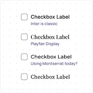
Purpose: Style the text label associated with the Checkbox to enhance the visual hierarchy and readability.
Goals: Improve the label's aesthetic appeal and legibility to enhance user experience.
❗Excessive label stylization may compromise readability or create confusion for users.
Checkmark Design
Purpose: Customize the design of the checkmark within the Checkbox to align with the overall visual style.
Goals: Create a visually appealing and recognizable checkmark that signifies the selected state.
❗Overly complex or abstract checkmark designs may cause confusion or be less intuitive for users.
Theme and Color
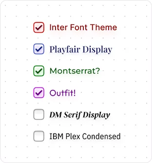
Purpose: Customize the Checkbox's color to align with the overall theme or brand palette.
Goals: Create visual consistency and reinforce brand identity through color customization.
❗Poor color choices may result in low contrast or accessibility issues for certain users.
Hover and Focus Effects
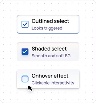
Purpose: Enhance interactivity and provide visual feedback during user interactions with the Checkbox.
Goals: Make the Checkbox more engaging and intuitive by providing clear hover and focus effects.
❗Overly pronounced or distracting effects may cause visual clutter or fatigue for users.
Adjacent Elements
Purpose: Consider the placement and alignment of other elements near the Checkbox for optimal visual harmony.
Goals: Ensure that adjacent elements do not interfere with the Checkbox's visibility or functionality.
❗Poor placement or alignment may cause visual confusion or hinder usability.
Checkbox Use Cases
Single Selection
Purpose: Single selection checkboxes are used when users can choose only one option from a given set.
Example: A user creating an account on a social media platform can agree to the platform's terms and conditions by checking a Checkbox.
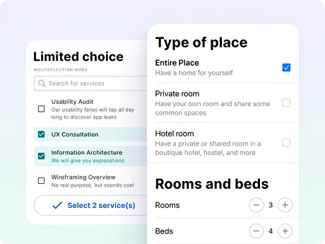
Multiple Selection
Purpose: Checkboxes are frequently used when users need to make multiple selections from a list of options. This pattern is commonly seen in forms, preference settings, and multi-select filters.
Example: A user in an email application can select multiple emails by using Checkboxes to perform actions like deleting, marking as read, or moving to folders.
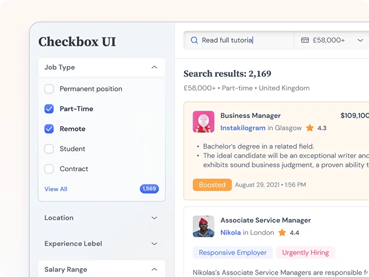
Filtering Options
Purpose: Checkboxes are commonly used in filtering functionality, allowing users to refine search results or narrow down content based on specific criteria.
Example: In a job search platform, users can narrow down their search results based on several criteria, such as location, job type, or salary. Checkboxes allow users to select/deselect filtering options to refine their search.
User Preferences
Purpose: Checkboxes are frequently used in user preference settings, allowing users to customize their experience or enable/disable certain features.
Example: A user customizing their email notification settings in a productivity app can choose to receive notifications for new tasks, due dates, or reminders by checking the corresponding checkboxes.
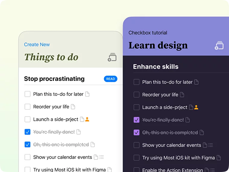
Task Management
Purpose: Checkboxes are often used in task management applications to mark tasks as completed, create task lists, or manage task assignments.
Example: A user managing their to-do list in a productivity app can check off completed tasks by selecting the checkboxes next to each task.
Checkbox Usability Tips
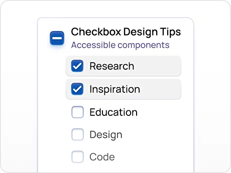
Group Related Checkboxes
UX Problem: When checkboxes that are related or have a hierarchical relationship are not visually or structurally grouped together, users not understand the relationship and make appropriate selections.
Solution: Group checkboxes logically and visually to clarify relationships and improve user comprehension.
To group related checkboxes effectively:
- Use consistent positioning: Group related checkboxes together by placing them in proximity to each other, either vertically or horizontally. This visual alignment helps users understand that they are part of the same category or option.
- Provide clear headings or subheadings: Use headings or subheadings to provide context and clarify the relationship between checkboxes. Clearly label these sections to denote the grouping or categorization.
- Apply visual grouping cues: Utilize visual elements like dividers, backgrounds, or indentation to visually separate and group related checkboxes. These cues will help users distinguish between different categories or options.
Limit Choices
UX Problem: When there are too many checkboxes available without any restrictions, users may feel overwhelmed and find it challenging to make informed choices.
Solution: Set appropriate constraints on the number of checkbox selections to prevent decision fatigue.
To limit checkbox choices effectively:
- Establish clear limitations: Determine the optimal number of checkboxes that users should reasonably select and clearly mention any restrictions upfront.
- Provide contextual guidance: Explain why there are limitations or suggest popular/ recommended choices. This helps users narrow down their preferences based on their needs or popular selections.
- Consider progressive disclosure: If there's an extensive list of options, employ a mechanism such as a "More Options" button or collapsible sections to initially show a subset of checkboxes. This improves the digestibility of the choices and reduces decision overload.
Default Selections
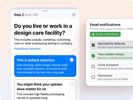
UX Problem: Users may overlook or feel uncertain about checkbox selection, resulting in potential errors or omission of desired choices.
Solution: Provide default selections that align with user expectations and common use cases while allowing users to modify or deselect them as needed.
To offer default selections effectively:
- Understand user expectations: Conduct research or analysis to determine common preferences or behaviors among your target audience. Align default selections with these expectations, minimizing the need for users to modify them frequently.
- Clearly indicate defaults: Visually differentiate default selections, such as by pre-checking the checkboxes or applying a distinct visual treatment. This allows users to quickly scan options and identify the preset choices.
- Provide easy modification: Make it effortless for users to change or deselect default selections if they have different preferences.
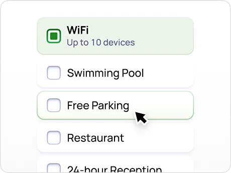
Ample Click Target
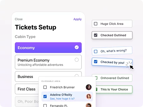
UX Problem: When the clickable area of checkboxes is too small, users may struggle to accurately select or interact with them, especially on touch devices, leading to frustration and errors.
Solution: Enlarge the clickable area of checkboxes to improve usability and ease of interaction.
To provide ample click targets for checkboxes:
- Increase the size of checkboxes: Make the checkboxes larger to provide a more significant clickable area. A larger checkbox is easier to tap or click, reducing the risk of errors.
- Use padding or spacing: Surround the checkbox element with additional padding or spacing to create a larger click target area around it. This helps to reduce misclicks.
- Ensure responsive design for touch devices: Consider the size of the checkboxes for touch devices specifically. Take into account the average size of a fingertip and adjust the clickable area accordingly to accommodate touch interactions.
Error Handling
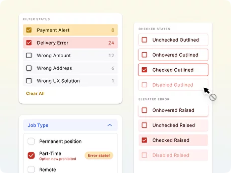
UX Problem: When users encounter an issue or error related to checkboxes, such as invalid selections or missing required checkboxes, they may not receive clear feedback on how to rectify the problem.
Solution: Provide informative error messages and guidance to help users understand and correct checkbox-related errors.
To handle checkbox-related errors effectively:
- Clearly indicate missing selections: Identify and highlight any missing required checkboxes with an error message that clearly states why the selections are necessary and prompts users to make the appropriate choices.
- Provide descriptive error messages: Instead of relying on generic error messages, create specific error messages related to checkbox selections. Be explicit about what went wrong and provide guidance on how to resolve the issue.
- Maintain form data: When users encounter an error related to a checkbox, preserve their previously entered form data. This prevents users from having to re-enter the entire form and helps them focus specifically on rectifying the error.
Visual Feedback on Interaction
UX Problem: When users interact with checkboxes, such as hovering or clicking, they may not receive sufficient visual feedback to confirm that their action has been registered, leading to uncertainty and potential usability issues.
Solution: Provide clear visual feedback when users interact with checkboxes to reinforce their actions.
To provide visual feedback on interaction:
- Highlight on hover: When users hover over a checkbox, apply a subtle but noticeable visual change to indicate interactivity. This can be accomplished by changing the background color, adding a border, or applying a shadow effect.
- Active state representation: When users click on a checkbox to select or deselect it, provide a clear visual indication of the active state.
- Animated transitions: Use smooth animations to transition between different checkbox states, such as a fade-in or a subtle scaling effect. This helps users perceive their actions and understand the outcome of their actions.
{{spacer-24}}
{{stars-conclusion}}
{{spacer-24}}
Related links
- Checkboxes in Material Design 3 UI kit
- Checkboxes in Panda Dashboard kit
- Checkboxes in Xela UI kit
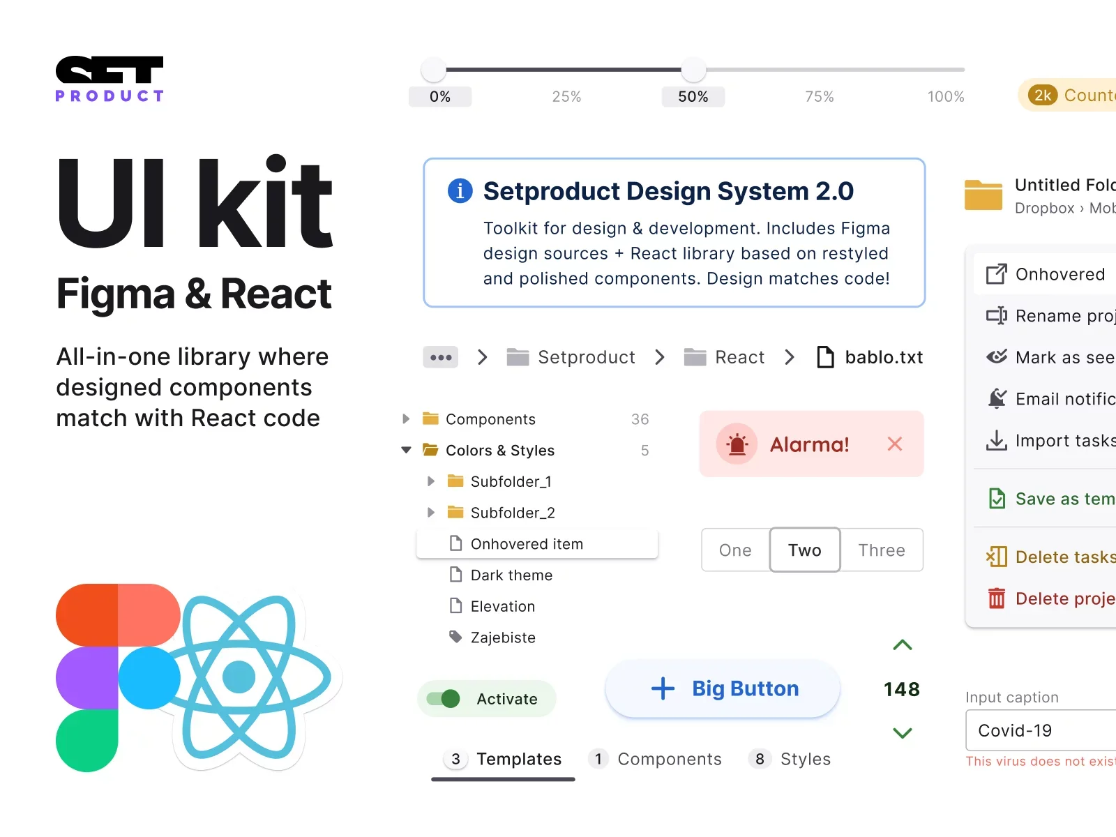
- Checkboxes in Setproduct Design System
- Selection Controls in MOST iOS kit
- Multi-select Checkboxes in Material X UI kit

%20(1).webp)
.webp)
.webp)
.webp)
.webp)
.webp)

.webp)
.webp)

.webp)
.webp)
.webp)

.webp)


%20(1).webp)

%20(1).webp)
.webp)
.webp)


